8,119 search results
(0.019 seconds)
- TT Cometus by TypeType,
$19.00 Dynamic, attractive and catchy - the new TypeType display font! Please note! If you need OTF versions of the fonts, just email us at commercial@typetype.org TT Cometus is an expressive typeface that captivates from the first time you read a text set in it. Despite its massiveness, the typeface is malleable and dynamic, like a comet piercing the space in order to achieve the only goal - to capture the attention of the viewer. TT Cometus is a slab serif whose strong serifs are serifed at the junctions with the vertical stroke to give the typeface a dynamic and modern character. Thanks to this solution, some elements of the font evoke associations with calligraphic works, while display elements remain stable thanks to massive serifs. The pointed endings of the letters c, y, e, t and noticeable inflows of arches and semi-ovals make the character of TT Cometus dynamic. The contrast between the thicknesses of the horizontal and vertical elements is small, but in the serifs, inflows, and letter endings, the contrast is pronounced. The nature of the font is balanced, and its friendliness is supported by the smoothness of shapes. Oriented towards the viewer, flowing yet massive and dynamic, TT Cometus is suitable for use in eye-catching projects. This is a display font that shows its character better in a large body size and can be used in printed materials or on the web. The font looks flawless in headlines and logos, and is suitable for use in branding. TT Cometus consists of 5 faces: 4 upright and one variable font. Each face has 568 glyphs. The font contains 18 OpenType features, including a large number of ligatures, sets of alternative characters for the ampersand and the letter g.
 - Gambler by Fenotype,
$25.00 Gambler is a characteristic display type collection of 7 font styles with both clean and textured -making it total 14 fonts designed to play together. Gambler strikes with witty and elegant appeal combining vintage and modern elements. Gambler is an effective set for creating identities for branding, posters, book covers, headlines, logotypes, prints on garments, restaurant menus, beer labels and so on, both offline and online. Gambler Script is a smooth contrasted script that comes in two weights and it is packed with plenty of OpenType features: Standard Ligatures and Contextual Alternates are automatically on and they help to keep the flow and connections smooth. From Stylistic Alternates you’ll find characters with pointed endings and some other small variations. For extra flair try Swash or Titling Alternates. Gambler Script is PUA encoded so you can access the extra characters in most graphic design softwares. Gambler Brush is a soft brush script with low contrast and large x-height. Gambler Brush comes with following OpenType features: Standard Ligatures and Contextual Alternates that are automatically on and that keep the connections smooth. For less uneven word picture try Stylistic or Swash Alternates. Gambler Brush is PUA encoded so you can access the extra characters in most graphic design softwares. Gambler Flare is a flared serif with sharp edges and wide characters Gambler Flare comes in two weights. Gambler Gothic is a rigid condensed sans serif that comes in two styles: Regular and Shadow. Gambler Gothic Shadow has a narrow lining giving a three dimensional expression to the font. Gambler fonts are designed to play together, in pairs, or all together but they also work great as themselves or combined with other Fenotype Fonts.
 - ITC Bodoni Seventytwo by ITC,
$29.99Giambattista Bodoni (1740-1813) was called the King of Printers; he was a prolific type designer, a masterful engraver of punches and the most widely admired printer of his time. His books and typefaces were created during the 45 years he was the director of the fine press and publishing house of the Duke of Parma in Italy. He produced the best of what are known as modern" style types, basing them on the finest writing of his time. Modern types represented the ultimate typographic development of the late eighteenth and early nineteenth centuries. They have characteristics quite different from the types that preceded them; such as extreme vertical stress, fine hairlines contrasted by bold main strokes, and very subtle, almost non-existent bracketing of sharply defined hairline serifs. Bodoni saw this style as beautiful and harmonious-the natural result of writing done with a well-cut pen, and the look was fashionable and admired. Other punchcutters, such as the Didot family (1689-1853) in France, and J. E. Walbaum (1768-1839) in Germany made their own versions of the modern faces. Even though some nineteenth century critics turned up their noses and called such types shattering and chilly, today the Bodoni moderns are seen in much the same light as they were in his own time. When used with care, the Bodoni types are both romantic and elegant, with a presence that adds tasteful sparkle to headlines and advertising. ITC Bodoni™ was designed by a team of four Americans, after studying Bodoni's steel punches at the Museo Bodoniana in Parma, Italy. They also referred to specimens from the "Manuale Tipografico," a monumental collection of Bodoni's work published by his widow in 1818. The designers sought to do a revival that reflected the subtleties of Bodoni's actual work. They produced three size-specific versions; ITC Bodoni Six for captions and footnotes, ITC Bodoni Twelve for text settings, and ITC Bodoni Seventytwo - a display design modeled on Bodoni's 72-point Papale design. ITC Bodoni includes regular, bold, italics, Old style Figures, small caps, and italic swash fonts. Sumner Stone created the ornaments based on those found in the "Manuale Tipografico." These lovely dingbats can be used as Bodoni did, to separate sections of text or simply accent a page layout or graphic design." - ITC Bodoni Twelve by ITC,
$29.99Giambattista Bodoni (1740-1813) was called the King of Printers; he was a prolific type designer, a masterful engraver of punches and the most widely admired printer of his time. His books and typefaces were created during the 45 years he was the director of the fine press and publishing house of the Duke of Parma in Italy. He produced the best of what are known as modern" style types, basing them on the finest writing of his time. Modern types represented the ultimate typographic development of the late eighteenth and early nineteenth centuries. They have characteristics quite different from the types that preceded them; such as extreme vertical stress, fine hairlines contrasted by bold main strokes, and very subtle, almost non-existent bracketing of sharply defined hairline serifs. Bodoni saw this style as beautiful and harmonious-the natural result of writing done with a well-cut pen, and the look was fashionable and admired. Other punchcutters, such as the Didot family (1689-1853) in France, and J. E. Walbaum (1768-1839) in Germany made their own versions of the modern faces. Even though some nineteenth century critics turned up their noses and called such types shattering and chilly, today the Bodoni moderns are seen in much the same light as they were in his own time. When used with care, the Bodoni types are both romantic and elegant, with a presence that adds tasteful sparkle to headlines and advertising. ITC Bodoni™ was designed by a team of four Americans, after studying Bodoni's steel punches at the Museo Bodoniana in Parma, Italy. They also referred to specimens from the "Manuale Tipografico," a monumental collection of Bodoni's work published by his widow in 1818. The designers sought to do a revival that reflected the subtleties of Bodoni's actual work. They produced three size-specific versions; ITC Bodoni Six for captions and footnotes, ITC Bodoni Twelve for text settings, and ITC Bodoni Seventytwo - a display design modeled on Bodoni's 72-point Papale design. ITC Bodoni includes regular, bold, italics, Old style Figures, small caps, and italic swash fonts. Sumner Stone created the ornaments based on those found in the "Manuale Tipografico." These lovely dingbats can be used as Bodoni did, to separate sections of text or simply accent a page layout or graphic design." - ITC Bodoni Ornaments by ITC,
$29.99Giambattista Bodoni (1740-1813) was called the King of Printers; he was a prolific type designer, a masterful engraver of punches and the most widely admired printer of his time. His books and typefaces were created during the 45 years he was the director of the fine press and publishing house of the Duke of Parma in Italy. He produced the best of what are known as modern" style types, basing them on the finest writing of his time. Modern types represented the ultimate typographic development of the late eighteenth and early nineteenth centuries. They have characteristics quite different from the types that preceded them; such as extreme vertical stress, fine hairlines contrasted by bold main strokes, and very subtle, almost non-existent bracketing of sharply defined hairline serifs. Bodoni saw this style as beautiful and harmonious-the natural result of writing done with a well-cut pen, and the look was fashionable and admired. Other punchcutters, such as the Didot family (1689-1853) in France, and J. E. Walbaum (1768-1839) in Germany made their own versions of the modern faces. Even though some nineteenth century critics turned up their noses and called such types shattering and chilly, today the Bodoni moderns are seen in much the same light as they were in his own time. When used with care, the Bodoni types are both romantic and elegant, with a presence that adds tasteful sparkle to headlines and advertising. ITC Bodoni™ was designed by a team of four Americans, after studying Bodoni's steel punches at the Museo Bodoniana in Parma, Italy. They also referred to specimens from the "Manuale Tipografico," a monumental collection of Bodoni's work published by his widow in 1818. The designers sought to do a revival that reflected the subtleties of Bodoni's actual work. They produced three size-specific versions; ITC Bodoni Six for captions and footnotes, ITC Bodoni Twelve for text settings, and ITC Bodoni Seventytwo - a display design modeled on Bodoni's 72-point Papale design. ITC Bodoni includes regular, bold, italics, Old style Figures, small caps, and italic swash fonts. Sumner Stone created the ornaments based on those found in the "Manuale Tipografico." These lovely dingbats can be used as Bodoni did, to separate sections of text or simply accent a page layout or graphic design." - ITC Bodoni Brush by ITC,
$29.99Giambattista Bodoni (1740-1813) was called the King of Printers; he was a prolific type designer, a masterful engraver of punches and the most widely admired printer of his time. His books and typefaces were created during the 45 years he was the director of the fine press and publishing house of the Duke of Parma in Italy. He produced the best of what are known as modern" style types, basing them on the finest writing of his time. Modern types represented the ultimate typographic development of the late eighteenth and early nineteenth centuries. They have characteristics quite different from the types that preceded them; such as extreme vertical stress, fine hairlines contrasted by bold main strokes, and very subtle, almost non-existent bracketing of sharply defined hairline serifs. Bodoni saw this style as beautiful and harmonious-the natural result of writing done with a well-cut pen, and the look was fashionable and admired. Other punchcutters, such as the Didot family (1689-1853) in France, and J. E. Walbaum (1768-1839) in Germany made their own versions of the modern faces. Even though some nineteenth century critics turned up their noses and called such types shattering and chilly, today the Bodoni moderns are seen in much the same light as they were in his own time. When used with care, the Bodoni types are both romantic and elegant, with a presence that adds tasteful sparkle to headlines and advertising. ITC Bodoni™ was designed by a team of four Americans, after studying Bodoni's steel punches at the Museo Bodoniana in Parma, Italy. They also referred to specimens from the "Manuale Tipografico," a monumental collection of Bodoni's work published by his widow in 1818. The designers sought to do a revival that reflected the subtleties of Bodoni's actual work. They produced three size-specific versions; ITC Bodoni Six for captions and footnotes, ITC Bodoni Twelve for text settings, and ITC Bodoni Seventytwo - a display design modeled on Bodoni's 72-point Papale design. ITC Bodoni includes regular, bold, italics, Old style Figures, small caps, and italic swash fonts. Sumner Stone created the ornaments based on those found in the "Manuale Tipografico." These lovely dingbats can be used as Bodoni did, to separate sections of text or simply accent a page layout or graphic design." - ITC Bodoni Six by ITC,
$40.99Giambattista Bodoni (1740-1813) was called the King of Printers; he was a prolific type designer, a masterful engraver of punches and the most widely admired printer of his time. His books and typefaces were created during the 45 years he was the director of the fine press and publishing house of the Duke of Parma in Italy. He produced the best of what are known as modern" style types, basing them on the finest writing of his time. Modern types represented the ultimate typographic development of the late eighteenth and early nineteenth centuries. They have characteristics quite different from the types that preceded them; such as extreme vertical stress, fine hairlines contrasted by bold main strokes, and very subtle, almost non-existent bracketing of sharply defined hairline serifs. Bodoni saw this style as beautiful and harmonious-the natural result of writing done with a well-cut pen, and the look was fashionable and admired. Other punchcutters, such as the Didot family (1689-1853) in France, and J. E. Walbaum (1768-1839) in Germany made their own versions of the modern faces. Even though some nineteenth century critics turned up their noses and called such types shattering and chilly, today the Bodoni moderns are seen in much the same light as they were in his own time. When used with care, the Bodoni types are both romantic and elegant, with a presence that adds tasteful sparkle to headlines and advertising. ITC Bodoni™ was designed by a team of four Americans, after studying Bodoni's steel punches at the Museo Bodoniana in Parma, Italy. They also referred to specimens from the "Manuale Tipografico," a monumental collection of Bodoni's work published by his widow in 1818. The designers sought to do a revival that reflected the subtleties of Bodoni's actual work. They produced three size-specific versions; ITC Bodoni Six for captions and footnotes, ITC Bodoni Twelve for text settings, and ITC Bodoni Seventytwo - a display design modeled on Bodoni's 72-point Papale design. ITC Bodoni includes regular, bold, italics, Old style Figures, small caps, and italic swash fonts. Sumner Stone created the ornaments based on those found in the "Manuale Tipografico." These lovely dingbats can be used as Bodoni did, to separate sections of text or simply accent a page layout or graphic design." - Amarga by Latinotype,
$29.00 The inspiration behind Amarga comes from the bitter taste of coffee. Amarga is a serif typeface with high contrast and pointed terminals, composed of 9 weights that range from a very heavy black version to a thin version plus italics, with a total of 18 fonts. Amarga has a great visual impact and is perfect for display uses in editorial design, web, branding, posters and many others.
 - HT Pasticceria by Dharma Type,
$19.99 HT Pasticceria is extremely eye-catching and high-contrast font. It is a chic typeface with a?sweet?and?perhaps?girly touch. HT Pasticceria is great for use in all kinds of display typography. Holiday Type Project offers retro hand drawing scripts. Inspired by retro script on shopfront lettering, wall paint advertisements in Italy around 1950s. Check out the script fonts from Holiday Type!
 - Red Klin by ParaType,
$25.00 A decorative сaps-only typeface designed for ParaType in 2004 by Gayaneh Bagdasaryan. Inspired by Russian fine art from the beginning of the 20th century - lettering by Sergey Chekhonin (1878-1936), graphic design by El Lissitzky (1890-1941) and the Suprematism painting. Sketch design of the font (under the name Klin) was awarded a TDC2 2000 diploma. For use in advertising and display typography.
 - M Young HK by Monotype HK,
$523.99 M Young is a humanistic script design characterised by its modern, lively and youngster-like style. M Young incorporates features of the writings of felt-tip writing pen, its entry and finial points of strokes are rounded, parallel without flare. Contrast is low and the text is visible and eye-catching. It is best suited for casual and lively text, illustrations, set upright (non-slanted), non-condensed.
 - Bacca la Hurra by Ilhamtaro,
$17.00 BACCA LA HURRA is a vintage font in the style of sign painting, characterized by bold strokes and squares. Consisting of Uppercase, Lowercase, Numerials and Punctuations, this font is perfect for vintage food packaging designs or other vintage branding. To enable the OpenType Stylistic alternates, you need a program that supports OpenType features such as Adobe Illustrator CS, Adobe Indesign & CorelDraw X6-X7. Cheers!
 - HT Osteria by Dharma Type,
$19.99 HT Osteria is a monoline script, but you don’t feel it monotonous because of distinctive shapes of the characters. HT Osteria is suitable for signage, package, and posters or any other kind of display use. Holiday Type Project offers retro hand drawing scripts. Inspired by retro script on shopfront lettering, wall paint advertisements in Italy around 1950s. Check out the script fonts from Holiday Type!
 - Santhen by Wacaksara co,
$10.00 Introducing Santhen! A handlettering styles brush font inspired by classic styles of paint stripped typography. It's the perfect choice for personal branding projects, handwritten quotes, homeware designs, product packaging or simply as a modern & stylish text overlay to any background image. Santhen is available in two styles. Santhen also comes with uppercase, lowercase, numerals, punctuations, common ligatures and also additional swash to let you customise your designs.
 - HU Handwrite by Heummdesign,
$15.00 It is a handwriting-style font for body text that emphasizes gentleness and solidity by using less curvature and making use of a straight feel. The handwriting feeling is emphasized through the style that makes use of the natural bending and stroke order. Softness was added in the shape of a gentle curve, and perspective was applied by setting a vanishing point in the lower left corner.
 - Branding Autumn by Rotterlab Studio,
$14.00 Branding Autumn introducing our new "Branding Autumn" Modern Calligraphy Script in Modern Elegant Style perfect for branding, logos, invitations, master heads and more. Branding Autumn Features: - Many languages - Alternative - PUA encoded - Ligature - Very easy to use in any software (Included Instructions) - No special software installation required. Compatible with Windows and Mac OS. Supported by Microsoft Word, Paint, Adobe, Corel draw, Cricut and other applications. Thank you...
 - Micro Manager NF by Nick's Fonts,
$10.00This font features a complete uppercase alphabet, including accented characters, as well as numbers and standard punctation. Lowercase characters are an assortment of useful dings and things. To create very low-load GIFs, compose your type in Photoshop (or equivalent) at 8 point (or multiples thereof), with anti-aliasing turned off. Both versions of the font include 1252 Latin, 1250 CE (with localization for Romanian and Moldovan). - Laughter JNL by Jeff Levine,
$29.00 Laughter JNL is a deconstruction of the vintage sign painter's design Brushmark JNL. By flattening most of the curved lines and making other minor adjustments to the original font, the end result was a fun and playful sanserif that is great for lighthearted ads, party invitations, special events, point-of-sale signage and many other applications where a less-than-formal type style is required.
 - Zappaloosa by Bogstav,
$18.00 Zappaloosa is a wordplay, and the name came to me while listening to the radio while making this font. At a point I must have misheard something, but the name Zappaloosa popped up in my mind. The letters of Zappaloosa are playful and easy to use for serious or more loose use. I've added 3 different versions of each lowercase letter and multilingual support
 - Bendigo by ITC,
$29.00The lively calligraphy font Bendigo was created by Phill Grimshaw in 1993 and looks as though it were written by an energetic hand. Generous capitals fit harmoniously with more reserved lower case letters and the right slant of both emphasizes the dynamic feeling of the font. Bendigo should be used in point sizes of 14 or larger and its strong character makes it particularly good for headlines. - Amadeus by Classic Font Company,
$14.95Amadeus was inspired by an alphabet reputed to be used in the Papal Chancery in the 16th century. It has highly decorated capitals and to be used at its best requires a large point size. The lower-case characters have been deliberately made simple to contrast with the ornate capitals. Included within the font are many extra characters plus a complete set of framed numerals. - M Young PRC by Monotype HK,
$523.99 M Young is a humanistic script design characterised by its modern, lively and youngster-like style. M Young incorporates features of the writings of felt-tip writing pen, its entry and finial points of strokes are rounded, parallel without flare. Contrast is low and the text is visible and eye-catching. It is best suited for casual and lively text, illustrations, set upright (non-slanted), non-condensed.
 - Linotype Cerny by Linotype,
$29.99Linotype Cerny is part of the Take Type Library, selected from the contestants of Linotype’s International Digital Type Design Contests of 1994 and 1997. Dutch artist Mark van Wageningen designed an alphabet consisting exclusively of capital letters. The font’s most distinguishing characteristic is its irregular outer contour, almost as though they were ripped out of paper. Linotype Cerny is intended exclusively for headlines in larger point sizes. - Chwast Buffalo by Linotype,
$29.99Seymour Chwast designed the fun font Chwast Buffalo in 1981 and gave it his name. Its extremely robust figures are rendered in regular, even strokes, significantly reducing the inner white spaces. The typeface should therefore only be used in large and very large point sizes. A distinguishing characteristic of Chwast Buffalo is its half-circle serifs, which give the forms a technical, constructed appearance. - Radonezh by Simeon out West,
$22.00 The Radonezh font is a Latin alphabet layout based on Russian Lettering I have seen. The font is designed to give a classic Medieval Eastern European feel with a hand-lettered style. Radonezh comes with full punctuation, a complete character set for most Western European Latin alphabet languages, Cyrillic languages, and polytonic orthography for Greek. Being a decorative font, it works best at larger point sizes.
 - Regatta Condensed by ITC,
$29.00Regatta is a bold, narrow sans serif designed by Alan Meeks in 1987. Its strong, robust figures makes it a particularly good font for headlines in larger point sizes. Regatta is distinguished by its diamond shaped dots on i and j as well as the slanted strokes of several figures. These characteristics relax the closed, static image of Regatta and let the font seem cheerful and friendly. - Simeon's Handwritten Blackletter by Simeon out West,
$20.00 Simeon's Handwritten Blackletter is the result of my desire to have my handwritten old English style writing available for my computer. It is a basic Gothic style font with my own touch to the lettering. Simeon's Handwritten Blackletter comes with full punctuation, a character set for most Western European based Latin alphabet languages. Being a decorative font, it works best at larger point sizes.
 - Alma by Sudtipos,
$69.00 From the technical hand of Alejandro Paul and the creative jungle in the mind of Angel Koziupa, comes a wild-natured script. Alma may appear slightly weathered, but still maintains a sharp and determined face. The casual strokes are at times pointed, yet ultimately playful. Released in OpenType format to expand possibilities of use with lots of alternates when used with OpenType-aware applications such as AdobeCS.
 - Merlandio by FadeLine Studio,
$14.00 Introducing! Merlandio is a hand painted font with a style natural, sweet and simple. Made with great care to provide the natural and modern elements. This font will look great if used single even with other pairing fonts. The great thing about this font is you can find some style when you use it, examples such as natural handwriting style, unique, simple, elegant, and bold.
 - Brush Maker by UICreative,
$23.00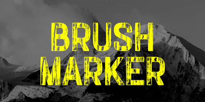 Introducing our new product the name Brush Marker Hand Painted Font. Modern Display font that is beautiful classy, elegant, and modern. This font is perfectly suited for a wide variety of projects, such as signature, stationery, logo, wedding, typography quotes, magazine or book covers, website headers, clothing, branding, packaging design, and more. Also for fashion-related branding or editorial design and displays both masculine and feminine qualities.
 - 1550 Arabesques by GLC,
$15.00 Font inspired by the decorative elements and opening capitals frequently in use in the early 1500s, under Geoffroy Tory’s book “Champfleury” influence, especially in Lyon (France). It is an entirely original design. It is used to embellish texts, such as posters, greetings, invitations, gastronomic menus and much more... This font easily supports enlargement to 48, 60, 72 points and more, as it is made for those sizes!
 - HT Libreria by Dharma Type,
$19.99 This font consists of thin lines, we get very delicate impression.The straight lines are regularly arranged, at the same time, this font has very beautiful curved lines. So its overall atmosphere is intelligent and sophisticated. Holiday Type Project offers retro hand drawing scripts. Inspired by retro script on shopfront lettering, wall paint advertisements in Italy around 1950s. Check out the script fonts from Holiday Type!
 - Lusta by Device,
$29.00 Lusta plays with the interchangeability of an inline and an outline, negative and positive space. Often one single character will epitomise the design of a font, and here the S served as the conceptual starting point. The inline/outline was then applied to sans and serif variants, and extended into a multi-line prisma and an offset layered shadow version, probably inspired by Face Photosetting’s Stack.
 - Best Mommy by Dhan Studio,
$23.00 Best Mommy is a beautiful hand-painted font that looks more natural and fun, combines a mixture of lowercase ligatures, uppercase alternatives and several lowercase alternatives and makes it look attractive and unique, also includes some cute extras that you can use your designs for. This fonts can be used for various purposes such as headings, logos, invitations, t-shirts, letterhead, signage, labels, news, posters, badges etc.
 - Kunstschau by Hanoded,
$15.00 The 1908 art exhibition in Vienna (Kunstschau 1908) featured works by Josef Hoffmann, Cark Otto Czeschka and Gustav Klimt, who showcased his famous painting 'The Kiss'. Kunstschau font was modeled on a stamp, designed by Austrian artist Bertold Löffler, for the 1908 exhibition. Kunstschau is a loose, handwritten font which comes with a distinct all caps upper and lower case, plus an extensive language support.
 - RM Almanack by Ray Meadows,
$19.00 Based on William Caslon’s design (c1720) which was itself based on Dutch Baroque typefaces. The old saying “when in doubt, use Caslon.” can now be updated ... “use RM Almanack instead!” Includes: Western European, Central European, Baltic & Turkish sets Due to the modular nature of this design there may be a slight lack of smoothness to the curves at very large point sizes (around 100 pt and above).
 - ITC Samuel by ITC,
$29.99ITC Samuel is a delicate and lively calligraphy font designed by Phill Grimshaw. Every detail has been worked to create harmony. The stroke contrast, the light brush character, the graceful forms all give ITC Samuel the spontaneity and individuality typical of handwriting. The font includes several ligatures and is legible even in smaller point sizes. ITC Samuel is perfect for invitations, greeting cards and other personal correspondence. - English 157 by ParaType,
$30.00 The Bitstream version of Englische Schreibschrift by H. Berthold, 1970–72. An unconnected copperplate script of the English nineteenth-century fashion, so-called Spencerian. Based on pressure pointed quill calligraphy. Unlike other copperplate scripts, the letters in this face do not link up. For use in advertising and display typography in relatively small sizes. Cyrillic version was developed at ParaType in 2000 by Vladimir Yefimov.
 - Framboisier by Hanoded,
$15.00 Framboisier means ‘Rasberry Bush’ in French. Even though it’s early spring, I already spotted raspberries at the greengrocers, so I figured a nice raspberry-related name would suit this font just fine. Framboisier is a hand painted script font. It’s a little messy, a little shaky, but legible and cute as well. Comes with all the diacritics and a whole bunch of alternate glyphs.
 - Cinta Adhesiva by Wordshape,
$20.00 Cinta Adhesiva began as a typeface designed for the masthead of a graffiti fanzine called Free Copy. The monumental letters painted by L.A.-based graffiti writers Crae and Hael greatly influenced the feel of the typeface. The availability and ease-of-use of tape as a medium to write with is apparent on a multitude of surfaces, and this approach led to the creation of Cinta Adhesiva.