6,504 search results
(0.018 seconds)
- Bodoni by Linotype,
$29.99 Giambattista Bodoni (1740–1813) was called the King of Printers and the Bodoni font owes its creation in 1767 to his masterful cutting techniques. Predecessors in a similar style were the typefaces of Pierre Simon Fournier (1712–1768) and the Didot family (1689-1836). The Bodoni font distinguishes itself through the strength of its characters and embodies the rational thinking of the Enlightenment. The new typefaces displaced the Old Face and Transitional styles and was the most popular typeface until the mid-19th century. Bodoni’s influence on typography was dominant until the end of the 19th century and, even today, inspires new creations. Working with this font requires care, as the strong emphasis of the vertical strokes and the marked contrast between the fine and thick lines lessens Bodoni’s legibility, and the font is therefore better in larger print with generous spacing. The Bodoni of Morris F. Benton appeared in 1911 with American Type Founders.
 - 1885 Germinal by GLC,
$38.00 This script font was inspired by a lot of manuscripts, notes and drafts, written by the famous french novelist Émile Zola (1840-1902). Specially, letters and notes from the period he was writting "Germinal" one of his very famous novel (published in 1884-1885) depicting the french minor's life in the past middle of eighteens. It is an elegant pen written type, sometimes connected, sometimes disrupted, but always regular and legible, with many variants, ligatures and contextual alternate glyphs specialy numerous in the OTF version. It is used as variously as web-site titles, posters and fliers design or greeting cards, all various sorts of presentations, menus, certificates, letters. This font, in spite of its small size, supports very strong enlargements as well as small sizes ( the original size was about 22 to 30 pts ). When printed, it remain perfectly legible and elegant from 12/14 pts even if using an ordinary inkjet printer.
 - Liebelei Variable by Wannatype,
$138.00 The typeface Liebelei has its roots back in 1932, when Vienna-based painter Rudolf Vogl created the poster for a movie called Liebelei after the popular play by Arthur Schnitzler. Now also available as Variable font!
 - Wintery Mix by DP Fonts,
$35.00 Wintery Mix contains a set of small winter and holiday illustrations collected from years of holiday cards I created. A winter scene or greeting can be created with the tap of an 'a' or 'B'.
 - French Plug by HiH,
$8.00 Frank H. Atkinson was a popular Art Nouveau sign painter in Chicago, Illinois. He designed signs for the Cadillac Motor Car Co., Chicago Academy of Fine Arts and the department store Marshall Field. Oddly enough, he even designed signs for other sign painters. In 1908 he published a book, Sign Painting, which sold well. French Plug, a bold, rounded, all-cap design in an American Art Nouveau style from that book. It has a relaxed, easy-going informality that is useful for ads and flyers. It also would have fit very nicely with many French posters of the period.
 - Barnstormer Script by Dear Alison,
$29.00 Have you ever wondered why sign painter scripts, even though they can sometimes be filled with unusual letterforms strike up such a personal connection of familiarity? Is it the weight of the brushstrokes, or is it the quick fluidity of the strokes? Whatever the reason, a sign painter script just has personality! Barnstormer Script taps into that association and brings a speedy sassiness reminiscent of retro travel brochures and appliance advertisements. But for whatever you might need this script for, you'll find it up for the task. Add a little flavor to your font collection and pick up Barnstormer Script today!
 - Typesetter Trinkets JNL by Jeff Levine,
$29.00 Typesetter Trinkets JNL adds more classic typographic gems to the Jeff Levine Fonts library. Re-drawn from vintage source material, the font has numerous cartoons, pointing hands, embellishments and stock printer's cuts for a myriad of uses.
 - Same Old English JNL by Jeff Levine,
$29.00 Same Old English JNL is your basic, everyday Old English text font with one small difference—it more resembles a hand-lettered typeface complete with tiny inconsistencies than it does the "perfect" versions found in printer's type.
 - Cute Snow by Putracetol,
$20.00 Cute Snow - Quirky Winter Font. Cute Snow a quirky playful font with 7 different style of the font. Each style has a difference in the decoration of the ornaments. This font is a winter theme font, so all the decorations are winter-related, such as: snow, snow cap, snowman, snow frezze, melt ice, snow pile and sparkle. With these decorations, this font will be perfect for your winter-themed projects. This font is also suitable for logos, branding, quotes, posters, stickers, greeting cards, invitation cards, birthday cards, quotes, crafting, svg, banners, movies, headlines and more. This font is also support multi language.
 - Snow Away by Putracetol,
$18.00 Snow Away - Quirky Winter Font. Snow Away a quirky playful font with 6 different style of the font. Each style has a difference in the decoration of the ornaments. This font is a winter theme font, so all the decorations are winter-related, such as: snow flag, ribbon, bell, Christmas earmuff, Christmas tree, and sparkle. With these decorations, this font will be perfect for your winter-themed projects. This font is also suitable for logos, branding, quotes, posters, stickers, greeting cards, invitation cards, birthday cards, quotes, crafting, svg, banners, movies, headlines and more. This font is also support multi language.
 - Arial by Monotype,
$45.99 Arial is one of the most widely used designs of the last 30 years. Drawn in 1982 by Robin Nicholas and Patricia Saunders for use in an early IBM® laser printer, Arial has become a staple for textual content. While it is widely believed that Arial's design was based on Helvetica, it is more accurate to consider Monotype Grotesque as its ancestor.
 - Rigney by Solotype,
$19.95Bill Rigney, an old job printer in my home town, established his shop in 1896, closed it in 1900 to take a steady job, stored the equipment in a large shed, and reopened for business upon his retirement in 1950. What a find! A bonanza of old type! We became good friends and upon his death I bought the type. Bless you Bill. - Cast Shadow JNL by Jeff Levine,
$29.00Cast Shadow JNL uses the same wood type as found in Trade Printer JNL and adds to it a cast shadow in right or left versions for a bold and unique look. Both fonts have limited character sets and should be used in point sizes larger than normally chosen to compensate for the visual discrepancy due to the cast shadow's effects. - DeVinne by Linotype,
$29.99 DeVinne Ornamental is a display typeface from the famous Parisian typefoundry Deberny & Peignot, developed around 1900. Its style has become synonymous with the Art Noveau period, which was raging internationally when DeVinne Ornamental's letters were first drawn. The typeface is named after the renowned American printer Theodore Low DeVinne (1828-1914). Optimal uses for DeVinne Ornamental include headlines in magazines and newsletters.
 - 1592 GLC Garamond by GLC,
$38.00 This family was inspired by the pure Garamond pattern set of fonts used by Egenolff and Berner, German printers in Frankfurt, at the end of the sixteenth century. All the experts said it was the best and most complete set of the time. The italic style used with it was Granjon’s, as in 1543 Humane Jenson. A few fleurons from the same printers have been added. It can be used variously for web-site titles, posters and flyers design, publishing texts looking like ancient ones, or greeting cards, various sorts of presentations, as a very elegant and legible font... This font supports very large sizes as easily as small sizes, remaining very smart, elegant and fine. Its original cap height is about five millimeters. Decorated letters like 1512 Initials, 1550 Arabesques, 1565 Venetian, 1584 Rinceau from GLC Foundry, can be used with this family without anachronism.
 - Poipoi by Dharma Type,
$14.99 Extraordinary impact and visual conspicuousness. Poipoi is a super 3D sans family for posters, logos and all display. The basic idea is not a brand new. The Stacking type system has been used since before wood type age. As you imagined, colored wood type(woodcut), many other engravings and contemporary printer machine print many colors separately with different printing plates for each color. Poipoi uses the same system for 3d effect. Please use Photoshop or Illustrator, or your favorite graphic design apps that can handle layers. Layers are the printing plates of wood type. You should be able to change text color for each layer. Poipoi "Standard" style is the base of this font family. You can add effects by stacking Highlight and shadow layers. Stacked layers in different color make the text in 3D. Instruction 1. Type your text as you like. 2. Set font-name "Poipoi" and font-style "Standard" 3. Set color of "Standard" layer. 4. Duplicate the "Standard" layer twice (One for Highlight, one for Shadow). 4'. The layer order should be Highlight, Standard, and Shadow from top to bottom. 5. Set font-style and color of "Highlight" and "Shadow" layers. 6. Adjust tracking if you need. (Please use same tracking value for all 3 layers.) For further detail, https://www.dropbox.com/s/xymis7dh5hwxn9q/Poipoi.pdf Poipoi Standard, Highlighted, and shadowed style can be used solely. Rounded terminals add soft, cute, and casual impressions to your design. Spec: Over 400 glyphs! Basic Latin ✓ Western Europe ✓ Central Europe ✓ South Eastern Europe ✓ Mac Roman ✓ Windows 1252 ✓ Adobe Latin 1 ✓ Adobe Latin 2 ✓ Adobe Latin 3 ✓ Almost all Latins are covered.
 - Ony by Cuda Wianki,
$20.00 Ony font was made by cutting letters in cardboard and printing them on paper. This non-perfect printing was used to get heavy, dirty letters. Font has alternate characters so it can imitate real printed words.
 - london 2012 - Personal use only

- Sign Letterer JNL by Jeff Levine,
$29.00Sign Letterer JNL is the serif version of the Art Deco hand-lettering of Sign Painter JNL—and inspired by original pen lettering found on an old decal catalog sheet from the late 1940s to the early 1950s. - Militaria JNL by Jeff Levine,
$29.00 Militaria JNL is a collection of various military insignias modeled from vintage printer's blocks. While this in no way represents all ranks, specialties and branches of the military, it is still a nice little package for themed projects.
 - Chisel Tip by m u r,
$15.00The evolution of letters is something obsessed over by graffiti writers and font fanatics alike. This font is authentic and can be used both by other graffiti writers as well as by people looking to create that particular style. - Cloister Open Face LT by Linotype,
$29.99Cloister Open Face was designed in 1929 by Morris Fuller Benton as one weight of the Cloister Old Style family. Cloister itself appeared from 1897 with American Type Founders, and later for the typesetting machines of the Linotype, Intertype and Monotype companies. At that time, it was the truest modern industrial revival of the Jensonian Roman. Benton stayed close to the style of his model in both design and spacing. Cloister Open Face has an old-world elegance, and it works well for titling in books and magazines. In 1458, Charles VII sent the Frenchman Nicolas Jenson to learn the craft of movable type in Mainz, the city where Gutenberg was working. Jenson was supposed to return to France with his newly learned skills, but instead he traveled to Italy, as did other itinerant printers of the time. From 1468 on, he was in Venice, where he flourished as a punchcutter, printer and publisher. He was probably the first non-German printer of movable type, and he produced about 150 editions. Though his punches have vanished, his books have not, and those produced from about 1470 until his death in 1480 have served as a source of inspiration for type designers over centuries. His Roman type is often called the first true Roman." Notable in almost all Jensonian Romans is the angled crossbar on the lowercase e, which is known as the "Venetian Oldstyle e."" - Largo EF by Elsner+Flake,
$35.00The typefaces Largo Mager (Light) and Largo Halbfett (Medium) were cast for the first time in 1937 by Ludwig & Mayer based on the designs by Hans Wagner. One weight Largo Licht (Outline) was added in 1956. All fonts were only configured with capitals. The digital version of Largo has pointed serifs and not the slightly rounded ones seen in the hot metal versions which gives the typeface a more elegant note. Largo is often used for fine printing jobs as business cards or formal invitations, or in the fashion and cosmetics fields. Hans Wagner was born in Munich in 1894 and died in 1977 in Altenburg where he had worked as a painter, graphic designer and book designer. In addition to the Largo typeface, he developed, among others, the Altenburger Gotisch (1928), the Welt-Antiqua (1931-1934) and the Wolfram (1930). - P22 Rodin by P22 Type Foundry,
$24.95 The great French sculptor August Rodin was strongly inspired by the Italian sculptor, painter and poet Michelangelo. Created in association with the Philadelphia Museum of Art, this font set is a tribute to the achievements of both extraordinary artists.
 - P22 Michelangelo by P22 Type Foundry,
$24.95The great French sculptor August Rodin was strongly inspired by the Italian sculptor, painter and poet Michelangelo. Created in association with the Philadelphia Museum of Art, this font set is a tribute to the achievements of both extraordinary artists. - Sign Expert JNL by Jeff Levine,
$29.00 An elegant, yet informal Roman alphabet with Art Nouveau influences was found amidst the pages of the 1922 edition of “The Expert Sign Painter”. It is now available digitally as Sign Expert JNL in both regular and oblique versions.
 - GhoulyBooly - Unknown license

- Store Tags JNL by Jeff Levine,
$29.00 Store Tags JNL is a collection of vintage-style store price tags that are great for a multitude of purposes. Print them with a color fill and overlay them on product photos in ad fliers. Enlarge them and print them out on card stock to create pre-printed tags, or print them out poster-size and use them for point-of-sale displays.
 - Charpentier Renaissance Pro by Ingo,
$42.00 A very legible Renaissance Antiqua This typeface is based on the desire to create an Antiqua like those which might have existed at the beginning of the »printing age« — the basic form oriented on the classical Roman and early Middle Ages models, the ductus defined completely by writing with a wide pen and much individual expression in detail. In the spring of 2005 I had the opportunity to closely examine a few pages in the famous book »Hypnerotomachia Poliphili« from 1499. The script used here from Aldus Manutius is exemplary. Most of the book, however, is not very carefully printed. The characters do not stay on the line; the print is at times too strong and at times much too weak. And on these imperfect pages the true character of the letters is recognizable; that is, that they are cut with lively detail which is a result of the patterns provided by full-time writers. After all, around 1499 script was written as a rule and the printed type was oriented on this pattern. I prefer the typeface on the lightly printed pages. The characters are not placed neatly on the line, but the distinct and emerging lively ductus of the individual characters automatically presents harmonious word formations in the eye of the beholder, with the non-perfect line stepping into the background. Also in Charpentier Renaissance, the strokes of the wide pen are still noticeable. The font has very defined softly bent serifs. The forms are powerful and stand solidly on the baseline. Charpentier Renaissance is very legible and yields a solid and yet still lively line formation. The accompanying italic, like its historical models, has almost no inclination. The lower case characters of Charpentier Renaissance Oblique have such idiosyncratic figures that they can also form a font of their own. Please visit www.ingofonts.com
 - Fyne Fish NF by Nick's Fonts,
$10.00The pattern for this face was designed by Will Bradley in 1894 for the cover of Inland Printer magazine, and was licensed the following year to American Type Founders. Its classic lines and condensed footprint make this typeface a natural for elegant and inviting headlines. All versions of this font include the Unicode 1250 Central European character set in addition to the standard Unicode 1252 Latin set. - Data Error AOE Pro by Astigmatic,
$24.00 The Data Error AOE Family was one of my earliest typefaces, at a time when I had become obsessed with all forms of "digital/techology" typestyles. It's been awhile since the early 2000's, but I've had a hankering for awhile now to revisit this typeface, giving it a more expansive language character set and fill it out with some Opentype features. Inspired by some old printouts of BASIC programs and an Atari 1050 Disk Drive manual with pin printer examples, comes the familiar yet oddly restricted style with this Data Error family. This family comes complete with Regular and Bold versions with their respective Oblique versions. Odd pin printer restrictions inherent in this typeface are: no characters extend below baseline or above ascender line, (except international accents). A nostalgic typeface for computer programmers everywhere, strong and legible at any size, Data Error is perfect for so many purposes, get it today!
 - Heckel by Hanoded,
$15.00 Erich Heckel (1883 - 1970) was a German painter and printmaker. He was a founding member of Die Brücke (The Bridge), a group of German expressionists. Heckel font somewhat resembles the loose (and messy) handwriting Erich Heckel used in some of his drafts.
 - Eckhardt Speedletter JNL by Jeff Levine,
$29.00Eckhardt Speedletter JNL was named in honor of Al Eckhardt (1929-2005), a talented sign painter and good friend of font designer Jeff Levine. The font was inspired by hand lettering on a reproduction of a 1950s rock and roll show poster. - Nurnberg Schwabacher by Intellecta Design,
$29.95"I digitized and to revitalize NurnbergSchwabacher by the extinct Haas'sche Schriftgiesserei, a German/Swiss foundry established in 1790 and based in Basel/Münchenstein. Many of its shares were acquired by D. Stempel in 1927. On the Luc Devroye site this foundry is listed on the Extinct Foundries of the 18th century page. This design is very similar to another Intellecta best seller: Hostetler Fette Ultfraktur Ornamental, both drawn from the classical type specimen book from Hostetler. The ornamental frame that completes the font is a fantastic baroque ornament that I found in another old book, unfortunately lost now. Luc Devroye, whose book is the source for all of my fonts, writes this about Rudolf Hostettler: He was a Swiss type designer, author of “The Printer’s Terms” designed by Jan Tschichold, of "Technical Terms of the Printing Industry" (5th edition was printed in 1995), and of "Type: eine Auswahl guter Drucktypen; 80 Alphabete klassischer und moderner Schriften" (Teufen, Ausser-Rhoden: Niggli, 1958). He also wrote "Type: A Selection of Types" (1949, fgm books, R. Hostettler, E. Kopley, H. Strehler Publ., St. Gallen and London) in which he highlights type made by European houses such as Haas, Enschedé, Deberny and Nebiolo. Jost Hochuli wrote his biography. - Holiday Font by TypeSETit,
$29.95 A non-traditional font with 52 images for the Winter Holidays.
 - MC Moxwel Snows by Maulana Creative,
$15.00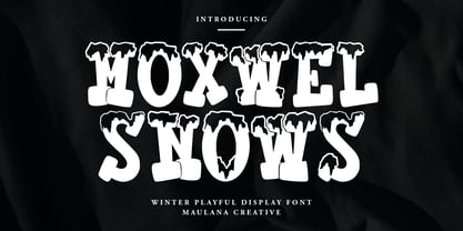 Moxwel Snows winter playful display font. Bold stroke, fun character with a bit of ligatures and alternates. To give you an extra creative work. Moxwel Snows winter playful display font support multilingual more than 100+ language. This font is good for logo design, Social media, Movie Titles, Books Titles, a short text even a long text letter and good for your secondary text font with script or serif. Make a stunning work with Moxwel Snows winter playful display font. Cheers, Maulana Creative
 - Bigday by Scoothtype,
$9.00 Bigday is a bold modern script with a bright atmosphere. It's inspired by suburban bars, winter and the city, chilly afternoons with a cocktail in your hand and the sound of crashing snow. Bigday comes with Contextual Alternatives that add variety to the text and help maintain a smooth flow. Contextual Alternative activates automatically. For extra flair, try Alternates or Swash danTails from the glyph palette. Bigday is PUA coded so you can access its alternatives in any graphic design software. This font is versatile and useful for web and print media; think websites, posters, menus, logos, cards, signs, packaging and more. Bigday is friendly, sturdy, and stands out, but most importantly, it's fun to play.
 - Stu by StuArt,
$9.00 Stu is based on the penmanship of the late Raoul "Stu" Stuart. Raoul's penmanship was always admired by those who saw it; it was a first glimpse into the artistic and creative side of an otherwise easy-going, funny guy. The print variants exude a soft yet masculine feel, while the scripts evoke a sense of sentimentality and romance. Stu features dingbats which say something about Raoul: affectionate and romantic (heart), a big coffee drinker (coffee cup), a great cook (spoon and fork), a music lover (musical note), and a prankster (winking smiley). (The winking smiley is available in all the font styles, while each of the other four dingbats is unique to one font style.) Stu is a tribute to the coolest dad in the world.
 - HWT Republic Gothic by Hamilton Wood Type Collection,
$24.95 The Republic Gothic series was among the last original wood type designs manufactured by Hamilton Manufacturing Co. It was first shown in Hamilton's New Gothic Faces in Wood Type (c. 1920). The design features a sans-serif style reminiscent of brush-formed letters popular with sign painters of the era. Originally issued in 6 different widths and in both outline and solid versions, this digital release features the "Extended" width known as Hamilton Republic Gothic series 775 & 776. The pair of outline and solid is designed as 'chromatics' that can be printed one over the other to achieve multiple color effects or individually as stylistic alternatives. This release features the first ever digitization of Republic Gothic. The two fonts are carefully aligned and kerned to allow for multicolor overlayment in any digital design program. It features a full Western and Central European Character set.
 - Conrad by Linotype,
$29.00The award-winning Conrad was created by Japanese type designer Akira Kobayashi. Its design was based on the fifteenth-century type by Conrad Sweynheym and Arnold Pannartz, two German printers active in Rome at that time. They produced a unique, slightly unbalanced yet attractive type. Kobayashi says of his typeface, “I have designed a couple of typefaces inspired from the past, but this time the original print acted merely as a reference. The distinctive lowercase ‘a’ and some other letters were inspired by Sweynheym and Pannartz’s second roman type, but I revived the type in a more informal way. Here I used the historical type as a springboard. The resulting type looks different, taking on a rather temporary and lively look. I assume that the Conrad is the first revival of the Sweynheym and Pannartz type, though it does not closely resemble the original.” Conrad won first prize for the text typeface category in Linotype’s Third International Typeface Design Contest (2000) as well as the Certificate of Excellence in Type Design from the Type Directors Club (2001).

