10,000 search results
(0.025 seconds)
- Kaffemoster by Hanoded,
$16.00 Kaffemoster is a Swedish slang word for a lady, usually a bit older, who likes to drink coffee and gossip while she’s drinking it. I have decided to study a bit of Swedish, so I downloaded an app and I am practising my Swedish vocabulary every night! Det går långsamt, men jag klarar det! Kaffemoster is a nice, handmade pencil font. It comes with extensive language support (including Swedish) and a nice set of alternates for the lower case letters. Kaffemoster är ett riktigt bra typsnitt!
 - ITC Garamond Handtooled by ITC,
$34.99Claude Garamond (ca. 1480-1561) cut types for the Parisian scholar-printer Robert Estienne in the first part of the sixteenth century, basing his romans on the types cut by Francesco Griffo for Venetian printer Aldus Manutius in 1495. Garamond refined his romans in later versions, adding his own concepts as he developed his skills as a punchcutter. After his death in 1561, the Garamond punches made their way to the printing office of Christoph Plantin in Antwerp, where they were used by Plantin for many decades, and still exist in the Plantin-Moretus museum. Other Garamond punches went to the Frankfurt foundry of Egenolff-Berner, who issued a specimen in 1592 that became an important source of information about the Garamond types for later scholars and designers. In 1621, sixty years after Garamond's death, the French printer Jean Jannon (1580-1635) issued a specimen of typefaces that had some characteristics similar to the Garamond designs, though his letters were more asymmetrical and irregular in slope and axis. Jannon's types disappeared from use for about two hundred years, but were re-discovered in the French national printing office in 1825, when they were wrongly attributed to Claude Garamond. Their true origin was not to be revealed until the 1927 research of Beatrice Warde. In the early 1900s, Jannon's types were used to print a history of printing in France, which brought new attention to French typography and the Garamond" types. This sparked the beginning of modern revivals; some based on the mistaken model from Jannon's types, and others on the original Garamond types. Italics for Garamond fonts have sometimes been based on those cut by Robert Granjon (1513-1589), who worked for Plantin and whose types are also on the Egenolff-Berner specimen. Linotype has several versions of the Garamond typefaces. Though they vary in design and model of origin, they are all considered to be distinctive representations of French Renaissance style; easily recognizable by their elegance and readability. ITC Garamond? was designed in 1977 by Tony Stan. Loosely based on the forms of the original sixteenth-century Garamond, this version has a taller x-height and tighter letterspacing. These modern characteristics make it very suitable for advertising or packaging, and it also works well for manuals and handbooks. Legible and versatile, ITC Garamond? has eight regular weights from light to ultra, plus eight condensed weights. Ed Benguiat designed the four stylish handtooled weights in 1992." In 1993 Ed Benguiat has designed Handtooled versions. - Ames' Text by Greater Albion Typefounders,
$16.00 Ames’ text is designed for use in its own right and also as a complement to our Ames’ Roman family. Ames’ text is a ‘New-Style’ Didone family offered in three weights and three widths. It is designed to embody clarity combined with contrast between horizontal and vertical strokes, but with sufficient stroke width in both directions to display well at small point sizes. All typefaces include small capital forms, new and old style numerals (and ‘small capital’ numerals for consistency). Ames’ text is distinctive enough for use in headings and titles, but comes into it own as a text face. Keep a lookout for our forthcoming Ames Display faces…
 - Aqueo by R9 Type+Design,
$38.00 Aqueo™ is a versatile display font family inspired by the cylindrical wireframe of a water glass. The one-sided round corner details added a contemporary feel to this unique typeface. It comes in 6 weights and 12 styles. To ensure the accuracy of the letterforms, we painstakingly drew a master set for each weight. And with over 1,350 glyphs each, Aqueo™ fonts support most Latin-based languages and feature an extensive set of stylistic alternates; The standard uppercase set takes more traditional forms, while the alternate uppercase set sports unorthodox lowercase forms. The standards exude confidence and dependability yet are friendly and approachable, and the alternates elicit more fun, quirky and whimsical. The More Opentype Features, the More Zing for Your Design Projects. Aqueo™ Display Sans Serif comes loaded with Opentype features such as case-sensitive marks, punctuations and mathematic symbols. It also has an extensive set of discretionary ligatures, stylistic alternates, and over 80 essential UX/UI icons, each in three design options. These various Opentype features help improve your user experience, streamline your workflow, and unlock a broader range of typography details you can choose for your design. If you’re looking for a unique contemporary typeface, try Aqueo™ on your packaging design, logo design, infographic, print design, store signages, and UX/UI projects today! To find out more about Aqueo™ Opentype features and type specimens, please visit https://r9typedesign.com/aqueo-font-features-specimen
 - P22 Operina by IHOF,
$24.95 Operina is based on a 16th-century lettering model of the scribe Ludovico degli Arrighi (Vicentino Ludovico degli Arrighi) used in his 1522 instructional lettering book, "La Operina da Imparare di scrivere littera Cancellarescha." This book contains what is considered to be the earliest printed examples of Chancery Cursive. Rather than try to reproduce a perfect, smooth, type-like version of Ludovico's hand, which has been attempted in the past, the designer opted to leave in some rough edges and, thereby, create a look that mimics the endearing artifacts of quill and ink lettering on parchment. When reviving an old style, a designer is faced with many challenging decisions, such as whether to aim for ultimate authenticity or to modify the alphabet for modern use. The decision here was to create a font that resembles the 16th-century Italian hand-lettering master's, but is also useful to the contemporary user. Because the letters U u W w J j and our modern Arabic numerals were not in use during the advent of these original letterforms, these had to be interpolated. To make a complete and useable font set, we also had to fashion many of the extra and diacritical characters to match the look of the alphabet. There are three fonts in this set: Romano(simple), Corsivo(more complex), and Fiore(swash). Romano is the most subdued, it contains Roman looking caps and has lining figures. Corsivo is more elaborate, it has more decorative capital letters and an alternate version of the lowercase with longer ascenders and descenders, and old style figures. Fiore, the swash font, is the most elaborate with the longest ascenders and descenders. You may not wish to use the Fiore version on its own, especially as all caps; it is meant to enhance the other two alphabets because it contains the most elaborate capitals and has many extra ligatures. P22 Operina Pro is an OpenType version that contains over 1200 characters. It features Small Caps, Old Style Figures, full European, Cyrillic and Greek character sets and a new OpenType first with automatic Roman Numerals. Just type any number and with the feature, it will convert to Roman Numerals!
 - Wanted Poster Caps - Unknown license

- Our Generation by Seemly Fonts,
$12.00 Our Generation is a brand new handwritten font. Our Generation is perfectly suited for stationery, logos, t-shirt, paper, print design, website header, photo frame, flyer, music cover, poster, image slider, and much more.
 - Summer Splendor by Seemly Fonts,
$14.00 Summer Splendor is a brand new handwritten font. Summer Splendor is perfectly suited for stationery, logos, t-shirt, paper, print design, website header, photo frame, flyer, music cover, poster, image slider, and much more.
 - Backstay by Ali Hamidi,
$14.00 Backstay is a casual and relaxed single line script font. It matches any branding project such as logos, t-shirt printing, creative products, and more. It will look extraordinary in a variety of contexts.
 - Fearful House by Seemly Fonts,
$14.00 Fearful House is a brand new display font. Fearful House is perfectly suited for stationery, logos, t-shirt, paper, print design, website headers, photo frames, flyers, music covers, posters, image sliders, and much more.
 - Instinct Question by Seemly Fonts,
$14.00 Instinct Question is a brand new display font. Instinct Question is perfectly suited for stationery, logos, t-shirt, paper, print design, website headers, photo frames, flyers, music covers, posters, image sliders, and much more.
 - Cute Rabbit by Seemly Fonts,
$14.00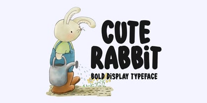 Cute Rabbit is a friendly and sweet display font. It is perfectly suited for stationery, logos, t-shirt, paper, print design, website header, photo frame, flyer, music cover, poster, image slider, and much more.
 - Striking Rainbow by Seemly Fonts,
$14.00 Striking Rainbow is a brand new display font. Striking Rainbow is perfectly suited for stationery, logos, t-shirt, paper, print design, website header, photo frame, flyer, music cover, poster, image slider, and much more.
 - Gladsome Morning by Seemly Fonts,
$14.00 Gladsome Morning is a cool, clean, and simple display font. It will look stunning on any food packaging design, poster, flyer, or print. Use this font for your designs and explore its endless possibilities.
 - Shy Darling by Seemly Fonts,
$14.00 Shy Darling is a cool and romantic display font. It is perfectly suited for stationery, logos, t-shirt, paper, print design, website header, photo frame, flyer, music cover, poster, image slider, and much more.
 - Sweet Daydream by Seemly Fonts,
$12.00 Sweet Daydream is a brand new display font. Sweet Daydream is perfectly suited for stationery, logos, t-shirt, paper, print design, website header, photo frame, flyer, music cover, poster, image slider, and much more.
 - Schoolblock by Wiescher Design,
$39.50 Schoolblock is the typeface German schoolchildren learn to imitate when they are taught the printed letters. I just had to do this one for use in a German schoolbook. Your education-designer, Gert Wiescher
 - Christmas Eve by Seemly Fonts,
$12.00 Christmas Eve is a brand new handwritten font. Christmas Eve is perfectly suited for stationery, logos, t-shirt, paper, print design, website header, photo frame, flyer, music cover, poster, image slider, and much more.
 - Expression Exchange by Seemly Fonts,
$14.00 Expression Exchange is a brand new handwritten font. Expression Exchange is perfectly suited for stationery, logos, t-shirt, paper, print design, website headers, photo frames, flyers, music covers, posters, image sliders, and much more.
 - Summer Fable by Seemly Fonts,
$14.00 Summer Fable is a brand new display font. Summer Fable is perfectly suited for stationery, logos, t-shirt, paper, print design, website headers, photo frames, flyers, music covers, posters, image sliders, and much more.
 - Meilesha by Selvia Design,
$13.00 "Meilesha" is a unique and beautiful handwritten font. This font is equipped with uppercase, lowercase, numerals, punctuations, and multilingual support. It is suitable for invitations, weddings, ornaments, logos, banners, posters, prints, branding, and others.
 - DearJoe 6 by JOEBOB graphics,
$29.00 The dearJoe series of fonts had it’s origin somewhere around 1999, the year I created dearJoe 1, which was a first (and half-assed) attempt at converting my own handwriting into a working font. Being able to type in my own handwriting had always been a childhood fantasy, and even though I only partly understood the software, a working font was generated and I decided to put it on the internet for people to use. And that’s what they did: at this moment the dearJoe 1 font has been downloaded millions of times and can be found on just about anything, ranging from Vietnamese riksjas, a Tasmanian gym to a fancy chocolate store on 5th Avenue. The font is not something I am particularly proud of, but it started me of in building what later became the JOEBOB graphics font foundry. Inbetween creating other fonts, the dearJoe series has become a theme I revisit every once in a while, trying to create an update on how my handwriting evolved, along with my abilities in creating fonts that mimic actual handwriting. In the last decade or so I started implementing ligatures and alternate characters, which helped a lot in making something that can almost pass for actual handwriting.
 - FS Blake by Fontsmith,
$80.00 Art deco The inspiration for FS Blake’s elegant, lightly geometric forms can be traced back to design of the 1930s; designer Emanuela Conidi was influenced by the typography of cool, European, art deco posters. FS Blake bears traits of the art deco style, from its thin weights to its heavy weights, giving a set of faces each with their own distinct character, but still with a strong family resemblance. Mechanical type Mechanical and organic shapes combine in FS Blake to create a harmonious whole of generous curves and cursive spikes. A strong, punchy contender in display sizes, it’s also got a gentle touch with small text in lighter weights. Lively, versatile and with plenty of character contrast between weights, the FS Blake family offers impact in whatever task it’s given.faces each with their own distinct character, but still with a strong family resemblance. Sketch book Great fonts still emerge from a combination of hand, paper and pencil. After filling her sketch book with ideas, Emanuela and Jason extracted the elements that both felt could work in a font. The process yielded a whole crop of starting points for future designs as well as a focus for FS Blake as a striking, characterful, almost industrial font.
 - Barth by Remedy667,
$18.00 If you’re in need of some serious typography, stop scrolling. Barth. Yoooou heard that right. Designed with a love for horror movies and 90s Nickelodeon nostalgia, Barth is the best font. Get serious about your design work, get Barth. It’s burgery. Looking for a horror font that is as fun and nostalgic as it is eye-catching? Barth. Yoooou heard that right. This retro font is sure to get your viewers hooked on your work with its bold style and innocent yet spooky lettering. It’s perfect for posters, books, movies, even restaurant signage and beyond. Features Doubles Elimination gives you a more natural look. Stands out and get noticed…. be heard. Includes a Remedy667 Font Catalog PDF, all your favorite fonts in one handy catalog. Additional Information Some fonts may require special graphic design software to access OpenType features. Examples of these programs are Adobe Illustrator, Adobe Photoshop, Adobe Indesign, and Corel Draw. Feedback is always welcome. If there is anything missing from our typefaces that you would like to see, or if there are any issues that occur when using them. Please don’t hesitate to contact us or email me at nick@remedy667.com and let us know.
 - Limon by Typesenses,
$49.00 Limon was entirely hand drawn and carefully digitised to get accurate curves but keeping the handmade look. The script fonts are smart scripts, plenty of alternates designed to preserve the calligraphic rhythm. Limon is a beautiful option for menus, magazine covers, wedding invitations, cards and all kind of stationery, packaging and labels. Default positional forms appear while you are writing when Standard Ligatures and Contextual Alternates features are on. Just keep them activated and let Limon Script do the rest. It warrants that all the connections will look good. Also, you can activate stylistic alternates, swash, titling and stylistic sets to have options for capitals, initials and terminals. Each Script Font reaches a total of more than 2900 glyphs (languages for every alternate included). Use professional software that widely support Open Type features. Otherwise, you may not have access to some glyphs. For further information about features and alternates, see the User Guide. Limon has extensive Western, Central and Eastern European language support. Limon Script matches very well with Dress and Chonky When life gives you Limon, make a beautiful design!
 - Lapidaria by SIAS,
$34.90 Lapidaria is a typeface that may be described as a ‘geometric sans with humanist qualities’. Its mood is smart and sober, its appeal is calm, cool and classical. Though quite well performing even in longer text bodies, a particular strength of Lapidaria lies in display typography. The most peculiar aspect of Lapidaria is its new family concept: for the very first time ever a tricameral alphabet model has been realized as a general-use sans: uppercase, lowercase and middlecase letters blending smoothly into one typographic tone, thus offering entirely new typographic possibilities. – The middlecase (or uncial) sorts being accommodated in the lowercase positions of the Medior fonts. All nine fonts equally offer full character coverage for all Euro-Latin languages – and for Greek. There are a lots of special characters and ligatures. Last but not least, a set of ten ornament characters (in each font) will let you make sparkling designs which will thrill your clients. Each font contains about 500 characters, that makes over 4,500 in total for the complete Lapidaria family package. __________________________________________________________________________________________
 - River Stone by Yumna Type,
$16.00 It may be difficult to find a font with characters and legibility rates when creating impactful visual designs. Amid the abundance of ordinary font options, the branding and marketing processes can remain stagnant because the absence of unique fonts will increase the risk of your visual designs getting blended with other people’s designs and be left forgotten. For that reason, we would be glad to introduce you to River Stone, a font to give you assistance to create prominent visual designs quickly and easily. River Stone is an uppercased display font in textured letter shapes with which it shows firm, eye-catchy impressions. The font’s textures can add dimensions to the letters’ displays and live up the design nuances. With the use of uppercases, this font is capable of protruding the desired messages and make the design displays more attractive. Its unique shapes will affect the legibility rate of the font, therefore, you need to use this font for big text sizes for a better legibility reason. In addition, this font provides you a clipart as a bonus and you can make use of the available features here as well. Features: Multilingual Supports PUA Encoded Numerals and Punctuations River Stone fits best for various design projects, such as brandings, posters, banners, headings, magazine covers, quotes, printed products, merchandise, social media, etc. Find out more ways to use this font by taking a look at the font preview. Thanks for purchasing our fonts. Hopefully, you have a great time using our font. Feel free to contact us anytime for further information or when you have trouble with the font. Thanks a lot and happy designing.
 - 1529 Champ Fleury Initials by GLC,
$42.00 In 1529, Geofroy Tory, French scholar, engraver, printer, publisher and poet, was publishing the well known so called Champ Fleury, printed by Gilles de Gourmond, in Paris. It is a fully illustrated handbook where the author explains how to draw Roman characters. The font used for the text - a Humane/Jenson type - was not a very beautiful one, but rough and ready, and the book is well known for its capital letters designs. We are offering here the two complete historical type sets and more -- we have entirely redrawn the lacked letters: J, U and W, Eth, Lslash, Thorn and Oslash in the two initial forms. The text font, 1529 Champ Fleury Regular is now containing all characters for West European (including Celtic), Baltic, East and Central European and Turkish language, and the Initial set 1529 Champ Fleury Init is containing two complete alphabets, with a very great effort to be as close as possible to the original pictures.
 - Optimisti by Juliasys,
$26.00 Optimisti is Finnish for optimist – and it’s an optimistic, light-hearted feeling that this trio of handwriting fonts transfuses into all kinds messages and identities. Casual, playful and character-strong as they are, the three of them make a perfect team for headlines, slogans, teaser texts and brand naming. Besides the two original fonts – “Optimisti Smooth” and “Optimisti Sparkling” differing in outline structure and texture – “Optimisti Decor” now joined the game. Optimisti Decor is loaded with a multitude of artful elements that can convey a very festive atmosphere – or, on the contrary, ironically make fun of it. Its features are is especially striking when used in all-caps setting. Use the Optimists separately or together to make a humorous – or serious but always cordial impression in print, on the web, on packaging or even on your shopping bag … All Optimisti fonts have a Western European, a Central European and an Extended Cyrillic character set. They support approximately 100 languages.
 - Cadmium by AVP,
$- Cadmium has a comprehensive latin character set and many Opentype features to enhance text, including small capitals, case-sensitive forms, superscript and subscript. Plenty of numeral variants include old-style figures, lining figures and fractions. Default numerals are proportionally spaced. Alternative styles for a handful of key characters provide some useful variations where stylistic sets can be implemented. The fonts are presented as four width-based sub-families: Expanded, Normal, Condensed and Compressed. Each width has a matching range of six weights and italics (obliques). Regular and Bold weights are style-linked, together with their respective oblique forms. Each width differs in its basic construction but all fonts share the same vertical metrics and may be used in combination with each other. Letter spacing is optimised for text sizes but is tolerant of significant tracking changes. Cadmium is good for signage, publicity and packaging, screen credits and titling, general print and publication, as well as web and screen applications.
 - FS Rufus by Fontsmith,
$80.00 Ligatures FS Rufus is an outgoing, likable sort of font with an eccentric streak. Wide letterforms and curious ink-traps make for an engaging personality, and a set of discretionary ligatures make FS Rufus irresistible to designers wanting to play. Not a small set, either: there are some 80 different options available. Wide The decision was made early on to make the letterforms of FS Rufus luxuriously wide. This generates a distinctive visual texture when the font is used for text. With other weights available for headlines, FS Rufus brings a curiously engaging look to editorial, magazine covers and advertising. Just look at my ink traps Ink traps are normally the preserve of fonts intended for printing at small sizes, in newspapers or directories – extra notches necessary to prevent ink from pooling. FS Rufus turns the ink trap into a beautiful eccentricity, flaunting it in both its lowercase and capitals. Take a look at the “h”, “a” and “k”, and the “B” and “N”. Attention-seeking? Moi?
 - Beorcana Pro by Terrestrial Design,
$40.00 Beorcana can be classified as a serifless roman, a stressed sans, a glyphic sans, or calligraphic sans. However it is classified, Beorcana derives not only from other stressed sans designs like Lydian, Amerigo and Optima, but also utilizes classic Renaissance proportions in both Roman and Italic, which facilitate extended reading. Beorcana is available in Display, regular Text and Micro styles. Beorcana’s Text styles offer comfort and liveliness in books, dictionaries, magazines and other reading-intensive settings. Display styles offer a stately and organic flavor for any application. Micro styles perform in tight and dense settings like dictionaries, bibles, maps and fine print. The name Beorcana is a variant of the Icelandic word for the Birch tree, and the related words for the Icelandic rune. Many variant spellings are used for the tree and the rune: Beorc, Berkanan, Birkana, Bercano, Bjork, Bjarka. The Birch was revered as a symbol of renewal, due to its role as a pioneer species in burned, boggy or otherwise unforested areas.
 - Fishwrapper by E-phemera,
$25.00 Fishwrapper is a three-member font family (Regular, Bold, and Italic) designed to replicate the look of authentic vintage newspaper typography. The fonts are rough and are meant to be used at newspaper sizes. All three fonts have a complete alternate alphabet built in: using the contextual alternates feature will automatically substitute alternate versions of most glyphs, so that identical characters do not appear side by side, thus helping to create the look of metal type. Fishwrapper Regular has a complete set of small caps built in. Each font features assorted rule lines and other decorative material, many accessible through the discretionary ligature OpenType feature (three em dashes in a row, for example, will become a rule line), as well as fractions and a full international character set. Used in conjunction with some of E-phemera's vintage headline fonts, the Fishwrapper family is intended as a complete vintage newspaper and job-printing type solution.
 - Vaccine by ParaType,
$30.00 Vaccine is a slab serif font family with a mixture of the usual and one-sided serifs. We call it ‘semi semi slab serif’. Serifs and terminals have soft rounded shapes, but stem junctions on the contrary use hard constructions. Such combination of basic design features makes the font distinct and strong in a setting and delicate and soft in appearance. This design peculiarity, together with low contrast and strong serifs, produces the qualities needed for using the font in small sizes, in low quality print, and in bad reading conditions. Vaccine got modern stylish design and has a prominent place in the set of popular faces. The family consists of 10 members - five weights with the corresponding italics. It can be used in a wide range of applications - magazines, advertising, corporate identity, urban navigation, packaging, children books, etc. Design by Manvel Shmavonyan with the help of Gayane Bagdasaryan as a consultant. Released by ParaType in 2013.
 - Tatty by Scrowleyfonts,
$- Tatty is a sans serif, monoline font that is distinguished by the gentle, rounded, backward curves on the ascenders. I created it because I had a picture in my mind of a font that I wanted to use when designing images and logos for clients' websites but I could never find one that was just exactly right. Many years ago I worked for a sign-writing company. My job was to copy and enlarge letter sets from printed copy and then cut masks for airbrushing. One morning I arrived at my desk to find that the airbrush artist had written on a rough, rubbed out, scribbled on drawing of the letter ‘a’ - “make a letter happy, make it beautiful”. That was the brief I set myself in the design of Tatty - to make every letter happy and beautiful. The result is a flowing, elegant yet simple type which I believe works particularly well for poetry.
 - Beorcana Std by Terrestrial Design,
$20.00 Beorcana can be classified as a serifless roman, a stressed sans, a glyphic sans, or calligraphic sans. However it is classified, Beorcana derives not only from other stressed sans designs like Lydian, Amerigo and Optima, but also utilizes classic Renaissance proportions in both Roman and Italic, which facilitate extended reading. Beorcana is available in Display, regular Text and Micro styles. Beorcana’s Text styles offer comfort and liveliness in books, dictionaries, magazines and other reading-intensive settings. Display styles offer a stately and organic flavor for any application. Micro styles perform in tight and dense settings like dictionaries, bibles, maps and fine print. The name Beorcana is a variant of the Icelandic word for the Birch tree, and the related words for the Icelandic rune. Many variant spellings are used for the tree and the rune: Beorc, Berkanan, Birkana, Bercano, Bjork, Bjarka. The Birch was revered as a symbol of renewal, due to its role as a pioneer species in burned, boggy or otherwise unforested areas.
 - Cheltenham Pro by SoftMaker,
$15.99 Where most typefaces are designed by just one individual, quite a few people have been involved in perfecting Cheltenham over the times. In 1896, the architect Bertram Grosvenor Goodhue created the initial design for Ingalls Kimball at the Cheltenham Press. Just a few years later, Morris Fuller Benton devised a full family of Cheltenhams for ATF. This is the basis of the design we have today. In 1975, Tony Stan revived this classic typeface and did what was customary at the time: increase the x-height and make the Cheltenham family more regular. SoftMaker updated the design yet again in 2012. The result is Cheltenham Pro, a typeface that is exceptionally readable and holds up even in adverse printing conditions. SoftMaker’s Cheltenham Pro typeface family contains OpenType layout tables for sophisticated typography. It also comes with a huge character set that covers not only Western European languages, but also includes Central European, Baltic, Croatian, Slovene, Romanian, and Turkish characters. Case-sensitive punctuation signs for all-caps titles are included as well as many fractions, an extensive set of ligatures, and separate sets of tabular and proportional digits.
 - TT Runs by TypeType,
$39.00 TT Runs useful links: Specimen PDF | Graphic presentation | Customization options TT Runs Version 2.0—an Unusual Wide-Proportioned Sans Serif! An update that expands the font's capabilities. TT Runs is a font designed for the sports industry. Before starting the development, we researched the identities of various Olympic venues and analyzed current sports brands. We put in maximum effort to design a unique yet elegant modern font well-suited for the sports sector. TT Runs has wide and unusual proportions that are different from traditional ones. It is because of the reversed contrast, which refers to the distinction between the upper and lower parts of letters. The uppercase letters have distinctive inverted proportions, particularly noticeable in characters like K, C, S, and R. This design choice gives the font an original personality and makes the letters look stylish and suitable for both athletic and casual sportswear. While updating the font, we kept its distinctive characteristics and preserved the graphical look of the majority of the characters. However, we thoroughly redesigned the outlines and italic font styles and updated the font's technical aspects entirely. As a result, TT Runs has become more convenient to use, and its range of applications has significantly broadened. - More projects and countries! The set of each font style has expanded from 791 to 917 characters. We added new languages and characters of the expanded Latin and Cyrillic writing systems. - Perfect italics! The new italic font styles are flawless from both graphical and technical points of view. The updated variable font. We have united the roman and italic font styles. You can now change the font on the axes of slope and weight, choosing the suitable values. - The new set of OpenType features! We added the updated numerators with currency symbols, numbers in filled circles, and localization features for the Dutch, Catalan, Turkish, Serbian, Bashkir, Chuvash, Bulgarian, and Romanian languages. TT Runs is an expressive font. It looks aesthetically pleasing on both athletic and casual clothing and is well-suited for printing on any material. Due to its proportions, the font is an ideal choice for headings, offering excellent readability and an elegant appearance in bigger blocks of text. Created with the sports industry in mind, this font brings a touch of style to any modern project. FOLLOW US: Instagram | Facebook | Website TT Runs OpenType features: aalt, ccmp, locl, subs, sinf, sups, numr, dnom, frac, ordn, tnum, onum, lnum, pnum, case, dlig, liga, salt, ss01, ss02, ss03, ss04, ss05, ss06, ss07, ss08, ss09, ss10, ss11, ss12, calt. TT Runs language support: English, Albanian, Basque, Catalan, Croatian, Czech, Danish, Dutch, Estonian, Finnish, French, German, Hungarian, Icelandic, Irish, Italian, Latvian, Lithuanian, Luxembourgish, Maltese, Moldavian (lat), Montenegrin (lat), Norwegian, Polish, Portuguese, Romanian, Serbian (lat), Slovak, Slovenian, Spanish, Swedish, Swiss German, Valencian, Azerbaijani, Kazakh (lat), Turkish, Uzbek (lat), Acehnese, Banjar, Betawi, Bislama, Boholano, Cebuano, Chamorro, Fijian, Filipino, Hiri Motu, Ilocano, Indonesian, Javanese, Khasi, Malay, Marshallese, Minangkabau, Nauruan, Nias, Palauan, Rohingya, Salar, Samoan, Sasak, Sundanese, Tagalog, Tahitian, Tetum, Tok Pisin, Tongan, Uyghur, Afar, Asu, Aymara, Bemba, Bena, Chichewa, Chiga, Embu, Gikuyu, Gusii, Jola-Fonyi, Kabuverdianu, Kalenjin, Kamba, Kikuyu, Kinyarwanda, Kirundi, Kongo, Luba-Kasai, Luganda, Luo, Luyia, Machame, Makhuwa-Meetto, Makonde, Malagasy, Mauritian Creole, Meru, Morisyen, Ndebele, Nyankole, Oromo, Rombo, Rundi, Rwa, Samburu, Sango, Sangu, Sena, Seychellois Creole, Shambala, Shona, Soga, Somali, Sotho, Swahili, Swazi, Taita, Teso, Tsonga, Tswana, Vunjo, Wolof, Xhosa, Zulu, Ganda, Maori, Alsatian, Aragonese, Arumanian, Asturian, Belarusian (lat), Bosnian (lat), Breton, Bulgarian (lat), Colognian, Cornish, Corsican, Esperanto, Faroese, Frisian, Friulian, Gaelic, Gagauz (lat), Galician, Interlingua, Judaeo-Spanish, Karaim (lat), Kashubian, Ladin, Leonese, Manx, Occitan, Rheto-Romance, Romansh, Scots, Silesian, Sorbian, Vastese, Volapük, Võro, Walloon, Walser, Welsh, Karakalpak (lat), Kurdish (lat), Talysh (lat), Tsakhur (Azerbaijan), Turkmen (lat), Zaza, Aleut (lat), Cree, Haitian Creole, Hawaiian, Innu-aimun, Lakota, Karachay-Balkar (lat), Karelian, Livvi-Karelian, Ludic, Tatar, Vepsian, Guarani, Nahuatl, Quechua, Russian, Belarusian (cyr), Bosnian (cyr), Bulgarian (cyr), Macedonian, Serbian (cyr), Ukrainian, Gagauz (cyr), Moldavian (cyr), Kazakh (cyr), Kirghiz, Tadzhik, Turkmen (cyr), Uzbek (cyr), Azerbaijan, Lezgian, Abazin, Agul, Archi, Avar, Dargwa, Ingush, Kabardian, Kabardino-Cherkess, Karachay-Balkar (cyr), Khvarshi, Kumyk, Lak, Nogai, Rutul, Tabasaran, Tsakhur, Buryat, Komi-Permyak, Komi-Yazva, Komi-Zyrian, Shor, Siberian Tatar, Tofalar, Touva, Bashkir, Chechen (cyr), Chuvash, Erzya, Kryashen Tatar, Mordvin-moksha, Tatar Volgaic, Uighur, Rusyn, Karaim (cyr), Montenegrin (cyr), Romani (cyr), Dungan, Karakalpak (cyr), Shughni, Mongolian, Adyghe, Kalmyk, Talysh (cyr) .
 - Mene One Mexicali by Handselecta,
$38.00This style mimics the flare or upward fade that comes with the use of a spray paint can, as the tops of the letters flare, and become wider. An original font style, named after the border town of Mexicali, this font style falls under the larger umbrella of what is called Cholo-graffiti style. Originally from New Jersey, MENE has made his home in, New York City. He had a brief albeit satisfying career of street bombing in the late 90s that saw its end with a brief encounter with the Vandal Squad. Now a family man, Mene has dedicated himself to the preservation and education of style in its many forms. - Imagist by Fenotype,
$35.00 The mystic sadness of the sight Of a far town seen in the night. Like the poetry movement of the early 20th century, from which the font takes its name, Imagist relies on the power of concrete images and brings an organic vibration to the words it forms. Imagist is a lively and decorative serif typeface with prominent features that appear especially in the letters K, R, M, N, W, V, k, w, v and y. Powerful ball terminals also bring recognizable attraction. Imagist contains six weights and corresponding Italics. Italics have a cursive-style letter s for as Stylistic Alternate. Old Style Numerals and Small Caps can be found in all cuts. Poem by T. E. Hulme.
