10,000 search results
(0.024 seconds)
- Rabsy by D&K Project,
$15.00 Rabsy is a unique cartoon font with a doodles concept. The included dingbat doodles pattern makes it easy for you to make unique patterns, and make fun display tittle. A mixed-case font (Rabsy and Rabsy Pattern) with lots of combination possibilities, makes for great fun! It is good for logotype, stickers, fun kids signs, and other lettering projects. This fun is perfect combination uppercase and lowercase. Rabsy File Downloaded: - UPPERCASE and lowercase - Lots of doodles Rabsy Pattern 1-9, A-Z and a-z (more fun with lots of combination possibilities) - Punctuation and numeral - Extended Latin characters for language support. Please let me know in the comments what you think or if you have any issues or queries, If you have any questions about licensing, need help with a typeface, or would like to request a new feature, drop me a message. Thank you, D&K Project
 - Bastie by Say Studio,
$14.00 astie - Elegant Serif Font Unique, playful and versatile serif with 35+ ligatures and 50+ alternates can combine to get curves and beautiful shapes just in seconds. Type the words and Add the unique shapes from Bastie ornament to get a more stunning display. This font is suitable for many design forms, such as magazines, postcards, logos, DIY Projects, invitation cards, quotes, vintage look design, an old classic, the 60s, 70s, 80s, wedding projects and much more. We recommend using Adobe Illustrator or Photoshop. how to access alternate? Adobe Photoshop go to Window - glyphs Adobe Illustrator go to Type - glyphs Supported Languages What's you get? - Unique Alternates - Multilingual Support - Works on PC & Mac - Simple Installations - Accessible in the Adobe Illustrator, Adobe Photoshop, Microsoft Word even work on Canva! - PUA Encoded Characters - Fully accessible without additional design software. Let me know if you any question:) Have a wonderful Day Say Studio
 - Amber Lemon by Supfonts,
$18.00 Amber Lemon is a cute handwritten signature font with heart and regular swashes. Perfect for greeting cards, wedding stationery, photographer watermarks logos, modern websites, apparel design and more. Amber Lemon features handwritten ligatures, beginning and end swashes for lowercase letters and heart connections Thanks so much for checking out my shop, and please get in touch if you have any questions! Amber Lemon Font Features: Full Set of standard alphabet and punctuation Extra set of beginning and ending swashed lowercase Extra set of heart connections handwritten ligatures PUA Encoded - no special software needed to access extra characters Multilingual Characters AÁĂÂÄÀĀĄÅÃÆBCĆČÇĊDÐĎĐEÉĚÊËĖÈĒĘẼFGĞĢĠḠHĦIIJÍÎÏİÌĪĮĨJKĶLĹĽĻŁMNŃŇŅÑ OÓÔÖÒŐŌØÕŒPÞQRŔŘŖSŚŠŞȘẞTŤŢȚUÚÛÜÙŰŪŲŮŨVWẂŴẄẀXYÝŶŸỲỸZŹŽŻ aáăâäàāąåãæbcćčçċdðďđeéěêëėèēęẽfgğģġḡhħiıíîïìijīįĩjȷkķlĺľļłmnńňņñoóôöòőōøõœpþ qrŕřŗsśšşșßtťţțuúûüùűūųůũvwẃŵẅẁxyýŷÿỳỹzźžż
 - Workaday by Yes Please,
$45.00 Workaday from Yes Please is a bold and clean contemporary take on the classic American Sans Serif. Inspired by the wildly varied history of early to mid 20th century American signage, aircraft markings and industrial shipping vernaculars, Workaday exudes a timeless, classic flavor packed with a personality perfect for graphic headlines, packaging, copy setting and much more! Workaday features conventional ligatures, a standard set of accents and symbols, and a set of open type alternate characters to provide a versatile end-user experience. Workaday has seen action for Nike Sportswear, MSN, IFC, FX and more. Workaday is designed by Lee Schulz.
 - Antique by Storm Type Foundry,
$26.00The concept of the Baroque Roman type face is something which is remote from us. Ungrateful theorists gave Baroque type faces the ill-sounding attribute "Transitional", as if the Baroque Roman type face wilfully diverted from the tradition and at the same time did not manage to mature. This "transition" was originally meant as an intermediate stage between the Aldine/Garamond Roman face of the Renaissance, and its modern counterpart, as represented by Bodoni or Didot. Otherwise there was also a "transition" from a slanted axis of the shadow to a perpendicular one. What a petty detail led to the pejorative designation of Baroque type faces! If a bookseller were to tell his customers that they are about to choose a book which is set in some sort of transitional type face, he would probably go bust. After all, a reader, for his money, would not put up with some typographical experimentation. He wants to read a book without losing his eyesight while doing so. Nevertheless, it was Baroque typography which gave the world the most legible type faces. In those days the craft of punch-cutting was gradually separating itself from that of book-printing, but also from publishing and bookselling. Previously all these activities could be performed by a single person. The punch-cutter, who at that time was already fully occupied with the production of letters, achieved better results than he would have achieved if his creative talents were to be diffused in a printing office or a bookseller's shop. Thus it was possible that for example the printer John Baskerville did not cut a single letter in his entire lifetime, for he used the services of the accomplished punch-cutter John Handy. It became the custom that one type founder supplied type to multiple printing offices, so that the same type faces appeared in various parts of the world. The type face was losing its national character. In the Renaissance period it is still quite easy to distinguish for example a French Roman type face from a Venetian one; in the Baroque period this could be achieved only with great difficulties. Imagination and variety of shapes, which so far have been reserved only to the fine arts, now come into play. Thanks to technological progress, book printers are now able to reproduce hairstrokes and imitate calligraphic type faces. Scripts and elaborate ornaments are no longer the privilege of copper-engravers. Also the appearance of the basic, body design is slowly undergoing a change. The Renaissance canonical stiffness is now replaced with colour and contrast. The page of the book is suddenly darker, its lay-out more varied and its lines more compact. For Baroque type designers made a simple, yet ingenious discovery - they enlarged the x-height and reduced the ascenders to the cap-height. The type face thus became seemingly larger, and hence more legible, but at the same time more economical in composition; the type area was increasing to the detriment of the margins. Paper was expensive, and the aim of all the publishers was, therefore, to sell as many ideas in as small a book block as possible. A narrowed, bold majuscule, designed for use on the title page, appeared for the first time in the Late Baroque period. Also the title page was laid out with the highest possible economy. It comprised as a rule the brief contents of the book and the address of the bookseller, i.e. roughly that which is now placed on the flaps and in the imprint lines. Bold upper-case letters in the first line dramatically give way to the more subtle italics, the third line is highlighted with vermilion; a few words set in lower-case letters are scattered in-between, and then vermilion appears again. Somewhere in the middle there is an ornament, a monogram or an engraving as a kind of climax of the drama, while at the foot of the title-page all this din is quietened by a line with the name of the printer and the year expressed in Roman numerals, set in 8-point body size. Every Baroque title-page could well pass muster as a striking poster. The pride of every book printer was the publication of a type specimen book - a typographical manual. Among these manuals the one published by Fournier stands out - also as regards the selection of the texts for the specimen type matter. It reveals the scope of knowledge and education of the master typographers of that period. The same Fournier established a system of typographical measurement which, revised by Didot, is still used today. Baskerville introduced the smoothing of paper by a hot steel roller, in order that he could print astonishingly sharp letters, etc. ... In other words - Baroque typography deserves anything else but the attribute "transitional". In the first half of the 18th century, besides persons whose names are prominent and well-known up to the present, as was Caslon, there were many type founders who did not manage to publish their manuals or forgot to become famous in some other way. They often imitated the type faces of their more experienced contemporaries, but many of them arrived at a quite strange, even weird originality, which ran completely outside the mainstream of typographical art. The prints from which we have drawn inspiration for these six digital designs come from Paris, Vienna and Prague, from the period around 1750. The transcription of letters in their intact form is our firm principle. Does it mean, therefore, that the task of the digital restorer is to copy meticulously the outline of the letter with all inadequacies of the particular imprint? No. The type face should not to evoke the rustic atmosphere of letterpress after printing, but to analyze the appearance of the punches before they are imprinted. It is also necessary to take account of the size of the type face and to avoid excessive enlargement or reduction. Let us keep in mind that every size requires its own design. The longer we work on the computer where a change in size is child's play, the more we are convinced that the appearance of a letter is tied to its proportions, and therefore, to a fixed size. We are also aware of the fact that the computer is a straightjacket of the type face and that the dictate of mathematical vectors effectively kills any hint of naturalness. That is why we strive to preserve in these six alphabets the numerous anomalies to which later no type designer ever returned due to their obvious eccentricity. Please accept this PostScript study as an attempt (possibly futile, possibly inspirational) to brush up the warm magic of Baroque prints. Hopefully it will give pleasure in today's modern type designer's nihilism. - Fino by TypeTogether,
$35.00 Tall, stately, and refined, with a showy contrast between thick and thin, a certain kind of titling Didone has become synonymous with fashion. Ermin Međedović’s latest type system amplifies the most theatrical aspects of this genre while bringing an uncommon flexibility of style and variation to any type palette — particularly those required for editorial design. Fino is a Rational (or Modern) display serif with sharp details. Its fairly Title proportions produce a regular beat of bold stems at frequent intervals. One can add an unexpected twist to this plot line by introducing the alternate ‘C, D, G, O, and Q’ (found in the uppercase); these replace the standard, Title oval shapes with big, full, show-stopping round ones. Other alternate forms, along with a grand ensemble cast of ligatures, lets the director continually flip the script. This stage is set in three acts: Fino, Fino, and Fino Stencil. Each of these offer six weights and italics, and each actor is comfortable speaking any Latin-based language, from standard Hollywood English to the many accents of Eastern Europe. Finally, every style comes in two optical sizes, with Title having the finest hairlines for the biggest parts. This lets you put Fino to work in a variety of productions, from short texts (24pt–48pt settings) to epic titles. The complete Fino family, along with our entire catalogue, has been optimised for today’s varied screen uses. All these talents let Fino perform a range of roles far broader than your typical Bodoni or Didot.
 - Fino Sans by TypeTogether,
$35.00 Tall, stately, and refined, with a showy contrast between thick and thin, a certain kind of titling Didone has become synonymous with fashion. Ermin Međedović’s latest type system amplifies the most theatrical aspects of this genre while bringing an uncommon flexibility of style and variation to any type palette — particularly those required for editorial design. Fino Sans is a Rational (or Modern) display serif with sharp details. Its fairly Title proportions produce a regular beat of bold stems at frequent intervals. One can add an unexpected twist to this plot line by introducing the alternate ‘C, D, G, O, and Q’ (found in the uppercase); these replace the standard, Title oval shapes with big, full, show-stopping round ones. Other alternate forms, along with a grand ensemble cast of ligatures, lets the director continually flip the script. This stage is set in three acts: Fino Sans, Fino Sans, and Fino Sans Stencil. Each of these offer six weights and italics, and each actor is comfortable speaking any Latin-based language, from standard Hollywood English to the many accents of Eastern Europe. Finally, every style comes in two optical sizes, with Title having the finest hairlines for the biggest parts. This lets you put Fino Sans to work in a variety of productions, from short texts (24pt–48pt settings) to epic titles. The complete Fino Sans family, along with our entire catalogue, has been optimised for today’s varied screen uses. All these talents let Fino Sans perform a range of roles far broader than your typical Bodoni or Didot.
 - Fino Stencil by TypeTogether,
$35.00 Tall, stately, and refined, with a showy contrast between thick and thin, a certain kind of titling Didone has become synonymous with fashion. Ermin Međedović’s latest type system amplifies the most theatrical aspects of this genre while bringing an uncommon flexibility of style and variation to any type palette — particularly those required for editorial design. Fino Stencil is a Rational (or Modern) display serif with sharp details. Its fairly Title proportions produce a regular beat of bold stems at frequent intervals. One can add an unexpected twist to this plot line by introducing the alternate ‘C, D, G, O, and Q’ (found in the uppercase); these replace the standard, Title oval shapes with big, full, show-stopping round ones. Other alternate forms, along with a grand ensemble cast of ligatures, lets the director continually flip the script. This stage is set in three acts: Fino Stencil, Fino Stencil, and Fino Stencil Stencil. Each of these offer six weights and italics, and each actor is comfortable speaking any Latin-based language, from standard Hollywood English to the many accents of Eastern Europe. Finally, every style comes in two optical sizes, with Title having the finest hairlines for the biggest parts. This lets you put Fino Stencil to work in a variety of productions, from short texts (24pt–48pt settings) to epic titles. The complete Fino Stencil family, along with our entire catalogue, has been optimized for today’s varied screen uses. All these talents let Fino Stencil perform a range of roles far broader than your typical Bodoni or Didot.
 - Crucifix by Canada Type,
$39.95In June of 2004, Canada Type released Crucifix, a condensed three-tiers typeface that tried to bridge the gap between traditional blackletter forms and the traditional European gothics. The main goal of Crucifix was to have as many as 4 different variations on each letter form, so the original release consisted of three fonts: a main font with a standard character set, a small caps set, and a unicase variation. Now Canada Type presents the next generation of this typeface: Crucifix 2.0 and Crucifix Pro. This new version takes advantage of both Unicode and OpenType technologies to make Crucifix as versatile as ever. The PostScript Type 1 and the True Type version boast extended Latin character set support, including Western, Eastern and Central European, Turkish and Baltic, as well as two non-Latin scripts: Cryillic and Greek. The OpenType version, Crucifix Pro, goes even further by including all of above in one font, along with proper automation to accommodate on-the-fly ligatures, small caps, numerators, denominators, some fractions and a ton of stylistic and contextual alternates - all programmed to work with the latest OpenType-enabled programs. Unique, stark, and with more than 900 characters, Crucifix has that clinical sharpness and special dramatic wonder to make it perfect for mystery, gothic, and horror design settings. - Pocketknife by Blank Is The New Black,
$13.00 Pocketknife is a simple grid-based titling font on it’s surface, but it has a surprisingly prolific set of features under the surface. The most notable of these features is an abundant set of ligatures that give Pocketknife it’s unique look. There are very few kerning pairs contained within Pocketwatch, and these ligatures fill in most gaps that could be created by letters with more empty space, such as L and T, and also give a more playful look to an otherwise sharp-edged typeface. Pocketknife also contains with 2 full sets of alternate characters, one pairing with the uppercase set and one pairing with the lowercase—available as OpenType stylistic alternates or individually in the Glyphs panel. Pocketknife Regular is designed to be used on it’s own, while the Inline and Base fonts are designed to be used as a simple layered combination. The Base font is nearly identical to Regular, but contains a few specially adjusted characters that better accommodate the Inline style. Pocketknife Outline is a combination of the Inline/Base styles, to be used individually. Pocketknife is sharp, but playful. Simple, but sophisticated. Sporty, technical, and aggressive, yet elegant and fun. Pocketknife, while simple at first glance, is a deceivingly versatile typeface.
 - Cooper Nouveau by House Industries,
$33.00 Few fonts reach cult status. Despite its ubiquity—and perhaps because of its lack of subtlety—for a hundred years Cooper continues to draw the faithful. It’s even come to define an entire typographic genre and recently starred in its own documentary. Cooper Nouveau is Dave West’s imaginative contribution to the Cooper oeuvre. Drawn in 1966, Nouveau refreshes Oswald Cooper’s original italic with an energetic pitch, simplified contours, and a plump friendly figure. Uniform strokes and generous curves push the font’s playful personality and springy silhouette even further. A selection of swashed characters and ligatures offers options for lively logos and strong captions. While Cooper Nouveau looks laid-back and easy-going, it’s more than capable of pulling it’s own typographic weight. Put it to work where relaxed needs to project confident. Set Nouveau large for eye-magnet posters, packaging, and advertisements. Maximize its youthful energy for kids’ themes, craft action, and apparel bounce. Or set it alongside a master like Benguiat Buffalo or Chalet to show how Cooper Nouveau can communicate on paper and screens with an inherent ability to speak the language of style in many tongues. But like any cult icon: beware! Cooper has a way of setting the needle, and Nouveau just may become your go-to design fix. FEATURES ALTERNATES: Cooper Nouveau contains several alternate characters, which add flair to your designs and can help solve spacing issues LIGATURES: Many letter combinations in Cooper Nouveau form a ligature to solve spacing issues and produce more pleasing designs. COOPER NOUVEAU CREDITS Typeface Design: Dave West Digitization: Dave Foster Typeface Direction: Ben Kiel, with Ken Barber Like all good subversives, House Industries hides in plain sight while amplifying the look, feel and style of the world’s most interesting brands, products and people. Based in Delaware, visually influencing the world.
 - TT Slabs by TypeType,
$29.00 TT Slabs update 1.110 What’s new: Case Sensitive Forms Tabular Figures Fractions Numerators Denominators Superiors Scientific Inferiors TT Slabs useful links: Customization options | Instagram | Facebook | Website About TT Slabs: World needs a beautiful, simple and high-quality fonts. We need simple and geometric fonts. Slab is a form of serifs, which gave its name to the font family. If you are looking for a versatile font with wide proportions for your projects—TT Slabs will suit you perfectly. Optimized for the websites, mobile applications, and printing materials. We offer you to have a look at this font’s narrow version—TT Slabs Condensed. TT Slabs language support: Acehnese, Afar, Albanian, Alsatian, Aragonese, Arumanian, Asu, Aymara, Banjar, Basque, Belarusian (cyr), Bemba, Bena, Betawi, Bislama, Boholano, Bosnian (cyr), Bosnian (lat), Breton, Bulgarian (cyr), Cebuano, Chamorro, Chiga, Colognian, Cornish, Corsican, Cree, Croatian, Czech, Danish, Embu, English, Erzya, Estonian, Faroese, Fijian, Filipino, Finnish, French, Friulian, Gaelic, Gagauz (lat), Galician, German, Gusii, Haitian Creole, Hawaiian, Hiri Motu, Hungarian, Icelandic, Ilocano, Indonesian, Innu-aimun, Interlingua, Irish, Italian, Javanese, Judaeo-Spanish, Judaeo-Spanish, Kalenjin, Karachay-Balkar (lat), Karaim (lat), Karakalpak (lat), Kashubian, Khasi, Khvarshi, Kinyarwanda, Kirundi, Kongo, Kumyk, Kurdish (lat), Ladin, Latvian, Laz, Leonese, Lithuanian, Luganda, Luo, Luxembourgish, Luyia, Macedonian, Machame, Makhuwa-Meetto, Makonde, Malay, Manx, Maori, Mauritian Creole, Minangkabau, Montenegrin (lat), Mordvin-moksha, Morisyen, Nahuatl, Nauruan, Ndebele, Nias, Nogai, Norwegian, Nyankole, Occitan, Oromo, Palauan, Polish, Portuguese, Quechua, Rheto-Romance, Rohingya, Romansh, Rombo, Rundi, Russian, Rusyn, Rwa, Salar, Samburu, Samoan, Sango, Sangu, Scots, Sena, Serbian (cyr), Serbian (lat), Seychellois Creole, Shambala, Shona, Slovak, Slovenian, Soga, Somali, Sorbian, Sotho, Spanish, Sundanese, Swahili, Swazi, Swedish, Swiss German, Swiss German, Tagalog, Tahitian, Taita, Tatar, Tetum, Tok Pisin, Tongan, Tsonga, Tswana, Turkish, Turkmen (lat), Ukrainian, Uyghur, Vepsian, Volapük, Võro, Vunjo, Xhosa, Zaza, Zulu.
 - TT Drugs Condensed by TypeType,
$29.00 TT Drugs useful links: Graphic presentation | Customization options TT Drugs Condensed—a modern font family which consists of 5 condensed sans serifs with a special contrast formula of lines and stems. TT Drugs Condensed is a condensed version of the TT Drugs font family. These fonts are perfect for design in the pharmaceutical industry: packaging, posters, blissery. However, those fonts can also be used in any other design, for example, in printing, logotypes and websites. Font family includes 10 most popular typefaces: thin, light, regular, bold, black and 5 appropriate italics. TT Drugs Condensed—a versatile tool for any design tasks. FOLLOW US: Instagram | Facebook | Website TT Drugs OpenType features: Case Sensitive Forms, Tabular Figures, Fractions, Numerators, Denominators, Superiors, Scientific Inferiors. TT Drugs language support: Acehnese, Afar, Albanian, Alsatian, Aragonese, Arumanian, Asu, Aymara, Banjar, Basque, Belarusian (cyr), Bemba, Bena, Betawi, Bislama, Boholano, Bosnian (cyr), Bosnian (lat), Breton, Bulgarian (cyr), Cebuano, Chamorro, Chiga, Colognian, Cornish, Corsican, Cree, Croatian, Czech, Danish, Embu, English, Erzya, Estonian, Faroese, Fijian, Filipino, Finnish, French, Friulian, Gaelic, Gagauz (lat), Galician, German, Gusii, Haitian Creole, Hawaiian, Hiri Motu, Hungarian, Icelandic, Ilocano, Indonesian, Innu-aimun, Interlingua, Irish, Italian, Javanese, Judaeo-Spanish, Judaeo-Spanish, Kalenjin, Karachay-Balkar (lat), Karaim (lat), Karakalpak (lat), Kashubian, Khasi, Khvarshi, Kinyarwanda, Kirundi, Kongo, Kumyk, Kurdish (lat), Ladin, Latvian, Laz, Leonese, Lithuanian, Luganda, Luo, Luxembourgish, Luyia, Macedonian, Machame, Makhuwa-Meetto, Makonde, Malay, Manx, Maori, Mauritian Creole, Minangkabau, Montenegrin (lat), Mordvin-moksha, Morisyen, Nahuatl, Nauruan, Ndebele, Nias, Nogai, Norwegian, Nyankole, Occitan, Oromo, Palauan, Polish, Portuguese, Quechua, Rheto-Romance, Rohingya, Romansh, Rombo, Rundi, Russian, Rusyn, Rwa, Salar, Samburu, Samoan, Sango, Sangu, Scots, Sena, Serbian (cyr), Serbian (lat), Seychellois Creole, Shambala, Shona, Slovak, Slovenian, Soga, Somali, Sorbian, Sotho, Spanish, Sundanese, Swahili, Swazi, Swedish, Swiss German, Swiss German, Tagalog, Tahitian, Taita, Tatar, Tetum, Tok Pisin, Tongan, Tsonga, Tswana, Turkish, Turkmen (lat), Ukrainian, Uyghur, Vepsian, Volapük, Võro, Vunjo, Xhosa, Zaza, Zulu.
 - Texta Pro by Latinotype,
$29.00 Because all good things can get better. Texta was born in 2014, a collaborative project of the study of humanist models from Edward Johnston to Adrian Frutiger. Texta Pro is a contemporary and rational sans, almost invisible, but not quite. It is a workhorse for any type of project. New design of symbols such as Section, Partialdiff, Dagger, approxequal, among others. Expansion of monetary signs (Bitcoin, Peso, Franc, etc.) Basic ligatures fi, fl. Includes Cyrillic. Added set of small caps for Latin, Cyrillic, numbers, punctuation and monetary. Increased set of monetary and mathematical symbols. Set of 983 glyphs, 487 more glyphs than the update. New ligatures ff, ffi, ffl, It has two stylistic sets, ss01 and ss02 (tails). Set of numbers with versions: higher, lower, denominators, numbered, old, modern and tabular for the last two cases. New fractions added. Set of case sensitive signs.
 - Dharma Gothic P by Dharma Type,
$19.99 Dharma Gothic P font family is designed based on Dharma Gothic and a distressed offshoot from the original. The glyphs that damaged by printing the original had been tweaked by hand work with great care. This family contains basic Roman, Italic, Bold and it’s Italic to suit a wide range of creative works. g, r & y have their alternative glyphs that can be used with OpenType salt feature. This font will be one of the most powerful solutions for printing and web.
 - SF Saggar by Sultan Fonts,
$19.99 SF Saggar is an Arabic typeface for Print and screen. Inspired by an alphabet written by the calligrapher and artist Mohamed Said Al-Saggar 40 years ago to simplify Arabic printing. Saggar is from Naskh style and contains 3 weights: Regular, bold and black. SF Saggar is a simple and little detailed font and its three weights are fully harmonized, one letter with one length on the line, and words with a uniform length on the line, gives a comfortable reading look.
 - MSung PRC by Monotype HK,
$523.99 Song style typefaces originated in the age of woodblock printing in Song Dynasty. Being an essential Chinese type style for printing and publishing all since Ming Dynasty. Based on the Kaishu calligraphic script, its structure has evolved, regularised and standardised with thick stems (豎), thin horizontal strokes (橫) and triangular finials. Dots (點), hooks (勾) and downstrokes retained some features of calligraphy, hence an appropriate choice for continuous reading. The typeface is equipped with a variety of stroke weights, all highly legible .
 - Die Bruecke by Hanoded,
$15.00 Die Brücke was a group of German expressionists which formed in Dresden in 1905. Members of the group include Erich Heckel, Fritz Bleyl, Ernst Ludwig Kirchner and Karl Schmidt-Rottluff. Much of the group's work was influenced by primitivism and medieval woodblock printing. Die Bruecke font was based on a printed invitation for an art exhibition from 1906. Although the font is all caps, upper and lower case glyphs differ and can be interchanged. Of course Die Bruecke comes with extensive language support.
 - Vippa Willette by NJ Studio,
$19.00 Hi...Thank for your visit :) Vippa Willette a sytlish signature Fonts are font designs that are made for various vector designs, printing such as digital wedding invitations, blogs, online shops, social media, while printing can be used in the field of product clothing, accessories, bags, pins, logos, business cards, watermarks and many others ... Vippa Willette is equipped with complete alternates and very beautiful ligature, so it can make your product look elegant and attractive, and also Multilingual support!!! Happy design ...
 - Hey Butterfly by NJ Studio,
$19.00 Hi...Thank for your visit :) Hey butterfly a beautyful Script Fonts are font designs that are made for various vector designs, printing such as digital wedding invitations, blogs, online shops, social media, while printing can be used in the field of product clothing, accessories, bags, pins, logos, business cards, watermarks and many others ... hey butterfly is equipped with complete alternates and very beautiful ligature, so it can make your product look elegant and attractive, and also Multilingual support!!! Happy design ...
 - Machine Killer by Invasi Studio,
$18.00 Machine Killer Font is a modern Blackletter style font that is perfect for your Display or Body text designs. It adds a bold touch to your projects and will inspire you to create something unique and modern. Funky Gloom Font is ideal for headings, flyers, greeting cards, product packaging, book covers, printed quotes, logotype, apparel design, and album covers, and it is perfect for headings, flyers, greeting cards, product packaging, book covers, printed quotes, logotype, apparel design, and album covers.
 - Braxton by Fontfabric,
$39.00 Braxton - brush flavored script font family includes 5 unique font weights. The font family is characterized by excellent legibility in both - web & print design areas, well-finished calligraphic designs, optimized kerning etc. Braxton is most suitable for headlines of all sizes, as well as for text blocks that come in both maximum and minimum variations. The font styles are applicable for any type of graphic design – web, print, motion graphics etc and perfect for t-shirts and other items like posters, logos.
 - Compita by Studio Buchanan,
$12.00 Compita is a Neo-Grotesk(ish) typeface that started life as a love-letter to Berthold's classic. But for every rigid, Neue-Haasism, there exists an equal and opposite amount of humanist attributes – along with a deliberate dose of creative license. It has some over-emphasised features and terminal endings which help to create its friendly personality, but sits them on a slightly condensed overall width. Together they help balance each other out, creating a face that feels both affable and professional. Aff-essional perhaps? The character set contains everything the modern day designer needs, including diacritic support for over 30 languages. And It’s packed full of the usual opentype features (that most will probably ignore) – Small caps, multiple number sets, and discretionary ligatures, to name just a few. Whether it’s deployed as a display face, or as the dependable choice for text, Compita is useable across multiple disciplines. Set in online, on screen or in print – it’s proof that not everything has to be Montserrat or Raleway...
 - Precious Sans Two by G-Type,
$60.00 Precious Sans Two is a complete reworking of the 2002 design which was only ever available in PostScript format. Over a decade later G-Type’s Nick Cooke decided to re-appraise the typeface, scrutinise the old letterforms and overhaul the family. Make no mistake though, Precious Sans Two is no rudimentary re-release; nearly every character has been redrawn, re-proportioned, respaced and improved. Precious Sans Two is now in cross-platform compatible OpenType format with extended Latin language support for Western & Central Europe, the Baltics & Turkey. The original quirkier glyphs (f, g, I) have been retained as an OT style set feature and the typeface now contains small caps and an extensive set of discretionary ligatures as well as both proportional & tabular figures. The character set is further enhanced with the addition of 20 directional single and double arrows in each of the six weights which range from Thin through to Black, all with accompanying italics. Precious Sans Two is a distinctively modern typeface, well equipped for advanced typographic use in print, web and digital publishing environments.
 - Wallington Pro by Zeune Type Foundry,
$24.00 Wallington Pro is a decorative-serif font embodying vintage and elegant curves with functional structure. Style is adopted from Old English cultures with their descendants around mid-12th century and Art nouveau in 19th century, it was inspired by natural forms and structures and the curved lines. Crafted with love and easy-to-read letter design. Wallington Pro consists of 721 glyphs including 268 unique ligatures, 30+ catchwords and 10 stylistic sets. All glyphs are divided into several OpenType features such as Ligatures, Contextual alternates, Old Style Numeric and some astonishing special characters that allows you to mix and match pairs of letters to fit your design. This variety encourages unusual and extroverted creation in lettering design. The typeface offers numerous combination possibilities between the basic glyph set and stylistic sets.The stylistic sets are alternate alphabets that you can access by using OpenType savvy programs such as Adobe Illustrator, Adobe Photoshop CC, Affinity Designer, CorelDraw or Adobe InDesign. Wallington is an experimental and versatile font. Suitable for digital lettering, prints, logo, poster, t-shirt, packaging and applicable for some type of graphic design.
 - Hello The Dog by Yumna Type,
$16.00 t can be complicated to create unique, attractive designs for your latest projects especially when you are left with an abundance of boring fonts because ordinary fonts make your designs less prominent, unattractive, and unprofessional. Therefore, we would like to introduce you to Hello the Dog. Hello the Dog is a display font with cute, charming characters inspired by a dog theme. All of its letters and characters are created in a cute way that portrays a dog’s characteristics, such as long ears, big eyes, and a cute nose. It has various sizes and variations ranging from uppercases for title displays and lower cases for softer text displays. Hello the Dog font, of which available features and a clipart bonus you can enjoy, will live up and charm your designs in order to attract the audience with the theme you have. In fact, it will also help you build up your brand identity to be unique and memorable, particularly brands related to dogs or pets. Features: Alternates Multilingual Supports PUA Encoded Numerals and Punctuations Hello the Dog fits best for various design projects, such as brandings, headings, magazine covers, quotes, printed products, merchandise, social media, etc. Find out more ways to use this font by taking a look at the font preview. Thanks for purchasing our fonts. Hopefully, you have a great time using our font. Feel free to contact us anytime for further information or when you have trouble with the font. Thanks a lot and happy designing.
 - Rainbow Night by Nathatype,
$29.00You may want your designs to look sharp, professional, and interesting without exaggerations, but how would you do it amid the abundance of font options available to choose? Rainbow Night is a perfect answer to your design needs. Rainbow Night is an elegant, prominent display serif font to attract everyone who sees it. A serif font is a font with hooks and tiny scratches attached to the letters’ edges. The huge serif size adjacent to each other in such a font makes the letters look heavier. Moreover, this font is deliberately created in thick lines and strong contrasts as the characters of a display font to produce strong visual displays. Generally, such a display serif font can show elegant, classy nuances to assign a strong identity to the brand, to stand the desired messages out, and to get the messages easily recognized by readers. You can apply this font for various text sizes due to its great legibility. In addition, you can make use of the available features here as well. Features: Stylistic Sets Ligatures Multilingual Supports PUA Encoded Numerals and Punctuations Rainbow Night fits best for various design projects, such as brandings, posters, banners, headings, magazine covers, quotes, printed products, merchandise, social media, etc. Find out more ways to use this font by taking a look at the font preview. Thanks for purchasing our fonts. Hopefully, you have a great time using our font. Feel free to contact us anytime for further information or when you have trouble with the font. Thanks a lot and happy designing. - Charming by Sensatype Studio,
$15.00 Charming is a classy font and decorative font for brand and logo design. Inspired by the name, we try to develop some functional font with classy touch and decorative in one package. Based on our experience as a graphic designer who works for a lot of companies, we often are requested to design any graphics with a classy style and decorative. So, we try to brainstorming and create this font to make the idea is going out. This is perfect for BRANDING and LOGO DESIGN. You will get classy, elegant, and certainly unique logos with this font. Charming font is also included full set of: uppercase and lowercase letters multilingual symbols numerals punctuation 2 Style Font Wish you enjoy our font. :)
 - Novante by Arterfak Project,
$28.00 Novante is a luxury display serif, a beautifully smooth and elegant typeface with high contrast of the letterforms that represents glamour and magnificence. Inspired by the luxurious Art Deco and modern minimalist of the design trends. Novante is an All-caps font equipped with lots of stylish ligatures and classy alternates that you can mix and match to get an elegant typographic look. This versatile font can be used for branding, logos, labels, quotes, magazines, cards, or short body text. The fonts features: Uppercase Small-caps Numbers Symbols Punctuations Accents (26 languages) Stylistic alternates Stylistic set 01-04 Discretionary Ligatures I hope you enjoy this elegant font as much as I was excited making it. Ramz. Check out Ranille which is a great pair for Novante.
 - Chip by Holland Fonts,
$30.00Chip 01 was originally designed for a high tech transparent anniversary telephone card, to give this card its own identity with a slight technological reference. Chip 02 is an adapted version with slightly increased legibility. - Circus Peanut by Elemeno,
$25.00With a rounded shape and a burlap texture, what else could we call this font? Circus Peanut is oblique and comes equipped with its own drop shadow. It's meant to be used at large sizes. - Wake Snake by Typefactory,
$14.00 Wake Snake is a beautiful font that is capable of handling a ton of project types and designs. This vintage, Victorian inspired font is ideal for a giving your projects a classy and nostalgic feel.
 - Sweet Pea by Typadelic,
$19.00Desiring to create a scrapbooking font, I based Sweet Pea loosely on my own handwriting. The characters don't sit on the baseline but tend to rise above or below it, giving a casual, handwritten appearance. - Hybi4 Script Neo by Hybi-Types,
$3.99 This typically handwritten script fonts are based on my own handwriting. First release of the Hybi4-Script was back in 1999. Now it’s renewed and completed with many more special characters and a bold style.
 - Big Vesta by Linotype,
$29.99Vesta™ was originally designed as an orientation and information system for the city of Rome, the birthplace of the roman alphabet. The forms are inspired by letterforms found on a frieze in the Vesta temple in Tivoli. Vesta has more contrast than the average sans serif but, like many of other designs of Gerard Unger, let in a lot of light - the letterforms are open, the counters generous. Relatively narrow and hence economical - without feeling too compressed - Vesta is an ideal solution for newspapers and magazines, and numerous other applications, including corporate identity and more. Big Vesta was intended as Vesta's display partner. However, it also performs very well at small sizes - its large x-height and short ascenders and descenders make it particularly economical, making it ideal when space is limited; for example on a mobile display. Vesta and Big Vesta are now available in seven weights - from Light to Black - and include everything necessary for setting extended texts well: italics, small caps, and a range of figures, including old style, lining, and tabular figures. All in addition, Vesta is available as a family of OpenType fonts with a very large Pro character set and supports most Central European and many Eastern European languages. - Guyon Gazebo by Alifinart Studio,
$19.00 Introducing Guyon Gazebo, the luxurious display font that will elevate your designs to new heights. Get ready to make a bold statement with its unique style, perfect for captivating headlines, branding that stands out, eye-catching promotional materials, or adding a touch of elegance as a stylish text overlay to any background image. With its high contrast strokes, slender stem, and pointed terminals, Guyon Gazebo exudes sophistication and charm. Let your creativity flow as you explore the extensive collection of standard and discretionary ligatures, ensuring your designs are irresistibly attractive and visually stunning. Embrace the jovial spirit of "Guyonan" as this font's name suggests, originating from the Javanese language. Inspired by the traditional rural gazebo, where locals gather to exchange jokes, Guyon Gazebo infuses a sense of lightheartedness into your designs. Included in the package are Guyon Gazebo Regular and Italic styles, along with a full set of basic Latin characters, ligatures, numerals, and punctuation marks, providing you with all the tools you need to bring your vision to life. Don't miss out on this opportunity to enhance your design projects with Guyon Gazebo. Take your typography to the next level and let your creativity shine. Get Guyon Gazebo today and unlock a world of endless possibilities. Ready to make a statement? Purchase Guyon Gazebo now and let your designs speak volumes! What’s included: Guyon Gazebo Regular & Italic Full set of basic Latin+ Ligatures Numeral & punctuation Multilingual Support: Afrikaans, Albanian, Basque, Bemba, Bena, Breton, Catalan, Chiga, Colognian, Cornish, Croatian, Czech, Danish, Dutch, Embu, English, Esperanto, Estonian, Faroese, Filipino, Finnish, French, Friulian, Galician, German, Gusii, Hungarian, Indonesian, Irish, Italian, Kabuverdianu, Kalaallisut, Kalenjin, Kamba, Kikuyu, Kinyarwanda, Latvian, Lithuanian, Lower Sorbian, Luo, Luxembourgish, Luyia, Machame, Makhuwa-Meetto, Makonde, Malagasy, Maltese, Manx, Meru, Morisyen, North Ndebele, Norwegian Bokmål, Norwegian Nynorsk, Nyankole, Oromo, Polish, Portuguese, Quechua, Romanian, Romansh, Rombo, Rundi, Rwa, Samburu, Sango, Sangu, Scottish Gaelic, Sena, Serbian, Shambala, Shona, Slovak, Soga, Somali, Spanish, Swahili, Swedish, Swiss, German, Taita, Teso, Turkish, Upper Sorbian, Uzbek (Latin), Volapük, Vunjo, Walser, Zulu. Typeface Story: The name "Guyon" derives from the Javanese language and is often associated with humor or joking. In rural areas, there is a traditional gazebo called "Cakruk" where locals gather in the afternoon or evening to exchange jokes (known as "guyonan"). This font's name pays homage to the jovial atmosphere found in these communal spaces. Thank you for choosing Guyon Gazebo! If you have any questions or need assistance, feel free to reach out to us. ------------------------------ Alifinart Studio alifinart@gmail.com www.alifinart.com Instagram | Behance
 - Ardentia by Asritype,
$19.00 Ardentia is a serif typeface, supporting a wide range of Latin based languages and Greek (see TechSpecs). Ardentia was created inspired by most serif text font used in book printing. Smooth curves help the flow for long text reading. Ardentia is designed with medium contrast in order to have all parts of the letter’s shape well printable in book size printing, for high or low resolution printers, high or low paper quality. Other than book printing, the medium contrast also gives good visibility in display thanks to its clearness. Thus, Ardentia will work well for both printing and display, webpage or electronic/digital display. Ardentia consist of 4 weights: Light, Regular, Semi-bold and Bold, plus matching italics. The thickness of the lowercases (vertical stem) of the regular font is drawn at about the middle of the thickness of similar kind (serif) and similar size fonts. So Ardentia is the right choice for both textbook and display altogether. Being a normal serif typeface, Ardentia is applicable to a wide range of usage. From book typing, news, magazines notes, cards, sticker texts, banners, to logos and the others design mean. Enjoy using Ardentia for your projects.
 - Dearest - Unknown license

- Thanks Bunny by Andrey Font Design,
$14.00 Thanks Bunny is a cute and jolly looking display font, carefully handcrafted to become a true favorite. Its casual charm makes it appear wonderfully down-to-earth, readable and, ultimately, incredibly versatile. Thanks Bunny will look outstanding in any context, whether it’s being used on busy backgrounds or as a standalone headline!
 - Merry Script by Letterara,
$14.00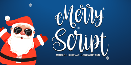 Merry script font that is simple and unique looking. Its beautiful charm makes it appear wonderfully down-to-earth, readable, and, ultimately, incredibly versatile. This will add a fun and friendly touch to any of your projects! This font is PUA encoded which means you can access all glyphs and sweeps easily.
