8,124 search results
(0.018 seconds)
- Blumen by Kaer,
$21.00 This font family based on vintage German book called “Der Raupen wunderbare Verwandlung und sonderbare Blumennahrung.” by Merian, Maria Sibylla and printed in Frankfurt am Mayn in 1683. I manually redesign initials and regular style fonts from this folio. Also, I’ve added some modern symbols. I'm happy to present to you my new font family. Blumen font family has Initials and Regular styles. It's all you need to precisely imitate medieval style text. Use Drop cap style as a decorative element at the beginning of a paragraph or section, other part of the paragraph should be in Regular style. You’ll get: * Initials & Regular styles * Uppercase and lowercase * Multilingual support * Numbers * Symbols * Punctuation * Ligatures Please feel free to request any help you need: kaer.pro@gmail.com Best, Roman. Thank you!
 - Tractatus by Kaer,
$24.00 These initials set I collected from “Tractatus sacerdotalis de sacramentis”, published in the city of Lugrun, printed by Arnaldum Guillermum de Brocario in 1503. Tractatus font family has Regular and Colored styles. It's all you need to precisely imitate medieval style text. Use this font as a decorative element at the beginning of a paragraph or section, other part of the paragraph should be in regular black letter font. You’ll get Drop Caps & Numbers set. --- *You can use color fonts in PS CC 2017+, AI CC 2018+, ID CC 2019+, macOS 10.14 Mojave+ * *Please note that the Canva & Corel & Affinity doesn't support color fonts!* *Please download this test file with only A letter ( https://www.dropbox.com/s/1lr7fify0n520ms/Tractatus-Test.otf?dl=0 ) to check your app & system.* --- Best, Roman. Thank you!
 - Albrecht Pfister by Proportional Lime,
$14.99 Herr Pfister was a printer in the city of Bamberg Bavaria. He is known to have published nine works. And it has been contentiously argued that he printed the “36 line Bible.” He was responsible for two innovations. The first was printing in his native German language and the second was the use of woodblock prints to add illustrations to the text. These were both first with the use of movable type. He was heavily influenced by Gutenberg’s typefaces but there are a range of notable and also subtle differences between the two men’s output. He was known to be active in the industry from about 1460 to his death in 1466. This font was specifically based on his "Biblia Paperum."
 - 1467 Pannartz Latin by GLC,
$38.00 This family was inspired by the edition De Civitate Dei (by Sanctus Augustinus) printed in 1467 in Sobiano (Italy, Roma) by Konrad Sweynheym and Arnold Pannartz who was the Punchcutter. It is one of the first few “Roman style” fonts, just before the birth of Jenson’s pattern (look at 1470 Jenson Latin). The present font contains all of the specific latin abbreviations and ligatures used in the original (about 54). Added are the accented characters and a few others not in use in this early period of printing. Decorated letters such as 1512 Initials, 1550 Arabesques, 1565 Venetian, or 1584 Rinceau can be used with this family without anachronism. If Italic style is required (not yet existing in early time of printing), we recommend using 1557 Italique.
 - Printers in Marks by Proportional Lime,
$19.99 In the early days of printing it was soon recognized that there was a need to identify the printer and publisher behind the printed work. So these industrious people created marks to identify themselves to clients. This font contains over 160 marks dating back to the early years of printing with the likes of Fust, Ratdolt, Manutius, Caxton, and a whole host of others represented. Some of these printers were very influential and altered the course of history, some merely enabled the broader public to access the classics. Some were imprisoned and others helped foment revolutions. But all were riding the new current of this technology of moveable type that helped transform our world through the enabling of easily exchanging information.
 - FHA Tuscan Roman by Fontry West,
$20.00 The first Tuscan lettering was penned in the mid-fourth century by the calligrapher Furius Dionysius Filocalus. The style was still in common usage as calligraphy when Vincent Figgins designed the first Antique Tuscan for print in 1817. Antique and Gothic Tuscan woodtype fonts appeared in the 1830’s. By the 1850’s, Tuscan fonts had become popular in America. These styles continued in print use into the twentieth century. Tuscan Antique and Gothic styles, borrowed from print and calligraphy, were perfect for signs, posters, handbills and other large format advertising. Sign painter, Frank Atkinson demonstrated several Tuscan forms in his book Sign Painting, A Complete Manual. Modified & Spurred Tuscan Romans were inspired by this and other works of the same period.
 - Le Monde Courrier Std by Typofonderie,
$59.00 A rounded slab in 4 styles In our age, since the arrival of microcomputing, the majority of professional letters have been composed in quality typefaces. Typewriters & the typestyles they used have become antiques. A letter set in Times or Helvetica & printed with a laser printer at 600 dpi or more are of such quality that one can no longer distinguish it with a document produced by offset printing. But letters composed in this way appear overly institutional when a bit of informality is needed. Le Monde Courrier, designed by Jean François Porchez, attempts to re-establish a style halfway between writing and printing. Informal neo-tech style This rounded slab serif returns the informal character of “typewritten” fonts to letters and suit well all bad conditions, from inkjet printed memos to webfonts use. With a unique typographic colour, it integrate itself with the rest of the Le Monde family with effective contrast. The verticals metrics and proportions of Le Monde Courrier are calibrated to match perfectly others Typofonderie families. Bukva:raz 2001 Type Directors Club .44 1998 European Design Awards 1998
 - Geiger by WyldType,
$14.99 Geiger is a geometric typeface inspired by type found in the intros of Commodore 64 games, its attention to the grid and its limited set of building blocks. The design of Geiger respects these criteria to create a sturdy alphabet without diagonals, and loosen its grip on the classic limitations to produce a complete character set worthy of today`s high-resolution displays with a retro touch. The properties of classic computing platforms, like their limited memory and low-resolution displays, required that the designers and programmers of the time devise and use certain techniques to produce interesting visual results. These platforms offered limited sets of default building blocks from which to build more complex graphics and type, and some skilled coders would work around these limitations to produce the unexpected. One of the areas that saw experimental digital type flourish is the Commodore 64 intro scene. The Geiger family includes four styles (regular, oblique, bold and bold oblique), all include common ligatures (fi, ff, ffi, fj, fl, jj, tt, Th, TT) and a few stylistic alternates (K, L). A particular attention was paid to the pattern created by the vertical stem and negative spaces of tightly set text, especially for Geiger Bold. Geiger produces good results at a size of 30pt or more, but we suggest using it at higher display sizes.
 - FiftiesHollow - Unknown license

- Pho Twice by Baqoos,
$18.00 Pho Twice is a boisterous neoteric handwritten typeface apt for headline, editorial, branding, packaging, printed materials and typographic applications. 200+ glyphs including punctuation and numerical.
 - Jabogram by Baqoos,
$19.00 Jabogram is a quixotic fortuitous san serif typeface apt for headline, editorial, branding, packaging, printed materials and typographic applications. 250+ glyphs including punctuation and numerical.
 - Earon by Baqoos,
$18.00 Earon is an inquisitive gubernatorial mono lineal typeface apt for headline, editorial, branding, packaging, printed materials and typographic applications. 220+ glyphs including punctuation and numerical.
 - Ornubs by Baqoos,
$18.00 Ornubs is an agile ministerial mono lineal typeface apt for headline, editorial, branding, packaging, printed materials and typographic applications. 220+ glyphs including punctuation and numerical.
 - Gvonz by Baqoos,
$15.00 Gvonz is a volitional innoxious tech display typeface apt for headline, editorial, branding, packaging, printed materials and typographic applications. 150+ glyphs with ligatures and fractions.
 - Barmo by Baqoos,
$18.00 Barmo is an enigmatic vociferous mono lineal typeface apt for headline, editorial, branding, packaging, printed materials and typographic applications. 220+ glyphs including punctuation and numerical.
 - Vienna Woodtype by XTOPH,
$25.00 This font is based on real prints made out of a linocut. The glyphs were handprinted, then scanned and then turned into a computer font.
 - Flock Machine by Baqoos,
$12.00 Flock Machine is an inerrant peppy handwritten typeface apt for headline, editorial, branding, packaging, printed materials and typographic applications. 200+ glyphs including punctuation and numerical.
 - Baregx by Baqoos,
$18.00 Baregx is an enthralling restorative mono lineal typeface apt for headline, editorial, branding, packaging, printed materials and typographic applications. 220+ glyphs including punctuation and numerical.
 - Mystere by Funk King,
$5.00Mystere is a new, hand-drawn font. This is currently a limited set designed for display usage. The font has a crude, yet stylish feel. - Ersota by Baqoos,
$18.00 Ersota is a jovial Introspective mono lineal typeface apt for headline, editorial, branding, packaging, printed materials and typographic applications. 220+ glyphs including punctuation and numerical.
 - Horror Hustle by Seemly Fonts,
$14.00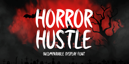 Horror Hustle is a casual display font. It is perfectly suitable for any Halloween-related project or crafty idea! The only limit is your imagination.
 - Roy Make by Baqoos,
$15.00 Roy Make is a handy perspicuous handwritten typeface apt for headline, editorial, branding, packaging, printed materials and typographic applications. 200+ glyphs including punctuation and numerical.
 - Phasma Geo by Baqoos,
$17.00 Pharma Geo is a rhapsody guileless handwritten typeface apt for headline, editorial, branding, packaging, printed materials and typographic applications. 200+ glyphs including punctuation and numerical.
 - Osrega by Baqoos,
$18.00 Osrega is an altruistic momentus mono lineal typeface apt for headline, editorial, branding, packaging, printed materials and typographic applications. 220+ glyphs including punctuation and numerical.
 - Pony Quest by Baqoos,
$12.00 Pony Quest is an ebullient neoteric handwritten typeface apt for headline, editorial, branding, packaging, printed materials and typographic applications. 200+ glyphs including punctuation and numerical.
 - Eva Poshy by Baqoos,
$12.00 Eva Poshy is an exhilaration rollicking handwritten typeface apt for headline, editorial, branding, packaging, printed materials and typographic applications. 220+ glyphs including punctuation and numerical.
 - Monthly Goals by WAP Type,
$20.00 Monthly Goals A Playful Font It is perfect for headings, flyer, greeting cards, product packaging, book cover, printed quotes, logotype, apparel design, album covers, etc.
 - Araboto by FarahatDesign,
$30.00 Araboto is a simple geometric Arabic typeface, with six weights. You can use it in a variety of uses from printings to web and mobile.
 - Boa by Alien,
$30.00 Boa bold is a basic display font made for print. It was created for an Artbook about reptiles. It needed to be round and clear.
 - Rock Corn by Baqoos,
$18.00 Rock Corn is a chipper intrepid handwritten typeface apt for headline, editorial, branding, packaging, printed materials and typographic applications. 200+ glyphs including punctuation and numerical.
 - Yekso by Baqoos,
$18.00 Yekso is a halcyon coltish mono lineal typeface apt for headline, editorial, branding, packaging, printed materials and typographic applications. 220+ glyphs including punctuation and numerical.
 - Mash Octave by Baqoos,
$12.00 Eva Poshy is an inquisitive rhapsodic handwritten typeface apt for headline, editorial, branding, packaging, printed materials and typographic applications. 220+ glyphs including punctuation and numerical.
 - OXIDISASTER - Personal use only

- Milonia by Khoir,
$15.00 Milonia - Serif font that prioritizes beauty with beautiful letter shapes and beautiful tails, has many alternative font choices that can support your design to be perfect. What's included? Uppercase Characters Lowercase Characters Support 75+ Language 87 Alternative FEATURES Milonia
 - Ninja Hirosi by Yoga Letter,
$16.00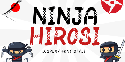 "Ninja Hirosi" is a very unique and cute display font. This font is equipped with uppercase, lowercase, numerals, punctuation, and multilingual support. Very suitable for comics, book titles, promotions, business branding, stickers, banners, branding, logos, film titles, and others.
 - Aulian by Saxofont,
$18.00 Aulian is an arabic font style made in all characters in uppercase, lowercase, multilingual, ligature, numeric and punc.this typeface with artistic style verym terestingt for loads of different projects and promotions, such as logo, poster, catalogs, advertisement needs, packagingdesign.
 - Slovenia by Garisman Studio,
$20.00 Introducing Slovenia Callygraphy Slovenia very perfect for logos, wedding invitations, posters, business cards, headlines, Instagram stories, youtube stories, book cover, poster promotion and many more! Includes many ligatures and opentype features, also Stylistic Sets with end & start love swashes.
 - Jelly Choco by Yoga Letter,
$18.00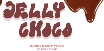 "Jelly Choco" is a very cute and unique bubble display font. This font is equipped with uppercase, lowercase, multilingual support, numerals, and punctuation. This font is very suitable for business branding, banners, posters, stickers, advertisements, product promotions, and more.
 - Textus Receptus by Lascaris,
$60.00 Textus Receptus is a historical revival based on the Roman and Greek types used by Johann Bebel (and later also Michael Isengrin) in Basel in the 1520s. The Roman is a low-contrast medium-to-heavy Venetian reminiscent of Jenson or Golden Type. The unusual polytonic Greek, not previously digitized, is lighter in weight and supplied with all the ligatures and variants of the original. Yet when used without historial forms the Greek has a surprisingly contemporary feel: it’s quirky and playful as a display face, but still easily legible in running text. Bebel’s Greek extended and refined the one used for the first printed Greek New Testament, Desiderius Erasmus’ Novum Instrumentum Omne, published in Basel in 1516 by Johann Froben. The name of the font was chosen in honor of this edition, which was so influential that it was later called the Textus Receptus (the “received text”), serving as the basis for Luther’s German Bible in 1522 and much subsequent scholarship for over 300 years. Following 16th century practice, Textus Receptus contains 130 ligatures and stylistic alternates for Greek, accessible either with OpenType features or with five stylistic sets. The Greek capitals, often printed bare in early editions, have been equipped with accents and breathings for proper polytonic or monotonic typesetting. The Roman includes both standard and historical ligatures along with the abbreviations and diacritics typically employed in early printed Latin. For expanded language coverage it has the entire unicode Latin Extended‑A range and part of Latin Extended-B. The capital A is surmounted by a horizontal stroke, as in some 16th century Italian designs, and the hyphen and question mark have both modern and historical form variants. Mark-to-base positioning correctly renders fifty combining diacritics, and with mark-to-mark positioning the most common diacritics may be stacked, permitting, for example, accents and breathings on top of length-marked vowels. Numerals include old-style, proportional lining and tabular lining. For further details, please download the 31-page Textus Receptus User Guide.
 - FuturistStencil - Unknown license


