10,000 search results
(0.032 seconds)
- Long Vacation by Din Studio,
$27.00 Do you want something prominent yet legible? This is Long Vacation, our new handwritten font, ideal for all of your design needs. Long Vacation is a visually interesting handwritten font showing a unique handwriting style giving the natural, lovely nuances on your designs. The flowing letters are interconnected and the scratches that connect the letters make the font look more natural. Details on each letter and curves on the edges show high contrasts. Due to its great legibility, you can apply this font to both big and small text sizes. Additionally, enjoy the features available here. Features: Stylistic Sets Multilingual Supports PUA Encoded Numerals and Punctuations Long Vacation fits best for various design projects, such as brandings, posters, banners, invitations, greeting cards, magazine covers, quotes, printed products, merchandise, logos, social media, etc. Find out more ways to use this font by taking a look at the font preview. Thanks for purchasing our fonts. Hopefully, you have a great time using our font. Feel free to contact us anytime for further information or when you have trouble with the font. Thanks a lot and happy designing.
 - Moubaru by Alit Design,
$15.00 "MOUBARU Typeface" is a modern sans serif font that comes in a variety of weights, ranging from Thin to Heavy. It has a high body, making it easy to read even in small sizes. The font includes 680 glyphs, which allow for a wide range of typographic possibilities. In addition to the regular weight, "MOUBARU Typeface" also includes a condensed version, which is ideal for situations where space is limited. The font supports Private Use Area (PUA) encoding, allowing you to access special characters and symbols that are not available in standard character sets. Overall, "MOUBARU Typeface" is a versatile font family that can be used in a variety of design contexts, from branding and advertising to editorial and web design. Its clean and modern aesthetic make it a popular choice for designers looking for a fresh and contemporary look. Language Support : Latin, Basic, Western European, Central European, South European,Vietnamese. In order to use the beautiful swashes, you need a program that supports OpenType features such as Adobe Illustrator CS, Adobe Photoshop CC, Adobe Indesign and Corel Draw. but if your software doesn't have Glyphs panel, you can install additional swashes font files.
 - Neue Comic by Unio Creative Solutions,
$4.00 Meet "Neue Comic," a rounded typeface making a bold entrance into the design scene, aiming to redefine the delicate balance between playfulness and practicality in typography. Crafted with the recognition that rounded aesthetics enhance information retention and legibility, Neue Comic delivers a distinct, rhythmic design that breaks through traditional design boundaries. Reflecting on the divisive legacy of Comic Sans, we pondered: Is it really deserving of all the hate? Comic Sans entered the typography scene in 1994 with the noble goal of injecting fun into casual contexts. However, it fell victim to misuse and eventually succumbed to an undeserved sense of imposter syndrome. This prompted us to create a typeface that transcends these limitations. Inspired by the non-connecting script of comic book lettering, Neue Comic seeks to recapture the charm of the '90s while acknowledging the genuine intention behind Comic Sans—offering accessibility and friendliness. Avoiding the pitfalls of overuse, Neue Comic presents itself with seven weights and corresponding obliques, showcasing the flexibility of a variable version. Specifications: - Files included: Neue Comic, including obliques - Multi-language support (Central, Eastern, Western European languages) - OpenType Features (Superscript and Subscript Numerals, Fractions, Oldstyle figures) Thanks for viewing, Unio.
 - Night Circus by Yumna Type,
$25.00 Night Circus is a capitalized display font in a circus theme having unique, interesting designs with big, prominent letter sizes to catch attention. All of its letters are peculiarly designed in bright colors and many decorative circus elements. The power-expressing big, thick letters are perfect to use in power, boldness message-delivering designs. The advantages of Night Circus font, which provides a clipart in line with the theme, are the abilities to produce unique, charming nuances to your designs and to make your products more interesting which increases the products’ attractiveness. You can use it in big text sizes to be greatly legible and enjoy the available features here. Features: Multilingual Supports PUA Encoded Numerals and Punctuations Night Circus fits best for various design projects, such as brandings, headings, magazine covers, quotes, printed products, merchandise, social media, etc. Find out more ways to use this font by taking a look at the font preview. Thanks for purchasing our fonts. Hopefully, you have a great time using our font. Feel free to contact us anytime for further information or when you have trouble with the font. Thanks a lot and happy designing.
 - Carlton by ITC,
$29.99Carlton is based on a typeface designed by Prof. F. H. Ehmcke. In 1908, Ehmcke released his Ehmcke-Antiqua design through the Flinsch typefoundry in Germany. Ehmcke-Antiqua was later distributed by the Bauer typefoundry in Frankfurt am Main. The Caslon Letter Foundry in England discovered the design and released their own typeface based upon the model, which they named Carlton. Carlton entered the Stephenson Blake program after they acquired the Caslon Letter Foundry in the late 1930s. As hot and cold metal typesetting became outdated technologies, Carlton and Ehmcke-Antiqua fell out of general use. In the 1990s, Letraset revived this classic design, distributing it under its English name, Carlton. Carlton's clean and generous capitals, as well as its understated yet detailed lower case, have found popularity again in recent years. The elegance of Carlton is best used for displays with large letter and word spacing. Carlton shows all of the hallmarks of a delicate serif typeface design; its forms capture a distinct moment that was common within Central European type design during the first third of the 20th Century. Carlton is similar to several other expressive typefaces from the early 1900s, including Bernhard Modern, Koch Antiqua, Locarno, and Nicolas Cochin." - Syntax Next Paneuropean by Linotype,
$103.99Syntax was designed by Swiss typographer Hans Eduard Meier, and issued in 1968 by the D. Stempel AG type foundry as their last hot metal type family. Meier used an unusual rationale in the design of this sans serif typeface; it has the shapes of humanist letters or oldstyle types (such as Sabon), but with a modified monoline treatment. The original drawings were done in 1954; first by writing the letters with a brush, then redrawing their essential linear forms, and finally adding balanced amounts of weight to the skeletons to produce optically monoline letterforms. Meier wanted to subtly express the rhythmical dynamism of written letters and at the same time produce a legible sans serif typeface. This theme was supported by using a very slight slope in the roman, tall ascenders, terminals at right angles to stroke direction, caps with classical proportions, and the humanist style a and g. The original foundry metal type was digitized in 1989 to make this family of four romans and one italic. Meier completely reworked Syntax in 2000, completing an expanded and improved font family that is available exclusively from Linotype GmbH as Linotype Syntax. In 2009 the typeface family was renamed into a more logical naming of "Syntax Next" to fit better in the Platinum Collection naming." - Univers Cyrillic by Linotype,
$55.00 The font family Univers is one of the greatest typographic achievements of the second half of the 20th century. The family has the advantage of having a variety of weights and styles, which, even when combined, give an impression of steadiness and homogeneity. The clear, objective forms of Univers make this a legible font suitable for almost any typographic need. In 1954 the French type foundry Deberny & Peignot wanted to add a linear sans serif type in several weights to the range of the Lumitype fonts. Adrian Frutiger, the foundry’s art director, suggested refraining from adapting an existing alphabet. He wanted to instead make a new font that would, above all, be suitable for the typesetting of longer texts — quite an exciting challenge for a sans-serif font at that time. Starting with his old sketches from his student days at the School for the Applied Arts in Zurich, he created the Univers type family. In 1957, the family was released by Deberny & Peignot, and afterwards, it was produced by Linotype. The Deberny & Peignot type library was acquired in 1972 by Haas, and the Haas’sche Schriftgiesserei (Haas Type Foundry) was folded into the D. Stempel AG/Linotype collection in 1985/1989.
 - Ongunkan Kensington Runestone by Runic World Tamgacı,
$70.00 The Kensington Runestone is a rune-covered slab of brownstone that was claimed to have been discovered in central Minnesota in the United States in 1898. Olof Öhman, a Swedish immigrant, reported that he dug it out of a field in the largely rural town of Solem in Douglas County. It was then named after the nearest settlement, Kensington. The inscription claims to be a record left behind by Scandinavian explorers in the 14th century (internally dated to 1362). There has been a long-standing debate as to the stone's authenticity, but since the first scientific review in 1910, scientific consensus has classified it as a 19th-century hoax, and some critics have directly accused Öhman of fabricating it. there is community.
 - Fantazija - Unknown license

- Cream Pie by ErlosDesign,
$14.00 CreamPie - Handwritten Display Font by erlosDESIGN CreamPie is a sweet and friendly handwritten font. Its natural and unique style makes it incredibly fitting to a large pool of designs. The only limit is your imagination!
 - Winter Moment by Seemly Fonts,
$14.00 New brushed display font called Winter Moment. Stationery, logos, t-shirts, paper, print designs, website headers, picture frames, flyers, album covers, posters, image sliders, and a lot more are all excellent places to include mindfulness.
 - Beitris by Kodhibanks,
$15.00 Beitris is a beautiful and elegant script font. Perfect for designing branding, blog logo, website logo, print ads, book covers, film covers, apparel, cards, logos, posters, etc. Beitris typeface gives you more alternatives in designing.
 - Sandikza by Falling Angel,
$- Sandikza started out as an idea for a metal titles and some games. Or anything that was printed distorted. In other word something harsh. It makes a death or dirt feeling anywhere it is used.
 - Milk Made by loryn ipsum,
$12.00 Milk Made | a rounded retro font Milk Made is a fun rounded retro font inspired by mid-century magazine and print advertisements. Perfect for; retro brands, young brands, gen z branding, logos, social media, posters.
 - Sf Supernova by S6 Foundry,
$15.00 Supernova is a stylistic display font developed within a set grid. Perfectly suited for headlines, large-format prints, brand identities, social media, advertising, editorial design, posters, magazines, logos, headings, digital and more. Multi-language support.
 - Woodcraft JNL by Jeff Levine,
$29.00 Woodcraft JNL is another fine example of the charm wood type adds to the printed page. The hand-cut design's eccentricities enhance any project that desires to reflect the advertising of another time and place.
 - TF Opicular by Tyfomono,
$20.00 OPICULAR is a Starter Series of modern sans serif with a geometric typical characters, Inspired by minimalism typography and functionalities, digital or print. Opicular comes in 3 weights and 6 styles from Book to Bold.
 - Another Wonder by Seemly Fonts,
$12.00 Another Wonder is a sweet and simple handwritten font. This font is ideal for stationery, logos, t-shirts, papers, print designs, website headers, picture frames, flyers, album covers, posters, image sliders, and many other things.
 - Bookvarium Roman by Letterhead Studio-VV,
$19.99 A unique display font based on the research in vintage and old fonts from the beginning of the 20th century. Perfectly work for headlines in print or can be a spice to any other design.
 - Prankster JNL by Jeff Levine,
$29.00 Prankster JNL gets its inspiration from a casual typeface popularly used in print ads of the 1950s and 1960s. Its friendly, unstructured approach to titles made the style an all-purpose workhorse of the era.
 - Shaded Spheres by Dingbatcave,
$15.00These Op-Art-looking little balls and gems appear 3-D without the help of any special graphic filters, which makes them perfect for use with flat colors or one-color print jobs. 72 characters. - Geralize by Yoga Letter,
$15.00 "Geralize" is a very elegant and professional modern slab serif font. This font is equipped with uppercase, lowercase, ligatures, numerals, punctuations, and multilingual support. It is suitable for logos, branding, banners, posters, prints, and more.
 - Tumb by That That Creative,
$18.00 Tumb is a bold quirky modern display font with stylized ink traps. It is perfect for giving your project a fun sophistocated playfulness. Perfect for headlines on posters, Instagram, print projects, branding, and logo design.
 - Black Beer by Fractal Font Factory,
$10.00 Black beer, strong Gothic. It is designed for logos, prints, headlines and more. The font has 4 styles, base, blurred, outlined, and aged. Contains basic characters and punctuation marks as well as extended multilingual characters.
 - Sigeboy by Sulthan Studio,
$12.00 Handwritten font using pen with one line and not thickened, ideal for all things sketch pens, engravings, and foil pens! Sigeboy is perfect for greeting cards, logos, clothing designs, home decor, prints, quotes and more!
 - Awesome Quote by Atom,
$15.00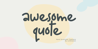 Awesome Quote is a sweet and friendly handwritten font. Its natural and unique style makes it incredibly fitting to a large pool of designs. The only limit is your imagination. Happy design! Eko Kurniawan | Letteratom
 - Grambly by Hitype,
$15.00 Grambly is a bold sans serif and unique display typeface with a combination of elegant and bold style that will make it stand out. Suitable for logos, stickers, posters, packaging, branding, invitations, notes, print, etc.
 - Richfont BT by Bitstream,
$50.99Based on Mr. Hubbard's own hand printing, Richfont Medium is an extremely casual design. Actually light in weight, it renders best at 14 point and above. Richfont Light and Bold are available from the designer. - Opportoonity JNL by Jeff Levine,
$29.00Opportoonity JNL is loosely based on lettering from 1940s cartoons. It's the perfect typeface for anything representing fun and carefree situations. There is a slightly limited character set and no kerning on this particular font. - Universal MICR Pi by Monotype,
$29.00MICR The MICR font has a very practical application. MICR numerals, when printed in magnetic inks, can be read by special scanners that recognize the characters from their magnetic fields rather than just their shapes. - Despatxada by Type-Ø-Tones,
$40.00 Despatxada letters are the scans of the alphabet of a manual rubber press. Letter by letter. Real prints. Real textures. You will not find another typeface like this. An heroic font in the digital era.
 - Rebecca YOFF by YOFF,
$9.00 Rebecca bundle is two fonts, one print and one script. You'll get both in one package. Both fonts are updated with smoother curves and support for more languages. Enjoy this bundle of beautiful handwriting fonts!
 - Theatrics JNL by Jeff Levine,
$29.00Theatrics JNL gives a rounded corner treatment to Prismatiq JNL; which in turn was modeled from lettering found in an early 1900s French lettering book displayed at an online image sharing site. Limited character set. - Petrarka by HiH,
$12.00 Petrarka may be described as a Condensed, Sans-Serif, Semi-Fatface Roman. Huh? Bear with me on this. The Fatface is a name given to the popular nineteenth-century romans that where characterized by an extremity of contrast between the thick and thin stroke. The earliest example that is generally familiar is Thorowgood, believed to have been designed by Robert Thorne and released by Thorowgood Foundry in 1820 as "Five-line Pica No. 5." Copied by many foundries, it became one of the more popular advertising types of the day. Later, in the period from about 1890 to 1950, you find a number of typeface designs with the thin stroke beefed up a bit, not quite so extreme. What you might call Semi-Fatfaced Romans begin to replace the extreme Fatfaces. Serifed designs like Bauer’s Bernard Roman Extra Bold and ATF’s Bold Antique appear. In addition, we see the development of semi-fatface lineals or Sans-Serif Semi-Fatfaces. Examples include Britannic (Stephenson Blake), Chambord Bold (Olive), Koloss (Ludwig & Mayer), Matthews (ATF) and Radiant Heavy (Ludlow). Petrarka has much in common with this latter group, but is distinguished by two salient features: it is condensed and it shows a strong blackletter influence, as seen in the ‘H’ particularly. Petrark was released about 1900 by the German foundry of Schelter & Giesecke of Leipzig and is one of the designs of the period that attempts to reconcile roman and blackletter traditions. Making a cameo appearance in this Multi-Lingual font is the Anglo-Saxon letter yogh (#729), which, along with the thorn and the eth, is always useful for preparing flyers in Old English. There are still pockets of resistance to the Norman French influence that washed up on England’s shores in 1066. This font stands with King Canute, seeking to hold back the tide (ignoring the fact that Canute was a Dane). Support the fight to preserve Anglo-Saxon culture. Buy Petrarka ML today. Petrarka Initials brings together the Petrarka upper case letters with a very sympatico Art Nouveau rendering of a female face.
 - FS Split Sans by Fontsmith,
$80.00 Quirky and irregular FS Split is no ordinary typeface. Its irregular proportions make it unique, with round letters appearing wide, and straight letters narrow. Other quirks include its eclectic crossbars – the uppercase ‘A’ has an unusually low bar, while the bar on ‘G’ is particularly long. The uppercase has many interesting features in fact, including large counters, closed terminals on certain letters like ‘J’, and a cap-height that lines up with ascenders. The lowercase also holds surprises – the dots on ‘i’ and ‘j’ are unusually large, and some characters, such as ‘g’, feature double-storey counters. An extreme but stylish italic The italic versions of FS Split Sans and Serif are particularly striking. While similar in style to their upright, Roman versions, they take on a larger-than-usual 18-degree angle, making the forward-slant more dramatic. Although the main purpose of any italic is to help words and phrases stand out, this unique execution helps to make the italic variants of FS Split stylish fonts in their own right – they would work brilliantly on magazine covers, in titles and headlines, pull quotes, and even used commercially in logos and corporate branding. Serif and sans: a split personality FS Split Sans and Serif have their differences but also their similarities, contrasting and complementing each other perfectly. This ‘love hate’ relationship inspired the name of the typeface family, and means the two variants provide a versatile, typographic palette for use in graphics and branding. While its proportions are similar to the sans, the serif has a bigger contrast between its weights of bold, regular and light, bracketed serifs, and different styles of terminals, some being straight and others ball-shaped. FS Split Sans has more subtlety and simplicity, with a smaller weight contrast, less flamboyant terminals, and more consistent counter sizes. The two variants are distinct yet alike, so can be used successfully either in isolation or together.
 - FS Split Serif by Fontsmith,
$80.00 Quirky and irregular FS Split is no ordinary typeface. Its irregular proportions make it unique, with round letters appearing wide, and straight letters narrow. Other quirks include its eclectic crossbars – the uppercase ‘A’ has an unusually low bar, while the bar on ‘G’ is particularly long. The uppercase has many interesting features in fact, including large counters, closed terminals on certain letters like ‘J’, and a cap-height that lines up with ascenders. The lowercase also holds surprises – the dots on ‘i’ and ‘j’ are unusually large, and some characters, such as ‘g’, feature double-storey counters. An extreme but stylish italic The italic versions of FS Split Sans and Serif are particularly striking. While similar in style to their upright, Roman versions, they take on a larger-than-usual 18-degree angle, making the forward-slant more dramatic. Although the main purpose of any italic is to help words and phrases stand out, this unique execution helps to make the italic variants of FS Split stylish fonts in their own right – they would work brilliantly on magazine covers, in titles and headlines, pull quotes, and even used commercially in logos and corporate branding. Serif and sans: a split personality FS Split Sans and Serif have their differences but also their similarities, contrasting and complementing each other perfectly. This ‘love hate’ relationship inspired the name of the typeface family, and means the two variants provide a versatile, typographic palette for use in graphics and branding. While its proportions are similar to the sans, the serif has a bigger contrast between its weights of bold, regular and light, bracketed serifs, and different styles of terminals, some being straight and others ball-shaped. FS Split Sans has more subtlety and simplicity, with a smaller weight contrast, less flamboyant terminals, and more consistent counter sizes. The two variants are distinct yet alike, so can be used successfully either in isolation or together.
 - FranciscoLucas Briosa - Unknown license

- FranciscoLucas Llana - Unknown license

- Niagato by Attype Studio,
$15.00 Niagato is Font that inspired by Japanese Letter style, perfect for any Asian theme of design & promotion to create spectacular designs! Niagato is perfect for branding, logo, invitation, stationery, social media post, product packaging, merchandise, blog design, game titles, cute style design, Book/Cover Title and more. What's Included : - Multilingual Support
 - Wesley SRF by Stella Roberts Fonts,
$25.00 Wesley SRF is another of the Ray Larabie originals provided to Stella Roberts Fonts. This stylized sanserif has a clean look for both text and display puposes. The net profits from my font sales help defer medical expenses for my siblings, who both suffer with Cystic Fibrosis and diabetes. Thank you.


