7,017 search results
(0.028 seconds)
- Maylane by Raditya Type,
$13.00 Maylane is a beautiful, loving elegant typeface. It is suitable for wedding invitation, quote, greeting and many more. “Maylane” includes the full set of upper and lower case letters, multilingual symbols, numbers, punctuation, stylistic set, and ligature. This font has a smooth texture, so it will be perfect for all types of printing techniques. You can do embroidery, laser cut, gold foil etc.
 - Pebl by Formation Type Foundry,
$25.00 Pebl is inspired by the naturally simplified and smoothed shapes of beach pebbles. The result is a bold, super-rounded display typeface. It's pared back to just the most basic, smooth outlines without counters, for a friendly and organic look. It’s ideal for logos, branding, headlines or just abstract type shapes in print, in displays, on the web, on T-shirts, wherever. Enjoy.
 - Seriously by Letterhend,
$12.00 Here come our latest product with serif typeface called Seriously. This typeface has 3 different weights that you can use according your needs. It has elegant look, very suitable for corporate branding, logo, document, social media design, presentation, print design, web, etc. This typeface is comes in uppercase, lowercase, punctuation, symbols, numerals, stylistic set alternate, ligatures, etc also support multilingual.
 - Remind by Din Studio,
$29.00 Introducing Remind Font. Remind is a modern serif font. Create from our talented font designer. The design of typeface will make your design more beautiful and inspiring. This font will suitable for any project, like branding, print template, logo and etc. Includes : Remind (OTF) Features : PUA encoded Stylistics Set Numerals and Punctuation (OpenType Standard) Full Support Thanks for visiting and purchasing my font!
 - Saj JY by JY&A,
$39.00 Designed by Jure Stojan, JY Saj is a typeface family that successfully balances the artistic and the conventional. With 10 weights (UltraThin to ExtraBold, with italic complements), it works at a variety of sizes, in print and on screen. There are both oldstyle and lining figures, the rupee symbol is supported, and roughly 3,500 kerning pairs were added per font.
 - Churchward Isabella by BluHead Studio,
$25.00 Churchward Isabella is a five weight typeface family originally designed during the 1980's by the late type designer Joseph Churchward, from New Zealand. A straightforward, geometric sans serif, it is a no-nonsense, highly legible workhorse design, readable on screen as well as in print, for text, headline and display. The family includes Light, Regular, Medium, Bold and Extra Bold.
 - DokChampa by Microsoft Corporation,
$49.00DokChampa is a Lao font based on the Arial typeface. DokChampa was created by the Monotype Type Drawing Office to support Lao and Thai scripts. The DokChampa font is a legible sans serif that is good for use on screen and in printed documents. DokChampa is a Lao script font and requires an application program that supports Lao or Thai scripts. - Hagia Pro by Studio Fat Cat,
$9.00 Hagia Pro's unique sans serif font family is the perfect tool for creators to create impactful things with a different touch. Hagia Pro contains several weights to give the user an interesting experience when using it. This unique sans serif font family is very good for branding, logo projects, headings, advertising, packaging, web design, print goods and other creative projects.
 - Hashiba Japanese Font by IbeyDesign,
$16.00 Hashiba Japanese Font is a cool, Japanese-inspired display font. It will look stunning on any food menu, poster flyer, or print. Use this font for your designs and explore its endless possibilities. Hashiba Japanese Font can pair with calligraphy Japanese font, Japanese font brush, Japanese calligraphy font, or Japanese brush font. Hope you enjoy, and happy designing :-) Thank You
 - Zanjabeel Arabic by Boharat Cairo,
$20.00 Zanjabeel is an Arabic typeface with a hybrid design between the Naskh and Modern Kufi styles, comes in 9 weights, and some italic letters that give a unique and dynamic feel. the typeface works well with large sizes, headlines, and short text. also, works in printing and digital uses. The typeface is a collaboration with the Egyptian designer Ibrahim Hamdi
 - Sandy Pillow by Nathatype,
$29.00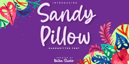 Sandy Pillow is a beautiful handwritten font. It brings an attractive typeface. Made for any professional projects. The font is suitable for any project like logo, t-shirt printing, wedding invitations, and greeting cards to social media quotes, branding, and more! Outstanding in a wide range of contexts. Featured : - Standard Ligatures - Stylistic Sets - Multilingual Support - PUA Encoded - Numerals and Punctuation
 - Tanseek Sans by Monotype,
$29.99The Tanseek™ Sans family provides interactive and print designers with a suite of powerful and versatile communication tools. Square shoulders, open counters and distinctive character shapes also ensure high levels of legibility. Designed by Dave Farey and Richard Dawson, the lower case has a subtle calligraphic emphasis, creating an inviting rhythm and typographic flow when letters combine into words and sentences. - Chaser by Larin Type Co,
$12.00 Chaser is stencil font inspired by aviation and military style includes 3 sections ( clean, rough, printed). this font is a narrow specialization, it will be an excellent option for projects in the military style in both modern and vintage versions. This font also includes several illustrations that may be useful for creating your project and will be a useful addition.
 - Stefania Antique by insigne,
$21.99 Stefania Antique is an aged version of Stefania, an elegant italic script. Stefania Antique is perfect for creating unique and ancient looking chancery manuscripts. A regular version and a more distressed alternate are available. Stefania Antique includes 64 OpenType ligatures that are used to automatically replicate the natural appearance of letterpress printing. Stefania Antique works great in conjunction with insigne Splats!
 - Precious Serif by G-Type,
$60.00 Precious Serif is a distinctive, modern slab serif typeface, first released in 2003 and now refreshed in 2017. This contemporary, chunky gem is the sister typeface to our Precious Sans family, both sets designed with similar metrics and characteristics to ensure they pair together seamlessly in print & digital applications. Mix Precious Sans & Serif together in a block of text to wonderful effect!
 - Headstone by RagamKata,
$14.00 Headstone a classic blackletter typeface combining a modern and classic typography style, with a touch of retro style. A very suitable font to make your project look elegant with it’s rounded and bold shape. Headstone is very ideal for heading, flyers, posters, product packaging, book cover, printed quotes and many more. Enhance your work with Headstone to make your work more well-known!
 - Mauline by Yukita Creative,
$14.00 a modern, stylish serif font that offers excellent legibility for a variety of applications. This font is ideal for use in any kind of graphic design or advertising work, from logo designs to web design and print projects. Its easy-to-read character shapes, distinct letterforms, and beautiful typographic details make this typeface perfect for creating impactful and captivating visual designs.
 - Ekkehard by Michael Browers,
$25.00 Hand drawn by Michael Browers, Ekkehard is inspired by multiple blackletter typefaces that appeared in an 1862 printing of "The Doctrine of the Simple and the Power of the Powerless" by Hans Nielsen Hauge. The result is an eclectic distressed font that is ideal for logos, product packaging, headlines, posters, merchandise, greeting cards, and other projects requiring a vintage, hand-made feel.
 - Omar by Ahmet Altun,
$- The Omar Font was completely created by graphic tablet. Omar font family comes in two weights; Normal and Italic. They're all capital but lowercase and capital letters are different from each other.It is legible in small type sizes. With its decorative view, you can get matchless products in typographic works, t-shirt prints, posters, logos and every kind of graphic works.
 - Bix Metric by S6 Foundry,
$20.00 Bix Metric is a stylistic display font developed within a set grid. The mono-spaced first set of the family comes in 3 styles in both upper and lowercase glyphs allowing mixing of infinite combinations. Perfectly suited for headlines, large-format prints, brand identities, social media, advertising, editorial design, posters, magazines, logos, headings, digital and more. With multi-language support.
 - Picto Handwriting by SoftMaker,
$15.99 Digitized handwriting fonts are a perfect way to give documents the “very special touch”. Invitations look simply better when handwritten than when printed in bland Arial or Times New Roman. Short handwritten notes look authentic and appealing. There are numerous occasions where handwritten text makes a better impression. “Picto Handwriting” comes with beautiful handwritten pictograms that let you quickly spruce up your designs.
 - Which Is by Gassstype,
$23.00 Hello Everyone, introduce our new product Font Which Is it is Special Handwritten Font.This is a Textured Natural Style and classy style with a clear style and dramatic movement. This font Which Is is great for your next creative project such as logos, printed quotes, invitations, cards, product packaging, headers, Logotype, Letterhead, Poster. You can activate 18 Ligatures glyphs OpenType panel.
 - Sildetas by insigne,
$22.00 Sildetas is an elegant high-contrast script face. Sildetas was conceived as non-connected, high-contrast and ultra heavy script, as best exemplified by the Black weight. However, it was too much of a temptation to design a hairline variant, and this exploration gave the family’s lighter weights an elegant, graceful feel. The script was modified further to use connected letterforms as the primary glyphs. With its unique swirled ball terminals, this versatile script draws immediate attention. The face glides and flows across the page and the swirling ball terminals provide an interesting diversion to the flow. The lighter weights have an almost spencerian look. Sildetas includes six weights and is a very unique script face. Lighter weights can be used for elegant invitiations. Sildetas can get the job done for many unique design tasks. Sildetas includes many useful OpenType features, including a set of non-connecting and titling alternates, ligatures, and two types of end swashes. Opentype features include simplified swashed stylistic alternates without ball terminals, swash endings, ending contextual alternates, discretionary ligatures, ligatures and five different stylistic sets filled with alternates. In total, there are over 60 alternate letterforms. OpenType-capable applications such as Quark or the Adobe suite can take full advantage of the automatically replacing ligatures and alternates. This family also includes the glyphs to support a wide range of languages.
 - Josef K Paneuropean by Juliasys,
$38.95 With the Josef K *, Julia Sysmäläinen continues her artistic debate on Franz Kafka’s writing style. This time the designer of FF Mister K is not drawn to Kafka’s literary works created at night but to those the writer produced at daytime as a high-ranking, confident bureaucrat – Dr Franz Kafka. The typefaces Josef K “Paneuropean” and “Strong European” echoe Kafka’s prestigious status at the Workmen’s Accident Insurance Institute of the Austro-Hungarian Empire. Their ductus, originating from a broad-nibbed ink pen combines a clear, self-confident stroke with the calligraphic features so typical for Franz Kafka’s handwriting. While both typefaces are more straightforward and bolder than the wonderfully erratic fonts of the FF Mister K family Josef K Paneuropean is best characterized as a semibold handwriting textface. Josef K Strong European, Sysmäläinen’s latest “K”-accomplishment, provides an ideal complement to it as a distinctly bold display face – great for headlines, product names and branding. It combines perfectly not only with Josef K Paneuropean but also with all the FF Mister K textfaces. Both Josef K Paneuropean and Josef K Strong European have Western, Central European and Extended Cyrillic character sets. With more than 2500 glyphs they support over 100 languages. *Kafka’s persona Josef K is a leading bank officer – reminiscent of the author himself – in the novel The Trial.
 - Matrise Text Pro by CheapProFonts,
$10.00 A new font in the style of a dot matrix/needle-printer. I have used some slightly smaller dots when designing the diacritics - this makes them easier to separate from the main letters. I have also used variable letter widths (and kerning), as opposed to the technology's original monospaced design - this to make the text more readable. Matrise Text Pro features a more "oldstyle" look with spurs and notches, while Matrise Pro has a more modern/streamlined design. ALL fonts from CheapProFonts have very extensive language support: They contain some unusual diacritic letters (some of which are contained in the Latin Extended-B Unicode block) supporting: Cornish, Filipino (Tagalog), Guarani, Luxembourgian, Malagasy, Romanian, Ulithian and Welsh. They also contain all glyphs in the Latin Extended-A Unicode block (which among others cover the Central European and Baltic areas) supporting: Afrikaans, Belarusian (Lacinka), Bosnian, Catalan, Chichewa, Croatian, Czech, Dutch, Esperanto, Greenlandic, Hungarian, Kashubian, Kurdish (Kurmanji), Latvian, Lithuanian, Maltese, Maori, Polish, Saami (Inari), Saami (North), Serbian (latin), Slovak(ian), Slovene, Sorbian (Lower), Sorbian (Upper), Turkish and Turkmen. And they of course contain all the usual "western" glyphs supporting: Albanian, Basque, Breton, Chamorro, Danish, Estonian, Faroese, Finnish, French, Frisian, Galican, German, Icelandic, Indonesian, Irish (Gaelic), Italian, Northern Sotho, Norwegian, Occitan, Portuguese, Rhaeto-Romance, Sami (Lule), Sami (South), Scots (Gaelic), Spanish, Swedish, Tswana, Walloon and Yapese.
 - Boston Skyline by Set Sail Studios,
$16.00 Boston Skyline is a carefully hand-crafted duo of premium Sans & Script fonts, designed to create a bold, authentic, and timeless lettering combination. The contrasting yet complimentary strong sans and free-flowing script lend themselves perfectly as primary and secondary fonts for logo designs, product packaging, eye catching quotes and display text. Here’s what’s included in this product: Boston Skyline Rough • A hand drawn script font with authentic textures built-in. Contains upper & lowercase characters, all punctuation and numerals. Boston Skyline Rough Alt • This is a second version of Boston Skyline Rough, with a completely new set of upper & lowercase characters. If you wanted to avoid letters looking the same each time to recreate a custom-made style, or try a different word shape, simply switch to this font for an additional layout option. Boston Skyline Sans Rough • A bold Sans font with a built-in rough 'letterpress' texture. Contains uppercase characters, all punctuation and numerals. Boston Skyline Swashes • This font contains 26 swashes, perfect for underlining your script text and adding some extra custom flair. Simply install this font separately and type any a-z character when using this font to generate a swash. Clean Versions • Are included for all fonts with textures completely removed and edges smoothed. Language Support; All fonts support English, French, Italian, Spanish, Portuguese, German, Swedish, Norwegian, Danish, Dutch, Finnish, Indonesian, Malay, Hungarian, Polish, Turkish, Slovenian
 - Zetwih by Twinletter,
$17.00 Zetwih, is a stunning display font with an alluring Japanese feel. With the beauty and charm of faux Japanese, Zetwih is the perfect solution for projects that require a distinctly Japanese and Southeast Asian touch. With Zetwih, you can create designs that are themed by Japanese and Southeast Asian culture in an authentic and captivating style. Each letter is carefully designed, combining elements of a distinctly Japanese aesthetic with a modern twist. Zetwih’s top features give you flexibility and creativity in your typography designs. With the available ligatures and alternates, you can combine beautiful characters and create interesting variations in letter composition. Zetwih also supports multilingualism, allowing you to express your message in multiple languages and reach an international audience. That way, you can adapt this font to the needs and preferences of your target market. Let Zetwih immerse you in the beauty and elegance of Japanese and Southeast Asian culture. Get this font now and create inspiring and stunning designs with an unforgettable Japanese touch. What’s Included : File font All glyphs Iso Latin 1 Alternate, Ligature Simple installations We highly recommend using a program that supports OpenType features and Glyphs panels like many Adobe apps and Corel Draw so that you can see and access all Glyph variations. PUA Encoded Characters – Fully accessible without additional design software. Fonts include Multilingual support
 - Matrise Pro by CheapProFonts,
$10.00 A new font in the style of a dot matrix/needle-printer. I have used some slightly smaller dots when designing the diacritics - this makes them easier to separate from the main letters. I have also used variable letter widths (and kerning), as opposed to the technology's original monospaced design - this to make the text more readable. Matrise Pro has a more modern/streamlined design, while Matrise Text Pro features a more "oldstyle" look with spurs and notches... ALL fonts from CheapProFonts have very extensive language support: They contain some unusual diacritic letters (some of which are contained in the Latin Extended-B Unicode block) supporting: Cornish, Filipino (Tagalog), Guarani, Luxembourgian, Malagasy, Romanian, Ulithian and Welsh. They also contain all glyphs in the Latin Extended-A Unicode block (which among others cover the Central European and Baltic areas) supporting: Afrikaans, Belarusian (Lacinka), Bosnian, Catalan, Chichewa, Croatian, Czech, Dutch, Esperanto, Greenlandic, Hungarian, Kashubian, Kurdish (Kurmanji), Latvian, Lithuanian, Maltese, Maori, Polish, Saami (Inari), Saami (North), Serbian (latin), Slovak(ian), Slovene, Sorbian (Lower), Sorbian (Upper), Turkish and Turkmen. And they of course contain all the usual "western" glyphs supporting: Albanian, Basque, Breton, Chamorro, Danish, Estonian, Faroese, Finnish, French, Frisian, Galican, German, Icelandic, Indonesian, Irish (Gaelic), Italian, Northern Sotho, Norwegian, Occitan, Portuguese, Rhaeto-Romance, Sami (Lule), Sami (South), Scots (Gaelic), Spanish, Swedish, Tswana, Walloon and Yapese.
 - OkayCursive by Okaycat,
$24.50 OkayCursive began over coffee, in a local flower shop, where my wife takes a floral arrangement class. I discovered a book there, with old photographs from Paris of flower shop displays. What caught my eye in the background of one of these photos, was the hand-painted lettering on a sign. Inspired, I quickly sketched some of the letters on a napkin and stuck it in my pocket. I began to sketch more over the next few days, looking to construct a full-out cursive font with this distinct French look. I wanted my design to be creative & free flowing, but I also wanted it to be at least somewhat proper. So, I consulted some schoolbooks for reference on the correct cursive forms. After more drawing, I began to create the final vector art. Gradually, these ideas -- plus many hours of careful kerning and metrics -- came together to form OkayCursive. Use OkayCursive any time you want fancy, legible, and luxurious text. Works great if you are designing a logo, or use it to create some beautiful titling. Use it for advertisement copy, or even for short to medium-length bodies of text -- go ahead and have fun with it. OkayCursive is extended, containing the full West European diacritics & a full set of ligatures, making it suitable for multilingual environments & publications.
 - Weiss Rundgotisch by Linotype,
$67.99The German designer Emil Rudolf Weiss originally created Weiss Rundgotisch for the Bauer typefoundry in 1937. In their catalog for the typeface, Bauer began with this quote from Leonhard Wagner: The round gothic (rundgotisch) script is the most beautiful kind of script; she is called the mother and the queen of all the rest." While designing Weiss Rundgotisch, Weiss was inspired by Renaissance types cut by the Augsberg printer Erhard Ratdolt. Ratdolt had spent some time in Venice, which is most likely where he became familiar with round gothic letters. This sort of letterform was never as popular in Germany as Fraktur or Gotisch may have been, but round gothic types were used there for centuries to represent arts and craft feelings, as well as old-fashioned handwork. For a blackletter typeface, Weiss Rundgotisch is very similar to normal serif and sans serif designs, especially its uppercase letters, which seem to have some uncial influence in them as well. Therefore, Weiss Rundgotisch is more legible for contemporary readers, making this an excellent choice for anyone looking to set text, logos, or headlines with in blackletter. Weiss Rundgotisch was apparently quite a difficult typeface to design, even for a master designer like Weiss. He began work on the face in 1915; Weiss Rundgotisch's development took over 20 years to complete." - Artusi by Zetafonts,
$39.00 Pellegrino Artusi was a celebrated Italian food writer, who is credited with the creation of one of the most influential cookbooks in the history of Italian cuisine. Taking inspiration from his legacy, Francesco Canovaro decided to work on a typographic homage to the delicacy and finesse of Italian traditional cuisine. Aptly named Artusi, the typeface is an enchanting combination of traditional Italian style, contemporary refinement and a playful touch of innovation. It is a transitional serif typeface with both text and display versions, developed on a wide range of seven weights and including a huge range of alternates, OpenType features and ligatures. Each weight of Artusi works like a different course in a balanced meal. Lighter weights are our starters, with their high contrast between thicks and thins, delicate curves, balanced proportions and subtle spiky serifs. The main course are naturally the regular and bold weights, where traditional Italian old style is enriched with a peppery kick of modern details. For dessert, the heavy weights offer luscious curves, opulent calligraphic swashes and eye-catching details, suitable for packaging and logos. When it comes to typography, let Pellegrino Artusi’s legacy inspire you. From packaging to web pages, Artusi typeface will bring a feeling of tradition, craft and quality to any project. Because, as Pellegrino would say, “To make a great impression, you have to choose the finest ingredients”... Buon Appetito!
 - Bohemian Initials by Kaer,
$24.00 I’m happy to present you the Bohemian initials font family. Regular and Colored styles (Uppercase & Numbers) based on Codex Gigas originated in medieval Bohemia. The manuscript has been dated 1230. The elaborate initials are at the beginning of the main texts and their principal divisions. The painter was aiming to achieve a plastic depiction of the trailing vines of the initials, and he painted with solid colours. He used only four of the primary colours cinnabar red, blue, green and yellow, brightly toned, as well as white accents and contours. The trailing vines of the initial letters are painted in a decorative, advanced Romanesque style, already bordering on naturalism. The plant taken as the starting point is the acanthus, a thistle-like plant which grows wild in the Mediterranean countries. The decoration of the Devil’s Bible is not the work of an amateur. Scholars have concurred: it is book illuminations created in Northeast France and Southern England in the so-called Channel style which provided the starting point for the coiled trailing-vine shapes in the initials of the Devil’s Bible. --- You can use color fonts in PS CC 2017+, AI CC 2018+, ID CC 2019+, macOS 10.14 Mojave+ Please note that the Canva & Corel & Affinity doesn't support color fonts! --- Please feel free to request any help you need: kaer.pro@gmail.com Thank you!
 - Rostley by Mans Greback,
$69.00 Rostley is a stunning serif font that blends classic elegance with ornamental charm. The uppercase design is bold, retro and proper, making it perfect for elegant and decorative designs. The font is perfect for projects that need a touch of beauty, such as logos, wedding invitations, and other formal designs. With its floral and leafy accents, Rostley adds a touch of cuteness and sophistication to any design. Designer Mans Greback has combined traditional serif design with modern style to create a unique and timeless font. The decorative alternates of Rostley allow you to add a personal touch to your designs, making them truly one of a kind. Whether you're creating something for fashion, beauty, or any other industry, Rostley is the perfect choice for a font that is both beautiful and functional. Use parenthesis symbols ( ) { } [ ] to make floral elements. Example: (Flower Style] The Rostley family consists of Regular and Italic. The font is built with advanced OpenType functionality and has a guaranteed top-notch quality, containing stylistic and contextual alternates, ligatures and more features; all to give you full control and customizability. It has extensive lingual support, covering all Latin-based languages, from Northern Europe to South Africa, from America to South-East Asia. It contains all characters and symbols you'll ever need, including all punctuation and numbers.
 - Fushar by Mikołaj Grabowski,
$19.00 Fushar is a bold comic color font family which comes in 5 layer-styles easy to compose in a multicolor manner and 3 OpenType-SVG color styles to make the work faster and easier. Character set covers Latin alphabet of European languages, Vietnamese and Pinyin with standard ligatures, digits, punctuation, currencies and other symbols - the total of 555 glyphs. The idea came from a custom logotype I made several years ago for a local charity organisation that helps children. The logotype was based on bold letters with light that make the "balloon" effect visible in "Holes" style. Later I expanded the family with "Cuts" and all the derivative fonts that make the whole color family. The purpose was to create a funny, friendly and playful script that would embrace the beauty of the Arabic script which is available in Fushar Arabic. The Latin character set is a useful addition and is available in multilingual bundles. Solid, Cuts and Holes are classic one-color styles which can be used separately to compose a simple text. With Shadows and Lights they can produce a multicolour design, as shown on the images above. To save the time, there are three already prepared combinations in the new OpenType-SVG color format. The features include contextual alternates, standard ligatures, fractions, ordinals, case-sensitive forms, proper mark attachment, superscript (1, 2, 3) & localizations.
 - Cyan by Wilton Foundry,
$29.00The design of Cyan was inspired by features found in classic Roman and styles like Trajan and Bodebeck. It shows the designer's personal preference for geometric Roman proportions while incorporating open centers (B,P,R) and compact serifs. Unlike Trajan, Cyan has lowercase characters in the regular version. The characters stay true to the same features as the capitals, resulting in an unusually distinctive style. The Regular Capitals version contains Roman numerals. Cyan's weight is similar to Trajan's but the horizontal strokes are slightly bolder resulting in better legibility for small sizes, especially for lowercase characters. There are many subtle details in Cyan that become more interesting in larger sizes, for instance the subtle curves in the serifs and the overall smoothness as a result of the mostly rounded angles. Cyan is a robust font that will exceed expectations in areas never explored before. The name is inspired by the Greek word cyan, meaning "blue". The color cyan can have many different variations. One definition is a color made by mixing equal amounts of green and blue light (it also is a pure spectral color). As such, cyan is the complement of red: cyan pigments absorb red light. Cyan is sometimes called blue-green or turquoise and often goes undistinguished from light blue. Obviously the Cyan family is a perfect companion to the Cyan Sans family. - Antikor by Taner Ardali,
$35.00 Antikor is "mono geometric sans" family consist of 3 styles, 55 fonts with real italics... All fonts of family contains 800+ glyphs, and equipped with many typographic features. (Styles: Mono, Text and Display) Antikor Text is designed for those who prefer to use monospaced fonts not only in coding but in many different media of graphic design. The idea came from creating a typeface with monospaced aesthetic without disturbing aspects of monospaced typefaces . Antikor text has proportional spacing and precise kerning to avoid poor rhythm and track in reading text. It also provides wide range of useful features with extended glyph sets and opentype features. Antikor Mono is geometric sans monospaced typeface with all typographic features except spacing and kerning. As other styles it has many opentype features and extended character set including SmallCaps, Stylistic Alternatives, Scientific Numbers, Fractions, Oldstyle Numbers, Case Sensitive Forms, Arrows, Circled numbers and etc... It is designed to meet all the needs of the monospaced text medias... As Antikor is a versatile family, Antikor Display is a very alternative typeface with playful calligraphic curves. It is designed with the idea of creating a contrast and eye catching touch in display use of typography. It creates tasty contrast against the serious and solid monospace look. Each style has 11 weights ranging from Hairline to ExtraBold + real italics, consist of 22 fonts.
 - Piskote by Twinletter,
$17.00 Piskote, is an eye-catching display font that brings a touch of elegance to any of your projects. With a theme that is relaxed but still exudes elegance, Piskote is the perfect solution for creating designs that catch attention and give off a signature charm. Piskote’s excellent features will make your designs even more special. With the available ligatures and alternates, you can combine beautiful characters and bring interesting variations to your typography designs. Piskote also supports multilingualism, allowing you to reach a global audience and adapt this font to different languages. That way, you can adapt your design to the needs and preferences of your target market. With a relaxed yet elegant style, Piskote adds a special touch to each of your projects. Let this font be your creative partner in creating stunning and stunning designs. Get Piskote now and experience the beauty and charm it has to offer. Make each of your designs different and special with these display fonts. What’s Included : File font All glyphs Iso Latin 1 Alternate, Ligature Simple installations We highly recommend using a program that supports OpenType features and Glyphs panels like many Adobe apps and Corel Draw so that you can see and access all Glyph variations. PUA Encoded Characters – Fully accessible without additional design software. Fonts include Multilingual support
 - Behind The Nineties Sans by Casloop Studio,
$9.00 Introducing Behind The Nineties Sans - the perfect counterpart to our beloved font, "Behind The Nineties." This new sans-serif addition effortlessly captures the classic vibes of the 80’s and 90’s while infusing a contemporary touch for a timeless yet modern aesthetic. Key Features: Sans Serif Sophistication: "Behind The Nineties Sans" exudes sleek and modern elegance, offering a clean alternative to its serif predecessor. Regular and Italic Styles: Whether you prefer a straightforward look or a touch of italicized flair, this font provides versatility for all your design needs. Classic with a Contemporary Twist: Embrace the spirit of the 80’s and 90’s with a font that seamlessly blends classic elements with contemporary sophistication. Editorial Excellence: Elevate your editorial projects with the precision and clarity of "Behind The Nineties Sans," ensuring a polished and professional appearance. Luxury Serif Companion: Pair it with "Behind The Nineties" serif font for a cohesive design that radiates opulence and luxury. Dramatic Impact: Make a statement with the font's dramatic presence, capturing attention and adding a bold touch to your creative endeavors. Multi-language support including Western European, Central European, South Eastern European, South American, Oceanian, and even Esperanto. "Behind The Nineties Sans" is your go-to font for achieving a harmonious blend of nostalgia and modern flair. It's time to redefine classic design with this exquisite sans-serif typeface.
 - Wingdings by Microsoft Corporation,
$29.00The Wingdings™ 1 font was designed by Kris Holmes and Charles Bigelow in 1990 and 1991. Wingdings 1 originally named Lucida Icons, Arrows, and Stars to complement the Lucida text font family by the same designers. Renamed, reorganized, and released in 1992 as Microsoft Wingdings(TM), the three fonts provide a harmoniously designed set of icons representing the common components of personal computer systems and the elements of graphical user interfaces. There are icons for PC, monitor, keyboard, mouse, trackball, hard drive, diskette, tape cassette, printer, fax, etc., as well as icons for file folders, documents, mail, mailboxes, windows, clipboard, and wastebasket. In addition, Wingdings includes icons with both traditional and computer significance, such as writing tools and hands, reading glasses, clipping scissors, bell, bomb, check boxes, as well as more traditional images such as weather signs, religious symbols, astrological signs, encircled numerals, a selection of ampersands and interrobangs, plus elegant flowers and flourishes. Pointing and indicating are frequent functions in graphical interfaces, so in addition to a wide selection of pointing hands, the Wingdings fonts also offer arrows in careful gradations of weight and different directions and styles. For variety and impact as bullets, asterisks, and ornaments, Windings 1 also offers a varied set of geometric circles, squares, polygons, targets, and stars. Character Set: Picture/Symbol - Lalibela by CyberGraphics,
$43.00My motivation for designing the Lalibela family (which is based on Bodoni) was to pay homage to Ethiopic script. The script has been around for about 3 000 years, but I took artistic licence to deviate from the original model and add personal touches. I chose Bodoni as a historical model because of its display value and not its text size use because the extreme contrast made it difficult to read at small sizes. A Modern typeface characterized by consistently horizontal stress, flat and un-bracketed serifs, and a high contrast between thin and thick strokes, were the final step in typography two-hundred-year journey away from calligraphy. The austerity, simplicity and greater contrast style was perfected.Contrary to all the refinements in Bodoni, I have revisited calligraphy with the font Lalibela that mimics Ethiopic Script. It was drawn with a much larger x height and less geometric than Bodoni for its primary use as a display font. For example, a lot of italic serifs were added to the roman face as well as 16 additional ligatures to obtain more a feel of calligraphy. I made the serifs thicker and bracket one side with straight steps obtaining a reduced contrast to withstand breaking up at smaller sizes.An additional variant, "Lalibela Alternate" was designed to provide an interesting mixing possibilities with the Bold face for more expressive headlines.