7,015 search results
(0.02 seconds)
- Goelt by Baqoos,
$18.00 Goelt is a rigidity contrast linear sans apt for headline, editorial, branding, packaging, printed materials and typographic applications. 150+ glyphs with ligatures and fractions provided in opentype .otf and .woff format.
 - Uegor by Baqoos,
$18.00 Uegor is a roundel compact linear sans apt for headline, editorial, branding, packaging, printed materials and typographic applications. 150+ glyphs with ligatures and fractions provided in opentype .otf and .woff format.
 - Paralucent Slab by Device,
$39.00 Paralucent Slab is an addition to the ever-popular Paralucent family. Paralucent is versatile all-purpose modern sans and slab serif design. Available in seven weights, from Thin to Heavy, with corresponding italics, it avoids some of the more eccentric calligraphic quirks of Akzidenz or Helvetica or the cool precision of Univers for an elegant, functional, yet warm design. Several core ideas inform Paralucent’s design. Prime attention has given to the negative space between characters, giving a more even “colour”, especially in text. For example, the J, L and T have shorter arms than comparable sans typefaces, while the M and W are wider. The A has a lower bar, opening up the interior counter. An unusually high lower-case x-height again helps to give a more even colour and improve legibility. Care has been taken to rationalise repeated elements like the tails on lower-case letters, or the Q and the “ear” of the g. Typographic design solutions that are consistent across all these features add more stylistic cohesion. ‘Ink traps’ are exaggerated incisions used to open up a letter's narrower internal angles, which can become clogged with ink, especially in small point sizes. Now largely redundant due to the high quality of modern print, they are still sometimes used as a stylistic quirk or design feature. Now that digital fonts are often reversed or outlined, or enlarged to enormous sizes, these can also lead to unexpected or obtrusive results. Paralucent takes these inevitable digital manipulations into account, and adds optical corrections without resort to ink traps. The family has been picked up by many UK and US publishers, featuring heavily in magazines like Loaded, Heat and TV Quick, as well as high-end coffee-table photography books and gallery websites. The addition of the Slab family adds even more options for running text and headline.
 - Long Wink by Seemly Fonts,
$14.00 Long Wink is a handwritten typeface that is ideal for use on stationery, logos, t-shirts, paper, print designs, website headers, picture frames, flyers, album covers, posters, image sliders, and other things.
 - Julie Brious by Cotbada Studio,
$5.00 Julie Brious is a handwritten signature typeface. Its classy energetic look makes it the perfect fit for feminine logos, printed quotes, invitation cards, social media headers, product packaging and a lot more!
 - Bricklayers by RMU,
$30.00 Bricklayers is a gorgeous poster and headline font which allows its users to build their individual brick walls for print and web design. Heed the instruction how to build your own wall.
 - Erpos by Baqoos,
$18.00 Erpos is a dynamic soften integral tech sans= apt for headline, editorial, branding, packaging, printed materials and typographic applications. 200+ glyphs with ligatures and fractions provided in opentype .otf and .woff format.
 - Heart Mother by Yoga Letter,
$14.00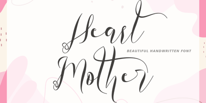 "Heart Mother" is a unique and beautiful handwritten font. This font is equipped with lowercase, uppercase, ligatures, numerals, punctuation, and multilingual support. Suitable for weddings, engagements, stickers, posters, prints, invitations, and others.
 - Blackburn by E-phemera,
$20.00Blackburn is a distressed text font designed to capture the look of old printing at small sizes. Based on a 19th century French type specimen, it contains a complete international character set. - Mstov by Baqoos,
$18.00 Mstov is an alacritous kooky tech display typeface apt for headline, editorial, branding, packaging, printed materials and typographic applications. 220+ glyphs with ligatures and fractions provided in opentype .otf and .woff format.
 - Arepo by Stone Type Foundry,
$49.00 Arepo is a display typeface inspired both by the Imperial Roman letter and the forms of Giambattista Bodoni. Together with Stone Print, SFPL, and Cycles it makes up a superfamily of typefaces.
 - Autumnal by Seemly Fonts,
$12.00 A lovely handwritten typeface is called Autumnal. For stationery, logos, t-shirts, paper, print design, website headers, picture frames, flyers, album covers, posters, image sliders, and other things, this typeface is ideal.
 - Classy Wishes by Seemly Fonts,
$14.00 Classy Wishes is a display font. Classy Wishes is perfectly suited for stationery, logos, t-shirt, paper, print design, website headers, photo frames, flyers, music covers, posters, image sliders, and much more.
 - Godehyda by Anomieka,
$13.00 It's smooth, it's cute, it's fun, and it's mighty tasty: it's Godehyda! It is perfect for headings, flyer, greeting cards, product packaging, book cover, printed quotes, logotype, apparel design, album covers, etc.
 - Bloop by Robert Petrick,
$19.95 Bloop is a versatile bold new cartoon font that is great for the web, video, print headlines or product logos. It is a hot, contemporary, very readable design with language character function.
 - Manohara Pro by BBA Key,
$17.00 Introducing Manohara Pro Family, a new modern font. Manohara Pro is perfect for stationery, logos, t-shirts, paper, print designs, website headers, photo frames, leaflets, music covers, posters, image sliders and more.
 - Mykonos by Deniart Systems,
$20.00 A geometrical, modern, angular design inspired by the Greek Key. It's complex yet simple, creating smooth, continuously flowing print. This font is well suited for headlines, posters, greeting cards, and much more.
 - Pleasing Moment by Seemly Fonts,
$14.00 Pleasing Moment is a striking display font. It is perfectly suited for stationery, logos, t-shirt, paper, print designs, website headers, photo frames, flyers, music covers, posters, image sliders, and much more.
 - Costumed Hero JNL by Jeff Levine,
$29.00 Comic books are filled with pages full of the daring adventures of crime fighters with colorful costumes, amazing abilities and wondrous powers. They have enthralled kids of all ages since the 1930s. Costumed Hero JNL emulates both the hand lettered cover titles of those vintage comics as well as the title credits from a 1960s television show based on one of these characters. With its non-conforming letter shapes and varying widths, the lighthearted look of classic comic title art can be yours. The font is available in both regular and oblique versions.
 - Kickback by Comicraft,
$39.00 Joe Canelli is a crooked cop working in a corrupt police force. Joe is haunted by nightmares of powerlessness. When his partner is brutally murdered and he's betrayed by his colleagues, it appears that Joe's nightmares are coming true. With his back against the wall there's only one thing he can do -- turn against the criminal network that he once embraced... KICKBACK is a fast-paced, action-filled, noir-style, crime thriller from the co-creator of V FOR VENDETTA, David Lloyd. KICKBACK is also a font. This one.
 - Knobbly Knees by Comicraft,
$- Comicraft's latest joint has us swollen with pride! This one caps 'em all! Yes, it may look a little bony and stick out at right angles to our shins, but we reckon we'll win the a whole bunch of contests with this one... if we get up off our haunches and hobble up on stage. Trust your knee jerk reaction and download KnobblyKnees now, they look good on Kate and Angelina, they'll look good on you too! Features: Five fonts (Regular, Bold, Light, Broken & Open) with upper and lower case characters.
 - Daddy's Hand by Breauhare,
$39.00 Daddy’s Hand is based on the actual handwriting of my dad. He always prided himself on his fine penmanship, and to see him write was kind of like watching a ballroom dance--his pen would smoothly and elegantly waltz across the paper as he wrote, gliding effortlessly. I know if he were alive today he would be quite honored that his handwriting is now a font. This font can be used for all sorts of elegant occasions or advertising, and has ligatures & alternate letters. Digitized by John Bomparte.
 - Rondell by Scrowleyfonts,
$12.00 Rondell was originally designed in 2011 as a reasonably priced variable width and weight font. There were a couple of things about it that I didn't like and so I withdrew it from sale. Since then I have found myself using it for many different projects and have realised how useful and versatile it is. Therefore I have fixed the things I didn't like about it and it is now available again. Rondell is a simple, smart, sans serif font. Rounded corners make it slightly informal and friendly.
 - Havelock by XO Type Co,
$40.00 Four interchangeable all-caps typefaces, made specifically for designers to layer and play with. Here’s more at the designer’s site. It combines hard and soft, geometry and pattern. Layer and mix styles within a single word, retaining coherent visual tone. Havelock Solid operates as a background layer, Multiline sits nicely atop it, Inline frames Multiline’s center strokes, and Stencil lets details peek through. If you’re working with translucent color, the blending can be gorgeous. Please note, if you're also looking at Havelock Titling: both collections are included in Havelock Complete for a lower price.
 - Cat Burglar PB by Pink Broccoli,
$16.00 Cat Burglar is another off-kilter sans-serif font by Pink Broccoli, this time inspired by the titling of a 1961 Looney Tunes cartoon called "The Pied Piper of Guadalupe". As with some of my previous type designs, it is a typographic drunken stumble, wonderfully and awkwardly stumbling across designs, surprising with each letter typed. With an extensive character set, and offbeat letter weighting, Cat Burglar is fun to typeset with, with a collection of double letter ligatures, as well as discretionary ligature combinations that add to the quirky playfulness.
 - Mayonaise by Hanoded,
$8.00 Ah, so you've noticed a typo! Mayonnaise - the sauce, is written with double 'n'! I know. This font was named after a Smashing Pumpkins song that I like very much. Mayonaise is a bit of an ugly duckling. It is strange, open and messy, and might not be love at first sight. BUT, when you spend some time with Mayonaise and get to know her, you might actually fall in love. Just like that song I mentioned earlier. Go on then, give it a try! At this price, you can't go wrong!
 - Zentral by Wilton Foundry,
$29.00 My goal in designing Zentral was to create a distinctive sculptural font intentionally in Regular and Italic only. I believe Zentral Regular and Italic has the latitude and flexibility needed in most type scenarios without having to resort to multiple weights. Zentral Regular upper/lowercase provides a very pleasant contrast and can be varied by using Zentral Regular capitals. Zentral Italic is ideal for creating emphasis of words, quotes or phrases. This combination provides maximum impact and readability. Zentral is a contemporary font ideal for branding, packaging, advertising, editorial in print and e-print applications.
 - MVB Peccadillo by MVB,
$39.00MVB Peccadillo is an interpreted revival of a metal typeface popular in the 19th Century, then known as Skeleton Antique. Highly condensed with extra short descenders, the face makes a big impact in a narrow space. Holly Goldsmith worked from letterpress-printed specimens of 96-point, antique metal type, deliberately retaining subtle distortions due to type wear and letterpress impression. Alan Dague-Greene, referring to printed samples of Skeleton Antique, adapted the design to create two additional optical sizes: “Eight” for smaller text and “Twenty-four” for subheads. - Andara by BonjourType,
$15.00 'Andara' is a handwritten font. We created this font for any modern branding brand. Unique and natural hand touch gives a different impression, this can make attention to take a closer look at your brand. Some agencies like this font for branding modern products, you can also make a large number of logos with one font as this font is suitable for use on web logos, signatures, portfolios, prints, headers, magazines, book covers, printed t-shirts, crafts, and cosmetic packaging. Hope this is a font worthy of your collection. Thank you,
 - Burdigala Semi Serif by Asgeir Pedersen,
$19.99Burdigala is a clean-cut, modern yet classic typeface inspired by Didones and Aicher’s Rotis family. The Semi Serif is ideal for larger amounts of (printed) texts in brochures, magazines and books. It is slighty narrow in order to conserve space, but spacious enough to faciliate reading and overall clarity. The expanded versions of the semi serif, being wider and more open, works equally well in media intended both for print and on-screen reading, e.g. in Pdf-documents etc. Burdigala is the ancient Roman name of the city of Bordeaux France. - Dacttelyons by Sitintahitam,
$27.00 Dacttelyons is a blackletter typeface inspired by gothic era, and this typeface perfect for people looking for vintage with dark feel. Dacttelyons suitable for any graphic designs such as branding materials, t-shirt, print, logo, poster, packaging .etc ADDITIONAL INFORMATION For upgrading license please contact me. Upgraded licenses are required for apps, books, television, commercial exhibition, film, gaming, print on demand products, etc. simply email me to : hastohst@gmail.com We hope you enjoy the font, please feel free to comment if you have any thoughts or feedback. Thanks for purchasing and have fun! Cheers 🍻
 - Anicon Slab by NREY,
$79.00 Anicon Slab font consist of 18 weight: from Thin to Black with each weight paired by italic. Also including Latin & Cyrillic language support with more than 35 languages. Anicon is a fonts superfamily, semicondensed sans serif and slab serif with humanistic forms of characters. This font was crafted with the intention to present a clean, legible, multipurpose font family that is easy to read wether it's on screen or print. Fit for all purposes; text, display, headline, print, corporate identity, logo, branding, product, infographic, photography and other application and medium.
 - Sho by Linotype,
$29.99Karl Georg Hoefer’s Sho first appeared in 1992 with Linotype-Hell. The font is a part of the package Calligraphy for Print, which also contains Ruling Script and Wiesbaden Swing. Calligraphy for Print 2 completes the set. These packages offer modern calligraphy fonts particularly well-suited to use in posters, magazines and advertisements. Sho distinguishes itself in the extreme contrast between the strokes. A unique characteristic of the font is the way it uses simple round forms in some of its letters, giving it a peppy and playful feel. - HWT Mardell by Hamilton Wood Type Collection,
$24.95 The Hamilton Wood Type & Printing Museum staff is honored to partner with New York-based graphic designer Louise Fili on her first font release project. The new font, “Mardell,” is named for Hamilton retiree and wood type cutter Mardell Doubek. This is the fourth font to be cut for the museum as part of the Wood Type Legacy Project. "The bold, lively angularity of Italian futurist letterforms made it a natural choice for wood type.” says Fili. This digital version presents Fili’s wood type design for use in web and print applications.
 - Astine Sophiya Script by madjack.font,
$13.00 Astine Sophiya Script, a handwritten script font inspired by handwriting with an aesthetic touch. Aliya Script is flexible enough for web and print and can be used in a variety of projects such as stationery, packaging, apparel, wedding stationery, prints, quotes, social media graphics, planners, greeting cards, logos, branding and much more. The script includes a set of uppercase characters, numbers, symbols, two sets of lowercase letters, and ligatures. Complete Set of standard alphabet and punctuation marks Additional set of brushed lowercase endings Handwritten ligature. Thank you so much for checking out my shop!
 - Anicon Sans by NREY,
$19.00 Anicon Sans font family consist of 18 weight: from Thin to Black, each weight paired by italic. Also including Latin & Cyrillic language support with more than 35 languages. Anicon is a superfamily, semi condensed sans serif and slab serif with humanistic forms in the characters. This font was crafted with the intention to present clean, legible, multipurpose characters that are easy to read wether it's on screen or print. Fit for all purposes; text, display, headline, print, corporate identity, logo, branding, product, infographic, photography and other applications and medium.
 - Athelas by TypeTogether,
$65.00 An attempt to go back towards the beauty of fine book printing, inspired in Britain's literary classics. Athelas takes full advantage of the typographic silence, that white space in the margins, between the columns, the lines, the words, the lettershapes and finally, within the characters themselves. It is also intended to take advantage of the great advances and technical developments made in offset printing. Athelas shows its best side in finely crafted book editions and good printing conditions. Athelas has a large character set that covers most of the languages that use the Latin script. Although inspired in British literature, this typeface respects the cultural values behind different languages, where diacritic marks have an utterly important role. Athelas features four weights and about 800 characters per weight, including small caps, discretionary ligatures, fractions, a complete range of numerals for every use and a set of ornaments and arrows.
 - Pobla by Tipo Pèpel,
$22.00 Optimum readability in small bodies with scarce interlining, under poor printing conditions such as in newspapers, where velocity and bad quality’s irregular surface papers, truly distort strokes was the challenge taken. Pobla was designed with this in mind, hence Patau present a hybrid between the conventional strokes of a serif’s classical roman type and markedly “fractured” forms inside, providing a unique personality to this typographic family, where calligraphic’s humanistic axis is visibly broken with the straight axis of the fabricated letters. Subtle details in the serifs, give it a modern look to a classic skeleton. Very pronounced ink traps get the shapes rounded in the printed product to artificially increase the average medium-eye and promote reading in the small sizes it was designed for. An absolutely handwriting look for the italics, where the rupture of the stroke marks a white’s subtle change to only whisper in the printing surface a slight difference, but without fuss and so not to break the rhythm of reading. And as we are used to, a complete set of OpenType features, where you will find small caps, fractions, ligatures, old numerals and tabular, discretionary ligatures and support for 220 languages; and all available in twelve weights to meet the needs of any newspaper printing.
 - Polias by Esintype,
$23.00 Polias is an all-caps uniwidth typeface inspired by an ancient inscription carved on a monoblock stone in hybrid characters — between no-contrast linear sans to low-contrast flared serif. The inspiring inscription is the dedication by Alexander the Great, discovered in the Temple of Athena Polias in the ancient Ionian city of Priene. Stanley Morison mentioned this inscription in one of his lectures: “The distinctive feature of this inscription consists of a consistent thickening towards the ends of perpendiculars and horizontals.” … “We have not the right to say that the serif was invented for Alexander the Great's inscription, only that this is its first datable appearance.” The letter proportions are almost identical to the original, but the stroke features have been reinterpreted and characterized. Serif-like nodes at the end of the strokes are subtle extensions that serve to accentuate rather than break its monoline elegance. With an analogy, they are not flowers, but like blooming buds. Polias is a flared sans typeface which is closer to sans-serif forms on the spectrum between sans and serif. It’s especially light looking by design to convey rather thin and white typographic color of its original monumental look. It comes in eight weights and a variable font, scaled from Thin to Bold. It is multiplexed, so the weights do not affect text lengths. Light weights are closely based on the actual carving of the inscription. Thicker weights can be used on smaller typesettings to compensate for the weight difference of larger letters’ strokes, and to keeping the monoline appearance of the entire text block intact. This method can be used for any purpose, such as setting a hierarchy between the lines or to justify their lengths. Some of the original letterforms have been preserved and stylistic alternatives such as Ionic four-bar Sigma, dotted Theta, palm Y are provided as open type feature. Some of the other ancient forms, such as the three-bar Sigma (S), the pointed U, were also added for both the Greek and Latin scripts. Polias is preferable for big type settings such as logos and headlines as a modern representation of perennial classical forms. Its a fine fit for product branding, movie posters, book covers, packaging materials, and more, which require an epic look to attracting attention with a distinctive elegance. Polias can be considered for distinctiveness wherever Roman Capitals work. As a noun, Polias is one of the epithets of Athena / Minerva, and in this case referring to her role as the protector of the city of Priene. Polias is one of the seven typeface designs in Esintype's ancient scripts of Anatolia project, Tituli Anatolian series.
 - Polias Varia by Esintype,
$140.00 Polias Varia is an all-caps uniwidth variable weight typeface inspired by an ancient inscription carved on a monoblock stone in hybrid characters — between no-contrast linear sans to low-contrast flared serif. The inspiring inscription is the dedication by Alexander the Great, discovered in the Temple of Athena Polias in the ancient Ionian city of Priene. Stanley Morison mentioned this inscription in one of his lectures: “The distinctive feature of this inscription consists of a consistent thickening towards the ends of perpendiculars and horizontals.” … “We have not the right to say that the serif was invented for Alexander the Great’s inscription, only that this is its first datable appearance.” In Polias Varia, the letter proportions are almost identical to the original, but the stroke features have been reinterpreted and characterized. Serif-like nodes at the end of the strokes are subtle extensions that serve to accentuate rather than break its monoline elegance. With an analogy, they are not flowers, but like blooming buds. Polias Varia is a flared sans typeface which is closer to sans-serif forms on the spectrum between sans and serif. It’s especially light looking by design to convey rather thin and white typographic color of its original monumental look. It comes in eight weights and a variable font, scaled from Thin to Bold. It is multiplexed, so the weights do not affect text lengths. Light weights are closely based on the actual carving of the inscription. Thicker weights can be used on smaller typesettings to compensate for the weight difference of larger letters’ strokes, and to keeping the monoline appearance of the entire text block intact. This method can be used for any purpose, such as setting a hierarchy between the lines or to justify their lengths. Some of the original letterforms have been preserved and stylistic alternatives such as Ionic four-bar Sigma, dotted Theta, palm Y are provided as open type feature. Some of the other ancient forms, such as the three-bar Sigma (S), the pointed U, were also added for both the Greek and Latin scripts. Polias Varia is preferable for big type settings such as logos and headlines as a modern representation of perennial classical forms. Its a fine fit for product branding, movie posters, book covers, packaging materials, and more, which require an epic look to attracting attention with a distinctive elegance. Polias Varia can be considered for distinctiveness wherever Roman Capitals work. As a noun, Polias is one of the epithets of Athena / Minerva, and in this case referring to her role as the protector of the city of Priene. Polias (family) is one of the seven typeface designs in Esintype’s ancient scripts of Anatolia project, Tituli Anatolian series.