10,000 search results
(0.032 seconds)
- Fearful House by Seemly Fonts,
$14.00 Fearful House is a brand new display font. Fearful House is perfectly suited for stationery, logos, t-shirt, paper, print design, website headers, photo frames, flyers, music covers, posters, image sliders, and much more.
 - Instinct Question by Seemly Fonts,
$14.00 Instinct Question is a brand new display font. Instinct Question is perfectly suited for stationery, logos, t-shirt, paper, print design, website headers, photo frames, flyers, music covers, posters, image sliders, and much more.
 - Cute Rabbit by Seemly Fonts,
$14.00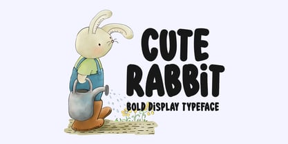 Cute Rabbit is a friendly and sweet display font. It is perfectly suited for stationery, logos, t-shirt, paper, print design, website header, photo frame, flyer, music cover, poster, image slider, and much more.
 - Striking Rainbow by Seemly Fonts,
$14.00 Striking Rainbow is a brand new display font. Striking Rainbow is perfectly suited for stationery, logos, t-shirt, paper, print design, website header, photo frame, flyer, music cover, poster, image slider, and much more.
 - Gladsome Morning by Seemly Fonts,
$14.00 Gladsome Morning is a cool, clean, and simple display font. It will look stunning on any food packaging design, poster, flyer, or print. Use this font for your designs and explore its endless possibilities.
 - Shy Darling by Seemly Fonts,
$14.00 Shy Darling is a cool and romantic display font. It is perfectly suited for stationery, logos, t-shirt, paper, print design, website header, photo frame, flyer, music cover, poster, image slider, and much more.
 - Sweet Daydream by Seemly Fonts,
$12.00 Sweet Daydream is a brand new display font. Sweet Daydream is perfectly suited for stationery, logos, t-shirt, paper, print design, website header, photo frame, flyer, music cover, poster, image slider, and much more.
 - Christmas Eve by Seemly Fonts,
$12.00 Christmas Eve is a brand new handwritten font. Christmas Eve is perfectly suited for stationery, logos, t-shirt, paper, print design, website header, photo frame, flyer, music cover, poster, image slider, and much more.
 - Slab Compact JNL by Jeff Levine,
$29.00 Slab Compact JNL was based on the printed title found on the box cover of a 1950s-era word games set called “Lex-O-Grams” and is available in both regular and oblique versions.
 - Expression Exchange by Seemly Fonts,
$14.00 Expression Exchange is a brand new handwritten font. Expression Exchange is perfectly suited for stationery, logos, t-shirt, paper, print design, website headers, photo frames, flyers, music covers, posters, image sliders, and much more.
 - Summer Fable by Seemly Fonts,
$14.00 Summer Fable is a brand new display font. Summer Fable is perfectly suited for stationery, logos, t-shirt, paper, print design, website headers, photo frames, flyers, music covers, posters, image sliders, and much more.
 - Meilesha by Selvia Design,
$13.00 "Meilesha" is a unique and beautiful handwritten font. This font is equipped with uppercase, lowercase, numerals, punctuations, and multilingual support. It is suitable for invitations, weddings, ornaments, logos, banners, posters, prints, branding, and others.
 - Lalibela by CyberGraphics,
$43.00My motivation for designing the Lalibela family (which is based on Bodoni) was to pay homage to Ethiopic script. The script has been around for about 3 000 years, but I took artistic licence to deviate from the original model and add personal touches. I chose Bodoni as a historical model because of its display value and not its text size use because the extreme contrast made it difficult to read at small sizes. A Modern typeface characterized by consistently horizontal stress, flat and un-bracketed serifs, and a high contrast between thin and thick strokes, were the final step in typography two-hundred-year journey away from calligraphy. The austerity, simplicity and greater contrast style was perfected.Contrary to all the refinements in Bodoni, I have revisited calligraphy with the font Lalibela that mimics Ethiopic Script. It was drawn with a much larger x height and less geometric than Bodoni for its primary use as a display font. For example, a lot of italic serifs were added to the roman face as well as 16 additional ligatures to obtain more a feel of calligraphy. I made the serifs thicker and bracket one side with straight steps obtaining a reduced contrast to withstand breaking up at smaller sizes.An additional variant, "Lalibela Alternate" was designed to provide an interesting mixing possibilities with the Bold face for more expressive headlines. - Blend by Typesenses,
$49.00 Blend is a hand drawn collection that takes its cues from the visual universe of bakeries and coffee shops. The name refers to the combining of different kinds of coffee beans to get a balanced taste, and Blend does just that, although here each typographic flavor can also be enjoyed separately. Projects such as branding, children’s books, wedding invitations and labels are sweetened with this cute family. The bouncing informal Script programmed with Open Type offers a wide range of features like ligatures, swashes, endings, initial forms and lots of alternates. Use professional software that widely support Open Type features. Otherwise, you may not have access to some glyphs. Keep the Standard Ligatures feature always active. For further information about features and alternates, see the User Guide Blend has extensive Western, Central and Eastern European language support. Make some coffee and enjoy!
 - VTC-TribalThreeFree - Personal use only

- Snickles - 100% free

- Basque by Monotype,
$29.99Basque is a delicate nineteenth-century upright typeface of angular appearance, reminiscent of Black Letter scripts. The letterforms of the Basque font do not flow, but are made up of straight lines joined to form a rigid shape. - TA Bankslab by Tural Alisoy,
$33.00 The building of the Northern Bank of St. Petersburg's Baku branch was built in 1903-1905. It was the first Art Nouveau-style building in Baku, Azerbaijan. Later the bank was transformed into the Russian-Asian Bank. After the oil boom in Baku in the 19th century, branches of many banks and new banks were opened in the city. The branch of the Northern Bank of St. Petersburg was among the first banks that was opened in Baku. N.Bayev was the architect of the building for the branch of the Northern Bank of St. Petersburg located at Gorchakovskaya 3 in 1903-1905. The building currently houses the Central Branch of the International Bank of Azerbaijan. My purpose in writing this is not to copy and paste the information from Wikipedia. What attracted me to the building was the word "Банкъ" (Bank) written in Cyrillic letters, which was also used in Azerbaijan during the Soviet era. The exact date of the writing is not known. Every time I pass by this building, I always thought of creating a font of this writing someday. I had taken a photo of the building and saved it on my phone. I did a lot of research on the font and asked a lot of people. However, some did not provide information at all and some said they did not have any information. I was interested in the history of this font but I do not know if this font really existed or it was created by the architect out of nowhere. If there was such a history of this font, I wanted to recreate this font and make it available. If not, I had to create it from scratch in the same way, using only existing letters on the building. Finally, I made up my mind and decided to develop the font with all letters I have got. It was difficult to create a font based on the word, Банкъ. Because in the appearance of the letters, the midline of the letters on A, H, K was very distinct, both in the form of inclination and in more precise degrees. The serif part of the letters, the height of the upper and lower sides, differed from each other. I don't know whether it was done this way when the building was constructed or it happened over time. I prepared and kept the initial version of the font. I took a break for a while. I started digging on the story of the font again. Meanwhile, I was researching and got inspired by similar fonts. Unfortunately, my research on the font's history did not yield any results. I decided to continue finishing up the font. After developing the demo, I created the font by keeping certain parts of these differences in the letters. In addition, I had to consider the development of letters in the Cyrillic, as well as the Latin alphabet, over the past period. Thus, I began to look at the appearance of slab-serif or serif fonts of that time. In general, as I gain more experience in developing fonts, I try to focus on the precision of the design for each font. In recent years, I specifically paid attention to this matter. YouTube channel and articles by Alexandra K.'s of ParaType, as well as, information and samples from TypeType and Fontfabric studios on the Cyrillic alphabet were quite useful. I gathered data regarding the Latin alphabet from various credible sources. I do not know if I could accomplish what I aimed at but I know one thing that I could develop the font. Maybe someday I'll have to revise this font. For now, I share it with you. I created the font in 10 styles. 7 weight from Thin to Extra Black, an Outline, Shadow, and Art Nouveau. The Art Nouveau style was inspired by the texture in the background used for the text on the building. The texture I applied to capital letters adds beauty to the font. If you like the font feel free to use it or simply let me know if your current alphabet doesn't support this font.
 - TA Bankslab Art Nouveau by Tural Alisoy,
$40.00 TA Bankslab graphic presentation at Behance The building of the Northern Bank of St. Petersburg's Baku branch was built in 1903-1905. It was the first Art Nouveau-style building in Baku, Azerbaijan. Later the bank was transformed into the Russian-Asian Bank. After the oil boom in Baku in the 19th century, branches of many banks and new banks were opened in the city. The branch of the Northern Bank of St. Petersburg was among the first banks that was opened in Baku. N.Bayev was the architect of the building for the branch of the Northern Bank of St. Petersburg located at Gorchakovskaya 3 in 1903-1905. The building currently houses the Central Branch of the International Bank of Azerbaijan. My purpose in writing this is not to copy and paste the information from Wikipedia. What attracted me to the building was the word "Банкъ" (Bank) written in Cyrillic letters, which was also used in Azerbaijan during the Soviet era. The exact date of the writing is not known. Every time I pass by this building, I always thought of creating a font of this writing someday. I had taken a photo of the building and saved it on my phone. I did a lot of research on the font and asked a lot of people. However, some did not provide information at all and some said they did not have any information. I was interested in the history of this font but I do not know if this font really existed or it was created by the architect out of nowhere. If there was such a history of this font, I wanted to recreate this font and make it available. If not, I had to create it from scratch in the same way, using only existing letters on the building. Finally, I made up my mind and decided to develop the font with all letters I have got. It was difficult to create a font based on the word, Банкъ. Because in the appearance of the letters, the midline of the letters on A, H, K was very distinct, both in the form of inclination and in more precise degrees. The serif part of the letters, the height of the upper and lower sides, differed from each other. I don't know whether it was done this way when the building was constructed or it happened over time. I prepared and kept the initial version of the font. I took a break for a while. I started digging on the story of the font again. Meanwhile, I was researching and got inspired by similar fonts. Unfortunately, my research on the font's history did not yield any results. I decided to continue finishing up the font. After developing the demo, I created the font by keeping certain parts of these differences in the letters. In addition, I had to consider the development of letters in the Cyrillic, as well as the Latin alphabet, over the past period. Thus, I began to look at the appearance of slab-serif or serif fonts of that time. In general, as I gain more experience in developing fonts, I try to focus on the precision of the design for each font. In recent years, I specifically paid attention to this matter. YouTube channel and articles by Alexandra K.'s of ParaType, as well as, information and samples from TypeType and Fontfabric studios on the Cyrillic alphabet were quite useful. I gathered data regarding the Latin alphabet from various credible sources. I do not know if I could accomplish what I aimed at but I know one thing that I could develop the font. Maybe someday I'll have to revise this font. For now, I share it with you. I created the font in 10 styles. 7 weight from Thin to Extra Black, an Outline, Shadow, and Art Nouveau. The Art Nouveau style was inspired by the texture in the background used for the text on the building. The texture I applied to capital letters adds beauty to the font. If you like the font feel free to use it or simply let me know if your current alphabet doesn't support this font.
 - Stray by Tour De Force,
$25.00 Stray might be the lonesome cowboy in this big odd world, but it's his just public façade. Stray is handsome player that works well with any team or in any environment. He doesn't have a horse, but he can be the one, he can carry any weight. OK, let's talk serious now: Stray is distinctive geometric sans serif family in 9 weights and matching Italics. By it's design, Stray flirts with humanistic typefaces in some elements, while on the other side, we can see vintage letter forms as well. It is well balanced typeface, fully legible in any (reasonable) size, with power to present versatile tasks and situations. Specific joining of letter stem and bowl is one of design characteristics of Stray, so it is not just another geometric sans family, it really differs in it's own details. Contains extended Latin character map support and Cyrillic (no localizations, sorry). As any serious working horse family, it is equipped with decent OpenType features like Small Caps (for basic Latin only), Fractions, Tabular Figures, Denominator, Numerator, Ordinals and Ligatures. It also comes with small interesting set of dingbats. This Stray is not homeless, he just looks for the proper job :-)
 - Changstein - Unknown license

- KG Something To Believe In by Kimberly Geswein,
$5.00 Highly legible writing with a painted, stamped effect.
 - Crox by NumidiaType,
$25.00 Crox™ is a sans-serif professional typeface inspired by crude geometry, creativity, and art. In the font family, there are 19 styles, including upright and italic, It is constructed of big lowercase letters with a maximum x-height for excellent optical reading. English letters are supported as a numerator and denominator set, this feature may aid in the creation of fractions using letters and numbers, as well as for sophisticated scripting and various scientific fractions forms. All weights support over 25 professional OpenType features within each style, with extensive coverage of western languages. These features were originally planned for personal and professional use, including multi-alternative characters in Styles: 1, 2, 4, 10, 11. Operational styles 6, 7 are enhanced with some scientific forms, to write the fit derived (SI units' expressions). Otherwise, it supports a wide range of professional factory pricing styles for business and marketing, as well as retail pricing styles in Sets 5, 8, and 9, with ligatures, old-style numerals, ordinals, swashes... Crox™ is enhanced with a poster weight like the fantastical type to fulfill your creative needs in three styles: poster, poster oblique, and poster italic for ADS and web design, branding, or product design. Glyphs: More than 970 glyphs, including those accessible with OpenType features. Powerful OpenType features: Standard Ligature, Alternate access, Automatic ordinals (English, French...), Case sensitive, localized forms, Numerator set, Denominator set, Subscript, Superscript, Swash, Stylistic alternate, Styles 1,2,3,4,5(Pricing style 1), 6(Derived Units),7(Advanced Fractions for Scientific units, Derived Units Vulgar Form), Set 8 (Pricing Style 2), Set (Pricing Style 3), Proportional Old-style, Tabular Old-style, Proportional Lining, Tabular Lining, Zero with slash, Fractions (Default, Automatic). Suitable for: logo and modern branding, web design, packaging, Product packaging, Articles, scientific document, Product user guides, multiple works in the Media, Design, ADS... Specimen Crox™ is a trademark of Yassine Abdi.
 - Vitrina by Design is Culture,
$39.00 Vitrina is a script based on letterforms painted on a window for a restaurant called "Latin American Cafeteria". Its quirky script forms are meant to evoke a sense of hand painted signage. Vitrina means "store front window" in Spanish.
 - SURROUNDED large - Unknown license

- Dialog by Linotype,
$39.00Dialog is my first sans serif. I had made some attempts earlier, but they didn't satisfy me. Dialog was, on the contrary, so inspiring that I made 19 different fonts of it, the most complete typeface for several years. I usually prefer typefaces with serifs, but I don't miss them in Dialog. The name needs no explanation. Dialog was released in 1993. - Arial by Monotype,
$45.99 Arial is one of the most widely used designs of the last 30 years. Drawn in 1982 by Robin Nicholas and Patricia Saunders for use in an early IBM® laser printer, Arial has become a staple for textual content. While it is widely believed that Arial's design was based on Helvetica, it is more accurate to consider Monotype Grotesque as its ancestor.
 - TE Alnaskh Quraan by Tharwat Emara,
$10.00 It is known as the Alnaskh Quraan Font for its extensive use in the copying and transmission of books because it helps the writer to write more quickly than any other font since the Islamic times and then Alnaskh Quraan font wrote the "Quran"And the advantages of Alnaskh Quraan font are clarifying the letters and show their beauty and splendor.
 - Hebrew Text Tanach by Samtype,
$125.00 This is a font to build a Hebrew Bible (Tanach) or any Hebrew prayer book. Magalith Tanach Pro has all Unicode Hebrew marks and others like ShevaNa, Dagesh Chazak, Qamats Katan, and Cholam Chaser. You can even hide marks You don't want to use. This font has a complex and exclusive Programmation of Opentype features. Adobe InDesign is the best program to use.
 - Retrofield by Mightyfire,
$15.00 Hello! Retrofield is here! With a cute, playful and bold looks, Retrofield bring happiness for both of writers and readers. If you want to write something fun, happy and cheerful, we suggest you to use Retrofield. Hope Retrofield can boost the appearance your text. Enjoy this font in your children book, birthday card, fun poster, comic book, and any other arts. :)
 - Rigney by Solotype,
$19.95Bill Rigney, an old job printer in my home town, established his shop in 1896, closed it in 1900 to take a steady job, stored the equipment in a large shed, and reopened for business upon his retirement in 1950. What a find! A bonanza of old type! We became good friends and upon his death I bought the type. Bless you Bill. - Adrenalina by BRtype,
$25.00 Adrenalina was created in 2003-2007. In 2014 the project was revised and became a font family. The character set was drawn through digital manipulation from photos of pichações taken in São Paulo - Brazil. Pixação is a form of tagging that comes from Brazilian graffiti writers. This style of pichação (or pixação) is also known as tag reto (straight tag).
 - Nouvelle Vague by Anatoletype,
$22.00Nouvelle Vague is a display script typeface of a distinguished look defined by a steady rhythm, only broken by its offbeat, dynamic uppercase initials. It's directly inspired by french advertising scripts from the fifties, particularly by Roger Excoffon's Mistral. In order to accentuate this influences and to reproduce their graphic impact, simply structured connections between letters are preferred over OpenType fanciness. - DeVinne by Linotype,
$29.99 DeVinne Ornamental is a display typeface from the famous Parisian typefoundry Deberny & Peignot, developed around 1900. Its style has become synonymous with the Art Noveau period, which was raging internationally when DeVinne Ornamental's letters were first drawn. The typeface is named after the renowned American printer Theodore Low DeVinne (1828-1914). Optimal uses for DeVinne Ornamental include headlines in magazines and newsletters.
 - Easy Eights NF by Nick's Fonts,
$10.00Here's a faithful rendering of a typeface originally named Octic, from the 1884 specimen book of the Palmer & Rey Type Foundry of San Francisco. Its geometric severity is softened by the gently scalloped "bites" taken out of the corner. Sets tight to make attention-getting headlines. Both versions contain the complete Latin 1252, Central European 1250 and Turkish 1254 character sets. - Turpentine Kisses by Bogstav,
$18.00 Based loosely on Clarendon, Turpentine Kisses breaks all the rules of the classic serif fonts. It's jumpy and bouncy with a clear handmade look. It's playful yet legible, and full of personality. I've added 3 different versions of each lowercase letter, and they automatically cycle as you type. Or you can just select the one you prefer from the glyph menu.
 - Hebrew Moses Std VF by Samtype,
$120.00 his is a beautiful, modern, and super readable font. You can use it in any kind of text, from folders to prayer books. This font is especially good for school and kid's books. This font also has modern punctuation: shevana, kamats katan, dagesh hazak, and holam chaser. This is a Variable font! One font with 5 styles (Regular, Medium, SemiBold, Bold, Heavy)
 - London Court by Greater Albion Typefounders,
$16.50 London Court is a family of three 'Tudor Revival' display faces, inspired by an inscription seen underneath a clock in a splendid Tudor revival arcade in Perth, Western Australia. The resulting typeface designs are similarly 'Tudor Revival' or if you prefer 'Tudorbethan'- Roman with Blackletter details. Ideal for creating headings and posters which have an 'Olde-Worlde' feel with modern legibility.
 - Springsteel by Paragraph,
$21.00 Introducing Springsteel, a new display sans serif with an unusual construction: curved lines on the outside with only a few straight lines on the inside. The resulting typeface shows a great deal of tension and dynamics. Preferably, it should be used at larger sizes, at smaller sizes only for special effects. It was spaced and kerned by Igino Marini/iKern.
 - Stay Calm by Nathatype,
$29.00 A typography can often be a deniable, yet crucial factor in designs’ displays and nuances. Additionally, it may be hard to find prominent, elegant, catchy fonts, whereas customers can easily forget designs without the right typography and remember nothing about your brands. Even the most interesting designs will look dull and too ordinary with inappropriate fonts. Therefore, we would like to introduce you to the Stay Calm, the perfect font option to create prominent designs. Stay Calm is an elegant, prominent display serif font to attract everybody's attention. It has bigger and thicker font proportions than the other ordinary serif fonts as its character to ease people to see it in big text sizes. Such unique characters as curvy thin lines and big, protruding dots, make this font suitable to create unique, interesting designs and applicable for bigger text sizes. You may also enjoy the available features here. Features: Ligatures Multilingual Supports PUA Encoded Numerals and Punctuations Stay Calm fits best for various design projects, such as brandings, posters, banners, headings, magazine covers, quotes, invitations, name cards, printed products, merchandise, social media, etc. Find out more ways to use this font by taking a look at the font preview. Thanks for purchasing our fonts. Hopefully, you have a great time using our font. Feel free to contact us anytime for further information or when you have trouble with the font. Thanks a lot and happy designing


