10,000 search results
(0.047 seconds)
- The Spooky Night by AEN Creative Studio,
$14.00 The Spooky Night is an incredibly unique and interesting display font. Add it to your creative Halloween themed ideas and notice how it will make them stand out! The only limit is your imagination!
 - Classic Heritage by Gleb Guralnyk,
$15.00 This vintage typeface named "Classic Heritage" has a steampunk look and was inspired by old-school lettering styles. The 13 stylistic alternate letters can help you to create a unique and interesting text composition.
 - PIXymbols Signet Oldstyle by Page Studio Graphics,
$29.00Create old style initials, evoking traditional printers' marks for stylish business or personal stationery. Includes 37 borders, each accessed by a single keystroke, which will automatically line up with the letters in the monogram. - Remind Him by Seemly Fonts,
$12.00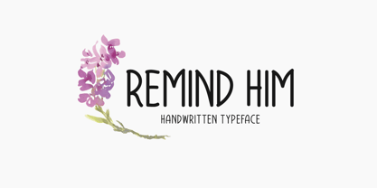 Remind Him is a cute and simple lettered handwritten font that can be used for all chalkboard quotes or teaching material! Its authentic look will add a personal and realistic feel to your designs.
 - Qara by Gholib Tammami,
$15.00 Qara is a breathtaking Didot font that exudes elegance, luxury, and an unparalleled sense of fashion. With its sleek and refined design, Qara captures attention and adds a touch of sophistication to any project.
 - Coldfield JNL by Jeff Levine,
$29.00Coldfield JNL is the revival of an old wood type font from Jeff Levine. Clean and easily readable at different point sizes, it is an excellent companion to Twelve Oaks JNL and Ingomar JNL. - Dreaming Christmas by Seemly Fonts,
$14.00 Dreaming Christmas is a striking display font. It can easily be matched to an incredibly large set of projects, so add it to your creative ideas and notice how it makes them stand out!
 - Turquoise Tuscan by Resistenza,
$59.00 A new Version of Turquoise Roman Capitals. With specials Tuscan Serifs to add more engraving feel. Turquoise Tuscan is full of ligatures and awesome alternates. Perfect for big headlines, logos, branding and wine labels.
 - Winter Wonderland by Ake,
$12.00 Winter Wonderland is a cute and simple lettered handwritten font that can be used for all chalkboard quotes or teaching material! Its authentic look will add a personal and realistic feel to your designs.
 - Potenciarte by Nasir Udin,
$25.00 Potenciarte is an all-caps display typeface inspired by the facade of old buildings from the era of Nederlandsch-Indie (1900’s) in Surabaya, where Art Deco & Art Nouveau typographic styles were widely used.
 - Vintage Badges by Decade Typefoundry,
$28.00 An awesome premium quality set of 26 layered badges. It’s a very versatile, “old timey” look, vintage and that can be used as logos, member badges, company badges, stamps, price reductions and much more.
 - Wood Factory by Kustomtype,
$25.00 Wood Factory is a western styled typeface created by Kustomtype. Wood Factory is an old Wood Type favorite. It was designed specifically for display, headlines and titles where a wanted poster look is desired.
 - Seek Truth by Seemly Fonts,
$12.00 Seek Truth is a straightforward lettered display font. Add it to your original ideas to see how it helps them stand out since it can be readily suited to a huge range of projects.
 - Anthom by Aqeela Studio,
$20.00 Anthom is an enchanting handwritten font. This versatile script font has a wide spectrum of applications ranging from greeting cards to headlines and is guaranteed to add a romantic feel to your next project
 - Bomber by Komet & Flicker,
$10.00 Bomber was inspired by the lettering used on the vehicles of the U.S. military. This font works great as an old-school style of athletic lettering. Also included is a fifteen character dingbat set.
 - Well Hope by Seemly Fonts,
$12.00 Well Hope is a cute and simple lettered handwritten font that can be used for all chalkboard quotes or teaching material! Its authentic look will add a personal and realistic feel to your designs.
 - Good Wish by Seemly Fonts,
$14.00 Good Wish is a striking display font. It can easily be matched to an incredibly large set of projects, so add it to your creative ideas and notice how it makes them stand out!
 - UCT Found Receipt by uppercaseTYPE,
$12.99Inspired by the idea of found paper objects, this font centers around a strict grid. Combining dot-matrix printers with subtle serifs, it combines old and new. Recommended usage is as a display font. - Splendid Moment by Seemly Fonts,
$12.00 Splendid Moment is a cute and simple lettered handwritten font that can be used for all chalkboard quotes or teaching material! Its authentic look will add a personal and realistic feel to your designs.
 - Happy Moment by Seemly Fonts,
$12.00 Happy Moment is a cute and tall lettered handwritten font that can be used for all chalkboard quotes or teaching material! Its authentic look and feel will add a realistic feel to your designs.
 - Jumping World by Seemly Fonts,
$14.00 Jumping World s an incomparable display font. It can easily be matched to an incredibly large set of projects, so add it to your creative ideas and notice how it makes them stand out!
 - Dualis by Volcano Type,
$19.00The DUALIS, aka the serif-detesting Garamond, combines specifics of 2 typeclasses: Sans Serif & Antiqua. When the Garamond is too old fashioned and the Optima is worn out, the Dualis will fit the gap. - Magemin by Sealoung,
$25.00 Magemin is an elegant and bold serif font. It is defined by smooth curves and is perfect for fashion branding or editorial designs. Add it confidently to your projects, and you won’t be disappointed.
 - Black Jacky by IbeyDesign,
$19.00 Black Jacky Bold Script Font is versatile script font that has a wide spectrum of applications ranging from greeting cards to headlines and is guaranteed to add a romantic feel to your next project.
 - Ora Sepira by Differentialtype,
$10.00 Ora Sepira is a retro bold serif font. This font is specially designed for a charming, elegant and retro appearance. It is suitable for various types of designs to add luxury to your project.
 - Western Railway JNL by Jeff Levine,
$29.00Western Railway JNL was inspired by sample lettering found in an old sign painter's reference book published during the early part of the 20th Century and modified for today's digital applications by Jeff Levine. - Cabrito Didone by insigne,
$- A graceful kid if ever you’ve seen one, Cabrito Didone joins the Cabrito family of fonts--a family designed to provide young infants with clear recognition of letter forms. The original letters were released as part of the children’s book about fonts, The Clothes Letters Wear. Now, this latest addition brings a new Didone flavor to the table. But don’t judge the book by its cover. While Didones can be stodgy in the way they deliver a sense of luxury, this stubborn goat of a Didone bucks the stodgy stereotypes with its high-contrast, carefree, flowing fun, taking a more calligraphic direction than most. Cabrito Didone joins structure and handwriting to create a flowing balance of both characteristics. It’s a unique combination of functional and friendly. Its 42 well-designed fonts give you plenty of easy-going, highly readable options to work with as you craft your design. The typeface has unique serifs that give the sense of ink pooling slightly at the points, drawn with a sharp nib. Cabrito Didone supports OpenType features and is packaged with upright obliques, alternates, ligatures, old-fashioned figures, and compact caps. Preview any and all of these features in the interactive PDF manual. The family member font also includes glyphs for 72 languages; over 600 glyphs per font await. Cabrito Didone is an excellent choice for websites as well as flyers and packaging. Like Cabrito, which is currently used by a number of visible brands, Cabrito Didone is also a great option for defining your brand. Grab a taste of the Cabrito Didone flavor--and those of the other Cabrito members: Sans, Semi and Inverto.
 - Flink by Identity Letters,
$25.00 The joy of pure geometry, revisited. Geometric typefaces are a staple in every typographer’s toolbox since the 1920s. It was a time when iconic faces such as Futura, Erbar, and Kabel appeared on the scene and turned the world of type upside-down. Inspired by those early giants as well as later epigones with a legacy of their own (such as 1970’s Avant Garde Gothic), Flink is the Identity Letters take on this genre, characterized by a clean and focused appearance. With neat shapes and the look of pure geometry, Flink adapts to a vast range of applications and topics, from the fine print in contract to website body copy to logo design to billboard-size slogans. Its x-height is considerably larger than in classic geometric sans-serif fonts; its proportions are harmonized as opposed to strictly constructed. This makes for a more contemporary look, setting it apart from the classics. To further reduce the rigidity of a purely geometric composition, you can replace some letters with more humanist alternates, such as a, g, j, etc. This font family comes along in 8 weights from Thin to Black. Each weight consists of an Upright and Italic version. There are more than 750 characters per style, including two stylistic sets that offer variations to the look and feel of Flink, making it even more versatile. Plenty of additional Open Type Features like ligatures, case sensitive forms, old-style figures, and symbols make Flink a valuable tool for the discerning typographer. Flink is the reimagination of a classic genre, designed to suit the needs of our time. ––––– Please note: There is an upgraded Version available: Flink Neue
 - CemeteryWalk by Ingrimayne Type,
$5.00 I created CemeteryWalk in 2018 to illustrate a program for a local cemetery walk. CemeteryWalk places letters on pictures of gravestones. In 2022 I expanded the family by placing three different sets of letters on the gravestones. Each of the four different sets of letters on gravestones has two styles, one with black letters on white gravestones and the other with white letters on black markers (the bold style). The bold style can be placed beneath the plain style to add color or texture. All eight styles are caps only, with the lower-case letters having different shapes for the tombstones but the same letters as in the upper case. There is only one set of accented characters and it is where the upper-case letters are found. Each also has an alternate set of characters that are somewhat similar in appearance and it can be accessed using the OpenType feature of stylistic sets. A final typeface in the family is a picture font of items that may be found on old tombstones.
 - Another Grotesk by Aleksandrs Golubovs,
$32.00 Another Grotesk is a contemporary typeface that was inspired by the early grotesques. Upon closer inspection you will notice the terminals of some of the characters are slightly turned inwards, this detail gives Another Grotesk its distinctive and friendly personality. Another Grotesk is functional and has been crafted with a great attention to detail. It is available in 9 weights and two optical sizes with matching italics which adds up to 36 styles. Another Grotesk Text family has been carefully redesigned some of the details were removed and simplified, x-height increased, and ink traps added, but preserved the overall look and feel of the display version, to ensure a greater legibility and clarity in running text. The extensive language support allows type setting in more than 200 languages across Latin, Cyrillic and Greek scripts. Another Grotesk also includes small caps and punctuation, tabular and old-style figures, as well as case sensitive feature and offers stylistic alternates for K, a, g, and y to fulfil any creative need of a designer.
 - Hiatus by Stephen Rapp,
$59.00 Hiatus bridges the gap between formal scripts used for invitations and more classic settings and casual scripts that exude a warmer tone. Like many formal scripts, Hiatus is fully connecting. Its low body height combined with generous letterspacing adds an elegant profile to lines of text. Like casual scripts, Hiatus has a warm, hand-lettered appearance with great rhythm. Solid in structure; Hiatus also sets well at smaller sizes. Type enthusiasts will enjoy the variety of options. For optimal text flow, both letters and ligatures have alternate versions programmed to come in at the appropriate place for both beginnings and endings as well as in various contextual settings. In addition, there are variations and flourished versions of almost every letter and ligature. Some ligatures have as many as 12 variations. Also included are fractions, a set of old-style numbers, and a set of ornamental flourishes. Hiatus is a unique contemporary script with the strength of a time-tested classic. Please note that this version supports a wider range of languages compared with the lower-priced version available through other channels.
 - Palo Slab by TypeUnion,
$30.00 Palo Slab is an epic font family made up of 9 weights in four widths, along with italic & oblique options to total a massive 108 styles. Using our 2020 release Palo as the base, the slab version began to take on its own life and personality to become a unique entity in its own right. From super punchy heavy weights to the delicate lighter weights, the Palo Slab super family is a versatile beast that offers you ultimate flexibility. The heavy weights ranging from Compressed Black to Wide Black are built with super tight spacing and love to be big and bold, so perfect for showing off your brand. The Italic styles add curves to the slab feel, providing a beautiful flow, but we've also included an oblique option if you want to use the blockier version. Palo Slab features extensive latin language support as well as OpenType features such as case sensitive punctuation, old style figures, scientific numbers and ligatures, + arrows. You can check out our 2020 release Palo here.
 - Fielding by AVP,
$25.00 Characterized by generous unstressed curves, subtley waisted stems and asymmetric serifs, Fielding is a great choice for sure-footed stylish text and elegant headlines. Its warm classical forms resolve into highly readable text at any size both on paper and on screen. Six weights and corresponding italics provide a choice of styles while small capitals, superscript, subscript, fractions, a range of ligatures and cameo capitals will add refinement to the most demanding of layouts. Default numerals are of uniform height, a little smaller than capitals and are proportional: not 'old style' in the traditional sense, they nevertheless sit comfortably in general text. Tabular numerals and lining numerals are also available. Italic styles are lighter in weight and freer in form, skipping alongside their upright counterparts to provide pleasing emphasis or variation. The comprehensive latin character set includes eastern European, Baltic and Turkish languages. First designed for a quarterly magazine, Fielding can be used wherever a modern interpretation of tradition is required including branding and packaging, websites, news media, books, general publicity and smart documentation.
 - Arise by Monotype,
$30.00 Arise is a humanist typeface designed for both text and display purposes. Its an understated type family with enough subtle nuances and personality to add distinction to your own typographic compositions. As can be seen in the /a/c/f/g/r/y/ glyphs, hooked terminals are a key feature of this typeface. These terminals are blade-like in appearance, defining a distinctive character that is unusual, yet balanced and refined. Practical features include 38 capital swash alternates for intial and final forms that can be particularly effective when used in titling and branding situations. Small caps are also included (along with matching diacritics) – these are designed to harmonise with regular lowercase forms so that you may easily achieve unicase-style typography. There are 18 fonts altogether, with 9 weights from ExtraLight to Ultra in both roman and italic. Arise has an extensive character set that covers all Latin European languages. Key features: 9 Weights Roman & Italic Small Caps 38 Alternates Old Style Figures European Language Support (Latin) 700+ Glyphs per font.
 - Antique Initials by Kaer,
$19.00 Hello, friends! I have a good news! At last I have finished working on my Antique Initials color font. Wow! It was a long and hard work because every initial is unique. I sketched each letter of the font very scrupulously from scratch. Each letter is uniquely designed and has a unique flower pattern in the background. I used a pale old color palette to color these letters. There came out two font variants: a black and white and a nice colored one. The font contains initials from A to Z (26 characters, lowercase glyphs are same). I hope you enjoy this font. Follow my shop to receive updates of products and the very hottest news! If you have any question or issue, please contact me: kaer.pro@gmail.com Please request to add additional characters and glyphs if you need! Thank you! You can use color fonts in PS since CC 2017, AI since CC 2018, ID since CC 2019, QuarkXPress since 2018, Pixelmator, Sketch, Affinity Designer Since macOS 10.14 Mojave, Paint.NET Windows only. Please note that the Canva do not support color fonts!
 - Hatchet Job by Wing's Art Studio,
$10.00 Hatchet Job - A Halloween Brush Font Unleashed onto an unsuspecting public this Halloween, Hatchet Job is a brush font inspired by the slasher and cabin-in-the-woods horror movies and comics typical of the 1970s and 80s. This textured all-caps design takes its visual style from old cabins, ghost ships and axe-splintered wood that can only spell danger! With a bold brush strokes and frayed edges, it offers the tools to leave your readers nerves in tatters! The Hatchet Job font family includes all-caps uppercase and lowercase characters, along with numerals, punctuation, symbols and language support. Also included are a complete set of alternative characters and additional paint marks, drips and splashes. Wingsart Studio Design Tip! The uppercase and lowercase characters work great when mixed in an alternating fashion, with shapes that combine to create a dynamic, un-hinged look that's perfect for the Halloween season. Add the alternatives and paint marks into the mix and you'll have yourself a title or header design that looks truly custom-made.
 - Soda Fountain JNL by Jeff Levine,
$29.00 In most cities during the 1950s and 1960s the corner pharmacy or soda shop was a mainstay of teenage life. It was a place to hang out with friends, hear the latest hits on the jukebox and indulge in everything sugary from malted milkshakes to banana splits. During this time, a popular form of window advertising was supplied by the Coca-Cola Company to promote its product being served by these locations. Specialty window decals designed to emulate drawn (raised) Venetian blinds "bookmarked" by the soda's logo were adhered to the shop's windows, with a space provided to add in customized lettering. The store's name or its specialties were applied to each window pane, and this formed a consistent border at the top of all of the shop's windows. Although few visual images exist of this specific bit of advertising nostalgia, an old record album by a late-1950s singer named Chip Fisher called "Chipper at the Sugar Bowl" provided a somewhat usable sample for what is now Soda Fountain JNL.
 - Mosquito by Monotype,
$29.99Éric de Berranger likes to multitask, and often works on two typeface families at once. Such was the case with Mosquito, a jaunty sans that was developed at the same time he was creating the more traditional Maxime. Mosquito represented a sort of recreation," says de Berranger. "When I grew tired of working on one design I could work on the other and then come back to the first, full of courage and desire!" Mosquito is built from simple, straightforward shapes, but its distinctive stroke terminals and slight oblique weight stress distinguish the design from more conventional sans serif faces. The relatively large x-height and open counters add to the legibility of the design. The capitals are straightforward (with just a hint of Peignot), while the lowercase has a softer, more inviting demeanor. "I drew Mosquito with the hope that it would be pleasant to look at and to read," says de Berranger. "I think the end result is almost feminine." Mosquito comes in three weights, with complementary italic designs and a suite of small caps, old style figures and alternate characters." - Bazaruto by Stiggy & Sands,
$29.00 Our Bazaruto family was inspired by an old fashioned specimen from “Letters and Lettering” by Carlyle & Oring, but you'll find the inspiration has been greatly expounded upon. What began as an all Capitals specimen has been fleshed out to an extended full character set with many features and variants from the original design. Bazaruto has been an exercise in typographic evolution. The original Art Deco style spawned an Engraved version, then a Bodoni-esque text style, and then a monoline version of that text style (both of the latter complete with Obliques). But after that is when the real interpretations of form began with the development of the Iron fonts, playing off the original specimen having a visual flavor of wrought ironwork in them, and blending that into the Bodoni-esque typestyles. Lastly, a fast and loose hand drawn version of the Iron fonts and an ornaments font were created to add more variety and spunk to the family. The Bazaruto family is a visual grab bag of styles which all have an underlying harmony.
 - Woodblock by Monotype,
$29.99The Woodblock font is a heavy face with angled counters and wedge serifs. The angles of the terminals and non-vertical strokes have been carefully drawn to add emphasis to the shapes of the letters.