2,039 search results
(0.021 seconds)
- Prestige Elite by Linotype,
$29.99 - Prestige Elite M by URW Type Foundry,
$35.99 Prestige Elite is a word processor face which offers clear and monospaced type. The slanted versions have kept the same design as the roman font. The word Elite denoted a specific size of typewriter face. The Prestige Elite font family is easy to read, even in small sizes and is useful for tabular material with narrow columns, such as directories and lists.
 - Prestigious by Fype Co,
$16.00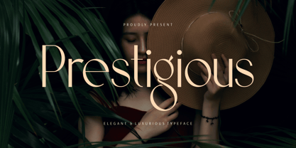 Prestigious is a luxury and elegant display font. That is both classically elegant and modern. Create beautiful wedding invitations, use it as an elegant solution for your next magazine layout, branding, social media, product design, stationery and advertising. It will elevate any design idea with its timeless class.
 - Aunchanted Elite by Typotheticals,
$5.00 Originally released free as Aunchanted, but completely redrawn with gentler curves to give a softer feel to the face. Aunchanted Elite has been expanded and updated in 2022
 - Ollivette Elite by Chank,
$59.00Fly your inner geek flag with this cool new "Eleet" typewriter font. It's kinda like a wonky internet translator that converts normal text into leet-speak, so you can exchange encoded love notes with cyber-hackers and goofy-gamers. The actual glyphs in this font are interchangeable with the more logical Ollivette typewriter font, but here the characters have all been moved around to create stylized interpretation of similar glyphs. So "ELEET" could also be typed "31337". Except you don't have to think about it. Get it? Got it? Good! 3NJ0¥ TH15 ƒØÑ+ & U53 !† 0FT3N. - Elite Sport by Alphabet Agency,
$10.00 Alphabet Agency presents Elite Sport Expanded, a super bold sans serif font inspired by college sports lettering. The font has a strong character defined by the straight edges and corners. Elite Sport Expanded is an all caps font. The font contains Latin Simple characters.
 - Modern Prestige by Letterhend,
$19.00 Modern Prestige is a unique serif which is combined with copperplate script letterform with all the swashes! This typeface has many alternates with swashes that can make your lettering / logotype become more interesting. The clean and neat of a serif combined with the swirl swashes makes this font one of a kind! This font perfectly made to be applied especially in logo, and the other various formal forms such as invitations, labels, logos, magazines, books, greeting / wedding cards, packaging, fashion, make up, stationery, novels, labels or any type of advertising purpose. Features : uppercase & lowercase numbers and punctuation multilingual ligatures alternates swashes PUA encoded We highly recommend using a program that supports OpenType features and Glyphs panels like many of Adobe apps and Corel Draw, so you can see and access all Glyph variations.
 - Edition - Unknown license

- Exit by FSD,
$50.00Exit is my first typeface (designed in 1988). The relationship to Neville Brody's work is evident but with personal touch - Elise by Context,
$12.00 Elise is a sweet natured, layered display typeface, with a few layers but a wealth of options. From the feminine to the fun to the nostalgic, Elise is a capable and personable set. Best used BIG and with color, you’ll always find an occasion for Elise’s charm. To use this typeface, once you have your copy in place in the design program of your choice, copy your text block and paste it directly on top of your existing text block. Set this new text block to a different Elise layer and voila! You’ll already start to see some interesting effects take place. In some cases, different effects are achieved by bringing The Elise Ribbed layer to the front or to the back. Also available is a free ornament set to get you started.
 - Eligated by Letterhend,
$17.00 Introducing, Eligated - a display serif typeface with nostalgic look and feel. Inspired from 60s and 70s signages, labels, and ads. This type of font perfectly made to be applied especially in logo, headline, signage and the other various formal forms such as invitations, labels, logos, magazines, books, greeting / wedding cards, packaging, fashion, make up, stationery, novels, labels or any type of advertising purpose. Features : uppercase & lowercase numbers and punctuation multilingual PUA encoded regular & bold version We highly recommend using a program that supports OpenType features and Glyphs panels like many of Adobe apps and Corel Draw, so you can see and access all Glyph variations.
 - Elita by Wiescher Design,
$14.00 »Elita« is a 100% geometric font designed on a 3 by 16 grid that makes it very slim. There are no optical tricks employed, it is purely geometric. The extreme narrow font design gives it high black and white contrast. The font is not made to write long copy, but it is perfect if you want to employ that magic between pure geometric and almost impossible to read. Just look at the samples and enjoy!
 - Elios by ATK Studio,
$15.00 Elios™ is a stencil display typeface with a strong personality. It comes with all caps letters and monospaced with rounded edges. This font come with single weight and character set that covers over 100 latin languages. Elios™ is perfect for poster, headlines, short texts, branding and other display use.
 - Exited by Sensatype Studio,
$15.00 A Modern Sport Font that perfect for technology, sport, racing, action design project. A new Sans Serif Font that we created special for Headline, Title and more stand out typography needs that will add your variations. It's so perfect to add your style and headline overview. And specially for Headline font, we crafted for futuristic style and modern feels so enjoy to create any project that will show your main idea out. Exited Modern Sport Font ready with: Any options to get creative variations Preview as a inspirations that you can do with Exited font Ready with All Uppercase characters Wish you enjoy our font. :)
 - Elias by Typemotion,
$25.00 Elias is a digital version of my own handwriting.
 - Prosty by Fontsphere,
$12.00 PROSTY is a family of minimalistic and geometric fonts. It follows the style of other Fontsphere's forms, but goes one step further. It contains both uppercase and lowercase characters, which makes it useful for display, titling, captions but also for composing short, intermediate and longer texts, which is a very interesting and useful combination here. It was created carefully with details in mind. PROSTY contains a large number of characters as well as multilingual support.
 - Presta by Type Juice,
$19.00 Presta is a variable weight sans serif typeface made up of 12 fonts from thin and condensed to wide and bold. Included in the variable font are over 500 alternate glyphs for creative customization. 12 fonts total 5 font weights Upper / lowercase glyphs Multilingual Over 5000 glyphs
 - Fresty by Blankids,
$22.00 Fresty is awesome for branding and logotype, Fresty has the impression of modern, trendy and elegant. Fresty has 376 Glyphs with PUA encoded and many alternative character & OpenType features so you can mix and match to create the look you want. Fresty includes 22 Multilingual Support (Afrikaans , Albanian , Catalan , Czech , Danish , Dutch , English , Estonian , Finnish , French , German , Hungarian , Icelandic , Italian , Norwegian , Polish , Portugese , Slovak , Slovenian , Spanish , Swedish , Zulu)
 - President by URW Type Foundry,
$35.99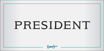
- Predige by Type Dynamic,
$37.00 Predige is a condensed and constructed sans type family, with a very low contrast. The Predige family includes 7 weights, from Hairline to Black, with their corresponding italics. Each font includes OpenType Features such as Proportional Figure, Tabular Figures, Numerator, Superscript, Denominators, Scientific Inferiors, Subscript, Ordinals, Ligatures and Fractions. Predige family supports Latin and Cyrillic, all these languages are covered: Latin language support: Afrikaans, Albanian, Asturian, Azeri, Basque, Bosnian, Breton, Bulgarian, Catalan, Cornish, Corsican, Croatian, Czech, Danish, Dutch, English, Esperanto, Estonian, Faroese, Filipino, Finnish, Flemish, French, Frisian, Friulian, Gaelic, Galician, German, Greenlandic, Hungarian, Icelandic, Indonesian, Irish, Italian, Kurdish, Latin, Latvian, Lithuanian, Luxembourgish, Malagasy, Malay, Maltese, Maori, Moldavian, Norwegian, Occitan, Polish, Portuguese, Provençal, Romanian, Romansch, Saami, Samoan, Scots, Scottish, Serbian, Slovak, Slovenian, Spanish, Swahili, Swedish, Tagalog, Turkish, Walloon, Welsh, Wolof Cyrillic language support: Adyghe, Avar, Belarusian, Bulgarian, Buryat, Chechen, Erzya, Ingush, Kabardian, Kalmyk, Karachay-Balkar, Karakalpak, Kazakh, Komi, Kyrgyz, Lak, Macedonian, Moldovan, Mongol, Permyak, Russian, Rusyn, Serbian, Tatar, Tofa, Tuvan, Ukrainian, Uzbek
 - Restages by Nathatype,
$29.00 Large font sizes are often hard for the eyes to see and difficult to read. As a consequence, you have to give a lot of extra effort just to find out the right, legible font type with a great weight for your brand. Restages is a capitalized display serif font with less thickness for an effortless readability. This font type is perfect for formal contents because of its stylish, elegant characters to strengthen the impressions delivered. Furthermore, this font is truly legible due to its simple, regular serif forms to ease readers to recognize each letter correctly. Make use of the font features available here. Features: Stylistic Sets Multilingual Supports PUA Encoded Numerals and Punctuations Restages fits best for various design projects, such as brandings, posters, banners, logos, magazine covers, quotes, headings, printed products, invitations, name cards, merchandise, social media, etc. Find out more ways to use this font by taking a look at the font preview. Thanks for purchasing our fonts. Hopefully, you have a great time using our font. Feel free to contact us anytime for further information or when you have trouble with the font. Thanks a lot and happy designing.
 - President by Linotype,
$29.99In 1952, Charles Peignot made a bold and fortuitous move: he invited a young Swiss designer to Paris to be the art director of the Deberny & Peignot type foundry. This started the professional type design career of Adrian Frutiger; and since then he has designed an astonishing range of masterful typefaces. One of the earliest for Deberny & Peignot was Président, a sharp-seriffed Latin titling face. Latin" is a typographic designation for roman typefaces with wedge or triangular-shaped serifs, a stylistic form that Frutiger would return to later with his beautiful typeface Méridien. Président™ has wide, solid shapes; very little contrast between thick and thin strokes; and an air of assurance. Use this titling font for business cards, announcements, or artistic signage." - Restine by Yoga Letter,
$18.00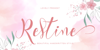 "Restine" is an elegant and beautiful handwritten font. This font is equipped with uppercase, lowercase, ligatures, swash, titling, numerals, punctuation, and multilingual support. Very suitable for weddings, Christmas, engagements, posters, stickers, banners, branding, and others.
 - Special Elite Pro by Stiggy & Sands,
$29.00 Our Special Elite Pro brings the unique individuality of the Special Elite Type No. NR6 vintage typewriter keyset to the digital age. Antique typewriters would type with a warmth and appeal to them, primarily because of their unpredictable “grunge” results from force of keystrokes to ribbon and paper. The SmallCaps and extensive figure sets add a more serious note to the nature of the typeface. OpenType features include: - SmallCaps. - Full set of Inferiors and Superiors for limitless fractions. - Tabular, Proportional, and Oldstyle figure sets (along with SmallCaps versions of the figures). - Stylistic Alternates for Caps to SmallCaps conversion.
 - Elite Sport Distressed by Alphabet Agency,
$10.00 Alphabet Agency presents Elite Sport Distressed, a super bold sans serif font design for use in extreme sport, combat sport and fitness themes. The font has a strong character defined by the straight edges and corners and expresses toughness with the harsh distressed effect. Elite Sport Distressed is an all caps font. The font contains Latin Simple characters.
 - Elite Resort JNL by Jeff Levine,
$29.00 A 1940s sheet music edition of an early 1900s song entitled "You Taught Me How to Love You, Now Teach Me to Forget" was set in a popular metal type slab serif face. It is presented digitally as Elite Resort JNL, in both regular and oblique versions.
 - Remington Elite Typewriter by Intellecta Design,
$24.90a digitization of Remington Elite model typewriter machine alphabet - Prestige 12 Pitch by Bitstream,
$29.99Limited to a single width for all characters and a rough image transferred through a ribbon to the paper, in 1953 Clayton Smith at IBM, Lexington, adapted the classical serifed letterform to this difficult medium to obtain a typewriter face of good readability and interesting texture. - CartoGothic Std - 100% free

- Bergamo Std - 100% free

- Parisine Std by Typofonderie,
$59.00 Ultra legible forceful sanserif in 32 fonts Parisine was born as official parisian métro signage typeface. This family of typefaces has become over years one of the symbols of Paris the Johnston for the London Underground or the Helvetica for the New York Subway. The Parisine was created to accompany travelers in their daily use: ultra-readable, friendly, human while the context is a priori hostile. Meanwhile, Parisine is now a workhorse and economical sanserif font family, highly legible, who can be considered as a more human alternative to the industrial-mechanical Din typeface family. More human, but not fancy: No strange “swashy” f, or cursive v, w etc. on the italics, to keep certain expected regularity, important for information design, signages, and any subjects where legibility, sobriety came first. Born as signage typeface family, the various widths and weights permit a wider range of applications. In editorial projects, the Compress version will enhances your headlines, banners, allowing ultra large settings on pages. The Narrow version will be useful as direct compagnon mixed to standard width version when the space is limited. The various Parisine typeface subfamilies Parisine is organised in various widths and subsets, from the original family Parisine, Parisine Gris featuring lighter versions of the usual weights and italics, Parisine Clair featuring extra light styles, to Parisine Sombre with his darker and extremly black weights as we can seen in Frutiger Black or Antique Olive Nord. Many years of adjustments were necessary to refine this complex family. Initially, Parisine was designed by Jean François Porchez in 1996 for Ratp to solely fulfil the unique needs of signage legibility. Parisine remain the official corporate typeface of the public transport in Paris, the worldwide capital for tourism, and now integral part of the French touch. Directly related, Parisine Office was initially created for Ratp’s internal and external communication, Parisine Office is available at Typofonderie too. Not connected with Ratp and public transports, Parisine Plus was created as an informal version of Parisine. Parisine: Introducing narrow and compressed families About Parisine Parisine helps Parisians catch the right bus Observateur du design star of 2007
 - Supernova Std by Martina Flor,
$79.00 Supernova is a new family that combines the spontaneity of a script typeface with the versatility of multiple weights and cuts. The development of script typefaces has largely been limited to variations in shape and proportion (and with the advent of OpenType technology, the addition of alternate letterforms). Their application has continued to be primarily linked to their emotional attributes, while roman types predominate in body texts. Supernova takes a step in a different direction and was conceived as a script typeface family comprised of several weights and cuts, including a versatile, eye-catching display version and a highly legible body-text version with five weights.
 - Apolline Std by Typofonderie,
$59.00 A Venetian serif in 6 styles The Apolline typeface family was created by Jean François Porchez as a means to study the transition from Renaissance writing into the first printing types. Rather than sticking to the method commonly used these days for the creation of revivals of Jenson or Bembo types, it seemed more interesting to try and get in the same mindset as those exceptional designers during this pivotal period in the history of typography. Thus Apolline is an exploration of the design methods used by people like Nicolas Jenson and his contemporaries for adapting handwriting with its multiple occurrences (a, a, a, b, b, b…) into single, unique signs (a, b…). Initially Jean François made drawings modelled after his own calligraphy. They were done at a very small size on tracing paper (2 cm high for the capitals) to preserve the irregularity of human handwriting. Besides emphasising the horizontal parts of the letter forms, the serifs were designed asymmetrically to reinforce the rhythm of the writing. The final drawings were produced at a large size (10 cm high for the capitals) to allow for subtle optimisation of specific details. The very narrow and fluid Apolline italic Influenced by various concepts for an ideal italic by Van Krimpen, Gill, etc. Apolline italic was designed at 8° degrees. Although the structure of the letterforms were informed by chancery scripts, the italic has full serifs like the roman. Very narrow and fluid, its unique design creates a good contrast when used in combination with its upright counterparts. Thanks to the presence of the serifs similar to roman typefaces it sets very neatly in large sizes. The next step was digitising the drawings with Ikarus (the pre-Bézier-curves era) to create the final roman and italic fonts. Two years later, when the family was expanded to six series the same method was used, this time with Fontographer. This was necessary for correcting a few problems caused by the conversion to Bézier outlines, and to add intermediate weights. Before the advent of feature-rich OpenType, quality type families consisted of several separate fonts for each weight to provide users with various sets of numerals, an extended ligature set and alternates, ornaments, and so on. Introducing Apolline Morisawa Awards 1993
 - Allumi Std by Typofonderie,
$59.00 Technology in mind in 12 fonts Allumi is a different font. Different from anything Jean François Porchez has designed in the past. Allumi is a sleek typeface designed with technology in mind. It’s a perfect font family for any communication concerning design, robotics, or functionality. Pushed to its extreme limits, the Allumi shapes are neither perfectly round or geometrically square. It’s a human design with a high tech touch. Allumi can be described as the Eurostyle (designed by Aldo Novarese in 1964) of the new century, mixed with Frutiger. Allumi is a serious typeface because of the unique design and sturdy form. The pure shapes can create a global presence today with an eye on the world of tomorrow. Two widths The Allumi family has been built around two series of widths, standard and extended. Italics have been carefully designed as slanted roman with all necessary optical and human corrections to create a perfect and neat italic. I Love Typography 2009
 - Mariné STD by TipoType,
$19.90Mariné STD is a geometric sans but with the softness of humanistic strokes. It’s mild contrast and multiple different styles allow Mariné to work well as both a text and display font. Mariné STD is a selected version of Mariné Family. - Ideal for print and identity works. - Works well for text or display uses. - Designed for web and apps. - Look serious or look casual. - Mencken Std by Typofonderie,
$59.00 An American Scotch remixed in 27 fonts Mencken has twenty seven styles, divided into three widths, three optical sizes, romans and italics. Generally, optical size typeface families belong to a same common construction. It falls into the same category of type classification, while presenting different x-heights or contrasts. Mencken is unique because it is designed according to different axis and optical sizes. Firstly, Mencken Text is a low-contrast transitional typeface, designed on an oblique axis, asserting horizontal with featuring open counters. Its capitals follow Didots to better harmonize the rest of the family. On the other side of the spectrum, Mencken Head (and narrow variations) is designed on a vertical axis, high contrast, in a contemporary Didot style. The Mencken is therefore a typeface answering to different sorts of uses, whose design is different according to its uses: from oblique axis in small size to vertical axis in large sizes. Vertical proportions (x-height, capitals height, etc.) were calibrated to be compatible with many Typofonderie typeface families. Lucie Lacava and I followed the idea launched by Matthew Carter few years ago for some of his typefaces intended for publications. From Baltimore Sun’s project to Typofonderie’s Mencken It is a bespoke typeface for American newspaper The Baltimore Sun started at the end of 2004 which marks the beginning of this project. The story started with a simple email exchange with Lucie Lacava then in charge of redesigning the American East Coast newspaper. As usual, she was looking for new typeface options in order to distinguish the redesign that she had started. At the time of its implementation, a survey of the newspaper’s readers has revealed that its previous typeface, drawn in the mid-1990s, was unsatisfactory. The Mencken was well received, some reader responses was particularly enjoyable: “It’s easier to read with the new type even though the type is designed by a French.” Why it is called Mencken? The name Mencken is a tribute to H. L. Mencken’s journalistic contributions to The Sun. According to the London Daily Mail, Mencken ventured beyond the typewriter into the world of typography. Because he felt Americans did not recognize irony when they read it, he proposed the creation of a special typeface to be called Ironics, with the text slanting in the opposite direction from italic types, to indicate the author’s humour. Affirming his irreverence, the Mencken typeface does not offer these typographic gadgets. Henry Louis Mencken (1880 — 1956) was an American journalist, satirist, cultural critic and scholar of American English. Known as the “Sage of Baltimore”, he is regarded as one of the most influential American writers and prose stylists of the first half of the twentieth century. He commented widely on the social scene, literature, music, prominent politicians and contemporary movements. Creative Review Type Annual 2006 Tokyo TDC 2018
 - Retiro Std by Typofonderie,
$59.00 Full of life Hispanic Didot in 2 optical sizes Retiro is a daring interpretation of Spanish typography. Severe, austere and yet, full of life, Retiro is a vernacular version of Castilian and Andalusian in a typical Didot. Named after a lovely park in Madrid, Retiro started life as a a bespoke typeface designed to give a unique voice to the magazine Madriz. In 2006, the founder of Madriz was looking for a Didot for his new magazine. The Didot is the archetypal typeface used in high-end magazines. Retiro is a synthesis of these high contrast styles mixed with an Hispanic mind. Result is then, after 2-3 years of work, a typeface with countless variations to establish typographic shades adapted to different sections and pages of the Madriz. In 2014, it was necessary to further revise the typeface before its launch at Typofonderie. In order to keep its originality, the unique weight was retained, but complemented with optical size variants to set highly contrasted headlines into various sizes, visually balanced. How to use Retiro optical sizes? Each font provided in Retiro family is named according to the scale of body size: 24 pt and 64 pt. Of course, these names are referring to the body sizes used in typographic design. In the “glorious old days,” the letterpress period, it was customary to cut punches directly to the size at which typefaces would be used. The punchcutter had to visually adapt his design to the engraving size. The aim was to optimize the best contrast and general weight, but also to respect both design’s and reader’s needs. In Retiro’s case, intended for large titling sizes, it’s an adaptation of this ancient practice for our contemporary uses. Although each font is named by a typographic point size, do not feel obliged to use this font at this precise size, but why not, in larger or smaller. It’s rather the concept of gradients that must be preserved in layouts, rather than strictly size numbers. It’s up to the designer to select the right font size for his own designs. Granshan Awards 2012 Creative Review Type Annual 2011 Designpreis 2011 Club des directeurs artistiques, 41e palmarès Type Directors Club 2010 Certificate of Type design Excellence
 - Shearman Std by UFF,
$25.00 Shearman STD has a simple design, based on industrial fonts, in particular at the typewriters fonts. It's a geometric font with curves elimination, noting in particular the O and Q letters. It has smooth angles and clean forms which combine in a font with modern appearance. It include five weights with two italics and an extended European character set.
 - Robox Std by Elemental Type,
$19.99 A unique sans serif typeface created from geometric shapes like perfect circles and straight stems with half-rounded endcaps. Simple, yet complex, this typeface is akin to other classics, like Avant Garde and Bauhaus, in that it can be used in modern, friendly or futurist designs. Whether your intent is serious or playful, the versatility of Robox has you covered.
 - Anisette Std by Typofonderie,
$59.00 A geometric Art Déco multi-widths type family Anisette has sprouted as a way to test some ideas of designs. It has started with a simple line construction (not outlines as usual) that can be easily expanded and condensed in its width in Illustrator. Subsequently, this principle of multiple widths and extreme weights permitted to Jean François Porchez to have a better understanding with the limitations associated with the use of MultipleMaster to create intermediate font weights. Anisette is built around the idea of two widths capitals can be described as a geometric sanserif typeface influenced by the 30s and the Art Deco movement. Its design relies on multiple sources, from Banjo through Cassandre posters, but especially lettering of Paul Iribe. In France, at that time, the Art Déco spirit is mainly capitals. Gérard Blanchard has pointed to Jean François that Art Nouveau typefaces designed by Bellery-Desfontaines was featured before the Banjo with this principle of two widths capitals. A simple sentence will be as diverse in its representations, as the number of Anisette variables available to the user. With Anisette, typography becomes a game, as to design any title page as flamboyant as if it has been specially drawn for it. Two typefaces, many possibilities The complementarity between the two typefaces are these wide capitals mixed with narrow capitals for the Anisette while the Anisette Petite – in its latest version proposes capitals on a square proportions, intermediate between the two others sets. Anisette Petite proposes capitals in a square proportion, intermediate between the two other sets, all of which are interchangeable. In addition, Anisette Petite also includes a set of lowercase letters. Its style references shop signs present in our cities throughout the twentieth century. Anisette, an Art Déco typeface Anisette: Reveal your typographic expertise Club des directeurs artistiques, 46e palmarès Bukva:raz 2001 Slanted: Contemporary Typefaces #24


Page 1 of 51Next page