10,000 search results
(0.034 seconds)
- Dash Dot BRK - Unknown license

- Iron Lounge Dots - Unknown license

- Z Dabble Down - Unknown license

- Urgency Of Now by PizzaDude.dk,
$20.00
- Dom Casual EF by Elsner+Flake,
$35.00 - SP Don Mills by Remote Inc,
$39.00A font family inspired by the twists and turns of North Americas first planned community. - Down Home JNL by Jeff Levine,
$29.00 In the October 31, 1920 edition of Wid's Daily (the predecessor to The Film Daily), a block of ad copy from a 1920 film called "Down Home" had the text printed in such a fluent pen-lettered style that a bit of a shortcut was used at the beginning of the design process for this typeface. Normally, font inspirations are redrawn [and not by simply using auto-trace] except under specialized circumstances like this one where that feature is a help, rather than a replacement for the creative process. The entire block of text copy was auto-traced, then the necessary letters were selected from the available wording and cleaned up to remove any sharp points and irregular curves in an effort to make the end results as close to the original and unusual hand-drawn text. From there the missing characters needed to produce a finished type font were created utilizing the standard methods of drawing and font construction. The end results turned out very well. Using the film's title as its namesake, this design is now available digitally as Down Home JNL in both regular and oblique versions.
 - Hebrew Dot III by Samtype,
$34.00 Beautiful font to use in Book covers and Posters.
 - Display Dots One by Gerald Gallo,
$20.00 Display Dots One is a display font not intended for text use. It was designed specifically for display, headline, logotype, branding, and similar applications. Display Dots One has upper and lowercase alphabets, numbers, and punctuation.
 - Hello The Dog by Yumna Type,
$16.00 t can be complicated to create unique, attractive designs for your latest projects especially when you are left with an abundance of boring fonts because ordinary fonts make your designs less prominent, unattractive, and unprofessional. Therefore, we would like to introduce you to Hello the Dog. Hello the Dog is a display font with cute, charming characters inspired by a dog theme. All of its letters and characters are created in a cute way that portrays a dog’s characteristics, such as long ears, big eyes, and a cute nose. It has various sizes and variations ranging from uppercases for title displays and lower cases for softer text displays. Hello the Dog font, of which available features and a clipart bonus you can enjoy, will live up and charm your designs in order to attract the audience with the theme you have. In fact, it will also help you build up your brand identity to be unique and memorable, particularly brands related to dogs or pets. Features: Alternates Multilingual Supports PUA Encoded Numerals and Punctuations Hello the Dog fits best for various design projects, such as brandings, headings, magazine covers, quotes, printed products, merchandise, social media, etc. Find out more ways to use this font by taking a look at the font preview. Thanks for purchasing our fonts. Hopefully, you have a great time using our font. Feel free to contact us anytime for further information or when you have trouble with the font. Thanks a lot and happy designing.
 - Dov Yam MF by Masterfont,
$59.00 Classic yet intimate hand writing with energetic flow and class!
 - Janda Scrapgirl Dots by Kimberly Geswein,
$5.00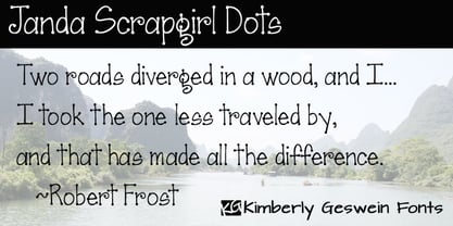 Cute scrapbooky handwriting with dots for character.
 - Bazoo Tow NF by Nick's Fonts,
$10.00Here's a faithful rendering of the slightly quirky, but thoroughly yeomanlike headline face Basuto, designed by Stanley Baxter and released by the Stephenson Blake Type Foundry in 1927. Bold, brassy and a little sassy, this one will perk up your headlines fer sure. Both versions include the complete Latin 1252, Central European 1250 and Turkish 1254 character sets, as well as localization for Moldovan and Romanian. - Dogs on Mars by SynFonts,
$39.00 - Dom Casual SH by Scangraphic Digital Type Collection,
$26.00Since the release of these fonts most typefaces in the Scangraphic Type Collection appear in two versions. One is designed specifically for headline typesetting (SH: Scangraphic Headline Types) and one specifically for text typesetting (SB Scangraphic Bodytypes). The most obvious differentiation can be found in the spacing. That of the Bodytypes is adjusted for readability. That of the Headline Types is decidedly more narrow in order to do justice to the requirements of headline typesetting. The kerning tables, as well, have been individualized for each of these type varieties. In addition to the adjustment of spacing, there are also adjustments in the design. For the Bodytypes, fine spaces were created which prevented the smear effect on acute angles in small typesizes. For a number of Bodytypes, hairlines and serifs were thickened or the whole typeface was adjusted to meet the optical requirements for setting type in small sizes. For the German lower-case diacritical marks, all Headline Types complements contain alternative integrated accents which allow the compact setting of lower-case headlines. - Red Dog Saloon by FontMesa,
$25.00Red Dog Saloon is an old classic western looking type font and one that never goes out of style. A fill font is included with this font, you will need an application that works in layers in order to use the fill fonts that come with FontMesa fonts. - Display Dots Seven by Gerald Gallo,
$20.00 Display Dots Seven is a display font not intended for text use. It was designed specifically for display, headline, logotype, branding, and similar applications. Display Dots Seven has upper and lowercase alphabets, numbers, and punctuation.
 - Today Sans Now by Elsner+Flake,
$59.00 With the publication of the “Today Sans Now” Elsner+Flake extends its offering of the “Today Sans Serif” type family, developed in 1988 by Volker Küster for Scangraphic, by another cut so that the gradation of the stroke width can now be more finely calibrated. The type complement is available for 72 Latin-based languages as well as Cyrillic. Where available, small caps were integrated, and mathematical symbols as well as fractions were included. In order to make the symbols for text applications in regard to headlines more flexible, the insertions which were formerly added, for technical reasons in order to sharpen the corners, were eliminated, and the optical size adjustments of the vertical and diagonal stem endings (I, v, H, V) to the horizontal bars (z, Z) were scaled back. Already since the end of 1984, Volker Küster experimented with broad sticks of chalk and a broad felt pen in order to develop a new sans serif typeface which, in the interest of easy legibility, would be built on the basic structures and proportions of the Renaissance-Antiqua. Using a normal angle of writing, his experiments lead to the form structure of the characters: a small contrast between bold and light weights, serif-like beginning and end strokes in some of the lower-case characters, and the typical, left-leaning slant of all round lower-case letters and the typical left-leaning axis of all round letter forms. In this way, a rhythmization of a line of type was achieved which created a lively image without being “noisy”. With this concept, Volker Küster has enlarged the Sans Serif by a distinctive, trend-setting form variation.
 - Now Showing JNL by Jeff Levine,
$29.00 Inside the pages of the April, 1937 issue of the fan magazine “Hollywood Now” is an unusual bit of hand lettering used for the titles in a number of featured articles. A narrow thick-and-thin Art Deco alphabet with many stylized characters, this type design is now available as Now Showing JNL in both regular and oblique versions.
 - Bluset Now Mono by Elsner+Flake,
$35.00 Bluset Monospaced enlarges the re-worked and expanded text- and headline typeface family Bluest Now with 6 new cuts. The concept for Bluest Now was based, in its original form, on a corporate design typeface by Elsner+Flake in 2004, ordered by the Landor Agency for a large German energy corporation. Regularly re-worked and brought up to modern standards, the typeface is still used to this day. Because of its large x-height and its well-balanced appearance, Bluset Now Mono is also excellent for use in small typesizes. The three Roman cuts, Regular, Medium and Bold, and the corresponding obliques, allow a clear differentiation of base- and display applications for every typesize. The character complement has been created for 72 Latin-based language areas and thus allows a neutral text exchange across language borders. Translation Inga Wennik
 - Morning Rain Dot by ToBeThea,
$12.00 Morning Rain Dot is handmade font with cute little dots. It’s great for big and short titles. You can costumize it and make it look even cuter :)
 - Dog Butter Pro by No Bodoni,
$35.00 This is a curvaceous playful casual upright display script (the name inspired by Tibetan yak butter) and is unique due to the tall ascenders and cap heights combined with a small x-height and small cap height. Due to these variations I designed different heights of quote marks for visual consistency. There are five weights and multi Latin language support. This font is perfect for lingerie catalogs, gorgeous cookbooks, curvaceous branding and logo design, callipygian magazine heads, sumptuous restaurant and food designs, flamboyant word poetry and more.
 - Up and Down by HIRO.std,
$22.00 Up and Down is a Display Font. This font describes about fun, dynamic, rough, headline, pleasure, humanist, easy going, and easy to use. FEATURES - Uppercase and Lowercase letters - Support Ligatures - Numbering and Punctuations - PUA Encoded Characters - Multilingual Support - Works on PC or Mac USE Up and Down works great in any branding materials, logotype, poster, print etc.
 - Display Dots Five by Gerald Gallo,
$20.00 Display Dots Five is a display font not intended for text use. It was designed specifically for display, headline, logotype, branding, and similar applications. Display Dots Five has an uppercase alphabet, numbers, and punctuation.
 - Cow Palace JNL by Jeff Levine,
$29.00 During the 1960s Hippie movement, a large amount of the rock and roll poster art was strongly influenced by the Art Nouveau period of the early 1900s. A poster for an appearance by The Doors at San Francisco’s Cow Palace Exposition Center (presented by Fillmore East and West owner Bill Graham) featured some wonderfully eclectic Nouveau-styled serif hand lettering. Now recreated as a digital type face called Cow Palace JNL (and named for the performance venue), the font is available in both regular and oblique versions.
 - Boom Pang Pow by TypoGraphicDesign,
$9.00 The typeface Boom Pang Pow is designed from 2020 for the font foundry Typo Graphic Design by Manuel Viergutz. A collection of comic and pop art elements like Speech Bubbles Catch Words, Punctuation Symbols, Boom, Pow, Bang … with various layers for colouring. 1 font-style (Comic) with 248 glyphs (Adobe Latin 1). For use in logos, magazines, posters, advertisement plus as webfont for decorative headlines. The font works best for display size. Have fun with this font & use the DEMO-FONT (with reduced glyph-set) FOR FREE!
 - How Dare You by Typefactory,
$14.00 How Dare You is a Retro Vintage typeface, perfectly suitable for creating quotes, Fashion, lifestyle design such as logos, title, and magazine and more. Features: – Uppercase – Lowercase – Symbols & Punctuation – Numeral – Ligature – Alternate – Multilingual Support
 - Tabloid Dot M by Nadyr Rakhimov,
$10.00 TabloidDot M is a simple monospace font created for a small project. It had one task, to imitate the inscriptions on the electronic scoreboard in the form of dots arranged on a grid. As time went on I decided to make an extended version of the font with alternate letters and more styles, plus a variable font to control the size of the dots. The font has 6 stylistic sets, Proportional and Old-style figures, Ornaments, a set of Arrows, Currency Symbols, and supports Extended Cyrillic.
 - Digital Sans Now by Elsner+Flake,
$59.00 Digital Sans Now combines and completes the many diverse requests and requirements by users of the past years. By now, 36 versions for over 70 Latin and Cyrillic languages have become available, including Small Caps. Digital Sans Now is also available as a webfont and reflects, with its simplified and geometric construction and its consciously maintained poster-like forms as well as with its ornamental character, the spirit of the decorative serif-less headline typefaces of the 1970s. The basic severity of other grotesque typefaces is here repressed by means of targeted rounds. Exactly these formal breaks allow the impression that it could be used in a variety of visual applications. Short texts, headlines and logos of all descriptions are its domain. It is because of this versatility that the typeface has become a desirable stylistic element, especially in such design provinces as technology, games and sports, and that, for many years now, it appears to be timeless. Additional weights designed on the basis of the original, from Thin to Ultra, the Italics, Small Caps and alternative characters allow for differentiated “looks and feels”, and, with deliberate usage, give the “Digital Sans Now” expanded possibilities for expression. The basis for the design of Digital Sans Now is a headline typeface created in 1973 by Marty Goldstein and the Digital Sans family which has been available from Elsner+Flake since the mid-1990s under a license agreement. The four weights designed by Marty Goldstein, Thin, Plain, Heavy and Fat, were originally sold by the American company Visual Graphics Corporation (VGC) under the name of “Sol”. Similarly, the company Fotostar International offered film fonts for 2” phototypesetting machines, these however under the name “Sun”. The first digital adaptation had already been ordered in the mid 1970s in Germany by Walter Brendel for the phototypesetting system Unitype used by the TypeShop Group, in three widths and under the name “Digital Part of the Serial Collection.” Based on the versions by VGC, Thin, Plain, Heavy and Fat, new versions were then created with appropriate stroke and width adaptations for data sets for the fonts Light, Medium and Bold as well as for the corresponding italics
 - ABC Dotted Tracing by Beast Designer,
$15.99 ABC Dotted Tracing Font is a user-friendly typeface designed specifically to aid in early childhood education and handwriting practice. Featuring clear, dotted outlines of each letter, this font serves as a guide for young learners as they trace and familiarize themselves with the alphabet. The dotted lines help children develop fine motor skills and hand-eye coordination while practicing proper letter formation. This font is often utilized in educational materials, worksheets, and apps aimed at supporting kids in mastering the fundamentals of writing in a fun and engaging way.
 - Times Kangaroo Down by Elemeno,
$25.00 - Wake Up Now by Seemly Fonts,
$12.00 Wake Up Now is a cute and simple lettered handwritten font that can be used for all chalkboard quotes or teaching material! Its authentic look will add a realistic feel to your designs.
 - Kristall Now Pro by Elsner+Flake,
$49.00 The design of Kristall Grotesk Now is based on a cut by Wagner & Schmidt, Leipzig, from the 30s of the last century as well as the digital version Kristall Grotesk MdK, created for the Stiftung Werkstattmuseum für Druckkunst. The implementation of the Kristall Grotesk MdK, a headline font, was deliberately created as a replica to create a faithful reproduction of the original. The design of the complete family Kristall Grotesk Now is based on the one cut Kristall Grotesk Buchschrift by Johannes Wagner GmbH, 1937, with its function as a text family. Designer: in parts Johannes Wagner GmbH, Redesign Elsner+Flake, Hamburg Designdate: 1937, 2009 Publisher: Elsner+Flake Design Owner: Elsner+Flake Original Foundry: in parts Johannes Wagner GmbH
 - Futura Now Variable by Monotype,
$383.99 For nearly 90 years, Paul Renner’s Futura has been as popular as it is versatile—from children’s books to fashion magazines to the plaque on the Moon. Futura is a typographic icon. Futura Now offers designers a chance to see Futura with fresh eyes. It’s more truly Futura-like than any digital version you’ve ever worked with. “It brings some much-needed humanity back to the world of geometric sans serifs,” says Steve Matteson, Monotype’s Creative Type Director who led the design team. “Despite its reputation as the ultimate modern typeface, Futura Now is surprisingly warm,” he explains. “It’s just as at home set next to a leafy tree as it is next to a stainless-steel table, because it skillfully navigates the border between super-clean geometry and humanist warmth.” Futura Now—the definitive Futura—contains 102 styles, including: new Headline and Text weights; new Script and Display weights and styles; and new decorative variants (outlines, inlines, shadows, and fill). Its contemporary alignment of names and weights makes the family easier to understand and use, and its comfortable Text and judicious Headline subfamilies provide instantly refined spacing. With a large Latin, Greek, and Cyrillic character-set, Futura Now serves a wider international creative community. Futura Now is available both as individual OpenType fonts and as a set of Variable fonts, delivering limitless styles in a tidy digital footprint.
 - Good Dog New by Fonthead Design,
$19.00GoodDog New is a font designed by Ethan Dunham that attempts to revive and refine the ubiquitous font family GoodDog. GoodDog was originally designed in 1996 and has enjoyed enormous popularity. The font desperately needed updating, so a completely new version was born. GoodDog New is a "do-over" of sorts. It is completely redrawn and cleaned up, with an attempt to maintain the look that made the original so popular. - Hebrew Dot II by Samtype,
$34.00 Beautiful font to use in Book covers and Posters.
 - Dez Now Sans by Dezcom,
$28.00 Dez Now Sans is a humanistic typeface family that was begun in 2005 by Chris Lozos of Dezcom. Since then, it has been nurtured, revised, and expanded to include 12 weights in both upright roman and true italics totaling 24 variations. This allows the user to choose the weights which best work for type-size, output device, and reproduction process. There is often a difference of opinion on what the best weight to use for normal text when setting type. The truth is, there is more than one answer. When you consider the size, weight, leading and set width—along with paper and ink specifications, you may find the need for several. The subject matter of the text with the specifics of the target audience, also increase the demand for expanding choices. Dez Now Sans was designed with several potential text weights to address any circumstance. Dez Now Sans gives you a full and varied toolbox of fonts to choose from.
 - Display Dots Six by Gerald Gallo,
$20.00 Display Dots Six is a display font not intended for text use. It was designed specifically for display, headline, logotype, branding, and similar applications. Display Dots Six has an uppercase alphabet, numbers, and punctuation.
 - WL Dot Matrix by Writ Large,
$5.00 WL Dot Matrix is another typographic flashback to computing of the mid 1980s, when 9-pin dot-matrix printers were the state of the art. Compatible with the cleaner WL Rasteroids family, WL Dot Matrix explores some of the common failure modes of old printers: smudging ribbons, slipped tractor feeds, and gummed up print heads.
 - Bornholm Tejn Low by Trine Rask,
$25.00 Bornholm Tejn is named after a village »Tejn« on the only rocky island in Denmark »Bornholm« Bornholm Tejn Low is the lowercase variant of Bornholm Tejn, released in 2012, the first face in a series of rough stone cut typefaces, that shares proportions, but differs in any other aspect like different pieces of rock. It is a powerful face, but still very friendly. Good for very big sizes, but can be used for small texts, movie titles, cartoons … Bornholm Tejn Low has a large x-height which supports the heavy and black look of the typeface. It contains tabular and proportional old style and lining figures.


