10,000 search results
(0.045 seconds)
- Neoncity by PandAE86,
$10.00 Neoncity is a bold and fresh display font with a vintage feel. Inspired by the flashing 80’s, it will add a distinct look to any design project. This font is perfectly used in larger type sizes, above 48 pt. Neoncity is perfect for a design that wants to imitate neon—use it in Photoshop, InDesign, Illustrator or Corel with color & blend effects, and its geometry also lends itself for signage, packaging, posters, branding, event invites, quote, blog posts, social media, and more! Thanks and have a wonderful day, Dedi T
 - Tangential Rounded by ArtyType,
$29.00 This variation of Tangential (see also the Standard & Semi Serif variants) continues with the angles that give the typeface its name; however, the square terminals are half-rounded to create a softer and slightly more fluid styling. The Tangential style I envisaged for the family is complemented by the prominent use of negative space throughout, most apparent on the drop-shaped ‘o,’ which is a key feature of the typeface and a letterform I'm particularly pleased with. Available in 2 weights, Regular & Bold, in both OpenType OTF & TrueType TTF formats.
 - Tangential SemiSerif by ArtyType,
$29.00 This variation in the Tangential series (see also the Standard & Rounded families) continues with the angles that give the typeface its name, however a semi-serif is applied wherever appropriate to create a more open, softer variant. The Tangential style I envisaged for the family is complemented by the prominent use of negative space throughout, most apparent on the drop shaped ‘o’ which is a key feature of the typeface and a letterform I'm particularly pleased with. Available in 2 weights, Regular & Bold, in both OpenType OTF & TrueType TTF formats.
 - Kocak by Grontype,
$14.00 Kocak is an unique modern semi bold and elegant decorative font with a fun, attractive style look. This font equipped with extra ligatures and alternates, that will give more personality to your stunning headlines. This font is able to use lower case as uppercase characters without sacrificing a strong even presence. Kocak is perfect for logotype design, posters, t-shirt designs, packaging brand, magazine header etc. Kocak Features: Uppercase glyphs Lowercase glyphs Numeral and Punctuations standard Ligatures Stylistic Alternates Thankyou for choosing this font, Enjoy Best Regard, Grontype
 - Taguro by Twinletter,
$18.00 Taguro Groovy is a geometric font and the curved lines in each anatomy with high contrast and bold characters make this a powerful font for your projects. This font has an elegant and distinct style that makes it visually different from many other fonts. It makes your design stand out from the rest. This delightful font has precisely defined Curves and the subtle strokes of the typeface make this font very pleasing to the eye.
 - MC Brakely by Maulana Creative,
$17.00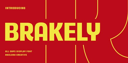 Brakely is a semi humanist sans Display font. ExtraBold stroke, fun character with a bit of ligatures and alternates. To give you an extra creative work. Brakely font support multilingual more than 100+ language. This font is good for logo design, Social media, Movie Titles, Books Titles, a short text even a long text letter and good for your secondary text font with script or serif. Make a stunning work with Brakely font. Cheers, Maulana Creative
 - Goofley by Maulana Creative,
$22.00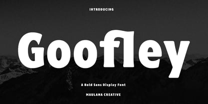 Goofley is a Display semi serif font. With medium low contrast stroke, fun character with a bit of ligatures and alternates. To give you an extra creative work. Goofley font support multilingual more than 100+ language. This font is good for logo design, Social media, Movie Titles, Books Titles, a short text even a long text letter and good for your secondary text font with sans or serif. Make a stunning work with Goofley font. Cheers, Maulana Creative
 - MC Realys by Maulana Creative,
$15.00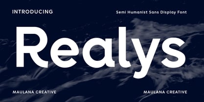 Realys is a semi humanist sans Display font. Regular stroke, fun character with a bit of ligatures and alternates. To give you an extra creative work. Realys font support multilingual more than 100+ language. This font is good for logo design, Social media, Movie Titles, Books Titles, a short text even a long text letter and good for your secondary text font with script or serif. Make a stunning work with Realys font. Cheers, Maulana Creative
 - Opun Loop by Jipatype,
$27.00 อบอุ่นลูป เป็นอักษรแบบแซนส์เซอริฟกลมมน มาพร้อมกับอักษรแบบมีหัวสำหรับภาษาไทย ดูกึงทางการ อ่อนโยน น่ารัก ใช้สำหรับเป็นพาดหัวก็ดี หรือเป็นเนื้อความก็เหมาะสม มีทั้งหมด 9 น้ำหนักและตัวเอียงของแต่ละน้ำหนักรวมทั้งหมดมี 18 สไตล์ และมีฟีเจอร์อื่น ๆ อาทิเช่น Small Caps และฟีเจอร์อื่น ๆ พร้อมให้คุณได้เลือกใช้งาน รองรับหลากหลายภาษา Opun Loop is a sans serif rounded typeface with loop head style for Thai character. Semi-formal, Softly, Lovely feel. Suitable for headline and text body. Comes with 9 weights and italics of each weight total 18 styles, and there are features such as Small Caps and many features available for you. Support multi-languages.
 - Red Thinker by deFharo,
$14.00 Red Thinker is a sans serif typeface that includes Small Caps, is of square proportion and fuses soft curves in the outer vertices with straight lines inside the characters, a semi-stencil design that gives it a technological aspect and future fiction. Red Thinker is the heir by right of the geometrical fonts of the early twentieth century inspired by the Bauhaus school and is specially designed for use in any size for both screen and printing.
 - Cicero by Présence Typo,
$36.00Cicero was the first typeface designed by Thierry Puyfoulhoux in 94. It is what could be called a semi-serif. Only the serifs which occur naturally when drawing letters with a flat nib pen have been retained. The absence of certain serifs allows for much tighter spacing. The remaining serifs still stabilize the baseline, although less effectively than a "full-serif" typeface. By borrowing features from both the sans and serif styles, Cicero truly stands at their crossroads. - Kiddo by EPtackArts,
$3.00 Kiddo is a whimsical, handwritten font family created for use along side children's media. It pairs nicely with Monterrat and other neat, rounded sans serif fonts. It looks great with brightly colored, soft illustrations to create lively layouts full of movement. The characters are simple and easy to read as to not compete with the semi-inconsistent baselines and stroke weights. The line variations add a lot of character to the typeface that really compliments a good story.
 - MC Botes by Maulana Creative,
$17.00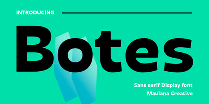 Botes is a modern semi-geo humanist sans serif font. With medium stroke, fun character with a bit of ligatures and alternates. To give you an extra creative work. Botes font support multilingual more than 100+ language. This font is good for logo design, Social media, Movie Titles, Books Titles, a short text even a long text letter and good for your secondary text font with script or serif. Make a stunning work with Botes font. Cheers, Maulana Creative
 - Lafoyettes by Maulana Creative,
$12.00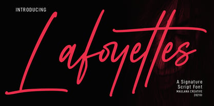 Lafoyettes is a Casual Signature Script font. With semi mono-line light stroke, fun character with a bit of ligatures. To give you an extra creative work. Lafoyettes font support multilingual more than 100+ language. This font is good for logo design, Social media, Movie Titles, Books Titles, a short text even a long text letter and good for your secondary text font with sans or serif. Make a stunning work with Lafoyettes font. Cheers, MaulanaCreative
 - Campan by Hoftype,
$49.00 Campan, is a new semi-linear face which unites mono-line and classic elements. It is very strong in headlines and its tall x-height lends itself to comfortable reading in text applications. The Campan family comprises 12 styles and is well suited for ambitious typography. It comes in OpenType format with extended language support. All weights contain ligatures, small caps, proportional lining figures, tabular lining figures, proportional old style figures, lining old style figures, matching currency symbols, fraction- and scientific numerals and matching arrows.
 - Uniman by The Northern Block,
$19.30 A clear and simple sans serif typeface. Straight lines are combined with precision curves to form a functional and versatile font best suited for a wide range of applications. Developed to meet the needs of the professional user, details include 9 weights with italics, 540 characters, 5 variations of numerals, small caps, stylistic alternatives, manually edited kerning and Opentype features.
 - Reznik by The Northern Block,
$32.00 A compact sans serif with a technical origin. Each character was drafted out from a grid template and then refined through the application of subtle curved detailing. The result is a precise, contemporary typeface best suited to identity, mobile and video game development. Details include 9 weights with italics, 500 characters, 5 variations of numerals, stylistic alternatives, manually edited kerning and Opentype features.
 - Renois by Craft Supply Co,
$20.00 Introducing Renois – Display Sans Serif Powerful Impact, Bold and Condensed Renois – Display Sans Serif is more than just a font; it’s a meticulously designed tool for achieving a commanding presence in a variety of display applications. Command Attention Instantly Furthermore, Renois is purpose-built to command attention instantly. Its bold and condensed design ensures that your message takes center stage and captures the viewer’s gaze right away, making it perfect for headlines and displays that demand immediate attention. Clarity in Boldness Remarkably, despite its boldness, Renois prioritizes clarity. Each character is thoughtfully crafted for optimal readability, guaranteeing that your message is not only impactful but also effectively communicated, even at larger sizes. Versatile for Diverse Displays Moreover, Renois’s versatility shines in various display applications, whether it’s for posters, banners, or promotional materials. This typeface seamlessly adapts to your design needs, making a bold and impactful statement in any context. In Conclusion In summary, Renois – Display Sans Serif is the font of choice when you need to make a powerful and clear statement in your displays. Elevate your designs with Renois, ensuring your message rises above the noise, leaving an indelible and memorable impact on your audience.
 - Serpentine by Image Club,
$29.99Dick Jensen (USA) designed Serpentine, is a contemporary-looking display font, for the Visual Graphics Corporation in 1972. With the rise of digital typesetting and desktop publishing, this typeface quickly became both popular and ubiquitous. This dynamic, wide, boxy design is identifiable via tiny triangular swellings at the stroke endings - what might be called semi-serifs. Serpentine is available in six different font styles: Light, Light Oblique, Medium, Medium Oblique, Bold, and Bold Oblique. Serpentine" is a greenish rock that sometimes resembles a serpent's skin, and is often used as a decorative stone in architecture. Though this font doesn't seem at all snaky or sinuous, it does have an architectural, stone-like solidity. The subtle, almost non-existent curves and semi-serifs keep it from being too stern or cold. Although the underlying strokes of each weight are similar, the six members of the Serpentine font family all present their own individual personalities. Serpentine Light lends itself well to text for onscreen displays, for instance, while the numbers from typeface's heavier weights are seen around the world on soccer jerseys! Additionally, the oblique styles convey a streamlined sense of speed, furthermore lending Serpentine well to sport and athletic applications (especially the faster, high-speed varieties). Because of its 1970s pedigree, Serpentine has come to be known as a genuine "retro" face. This makes the typeface even more appropriate for display usage, in applications such as logo design, magazine headlines, and party flyers. If you like Serpentine, check out the following similar fonts in the Linotype portfolio: Copperplate Gothic (similar serifs) Eurostile (similar width) Princetown (another "athletic" font) Insignia (similar "techno" feeling)" - Serpentine by Linotype,
$29.00Dick Jensen (USA) designed Serpentine, is a contemporary-looking display font, for the Visual Graphics Corporation in 1972. With the rise of digital typesetting and desktop publishing, this typeface quickly became both popular and ubiquitous. This dynamic, wide, boxy design is identifiable via tiny triangular swellings at the stroke endings - what might be called semi-serifs. Serpentine is available in six different font styles: Light, Light Oblique, Medium, Medium Oblique, Bold, and Bold Oblique. Serpentine" is a greenish rock that sometimes resembles a serpent's skin, and is often used as a decorative stone in architecture. Though this font doesn't seem at all snaky or sinuous, it does have an architectural, stone-like solidity. The subtle, almost non-existent curves and semi-serifs keep it from being too stern or cold. Although the underlying strokes of each weight are similar, the six members of the Serpentine font family all present their own individual personalities. Serpentine Light lends itself well to text for onscreen displays, for instance, while the numbers from typeface's heavier weights are seen around the world on soccer jerseys! Additionally, the oblique styles convey a streamlined sense of speed, furthermore lending Serpentine well to sport and athletic applications (especially the faster, high-speed varieties). Because of its 1970s pedigree, Serpentine has come to be known as a genuine "retro" face. This makes the typeface even more appropriate for display usage, in applications such as logo design, magazine headlines, and party flyers. If you like Serpentine, check out the following similar fonts in the Linotype portfolio: Copperplate Gothic (similar serifs) Eurostile (similar width) Princetown (another "athletic" font) Insignia (similar "techno" feeling)" - Grish by Sensatype Studio,
$15.00 A Modern Sans serif font are prepared special for action, bold, and sport design needs. A new Sans serif font that we created special for Headline, Title and more stand out typography needs, with extra outline that will add your variations. It's so perfect to add your style and headline overview. And specially for Brisk font, we crafted for futuristic style and modern feels so enjoy to create any project that will show your main idea out. Grish Brutalism Sans Serif Font ready with: Any options to get creative variations (combination of Outline Characters) Preview as a inspirations that you can do with Grish font Ready with Uppercase and Lowercase characters Wish you enjoy our font. :)
 - Quarpa by Pasternak,
$9.00 Name: Quarpa Styles: 6 styles Glyphs: 394 Year: 2021 This lofty font features a compact structure as well as a unique combination of rounded corners and square contours. The collection includes six styles: Extra Light, Light, and Semi Light that will ensure elegance; Regular, Medium, Semi Bold and Bold suitable for a solid design. Each of them also has Italic variation. It’s an ideal option for outstanding corporate images, logos, promos, or video presentations. Quarpa has proper kerning, multi-lingual support, and ligatures. Languages: Afrikaans, Albanian, Asu, Basque, Bemba, Bena, Bosnian, Catalan, Cebuano, Chiga, Colognian, Cornish, Corsican, Croatian, Czech, Danish, Embu, English, Esperanto, Estonian, Faroese, Filipino, Finnish, French, Friulian, Galician, German, Gusii, Hungarian, Icelandic, Ido, Indonesian, Interlingua, Irish, Italian, Javanese, Jju, Kabuverdianu, Kalaallisut, Kalenjin, Kamba, Kikuyu, Kinyarwanda, Kurdish, Latvian, Lithuanian, Lojban, Low German, Lower Sorbian, Luo, Luxembourgish, Luyia, Machame, Makhuwa-Meetto, Makonde, Malagasy, Malay, Maltese, Manx, Maori, Meru, Morisyen, North Ndebele, Northern Sotho, Norwegian Bokmål, Norwegian Nynorsk, Nyanja, Nyankole, Occitan, Oromo, Polish, Portuguese, Romanian, Romansh, Rombo, Rundi, Rwa, Samburu, Sango, Sangu, Sardinian, Scottish Gaelic, Sena, Shambala, Shona, Slovak, Slovenian, Soga, Somali, South Ndebele, Southern Sotho, Spanish, Swahili, Swati, Swedish, Swiss German, Taita, Taroko, Teso, Tsonga, Tswana, Turkmen, Upper Sorbian, Vunjo, Walloon, Walser, Xhosa, Zulu
 - Mr Palker Dadson by Letterhead Studio-YG,
$35.00 Mr Palker Dadson — has appeared in a natural evolution of the Palker-Palkerson family. Its closest relative - burly slab serif Mr Palker Dad. This generation is more stout than the previous one. One may even be brave enough to use them for composing small texts. Notably Mr Parker Dad has become one of the frequently sold typefaces on the «Peterburg. The city speaks» map as it is highly readable while remaining extremely tight. Mr Parker Dadson has all the features of P&P’s family.
 - Hardal MF by Masterfont,
$59.00 A unique semi geometric type that is inspired by natural round forms that flow in a sweet harmony.
 - Tournedot by Suomi,
$35.00 Tournedot is a semi-serif headline font with two stylistic sets to give more possibilities for different feel.
 - Intimate Summer by Get Studio,
$15.00 Introducing Intimate Summer Font Duo, featuring a strong and bold sans font alongside a casual handwriting-inspired script font. This duo is a perfect combination that brings harmony and versatility to your creative projects. The bold sans font exudes strength and confidence with its clean lines and thick letterforms. It commands attention and adds a modern and retro touch to any design. Complementing the bold sans is the casual script font, which mimics the relaxed style of handwritten text. This script font brings a unique and free-spirited atmosphere to your typographic compositions. Together, this font duo offers an ideal balance between strength and casualness, making it a versatile choice for a variety of design applications. Whether you're designing logos, branding materials, invitations, or editorial layouts, this font duo is a captivating combination that adds an irreplaceable casual touch to your projects.
 - Episodian by Atlantic Fonts,
$26.00 Episodian is a retro-modern san-serif family with a sci-fi, techno edge and contemporary elegance of its own. Episodian now includes regular and bold with corresponding italic fonts.
 - Leaner by Kulturrrno,
$9.00 "Leaner" is uppercase sans-serif typeface. It’s clean and universal. Best for logos and heading. Extended latin glyphs Uppercase letters Thin / Regular / Bold weights + Same italics Numbers & punctuation That's it!
 - TD Beta by Inusentes Catapusan,
$9.00 TD Beta is a bold and light sans serif typeface inspired by Futura and Helvetica. It is best used for headlines, titles, display, and even long paragraphs on digital collaterals.
 - Genesee JNL by Jeff Levine,
$29.00Genesee JNL is a medium-bold sans serif inspired by the letter shapes of Jeff Levine's Paper Stencil JNL, and named for the river valley that traverses Rochester, New York. - Monotype Clarendon by Monotype,
$40.99The first Clarendon was introduced in 1845 by R. Besley & Co, The Fan Street Foundry, as a general purpose bold for use in conjunction with other faces in works such as dictionaries. In some respects, Clarendon can be regarded as a refined version of the Egyptian style and as such can be used for text settings, although headline and display work is more usual. - Monotype New Clarendon by Monotype,
$29.99The first Clarendon was introduced in 1845 by R. Besley & Co, The Fan Street Foundry, as a general purpose bold for use in conjunction with other faces in works such as dictionaries. In some respects, Clarendon can be regarded as a refined version of the Egyptian style and as such can be used for text settings, although headline and display work is more usual. - CG Clarendon by Monotype,
$29.99The first Clarendon was introduced in 1845 by R. Besley & Co, The Fan Street Foundry, as a general purpose bold for use in conjunction with other faces in works such as dictionaries. In some respects, Clarendon can be regarded as a refined version of the Egyptian style and as such can be used for text settings, although headline and display work is more usual. - Bamberger by Fontimonim,
$39.00 A bold, vivacious and rough font that includes six weights for widespread use. Bamberger balances the eccentricity of hand-drawn letters with the stability and readability of a basic and neutral sans font. This combination radiates warmth and boldness appeal. It works great on packaging, viral campaigns, restaurant menus, children's books and digital applications.
 - Chuterolk by Namara Creative Studio,
$12.00 Modern sans serif font that is out of this world. A strong balance between strong pointed corners and smooth curves, Perfect for all purposes but especially for headlines. With 8 Variant to choose : Light, Light Italic, Regular, Italic, Rounded, Shadow, Bold and Bold Italic. This font also includes alternative glyphs, ligatures and multilingual support.
 - Supra Demiserif by Wiescher Design,
$29.00 »Supra Demiserif« is the demi serif addition to the Supra family. I am no fan of slab serif fonts, so I designed this one with half serifs, that makes the serifs less important. Then I found, that the italic does not look nice with slab serifs, so I did only one italic cut for the normal weight. The light and normal weights and the dominant x-height with its high ascenders make for easy reading of long copy. The heavy and x-light weights are great for elegant headlines. Supra is an OpenType family for professional typography with an extended character set of over 700 glyphs. It supports more than 40 Central- and Eastern-European as well as many Western languages. Ligatures, different figures, fractions, currency symbols and smallcaps can be found in all cuts. with each other.
 - PALMSPRINGS PERSONAL USE - Personal use only

- Shaky Hand Some Comic by TypoGraphicDesign,
$19.00 CHARACTERISTICS The kiddy and warmly character and the cute, huge points (amongst others punctuation), gives the typeface a high recognition value and uniqueness. APPLICATION AREA The warm, child-like, bold and striking sans serif font »Shaky Hand Some Comic« would look good at display size for headlines in magazines or websites, posters, packaging, covers or webbanner. TECHNICAL SPECIFICATIONS Headline Font | Display Font | Sans Serif Font »Shaky Hand Some Comic« OpenType Font with 340 glyphs alternative letters and ligatures (with accents & €) & 3 styles (regular, bold & 3d)
 - Entendre Rough by Wordshape,
$30.00 Entendre Rough defies the conventions of most distressed typefaces, as it is an actual text typeface family. Sure, you can use it for your big display type, but you can also use it for body text. Entendre Rough is a stately, commanding and handsome distressed sans serif typeface family that pulls reference from Trajan capitals, the history of English calligraphy, and a variety of other sources to summon a sense of warmth, consideration, trust and authority. Entendre Rough spans 22 weights and styles including Regular and Condensed versions. The large x-height and refined characteristics of the family lend the family a sober and sophisticated appearance that is suitable for both print design and on-screen use. Entendre Rough includes Central and Eastern European language support as well as Western European language support, including Greek and Cyrillic. Entendre Rough’s generous x-height and medium-length ascenders and descenders offer pronounced readability, making the family useful for text typesetting both in print and on screen. Within, humanist elements are tempered with monumental construction, making the heavier weights go-tos for display design work. All of the Entendre Rough family of typefaces feature Western, Eastern and Central European language support alongside nuanced Greek and Cyrillic. Entendre Rough pairs well with our non-distressed Entendre family and our rounded sans serif family Elpy, sharing similar proportions and spacing.
 - Syondola by Greater Albion Typefounders,
$12.95 Syondola is Greater Albion's venture into the Wild-West. Need something to evoke saloon bars, or the OK Corral, or river Paddleboats? Syondola is it! Two styles are offered, Regular with clean and precise outlines, and Rustic, which has a deliberately slightly eroded look, for that old and timeworn feel.
