1,808 search results
(0.014 seconds)
- Selfish - 100% free

- Misproject - 100% free

- Downcome - 100% free

- Astonished - 100% free

- DIESEL - 100% free

- Besign - 100% free

- Porcelain - 100% free

- Ornaments 6 AR by ARTypes,
$30.00Ornaments 6 are based on designs for the Curwen Press by Edward Bawden and Percy Smith. - Cyberend by Alit Design,
$19.00 Introducing "Cyberend" – a font that seamlessly marries the raw, edgy aesthetic of cyberpunk with the precision of square pixels and the sleek modernity of italic serifs. As the digital world converges with futuristic design, Cyberend emerges as the quintessential typeface for those seeking a cyberpunk-inspired typographic experience. Dystopian Elegance: Cyberend encapsulates the essence of cyberpunk, embodying a dystopian elegance that effortlessly blends chaos and sophistication. The font's italic serifs add a touch of rebellion and forward momentum to every character. Pixelated Precision: Immerse yourself in the pixelated precision of Cyberend, where each character is meticulously designed with square pixels. The result is a sharp, high-tech appearance that resonates with the digital landscapes of cyberpunk aesthetics. Versatile Impact: From gaming interfaces to film titles, Cyberend makes a bold statement in any digital or print medium. Its versatility allows you to infuse cyberpunk vibes into logos, posters, websites, and more, giving your projects a distinctive and immersive feel. Futuristic Legibility: Despite its cyberpunk flair, Cyberend prioritizes legibility. Each character is crafted to ensure readability, maintaining a perfect balance between avant-garde design and practical functionality. Unleash the power of Cyberend to transport your audience into a cyberpunk-inspired future. Whether you're designing for tech enthusiasts, gamers, or cyberpunk aficionados, this font is your gateway to a digital realm where style meets rebellion. Upgrade your typographic game with Cyberend and let your creations transcend the boundaries of conventional design.
 - Lamar Pen by Three Islands Press,
$39.00 Mirabeau Buonaparte Lamar had an exotic name for a historic Texan, but he left his mark beginning in 1836, the year of Texas independence and the first year that pioneers other than mountain men made their way West. Lamar went on to become the young republic’s first elected vice-president (to President Houston) and second president -- and to author a number of interesting letters in his elegant, stylish hand. (Mirabeau B. Lamar grew up a well-to-do southerner from Georgia, and his penmanship shows it.) One of the most interesting aspects of designing old handwriting fonts, to me, is pausing to reflect on the actual moment that the letter-writer is sitting at his or her desk or table, pen in hand, putting thoughts to words -- 150 to 200 years ago. Has a complete character set, and plenty more.
 - Atocha by Sudtipos,
$49.00 It was expected that Joluvian’s third type font would be inspired by the city where he currently resides: Madrid, Spain. His previous creations had originated in Venezuela (Zulia) and The Philippines (Salamat), both, places where he had once lived. Joluvian believes “now is the time to pay tribute and show gratitude towards a city that has bestowed me with so many fortunes.” He considers that Madrid’s people, streets, scents, flavor and sounds are gift enough to awaken the creative urgency in any artist. This time around, it is being expressed through the crafts of the Typographic industry. Since his arrival in Spain, Joluvian has been attached to the city’s central area, specifically to the renowned Atocha Street and its railroad station. It was precisely on that street that Joluvian and Mauco Sosa, his friend and partner, decided to establish the Patera Studio: a charming creative space that birthed the concept for this new font which they proudly named Atocha Script. The artists where still in the final phases of their previous script, Salamat, when the idea for Atocha came about. This dynamic is actually very typical of the artistic process, in which every finished product spawns the need to create its next level offspring. “Working on Atocha and Atocha Caps has been a very pleasant journey. We have given our best efforts, for we wanted to offer a typeface that was both versatile and user-friendly on a number of applications, showing a wide scope of alternatives in our glyphs,” says the artist. The illustrations were created by Mauco, to ensure visual integration that would showcase the work of both members of the Patera Studio and their complementing aesthetic voices. Atocha, as Salamat and Zulia before, was digitized by Alejandro Paul.
 - Porcelain - 100% free

- Disgusting Behavior - 100% free

- Toony Sans by Mans Greback,
$59.00 Toony Sans stands as a modern interpretation of classic typography. A nod to beloved animations, its crisp, sans-serif form captures an essence of professionalism with just a touch of nostalgic charm. Toony Sans presents a clean, streamlined look, perfect for projects requiring clarity and elegance. Its sharp edges and precise design give it a contemporary feel, yet there's an undeniable warmth that resonates with every character.
 - Medoc by Kustomtype,
$25.00 Medoc is a clean and fresh font, designed with the intention of producing a good readable modern typeface. Medoc has historical roots, though it's redesigned with precision and a high contrast. Medoc will catch the reader's eye immediately. Both the regular and italic match in perfect harmony. Useful for titling, head text, magazines, posters and all your graphic work that need a nice and modern look!
 - Modern Techno by Nirmana Visual,
$24.00 Introducing our cutting-edge techno font, designed to add a futuristic and sleek aesthetic to your designs. Inspired by the sleek designs of technology and the digital age, this font captures the essence of innovation and progress. Its clean and precise letterforms, along with its distinct futuristic style, make it an excellent choice for technology-based branding, gaming graphics, sci-fi posters, and digital interfaces.
 - Accura by dooType,
$15.00 Accura is a sans serif font with a technological aspect and simple letterforms. Its closed angles and smooth curves make it an unique source of personality, and still offers great readability. Perfectly fits to headline sizes and text blocks, Accura has seven precise-calculated weights and their matching italics, from thin to black. Offers support for more than 50 languages and count on opentype features.
 - ITC Veljovic by ITC,
$29.99ITC Veljovic was designed by Jovica Veljovic and displays an obvious calligraphic heritage. The designer was strongly influenced by German designer Hermann Zapf and Israeli designer Henri Friedlander. ITC Veljovic exhibits a crisp precision, as if the letters were cut in stone rather than drawn with pen and ink. In 2014 Veljovic revised this family and ITC New Veljovic was released with many more weights and styles - BR Hendrix by Brink,
$30.00 A modern geometric grotesque type family of 16 styles. BR Hendrix is a fine balance of functionality and contemporary characteristics. Precisely drawn with a modern aesthetic in mind, Hendrix has familiar qualities associated with the classic grotesques, but combines them with a stronger geometric flavour. BR Hendrix provides advanced typographic support with features such as case sensitive forms, fractions, slashed zeros and multiple figure sets.
 - Cuizy by Twinletter,
$13.00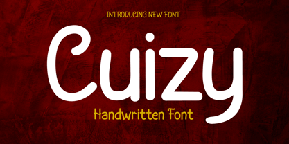 Introducing "Cuizy Font" - Where Handwriting Meets Distinctive Design. Cuizy Font is your key to adding a touch of personal charm and uniqueness to your projects. Crafted with precision, it effortlessly blends the warmth of handwritten text with contemporary style. What’s Included : File font All glyphs Iso Latin 1 Alternate, Ligature Simple installations PUA Encoded Characters – Fully accessible without additional design software. Fonts include Multilingual support
 - Zenga by The Northern Block,
$29.99 Zenga is a contemporary typeface that fuses precise geometry with subtle hints of blackletter forms. The concept was to adapt core values from the gothic style and develop a design suitable for grid and pixel based platforms. Details include five distinctive weights with italics, over 500 characters, five variations of numerals with stylistic zero's, ten alternative characters, extended symbols including chess pieces and OpenType features.
 - Everflow by Andrejs Kirma,
$28.99 Everflow is the third typeface family by Andrejs Kirma. Coming from the background of creating a large amount of geometric icons, he set the goal of creating geometric typefaces in a variety of styles and consequently exploring new opportunities in typeface design. A modern, geometric serif typeface in seven weights Everflow was created to serve the modern designer that appreciates precision, versatility and simplicity.
 - Forged by Hemphill Type,
$30.00 Hand forged with strength & precision – Forged is a bold, powerful typeface that stands strong. Handcrafted as if by a blacksmith, this typeface has its quirks and imperfections like any metalwork which gives it a unique character. The family consists of regular, outline, bevel and fill versions. All weights are versatile and can be used for packaging, logotype, copy and headings. Strike while the iron's hot!
 - Tinakori by Hendriks Studio,
$26.00 Inspired by a bustling village within Aotearoa New Zealand’s capital city of Wellington, Tinakori is an elegant and sophisticated serif font that invokes art deco, classical art and thin balletic structures. It’s been a passion project that’s finally come to fruition. The simple italic and bold versions help accentuate the individuality of the serif which is precise but holds a fluidity that makes it feel inventive.
 - Catchfire by Alan Smithee Studio,
$10.00 Warm and human, yet reliable and precise. Catchfire blends humanist proportions and geometric features. The result is a sans serif typeface with strong personality traits, but that can fulfil everyday needs. It is very legible due to its open counters. It boasts a large character-set, OpenType features, circled numbers, wide range of weights, cursive italics : everything needed to become your new companion for years to come!
 - Algoria by Sealoung,
$15.00 Algoria is a functional sans serif that includes open character openings, a uniform distribution of white and black, and excellent readability. The general neutrality of the font patterns is not without elegance, and all the details of the typeface are crafted with mathematical precision and love. Typographic designs are developed for the widest possible range of tasks that any quality corporate font must accomplish.
 - Bennet Display by Lipton Letter Design,
$29.00 Bennet, Richard Lipton’s spirited serif superfamily, was inspired by Moth Design’s logotype and stationery system for the North Bennet Street School in Boston. Initially modest in concept, Bennet grew to an expansive suite of 96 fonts tuned for editorial use. The three widths of Bennet’s Display and Banner sizes—Regular, Condensed, and Extra Condensed—are ideal for precise fitting of newspaper and magazine headlines. Lipton developed graded text styles for the series, offering users precise variations to help compensate for varying degrees of ink spread on different types of paper stock during the printing process. For example, because of ink absorption, the lightest grade—Bennet Text One—printed on low-quality newsprint stock will have the same gray value as the darkest grade—Bennet Text Four—on superior coated paper. (Bennet Text Two is the default grade and offered here.) Bennet also provides for a stellar reading experience in digital media, its carefully considered details vibrant yet legible on-screen.
 - Kronix by Hazztype,
$20.00 Introducing Kronix, a geometric, futuristic font that embodies the essence of technology in the digital age. Kronix combines sleek lines, precise angles, and contemporary design elements to create a visually striking font perfect for technology-themed projects. Its clean and minimalist letterforms embody the essence of modernity and sophistication, capturing the attention of tech-savvy audiences. With its crisp edges and precise spacing, this font creates a harmonious visual rhythm that adds a touch of elegance to any design. Kronix is versatile and adaptable, making it suitable for a wide range of applications, including websites, mobile apps, and branding materials. Its modern aesthetic aligns perfectly with the fast-paced advancements in technology, allowing your design to stay relevant and visually impactful. Whether you're designing a tech magazine cover, creating a sci-fi movie poster, or developing a high-tech product packaging, Kronix is the ultimate choice for adding a geometric, futuristic flair that captivates the imagination and elevates your design to the forefront of modern technology.
 - Bennet Text by Lipton Letter Design,
$29.00 Bennet, Richard Lipton’s spirited serif superfamily, was inspired by Moth Design’s logotype and stationery system for the North Bennet Street School in Boston. Initially modest in concept, Bennet grew to an expansive suite of 96 fonts tuned for editorial use. The three widths of Bennet’s Display and Banner sizes—Regular, Condensed, and Extra Condensed—are ideal for precise fitting of newspaper and magazine headlines. Lipton developed graded text styles for the series, offering users precise variations to help compensate for varying degrees of ink spread on different types of paper stock during the printing process. For example, because of ink absorption, the lightest grade—Bennet Text One—printed on low-quality newsprint stock will have the same gray value as the darkest grade—Bennet Text Four—on superior coated paper. (Bennet Text Two is the default grade and offered here. Additional grades are available upon request.) Bennet also provides for a stellar reading experience in digital media, its carefully considered details vibrant yet legible on-screen.
 - Tepuy by John Moore Type Foundry,
$20.00 Tepuy is the name given to the ancient plateau-shaped mountains that abound in the Venezuelan Amazon. Tepuy is a display typeface inspired by the symbolic forms of the Venezuelan ethnic roots. It is constructed based on a very precise geometry of open forms that produce a double letter in form and counterform. Tepuy originates as an evolution curve of my Font Makiritare rectilinearly. Was devised for a book of photographs of the ancient mountains of the Venezuelan Amazon, its form and Makiritare are morphologically inspired crafts in the ethnic groups of the region. Tepuy is held in a very precise geometric construction based on rounded forms, each letter is a form envelope enclosing another in counterform, is a letter to display. Tepuy comes in four versions Regular, Light and thin, and there is a double line version enclosed. Tepuy recommended for creative headlines for the label and packaging design aimed at all ages.
 - Neotuba by IbraCreative,
$17.00 Neotuba – A Display Racing Serif Font Neotuba, a captivating display racing serif font, seamlessly marries classic elegance with a contemporary edge. Its sleek, elongated letterforms convey a sense of speed and dynamism, making it an ideal choice for racing-themed designs or any project that demands a touch of velocity. The font exudes a refined sophistication through its precisely crafted serifs and balanced letter proportions, ensuring readability even at high speeds. Neotuba’s distinctive design captures the essence of speed and precision, making it a versatile and eye-catching choice for headlines, logos, or any creative endeavor where a racing-inspired aesthetic is desired. Neotuba is perfect for branding projects, logo, wedding designs, social media posts, advertisements, product packaging, product designs, label, photography, watermark, invitation, stationery, game, fashion and any projects. Fonts include multilingual support for; Afrikaans, Albanian, Czech, Danish, Dutch, English, Estonian, Finnish, French, German, Hungarian, Italian, Latvian, Lithuanian, Norwegian, Polish, Portuguese, Slovak, Slovenian, Spanish, Swedish.
 - Bennet Banner by Lipton Letter Design,
$29.00 Bennet, Richard Lipton’s spirited serif superfamily, was inspired by Moth Design’s logotype and stationery system for the North Bennet Street School in Boston. Initially modest in concept, Bennet grew to an expansive suite of 96 fonts tuned for editorial use. The three widths of Bennet’s Display and Banner sizes—Regular, Condensed, and Extra Condensed—are ideal for precise fitting of newspaper and magazine headlines. Lipton developed graded text styles for the series, offering users precise variations to help compensate for varying degrees of ink spread on different types of paper stock during the printing process. For example, because of ink absorption, the lightest grade—Bennet Text One—printed on low-quality newsprint stock will have the same gray value as the darkest grade—Bennet Text Four—on superior coated paper. (Bennet Text Two is the default grade and offered here.) Bennet also provides for a stellar reading experience in digital media, its carefully considered details vibrant yet legible on-screen.
 - Cumbre by Antipixel,
$22.00 Cumbre is a slanted display type with unorthodox anatomy, a dynamic rhythmic structure, movement expression, and intense visual language. An eccentric rebel with ribbon-like moves, a balanced extrovert that makes meticulous use of ink traps. Both the name and design got inspiration from mountain peaks. "Cumbre" in Spanish means summit, and that's the motive for the spiked design and the angular serrated structure. Cumbre is built by balancing sharp angles and venturous curves. The stems are spiky, and they vary in width. Cumbre is slanted and unicase. It has condensed proportions, moderate weight contrast, spacious counters, pointy terminals, and square ink traps. Cumbre is meant for large display settings to make the most out of the precise outlines and the clean intersections. The font styles: 'Sharp' has straight paths and precise intersections. 'Round' has the same outlines but with round corners. 'Stamp' has irregular wavy contours and heavy swelling at intersections.
 - Cut Paper Stencil JNL by Jeff Levine,
$29.00Playing around with a previous design, Jeff Levine came up with Cut Paper Stencil JNL, a typeface with both an Art Deco flair and the look of letters made from cut paper. - Dobra by DSType,
$26.00 Dobra is a redesign of the previous released Dione. Dobra is a very geometric and robust sans typeface, specially suited for magazines and newspapers, but it works great as a corporate typeface.
 - Memory Lapses - 100% free

- Horse Puke - 100% free

- Broken 15 - 100% free

- Disco by Solotype,
$19.95Each letter or character comes in two forms on this font: One as a complete disc, the other as a disc with a segment removed so the succeeding character can overlap the preceding one. - Kunst by Matt Grey Design,
$24.00Inspired by European brutalist design aesthetic, Kunst strives for form dominated by pure geometric precision, utilising 45° angles based on a strict grid. See the PDF specimen | Also available in Rounded and Imprint styles. Covers Western and Cyrillic character sets with a full range of Smallcaps. Includes Tabular Figures, Standard and Discretionary Ligatures, and Contextual Alternates such as arrows, Smart Quotes, and German Capital Eszett/scharfes (Sharp s).


