1,808 search results
(0.014 seconds)
- My Recipes by Pixel Colours,
$15.00 My Recipes is a sweet font duo designed with an authentic hand drawn flavour. Combine it with it's lovely graphics and get the perfect recipe!
 - Prelo Compressed by DSType,
$55.00 - Preto Sans by DizajnDesign,
$24.00 Preto is an extensive type family, which explores the function of serifs on readability and legibility. Preto consist of three subfamilies: Sans, Semi and Serif. Preto is designed for multilingual typesetting. All of the subfamilies have equal gray value but different texture which can be use to differentiate languages. Preto subfamilies have two text weights and two bold styles (Regular --> Bold, Medium --> Black). Every weight has a companion Italic style as well. Preto Sans The Sans version of Preto forms the basic skeleton of the family, it is decidedly simpler than the other styles (Semi and Serif). Although you can find many distinctive and unique elements in the details. The most visible elements are the tapered upper part of the letters. The capital letters have uniform widths achieving very different texture than traditional roman proportions. There are two different options for ligatures and alternative characters (J, Q, g, &) gives more variability for different languages.
 - Prelo Condensed by DSType,
$55.00Prelo was designed to be a neutral, highly readable typeface, for identity, editorial and information design. With nine weights and nine true italics, from Hairline to Black, Prelo is a workhorse typeface, full of OpenType features such as Small Caps, Tabular Figures, Central Europe characters and Historical Figures, among others. Like other DSType fonts, most of the diacritics were designed to fit the gap between the x-height and the caps height, avoiding some common problems with the accented characters. The curves are soft and smooth, providing legibility, even in very poor conditions and the neutrality allows this typeface to be used with any serif companion. - Preto Semi by DizajnDesign,
$24.00 Preto Semi is an experiment. It is an attempt to create a readable type for text point sizes (other than sans-serif and serif). Preto Semi is not a Sans with added serifs or Serif with serifs removed. The use of the serifs is redefined and used for other purpose(s). The serifs became the extension of the stroke, they help to solve the spacing problem of sans-serif types and they use the primary function of serifs – keeping the eye on the baseline and emphasize the horizontal rhythm of the lines of text. Preto Semi is intended for magazines and editorial design, as other members of Preto family. Preto is an extensive type family, which explores the function of serifs on readability and legibility. Preto consist of three subfamilies: Sans, Semi and Serif. Preto is designed for multilingual typesetting. All of the subfamilies have equal gray value but different texture which can be use to differentiate languages. Preto sub-families have two text weights and two bold styles (Regular -> Bold, Medium -> Black). Every weight has a companion Italic style as well.
 - WIP The President by WIP Fonts,
$49.00WIPEU The President depicts the handwriting of a versatile and energetic man of vision at the highest stage. The (lower case) characters are joined as it is usual in German speaking countries. Originally designed in 1995 the font has been extended by a lot of new characters such as accented characters, punctuation, symbols and currency symbols. - Bad Cake Recipe by Bogstav,
$15.00 I've had a lot of lovely cakes through the years (My wife is a great cook!) But I've also tried some really...ehem...not so good cakes. Actually, the worst cake I ever had, was at work - if you didn't know, I work as a kindergarten teacher - and the cake was made by one of the kids! Anyway, this font was made as a sort of tribute to that cake - the font may not represent something that is smooth and lovely, but it was made with lots of personality and love - just like that cake from that kindergarten kid!
 - Cartoon US Presidents Dingbats by Pedro Teixeira,
$3.00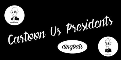
- Preto Serif OT Std by DizajnDesign,
$50.00 Preto is an extensive type family, which explores the function of serifs on readability and legibility. Preto consist of three subfamilies: Sans, Semi and Serif. Preto is designed for multilingual typesetting. All of the subfamilies have equal gray value but different texture which can be use to differentiate languages. Preto sub-families have two text weights and two bold styles (Regular -> Bold, Medium -> Black). Every weight has a companion Italic style as well. The serif version has been designed to work best at small point sizes (around 8, 9 points). You will not achieve calm, boring or invisible look of your text with Preto Serif. Its long, spiky and sharp serifs contribute to give the typeface a distinct and energetic character. It is very suitable for magazines, corporate identity, brochures or other print materials where a typeface for continuous reading is required. The ligatures in Preto Serif are very special. You can set them in different tracking values and spacing will increase/decrease consistently in the ligatures as well. Alternative characters in the font files allow you to change the feeling of the text from typical to more special (J, Q, g , &). Each font contains a full set of small caps and many alternative characters for complex typesetting.
 - Preto Sans OT Std by DizajnDesign,
$50.00 Preto is an extensive type family, which explores the function of serifs on readability and legibility. Preto consist of three subfamilies: Sans, Semi and Serif. Preto is designed for multilingual typesetting. All of the subfamilies have equal gray value but different texture which can be use to differentiate languages. Preto subfamilies have two text weights and two bold styles (Regular --> Bold, Medium --> Black). Every weight has a companion Italic style as well. Preto Sans OT Std The Sans version of Preto forms the basic skeleton of the family, it is decidedly simpler than the other styles (Semi and Serif). Although you can find many distinctive and unique elements in the details. The most visible elements are the tapered upper part of the letters. The capital letters have uniform widths achieving very different texture than traditional roman proportions. There are two different options for ligatures and alternative characters (J, Q, g, &) gives more variability for different languages.
 - Preto Semi OT Std by DizajnDesign,
$- Preto Semi is an experiment. It is an attempt to create a readable type for text point sizes (other than sans-serif and serif). Preto Semi is not a Sans with added serifs or Serif with serifs removed. The use of the serifs is redefined and used for other purpose(s). The serifs became the extension of the stroke, they help to solve the spacing problem of sans-serif types and they use the primary function of serifs – keeping the eye on the baseline and emphasize the horizontal rhythm of the lines of text. Preto Semi is intended for magazines and editorial design, as other members of Preto family. Preto is an extensive type family, which explores the function of serifs on readability and legibility. Preto consist of three subfamilies: Sans, Semi and Serif. Preto is designed for multilingual typesetting. All of the subfamilies have equal gray value but different texture which can be use to differentiate languages. Preto sub-families have two text weights and two bold styles (Regular -> Bold, Medium -> Black). Every weight has a companion Italic style as well.
 - Recipe for a lovely day by PizzaDude.dk,
$16.00 Originally I planned to call this font “pegefinger” which is index finger in danish. Due to the obvious reason that I drew the letters using my “pegefinger” :) Most letters mimic a loose (perhaps even childish) handwriting, but the legibility is never out of hand. I’ve added 5 different versions of each lowercase letter, and they automatically changes as you type!
 - ROTRING - Unknown license

- Operational Amplifier - Unknown license

- Abscissa - Unknown license

- Hera Big by Lucas Sharp,
$40.00 Hera Big is a type family in eight weights & 16 fonts. The family explores the motion and fluidity of the ball serif, in an evolution from its previous identity as a counterpart to the slab serif. Informed by great fat-faces from Figgins to Lubalin, but never deferring to precedent by default, Hera is a fresh mix of originality and organic form, never sacrificing function for beauty.
 - LTC Archive Ornaments by Lanston Type Co.,
$24.95 Unlike previous dingbat fonts released from Lanston Type Co., Archive Ornaments derives from a unique collection of brass ornament plates that were originally used in creating the matrices for casting metal type. Using the plates as a reference point allowed for a more precise rendering of the ornaments. Letterpress prints were made directly from the brass plates, which were then re-drawn and digitized. Each character has been optimized for the combination of decorative borders and patterns as well as individual accentuation. The completed digitized font contains over 100 glyphs, ranging in style from geometric to organic designs.
 - Vektori by Suomi,
$19.00 Vektori family comes from those Atari games that had those distinct vector graphics with thin and precise straight lines.
 - Garcog by Patria Ari,
$24.00 Garcog : The Ultimate Typeface for Mechanical Aesthetics. Inspired by the intricate design of gears and cogs, Garcog features upper shapes cut like precision engineering. This unique font adds a touch of industrial sophistication to your projects, making it the perfect choice for conveying precision, innovation, and mechanical excellence. Ideal for engineering, manufacturing, and tech-related designs, Garcog is the font that propels your message into a new dimension of creativity.
 - Acto by DSType,
$40.00 Acto is a type system designed as the sans serif counterpart of the previous released Acta. Both type families were designed in 2010 for the redesign of the Chilean newspaper La Tercera, but unlike some of our previous fonts (i.e., Leitura) Acto doesn't exactly match Acta in terms of structure, so they can live on their own. Acto is our first sans where the uppercase has the same height as the ascenders, so we decided to avoid common problems like the confusion between the I and the l, by drawing a curved l. We kept that spirit by removing the spurs on the b, g and q, resulting on a more warm typeface than Prelo, for instance. In the end it's a very powerful sans family, with eleven weights with matching italics, for editorial and corporate design.
 - Rail by Type Fleet,
$- Rail grandeur precision & leverage Rail type family is a tough conveyance mechanism for large and lengthy information packages. It offers great reading comfort and avoids unnecessary friction. The precise construction of this slab serif signals greater legibility and capacity. Rail is designed to provide reading enjoyment. It’s suitable for complex typography projects like magazines and annual reports. The typeface’s x-height is approximately 68% of its capitals. The italics are constructed at a 11° angle.
 - Gravita by TipoType,
$29.00 Gravita is a typeface family that conveys security and respect by combining the solidity of its classic proportions with the strict precision of its modern profile drawing. Ideal for modern corporate communication where you need customers to perceive confidence and transparency. It has 9 weight variables, 2 predefined sets (GEO and HUM) with their respective italics. Its design is inspired by the geometric precision of modernist imprint typefaces reinterpreted under a 21st century humanist sensitivity
 - Nine Thousand by SparkyType,
$19.00The powers of the SparkyType and PizzaDude combine to bring a font straight from the future. Nine Thousand is dripping with computer energy and robotic precision. - Nine Thousand by PizzaDude.dk,
$19.00The powers of the SparkyType and PizzaDude combine to bring a font straight from the future. Nine Thousand is dripping with computer energy and robotic precision. - PlatformOne by The Northern Block,
$12.80 PlatformOne is a 10 font family consisting of 5 weights with italics. A clean geometric font with precise corners inspired by commuter travel on Britain's public transport networks.
 - Bergins by Craft Supply Co,
$20.00 Discover Bergins – Grotesque Sans Serif Modern Aesthetic Initially, Bergins captivates with its modern grotesque aesthetic. Designed meticulously, it embodies a fresh and contemporary vibe, ensuring visual appeal and innovation in design. Clarity and Precision Additionally, clarity reigns in its design. Every stroke and curve in Bergins speaks precision, offering optimal readability across various platforms and sizes, facilitating diverse applications. Versatility Unleashed Moreover, Bergins exhibits remarkable versatility. It seamlessly integrates with a multitude of design layouts, from digital platforms to printed materials, enhancing adaptability and usability.
 - Scape by Reserves,
$39.99 Scape is a precisely drawn, contemporary stencil face built from a single weight rounded end stroke. The fine, linear rounded forms create a subtle contrast to the raw utilitarian nature of the stenciled characters. Extremely versatile, Scape is highly legible due to it’s upright, consistently balanced sans letterforms. Stylistically, it exemplifies refinement and clarity with an distinct edge. Features include: Precision kerning Expanded ligature set Alternate characters (O, _, ®) Alternate zero Extended language support (Latin-1 and Latin Extended-A) *Requires an application with OpenType and/or Unicode support.
 - Campeno by Craft Supply Co,
$20.00 Geometric Precision Let’s step into the world of Campeno, a Geometric Sans Serif font that embodies precision and order. This font is the epitome of geometric perfection, making it an ideal choice for various editorial applications. Editorial Excellence Campeno’s geometric form is what sets it apart and makes it a top choice for editorial needs. Whether you’re working on magazines, long-form text, or other editorial projects, its geometric precision enhances readability and offers editorial excellence. Versatile Typography What makes Campeno even more exceptional is its versatility. It seamlessly adapts to diverse design contexts, ensuring that it can be used for a wide range of projects, from magazines to websites and beyond. Engaging Readability Beyond its geometric aesthetics, Campeno excels in providing engaging readability. It guides the reader through the content, focusing on the message while maintaining a visually appealing design. In Conclusion In summary, Campeno – Geometric Sans Serif is the font that brings precision and clarity to your editorial projects. Its geometric form ensures that your content is not only engaging but also visually appealing, catering to a broad readership while maintaining a high standard of clarity. Whether you’re working on magazines, websites, or other editorial endeavors, Campeno stands out as a font that combines aesthetics with functionality, offering editorial excellence for your projects.
 - Blundell Sans by K-Type,
$20.00 Blundell Sans is a type-hybrid that combines the precision and power of a sans serif with the elegance and humanism of a script. A resolutely upright font with a strong diagonal thrust.
 - Metaluna by Device,
$39.00 Metaluna is an extended sans serif family of five weights derived from Rian Hughes’ classic Forbidden Planet logo. Sleek and modern, it suggests cutting-edge tech, supercar marques or high-precision engineering multinationals.
 - Apice by Stefano Giliberti,
$15.00 Apice is a font family made for precise bursts of data. It supports 111 languages, features a total of 310 glyphs and includes an italicized and outline version for each of the 3 weights.
 - Ruby by SparkyType,
$25.00Ruby is a poster font with proud geometry and rounded terminals. With its roots in skateboard graphics it is young, fresh, strong and confident. Ruby comes with two complimentary styles for adding that precious sparkle. - Coreopsis by Andrew Harper Fonts,
$19.00 Coreopsis is a family of fonts that combines mathematical precision with a hand-drawn feel. Versatile enough to be applied to an attention-grabbing headline, or to blocks of paragraph text. Coreopsis is available in three weights.
 - Nordic Salt by Supfonts,
$14.00 Nordic Salt - a perfect clean modern serif Font is an open type with clean shapes and precise kerning. Language support: All European languages Don't forget to subscribe so you don't miss out on the new awesome fonts Dima
 - High Tide AT by Arctype,
$12.00 High Tide is inspired by the lettering made by the fisherman of Cornwall. Shapes made by hand that are created to be functional with a geometric precision, yet appear hand-drawn and human for an honest and sincere quality.
 - Yodo by The Northern Block,
$12.80 A geometric typeface that combines elegant curves with precise angles. The contemporary nature of this font will compliment a wide variety of graphic design applications. Details include 3 weights, a full character set, manually edited kerning and Euro symbol.
 - Boren by Lone Army,
$19.00 Revolutionary sans serif font BOREN with futuristic LiquidFlow style brings modernity and creativity. Crafted with precision, it captivates with smooth lines and high-tech aura, adding professionalism to projects. Choose BOREN for sophistication and futurism in your creative designs!
 - Vacant by Reserves,
$39.99 Vacant is a precisely drawn, contemporary stencil face built with attention towards retaining pure underlying geometric forms and visual balance between letterforms. Stylistically, Vacant exudes a strong sense of clarity and sophistication which contrasts the unrefined nature of stencil typefaces.
 - Raberly by Aisyah,
$12.00 Introducing "Raberly Handwritten" font, a unique and stylish typeface that blends elegance with a touch of playfulness. Crafted with care and precision, Raberly Handwritten captures the essence of free-flowing ink strokes on paper, giving your projects an artistic flair.
 - Colibre Bristole Pro by Jolicia Type,
$20.00 Colibre Bristole Pro is a serif font family that crafted with precision, Colibre Bristole consist of 9 styles from thin to black. has 49 ligatures to make writing more interactive Features : · Multilanguange · Alternates · PUA Encoded · Font Family totals 9 fonts


