10,000 search results
(0.046 seconds)
- Harman by Ahmet Altun,
$19.00 Harman Font Family includes Seven fonts and their inline forms that have different styles from each other but at the same time compatible when used together. This font collection is completely hand-made. In addition it includes very useful extra elements. The word “Harman” is a Turkish word meaning the blend in English. Harman Font Family Collection was designed carefully to create elegant typographic works. It would be a perfect choice to design posters, affiches, logos, t-shirt and magazine prints, eye-pleasing typographic designs and more.
 - Black Dragon by Mega Type,
$12.00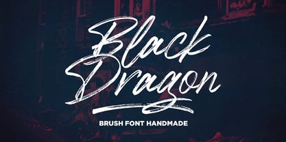 Black Dragon is a handmade brush font, naturally handmade and with underscores. Black Dragon is perfect for use in title designs such as clothing, invitations, title books, stationery designs, quotes, branding, logos, greeting cards, t-shirts, packaging designs, posters, and more. Black Dragon includes a complete set of uppercase and lowercase letters, as well as multi-language support, numbers, punctuation, ligatures, alternatives and extra swash. If you have any question, don't hesitate to contact me by email : megatype04@gmail.com Thanks so much for looking and Enjoy it!
 - Kaftus by Kulokale,
$28.00 Kaftus is a unique and stylish serif font. Kaftus is well-suited for advertising, branding, logotypes, packaging, titles, headlines and editorial design. This font is encoded with Unicode PUA, which allows full access to all additional characters without having special design software. Mac users can use Font Book, and Windows users can use Character Map to view and copy one of the extra characters to paste into your favorite text editor / application. We hope you enjoy the font. Thanks for purchasing and have fun!
 - Reflex by Sudtipos,
$29.00 Reflex update: Now in 18 styles and variable version. Reflex was designed as an alternative to many overused types found on the packaging of pop culture products. Taking its inspiration from Bauhaus design roots, even in its heavy weights it maintains a soft aesthetic that can transparently convey a message of newness and understanding, as well as clarity and evenness. The Reflex set comes with a wide range of linguistic support, at no extra charge, including characters for Central European, Cyrillic, Greek, Turkish and Baltic regions.
 - Local Brewery by Cultivated Mind,
$29.00 Local Brewery is a vintage inspired font collection that includes six script styles and two sans serif styles. Script styles include a ripple edged, smooth or rough version. The sans serif styles include a ripple edged or rough version. Local Brewery Script comes with lower case y, g and tail alternates. These alternates will give your designs an extra flair and uniqueness. The script and sans serif fonts work exceptionally well together. Use Local Brewery for packaging, magazines, marketing, weddings, beer labels, film and clothing.
 - Jefferys York by Maulana Creative,
$15.00 Jefferys York is a signature script font With clean monoline stroke, condensed, upright and fun character. It has Opentype features of ligatures and lowercase alternates, To give you an extra creative work. Jeffreys York script font support multilingual more than 100+ language. This font is good for logo design, Social media, Movie Titles, Books Titles, a short text even a long text letter and good for your secondary text font with sans or serif. Make a stunning work with Jeffreys York signature font. Cheers, MaulanaCreative
 - Freak Funky by Maulana Creative,
$13.00 Freak Funky is a Fancy Brush Script font. With rough brush stroke, slant and fun character with a bit of ligatures and bit of alt lowercase. To give you an extra creative work. Freak Funky font support multilingual more than 100+ language. This font is good for logo design, Social media, Movie Titles, Books Titles, a short text even a long text letter and good for your secondary text font with sans or serif. Make a stunning work with Freak Funky font. Cheers, Maulana Creative
 - Logkey Block by Maulana Creative,
$12.00 Logkey Block is a fancy unique font. With bold square stroke, fun character with a bit of ligatures and has a two files lowercase alternates. To give you an extra creative work. Logkey Block font support multilingual more than 100+ language. This font is good for logo design, Social media, Movie Titles, Books Titles, a short text even a long text letter and good for your secondary text font with sans or serif. Make a stunning work with Logkey Block font. Cheers, Maulana Creative
 - Stones by Fana Studio,
$20.00 STONES is a supercharged, street-wise brush font bursting with energy. With extra attention to quick strokes and sharp details, STONES is guaranteed to deliver an unapologetically loud & fast-paced message; ideal for logos, apparel, quotes, product packaging, or anything which needs a typographic turbo-boost. What you get : Numeral and Punctuation International Language Works on PC & Mac Simple installations Accessible in the Adobe Illustrator, Adobe Photoshop, Adobe InDesign, even works on Microsoft Word. Thank you for your purchase! Hope you enjoy with our font!
 - Stand Against by Maulana Creative,
$15.00 Stand Against Handwritten Graffiti Font Stand Against is a street display graffiti script font. With back slanted mono-line stroke, fun character with a bit of ligatures and alternates. To give you an extra creative work. Stand Against font support multilingual more than 100+ language. This font is good for logo design, Social media, Movie Titles, Books Titles, a short text even a long text letter and good for your secondary text font with script or signature. Make a stunning work with Stand Against font. Cheers, MaulanaCreative
 - P22 FLW Terracotta by P22 Type Foundry,
$29.95The lettering and 100 extras for this font set, the third in P22’s Frank Lloyd Wright series, are derived from letterforms and decorative embellishments found in Wright’s early work (1893–1910) and in his book, The House Beautiful (1896–97). Wright based his delicate graphic designs on stylized natural plant forms. Users go this font can adorn their graphics with these beautiful motifs. Terracotta Regular and Terracotta Alt have been remastered and now contain almost 400 characters including support for Western and Central European languages. - Curve by Fontador,
$24.99 Curve is a modern neo-classical typeface family with some features of the Didone genre, but especially designed for contemporary typography. A large x-height not only creates space in the letters for extra-bold styles, but also lends Curve an open and generous character in the more narrow and semi-bold versions. It has 616 glyphs with small caps, numbers and ligatures in 10 weights. Curve is a contemporary serif typeface, special for logos, brands, magazines and editorial and for setting trends in fashion and design.
 - Didona by ParaType,
$30.00 Designed at ParaType (ParaGraph) in 1992 by Vladimir Yefimov. Based on letterforms of Firmin Didot, a French typographer from the 18th century, ITC Didi, of 1970, by Herb Lubalin and Tom Carnase, and Russian typefaces of the 18th-19th centuries. A little extragerrated decorative stylization of letterforms in the spirit of Modern Serif, with elements of an irony. For use in headlines, in advertising and display typography. Improved and added with Extra Bold, old style figures, ligatures and other symbols in 2010 by the same author.
 - Liquorstore Bold & Bolder by Chank,
$99.00 In this modern era, sometimes being bold is not enough. Sometimes you need to go BOLDER! So here comes the Liquorstore Bolder font family, the long awaited sequel to the popular Liquorstore industrial, geometric display font. This new bolder font family features multiple styles that work on their own or as overlapping layers to create stunning multi-color typography. Chromatic layering effects are created with inline, outline, bi-line, and tri-line styles can be used together to create extra impactful words in your logos and headlines.
 - Aveghia by Kulokale,
$27.00 Aveghia is a modern and expressive serif font. Aveghia is well-suited for advertising, branding, logotypes, packaging, titles, headlines and editorial design. This font is encoded with Unicode PUA, which allows full access to all additional characters without having special design software. Mac users can use Font Book, and Windows users can use Character Map to view and copy one of the extra characters to paste into your favorite text editor / application. We hope you enjoy the font. Thanks for purchasing and have fun!
 - Vin Sans Pro by Mint Type,
$35.00 Vin (translated from Ukrainian as “he”) is a superfamily consisting of three robust typefaces with pronounced vertical stems and rounded corners. All three typefaces feature very large x-height for even more expression and assertiveness. Vin Sans Pro is a quite narrow rigid sans-serif typeface with extra-large x-height and rounded corners. It is perfect for any kind of short copy with lots of attention guaranteed. Be sure to check other two typefaces of Vin superfamily: Vin Slab Pro and Vin Mono Pro .
 - Milatones Signature by Maulana Creative,
$15.00 Milatones is casual signature font, with clean thin mono-line stroke, super slanted, condensed and fun character. It has Opentype features ligatures of character and lowercase alternate "t", To give you an extra creative work. Milatones font support multilingual more than 100+ language. This font is good for logo design, Social media, Movie Titles, Books Titles, a short text even a long text letter and good for your secondary text font with sans or serif. Make a stunning work with Milatones font. Cheers, MaulanaCreative
 - Rigular Script by Gloow Studio,
$18.00 Rigular Script has inspirated from retro style and funky designs like signs and old poster. This font comes with an extra extrude to make the font look more retro/unique and save your time on making it. Font has an opentype features that allow you to modify it as you like as needed. Andala perfect for poster, logo, book covers, tshirt designs, packaging and more. Features : Uppercase Lowercase Number Punctuation Ligature Multilingual Language PUA encode Opentype Features Just enjoy with our product! Thank you
 - Sacred Bridge by Bombastype,
$35.00 Sacred Bridge is an old fashioned display typeface, inspired by vintage signage combined with ornaments that were inspired by certain Indonesian tribe ornament feels, because our little type foundry is focused on vintage display fonts. Till now at least. Sacred Bridges offers a layered system, with regular, rough and slant versions from each style. And don't forget about the Extras (ornaments) we offer. You'll get separate ornaments and objects that you can mix and match. We also give you most of our ornaments seen in our display.
 - Sidehustle by Maulana Creative,
$14.00 Sidehustle is casual script font, with clean bold mono-line stroke, slant and fun character. It has Opentype features ligatures of character and some lowercase alternative option, To give you an extra creative work. Sidehustle script font support multilingual more than 100+ language. This font is good for logo design, Social media, Movie Titles, Books Titles, a short text even a long text letter and good for your secondary text font with sans or serif. Make a stunning work with Sidehustle font. Cheers, MaulanaCreative
 - HU Discopangpang KR by Heummdesign,
$25.00 "Disco Pang Pang" is the Korean name for Tagada rides. It is a characteristic typeface that is good to use when you want to make use of a unique and bouncy feeling. Light and Extrabold are made with the thickness of normal typefaces, but Left and Right have strange shapes with stroke thicknesses that are biased to one side. Its unique shape can make a strong impression on people. This font contains Korean.
 - Paverify by Esintype,
$14.00 Paverify is an all-caps geometric slab serif display face inspired by a particular pavement tile component which is evoking a blocky “I” letter. All other characters were interpreted based on its look and drawn accordingly. There are three uppercase Roman fonts in different weights and widths substantially. With the additional versions, type family consisting of 7 fonts in total. Over 220 Latin, Cyrillic and Greek script languages supported. Each font contains an extensive multilingual support with more than 1600 glyphs and OpenType features, including number forms, fractions, and stylistic alternate sets those provide different looks by the typographic preferences. For the lowercase letters there are small caps variants, i.e., shorter caps. These also have identical glyphs and matching marks to enable “Small Capitals From Capitals” feature. Narrower Medium and Bold styles was produced to accompany the Black first design. Paverify comes with an ornaments font named as “Extras”, which contains geometric graphical elements, i.e., paver stone patterns, banner/sticker background sets, star comps and a collection of catchwords to simplify creating feature rich layouts. As is known as interlocking paver in certain regions — a rectangular shape with the distinctive diagonal tabs — transcribing the simplest letter to draw into the whole alphabet was a challenging task. Not only it was the single thing that can be used as a source, considering its thick form in roughly 1.2:1 proportions compared to the sophistication of letterforms was the challenge. Starting point was keeping design consistent while both avoiding and preserving a particular appearance to achieve a similar texture, basically a repeating pattern on the streets. In contrary of a traditional approach, Paverify tend to have more contrast than the other slab serifs which helps to reduce massive stem weight of the source form. This look contributes to its hand painted sign effect achieved in a certain degree, which may otherwise impractical to transform because the source material is an inorganic, static form by definition. Tight and even spacing of the pavement tiles was inspirational for the kerning balance of the letters. Although the lighter weights have more space between the letter pairs, black weight adjusted as to be close to each other as the original grid. Tight spacing can be ignored by using Capital Spacing OpenType feature for the Outline versions as layer fonts. In one stroke, this gives an extra space between the letters to avoid diagonal armed letter terminals overlap. Black typographic colour and texture gives a sturdy appearance to the lines, it is useful for the projects where a robust display faces preferred for the titling, strong headlines, letter stacks, dropcaps, initials, short names on materials such as advertisements, book covers, posters, logotypes, wordmarks, package designs, and more in print or digital. Paverify can be paired as a complimentary face in a combination with broader type systems, where vintage look compositions and woodcut style fusions requiring an extra stunning texture.
 - October Crow - 100% free

- Makeba by RagamKata,
$14.00 Makeba - Psychedelic Typeface This is a writing style that might suit what you need, strong and bold, psychedelic style. Add just the right amount of vintage flair to your retro graphics with this original psychedelic-style design. Suitable for music posters, album graphics, book titles, etc. Get powerful but still funky with Makeba - Psychedelic Typeface.
 - Arggh @$*# Lite - Unknown license

- Presstape Lite - Personal use only

- Saginaw - Unknown license

- Isle Body by Mans Greback,
$19.00 Isle Body is a high-quality serif typeface family, drawn by Måns Grebäck during 2018 and 2019. It is a sweet font with a casual and calm look, with generous spacing and an even weight, adapted for body texts and small sized type settings. It comes in four weights, each one as italic, totaling in eight styles: Light and Light Italic, Medium and Medium Italic, Bold and Bold Italic, Black and Black Italic. The font family can be used in a combination with a font of a different style, or together with its sister font Isle Headline, also a serif font, which has the same basic structure but more distinct weights and a sharper look. Each style contains ligatures and support for a wide range of languages.
 - Distopia by Unio Creative Solutions,
$5.00 Distopia is a contemporary type system which focus on clarity and legibility, developed in two weights with true matching italics. Distopia includes, as previously said, two contrasting versions: Light and Regular with corresponding true italics. This font family combines modernist shapes with slight grotesque touches. Each variant was designed with an attentive optical evaluation; curves, details and spaces were specifically tweaked to better suit the requirements of a highly-legible typeface. The end result is a family with full multilingual capabilities and a coverage of several languages based on the Latin alphabet; Distopia aims to become your next typographic companion. Specifications: - Files included: Distopia Light, Distopia Regular with corresponding true italics - Multi-language support (Central, Eastern, Western European languages) - OpenType features Thanks for viewing, Unio.
 - Supra by Wiescher Design,
$29.00 »Supra« – designed by Gert Wiescher in 2012/13 – is a new sans typeface family of eight weights with matching italics. Supra is influenced by current and past sans typefaces, but has a completely new look. The pleasant flow and warm touch combined with great legibility makes Supra unique. The light and normal weights and the dominant x-height with its high ascenders make for easy reading of long copy. The heavy and x-light weights are great for elegant headlines. Supra is an OpenType family for professional typography with an extended character set of over 700 glyphs. It supports more than 40 Central- and Eastern-European as well as many Western languages. Ligatures, different figures, fractions, currency symbols and smallcaps can be found in all cuts.
 - Isle Headline by Mans Greback,
$19.00 Isle Headline is a high-quality serif typeface family, drawn by Måns Grebäck during 2018 and 2019. It is a sharp font with a clear and attentive look, adapted for headlines, titles and large type settings. It comes in four weights, each one as italic, totaling in eight styles: Light and Light Italic, Medium and Medium Italic, Bold and Bold Italic, Black and Black Italic. The font family can be used in a combination with a font of a different style, or together with its sister font Isle Body, also a serif font, which has the same basic structure but with a softer look and adapted for body text and smaller type. Each style contains ligatures and support for a wide range of languages.
 - Phone Pro by Tamar Fonts,
$50.00 "Relation Between Typology and Type Design" 'PRISTINE'; this font is—neither beautiful nor ugly, neither vigorous nor weak, neither traditional nor modern, neither serif nor sans serif, neither script nor printable, neither a text font nor a display font—it is rather all of the above, which makes it a more versatile typographic tool—[handwritten] characters that are well-suited for a wide variety of applications—from editorial design, [friendly] greeting cards... to branding, advertising, publicity and digital. Each glyph design combines its unique shapes and stylish ink-traps with parabolic curves. Each glyph design has been treated as an 'individual character'—the way I would treat a breathing, living, vulnerable and courteous human being; looking after each and every character as if it was my only child — bringing to light the authenticity and uniqueness of each individual, as well as my objective to bring about peace and harmony between them all as a whole. Designed with the intention of harmonizing between four scripts — Latin, Cyrillic, Greek and Hebrew; the whole family has a comprehensive set of characters—in addition to the Latin letters, the Phone typeface also has a full set of characters for Vietnamese, partially extended Cyrillic, Greek and Hebrew (sold separately). The t_t ligature is something unique to Phone, as well as the t_z ligature, among others and extras. A distinctive trait of the Phone typeface, is a high x-height combined with relatively short ascenders. The Phone typeface is in a way evoking the feeling of some Gaelic font and of the [Egyptian] Papyrus font (by Chris Costello, though, not being based on neither of those), having an exotic and an exquisite look, under the category of "Soft Fonts & Friendly Faces". Copyright Tamar Fonts/Hillel Glueck 2021 ALL RIGHTS RESERVED Any unauthorized distribution of my work is strictly prohibited, and will be prosecuted; do the right thing, and do not participate in the piracy of my typefaces; if you appreciate my work, then please pay for it and help me prosper — thank you!
 - Irrlicht by Aarhaus,
$30.00 Irrlicht is based on C. H. Kleukens’ 1923 typeface Judith Type . Whilst Dunkle Irrlicht is a fairly faithful rendition and extension of Kleukens’ typeface, the Licht style was initially added as a stand-alone stencil version; yet, the two styles work perfectly together – for different nuances, for emphasis or simply stacked/layered. Irrlicht is equipped with upper- and lowercase ligatures, contextual and stylistic alternates, fractions, superior and inferior figures, extended language support and a few extra goodies. Additional information – How Irrlicht came to life Christian Heinrich Kleukens cut his Judith Type in 1923, at the peak of German expressionism, exclusively for publications with the Ernst-Ludwig-Press, such as a limited series of biblical prints – the first being the Book of Judith , hence the original’s name. I stumbled upon this typeface a couple of years ago in a nice little 1930 booklet of the Gutenberg-Gesellschaft and was struck by its forceful darkness on paper and its seemingly simple, crude letterforms. The lack of a long-ſ in the final version of Judith Type – quite unusual for a German typeface of that time – adds to this feel of crudeness and spontaneity*. Judith Type seemed to me like a semi-blackletter cousin of Rudolf Koch’s typeface Neuland (cast in the same year). Besides its apparent affinity with expressionism, it reflects a lot of that deeply spiritual craftsmanship of the era – much like Neuland. A few months later, when I was working on a stencil project and looking for a typeface that could be cut into thin wooden plates easily, I remembered those dark, sharp letters that seemed to be lacking any curves at all. After enlarging a few letters and tracing them by hand, the whole set was redrawn digitally, using only straight lines. As for spacing, the goal was to keep the letters tight but to avoid touching characters – without ironing out all the original’s tension and rhythm. Deliberate kerning, subtle contextual alternates and ligatures help to deal with critical glyph combinations. Two additional versions were developed: a stencil version with open counters and, in reference to a popular style of the 1920s and inspired by dry, cracked wood, an inline version. These two additional styles were later merged into one font – Lichte** Irrlicht was born. — AARHAUS * Consequently, the original typeface’s German eszett is simply a ligature of the “round s” and standard z . In some of his publications, Kleukens dispenses with using eszett altogether and sets double s instead. Irrlicht , however, does feature a more common eszett (ß); the original, among other more faithful letter forms, can be accessed via the stylistic sets feature ** licht – literally bright – being the German term for inline typefaces – not to be confused with leicht ( light )
 - Peex - Unknown license

- Live Grotesk by Matt Chansky,
$18.00 An exquisite neutral body copy and memorable modern headline font – all under one pixel-perfect font family. Live Grotesk is no ordinary font, in fact it's two fonts in one, seamlessly working together. When big messaging requires a charismatic headline font to activate layout designs, amplify attention, and delight audiences with brand retention – turn on "FM," Live Grotesk's headline font. When you need a body copy font that is space-efficient, a highly refined neutral with a high x-height to help with readability, particularly on screens – Live Grotesk is for you. Stylish simplicity and neutrality are key components of the signature body copy look. This is why Live Grotesk is a uniquely crafted modern font for today's modern creatives. With a variety of weights, from light to bold, you'll also enjoy the robust offering of multilingual glyphs, plus a handful of extras like the estimated symbol, directional arrows, and helpful UX characters. When the creative direction calls for memorable, approachable, and consumable typography, consider Live Grotesk to elevate your marketing tactics. It's a font alive with versatility, that's why it's called Live Grotesk.
 - PT Sans Pro by ParaType,
$50.00PT Sans Pro is a comprehensive type family intended for a wide range of applications. It consists of 32 styles: 6 weights (from light to black) with corresponding italics of normal proportions; 6 narrow styles; 6 condensed styles; 6 extra condensed styles and 2 caption styles (regular and bold). The design combines traditional conservative appearance with modern trends of humanistic sans serif and possess enhanced legibility especially in caption styles. These features, besides conventional use in business applications and printed materials, make the fonts usable for direction and guide signs, schemes, screens of information kiosks, and other objects of urban visual communications. The fonts have extended Latin and Cyrillic character sets serving alphabets of all title languages of the national republics of Russian Federation and supporting the most of the languages of neighboring countries. Each font contains about 1400 characters including small caps for all alphabetic characters, 4 sets of figures with lining and old style variations, stressed Cyrillic vowels, indices, fractions and so on. Design -- Alexandra Korolkova with assistance of Olga Umpeleva and supervision of Vladimir Yefimov. The fonts released by ParaType in 2010. - Becky by W Type Foundry,
$22.00 Becky is a versatile display type designed to appeal to to a young audience of creative, up-to-date people. Geared towards the world of advertising and retail. It is well-suited for large headlines, branding, logos, publishing and short texts. With a modern look inspired by such geometric classics as Futura and an overall edgy, informal quality (seen in details like the subtle curve of its verticals), Becky stands out as a fun, unique type. Becky is a 10-variant type family that comes in 5 weights: light, regular, medium, bold and extra bold. It features 445 characters in total. Becky features 2 alternative stylistic sets: SS1 in which the diagonals in the letters X, Y, V, W, R, K, y,x,v,w and k shift from curved to straight in order to achieve a more formal look, especially useful for smaller texts. SS2 offers alternate glyphs for I, E, J, e, j and t, further expanding the possibilities of the typography. Learn about upcoming releases, work in progress and get to know us better! On Instagram W Foundry On facebook W Foundry wtypefoundry.com
 - Novel Sans Hair Pro by Atlas Font Foundry,
$50.00 Novel Sans Hair is the new package of 24 ultra light weights of Novel Sans Pro, the humanist grotesque typeface family within the largely extended award winning Novel Collection, containing Novel Pro, Novel Sans Pro, Novel Sans Hair Pro, Novel Sans Condensed Pro, Novel Mono Pro, Novel Sans Rounded Pro and Novel Sans Office Pro. Novel Sans Hair has a carefully attuned character design and a well balanced weight contrast. Classic proportions and the almost upright italic makes Novel Sans Pro being a modern humanist with the calligraphic warmth of a real italic. Many similarities with the other typeface families within the Novel Collection enable designers to combine the families and reach highest quality in typography. Novel Sans Hair [1020 glyphs] comes in 24 styles and contains small caps, an extra set of alternate glyphs, many ligatures, lining figures [proportionally spaced and monospaced], hanging figures [proportionally spaced and monospaced], small caps figures [proportionally spaced and monospaced], positive and negative circled figures for upper and lower case, superior and inferior figures, fractions, extensive language support, arrows for uppercase and lowercase and many more OpenType™ features.
 - As of my last update in April 2023, "Twilight" is not officially recognized as a standard font by major type foundries or as part of the conventional font libraries that come with software like Adobe...
- Mayonaise by Hanoded,
$8.00 Ah, so you've noticed a typo! Mayonnaise - the sauce, is written with double 'n'! I know. This font was named after a Smashing Pumpkins song that I like very much. Mayonaise is a bit of an ugly duckling. It is strange, open and messy, and might not be love at first sight. BUT, when you spend some time with Mayonaise and get to know her, you might actually fall in love. Just like that song I mentioned earlier. Go on then, give it a try! At this price, you can't go wrong!


