10,000 search results
(0.038 seconds)
- Oksana Sans by AndrijType,
$33.00 Oksana Sans is a gothic sister of the Oksana Text typeface. Supports all European Latin and Cyrillic codepages.
 - Shangrala by BA Graphics,
$45.00For headlines, text, or anything inbetween; a beautiful readable face with just a touch of the Far East. - Antique Light by Wooden Type Fonts,
$15.00 One of the classic display types of the 19th century, a slab font, suitable for text and display.
 - Scrup by Typotheticals,
$5.00 Scrup A basic font with a science fiction influence, good for headlines and where strong text is required.
 - Malibu Heights by BA Graphics,
$45.00A beautiful new sans serif great for magazines, ad work, text or headlines works for all your needs. - Vernon by Giles Edwards,
$25.00 Vernon’s inspiration came while researching and investigating a 'legible' typeface design for tangible purpose. The main characteristics of ‘Vernon’ can be seen in the slightly modulated strokes that reference the natural and friendly humanist proportions of the humanist hand, with open interior letterspace characteristics. The subtle detailing and finishing of strokes and junctions – seen in the curved tail of the lowercase ‘l’ and the head serif of the lowercase ‘i’, create a smooth rhythm along the baseline. Utilizing the ‘contextual alternative’ feature of OpenType, Vernon substitutes select characters in words with word-shapes that may cause visual confusion to some readers. Vernon uses subtle character differentiation in the detailing of the inner-shape / counter space from similar letter shapes (for example: ‘p’, ‘d’, ‘g’ and ‘q’) to assist in creating the contextual alternate designs. Vernon is recommended for use as a text typeface, as it performs well at small text sizes (12 point size and below) intended for continuous reading of printed instructional and presentational information, especially where an inclusive audience demographic is required.
 - Lotter by Kaer,
$19.00 Lotter blackletter with Drop caps One fine day I found a vintage book, it called “A treatise by the Dominican friar-writer Marcus von Weida on the Brotherhood of the Holy Rosary”. It was printed in 1515 by Melchior Lotter in Leipzig. The text was illustrated by hand-colored engravings on religious and liturgical themes and beautiful initials I like. Lotter was the last name of a family of German printers, intimately connected with the Reformation. An innovation by the elder Lotter was his use of Roman types for Latin, reserving the Gothic types for German. I'm happy to present to you my new font family. Lotter font family has Drop cap and Regular styles. It's all you need to precisely imitate medieval style text. Use Drop cap style as a decorative element at the beginning of a paragraph or section, other part of the paragraph should be in Regular style. You’ll get: * Drop cap & Regular styles * Uppercase and lowercase * Multilingual support * Numbers * Symbols * Punctuation * Ligatures Please feel free to request any help you need: kaer.pro@gmail.com Best, Roman.
 - Stajn Pro by Anže Veršnik,
$45.00 stajn-type.com — Stajn Pro Type Family Website where you can get DEMO version of Stajn Pro Book Stajn Pro was designed upon a main goal of using this typeface to set larger amount of text. The slightly condensed proportion allows for more content per page while large x height with its larger counters improves legibility and readability while used on smaller sizes. Despite the fact that Stajn Pro was designed as a body text Type Family, it works as well as a display too. Wide variety of weights as well as interesting, strong and at the same time beautiful character along with some stylistic alternate makes Stajn Pro a useful typeface in a field of editorial, magazine and promotional materials design. The Stajn Pro character includes some humanistic typeface characteristics, which add some softness and elegance in its strong and stable presence. More information about development, usage and characteristics of a Stajn Pro Type Family at stajn-type.com If you have any other questions please do not hesitate to write me at info@stajn-type.com
 - Eckhardt Casual JNL by Jeff Levine,
$29.00 Eckhardt Casual JNL was modeled from an example of poster lettering found in a 1941 Speedball® Lettering Pen instruction book. The font is named in honor of Jeff Levine's good friend, the late Albert Eckhardt, Jr. (owner of Allied Signs in Miami, Florida until his passing) and is one of a number of releases with a "sign painter" theme that comprise the "Eckhardt Series".
 - Air Superfamily by Positype,
$29.00 In B-movie awesomeness, Air began as Grotesk vs. Grotesque. I was trying to unify the prevailing traits of German and English Grotes(que/k)s in order to make something different but familiar. I am NOT trying to reinvent Helvetica (snore), so get that out of your system. From the onset, I intended this typeface to be a true workhorse that offers infinite options and flexibility for the user. At its core, it is the maturation of the Aaux Next skeleton I developed years ago. I worked out Aaux Next to settle my issues and love for Akzidenz. With Aaux Next, I strove to be mechanical, cold and unforgiving with it. I was single, young, cocky and it fit. Now I'm married, kids, dog and have found that I've turned into a big softy. When I look at Aaux Next (and have for the past few years) I see another typeface trying to eek out. I wanted it to avoid the trappings of robotic sans, quick tricks and compromises. The typeface’s DNA needed to be drawn and not just generated on a screen — so I set aside a year. I love type. I love working with type. I hate when my options for a slanted complement is only oblique or italic. I set out to produce both to balance usage — there are more than enough reasons to prepare both and I want the user to feel free to consciously choose (and have the option to choose) the appropriate typeface for print, web, etc. That flexibility was central to my decision-making process. The Oblique is immediate and aggressive. The Italic was redrawn at a less severe angle with far more movement and, as a result, is far more congenial when paired with the Uprights. Condensed and Compressed. Yep, why not? I know I would use them. There are nine weights currently available. The logical progression of weights and the intended flexibility demanded I explore a number of light weights and their potential uses — this has produced a number of ‘light without being too light’ options that really work based on the size. The result is a robust 81-font superfamily that is functional, professional, and highly legible without compromising its personality. Pair that with over 900 characters per font that includes ligatures, discretionary ligatures, stylistic alternates, fractions, proportional/tabular lining and proportional/tabular oldstyle figures, numerators, denominators, ordinals, superiors, inferiors, small caps, case-sensitive functionality and extensive language support and you have a versatile superfamily well-suited for any project.
 - Sunkids by Wacaksara co,
$18.00 Sunkids is a bold connected script font inspired by the spirit of sports and the Olympic Games. This font is great for your next creative project such as logos, printed quotes, invitations, cards, product packaging, headers, Logotype, Letterhead, Poster, Apparel Design, Label, and etc. Sunkids comes with uppercase, lowercase, numerals, accents (Multilingual characters), punctuations and so many variations on each character include OpenType alternates, PUA encoded and common ligatures.
 - Ambivert by Gassstype,
$23.00 Hello Everyone, introduce our new product Font Ambivert is a Rough Display Font.This is a Textured Natural Style and classy style with a clear style and dramatic movement. This font Ambivert is great for your next creative project such as logos, printed quotes, invitations, cards, product packaging, headers, Logotype, Letterhead, Poster, Design this font is great for your creative projects such as watermark on photography, and perfect for logos & branding.
 - Blaze Vortex Graffiti by Sipanji21,
$10.00 "Blaze Vortex" is an edgy graffiti monoline font that adds a raw and urban touch to your designs. With its captivating swash decorations, this font takes your designs to the next level of awesomeness. Perfect for streetwear brands, music posters, and urban-themed projects, "Blaze Vortex" exudes boldness and excitement. Unleash your creativity and make your designs stand out with this electrifying font. note : key for swash use : ABCDEFGHIJKLMNOP
 - Thessallone by Wacaksara co,
$16.00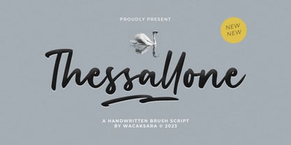 Thessallone is a handwritten brush script font. Perfect for adding a unique impression that looks natural like manual handwriting when opentype is active. This font is great for your next creative project such as Logotype, printed quotes, invitations, cards, product packaging, headers, letterhead, poster, apparel design, label, book cover and etc. Thessallone comes with uppercase, lowercase, numerals, punctuations and so many ligatures variation to let you customise your designs. Thanks
 - Lucid Dreams by Prestige Artsy Studio,
$29.99 Lucid Dreams is a timeless powerful and bold display serif. Thanks to OpenType features Lucid Dreams comes in with over 100 stylistic alternates providing you with several options to embellish your next branding project. Lucid Dreams will work perfectly for wall art work, quotes, branding, logo design, t-shirt design, posters, magazine headlines, stationary and much more. I can't wait to see what you can do with Lucid Dreams!
 - Everland Script by Wacaksara co,
$16.00 Everland Script is a hand painted bold script font inspired by old signage and sign painting. This font is great for your next creative project such as Logotype, printed quotes, invitations, cards, product packaging, headers, Letterhead, Poster, Apparel Design, Label, and etc. Everland Script comes with uppercase, lowercase, numerals, punctuations and so many variations on each character include OpenType alternates, and common ligatures to let you customize your designs.
 - Linotype Dala by Linotype,
$40.99Created by Swedish designer Bo Berndal in 1999, Linotype Dala Text can best be described as a softer, friendlier blackletter. Blackletter refers to typefaces that evolve out of Northern Europe's medieval manuscript tradition. Often called gothic, or Old English, these letters are identified by the traces of the wide-nibbed pen stroke within their forms. Linotype Dala Text most resembles the fraktur type of blackletter. Fraktur types were popular text faces in Northern Europe until the 20th century. Inspired by Swedish folklore, this fraktur is much softer and rounder than most examples. Its connection to the Scandinavian folkloric tradition makes Linotype Dala perfectly suited for such texts as fairy tales, medieval stories, and other things that might appeal to a child's sense of adventure. To strengthen the medieval fairy tale look, use Linotype Dala Text together with other elements of the Linotype Dala family: Library's Linotype Dala Pict and Linotype Dala Border. The characters in these two supplementary fonts were inspired by medieval and renaissance folk art, and were also drawn by Bo Berndal, making them a perfect match. All three styles of the Linotype Dala Family are part of the Take Type 4 collection from Linotype GmbH." - Axeo by Asritype,
$13.00 Axeo is a freeform serif typeface. With more than 500 glyphs for each cut, Axeo supporting wide Latin Base Languages. The font structures is sans-serif typeface. Then, the fonts is made into serif (serifed) using rhombus and adapted/modified rhombus (before remove overlaps) placed on its appropriate positions. This fonts is released first, while the sans-serif is being in process. There are 10 fonts; 5 weight in normal width: Light, Regular, Medium, Bold, and Black; and 4 in semi-condensed: Light, Regular, Medium, Bold and Black, too. The fonts has some minor character variations, all are sets in SS01.There are also standard and discretionary ligatures, arrow, some geometric shapes and ornaments. With its sansserif structure, the Medium, Bold and Black fonts is playful with text effect in various applications such MS Word, CorelDraw or others to enhance the appearance. Its serif form will make unique enhancements. Thus, the fonts is suitable for Branding, logos, cards, advertisements, banners, display and more; for the main texts or its companions. While the light, regular and medium fonts can also be used as description text, card text, note, caption and longer non-formal texts or other usages.
 - Karim by Linotype,
$187.99Karim is a traditional-style Arabic text face, designed in response to a demand for a traditional text face adapted to setting Quranic commentaries. Within the constraints of the standard character set and typesetting program, Karim’s design aims to recall the style and fluency of manuscript Naskh without, however, reproducing the idiosyncrasies of any particular calligrapher. The line weight chosen is heavier than usual for a traditional light face in order to benefit the reproduction of small size Tafsir text. A tall kaf, deep descenders and slightly inclined alifs and lams all help to suggest the cursiveness of manuscript. The type-style that emerges is characterized by restraint and clarity; qualities suited to Karim’s original purpose, and ones that recommend it for wider use. Karim ships includes Latin glyphs from Janson Text Roman, allowing the single font to set text in both most Western European and Arabic languages. Karim’s code pages incorporate Basic Latin and the Arabic character set, which supports Arabic, Persian, and Urdu. The font includes tabular and proportional Arabic, Persian, and Urdu numerals, as well as a set of tabular European (Latin) numerals. - Light Fun by Olivetype,
$18.00 Inspired by pop art and handmade touch, Light Fun is a bold display font that gives off a "light" feeling. Light Fun is playful and fun, but still serious enough for a corporate environment. This typeface is perfect for use in posters, branding, and product packaging. It screams creativity, suitable for a logo, a poster, a product packaging project and more. So what’s included : Basic Latin Uppercase and Lowercase Numbers, symbols, and punctuations Multilingual Support. Accented Characters : ÀÁÂÃÄÅÆÇÈÉÊËÌÍÎÏÑÒÓÔÕÖØŒŠÙÚÛÜŸÝŽàáâãäåæçèéêëìíîïñòóôõöøœšùúûüýÿžß PUA Encoded and fully accessible without additional design software Simple Installations, works on PC & Mac Download Light Fun now and use it in your next project!
 - ITC Kallos by ITC,
$29.99ITC Kallos is the work of British designer Phill Grimshaw, a text typeface family with traditional calligraphic flair. It is the result of Grimshaw's first experiments with text typeface design. The long ascenders and descenders of the lowercase alphabet lend them a look of sophisticated elegance. The capitals display the unmistakable influence of the pen and the proportions of classic inscriptional forms. - Ye-As-Ta by Grummedia,
$20.00Ye-As-Ta is a unique interpretation of traditional brush drawn oriental calligraphy. A caps only font, the characters type English style left to right but appear laid on their side. When the text box is rotated 90 degrees clockwise the text reads top right to bottom left, oriental style. A fun typeface, though reading can require a little practice! - Jules Otonomi by Maulana Creative,
$12.00 Jules Otonomi is a Classy look signature font. Jules Otonomi included opentype features Rich Ligatures. Jules Otonomi support multilingual more than 100+ language. This font is good for logo design, Movie Titles, Books Titles, a short text even a long text letter and any awesome project you create. Make a stunning work with Jules Otonomi classy signature font. Cheers, MaulanaCreative
 - Pyramus NF by Nick's Fonts,
$10.00This engaging antique text face is based on Paragon Light, from the 1905 specimen book from Barnhart Brothers & Spindler. Although it is spaced and kerned for text work, it also is suited for headlines if you tighten the tracking. Both versions of this font contain complete Unicode 1252 (Latin) and Unicode 1250 (Central European) character sets, with localization for Romanian and Moldovan. - Vespertine by Gassstype,
$28.00 Here comes a New font, Vespertine is a Strong Rough Brush Font that is written casually and quickly. comes in two mode = Standart and italic. Letters are made with brushes on Procreate. Then crafted carefully drawn into vector format. That is why Vespertine has Rough and strong characteristic more natural look to your text with a more modern look to your text.
 - Arabescos ND by Neufville Digital,
$29.60 Arabescos ND is part of Neufville Digital's GRAFÍA LATINA Collection. The original name of this collection of typographic decorations is 'FUGUE D´ARABESQUES'. These elements can spice up texts and give them a significance beyond their words. Unlike other typographic decorum these symbols inspired by sea and air have numerous matching points to join them with letters, words and texts.
 - NorB Scribe by NorFonts,
$28.00 NorB Scribe is a handwritten text font witch can be used with any word processing program for text and display use, print and web projects, apps and ePub, comic books, graphic identities, branding, editorial, advertising, scrapbooking, cards and invitations and any casual lettering purpose… or even just for fun! It comes with 6 weights featuring Light, Normal, Bold with their Italic version.
 - Nordika by Scholtz Fonts,
$19.00Nordika is an understated, elegant, sans serif face with that clean legible corporate look. Its simple, trendy design makes it distinctive enough for display work. It makes a bold statement and is highly readable. Nordika is both condensed and quite bold and is therefore suitable for body text where some emphasis is required. Great for text and headlines - for just about any application. - Kids Rule by PizzaDude.dk,
$13.00 Sometimes you need a lot of text, and that text needs a little bit extra something. Something sweet for the eye, but still legible and not too funky. Maybe that's where Kids Rule comes in. It's a bouncy, but super-legible handmade comic font. It has a lot of attitude, and I have added 5 different versions of each letter!
 - NorPen Script by NorFonts,
$15.00 NorPen Script is a handwritten Text Font made with an arabic calligraphy pen (my favorite pens) witch can be used with any word processing program for text and display use, print and web projects, apps and ePub, Comic Books, graphic identities, branding, editorial, advertising, scrapbooking, cards and invitations … or even just for fun! It comes with 2 weights: Regular and Italic.
 - Linotype Aperto by Linotype,
$40.99Linotype Aperto is a typical text font in the style of transitional faces, like its often-used cousin Times. It is available in roman, semibold and bold weights, each with its matching italic. The roman weight is complete with old style figures and small caps. Its balanced, reserved appearance makes Aperto extremely flexible, good for long texts as well as headlines. - Luxury Home by Fo Da,
$5.00 Luxury Home is a slab serif typeface of 9 weights from Extra Light to Extra Black and can be used as both a headline and text face. "Luxury Home" is recommended for using in long-form writing and articles, since a serif is far more readable for longer passages of text. The typeface has a carefully crafted weight range, with ligatures .
 - Stoopid Markers by Gassstype,
$28.00 Here comes a New font, Stoopid Markers is a Bold Market Typeface that is written casually and quickly. these strong Letters are made with Market Typeface on Procreate. Then crafted carefully drawn into a vector format. That is why Stoopid Markers has a charming, authentic, and relaxed characteristic more natural look to your text with a more natural look to your text.
 - Mary Read by Melli Diete,
$50.00 Mary Read is a modern handwritten Display Font, showing its fancy curves best in headlines as well as short texts. For typographic variety the typeface offers a range of features and extras. Give your texts a quite playful and handwritten note. Being chi chi is not a crime, don’t hesitate to pepper some sweetness in the midst of people’s attention.
 - Cyrillic Latino by Wiescher Design,
$39.50 Cyrillic Latino is a combination of the cyrillic and latin version of my Bodoni-Classic-Text typefaces. The typeface comes in very handy if you want text to look Russian but can be read by everyone. Since it is a combination of two of my typefaces I only charge the price for one typeface. Your trying-to-be-fair designer, Gert Wiescher
 - ITC Oldbook by ITC,
$29.99For some time, Eric de Berranger had wanted to create a distressed typeface design - one that gave the appearance of antique printing and showed signs of wear, yet was still highly readable. He was busy designing a new face called Maxime, when an idea struck: I realized that I could use these lettershapes as the basis for my antique typeface," he says. The two faces ended up being designed in tandem. While ITC Oldbook clearly captures the flavor of aged, uneven and imperfect printing, it also meets de Berranger's goal of being exceptionally readable in text sizes. Beginning with well-drawn characters was the key, and these were carefully modeled into the distressed forms. "The process was more difficult than I originally thought," says de Berranger. "The antique letters had to be tested and modified several times to work correctly." ITC Oldbook elegantly simulates antique printing in both text and display sizes. And while stroke weights are uneven and curves are irregular, the design has remarkably even color when set in blocks of text copy. Add to this the design's inherent legibility, and ITC Oldbook acquires a range far beyond replication of things old; it's suitable for any project that calls for warm and weathered typography. ITC Oldbook is available in roman and bold weights with complementary italic designs. Small caps, old style figures and a suite of alternate characters and ornaments provide additional flexibility and personality to the design." - HGB Unik by HGB fonts,
$23.00 For many years I had repeatedly written names on certificates or designed texts for certificates of honor with a pen. I later digitized a font written with a broad pen from 1988 to make it easier to use. After the technical possibilities for this had developed, I made a PostScript font out of this document font. The "HGB-Unik" is a humanistic antiqua that arose from this written type. In 2009 Unik was chosen as the text font for a book. However, the book designers wanted to have an italic and a bold style as well. The cursive was developed from written texts that I also wrote for various occasions in the 1980s. The resulting font family was thoroughly revised several times until a usable text font with four weights was created. Although the Unik looks very idiosyncratic in display size, it shows a surprisingly balanced, pleasant typeface in read size.
 - Stapel by ParaType,
$30.00 Stapel is a contemporary closed sans serif with sci-fi looking forms and eloquent, thin stroke joints. The superfamily consists of three subfamilies of different width: Normal, Narrow and Condensed. Each subfamily contains seven weights with corresponding true italics. Additionally, there are several extra wide bold styles. All these styles work perfectly in headings and short display texts. Another important subfamily is Stapel Text which includes upright and italic styles of lower contrast and more generous spacing. Text styles are great for body text in small and medium point sizes. Most styles include alternate characters, proportional and lining figures, math symbols, fractions, currency signs and case-dependent punctuation. A wide range of styles and typographic features makes Stapel ideal for use in brand identity, infographics and all kinds of designs related to technology, science, finance, politics or sports. Stapel was designed by Alexander Lubovenko and released by Paratype in 2020.
 - MVB Celestia Antiqua by MVB,
$39.00Mark van Bronkhorst designed MVB Celestia Antiqua at a time when font choice was limited. Design was characterized by overuse of the few fonts that came with laser printers. A rustic typeface, recalling the roughness and irregularity of pre-digital printing, was a response to the cold crispness of DTP. MVB Celestia Antiqua holds its own among a large group of other “weathered” serif fonts, in part due to the size of the family: three weights, small caps, italics, and two titling styles. But it's also successful because it's simply drawn well, the contours only as rough as they need to be, enabling text at any size, large or small. - Jan by Linotype,
$29.99Jan Regular combines an experimental, bold, mono-weight geometric sans serif with the Arabic writing system's means of joining letters. Adding in script-like letter connections, a feature that is found in both western cursive and Arabic type, as well as distinctly Arabic-like accents above and below certain letters, Michael Parsons has created a cross cultural typographic statement. Jan Regular is best used for headlines, and small strings of text, in sizes large enough to view and appreciate the unique counter forms within the letters. This font is one of 10 creations from the young Swiss designer Michael Parson included in the Take Type 5 collection, from Linotype GmbH."