10,000 search results
(0.037 seconds)
- Eddieth Brush by Keristyper Studio,
$12.00 Eddieth Handbrush is a best-handwritten brush that is written casually and quickly. This font is good for logo design, Social media, Movie Titles, Books Titles, short text even long text letters, and good for your secondary text font with sans or serif. Featured: Standard Uppercase & Lowercase Numeral & Punctuation Multilingual : ä ö ü Ä Ö Ü ß ¿ ¡ Alternate & Ligature PUA encoded We recommend programs that support the OpenType feature and the Glyphs panel such as Adobe applications or Corel Draw. so you can use all the variations of the glyphs. Hope you enjoy our fonts!
 - InSign by Konst.ru,
$- Geometric font for paradoxical or short texts. Also maybe use for headlines, logos etc.
 - Ravenwood by BA Graphics,
$45.00A strange design very mysterious and bizarre but sets extremely well even in text. - Lazy Fox by Pixel Colours,
$18.00 Lazy Fox is a handwritten font that has an imperfect look, great for texts!
 - Alons Antique by BA Graphics,
$45.00Created as a Headline Face Alons Antique works amazingly well as a text face. - Kauhuaatos by Morganismi,
$12.00 Kauhuaatos is a writable picture font, ideal for scaring anybody by text or prints.
 - Monica by Weknow,
$25.00 Give a groovy fun simple rounded, fancy, a cute looks to any text project
 - Pixa Circle by Ayi Studio,
$10.00 Font family designed for screen texts with eight variants and a variant of dingbats.
 - Pixa Square by Ayi Studio,
$10.00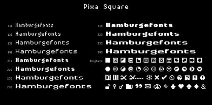 Font family designed for screen texts with twelve variants and a variant of dingbats.
 - AleKoteret MF by Masterfont,
$59.00 This high readable font family is highly suitable for headlines as well as text.
 - Scotch by Positype,
$29.00 Clean, crisp, rational, familiar, modern… serifed. Positype Scotch reaches back to history just enough to produce something warm and easy on the eyes. No corners were cut, no quick tricks… this type suite was drawn for specificity: Text, Display, and Deck… ALL in 3 widths that now include Condensed and Compressed. Each unique, each inter-connected, each part of the whole. Scotch Text is offered in 6 weights with matching true italics. Drawn for economy and an easy read, the family is a workhorse for long-passage text settings. 4 sets of numerals, well-proportioned small caps, and a plethora of extras round out each font. Scotch Display is not just a thinner version of Scotch Text wrapped in a higher contrast. Display sports shorter ascenders and descenders, a unique footprint, great contrast, and a more folded, calligraphic italics. Display subtly oozes sophistication and provides an attractive, exhuberant companion to Scotch Text. Scotch Deck rounds out the offering by choosing to be specific to its offering. Deck utlitizes traits and proportions shared between Text and Display, but alters its overall mass to balance out the needs for settings that require subheadlines, callouts and other similar uses. Essentially, something not so high-contrast and not so stress dense that works great for middle-sizes.
 - Xtra Sans by Typolar,
$58.00 In its characteristics Xtra Sans is a combination of modern grotesks/grotesques and traditional calligraphy. Its upright and compact letterforms generate a sturdy effect as in the early 20th century grotesks Nobel, Kabel or Erbar. On the contrary, dynamic inside forms (counters) give the characters a fluent appearance. As a result, Xtra Sans stands out in large size, while remaining highly legible in small and long text. In 2007 Xtra Sans received a Certificate of Excellence in Type Design from Type Directors Club, New York. In 2002, still unpublished, it was awarded a bronze prize at the Morisawa Awards, Tokyo.
 - Gramma by CAST,
$45.00 Gramma is a compact sans with big x-height, a robust and balanced typeface that work well both for headlines and main bodies of text. The initial constructions, assembled from a few well-defined geometric modules, were later polished into more organic forms; the letters’ arches are quite squared, and the counters and other internal negative spaces push outward, creating a tension that balances the forms’ compression. Gramma’s most evident characteristic is its “bird-beak” terminals (present in many letters, including the c, e, f, s...) that replicate the unconnected junctures between stem and curve, visible in the a,b,d,g,h.
 - 1883 Fraktur by GLC,
$38.00 This family was inspired by the set of fonts used in the end of 1800s by the famous J. H. Geiger, printer in Lahr (Germany), especially these used to print an almanac for the year 1883. It is a Fraktur pattern, with two styles, as a few others incomplete fonts also used for this work were Blackletters from other patterns. Both were used in two size, for titles, subtitles, main text and notes. This font contains standard ligatures and German historical ligatures (German double s, long s, tz, ch, ck...) and diacritics. 1543 German Deluxe Initials may be used in complement this family.
 - Conglomerate by Typetanic Fonts,
$39.00 Sans or serif? Square or rounded? Calligraphic or geometric? Conglomerate is both all and none of these things — a subtle yet unorthodox blend of typographic traits resulting in a clean, unique, and versatile font family with large, open counters for legibility in text yet crisp, sharp details that sparkle at display sizes. Conglomerate is sturdy but never stiff, crisp but never stark — perfect for projects that require a more contemporary feel than either a traditional serif or geometric sans might bring. Conglomerate received a PRINT Magazine Best in Class award, and was one of Typographica’s Favorite Typefaces of 2016.
 - Gaspo Slab by Latinotype,
$26.00 Gaspo Slab is a fresh slab serif typeface that features esthetically pleasing curves, strong serifs, ample counters, humanist proportions and ink traps. The result is a very functional font with a contemporary design and highly readable at small sizes. Gaspo Slab consists of 7 weights, from Ultra Light to Black, with matching italics. This family comes with a 434-character set that includes European diacritics, tabular figures, alternative characters, numerators and fractions, making it possible to use the font in 128 different languages. The font is well-suited for headlines, medium-length text, magazines, newspapers, advertising, corporate use and product design.
 - Gutknecht by Proportional Lime,
$9.99 Jobst Gutknecht was a highly successful printer in the city of Nuremburg from 1514 to 1542. He published the "Achtliederbuch" (the first Lutheran hymnal, with a whole 4 tunes) and many works by Martin Luther. This font is an accurate "recutting" of the font face Gutknecht used for the body text in his printed works. It has been extended to over 900 glyphs adding hundreds for modern use. It also presents many ancient things like old ligatures such as "tz", a hedera, and alternate style pilcrow for visual interest. And for those conservative types the modern lower case "k" is also available.
 - Brewery No 2 Paneuropean by Linotype,
$103.99An entry in the Second Linotype Design Contest, Linotype Brewery, designed by Gustavs Andrejs Grinbergs, became part of the TakeType Collection in 1997. Brewery No 2 represents a significantly improved version of its precursor, and the typeface has been both extended and enhanced. When asked about prototypes, Grinbergs cites German typefaces of the early 20th century. It is thus not surprising that the characters of Brewery™ No 2 are based on geometrical forms. However, this is no mere synthetic Grotesque-derived typeface. It has significant contrasts in line thickness and triangular line terminals that are not unlike serifs, placing it in the middle ground somewhere between a Grotesque and serif font. The contrast between the features of a synthetic Grotesque and an Antiqua gives the characters of Brewery No 2 their distinctive charm and is the distinguishing attribute of this contemporary typeface. Additional vibrancy is provided by bevelled line endings (as in the case of the 'E' and the 'F'), the circular punctuation marks and the slight curve of the descending bar of the 'k'. Thanks to a generous x-height and its open counters, Brewery No 2 is also highly legible in small point sizes. Only in its bolder versions is another aspect of Brewery No 2 apparent; Grinbergs has here made the linking elements more rectangular and has emphasized the counters, so that the Bold variants of Brewery No 2 exhibit elements typical of a broken typeface. Brewery No 2 is available in seven finely graduated weights, ranging from Light to Black. Every variant has a corresponding, slightly narrower Italic version. In addition, the lowercase 'a' is given a closed form, the 'e' is more rounded and the 'f' has a descender. The character sets of Brewery No 2 leave nothing to be desired. In addition to small caps and ligatures, there are various numeral sets with old style and lining figures for setting proportional text and table columns. In its most extensive form (the Pan-European variant), Brewery No 2 can be used to set texts in many languages that employ the Latin alphabet and also texts in international languages that use Cyrillic or monotonic Greek orthography. Although some of the features of Brewery No 2, such as the tiny serifs, are only evident in the larger point sizes, this typeface is not just at home when used to set headlines. Brewery No 2 also cuts a good figure in short or medium length texts. This contemporary typeface with its formally elegant quality looks good, for example, on posters, in newspapers and promotional material. It can also be used for websites as it is also available as a web font. - Brewery No 2 by Linotype,
$40.99 An entry in the Second Linotype Design Contest, Linotype Brewery, designed by Gustavs Andrejs Grinbergs, became part of the TakeType Collection in 1997. Brewery No 2 represents a significantly improved version of its precursor, and the typeface has been both extended and enhanced. When asked about prototypes, Grinbergs cites German typefaces of the early 20th century. It is thus not surprising that the characters of Brewery™ No 2 are based on geometrical forms. However, this is no mere synthetic Grotesque-derived typeface. It has significant contrasts in line thickness and triangular line terminals that are not unlike serifs, placing it in the middle ground somewhere between a Grotesque and serif font. The contrast between the features of a synthetic Grotesque and an Antiqua gives the characters of Brewery No 2 their distinctive charm and is the distinguishing attribute of this contemporary typeface. Additional vibrancy is provided by bevelled line endings (as in the case of the 'E' and the 'F'), the circular punctuation marks and the slight curve of the descending bar of the 'k'. Thanks to a generous x-height and its open counters, Brewery No 2 is also highly legible in small point sizes. Only in its bolder versions is another aspect of Brewery No 2 apparent; Grinbergs has here made the linking elements more rectangular and has emphasized the counters, so that the Bold variants of Brewery No 2 exhibit elements typical of a broken typeface. Brewery No 2 is available in seven finely graduated weights, ranging from Light to Black. Every variant has a corresponding, slightly narrower Italic version. In addition, the lowercase 'a' is given a closed form, the 'e' is more rounded and the 'f' has a descender. The character sets of Brewery No 2 leave nothing to be desired. In addition to small caps and ligatures, there are various numeral sets with old style and lining figures for setting proportional text and table columns. In its most extensive form (the Pan-European variant), Brewery No 2 can be used to set texts in many languages that employ the Latin alphabet and also texts in international languages that use Cyrillic or monotonic Greek orthography. Although some of the features of Brewery No 2, such as the tiny serifs, are only evident in the larger point sizes, this typeface is not just at home when used to set headlines. Brewery No 2 also cuts a good figure in short or medium length texts. This contemporary typeface with its formally elegant quality looks good, for example, on posters, in newspapers and promotional material. It can also be used for websites as it is also available as a web font.
 - PGF Americas by PeGGO Fonts,
$27.90 PGF-Americas is a font family, created by Pedro González for Peggo Fonts between 2015 and 2021. Inspired by Rudolf Koch’s Carved Letter design artwork. PGF-Americas delivers a readable, playful, and versatile experience through a font-weight range that goes from thin to ExtraDark plus two Inline weights, an Initials set, one set with ornaments and the other with weather theme dingbats that follow a coherent rhythm and proportions of the family core. An expressive tool that can consistently be applied as decorative complements to solve label, books & movie cover design, headlines, posters and friendly educational products. It adds generous OpenType features with the same spirit as the default versions. Access All Alternates Glyphs Composition/Decomposition Localized Forms Subscript Scientific Inferiors Superscript Numerators Denominators Fractions Ordinals Linig Figures Proportional Figures Tabular Figures Oldstyle Figures Case-Sensitive Forms Discretionary Ligatures Standard Ligatures Full Widths Swash Stylistic Alternates Stylistic Set 1, Stylistic Set 2, Stylistic Set 3, Stylistic Set 4 It supports over 300 Latin based languages: Abenaki, Afaan Oromo, Afar, Afrikaans, Albanian, Alsatian, Amis, Anuta, Aragonese, Aranese, Aromanian, Arrernte, Arvanitic (Latin), Asturian, Atayal, Aymara, Azerbaijani, Bashkir (Latin), Basque, Belarusian (Latin), Bemba, Bikol, Bislama, Bosnian, Breton, Cape Verdean Creole, Catalan, Cebuano, Chamorro, Chavacano, Chichewa, Chickasaw, Cimbrian, Cofán, Cornish, Corsican, Creek, Crimean Tatar (Latin), Croatian, Czech, Danish, Dawan, Delaware, Dholuo, Drehu, Dutch, English, Esperanto, Estonian, Faroese, Fijian, Filipino, Finnish, Folkspraak, French, Frisian, Friulian, Gagauz (Latin), Galician, Ganda, Genoese, German
 - Italia by ITC,
$29.00Italia is the work of Colin Brignall, a refreshingly different serif typeface. At first glance, Italia might seem comparable to any other square serif typeface, but it has a distinctive pattern all its own. Italia can be used as either a display or text typeface and will give any text a unique look. - Jam Adega by JAM Type Design,
$20.00 Jam Adega is a humanist sans-serif typeface, intended to be clear and highly legible at a distance or at small text sizes. Jam Adega is extremely legible at a glance. This typeface can be used in large blocks of small text or as signage because of its instant and clear legibility.
 - Jilkyway by PizzaDude.dk,
$20.00Jilkyway is a truly weird font. Here and there you might spot some sanity in the weird font curves. But as you type, your text becomes more and more weird! The font is also suitable for text written in ALL CAPS! You will need to use OpenType supporting applications to use the autoligatures. - Pragma ND by Neufville Digital,
$45.25 Pragma ND is a sans serif typeface with calligraphic features. Its vital rhythm facilitates the reading of long texts. It also has an “authentic” italic imitating the movement of handwriting. Its high legibility makes it an ideal typeface for long texts in analog and digital contexts. Pragma is a Trademark of BauerTypes SL
 - Linotype Sallwey Script by Linotype,
$29.99Linotype Sallwey Script was designed by Friedrich K. Sallwey in 1980. This typeface has a handwritten character due in part to its slight lean to the right. Sallwey Script is both lively and harmonious and lends texts a private, personal touch. Sallwey Script is best suited to middle length texts and headlines. - HU Mobydick by Heummdesign,
$15.00 HU mobydick is a body font with square modules and a wide space composition. Sharp right-angled joints and strong endings. And thin strokes are combined to complete a harmonious typeface for body text. The gray level of the body text is set low, so it can be used for light work.
 - Civane Serif by insigne,
$35.00 Civane Serif maintains the epic grandeur of Civane with a text-friendly typeface. Inspired by the great tales of old, the grandeur of Civane is refined into a serif font with sharp serifs. Civane Serif is a contemporary sans-serif typeface with a robust character set. The Civane Serif family of typefaces supports 48 Latin-based Western, Central, and Eastern European languages, as well as the Baltic States and Turkey. Ligatures, small caps, embellishments, and a wide range of numerals are all accessible in OpenType, including proportional and tabular-width numbers, old style figures, fractions, inferiors, and superiors. Civane Serif is one of the finest choices for serif text setting. The italic or bold weights, as well as the roman set in titling caps, will impart a feeling of serene dignity on posters and webpages. Civane Serif's craftsmanship shines through with its higher contrast modern design, perfect for high-end premium goods and services.
 - Queen Kelly Sword Regular by Julia Visht,
$21.00 “Queen Kelly’s Sword” - new elegant luxury bold serif from Julia Visht. Classical font serif with stylish decorative elements! Romantic and elegant, “Queen Kelly’s Sword” – is a luxury bold serif with both modern and vintage curves. “Queen Kelly’s Sword” is a must-have for your collection of fonts. Main features: Ligatures. Set of OpenType ligatures allows to make your design truly unique. Alternates. Set of stylistic alternates allows you to create even more authentic custom-feel text. OpenType Style Set. Open Type Style Sets allow to create many perfect styles of your text. Multyfunctionality. It's perfect for: elegant modern branding, web-design, posters, headers, advertising, wedding stationery, book cover designs, classy packaging, album covers, greeting cards, wall art, websites, photos, and so much more. Multylangual support. English, German, Italian, French, Danish, Norwegian, Swedish, Italian, Spanish, Filipino, Scottish Gaelic, Indonesian, Irish, Swiss German, Portuguese. Stylish font for your stylish projects! Happy creating! Designers: Julia Kruk Publisher: Julia Visht
 - La Belle Zabriella by Julia Visht,
$19.00 “La Belle Zabriella” - new elegant luxury font family from Julia Visht. Classical font collection: luxury modern Serif (Bold, Regular, Light) with stylish decorative elements and classy authentic Script! La Belle Zabriella is a must-have for your collection of fonts. Main features: -Ligatures. Set of opentype ligatures allows to make your design truly unique. -Alternates. Set of lowercase alternates allows you to create even more authentic custom-feel text. - OpenType Style Set. Open Type Style Sets allow to create many perfect styles of your text. -Multyfunctionality. It's perfect for: elegant modern branding, web-design, logo creating, posters, headers, advertising, wedding stationery, book cover designs, classy packaging, album covers, handwritten quotes, greeting cards, wall art, websites, photos, and so much more. -Multylangual support. English, German, Italian, French, Danish, Norwegian, Swedish, Italian, Spanish, Filipino, Scottish Gaelic, Indonesian, Irish, Swiss German, Portuguese. Stylish font family for stylish projects! Happy creating! Designers: Julia Kruk Publisher: Julia Visht
 - Automove by Din Studio,
$25.00 Need some help to finish your designs? There are a lot of considerations when selecting a font type for an important project either for your own company or a daily used font. Therefore, Automove, a display font in the racing theme capital letters, is carefully and accurately created to meet your design needs. This font is available in two versions, regular and italic. Automove, which seems to be a long lasting font amid other typographies owing to its unique styles and shapes, is generally applicable to large-sized texts in titles instead of the contents of the texts due to its readability in such large-sized letters. In addition, this font provides interesting features to help designers improve their design products. Features: Multilingual Supports PUA Encoded Numerals and Punctuations Automove is perfectly suitable for doing design projects such as posters, logos, book covers, headings, printed products, merchandise, social media, etc. Find out more ways to use this font by taking a look at the font preview.
 - Truecolor by Ditatype,
$29.00 Truecolor is a bold and distinctive brush font that commands attention. The characters in this font are characterized by their robust, square forms, which give the font a sense of solidity and reliability. Each letter is meticulously designed to maintain a cohesive and balanced appearance, adding an air of authority and visual impact to your text. It has the power to transform your text into a striking focal point, ensuring that every word is seen and remembered. In addition, you can also enjoy the features here. Features: Ligatures Stylistic Sets Multilingual Supports PUA Encoded Numerals and Punctuations Truecolor fits in headlines, logos, posters, flyers, branding materials, print media, editorial layouts, and many more designs. Find out more ways to use this font by taking a look at the font preview. Thanks for purchasing our fonts. Hopefully, you have a great time using our font. Feel free to contact us anytime for further information or when you have trouble with the font. Thanks a lot and happy designing.
 - Zeppelotta by IKIIKOWRK,
$19.00 Proudly present Zeppelotta - Classic Art Deco Type, created by ikiiko Zeppelota is a classic serif font adapted from the art deco style, a visual style that emerged in the 1920s and 1930s. This font is characterized by bold geometric shapes, a symmetrical design, and a sense of modernity and glamour. Zeppelotta is designed to have a distinctive classic impression with the presence of decorative elements such as extended lines, neat and tidy decorative shapes and types. These decorative elements can add a sense of sophistication and luxury to text. With a wide selection of alternates and ligatures, you can create a variety of styles and play with this unique fonts. This typeface is perfect for an elegant logo, jewelry stuff, packaging, magazine design, fashion brand, classic stuff, poster, flyer, wedding invitation, quotes, or simply as a stylish text overlay to any background image. What's Included? Uppercase & Lowercase Numbers & Punctuation Alternates, Stylistic & Ligature Multilingual Support Works on PC & Mac
 - Favio by Anastasia Kuznetsova,
$17.00 I present to you an elegant, playful and very harmonious duo of serif fonts "Favio", inspired by ancient printed texts. It looks great on its own as part of a minimalist design. Play with letters to get different effects. The font "Favio" is guaranteed to give your text an individual and very attractive look. Great for branding, wedding invitations, packaging, quotes and labels. And it is also a bold choice of typography for the design of logos, album covers, illustrations, children's books, posters and much more. Font Features: - A-Z; a-z character set; - 1 language (English); - numbers and punctuation marks, symbols. Fonts can be opened and used in any software that can read standard fonts, even in MS Word. No special software is required to get started. It is recommended to use it in Adobe Illustrator or Adobe Photoshop. Made with love and magic ♡ Thank you for reading it, and do not hesitate to send me a message if you have any questions! ~ Anastasia
 - Mottona by Creative Lafont,
$10.00 Introducing Mottona Bold Script (OpenType Font) Mottona Bold Script is a modern script font, every single letters has been carefully crafted to make your text look beautiful. As a modern script style this font will be a perfect fit for a broad range of projects, like wedding invitations, greeting cards, posters, name cards, quotes, blog headers, branding, logo, fashion, apparel, stationery, etc. Mottona Bold Script allows you to customize your text by making use of the many character variations included: Stylistic Alternates in Stylistic Sets, Initial and Terminal Forms as well as ligatures can be activated in OpenType savvy applications like Adobe Photoshop, Adobe Illustrator or Adobe InDesign or accessed via glyphs panel. Just change the regular character variant to its design alternative to customize to the layout of your dreams! Files included: - Mottona Bold Features: - Basic Latin A-Z and a-z - Numbers & Symbols - Stylistic Set & Ligatures - PUA-encoded characters - Latin "Pro" characters Thanks for your visit :-)
 - Klint by Linotype,
$40.99 Type designer Hannes von Döhren created Klint. A sans serif typeface with a technical appearance and humanistic streak. The family includes five weights; each weight ships in three widths: condensed, regular, and extended. All of the 15 Klint variants have a companion Italic, rounding out family at 30 fonts. Klint's large x-height makes the design especially legible at small point sizes. In today's day and age, appliance manufacturers and/or companies in the mobile phone, computer hardware and software or Internet sectors are becoming ever more important. Klint fills the rising need for superfamilies with a technical feeling that are also legible in both text and display settings. Through conspicuous letters like R, K, k, or g, as well as the independent nature of its Italic, Klint exudes an ethos that separates it from the competition. Longer text passages in brochures, catalogs, or magazines would be well served by Klint's Light, Regular, and Medium weights. The heavier cuts are optimized for poster settings and headlines."
 - Grace by Linotype,
$29.99Grace was designed by Elisabeth Megnet and appeared with Linotype in 1992. The font is a part of the package Calligraphy for Print, which also contains Ruling Script and Wiesbaden Swing. Calligraphy for Print 2 completes the set. These packages offer modern calligraphy fonts particularly well-suited to use in posters, magazines and advertisements. The basic style of Grace is based on the Gothic miniscule of the 13th century. It represents a modern philosophy held by Andre Guertler, Professor of Typography in Basel with whom Megnet once studied. With this philosophy, calligraphy is not to be seen as a decorative art, and fonts created according to this tenet have far fewer ornamental strokes. They are eccentric, drawn out and almost bulky. Like Gothic forms, one of the predecessors of this font, Grace gives vertical lines a particular emphasis. This font is not meant for long texts but makes a distinctive impression in shorter texts or headlines. - Leophard by Arterfak Project,
$16.00 Create a great combination design with this font family! Leophard font family is a modern slab serif that is inspired by sporty design and vintage style. There are 6 different styles that you can apply in your design projects. This font is made with tenacious basic shapes, the visuality of strength, old school movement, and modern minimalist style. - Regular style - good for your titles, sub-headlines or body text for readability. - Bold style - recommended for your titles, naming, labels or logos. - Bold inline style - is cool for your big typographic designs that are showing the precision of the shapes. - Outline style - good for your additional text, or minimalism design purposes. - Shadow style - suitable for vintage logos, minimalist effects, and titles. - Stencil style - inspired by street art and letterpress design. Recommended for design project which visualizes strength and movement. Make a great combination on your label designs, brand, poster headlines, movie titles, storefront, monograms, sport designs and merchandise design.
 - Ozana Pro Display by Mostardesign,
$25.00 Ozana Pro is a bracketed serif font family adapted to the professional requirements of graphic designers, web designers and mobile app developers. Comprised of 24 styles including 12 styles designed especially for headlines and 12 styles for text and long paragraph design. Ozana Pro is a very versatile family of fonts that can be used in many projects such as editorial design, branding or corporate identity creation, design of posters or logos, the creation of websites or the development of mobile applications. With this design of glyphs differentiated by the optical size according to the styles, the titles have a very graphic aspect while the long texts have a more classic design in order to keep an optimal readability in all cases. Ozana Pro is also equipped with powerful OpenType features such as case sensitivity, true small caps, ligatures, tabular figures, old styles figures, numbers circled. Ozana Pro is also available as a variable font family.
 - Amika by Craceltype,
$39.00 Amika™ is a rational geometric sans serif with an engaging personality and a contemporary profile. The large x-height, minimal contrast and the double storey 'a' makes Amika™ a highly legible typeface suited for any kind of text applications, from display poster type to massive text layouts. Amika™ has 22 styles and it's a workhorse type system. Versatile and reliable, it covers 230+ languages, including extended Latin, Cyrillic and Greek writing systems. With over 1280 glyphs per style, its Opentype features include alternative shapes, small caps, standard and discretionary ligatures, localized forms in Latin and Cyrillic, case sensitive forms, numerators and denominators, proportional and tabular figures, slashed zero, fractions and more. With a tectonic touch, Amika™ is a prototypical sans serif of the New Media age that, due to its extensive set of features, conveys a great choice for a wide range of applications, from branding to broadcast.
 - Lektorat by TypeTogether,
$35.00 Florian Fecher’s Lektorat font family is one for the books, and for the screens, and for the magazines. While an editorial’s main goals are to entertain, inform, and persuade, more should be considered. For example, clear divisions are necessary, not just from one article to the next, but in how each is positioned as op-ed or fact-based, infographic or table, vilifying or uplifting. From masthead to colophon, Lektorat has six concise text styles and 21 display styles to captivate, educate, and motivate within any editorial purpose. Magazines and related publications are notoriously difficult to brand and then to format accordingly. The research behind Lektorat focused on expression versus communication and what it takes for a great typeface to accomplish both tasks. In the changeover from the 19th to 20th century, German type foundry Schelter & Giesecke published several grotesque families that would become Lektorat’s partial inspiration. Experimentation with concepts from different exemplars gave birth to Lektorat’s manifest character traits: raised shoulders, deep incisions within highly contrasted junctions, and asymmetrical counters in a sans family. After thoroughly analysing magazine publishing and editorial designs, Florian discovered that a concise setup is sufficient for general paragraph text. So Lektorat’s text offering is concentrated into six total styles: regular, semibold, and bold with their obliques. Stylistic sets are equally minimal; an alternate ‘k, K’ and tail-less ‘a’ appear in text only. No fluff, no wasted “good intentions”, just a laser-like suite to focus the reader on the words. The display styles were another matter. They aim to attract attention in banners, as oversized type filling small spaces, photo knockouts, and in subsidiary headings like decks, callouts, sections, and more. For these reasons, three dialed-in widths — Narrow, Condensed, and Compressed — complete the display offerings in seven upright weights each, flaunting 21 headlining fonts in total. If being on font technology’s cutting edge is more your goal, the Lektorat type family is optionally available in three small variable font files for ultimate control and data savings. The Lektorat typeface was forged with a steel spine for pixel and print publishing. It unwaveringly informs, convincingly persuades, and aesthetically entertains when the tone calls for it. Its sans serif forms expand in methodical ways until the heaviest two weights close in, highlighting its irrepressible usefulness to the very end. Lektorat is an example of how much we relish entering into an agreed battle of persuasion — one which both sides actually enjoy.