10,000 search results
(0.041 seconds)
- Ceciliany by Brenners Template,
$19.00 Ceciliany is a classy font family that adds calligraphic touches to the basic structure of the display serif. Italic styles share a language set and OpenType Features compared to static styles, but have a completely different metrics In addition, an elaborate and detailed kerning system is also operated separately. 9 weights and 18 unique styles offer designers the amazing creativity of the serif font family. It offers a variety of options for editorial design as well as typography work for various channels. Features 9weights, 18styles Optimized Kernings Stylistic Set Fractions Oldstyle Figures Discretionary Ligatures : AM, AR, BA, BR, CA, CH, CR, DE, EA, El, FR, GA, GH, HR, IL, IM, JA, KA, KR, Ki, LA, LE, LO, MA, Ma, Me, NA, NE, NT, Nu, PS, RA, RE, RO, Ro, SA, ST, TH, UB, Ze, Zo, ft, li. Standard Ligatures : ff, fi, fl. * In particular, ligatures displayed in preview images can be easily applied to Adobe apps. Check out the ligature features of the software you are using.
 - Publica Slab by FaceType,
$- ‘Publica Slab’ is the serifed sister of Publica Sans and Publica Play – packed with subtle open type features, tabular options, rare currencies signs and symbols and arrows, ‘Publica Slab’ provides everything you need for big design tasks like signage, corporate design and magazine design. Take a close look at our gallery (especially ‘OpenType Features 1–6’) to discover the versatility of Publica Slab. Alternates Give your typography a certain spin with the variety of alternate letters provided. Currency You need to set prices in exotic countries? No problem: Publica Slab gives you loads of rare currency symbols. Case Sensitive Forms Sometimes you write in all caps and there are some symbols (e.g. brackets) that need some extra treatment to make it look perfect – that’s what case sensitive forms are for. Figures Publica Slab provides 6 sets of figures, like lining, tabular, oldstyle, numerators ... Discretionary Ligatures Ligatures can make your logo or headline look spicy. So there are plenty of them.
 - Grantig by Julien Fincker,
$19.99 Grantig is a bold serif display typeface. Inspired by the opening titles of old western movies, the genre of western slab serifs has been translated into a modern context and adapted to today's needs. As a result, it breaks free from the chains of its genre and opens up to many themes. Grantig is the german word for grumpy. With its massive serifs and strictly rounded curves, it comes particularly close in character to the grumpy Western heroes of days gone by, always in the presence of his two leaning companions, Slant and Backslant. With Grantig, it is particularly easy to create eye-catching and type-accentuated headlines. Its expressive nature makes it particularly suitable for editorial, packaging and advertising. With its 482 characters, Grantig covers the language usage for many Latin-based languages. At the same time, it has the most important open type features, such as lining and oldstyle figures, alternate characters, and arrows.
 - Marat by Ludwig Type,
$45.00 Although originally conceived as a magazine face – with strong serifs and open character shapes for good legibility in small sizes, and compact letter forms optimized for narrow columns and tight headlines – Marat evolved into a comprehensive family for general use. This specific construction and the round forms of the letters create an elegant, soft and friendly appearance. The typeface suits a wide range of typography, e.g. editorial, brochures, packaging and corporate design. In particular, in bold weights it works surprisingly well, which is not always the case with serif faces. Marat includes oldstyle and lining figures (both proportional and tabular), a wide range of language support and various OpenType features (e.g. ligatures, case-sensitive forms, fractions, superiors and inferiors). It is the perfect companion for Marat Sans, a clean and lively sans serif typeface. Marat has been selected by the Type Directors Club of New York to receive the Certificate of Excellence in Type Design 2008.
 - Saviko Sans by Luhop Creative,
$12.00 Saviko Sans is a geometric sans font family who dares the modernism and the harmony. with very open terminals that makes this font family elegant, friendly and contemporary. Saviko Sans has been designed with a higher a-height than other fonts in its class to make tiny readability more obvious in any use situation. It will be ideal for use in small sizes such as business cards or mobile applications. The family contains 23 weights from Thin to Extra Black and is ideally suited for film and TV, advertising and packaging, editorial and publishing, logo, branding, music and nightlife, software and gaming, sports as well as web and screen design. Saviko Sans provides advanced typographical support with features such as ligatures, alternate characters, case-sensitive forms, fractions, super- and subscript characters, and stylistic alternates. It comes with a complete range of figure set options – oldstyle and lining figures, each in tabular and proportional widths.
 - Pennyroyal Pro by Stiggy & Sands,
$39.00 A Historical Revival for Modern Typesetting Flair Pennyroyal began as a Barnhart Brothers & Spindler typeface called Plymouth Bold, first cut in 1900. What began as a straightforward rustic typestyle has been revived to include a more extensive character set. But this font wasn’t just revived, it has come alive with character and personality. Taking things further, Pennyroyal Pro adds in Unicase (stylistic alternates), Swashes (swash alternates), and a collection of grunge alternates from the original source and additional alternates included (PUA encoded). You’ll find that Pennyroyal Pro contains 1476 characters. The expanded SmallCaps option for Pennyroyal Pro gives the typestyle a more sophisticated option, while the expansive options like Unicase and Swashes allow for more uniqueness, play, and experimenting far beyond the original typeface inspiration. Opentype features include: A collection of ligatures. Smallcaps. Full set of Inferiors and Superiors. Proportional figures and Oldstyle figure sets. Unicase Capitals as Stylistic Alternates Swash Caps & Lowercase alternates Smallcap Swash Caps & Lowercase alternates Grunge Alternates for Capitals Additional Swash Alternates
 - Publica Play by FaceType,
$- Publica Play is Publica Sans’ and Publica Slab’s playful sister. It comes with loads of subtle open type features, tabular options, rare currencies signs and symbols and arrows – ‘Publica Play’ has everything you need for playful design tasks. Take a close look at our gallery (especially ‘OpenType Features 1–7’) to discover the versatility of Publica Play. Alternates and Stylistic Sets Give your typography a certain spin with the variety of alternate letters provided. Explore the Stylistic Sets provided. Currency You need to set prices in exotic countries? No problem: Publica Play gives you loads of rare currency symbols. Case Sensitive Forms Sometimes you write in all caps and there are some symbols (e.g. brackets) that need some extra treatment to make it look perfect – that’s what case sensitive forms are for. Figures Publica Play provides 6 sets of figures, like lining, tabular, oldstyle, numerators ... Discretionary Ligatures Ligatures can make your logo or headline look spicy. So there are plenty of them.
 - Gridiot by Peter Bain,
$10.00 Gridiot is a constructed, semi-serif, two-weight stencil family that expands an approach taken by Josef Albers. Intended for display or headline setting, it features chamfered or bevel-cut corners, used instead of curves. The individual letter components sometimes vary in depth, avoiding a strictly modular approach, while the widths are kept consistent. The lining figures provide a standard set of numbers, and the oldstyle figures align with the lowercase, encouraging lowercase-only setting. Currency and other useful numerical symbols are provided in both versions. The zero is intentionally lighter, following early Renaissance types; there are filled versions as stylistic alternates. While horizontal scaling distorts the relationship between verticals and horizontals in a typeface, since every chamfer in Gridiot is at 45°, changing the horizontal scaling of the type will affect all diagonals equally. When used at a large size, or for a just few words, Gridiot can be very tightly spaced. Remember, any idiot can design a typeface on a grid: Gridiot.
 - Trevor by TypeTogether,
$36.80 Teo Tuominen’s Trevor took its first breath as a revival of an 18th century antiqua, but culminated in an entirely new and good-natured family. Trevor is an affable slab serif in nature: both heavy and kind. Known for their familiarity and their dark colour, the terminals of slab serifs put additional weight along the line to maintain an inky presence. Their clunky forms reveal slight immaturity and arouse the reader’s sympathy for the subject at hand. Trevor connects with others by consciously riding the line between being personal and commanding. One goal with Trevor was to pair the robust nature of a low contrast slab serif with more sophisticated elements, such as the ball terminals. So wherever one looks in Trevor, rounded corners rule the day, softening the overall appearance by mimicking ink spread made by old metal type. The easygoing look is tempered by very few inktraps and sharp corners, mostly to the inside of characters and in acute angles. Whatever Trevor is paired with, it has an altruistic outlook in that it sees the best in others. It’s the neighbourly type family — the neighbour you actually want. Trevor’s almost monolinear weight and high x-height give it a typewriter look in the extralight and light weights, but the whole family was made to work with many other font styles, design work, and information structures. It certainly finds its home in packaging and advertising, its sturdy verticality and narrowness fit the needs of headlines and intro text, and its seven weights are primed for plays and involved text needing many layers of distinction. The black weight is treated like a separate display style with altered ball terminals and serifs to capitalise on the added heft. Trevor’s seven roman weights cover the Latin A Extended glyph set to bring its kindly and commanding outlook to your projects. Along with alternate version of the ‘R’ in the black weight, its OpenType features include both tabular and proportional lining and oldstyle figures, ligatures, and fractions. The complete Trevor family, along with our entire catalogue, has been optimised for today’s varied screen uses.
 - TA Film Fiction Semi X by Tural Alisoy,
$25.00 Film Fiction Semi Expanded has been updated and will now beautify your designs under the name TA Film Fiction Semi-X. We've already updated and revitalized TA Film Fiction Semi-X to ensure it perfectly matches your evolving creative vision. The inclusion of tabular figures, old-style figures and alternative glyphs expands your design palette and allows you to adapt the font to your unique style. TA Film Fiction Semi-X has been updated experience the appeal – this can be your font of choice to enhance your brand identity, cinematic efforts and editorial design. This brilliant typeface is not just a typographic tool, but a creative catalyst for headlines, logos, web elements, signage, posters and fashion apparel, packaging. TA Film Fiction Semi-X does not follow trends, it defines them, imbuing each project with a true modern essence. Embrace the possibilities with 9 different styles, each boasting a large set of 758 glyphs. Discover OpenType features: Access All Alternates, Case-Sensitive Forms, Glyph Composition / Decomposition, Denominators, Fractions, Kerning, Standard Ligatures, Lining Figures, Localized Forms, Mark Positioning, Mark to Mark Positioning, Numerators, Oldstyle Figures, Ordinals, Proportional Figures, Stylistic Alternates, Scientific Inferiors, Stylistic Set 1, Stylistic Set 2, Stylistic Set 3, Stylistic Set 4, Stylistic Set 5, Stylistic Set 6, Stylistic Set 7, Subscript, Superscript, Tabular Figures TA Film Fiction Semi-X supports Khinalyg (Xınalıq) alphabet Test your alphabet, explore the nuances and witness the transformation. And if you're at any creative crossroads, I'm here for you. If you want to customize TA Film Fiction Semi-X, need font files or have any other questions, please reach out to me at t@taft.work. TA Film Fiction Semi-X be the cornerstone of your creative journey. Elevate your designs, embrace innovation and redefine possibilities with TA Film Fiction Semi-X, where each character tells a story. Questions? Contact us at t@taft.work Instagram @taft.work or @tural_a Visit us https://taft.work/
 - Hex Braille by Echopraxium,
$5.62 The purpose of this monospace font is to display braille in an original although rather steganographic way. Its glyphs are built from a flat hexagon which can be read as 3 rows of 2 vertices (i.e. regular braille glyph grid). The initial design is illustrated by glyphs 'ç' (no dot) and 'û' (6 dots) as shown by poster 5. Glyphs are connected to each other, thus 6 connections for each hexagon (2 on left/right and 4 on top/bottom). In the final design many diagonal segments of the hexagon were removed for esthetical reason. Text is displayed not as a honeycomb but as a lattice instead which mixes hexagons, squares and "irregular convex octagons" (mostly unclosed), the design favored squares over octagons. The whole slightly resembling a PCB. Text can be framed with 3 sets of Frame glyphs (as shown in Poster 4): Octagonal: { €, °, £, µ, §, ¥, ~, ¢ } which can be mixed with Rectangular High Rectangular Low: { è, é, ê, ï, î, à, â, ä } Rectangular High: { Â, ù, Ä, Ê, Ë, ô, õ, ë } which can be mixed with Octagonal NB: When using Frame glyphs, it is advised to show Pilcrow (¶) and Non Breaking Space, which are replaced by empty shapes (e.g. in Microsoft Word, use CTRL+8 or use [¶] button in the ribbon).
 - Parshanut MF by Masterfont,
$59.00 A modern touch to a Biblical oriented font. High legibility as text font.
 - Taste by Suomi,
$25.00 Taste, with seven weights, is versatile enough for use in headlines and text.
 - Victorian Frames by Dingbatcave,
$15.00Elegant settings perfect for framing gems, words, quotes, text and pictures. 72 characters. - Rescue by ArFF,
$24.95A highly readable sans serif that is good for text and display use. - Shmulik Yael MF by Masterfont,
$59.00 Tender and elegant hand writing font, expanded to add air to your text.
 - Newmark by Jonahfonts,
$40.00 Very suitable for a wide range of applications including texts, packaging and headings.
 - Estanica by Ixipcalli,
$30.00 Typography inspired by ancient medieval writings from texts and wordings of Spanish scriptures.
 - Thalweg Poetica by Ani Dimitrova,
$29.00 Thalweg Poetica is a revival font that comes with a story created in 1993 by the Bulgarian artist Ivan Kyosev. It is a sequel to the Thalweg font family completed in 2020. The construction of characters combines the upright character of the Thalweg font and the handwritten character of Thalweg Italic. The font partners perfectly with the Talweg font family and gives designers a new opportunity for expression. Thalweg Poetica contains 4 widths / Normal, Semi Condensed, Condensed & Extra Condensed / and 8 weights ranging from Thin to Black with small caps versions, each style containing more than 1100 glyphs. The font comes with extended coverage of the Latin, Cyrillic, and Greek Scripts. All of the weights are specifically equipped for complex, professional typography with Open Type Features. These features include Small Caps, Ligatures, Discretionary Ligatures, Superscript, Subscript, Tabular Figures, Old-Style Figures, Circled Figures, Arrows, Matching currency symbols, and fraction. The Thalweg Poetica family is ideally suited for small text, books and magazines, branding, posters, as well as web and screen design, headlines, and more. The Regular and Medium weights are perfect for body text and they give an interesting texture to the text. The range of styles gives good flexibility to this family.
 - Ricardo by Bureau Roffa,
$19.00 Rather than confining itself to a single style, Ricardo combines the best of two worlds: the conceptual clarity of a geometric design with the legibility and warmth of a humanist design. Its open counters, crisp joints, and even texture allow for effective use in long-form text settings, while its simple geometric shapes combined with some unexpected details make it highly suitable for display settings such as branding and marketing. Ricardo contains seven carefully chosen weights, ranging from ExtraLight to ExtraBold. The Medium weight functions as a slightly darker alternative to the Regular. Ricardo’s 812 glyphs per style support over a hundred languages, and also include arrows and case-sensitive punctuation. The Ricardo family consists of three subfamilies: Ricardo, Ricardo ALT, and Ricardo ITA. Ricardo contains the most conventional forms, and is the most suitable option for long-form text. Ricardo ALT contains simplified shapes for the a, j, u, and t, which are also accessible through Stylistic Set 2 within Ricardo (in opentype-savvy applications). The cursive-like italics of Ricardo ITA provide a slightly more eccentric alternative to the standard italics. Furthermore, all styles contain stylistic alternates that swap the blunt apexes in A, M, N, V, W, v, w, y, and 1 for pointier ones. These are also accessible through Stylistic Set 1. Other opentype goodness includes: (discretionary) ligatures, smallcaps, case-sensitive forms, fractions, nine sets of numerals, and more. David Ricardo (1772-1823) is considered the first of the classical economists, and combined ground-breaking mathematical abstractions with an understandable down-to-earth way of explaining his ideas.
 - Rusch by Proportional Lime,
$9.99 Adolf Rusch von Ingweiler, was in the 19 th century known mysteriously as the “R'' printer. He was the first printer North of the Alps to introduce the new Roman style of type known now as Antiqua. He was active in the city of Strasbourg from around the early 1460's to 1489. One wonders if the unusual form of “R'' was a personal conceit. This font is, therefore, an Antiqua style font and has over a 1000 defined glyphs with wide support for medieval characters that have since fallen out of use. The baseline was slightly tidied up in order to give the printed text an even cleaner look than the original. The letters are very close approximations of the original type catalogued by the “Veröffentlichungen der Gesellschaft für Typenkunde des 15. Jahrhunderts” as Typ.1:103R GfT1197.
 - Squeam by PizzaDude.dk,
$17.00 Here's a fun font that is quirky, jumpy and uneven. It's also unpredictable, but not more than your text will be clear and legible...but in a fun way! :) I've added several lowercase versions that automatically cycles as you type. A great way to make your text random and lively
 - Lieur by inkstypia,
$3.00 Lieur is a minimalist, geometric, sans serif font suitable for logos, label designs, or even just plain body text. It comes with 2 styles, Normal and Italic, and includes Light, Regular, Medium, Bold, and Black weights to give you great possibility to harmonize the look and feel of your text.
 - Beauties Bright by Lucky Type,
$20.00 Beauties Bright allows you to make handwriting that looks fresher, both quickly and easily. Beauties Bright includes Stylistic Alternates for lowercase and uppercase characters. It is suitable for a variety of texts in your writing and also includes more than 20 swashes that allow your handwritten text to look more amazing.
 - Shutter by Gassstype,
$27.00 Introducing Shutter is a handwritten brush that is written casually and quickly. Letters are made with brushes on Procreate. Then crafted carefully drawn into vector format. That is why Shutter has charming, authentic and relaxed characteristic more natural look to your text with a more natural look to your text.
 - Loge by Haiku Monkey,
$10.00Loge is a heavy-duty sans serif font that scales very well to large sizes. Recommended for use in display text, headlines, and body text that needs to stand out. Get your message across with grace and verve! Comes with a good supply of ligatures and a full character set. - Klose Slab by Studio Sun,
$20.00 Introductory Klose Slab Another Vintage Typeface from Studio Sun (SUN014) for your Fonts collection. Klose comes with 4 style (condensed, normal, semi expanded, and expanded) also available in Variable Font format (for customize widths). Perfect for logotype, head text, displayed text, and many more). Klose support more 75 language (Latin pro).
 - Rabenau by Linotype,
$29.99 Rabenau (formerly Lucinde), the distinctly warm and legible type family For 30 years the graphic designer Axel Bertram worked at creating his typefaces: He developed complete new alphabets for magazines and typewriters as well as for the constant demand for typefaces for use by commercial artists. He has developed wall charts the size of advertising posters as teaching aids for training commercial and graphic artists to write in a clean, classic cursive script. In the eighties he used the American Chyron computer to design a screen font for television. In the mid-nineties he discovered for himself the fabulous possibilities offered by the Fontographer font software program and explored them playfully. From the results of these experiments, Axel Bertram selected a design for further development. From 2003 onwards the calligrapher and type designer Andreas Frohloff collaborated with him on the further development and production of the 16 fonts of the Rabenau™ typeface family.The Rabenau font was inspired by many factors: From the fonts used as book covers to typewriter fonts and even printed material from England dating from the beginning of the nineteenth century (e.g. those used by the skilled printer William Bulmer), Rabenau's relatively high contrast is offset by some organic tapers, subtley rounded bracketed serifs, and a fairly generous x-height. This makes for a typeface that looks especially good in print. Its broad repertoire of weights and styles - Condensed, Poster, and Shadow - give it added versatility, and make it ideal for setting both display and text in the same typeface. Throughout the heavier weights, the contrast is maintained. The Poster Italic sparkles, and will make a fine display type for dynamic headlines, or logotypes. This family of sixteen fonts works beautifully together. All Rabenau font styles have a large set of ligatures and thus cover typical letter combinations in many European languages. Besides the standard ligatures for ff, fi and fl, letter connections are also available for tt, th and fj or ffi, ffl and ffk. The range is completed with lovely arched transitions for the characters st, ck or ct. The latter gives the font that certain something, both in continuous text and above all in headlines.
 - El&Font is not just a single typeface, but it's part of a larger collection created by the designer Jérôme Delage, with a unique trait that makes it stand out: its inclusion of graffiti style. When d...
- Nutshell Crew by IKIIKOWRK,
$19.00 Proudly present Nutshell Crew - Street Brush Type, created by ikiiko. Nutshell Crew is a rough handwriting type inspired by hand-drawn street brushes. A type of decorative font that features bold, brush-like strokes, often resembling calligraphy, graffiti, or hand-painted lettering. This font features a rough and edgy style, making it ideal for any urban-inspired design project with a blend of grungy and hand-drawn lines will give your words a distinctive and rebellious character, setting you apart from the crowd. The perfect one for the modern-day hipster! This type is very suitable for making a streetwear brand, poster or magazine layout, posters, album covers, quotes, or simply as a stylish text overlay to any background image. What's Included? Uppercase & Lowercase Numbers & Punctuation Alternates Multilingual Support Works on PC & Mac
 - Australia Script by Dhan Studio,
$16.00 Australia Script is an elegant style handwritten font with a slightly rough scratch, which has a signature style, this font is intentionally made with ligatures and unique alternatives to your various personal designs. Perfect for invitations, greeting cards, news, branding, logos, business cards, posters, product packaging, blog posters, etc. How to access all alternative characters, using Windows Character Map with Photoshop: https://www.youtube.com/watch?v=Go9vacoYmBw How to access all alternative characters using Adobe Illustrator: https://www.youtube.com/watch?v=XzwjMkbB-wQ Australia Script is coded with PUA Unicode, which allows full access to all the extra characters without having special designing software. Mac users can use Font Book , and Windows users can use Character Map to view and copy any of the extra characters to paste into your favourite text editor/app.
 - Marvello by Keristyper Studio,
$14.00 Marvello a classy elegant stencil serif font is perfect for any project. This font is good for logo design, Social media, Movie Titles, Books Titles, short text even long text letters, and good for your secondary text font with sans or serif. **Featured:** * Standard Uppercase & Lowercase * Numeral & Punctuation * Multilingual : ä ö ü Ä Ö Ü ß ¿ ¡ * Alternate & Ligature * PUA encoded We recommend programs that support the OpenType feature and the Glyphs panel such as Adobe applications or Corel Draw. so you can use all the variations of the glyphs. Hope you enjoy our fonts!
 - Heartline by Keristyper Studio,
$14.00 Introducing Heartline a magical script font carefully created with a touch of elegance. This font is good for logo design, Social media, Movie Titles, Books Titles, short text even long text letters, and good for your secondary text font with sans or serif. **Featured:** * Standard Uppercase & Lowercase * Numeral & Punctuation * Multilingual : ä ö ü Ä Ö Ü ß ¿ ¡ * Alternate & Ligature * PUA encoded We recommend programs that support the OpenType feature and the Glyphs panel such as Adobe applications or Corel Draw. so you can use all the variations of the glyphs. Hope you enjoy our fonts!
 - Wakolltu by Keristyper Studio,
$14.00 Wakolltu is ethnic culture font. it has a fun character and display typeface. This font is good for logo design, Social media, Movie Titles, Books Titles, short text even long text letters, and good for your secondary text font with sans or serif. **Featured:** * Standard Uppercase & Lowercasea * Numeral & Punctuation * Multilingual : ä ö ü Ä Ö Ü ß ¿ ¡ * Alternate & Ligature * PUA encoded We recommend programs that support the OpenType feature and the Glyphs panel such as Adobe applications or Corel Draw. so you can use all the variations of the glyphs. Hope you enjoy our fonts!
 - Thunder Shutter by Aminmario Studio,
$20.00 Thunder Shutter font is modern and elegant signature with a great flow effect. This font is great for your creative projects such as watermark on photography, and perfect for logos & branding, photography, invitation, watermark, advertisements, product designs, stationery, wedding designs,label, product packaging, social media, movie titles, books titles, a short text even a long text letter and good for your secondary text font with sans or serif. And also for special events or anything that need handwritting taste. Thanks for checking out this font. I hope you enjoy it!
 - Jufertie by Keristyper Studio,
$14.00 Jufertie is a handwritten font with a unique character. This font is good for logo design, Social media, Movie Titles, Books Titles, short text even long text letters, and good for your secondary text font with sans or serif. **Featured:** * Standard Uppercase & Lowercase * Numeral & Punctuation * Multilingual : ä ö ü Ä Ö Ü ß ¿ ¡ * Alternate & Ligature * PUA encoded We recommend programs that support the OpenType feature and the Glyphs panel such as Adobe applications or Corel Draw. so you can use all the variations of the glyphs. Hope you enjoy our fonts!
 - King Trufle by Keristyper Studio,
$14.00 King Trufle is display fun font with a bold and rough style. This font is good for logo design, Social media, Movie Titles, Books Titles, short text even long text letters, and good for your secondary text font with sans or serif. Featured: OTF Standard Uppercase & Lowercase Numeral & Punctuation Multilingual : ä ö ü Ä Ö Ü ß ¿ ¡ Alternate & Ligature PUA encoded We recommend programs that support the OpenType feature and the Glyphs panel such as Adobe applications or Corel Draw. so you can use all the variations of the glyphs. Hope you enjoy our fonts!
 - Hensoca by Keristyper Studio,
$12.00 Hensoca is a typeface that is inspired by vintage victorian signs and letterhead. This font is good for logo design, Social media, Movie Titles, Books Titles, short text even long text letters, and good for your secondary text font with sans or serif. **Featured:** * Standard Uppercase & Lowercase * Numeral & Punctuation * Multilingual : ä ö ü Ä Ö Ü ß ¿ ¡ * Alternate & Ligature * PUA encoded We recommend programs that support the OpenType feature and the Glyphs panel such as Adobe applications or Corel Draw. so you can use all the variations of the glyphs. Hope you enjoy our fonts!
 - Karliga by Keristyper Studio,
$14.00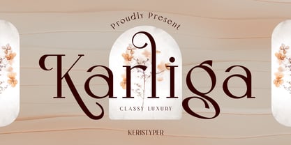 Karliga is a modern vintage serif typeface. This font is good for logo design, Social media, Movie Titles, Books Titles, short text even long text letters, and good for your secondary text font with sans or serif. **Featured:** * Standard Uppercase & Lowercase * Numeral & Punctuation * Multilingual : ä ö ü Ä Ö Ü ß ¿ ¡ * Alternate & Ligature * PUA encoded We recommend programs that support the OpenType feature and the Glyphs panel such as Adobe applications or Corel Draw. so you can use all the variations of the glyphs. Hope you enjoy our fonts!
 - Tecnica Slab by Graviton,
$20.00 Tecnica Slab font family has been designed for Graviton Font Foundry by Pablo Balcells. It is a modular, geometric, slab serif typeface with a slightly condensed design and subtle rounded angles. It has been conceived to be most suitable for all sized headlines, as well as short and middle length text blocks. The standard styles give texts a classic appearence while alternate styles give texts a playfull one. Tecnica Slab consists of 4 styles, 2 weights plus alternates, each containing small caps and glyph coverage for several languages.