10,000 search results
(0.041 seconds)
- ITC Bodoni Ornaments by ITC,
$29.99Giambattista Bodoni (1740-1813) was called the King of Printers; he was a prolific type designer, a masterful engraver of punches and the most widely admired printer of his time. His books and typefaces were created during the 45 years he was the director of the fine press and publishing house of the Duke of Parma in Italy. He produced the best of what are known as modern" style types, basing them on the finest writing of his time. Modern types represented the ultimate typographic development of the late eighteenth and early nineteenth centuries. They have characteristics quite different from the types that preceded them; such as extreme vertical stress, fine hairlines contrasted by bold main strokes, and very subtle, almost non-existent bracketing of sharply defined hairline serifs. Bodoni saw this style as beautiful and harmonious-the natural result of writing done with a well-cut pen, and the look was fashionable and admired. Other punchcutters, such as the Didot family (1689-1853) in France, and J. E. Walbaum (1768-1839) in Germany made their own versions of the modern faces. Even though some nineteenth century critics turned up their noses and called such types shattering and chilly, today the Bodoni moderns are seen in much the same light as they were in his own time. When used with care, the Bodoni types are both romantic and elegant, with a presence that adds tasteful sparkle to headlines and advertising. ITC Bodoni™ was designed by a team of four Americans, after studying Bodoni's steel punches at the Museo Bodoniana in Parma, Italy. They also referred to specimens from the "Manuale Tipografico," a monumental collection of Bodoni's work published by his widow in 1818. The designers sought to do a revival that reflected the subtleties of Bodoni's actual work. They produced three size-specific versions; ITC Bodoni Six for captions and footnotes, ITC Bodoni Twelve for text settings, and ITC Bodoni Seventytwo - a display design modeled on Bodoni's 72-point Papale design. ITC Bodoni includes regular, bold, italics, Old style Figures, small caps, and italic swash fonts. Sumner Stone created the ornaments based on those found in the "Manuale Tipografico." These lovely dingbats can be used as Bodoni did, to separate sections of text or simply accent a page layout or graphic design." - ITC Bodoni Brush by ITC,
$29.99Giambattista Bodoni (1740-1813) was called the King of Printers; he was a prolific type designer, a masterful engraver of punches and the most widely admired printer of his time. His books and typefaces were created during the 45 years he was the director of the fine press and publishing house of the Duke of Parma in Italy. He produced the best of what are known as modern" style types, basing them on the finest writing of his time. Modern types represented the ultimate typographic development of the late eighteenth and early nineteenth centuries. They have characteristics quite different from the types that preceded them; such as extreme vertical stress, fine hairlines contrasted by bold main strokes, and very subtle, almost non-existent bracketing of sharply defined hairline serifs. Bodoni saw this style as beautiful and harmonious-the natural result of writing done with a well-cut pen, and the look was fashionable and admired. Other punchcutters, such as the Didot family (1689-1853) in France, and J. E. Walbaum (1768-1839) in Germany made their own versions of the modern faces. Even though some nineteenth century critics turned up their noses and called such types shattering and chilly, today the Bodoni moderns are seen in much the same light as they were in his own time. When used with care, the Bodoni types are both romantic and elegant, with a presence that adds tasteful sparkle to headlines and advertising. ITC Bodoni™ was designed by a team of four Americans, after studying Bodoni's steel punches at the Museo Bodoniana in Parma, Italy. They also referred to specimens from the "Manuale Tipografico," a monumental collection of Bodoni's work published by his widow in 1818. The designers sought to do a revival that reflected the subtleties of Bodoni's actual work. They produced three size-specific versions; ITC Bodoni Six for captions and footnotes, ITC Bodoni Twelve for text settings, and ITC Bodoni Seventytwo - a display design modeled on Bodoni's 72-point Papale design. ITC Bodoni includes regular, bold, italics, Old style Figures, small caps, and italic swash fonts. Sumner Stone created the ornaments based on those found in the "Manuale Tipografico." These lovely dingbats can be used as Bodoni did, to separate sections of text or simply accent a page layout or graphic design." - ITC Bodoni Six by ITC,
$40.99Giambattista Bodoni (1740-1813) was called the King of Printers; he was a prolific type designer, a masterful engraver of punches and the most widely admired printer of his time. His books and typefaces were created during the 45 years he was the director of the fine press and publishing house of the Duke of Parma in Italy. He produced the best of what are known as modern" style types, basing them on the finest writing of his time. Modern types represented the ultimate typographic development of the late eighteenth and early nineteenth centuries. They have characteristics quite different from the types that preceded them; such as extreme vertical stress, fine hairlines contrasted by bold main strokes, and very subtle, almost non-existent bracketing of sharply defined hairline serifs. Bodoni saw this style as beautiful and harmonious-the natural result of writing done with a well-cut pen, and the look was fashionable and admired. Other punchcutters, such as the Didot family (1689-1853) in France, and J. E. Walbaum (1768-1839) in Germany made their own versions of the modern faces. Even though some nineteenth century critics turned up their noses and called such types shattering and chilly, today the Bodoni moderns are seen in much the same light as they were in his own time. When used with care, the Bodoni types are both romantic and elegant, with a presence that adds tasteful sparkle to headlines and advertising. ITC Bodoni™ was designed by a team of four Americans, after studying Bodoni's steel punches at the Museo Bodoniana in Parma, Italy. They also referred to specimens from the "Manuale Tipografico," a monumental collection of Bodoni's work published by his widow in 1818. The designers sought to do a revival that reflected the subtleties of Bodoni's actual work. They produced three size-specific versions; ITC Bodoni Six for captions and footnotes, ITC Bodoni Twelve for text settings, and ITC Bodoni Seventytwo - a display design modeled on Bodoni's 72-point Papale design. ITC Bodoni includes regular, bold, italics, Old style Figures, small caps, and italic swash fonts. Sumner Stone created the ornaments based on those found in the "Manuale Tipografico." These lovely dingbats can be used as Bodoni did, to separate sections of text or simply accent a page layout or graphic design." - A to Z - Unknown license

- Down River by Epiclinez,
$18.00 Down River is a sweet hand-lettered font. This smooth buttery font is a perfect companion for your next design project!
 - Altemus Leaves by Altemus Creative,
$11.00 Each style is a collection of 174 leaf, illustrative and printer cut designs from the 1950s.
 - 21 Emmerson by Deniart Systems,
$20.00 A bit grungy, a bit stern, 21 Emmerson is a tribute to my birthplace and was designed with punky headline posters in mind. The simple lines of this font are angular and sharp - great for party posters, invitations, labels, etc.
 - Laillie Dream by Midvel,
$11.00 This is our new font, Laillie Dream is playful handwritten typeface. Laillie Dream comes with three weight, include uppercase, lowercase, number, punctuation, multilingual. This font is suitable to design especially poster, logo, book cover, greeting card, quotes, advertising poster, and anymore
 - Turman Grotesk by Chank,
$99.00 Turman Grotesk is inspired by the hand-drawn painterly letterforms poster artist Adam Turman uses in his poster designs. Each character uppercase and lowercase has contextual alternates that can be used to give your type a more natural, handmade feel.
 - Nagotire by HafisHidayat,
$20.00Introducing the elegant and fashionable Nagotire handwritten font, which looks like a signature, this font is purposely made with a quirky alternative. Nagotire is suitable for greeting cards, product packaging, news, invitations, posters, blog posters, branding, business cards, logos, etc. - Emirose by Ergibi Studio,
$16.00 Emirose consists of 4 weights: Thin, Light, Regular and Bold, all equipped with many ligatures and alternative letters that look cute and classy. They work very well for your work such as logos, brands, packaging, posters, invitations, headlines, posters, and more.
 - Obrigado by Hanoded,
$15.00 Obrigado means 'Thank You' in Portuguese. It is my way of saying thanks to the unknown designer of a Portuguese port-wine poster from the thirties. Obrigado font is based on that poster. As I had to work with a handful of glyphs, I designed the missing ones myself. Obrigado is a quite elegant and refined art deco font, which would be ideal for posters and logos. Obrigado speaks most Roman based languages.
 - Scramble Storm by Gassstype,
$27.00 Introducing of our new product **Scramble Storm** Horror brush Font is handmade Rough Brush Font with ligature and Multilanguage support. Can make it easier to convey the message in your design. use for awesome display, labeling, movie sceen, poster, movie title,quotes, posters, DIY projects, branding, packaging, greeting cards, websites, photos, photography overlays, signs, window art, tags and so much more! Best for project that need horror vibes , horror poster, childrenbook, cartoon, comic etc
 - Ice Cream Grande by Zeenesia Studio,
$15.00 Ice Cream Grande is Display and colorfull font. It was created with freehand handwriting style using a marker. It look classy and happiness to all your designs. You can use this font for a logo, kids clothing, invitation, poster, friendly design, fun design, book cover, adventure poster, outbound poster, and any cute and funny typeface needs and more. It came with number & punctuation, multilingual support, and PUA encode Hope you like this product.
 - Button by Scholtz Fonts,
$21.00Button is a solid, chunky, font, with a bold symmetry that makes it a must for products aimed at the younger set. Its unusual letter shapes all point to “NEW TREND!” It is the perfect choice for marketing companies targeting: ⁃ web-design and the creation of stylish buttons and menus ⁃ the music scene: CD covers, posters, music videos ⁃ the movie scene: posters, ads, movie titles ⁃ the theatre scene: posters, programs, ads, promotions ⁃ the fashion scene: swingtags, posters, brochures, signage, ads It has been carefully letterspaced and kerned. It contains a full character set: all upper and lower case characters, punctuation, numerals and accented characters are present. - ITC New Esprit by ITC,
$29.99Originally drawn in 1985, Jovica Veljović had intended to add a few kerning pairs and make some minor refinements to the letterforms. However, his work lead him to take a fresh look at the family. Veljović recalls, … I soon realized that some characters could benefit by more refined shapes and proportions. By the time I was done, I had worked on just about every character in the original design." In fact the end result is two systems: one optimized for extended texts; the other for display settings. The original elegance of the design is not lost, but the new design brings with it letterforms that are altogether more harmonious and balanced. The roman is dynamic and spirited, just oozing character. The italic by contrast is a little more restrained, but nonetheless an elegant and fitting accompaniment. The text-optimized fonts come with a generous x-height, and slightly less contrast; though its marginally wider proportions let in the light, making it very legible even at small sizes. ITC New Esprit ® is a versatile family, brought to you in four weights from regular to black. OpenType features like small caps, alternates, and a broad character set make this a welcome addition to everyone's font library. Whether you want elegant and legible text, or dynamic and personable headlines, then you'll want to click through to see more of ITC New Esprit. " - Brotherhood by 38-lineart,
$19.00 The current trend is social media, friendship connection applications and personal web portfolios. This media is used to tell about existence, most people like to upload photos on social media networks, even for personal web portfolios, sometimes people prefer to see the side of daily activities rather than products which are offered. Photos are visual responses, and there are many stories that can be told from a photo. But it will look more interesting if it is added with captions. The very appropriate caption is a text in handwriting. This is what inspired us to create attractive handwriting for social media and networking. We started to do a little research to see the trends of this type of font. Here are some of our notes; 1. Texts are usually in the form of relaxed, non-connected handwriting. 2. There are several connected glyphs, usually by the letters 'o', 'i' and 'y'. And double letters like ‘ll’ and ‘tt’. We anticipate this by making ligature for common texts written concatenated. 3. For personal web portfolio needs, provide affirmation as a characteristic. So the first letter is usually in the form of uppercase which is more prominent than the lowercase rhythm. Prominent but still in proportion. So this is "Brotherhood", a handwritten font that you can use for personal brands, captions and even paragraph writing. Expand your friendship and make your business more closely to your customers as a "Brotherhood" with this font.
 - Elaina by Laura Worthington,
$39.99 Elaina Family Elaina Script is a tidy, precisely penned script face — perhaps closest of all of Laura’s faces to her own handwriting. In its standard form, with its sober x-height and restrained ascenders and descenders, it’s a pleasure to read at smaller display sizes and in short blocks of text. It is accompanied by an unconnected version of the lowercase characters, its stylistic alternates, and a companion font, Elaina Semi Serif, useful for body text and complementary contexts. Of course, like most of Laura’s typefaces, it includes hundreds of swashes, alternates, and ligatures, for attention-getting effects at large sizes and in brand identities. Elaina Script Elaina Script is a tidy, precisely penned script face — perhaps closest of all of Laura’s faces to her own handwriting. In its standard form, with its sober x-height and restrained ascenders and descenders, it’s a pleasure to read at smaller display sizes and in short blocks of text. It is accompanied by an unconnected version of the lowercase characters. Of course, like most of Laura’s typefaces, it includes hundreds of swashes, alternates, and ligatures, for attention-getting effects at large sizes and in brand identities. Elaina Semi-Serif Elaina Semi Serif was designed to complement Elaina Script. Both faces share calligraphic roots and typographic and allow them to mix harmoniously. Its modulated strokes and subtly flared terminals give it a humanist feel that adds warmth and positivity to any setting.
 - FF Real Head by FontFont,
$50.99 FF Real is a convincing re-interpretation of the German grotesque style from between 1998 and 1908, but with much more warmth and improved legibility as well as a hint towards the warmer American grotesques. Later on, not just slanted styles, but a “proper” italic version was added inspired by the way Roman and Italic are distinguished in traditional serif faces. NEW: a specially created set of obliques were added in 2018 to give designers more design flexibility, for those looking for a less calligraphic look. In 2020 the family was extended with matching condensed weights. FF Real was originally conceived by Erik Spiekermann as one text weight and one headline weight to be used as the only faces in his biography ‘Hello I am Erik’, edited by Johannes Erler, published in 2014. While Spiekermann drew the alphabets, he passed on the font data to Ralph du Carrois and Anja Meiners who cleaned it up and completed it. In the meantime, FF Real has been extended to a family of two styles and 65 weights each. The design of FF Real is rooted in early static grotesques from the turn of the century. Several German type foundries – among them the Berlin-based foundries Theinhardt and H. Berthold AG – released such designs between 1898 and 1908. The semi-bold weight of a poster-size typeface that was lighter than most of the according semi-bolds in metal type at the time, gave the impetus to FF Real’s regular weight. In the words of Spiekermann, the historical example is “the real, non-fake version, as it were, the royal sans serif face“, thus giving his new typeface the name “Real” (which is also in keeping with his four-letter names, i.e. FF Meta, FF Unit). FF Real is a convincing re-interpretation of the German grotesque style, but with much more warmth and improved legibility. With a hint towards the warmer American grotesques, Spiekermann added those typical Anglo-American features such as a three-story ‘g’ and an ‘8’ with a more defined loop. To better distinguish characters in small text sizes, FF Real Text comes in old style figures, ‘f’ and ‘t’ are wider, the capital ‘I’ is equipped with serifs, as is the lowercase ‘l’. What’s more, i-dots and all punctuation are round.
 - Suti by Melvastype,
$29.00 Suti is a non-connected sign painters casual script with upper and lower cases. Suti was originally designed in 2010 but it was completely re-drawn in 2016. Casual lettering is a style sign painters use. Every sign painter has more or less their own style to make these letters. The casual alphabets are painted with speed and they don’t need to line perfectly but letters are still clean and easy to read. Suti has smooth and round forms. Friendly and casual looks. It is suitable for logos, titles, package design or where ever you need a fun and sympathetic display font.
 - Hebrew Dot III by Samtype,
$34.00 Beautiful font to use in Book covers and Posters.
 - Hebrew Dot by Samtype,
$34.00 Beautiful font to use in Book covers and Posters.
 - Hello Arson by Dismantle Destroy,
$19.00 This font is great for CD covers and posters.
 - Hebrew Dot II by Samtype,
$34.00 Beautiful font to use in Book covers and Posters.
 - Droporado 4F by 4th february,
$30.00 Funny font for decorating posters, logos and small headings.
 - Klein by Zetafonts,
$39.00 Klein PDF Specimen Klein is Zetafonts love letter to the grandmother of all geometric sans typefaces, Futura. Starting from a dialogue with Paul Renner’s iconic letterforms and proportions, Francesco Canovaro and Andrea Tartarelli decided to depart from its distinctive modernist shapes with slight humanist touches and grotesque solutions - with some design choices evoking the softness of humanist sans serifs like Gill Sans. The end result is a workhorse superfamily of 54 fonts with full multilingual capabilities and coverage of over two hundred languages using latin, cyrillic and greek alphabets. The original display-oriented family, developed in nine weights with matching italics (from the hairline thin to the sturdy black), has been paired with a text version (with slightly higher x-height, better readability and maximum legibility at small point size) and with a condensed version, to be used for space-saving display solutions in editorial and advertising formats. With a name that is both a nod to its humble functionality and an homage to french nouveau realiste artist Yves Klein, this typeface aims to become your next trusted companion in all your adventures in print, digital and motion design.
 - Nassim Latin by Rosetta,
$60.00 Nassim is a contemporary typeface for multilingual text-setting. With its lively texture and balanced rhythm, Nassim is a proven workhorse for a vast array of applications, from literature to the sciences, scholarly publications to contemporary news. Nassim Latin is stout in colour and resolute in its construction, standing up to the demands of long-form reading. But the heartiness that keeps it going is balanced with lively details: the asymmetric serifs and calligraphic modulation allude just enough to broad-nib flourishes to keep the reader alert and looking for what comes next. Nassim has always been ahead of the curve, bridging the distinct typographic traditions of Arabic and Latin without forcing the typographer into compromise. Nassim Latin offers upright and true italic styles across five weights, supporting more than 110 languages, and designed to pair harmoniously in multi-script settings with Nassim Arabic. Beyond that, it is equipped with smart OpenType features like small caps, case-sensitive punctuation, and a full palette of ranging numerals, fractions, and superior and inferior figures ensure that Nassim Latin is up to any task, be it print publications or delivering late-breaking online news.
 - Typical Pro by Typicaltype,
$25.00 Get ready for a modern spin on your typographic projects with the Typical Pro Sans Serif Font 9 Weight. This font offers a clean, grotesk feel that is perfect for any technical or heading design. Its contemporary design makes a perfect choice for projects with a modern flair. With clean lines, tight letter spacing, and a classic sans serif style, this font is sure to bring a unique edge to any project. Enjoy the perfect mix of texture and proportion with this modern font. Get ready to take your typography to the next level with Typical Pro Sans Serif Font 9 Weight. Typical Pro Sans Serif Font is a grotesk typeface of modern design, with technical precision and a clean finish. Its 9 weight offers clear and refined letters that provide perfect legibility for headlines and other text styles. Its line height is consistent and balanced, making it suitable for producing high-impact visual messages. Its modern, straightforward letterforms give projects an air of sophistication, while retaining a firm technical backbone. With nine different weights, it is the perfect choice for any heading or label that requires a strong, contemporary look.
 - Mandrel by insigne,
$39.99 From the realm of insigne, a new family has risen. By name, Mandrel. Courtly in character and elegant in appearance, the face finds great favor among those with whom it seeks audience. With confident air, Mandrel carries itself gracefully before each pair of eyes, never faltering or stumbling in its refined step. But while dressed with gentility, this elegant family is not faint of heart when challenged. Crafted well for high-impact resistance, Mandrel steps boldly and prominently into the arena of the reader’s eye, boasting its tall x-heights, high contrast, confident bends, and sharp serifs. Skillfully, it wields its sharp serif endings, cutting swiftly through opponents’ crude clutter, which fights for the reader’s attention. From Thin to Black, nine weights and their matching italics make up this noble family. Mandrel furthermore includes an abundant treasury of OpenType variables to adorn your text. Ligatures, old-style figures, and stylistic sets are available to accompany the family’s 500 glyphs and its support for more than 70 languages. Raise your cup to this new Mandrel! With strong serifs and high contrast, you’ll find this champion ready to take up your challenge in many a test ahead.
 - Arable by Heyfonts,
$18.00 Arable Font Is "Unique Display Font" refers to a specific type of typography that is characterized by its distinctive, one-of-a-kind design, and it is typically used for eye-catching and decorative purposes. Here's a detailed explanation of what a unique display font is: -Distinctive Design: Unique display fonts stand out because of their distinct and unconventional design. They often deviate from traditional letterforms and can take on a wide range of creative and artistic shapes. Unlike standard, legible fonts used for body text, display fonts prioritize aesthetics over readability. -Specialized Use: Display fonts are not intended for extended reading. Instead, they are used in small quantities for headlines, titles, logos, posters, banners, invitations, and other design elements where visual impact is essential. Their unique and attention-grabbing design makes them ideal for drawing attention to specific text. -Creative Freedom: Designers have creative freedom when creating unique display fonts. This allows for a wide array of styles, from whimsical and ornate to futuristic and abstract. Some display fonts may be inspired by art movements, cultures, historical periods, or nature, leading to highly original and thematic designs. -Limited Character Set: Display fonts often have a limited character set compared to standard fonts. They typically include uppercase letters, numbers, and basic punctuation marks, but may lack lowercase letters or extended characters. This limitation is due to their specialized use and focus on visual impact. -Customization: Some unique display fonts are custom-designed for specific projects or brands. Designers work closely with clients to create a font that aligns with the brand's identity or the project's theme, ensuring a truly unique and tailored result. -Combination with Other Fonts: In many design projects, unique display fonts are paired with more standard, legible fonts to achieve a balance between visual impact and readability. This combination allows for a harmonious and effective overall design.
 - Fashion Experiment by PeachCreme,
$21.00 "Fashion Experiment" is an all-caps handwritten display font featuring a funky and expressive gel pen-style that is perfect for creating impactful header text, poster designs, album covers, product designs, and merchandise. The font's unique and playful appearance is crafted to maintain an authentic look, with alternative letters and ligatures adding to its creative potential. The font includes alternative letters and ligatures coded for uppercase letters. The font also features more than 100k kerning pairs, ensuring optimal precision and readability. To maintain the authentic appearance of ligatures, this font was crafted from the handwritten text. However, as ligatures that complement one combination of letters may not work for another, it is essential to have the option of switching to alternate letters or avoiding the use of ligatures altogether. The frequency of use for certain letters varies, resulting in some letters having more alternates than others. For example, letters such as A, E, L, M, S, and T are more commonly used than letters like X, Z, and Q, which explains the difference in alternate options. We recommend using programs that support OpenType features to fully access the font's features. This will allow you to access glyphs directly on the same panel without copying/pasting each glyph. Additionally, the OpenType panel allows you to turn on standard ligatures, which can automatically change letters for available ligatures. Even if you are using a program that does not support OpenType, you can still access the alternates and ligatures of this font through Fontbook or Character Map, as the glyphs are PUA-encoded. However, please note that you will have to copy and paste each ligature or alternate individually, which can be time-consuming and require extra effort. Happy designing, Gulya
 - Glittera by Natural Ink,
$12.00 Glittera Script is a modern calligraphy design, including Regular. This font is casual and beautiful with swash. Can be used for various purposes. such as logos, product packaging, wedding invitations, branding, headlines, signage, labels, signatures, book covers, posters, quotes, and more. Glittera Script includes a change of the OpenType language style, binding and international support for most Western languages. To activate the OpenType Stylistic alternative, you need a program that supports OpenType features such as Adobe Illustrator CS, Adobe Indesign & CorelDraw X6-X7, Microsoft Word 2010 or newer versions. How to access all alternative characters using Adobe Illustrator: https://www.youtube.com/watch?v=XzwjMkbB-wQ Glittera Script is coded with PUA Unicode, which allows full access to all additional characters without having to design special software. Mac users can use the Font Book, and Windows users can use Character Map to view and copy one of the additional characters to insert into your favorite text editor / application. How to access all alternative characters, using Windows Character Map with Photoshop: https://www.youtube.com/watch?v=Go9vacoYmBw If you need help or have questions, please let me know. I am happy to help :) Thank you & Congratulations on Designing! Script is coded with PUA Unicode, which allows full access to all additional characters without having to design special software. Mac users can use the Font Book, and Windows users can use Character Map to view and copy one of the additional characters to insert into your favorite text editor / application. How to access all alternative characters, using Windows Character Map with Photoshop: https://www.youtube.com/watch?v=Go9vacoYmBw If you need help or have questions, please let me know. I am happy to help :) Thank you & Congratulations on Designing!
 - Inverness by Red Rooster Collection,
$45.00 In the 1930s, it was popular to take day-trips by train to the seaside in the British Isles. Many posters were designed by the various regions to advertise these excursions; it is from one of these posters that Inverness was created.
 - Vampliers by Remedy667,
$18.00 Vampliers is a handmade horror font, inspired by the lettering of classic sci-fi and horror film posters. It’s perfect for Halloween party invites, posters, packaging design… Any project you want to give that “vintage spooky” feel, Vampliers will protect your neck.
 - Nomarch by Scriptorium,
$24.00Nomarch is a charming new Art Nouveau font based on samples of poster lettering from the beginning of the twentieth century. The relatively bold weighting of the characters makes Nomarch particularly good for use in large sizes for titles on posters and flyers. - Tattoo Master by Vozzy,
$10.00 Introducing a vintage look label font named "Tattoo Master". This family includes five styles - Regular, Texture, Shadow, Full and Aged. You can see samples on the posters. This font will be great on any retro design on poster, t-shirt, label, logo etc.
 - Ovalie by Typefactory,
$14.00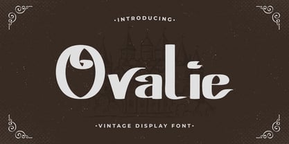 Ovalie is a vintage display font that was made by hand and inspired by classic posters. Ovalie comes with uppercase, lowercase, numerals, symbols & punctuations, alternate, ligature and multilingual support. Perfect to use for Logotype, Letterhead, Poster, Apparel Design, Labels, and many more designs.
 - Jositary by HafisHidayat,
$15.00 Jositary is and elegant and fashionable handwriting font, which looks like a signature. This font is intentionally made with unique alternates. Jositary suits perfectly for branding, posters, invitations, greeting cards, news, product packaging, blog posters, logos, business cards, all including personal charms etc.
 - ST Titan by ShimanovTypes,
$20.00 ST Titan is a retro futuristic display font with vintage vibes, inspirated by old sci-fi book's headers and posters. It's good for social media, headlines, large-format print, branding, posters, fashion designs and websites. Extended Latin and Cyrillic support. 30+ languages
 - Spring Market Serif by BeckMcCormick,
$16.00Spring Market is a farmhouse-style serif font. One of my first-ever releases, it was lovingly hand-drawn and inspired by the countryside of Upstate South Carolina. Spring Market Rustic Farmhouse Serif Font has the perfect amount of rusticity and refinement for your next project. I recommend this font for logos, invitations, and your next home decor project that needs that shabby chic touch! Spring Market features European language support!
