10,000 search results
(0.038 seconds)
- Tascinorm by Abdullah Tasci,
$40.00 Specially designed to improve legibility in long texts, Tascinorm is a unique, modern typeface which will meet the needs of a vast audience.
 - eSpectrum by Jonahfonts,
$29.00 A text and display font suitable for various applications, many of which include, letterheads, packaging and logos. Excellent for very large typographic layouts
 - Hallandale JNL by Jeff Levine,
$29.00Hallandale JNL is versatile enough to be a headline font as well as a text font, without a loss of style or integrity. - Kona by Linecreative,
$14.00 Kona is a display font perfect for branding, homeware design, product packaging, magazine headers - or just perfect as display text against any background.
 - Data 70 by ITC,
$29.99Data Seventy is a high-tech style font, with the look of old computer lettering. Data Seventy gives any text a futuristic appearance. - Metric Navy PRO by Sea Types,
$19.00 Metric Navy PRO is a lightweight monoline developed for short texts and loose phrases in versions: thin, light, normal, regular, bold and black.
 - Valimo by Fenotype,
$19.00 Valimo RMX is a destroyed hard-to-read typeface. It's suitable for creating text "textures" where you don't necessarily need any actual content.
 - Ellen by Lebbad Design,
$29.95 Ellen is a charming elegant serif face. Great for headline display and text use. Many alternates and ligatures are included with this font.
 - Yankee Ghosts BB by Blambot,
$20.00Designed as the main header text for the online, interactive, horror novel, DEAD ENDS. Based on historical documents of colonial-era New England. - Milligram by Zetafonts,
$35.00 Grotesque sans typefaces: you know you won’t ever get tired of those. And any moment you decide that Vignelli was right and one Swiss font is enough, here comes a new specimen from the past inviting you to try new takes on the modernist letterforms. It's a tight and crowded design space, so design decisions are subtle and almost unnoticeable. Whoever you decide to be in the details - either God or the Devil - you surely need a taste for the infinitesimal to work with these shapes. Time design borders sandstoning shapes, in a delicate equilibrium between modernist precise ideals and the fascinating energy of old lead grotesques. The resulting typeface develops around an idiosyncratic relationship with negative space, inspired by the tight metrics modernist designers imposed on their layouts. Leaving a text optimised spacing to the text subfamily, Milligram plays with a feeling of attraction behind shapes, something brought to the extremes in the logo-oriented Milligram Macro Variant. Designed by Cosimo Lorenzo Pancini with Andrea Tartarelli, Milligram is a fine but bold homage to the Akzidenz Grotesk that never was. • Suggested uses: Milligram is a versatile type family: perfect for modern branding and logo design (Milligram Macro), for text and editorial design (Milligram Text), web design, packaging and countless other projects; • 36 styles: 7 weights + 7 italics x 3 different styles + 2 variable fonts; • 759 glyphs in each weight; • Useful OpenType features: Access All Alternates, Case-Sensitive Forms, Glyph Composition / Decomposition, Denominators, Fractions, Kerning, Lining Figures, Localized Forms, Mark Positioning, Mark to Mark Positioning, Alternate Annotation Forms, Numerators, Oldstyle Figures, Ordinals, Proportional Figures, Scientific Inferiors, 5 Stylistic Sets, Subscript, Superscript, Tabular Figures, Slashed Zero; • 207 languages supported (extended Latin and Cyrillic alphabets): English, Spanish, Portuguese, French, Russian, German, Javanese (Latin), Turkish, Italian, Polish, Afaan Oromo, Tagalog, Sundanese (Latin), Filipino, Moldovan, Romanian, Indonesian, Dutch, Cebuano, Malay, Uzbek (Latin), Kurdish (Latin), Swahili, Hungarian, Czech, Haitian Creole, Hiligaynon, Afrikaans, Somali, Zulu, Serbian, Swedish, Bulgarian, Shona, Quechua, Albanian, Catalan, Chichewa, Ilocano, Kikongo, Kinyarwanda, Neapolitan, Xhosa, Tshiluba, Slovak, Danish, Gikuyu, Finnish, Norwegian, Sicilian, Sotho (Southern), Kirundi, Tswana, Sotho (Northern), Belarusian (Latin), Turkmen (Latin), Bemba, Lombard, Lithuanian, Tsonga, Wolof, Jamaican, Dholuo, Galician, Ganda, Low Saxon, Waray-Waray, Makhuwa, Bikol, Kapampangan (Latin), Aymara, Ndebele, Slovenian, Tumbuka, Venetian, Genoese, Piedmontese, Swazi, Latvian, Silesian, Bashkir (Latin), Sardinian, Estonian, Afar, Cape Verdean Creole, Maasai, Occitan, Tetum, Oshiwambo, Basque, Welsh, Chavacano, Dawan, Montenegrin, Walloon, Asturian, Kaqchikel, Ossetian (Latin), Zapotec, Frisian, Guadeloupean Creole, Q’eqchi’, Karakalpak (Latin), Crimean Tatar (Latin), Sango, Luxembourgish, Samoan, Maltese, Tzotzil, Fijian, Friulian, Icelandic, Sranan, Wayuu, Papiamento, Aromanian, Corsican, Breton, Amis, Gagauz (Latin), M?ori, Tok Pisin, Tongan, Alsatian, Atayal, Kiribati, Seychellois Creole, Võro, Tahitian, Scottish Gaelic, Chamorro, Greenlandic (Kalaallisut), Kashubian, Faroese, Rarotongan, Sorbian (Upper Sorbian), Karelian (Latin), Romansh, Chickasaw, Arvanitic (Latin), Nagamese Creole, Saramaccan, Ladin, Palauan, Sami (Northern Sami), Sorbian (Lower Sorbian), Drehu, Wallisian, Aragonese, Mirandese, Tuvaluan, Xavante, Zuni, Montagnais, Hawaiian, Marquesan, Niuean, Yapese, Vepsian, Bislama, Hopi, Megleno-Romanian, Creek, Aranese, Rotokas, Tokelauan, Mohawk, Warlpiri, Cimbrian, Sami (Lule Sami), Jèrriais, Arrernte, Murrinh-Patha, Kala Lagaw Ya, Cofán, Gwich’in, Seri, Sami (Southern Sami), Istro-Romanian, Wik-Mungkan, Anuta, Sami (Inari Sami), Yindjibarndi, Noongar, Hotc?k (Latin), Meriam Mir, Manx, Shawnee, Gooniyandi, Ido, Wiradjuri, Hän, Ngiyambaa, Delaware, Potawatomi, Abenaki, Esperanto, Folkspraak, Interglossa, Interlingua, Latin, Latino sine Flexione, Lojban, Novial, Occidental, Slovio (Latin), Volapük.
 - The Fright House by IKIIKOWRK,
$17.00 Proudly Present The Fright House - Classic Horror Type, created by ikiiko. Inspired by classic horror movie posters, The Fright House, with its retro appeal and traditional serif styling, revives the spirit of horror from the 1970s. The nostalgia and appeal of a past of dread is captured by this typeface, which pays homage to the typefaces that covered horror novels, movie posters, and spooky magazines during that time. The Fright House is a classic elongated condensed serif typeface with a timeless elegance inspired by 1970s fonts. With a precisely defined serif that gives it a sharp and unsettling feel. Each character has graceful contours and precise proportions, seamlessly blending vintage design with the thrilling charm of suspense. This typeface is perfect for an vintage poster, movie title, classic stuff, magazine layout, book cover, and also good for quotes, or simply as a stylish text overlay to any background image. What's included? Uppercase & Lowercase Number & Punctuation Ligature (Bonus) Multilingual Support Works on PC & Mac Get also a good offer & FREEBIE at our site : www.ikiiko.com Enjoy our font and if you have any questions, you can contact us by email : ikiikowrk@gmail.com
 - Haunted Brick by LetterStock,
$20.00 Introducing “Haunted Brick” – The Spooky Halloween Decorative Font Dive into the eerie world of “Haunted Brick,” a spellbinding decorative Halloween font that will send shivers down your spine. Perfect for crafting captivating Halloween posters, invitations, and chilling social media posts, this font boasts a unique hand-drawn style adorned with intricate spider webs in every glyph. Key Features: Spine-Chilling Elegance: “Haunted Brick” strikes the perfect balance between elegance and the macabre, adding a spine-chilling touch to your Halloween designs. Creepy Creativity: Whether you’re conjuring up posters, eerie invitations, or haunting social media content, “Haunted Brick” lends an air of mystery and excitement to your projects. Intricate Spider Webs: Every character in “Haunted Brick” is intricately adorned with spider webs, ensuring that your text is truly one-of-a-kind and perfect for all things Halloween. Why Choose “Haunted Brick”: – Elevate your Halloween designs with a font that’s both spooky and stylish. – Craft invitations that send shivers down the spines of your guests. – Create captivating posters that will haunt the memories of those who see them. – Perfect for adding a dose of horror to your social media posts. Embrace the Spookiness – Download “Haunted Brick” Now!
 - Sonrisa by CastleType,
$59.00 Sonrisa is a design that evolved from my sketches of the skeletal structure of Jakob Erbar’s Koloss, trying to discover its underlying essence without all the contrast and bulkiness of the original design. Sonrisa Thin was the resulting font, from which the other weights of the family were developed. Gentle curves, open counters, generous x-height, and sleekly tapered terminals give Sonrisa a very legible, modern, elegant appearance. When she saw the first draft of this typeface, the smile on my friend Jennifer’s face gave me the idea to call it “Sonrisa” (Spanish for “smile”). Jennifer, a clinical psychologist, described Sonrisa’s personality as: "happy, clean, clear, open, joyful, spacious, playful, calm. I can see it being used for body product lines such as oils and lotions. Can see it being used in home/travel magazines or even Architectural Digest. Yoga magazine, definitely." Sonrisa is what some foundries call a “Pro” typeface family with all the bells and whistles that provide typographic versatility: true small caps, oldstyle numerals, arbitrary fractions, discretionary ligatures, and other powerful OpenType features. All fonts in the family, except Sonrisa Titling, support most European languages, including modern Greek and languages that use the Cyrillic Alphabet. (Cyrillic glyphs designed in consultation with Ukrainian type designer, Sergiy S. Tkachenko.) Sonrisa is available in the original Thin, monoline version as well as six weights (Light, Regular, Medium, Bold, Extra Bold, Black), and a Titling font that is essentially a display font construction kit. If you enjoy using Sonrisa even half as much as I enjoyed creating it, then I know you will have a “sonrisa” (smile) on your face!
 - Sazone by Product Type,
$15.00 Welcome to Sazone, a font that represents the essence of the future with a stunning modern and futuristic twist. Are you looking for the perfect solution for modern, futuristic, sci-fi, and future-themed projects? Sazone is the answer. Sazone is a font specially designed to bring an extraordinary and stunning visual experience. Each letter is unique and conveys a sense of the future, showing astonishing sophistication and innovation. The main benefit of Sazone is its ability to deliver unrivaled style. With a unique and exclusive character, this font will give a modern, classy, and futuristic look to every text you use. Every detail is carefully thought out to create a standout and stunning impression. Also, multilingual support, allows you to display text in multiple languages without restrictions. This gives you the flexibility to reach a global audience and convey messages effectively in the most relevant contexts. Take your projects to the next level with Sazone. Let this font be the catalyst for your visual success in creating eye-catching future looks. It doesn’t matter whether you are designing logos, posters, or websites, Sazone will give off a distinctive feel, exude sophistication, and deliver an unforgettable experience. Explore endless possibilities and make your vision come true with Sazone. It’s time to enter a spectacular and amazing future. Choose Sazone and let this font become an indispensable part of your vibrant, modern, futuristic, sci-fi, and future projects. What’s Included : - File font - All glyphs Iso Latin 1 - We highly recommend using a program that supports OpenType features and Glyphs panels like many Adobe apps and Corel Draw, so you can see and access all Glyph variations. - PUA Encoded Characters – Fully accessible without additional design software. - Fonts include Multilingual support
 - Sunset Imaginary by Din Studio,
$29.00 Sunset Imaginary is a captivating duo of fonts that brings together the charm of a handwritten style and the timeless elegance of a serif typeface. This combination creates a harmonious and versatile typographic pairing, perfect for a wide range of design projects. The first font in the Sunset Imaginary duo is a beautiful handwritten font. Its letterforms are intricately crafted, with each letter seamlessly connected to the next, creating a flowing and cohesive script. This handwritten style exudes a sense of warmth and authenticity, as if each word was lovingly penned by hand. The connected letters add a touch of fluidity and rhythm to the text, enhancing its visual appeal. Complementing the handwritten font is a refined serif typeface. With its classic and elegant characteristics, the serif font provides a sense of stability and sophistication to the overall design. The carefully designed serifs and balanced proportions give the text a timeless and polished look. The combination of the handwritten font and serif font in Sunset Imaginary offers a versatile typographic palette. It allows you to create striking contrasts and establish hierarchy within your designs. Enjoy the various features available in this font. Features: Stylistic Sets Ligatures Multilingual Supports PUA Encoded Numerals and Punctuations Sunset Imaginary fits in invitation posters, branding materials, packaging, editorial layouts, or any project that demands a balance of personal touch and timeless elegance Find out more ways to use this font by taking a look at the font preview. Thanks for purchasing our fonts. Hopefully, you have a great time using our font. Feel free to contact us anytime for further information or when you have trouble with the font. Thanks a lot and happy designing
 - Aureata by preussTYPE,
$30.00 Whenever I've stayed in Munich my friend Michael Bundscherer and I go on a typographical expedition. When we talk about that, we remember the bygone world of sign painter. On one of the facades of a furniture shop in Munich, you can discover the lettering of the name in golden letters. This one convinced us because of the simple elegance Art Deco. These letters on the facade are in any case the character set, which forms the basis of this document. The missing (especially the lowercase letters and the numbers) were modeled. The "OPEN" called version tries to replicate the 3-D effect. The font is particularly suitable for shorter texts and headlines.
 - Aretha by Lafontype,
$25.00 Aretha is a classy and beautifully designed sans serif. The main idea of Arteha is to combine the sans serif humanist font style with traditional styles so as to provide a pleasant atmosphere for the reader. The horizontal side of Aretha is designed with a slightly thinner so that the counter can look wider and also looks stiff in some parts to give a firm impression on the letters. Not only for display size, Aretha also works well in text size. Represents multilingual and is equipped with several Open Type features such as tabular figures and stylistic alternates in letters a, g, t and y, so this is very suitable to complement your various design needs.
 - Chevin Pro by G-Type,
$72.00 Chevin is a contemporary rounded type family in 6 weights which was designed with functionality and legibility in mind. With its open counters and slightly condensed style, Chevin can be used for text and is particularly suited to signage. Erik Spiekermann is a fan, noting that Chevin “is charming without being cute, and very legible even in small sizes because of its restrained shapes and simple construction.” Chevin is named after a hill on the outskirts of Otley in West Yorkshire. Since 2007, the type family has been highly prominent in the UK as Royal Mail’s corporate font and the typeface that adorns every Post Office in the country. The Chevin Pro set includes additional Greek and Cyrillic layouts.
 - Caslon Bold by ParaType,
$30.00 The Bitstream version of Caslon Bold of the American Type Founders, 1905. Based on William Caslon I’s first English Old Style typefaces of 1725. Caslon modeled his designs based on late 17th century Dutch types, but his artistic skills enabled him to improve those models, bringing a variety of forms and subtlety of details. Strokes in Caslon fonts are somewhat heavier than in earlier Old Style fonts, serifs are thicker and a bit stubby. Italic letters have uneven slope. A text set in Caslon looks legible and aesthetically appealing. Caslon is a favorite font of English printers for setting of classical literature. Cyrillic version was developed for ParaType in 2002 by Isay Slutsker and Manvel Shmavonyan.
 - Via Sans by Latinotype,
$26.00 Via sans is a font inspired by classics like Steile Futura and Din 1451, with neo-humanist characteristics. It was designed as a font for fast reading from a distance, which saves horizontal space in the text composition, making it a very good alternative when composing long phrases in reduced spaces, with high readability in various sizes due to its ample counters. With round corners that reduce the irradiation that reflective materials in signs produce. This family is composed by 8 fonts, 4 weight variations and 4 inclination variations, which include European accents marks, ligatures, fractions, ordinals and tabular numbers, in addition to a pictogram set that complement applications for wayfinding and maps.
 - Chevin Std by G-Type,
$60.00 Chevin is a contemporary rounded type family in 6 weights which was designed with functionality and legibility in mind. With its open counters and slightly condensed style Chevin can be used for text and is particularly suited to signage. Erik Spiekermann is a fan, noting that Chevin “is charming without being cute, and very legible even in small sizes because of its restrained shapes and simple construction.” Chevin is named after a hill on the outskirts of Otley in West Yorkshire. Since 2007 the type family has been highly prominent in the UK as Royal Mail’s corporate font and the typeface that adorns every Post Office in the country. The Chevin Pro set includes additional Greek and Cyrillic layouts.
 - Bolívar by César Puertas,
$39.95 Bolívar is a contemporary display typeface inspired in the handwriting of one of the most prominent personalities of the Latin American 19th century: Simón Bolívar, “the liberator". The typeface intends to capture the passion of handwritten letterforms and to translate it into type. Among the characteristics that best contribute to its strong personality, are the impressive length of ascenders and descenders as well as the more than 45 degrees of slant. Bolívar mimics certain aspects of handwriting such as the slightly different baseline for each letter and ink clogs in the counters of some letters. Use Bolívar whenever you need to add passion to a piece of text, from logos or single words to sentences and captions.
 - Caslon 540 by ParaType,
$30.00 The Bitstream version of Caslon 540 of the American Type Founders, 1902. Based on William Caslon I's first English Old Style typefaces of 1725. Caslon modeled his designs based on late 17th century Dutch types, but his artistic skills enabled him to improve those models, bringing a variety of forms and subtlety of details. Strokes in Caslon fonts are somewhat heavier than in earlier Old Style fonts, serifs are thicker and a bit stubby. Italic letters have uneven slope. A text set in Caslon looks legible and aesthetically appealing. Caslon is a favorite font of English printers for setting of classical literature. Cyrillic version was developed for ParaType in 2002 by Isay Slutsker and Manvel Shmavonyan.
 - ITC New Baskerville by ITC,
$34.99 ITC New Baskerville is one of many contemporary type families based on the work of John Baskerville (1706-1775), a writing master and printer from Birmingham, England, whose types were cut by the punchcutter John Handy. Baskerville produced a masterpiece folio Bible for Cambridge University, and today, his types are considered to be fine representations of eighteenth-century rationalism and neoclassicism. ITC New Baskerville is a late 20th-century interpretation of Baskerville’s style, designed by John Quaranda. It makes an excellent and very readable text face; its sharp, high-contrast forms make it suitable for elegant advertising settings as well. ITC New Baskerville® font field guide including best practices, font pairings and alternatives.
 - Kernig Braille by Echopraxium,
$5.00 This font is the younger sister of HexBraille with which it may be combined to create new patterns. This also explains why their introductory text are similar. Introduction The purpose of this monospace font is to display braille in an original and "steganographic" way. The Kernig prefix means "Robust" in German, this is because of the crank shapes . The core of the glyph design is a flat hexagon which can be read as 3 rows of 2 dots (i.e. regular braille glyph grid). Even if within a glyph, braille dots ("square dots" indeed) are placed on the vertices of a flat hexagon, the difference with HexBraille is that edges connecting vertices are not straight lines but "crank shapes" instead. This can be summarized by saying that the whole glyph is a Hexcrank (a flat hexagon where vertice pairs are connected by a crank shape) NB: The initial design is illustrated by glyphs 'ç' (no dot) and 'û' (6 dots) as shown by poster 6. A. "Kernig Lattice" In KernigBraille, glyphs are connected to each other, thus for each Hexcrank glyph there are 6 connections: 2 on left/right and 4 on top/bottom. In the final design some cranks were removed for esthetical reason (i.e. leave empty space for allowing patterns diversity). In summary, a text using this font won't display a honeycomb but a lattice instead. NB: Please notice that in order to obtain the lattice without vertical gaps, you must set the interline to 0. The lattice is made from 3 kind of shapes: a.1. Hexcrank a.2. Square a.3. Irregular cross (mostly unclosed) The design favored squares over crosses. The whole slightly resembling a PCB. B. Text Frames It's possible to frame the text with 4 sets of frame glyphs (as illustrated by poster 2) b.1. Kernig { € ° £ µ § ¥ ~ ¢ } b.2. Rectangular-High { è é ê ï î à â ä } b.3. Rectangular-Low { Â ù Ä Ê Ë Ô õ ö } b.4. Mixed Kernig+High: a mix of Kernig and Rectangular-High frame glyphs When using frame glyphs, it is advised to show Pilcrow (¶) and Non Breaking Space, which are replaced by empty shapes in this font (e.g. in Microsoft Word, use CTRL+8 or use [¶] button in the ribbon).
 - Baskerville by Linotype,
$40.99John Baskerville (1706-1775) was an accomplished writing master and printer from Birmingham, England. He was the designer of several types, punchcut by John Handy, which are the basis for the fonts that bear the name Baskerville today. The excellent quality of his printing influenced such famous printers as Didot in France and Bodoni in Italy. Though he was known internationally as an innovator of technique and style, his high standards for paper and ink quality made it difficult for him to compete with local commercial printers. However, his fellow Englishmen imitated his types, and in 1768, Isaac Moore punchcut a version of Baskerville's letterforms for the Fry Foundry. Baskerville produced a masterpiece folio Bible for Cambridge University, and today, his types are considered to be fine representations of eighteenth century rationalism and neoclassicism. Legible and eminently dignified, Baskerville makes an excellent text typeface; and its sharp, high-contrast forms make it suitable for elegant advertising pieces as well. The Linotype portfolio offers many versions of this design: ITC New Baskerville® was designed by John Quaranda in 1978. Baskerville Cyrillic was designed by the Linotype Design Studio. Baskerville Greek was designed by Matthew Carter in 1978. Baskerville™ Classico was designed by Franko Luin in 1995." - Baskerville Classico by Linotype,
$29.99John Baskerville (1706-1775) was an accomplished writing master and printer from Birmingham, England. He was the designer of several types, punchcut by John Handy, which are the basis for the fonts that bear the name Baskerville today. The excellent quality of his printing influenced such famous printers as Didot in France and Bodoni in Italy. Though he was known internationally as an innovator of technique and style, his high standards for paper and ink quality made it difficult for him to compete with local commercial printers. However, his fellow Englishmen imitated his types, and in 1768, Isaac Moore punchcut a version of Baskerville's letterforms for the Fry Foundry. Baskerville produced a masterpiece folio Bible for Cambridge University, and today, his types are considered to be fine representations of eighteenth century rationalism and neoclassicism. Legible and eminently dignified, Baskerville makes an excellent text typeface; and its sharp, high-contrast forms make it suitable for elegant advertising pieces as well. The Linotype portfolio offers many versions of this design: ITC New Baskerville® was designed by John Quaranda in 1978. Baskerville Cyrillic was designed by the Linotype Design Studio. Baskerville Greek was designed by Matthew Carter in 1978. Baskerville™ Classico was designed by Franko Luin in 1995." - Baskerville LT by Linotype,
$40.99 John Baskerville (1706-1775) was an accomplished writing master and printer from Birmingham, England. He was the designer of several types, punchcut by John Handy, which are the basis for the fonts that bear the name Baskerville today. The excellent quality of his printing influenced such famous printers as Didot in France and Bodoni in Italy. Though he was known internationally as an innovator of technique and style, his high standards for paper and ink quality made it difficult for him to compete with local commercial printers. However, his fellow Englishmen imitated his types, and in 1768, Isaac Moore punchcut a version of Baskerville's letterforms for the Fry Foundry. Baskerville produced a masterpiece folio Bible for Cambridge University, and today, his types are considered to be fine representations of eighteenth century rationalism and neoclassicism. Legible and eminently dignified, Baskerville makes an excellent text typeface; and its sharp, high-contrast forms make it suitable for elegant advertising pieces as well. The Linotype portfolio offers many versions of this design: ITC New Baskerville® was designed by John Quaranda in 1978. Baskerville Cyrillic was designed by the Linotype Design Studio. Baskerville Greek was designed by Matthew Carter in 1978. Baskerville™ Classico was designed by Franko Luin in 1995."
 - Monotype Baskerville by Monotype,
$29.99 John Baskerville (1706-1775) was an accomplished writing master and printer from Birmingham, England. He was the designer of several types, punchcut by John Handy, which are the basis for the fonts that bear the name Baskerville today. The excellent quality of his printing influenced such famous printers as Didot in France and Bodoni in Italy. Though he was known internationally as an innovator of technique and style, his high standards for paper and ink quality made it difficult for him to compete with local commercial printers. However, his fellow Englishmen imitated his types, and in 1768, Isaac Moore punchcut a version of Baskerville's letterforms for the Fry Foundry. Baskerville produced a masterpiece folio Bible for Cambridge University, and today, his types are considered to be fine representations of eighteenth century rationalism and neoclassicism. Legible and eminently dignified, Baskerville makes an excellent text typeface; and its sharp, high-contrast forms make it suitable for elegant advertising pieces as well. The Linotype portfolio offers many versions of this design: ITC New Baskerville® was designed by John Quaranda in 1978. Baskerville Cyrillic was designed by the Linotype Design Studio. Baskerville Greek was designed by Matthew Carter in 1978. Baskerville™ Classico was designed by Franko Luin in 1995."
 - Baskerville LT Cyrilic by Linotype,
$29.99John Baskerville (1706-1775) was an accomplished writing master and printer from Birmingham, England. He was the designer of several types, punchcut by John Handy, which are the basis for the fonts that bear the name Baskerville today. The excellent quality of his printing influenced such famous printers as Didot in France and Bodoni in Italy. Though he was known internationally as an innovator of technique and style, his high standards for paper and ink quality made it difficult for him to compete with local commercial printers. However, his fellow Englishmen imitated his types, and in 1768, Isaac Moore punchcut a version of Baskerville's letterforms for the Fry Foundry. Baskerville produced a masterpiece folio Bible for Cambridge University, and today, his types are considered to be fine representations of eighteenth century rationalism and neoclassicism. Legible and eminently dignified, Baskerville makes an excellent text typeface; and its sharp, high-contrast forms make it suitable for elegant advertising pieces as well. The Linotype portfolio offers many versions of this design: ITC New Baskerville® was designed by John Quaranda in 1978. Baskerville Cyrillic was designed by the Linotype Design Studio. Baskerville Greek was designed by Matthew Carter in 1978. Baskerville™ Classico was designed by Franko Luin in 1995." - Hantlay by DYSA Studio,
$18.00 Hantlay is a handwritten brush font. This another collection of script is perfect for your next personal branding project, excellent for your business. Hantlay have a smooth edges, so this font gives an authentic handcrafted feel style. Hantlay is perfect choice for people looking for clean, modern, minimalist, elegant, beauty design styles. Suitable for almost any graphic designs such as logo, branding materials, business cards, gift cards, t-shirt, cover, thumbnail, print, poster, photography, quotes .etc
 - Pantai Bali by DYSA Studio,
$19.00 Pantai Bali is a new organic siganture font. This another collection of script is perfect for your next branding project, excellent for your business. Pantai Bali have a natural edges, so this font gives an authentic handcrafted feel style. Pantai Bali is perfect choice for people looking for clean, modern, minimalist, elegant, beauty design styles. Suitable for almost any graphic designs such as logo, branding materials, business cards, gift cards, t-shirt, cover, thumbnail, print, poster, photography, quotes .etc
 - Mahegrena by IRF Lab Studio,
$12.00 Mahegrena is a monoline script font. This another collection of script is perfect for your next personal branding project, excellent for "Logotype". Mahegrena have a smooth edges, so this font gives an authentic handcrafted feel style. Mahegrena is perfect choice for people looking for clean, modern, minimalist, elegant, beauty design styles. Suitable for almost any graphic designs such as logo, branding materials, business cards, gift cards, t-shirt, cover, thumbnail, print, poster, photography, quotes .etc Thank You!
 - Gladies by DYSA Studio,
$25.00 Gladies is a New Modern Serif Typeface. This another collection of Serif is perfect for your next branding project, excellent for your business. Gladies have a smooth edges, so this font gives an authentic handcrafted feel style. Gladies is perfect choice for people looking for clean, modern, minimalist, elegant, beauty design styles. Suitable for almost any graphic designs such as logo, branding materials, business cards, gift cards, t-shirt, cover, thumbnail, print, poster, photography, quotes .etc
 - Laceria by DYSA Studio,
$19.00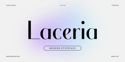 Laceria is a New Modern Serif Typeface. This another collection of Serif is perfect for your next branding project, excellent for your business. Laceria have a smooth edges, so this font gives an authentic handcrafted feel style. Laceria is perfect choice for people looking for clean, modern, minimalist, elegant, beauty design styles. Suitable for almost any graphic designs such as logo, branding materials, business cards, gift cards, t-shirt, cover, thumbnail, print, poster, photography, quotes .etc
 - Marida Cole by DYSA Studio,
$18.00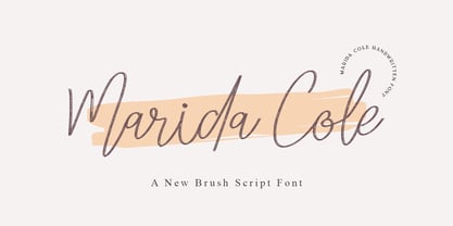 Marida Cole is handwritten script font with brush style. This another collection of script is perfect for your next branding project, excellent for your business. Marida Colehave a smooth edges, so this font gives an authentic handcrafted feel style. Marida Cole is perfect choice for people looking for clean, modern, minimalist, elegant, beauty design styles. Suitable for almost any graphic designs such as logo, branding materials, business cards, gift cards, t-shirt, cover, thumbnail, print, poster, photography, quotes .etc
 - Own Friday by DYSA Studio,
$18.00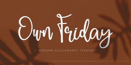 Own Friday is handwritten calligraphy font. This another collection of script is perfect for your next personal branding project, excellent for your business. Own Friday have a smooth edges, so this font gives an authentic handcrafted feel style. Own Friday is perfect choice for people looking for clean, modern, minimalist, elegant, beauty design styles. Suitable for almost any graphic designs such as logo, branding materials, business cards, gift cards, t-shirt, cover, thumbnail, print, poster, photography, quotes .etc
 - Alfrere Sans by Greater Albion Typefounders,
$12.50 Alfrere Sans is a clean Sans Serif display family inspired by a well-known 1950s television caption. The family of seven faces have been designed for independent use, but they also have an extra feature. All faces have identical metrics and can be overlaid with each other, to yield an unending range of multi-colored lettering effects. Bring a touch of the 50's to your next poster design. Better yet, explore the world of multi-colored overlaid typefaces....
 - Belagoya by DYSA Studio,
$19.00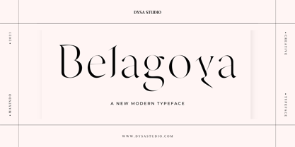 Belagoya is a New Modern Serif Typeface. This another collection of Display is perfect for your next branding project, excellent for your business. Belagoya have a smooth edges, so this font gives an authentic handcrafted feel style. Belagoya is perfect choice for people looking for clean, modern, minimalist, elegant, beauty design styles. Suitable for almost any graphic designs such as logo, branding materials, business cards, gift cards, t-shirt, cover, thumbnail, print, poster, photography, quotes .etc
 - Hello Freshtea Brush by Lucky Type,
$14.00 Hello Freshtea is a rough brush and fresh handwritten script font with an irregular baseline and dramatic movement. This font is great for your next creative project such for use with logos, printed quotes, invitations, cards, product packaging, headers, logotype, letterheads, posters, apparel design, labels, and more. Hello Freshtea is complete with uppercase and lowercase letters, as well as multi-language support, numbers, punctuation. also provide some ligatures. Mail Support: If you have any question, please contact.