10,000 search results
(0.051 seconds)
- Senohraby by Spurnej Type Foundry,
$19.00 Senohraby is an uppercase display typeface inspired by the old sign at Senohraby train station that is now slowly chipping away. Senohraby is available in three interconnected styles that freely various ages of the sign. “Paint” is a more or less preserved font written with a flat brush and featuring slight scratches and errors. The other styles, “Dirt” and “Trash”, follow up on this style and are increasingly marked by age, damage and erosion... In each style one can use simple alternation with lowercase letters, context-based alternation to eliminate repetition of adjacent characters, and a broad range of language support. As a result, each letter offers six variations that can be combined. These can be used as another alternation within a single word or as different bold weights. As a bonus, a fourth, additional style named “Crap” is freely available and as the name implies, it contains a wide array of various impurities.
 - Trakya Sans by Bülent Yüksel,
$19.00 Thrace (/θreɪs/; Greek: Θράκη, Thráki; Bulgarian: Тракия, Trakiya; Turkish: Trakya) is a geographical and historical region in Southeast Europe, now split among Bulgaria, Greece, and Turkey, which is bounded by the Balkan Mountains to the north, the Aegean Sea to the south, and the Black Sea to the east. It comprises southeastern Bulgaria (Northern Thrace), northeastern Greece (Western Thrace), and the European part of Turkey (East Thrace). Trakya Sans is a modern sans serif with a geometric touch. Futura, Avant Garde and the like. It has a modern streak which is the result of a harmonization of width and height especially in the lowercase letters to support legibility. Ideally suited for advertising and packaging, editorial and publishing, logos, branding and creative industries, posters and billboards, small text, way-finding and signage as well as web and screen design. Trakya Sans provides advanced typographical support for Latin-based languages. An extended character set, supporting Central, Western and Eastern European languages, rounds up the family. The designation “Trakya Sans 500 Regular” forms the central point. The first figure of the number describes the stroke thickness: 100 Thin to 900 Bold. "Trakya Sans" comes in 5 weights with matching italics plus "Trakya Sans Alt", also 5 weights and italics so a total of 20 styles. The family contains a set of 630+ characters. Case-Sensitive Forms, Classes and Features, Small Caps from Letter Cases, Fractions, Superior, Inferior, Denominator, Numerator, Old Style Figures just with one easy touch in all graphic programs. Trakya Sans is the perfect font for web use. You can enjoy using it.
 - Trakya Slab by Bülent Yüksel,
$19.00 Thrace (/θreɪs/; Greek: Θράκη, Thráki; Bulgarian: Тракия, Trakiya; Turkish: Trakya) is a geographical and historical region in Southeast Europe, now split among Bulgaria, Greece, and Turkey, which is bounded by the Balkan Mountains to the north, the Aegean Sea to the south, and the Black Sea to the east. It comprises southeastern Bulgaria (Northern Thrace), northeastern Greece (Western Thrace), and the European part of Turkey (East Thrace). Trakya Slab is a modern slab serif with a geometric touch. It has a modern streak which is the result of a harmonization of width and height especially in the lowercase letters to support legibility. Ideally suited for advertising and packaging, editorial and publishing, logos, branding and creative industries, posters and billboards, small text, way-finding and signage as well as web and screen design. Trakya Slab provides advanced typographical support for Latin-based languages. An extended character set, supporting Central, Western and Eastern European languages, rounds up the family. The designation “Trakya Slab 500 Regular” forms the central point. The first figure of the number describes the stroke thickness: 100 Thin to 900 Bold. "Trakya Slab" comes with 5 weights and italics; "Trakya Slab Alt" also comes with 5 weights and matching italics, giving a total of 20 styles. The family contains a set of 630+ characters. Case-Sensitive Forms, Classes and Features, Small Caps from Letter Cases, Fractions, Superior, Inferior, Denominator, Numerator, Old Style Figures just with one touch, easy to access in all graphic programs. Trakya Slab is the perfect font for web use. Enjoy using it.
 - Present Bold is a vivid and vibrant typeface that embodies strength and clarity in its design. With its bold and assertive strokes, this font captures the attention immediately, making it an ideal ch...
- Stuffed Shirt JNL by Jeff Levine,
$29.00 Stuffed Shirt JNL acquires its name from a term popularized during the years when the Art Deco period flourished. The Great Depression further widened the gap between the 'haves' and the 'have nots'. Occasionally, some of those that 'had' (and some who pretended they did) came off as standoffish, egotistical and pompously arrogant. Such individuals were referred to as a "stuffed shirt"; a blowhard who thought he was better than others. In this case, Stuffed Shirt JNL is no more than a dual-line adaptation of Playwright JNL, itself an interpretation of the classic Broadway type design in a way that emulates the hand lettering of old-time sign painters.
 - Ten Mincho by Adobe,
$69.00Ten Mincho is a Japanese typeface design from Adobe Originals, designed by Ryoko Nishizuka and useful for a broad range of settings, such as advertising copy, book titles, and headings. As a traditional Mincho-style design the strokes are slightly heavy and rounded, and exhibit smaller counter spaces. Ten Mincho also features a full set of Latin glyphs, collectively known as Ten Oldstyle and designed by Robert Slimbach. This relatively feature-rich Latin subset includes OpenType features such as small caps and old-style figures. Finally, look for a small number of color emoji in an SVG table, some of which are accessible as alternates. - Milliard by René Bieder,
$39.00 Milliard is a sharp and contemporary family of 22 fonts, taking inspiration from grotesk typefaces developed in the early twentieth century. Its open counters on lowercase "a", "c" or "e" allow for great legibility in small text sizes, supporting an unobtrusive, clear and modern appearance. When set in headlines, Milliard reveals a part humanistic, part geometric voice ranging from elegant and open thin weights to athletic and powerful heavy weights. Milliard comes with many opentype features including stylistic sets, old style numbers, arrows and many more making it a perfect choice for professional type setting in any digital or analog surrounding that requires a clear and modern voice.
 - Osovec by Dima Pole,
$27.00 This font is dedicated to the glory of the human spirit and honor. Osovec is a fortress of World War I. On the 6 August 1915, the defenders of the fortress, the Russian soldiers, against whom the enemy had used poison gas; though half-dead, were able to rise to the counter. Thus it was that 60 Russian soldiers routed the 2 thousand strong enemy army. This heroic episode has gone down in history as"Attack of the dead". The font contains more than 700 glyphs, support for all 104 European languages, all Slavic languages, a variety of OT features, including ligatures, old numerals, alternatives, ordinals, and many others.
 - Modern English JNL by Jeff Levine,
$29.00 Alf Becker was a master sign painter and lettering stylist who created well over 100 alphabets for a monthly feature in the trade magazine "Sign of the Times" during the 1930s and 1940s. Thanks to Tod Swormstedt of ST pubications for supplying the source material. One of these designs features a modernized version of Old English or "text" lettering making it more legible for sign and show card work. Doing away with extra curves and swashes, this type style is more calligraphic in nature than classic. Modern English JNL was modeled from Becker's original design, and is available in both regular and oblique versions.
 - Carmel by Type Associates,
$24.95 This font has been on my drawing board since the late eighties. It was based on drawings provided to me by an old sign-painter family friend and we used it extensively as a caps-only font in the early 90s on a cellphone ad campaign. It loves to be tight set and stacked and provides real grunt when you need it. Small caps have been added and have been weight and proportion adjusted so as to complement the caps. At Type Associates we believe that a font is not complete until the spacing is optimal. Carmel is another example of quality through extensive experience, testing, adjusting and refining.
 - Floridium Pro LV by No Bodoni,
$35.00 Floridium grew out of an affection for the old wood types of the 1800s. Painters Roman* was the initial inspiration. It was the source for the �banana� and �snake head� serifs. But the design�released by Adobe as Juniper�was too quirky to be useful. I tried to make it more sophisticated and modern while keeping the original personality of the 19th century types. The name resulted from a trip to Miami while the initial drawings were being made. Not the best way to name a typeface, but while we were in Miami Beach there was this tall blonde in a bright yellow bikini sitting on this bright yellow Porsche and...
 - Serpentine by Image Club,
$29.99Dick Jensen (USA) designed Serpentine, is a contemporary-looking display font, for the Visual Graphics Corporation in 1972. With the rise of digital typesetting and desktop publishing, this typeface quickly became both popular and ubiquitous. This dynamic, wide, boxy design is identifiable via tiny triangular swellings at the stroke endings - what might be called semi-serifs. Serpentine is available in six different font styles: Light, Light Oblique, Medium, Medium Oblique, Bold, and Bold Oblique. Serpentine" is a greenish rock that sometimes resembles a serpent's skin, and is often used as a decorative stone in architecture. Though this font doesn't seem at all snaky or sinuous, it does have an architectural, stone-like solidity. The subtle, almost non-existent curves and semi-serifs keep it from being too stern or cold. Although the underlying strokes of each weight are similar, the six members of the Serpentine font family all present their own individual personalities. Serpentine Light lends itself well to text for onscreen displays, for instance, while the numbers from typeface's heavier weights are seen around the world on soccer jerseys! Additionally, the oblique styles convey a streamlined sense of speed, furthermore lending Serpentine well to sport and athletic applications (especially the faster, high-speed varieties). Because of its 1970s pedigree, Serpentine has come to be known as a genuine "retro" face. This makes the typeface even more appropriate for display usage, in applications such as logo design, magazine headlines, and party flyers. If you like Serpentine, check out the following similar fonts in the Linotype portfolio: Copperplate Gothic (similar serifs) Eurostile (similar width) Princetown (another "athletic" font) Insignia (similar "techno" feeling)" - Serpentine by Linotype,
$29.00Dick Jensen (USA) designed Serpentine, is a contemporary-looking display font, for the Visual Graphics Corporation in 1972. With the rise of digital typesetting and desktop publishing, this typeface quickly became both popular and ubiquitous. This dynamic, wide, boxy design is identifiable via tiny triangular swellings at the stroke endings - what might be called semi-serifs. Serpentine is available in six different font styles: Light, Light Oblique, Medium, Medium Oblique, Bold, and Bold Oblique. Serpentine" is a greenish rock that sometimes resembles a serpent's skin, and is often used as a decorative stone in architecture. Though this font doesn't seem at all snaky or sinuous, it does have an architectural, stone-like solidity. The subtle, almost non-existent curves and semi-serifs keep it from being too stern or cold. Although the underlying strokes of each weight are similar, the six members of the Serpentine font family all present their own individual personalities. Serpentine Light lends itself well to text for onscreen displays, for instance, while the numbers from typeface's heavier weights are seen around the world on soccer jerseys! Additionally, the oblique styles convey a streamlined sense of speed, furthermore lending Serpentine well to sport and athletic applications (especially the faster, high-speed varieties). Because of its 1970s pedigree, Serpentine has come to be known as a genuine "retro" face. This makes the typeface even more appropriate for display usage, in applications such as logo design, magazine headlines, and party flyers. If you like Serpentine, check out the following similar fonts in the Linotype portfolio: Copperplate Gothic (similar serifs) Eurostile (similar width) Princetown (another "athletic" font) Insignia (similar "techno" feeling)" - League of Ages - Personal use only

- Flaemische Kanzleischrift - Personal use only

- ZentenarZier - Unknown license

- TrixieExtra - Unknown license

- Harpagan by Borutta Group,
$39.00 Harpagan is an experimental type family characterized by scalable construction from mono linear grotesk to display bold. I’ve designed this typeface after my trip to Kyrgyzstan, Uzbekistan and Kazachstan, where i’ve been impressed by the impact of arabic script in Asian style Cyrillics. The Harpagan type Family consist of 5 futuristic styles.
 - Beast Sketch by 38-lineart,
$19.00 "Beast Sketch" is an extraordinary handwritten font created with bold, untamed strokes using ink and a bamboo pen. It boasts a masculine aesthetic, an organic, natural feel, and extensive Latin character support. Perfect for book titles, magazine covers, logos, and more, it adds a raw, authentic, and compelling vibe to your projects.
 - Herman by Monotype,
$15.99 An edgy little number here; Herman was created using a chiselled marker pen and is handwritten as a slanted, bold font with a distinct marker contrast. Designed with two sets of all caps, and alternates that rotate the upper and lower case; Herman is a standout that’s charming and slightly retro, too.
 - Urban Dope 3d Graffiti by Sipanji21,
$15.00 "Urban Dope" is a graffiti font characterized by its bold letterforms and rounded corners. This font is ideal for a wide range of design projects, including headlines and various other creative endeavors. With its edgy and dynamic style, "Urban Dope" adds an urban flair to your typography, capturing the essence of street culture.
 - The Hungry by Zeenesia Studio,
$14.00 The Hungry font. It has a bold and smooth style and is perfect for making any design stand out. Best suitable for branding, packaging, print titles, tshirt design, food design, and similar projects. more than 50 stylistic alternates and some natural ligatures to make this font very classy and look so beauty.
 - Bakrie by 160 Std,
$20.00 Bakrie is a bold and incredibly unique display font. Masterfully designed to become a true favorite, this font has the potential to bring each of your creative ideas to the highest level! suitable for use in many design forms, for example Headline, Magazines, Postcards, Logos, DIY Projects, Brand, Apparel, Quotes, and much more.
 - Sweet Party by Elysart,
$9.00 Sweet Party Font in 4 styles is a cute and bold handwritten font by @elysarto. Great for a fun and festive mood! The font will be awesome for many industries including : fashion, kids, school and many more! Here’s what you’ll get on the package : What's included? - Uppercase Characters - Lowercase Characters - Numbers and Punctuation
 - Volvoreta RG LG by LGF Fonts,
$17.00 Bolboreta Hollow is a revival of "Decorativa" font of Richard Gans Foundry .We've expanded the family with padded versions, striped versions (gray on other Gans fonts, in keeping with the days of lead fonts), and those same fills in separate font files, for graphic designer layered play. In addition to Bold versions.
 - Blacker Gothic by Letterara,
$25.00 Discover the allure of Blacker Gothic, an entrancing blackletter font that seamlessly blends bold elegance with distinctive character forms. Perfect for enhancing a variety of design projects, from product packaging to branding, its PUA encoding grants easy access to a wealth of unique glyphs and swashes, ensuring extraordinary results for your creative endeavors
 - Heifin by Daily Studio,
$16.00 Heifin is a beautiful bold typeface designed by Daily Studio. Contain unique upper and lowercase best for any purpose, especially to make a title, logo, and branding. This font will make your projects looks more stunning and amazing. Use your creativity to mix and match with other font to create a masterpiece.
 - Sortemun by Mandarin,
$15.00 Sortemun is a modernist display font based on heavy metal band graphics with a touch of horror movies from the 70/80’s. Bold, mysterious and vampiric it’s suitable for use in various projects such as rock/metal albums, scary games, horror movie titles, swag graphics, headlines, book covers, Halloween based parties etc.
 - Churchward Lorina by BluHead Studio,
$25.00 Churchward Lorina is a four weight typeface family originally designed in 1996 by New Zealand type designer Joseph Churchward. A personable geometric sans serif, it possesses some of Churchward's trademark quirkiness but reamins highly legible and readable on screen as well as in print. The family includes Light, Regular, Bold and Black.
 - Tropical Times by Sarid Ezra,
$19.00 Introducing Tropical Times - a handwritten tropical vibes font Tropical Times is a bold handwritten typeface with tropical and summer vibes. You can use this font for any purpose, especially for quotes, branding, book cover, or even merchandise. With stylish ligatures that will make your project more natural and handmade.This font also support multilingual.
 - Breakneck by Alphabet Agency,
$15.00 Breakneck Font Duo includes Breakneck and Breakneck Italic fonts. The fonts are excellent for expressing motion; ideal for racing themes. The sharp angles combined with the bold sport style create the expression of speed. Each font contains all basic Latin characters that includes uppercase, lowercase, numbers, punctuation plus much more (130+ characters).
 - Mightsilly by Qwrtype Foundry,
$14.00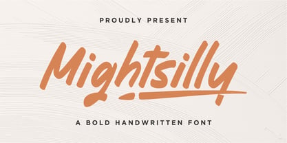 Proudly presenting Mightsilly Mightsilly is a bold handwritten font. Mightsilly is perfect for product packaging, branding project, magazine, social media, wedding invitations, or just used to express words above the background. Mightsilly also comes with multilingual support. Enjoy the font, feel free to comment or feedback, send me PM or email. Thank you!
 - Tenda Display by Attract Studio,
$18.00 Tenda Display is a simple font but a whimsical design that comes with a bold emotional character to read. Tenda Display uses the Opentype feature with the intention of multiplying other unique characters such as Alternate letters and Ligatures that suit your project. Include : Tenda Display Tenda Display Outline Tenda Display Extrude
 - Aqum Two by Slava Antipov,
$19.00 Aqum Two is a minimalistic geometric sans serif font family with rounded corners and ends. This shape gives it a friendlier look. This family consists of 4 fonts: Bold with uppercase and lowercase letters, Small caps have tiny uppercase , Curl have 290 alternate glyphs, Classic is a simple font with all caps.
 - Self Promotion JNL by Jeff Levine,
$29.00 The July 26, 1934 of the movie industry trade paper The Film Daily contained an ad for Paramount promoting its most recent releases. Hand lettered in an ultra bold Art Deco sans serif style, it was the working model for Self Promotion JNL, which is available in both regular and oblique versions.
 - Tidy Hand by Sean Johnson,
$- Tidy Hand is a clean and simple hand-written font, reminiscent of classic Swiss type. Perfectly suited to annotating sketches, UX / UI wireframes and architects drawings, where a slightly more formal, but still hand-drawn aesthetic is needed. Available in light, regular and bold; with Greek, Cyrillic and full extended Latin character sets.
 - Newsbreak JNL by Jeff Levine,
$29.00Breaking news! Hallandale JNL has been italicized and run through a line filter (courtesy of Ray Larabie of Typodermic Fonts)! The result: Newsbreak JNL... a bold, techno-style font with all of the headlines and the first on the scene when the latest news matters... Get the whole story first... with Newsbreak JNL! - Sablon B by Roman Cernohous Typotime,
$29.00 As a stand-alone version of our original Sablon, Sablon B delivers a bold expression without any distracting moments. The completely redesigned letters and numerals are available in four weights and are complemented by a vintage stylistic set based on lower horizontal lines. Wide language support including a complete set of Cyrillic characters.
 - Kirha by Twinletter,
$15.00 Introducing our newest gothic font called Kirha blackletter font, presenting a vintage and elegant style. With a classic typeface, this font evokes confident elegance with striking details on each side of the lettering. Use this font to enhance visual projects that require a bold classic look that exudes style, elegance, and strong personality.
 - Sweet Ponch by Gleb Guralnyk,
$12.00 Hi, introducing a bold smooth font Sweet Ponch. It has a rounded simple shape in a childish funny style. It's perfect for various food packaging, logo design and lettering compositions. Ponch font has a west european multilingual support, check out a screenshot with all available characters. Thank you and have a nice day!


