7,122 search results
(0.021 seconds)
- Dom Casual SB by Scangraphic Digital Type Collection,
$26.00Since the release of these fonts most typefaces in the Scangraphic Type Collection appear in two versions. One is designed specifically for headline typesetting (SH: Scangraphic Headline Types) and one specifically for text typesetting (SB Scangraphic Bodytypes). The most obvious differentiation can be found in the spacing. That of the Bodytypes is adjusted for readability. That of the Headline Types is decidedly more narrow in order to do justice to the requirements of headline typesetting. The kerning tables, as well, have been individualized for each of these type varieties. In addition to the adjustment of spacing, there are also adjustments in the design. For the Bodytypes, fine spaces were created which prevented the smear effect on acute angles in small typesizes. For a number of Bodytypes, hairlines and serifs were thickened or the whole typeface was adjusted to meet the optical requirements for setting type in small sizes. For the German lower-case diacritical marks, all Headline Types complements contain alternative integrated accents which allow the compact setting of lower-case headlines. - Baskerville No. 1 SH by Scangraphic Digital Type Collection,
$26.00Since the release of these fonts most typefaces in the Scangraphic Type Collection appear in two versions. One is designed specifically for headline typesetting (SH: Scangraphic Headline Types) and one specifically for text typesetting (SB Scangraphic Bodytypes). The most obvious differentiation can be found in the spacing. That of the Bodytypes is adjusted for readability. That of the Headline Types is decidedly more narrow in order to do justice to the requirements of headline typesetting. The kerning tables, as well, have been individualized for each of these type varieties. In addition to the adjustment of spacing, there are also adjustments in the design. For the Bodytypes, fine spaces were created which prevented the smear effect on acute angles in small typesizes. For a number of Bodytypes, hairlines and serifs were thickened or the whole typeface was adjusted to meet the optical requirements for setting type in small sizes. For the German lower-case diacritical marks, all Headline Types complements contain alternative integrated accents which allow the compact setting of lower-case headlines. - Goudy Old Style SB by Scangraphic Digital Type Collection,
$26.00Since the release of these fonts most typefaces in the Scangraphic Type Collection appear in two versions. One is designed specifically for headline typesetting (SH: Scangraphic Headline Types) and one specifically for text typesetting (SB Scangraphic Bodytypes). The most obvious differentiation can be found in the spacing. That of the Bodytypes is adjusted for readability. That of the Headline Types is decidedly more narrow in order to do justice to the requirements of headline typesetting. The kerning tables, as well, have been individualized for each of these type varieties. In addition to the adjustment of spacing, there are also adjustments in the design. For the Bodytypes, fine spaces were created which prevented the smear effect on acute angles in small typesizes. For a number of Bodytypes, hairlines and serifs were thickened or the whole typeface was adjusted to meet the optical requirements for setting type in small sizes. For the German lower-case diacritical marks, all Headline Types complements contain alternative integrated accents which allow the compact setting of lower-case headlines. - Vega SH by Scangraphic Digital Type Collection,
$26.00Since the release of these fonts most typefaces in the Scangraphic Type Collection appear in two versions. One is designed specifically for headline typesetting (SH: Scangraphic Headline Types) and one specifically for text typesetting (SB Scangraphic Bodytypes). The most obvious differentiation can be found in the spacing. That of the Bodytypes is adjusted for readability. That of the Headline Types is decidedly more narrow in order to do justice to the requirements of headline typesetting. The kerning tables, as well, have been individualized for each of these type varieties. In addition to the adjustment of spacing, there are also adjustments in the design. For the Bodytypes, fine spaces were created which prevented the smear effect on acute angles in small typesizes. For a number of Bodytypes, hairlines and serifs were thickened or the whole typeface was adjusted to meet the optical requirements for setting type in small sizes. For the German lower-case diacritical marks, all Headline Types complements contain alternative integrated accents which allow the compact setting of lower-case headlines. - Ringtown by Fargun Studio,
$12.00 Ringtown is handwritten font with a signature style. perfect for branding projects, homeware designs, product packaging or simply as a stylish text overlay to any background image. Ringtown has an entire 2 alternate font set and marker style font. This is accessible simply by their own separate font file - just install this as normal and select Ringtown Alt 1, Ringtown Alt 2, Ringtown Marker and Ringtown Swash in your text-tool Fonts are provided in .otf formats Ringtown incudes 6 Font files: Ringtown -- A handwritten script font containing upper & lowercase characters, numerals and a large range of punctuation. Ringtown Alt 1– the second version of Ringtown, with a completely new set of both lower and uppercase characters. Ringtown Alt 2– the thirth version of Ringtown, with a completely new set of both lower and uppercase characters. Ringtown Swash -- A set of 36 hand-drawn swashes, with cool touch to underline you’re Ringtown text. Need help? If you need help or advice, please contact me by e-mail "fargunstudio@gmail.com" Thank you for your purchase!
 - Dave Gibbons by Comicraft,
$49.00 How can we possibly call our line of celebrity fonts the MASTERS OF COMIC BOOK ART if it doesn't include a font based on the remarkable work of comic’s renaissance gentleman, artist/writer/colorist/letterer, Dave Gibbons?! Based on Dave’s easy-on-the-eye hand lettering, this is the font Dave himself uses to letter projects such as STAR WARS: VADER'S QUEST, MARTHA WASHINGTON & BATMAN: BLACK & WHITE. Other guys may imitate him, but the original is still the greatest! Get in with the In Crowd and check out the font created by Mister Fontastic for Dave Gibbons Original Graphic Novel, The, ah, The Originals. Yes, Dave Gibbons now comes in lower case, it’s not just what he does when he gets back from the off license. Be sure and pick up The Originals from Amazon -- now available in paperback, and probably still available as a hard case, much like Dave. After the crack about the beer above, I'm guessing you'll find me with a broken spine in the remainder pile. See the family related to Dave Gibbons: Dave Gibbons Journal & Dave Gibbons Lower .
 - Frankfurter SH by Scangraphic Digital Type Collection,
$26.00Since the release of these fonts most typefaces in the Scangraphic Type Collection appear in two versions. One is designed specifically for headline typesetting (SH: Scangraphic Headline Types) and one specifically for text typesetting (SB Scangraphic Bodytypes). The most obvious differentiation can be found in the spacing. That of the Bodytypes is adjusted for readability. That of the Headline Types is decidedly more narrow in order to do justice to the requirements of headline typesetting. The kerning tables, as well, have been individualized for each of these type varieties. In addition to the adjustment of spacing, there are also adjustments in the design. For the Bodytypes, fine spaces were created which prevented the smear effect on acute angles in small typesizes. For a number of Bodytypes, hairlines and serifs were thickened or the whole typeface was adjusted to meet the optical requirements for setting type in small sizes. For the German lower-case diacritical marks, all Headline Types complements contain alternative integrated accents which allow the compact setting of lower-case headlines. - Stilla SH by Scangraphic Digital Type Collection,
$26.00Since the release of these fonts most typefaces in the Scangraphic Type Collection appear in two versions. One is designed specifically for headline typesetting (SH: Scangraphic Headline Types) and one specifically for text typesetting (SB Scangraphic Bodytypes). The most obvious differentiation can be found in the spacing. That of the Bodytypes is adjusted for readability. That of the Headline Types is decidedly more narrow in order to do justice to the requirements of headline typesetting. The kerning tables, as well, have been individualized for each of these type varieties. In addition to the adjustment of spacing, there are also adjustments in the design. For the Bodytypes, fine spaces were created which prevented the smear effect on acute angles in small typesizes. For a number of Bodytypes, hairlines and serifs were thickened or the whole typeface was adjusted to meet the optical requirements for setting type in small sizes. For the German lower-case diacritical marks, all Headline Types complements contain alternative integrated accents which allow the compact setting of lower-case headlines. - Aachen SH by Scangraphic Digital Type Collection,
$26.00Since the release of these fonts most typefaces in the Scangraphic Type Collection appear in two versions. One is designed specifically for headline typesetting (SH: Scangraphic Headline Types) and one specifically for text typesetting (SB Scangraphic Bodytypes). The most obvious differentiation can be found in the spacing. That of the Bodytypes is adjusted for readability. That of the Headline Types is decidedly more narrow in order to do justice to the requirements of headline typesetting. The kerning tables, as well, have been individualized for each of these type varieties. In addition to the adjustment of spacing, there are also adjustments in the design. For the Bodytypes, fine spaces were created which prevented the smear effect on acute angles in small typesizes. For a number of Bodytypes, hairlines and serifs were thickened or the whole typeface was adjusted to meet the optical requirements for setting type in small sizes. For the German lower-case diacritical marks, all Headline Types complements contain alternative integrated accents which allow the compact setting of lower-case headlines. - Garamond No. 1 SB by Scangraphic Digital Type Collection,
$26.00 Since the release of these fonts most typefaces in the Scangraphic Type Collection appear in two versions. One is designed specifically for headline typesetting (SH: Scangraphic Headline Types) and one specifically for text typesetting (SB Scangraphic Bodytypes). The most obvious differentiation can be found in the spacing. That of the Bodytypes is adjusted for readability. That of the Headline Types is decidedly more narrow in order to do justice to the requirements of headline typesetting. The kerning tables, as well, have been individualized for each of these type varieties. In addition to the adjustment of spacing, there are also adjustments in the design. For the Bodytypes, fine spaces were created which prevented the smear effect on acute angles in small typesizes. For a number of Bodytypes, hairlines and serifs were thickened or the whole typeface was adjusted to meet the optical requirements for setting type in small sizes. For the German lower-case diacritical marks, all Headline Types complements contain alternative integrated accents which allow the compact setting of lower-case headlines.
 - LCD SH by Scangraphic Digital Type Collection,
$26.00 Since the release of these fonts most typefaces in the Scangraphic Type Collection appear in two versions. One is designed specifically for headline typesetting (SH: Scangraphic Headline Types) and one specifically for text typesetting (SB Scangraphic Bodytypes). The most obvious differentiation can be found in the spacing. That of the Bodytypes is adjusted for readability. That of the Headline Types is decidedly more narrow in order to do justice to the requirements of headline typesetting. The kerning tables, as well, have been individualized for each of these type varieties. In addition to the adjustment of spacing, there are also adjustments in the design. For the Bodytypes, fine spaces were created which prevented the smear effect on acute angles in small typesizes. For a number of Bodytypes, hairlines and serifs were thickened or the whole typeface was adjusted to meet the optical requirements for setting type in small sizes. For the German lower-case diacritical marks, all Headline Types complements contain alternative integrated accents which allow the compact setting of lower-case headlines.
 - Friz Quadrata SB by Scangraphic Digital Type Collection,
$26.00Since the release of these fonts most typefaces in the Scangraphic Type Collection appear in two versions. One is designed specifically for headline typesetting (SH: Scangraphic Headline Types) and one specifically for text typesetting (SB Scangraphic Bodytypes). The most obvious differentiation can be found in the spacing. That of the Bodytypes is adjusted for readability. That of the Headline Types is decidedly more narrow in order to do justice to the requirements of headline typesetting. The kerning tables, as well, have been individualized for each of these type varieties. In addition to the adjustment of spacing, there are also adjustments in the design. For the Bodytypes, fine spaces were created which prevented the smear effect on acute angles in small typesizes. For a number of Bodytypes, hairlines and serifs were thickened or the whole typeface was adjusted to meet the optical requirements for setting type in small sizes. For the German lower-case diacritical marks, all Headline Types complements contain alternative integrated accents which allow the compact setting of lower-case headlines. - Flamenca by Eurotypo,
$28.00 Flamenco is an Andalusian art. Who think in flamenco, think in Spain. Is the result of a cultural mix: Gypsies, Arabs, Jews and Christians mixed elements of their respective cultures with traditional Andalusian elements. It incorporate dance, song and guitar music. Known for its emotional intensity, flamenco is distinguished by the graceful arm movements, ferocious stomping’s flamenco dancer, deep groans and strumming guitar. Flamenco is an art of passion. Flamenca Regular and Flamenca Luz is a brush script inspired by the flamenco dance. Flamenca is an organic, modern and casual calligraphy family font that has preserved in its glyphs its original textured appearance for a more personalized effect even more authentic. As an exclusively Open Type release, with 747 glyphs, it has several special alternatives for all letters with lots of possibility an infinity of combinations. There are plenty of options to allow you to create something unique and special: standard and discretionary ligatures, several swashes, initial and terminal forms and stylistics alternates for each letter, catchwords, ornaments that can be added to the beginning or end of each letter, and much more. Ornaments has been created inspired in the bars of the Andalusian patios where flamenco is danced. These lovely fonts have already an extended character set to support Central and Eastern as well as Western European languages. As a whole, Flamenca was made to make your project more beautiful and attractive! Have fun with it! Flamenca is fancy, delicious & fresh!
 - Nexa Slab by Fontfabric,
$35.00 Nexa Slab is a geometric slab serif font whose design is based on the already popular best-seller Nexa . The font family contains 3 basic forms: italics, obliques and uprights, each of which has 8 different weights. This visual richness makes it the ideal slab serif font family for the web as well as for print, for motion graphics, logos, t-shirts and so on. It is also great for headings, fitting nicely with both small and large typesetting text blocks. Nexa Slab draws from the rich traditions of the classic Neo-Grotesque slab serif fonts such as Lubalin Graph, Rockwell and Memphis, which conceal the richness of typesetting text in its crucial advertising function. Just like these fonts, it’s design is subject to rational, carefully thought-out, thick and thin bars with a low contrast between them. The letters are characterized by the strict geometry and square proportions of the original, extra-fortified by suitably balanced slab serifs. Nexa Slab is serious without being rigid and inflexible, finished and lacking in nothing, systematic without being monotonous, and though it may seem at first glance to be more suitable for short, direct messages; in the hands of a master designer... it can build and create exquisite and harmonic designs. Open Type Features: Lining figures (proportional and tabular) The “f” ligature set Alternate characters (a, g, y) Automatic fractions Automatic numerators Automatic denomerators Automatic subscript and superscript Automatic ordinals Extended language support (most Latin-based scripts supported)*
 - Storyville by Canada Type,
$29.95 This is the redrawn and expanded version of an alphabet Rebecca Alaccari made back in 2009 as a bespoke font for a tourism agency looking to recapture the appeal of New Orleans after the hurricane Katrina disaster robbed it of its core industries. The brief back then was to "revive the unique spirit of what always made Nola great for new adults, which is the excellent combination of history, romance, food and music." No word of a lie, the brief actually contained "new adults." Storyville contains two interchangeable sets of forms drawn in the doodly, loose and organic way now conspicuously popular with today's young designers, almost every one of whom thinks they will get to design something for a boutique coffee bar somewhere. Well, this whole thing perhaps means freedom, youth, fun, happiness, good stuff like that. But just in case, a little caution doesn't hurt: Use this font only if you know what you're doing. We don't want to go back to the 1990s. Please. We were nearly done for by that exposure the first time around. The ligatures feature in this font does some pseudo-randomization, so the forms in doubled letters don't repeat. Serious fun can be had by also applying the stylistic alternates feature, or picking a letter in the middle of a setting and disabling the ligatures feature. Or various sequences of all that. If you don't like any of that stuff, just forget about it. Uh, wutever.
 - Dulcinea by Re-Type,
$79.00 Dulcinea is the title of Ramiro Espinoza’s in-depth look at Spanish Baroque calligraphy’s most extreme tendencies, and especially at some of those produced by the writing masters Pedro Díaz Morante and Juan Claudio Aznar de Polanco. These 17th and 18th centuries alphabets with their plentiful calligraphic flourishes represented a marked break with the harmonic and angular Renaissance Cancellaresca style. It was Morante who first introduced and popularized the use of the pointed quill in Spain, and although his famous text entitled “Arte Nueva de escribir” – first volume published in 1616 – contains alphabets that have much in common with traditional broad nib Cancellaresca calligraphy, most of the examples therein are outgrowths of the new models put forward by the Italian master Gianfrancesco Cresci. The writing’s swashes are complex and intricate, but at the same time they feature a profusion of defects. Many of them sometimes come close to ugliness. However, these pages contain an artistic essence that bears a relationship to the ironic and sometimes somber character of Spanish Baroque. That’s why the name of the font pays homage to “Dulcinea del Toboso”, the fictional beauty from Miguel de Cervantes’s ‘Don Quixote’, a work that reveals many of the period’s conflicts, such as the contrast between utopian ideals and reality, uncertainty and madness. But Dulcinea is far from being just a revival. Its forms are not careful tracings of the outlines of Morante and Polanco’s letters, nor are they attempts to reproduce them digitally. In fact, the author of the letters says that had the font been created that way it would have been too archaic to serve as acceptable contemporary typography. However, he believes that there are myriad interesting details that can be rescued and preserved, along with the playful spirit of the original. The work of designing Dulcinea consisted of combining original historical elements with the creativity and calligraphy of the font’s author in order to produce a modern typography that isn’t based on the same traditional sources as many recently created scripts fonts. Dulcinea offers attractive options for the setting of texts and headlines: abundant ligatures and swashes along with intricate alternate characters. It sophisticated forms make it an ideal option for women’s magazines, recipe books, lingerie products or perfume packaging.
 - Polyflec by Typodermic,
$11.95 Introducing Polyflec, the ultimate technical typeface that combines form and function with a cutting-edge design. With its square letterforms and intricate angles, Polyflec is the perfect choice for those seeking a modern, sleek and professional look. The unique design of Polyflec is inspired by the world of technology and industrial design, offering a truly unique and innovative aesthetic. Each letterform has been expertly crafted to convey a sense of precision and technical mastery, making it the ideal choice for those looking to make an impact in the digital age. Polyflec comes in four different weights and italics, giving you the freedom to choose the perfect style for your message. Whether you’re creating a bold and impactful headline, or a refined and elegant piece of text, Polyflec has everything you need to make a statement. So why settle for a plain and outdated typeface when you can harness the power of Polyflec? With its striking design and unmatched versatility, Polyflec is the perfect choice for anyone looking to take their message to the next level. Try it out today and experience the cutting-edge of technological typography! Most Latin-based European writing systems are supported, including the following languages. Afaan Oromo, Afar, Afrikaans, Albanian, Alsatian, Aromanian, Aymara, Bashkir (Latin), Basque, Belarusian (Latin), Bemba, Bikol, Bosnian, Breton, Cape Verdean, Creole, Catalan, Cebuano, Chamorro, Chavacano, Chichewa, Crimean Tatar (Latin), Croatian, Czech, Danish, Dawan, Dholuo, Dutch, English, Estonian, Faroese, Fijian, Filipino, Finnish, French, Frisian, Friulian, Gagauz (Latin), Galician, Ganda, Genoese, German, Greenlandic, Guadeloupean Creole, Haitian Creole, Hawaiian, Hiligaynon, Hungarian, Icelandic, Ilocano, Indonesian, Irish, Italian, Jamaican, Kaqchikel, Karakalpak (Latin), Kashubian, Kikongo, Kinyarwanda, Kirundi, Kurdish (Latin), Latvian, Lithuanian, Lombard, Low Saxon, Luxembourgish, Maasai, Makhuwa, Malay, Maltese, Māori, Moldovan, Montenegrin, Ndebele, Neapolitan, Norwegian, Novial, Occitan, Ossetian (Latin), Papiamento, Piedmontese, Polish, Portuguese, Quechua, Rarotongan, Romanian, Romansh, Sami, Sango, Saramaccan, Sardinian, Scottish Gaelic, Serbian (Latin), Shona, Sicilian, Silesian, Slovak, Slovenian, Somali, Sorbian, Sotho, Spanish, Swahili, Swazi, Swedish, Tagalog, Tahitian, Tetum, Tongan, Tshiluba, Tsonga, Tswana, Tumbuka, Turkish, Turkmen (Latin), Tuvaluan, Uzbek (Latin), Venetian, Vepsian, Võro, Walloon, Waray-Waray, Wayuu, Welsh, Wolof, Xhosa, Yapese, Zapotec Zulu and Zuni.
 - Jekatep by ActiveSphere,
$30.00 Jekatep is a sans-serif display font and works best in text and display applications, such as posters, headline, magazine, logos, titles, product branding, corporate branding and publishing. Jekatep font has three weights; light, regular, and bold, each available in italic, making a total of six styles. Each style has a full upper and lower-case, accents, punctuation and a selection of monetary symbols. Currently Available for Mac and PC, in Open Type, PostScript or TrueType.
 - Carpe Noctem by Hanoded,
$20.00 Carpe Noctem (Latin for ‘Seize The Night’), was a bit of a surprise. Someone asked me if I could create a lower case for my Closet Skeleton font. I began working on it and lo and behold, a beautiful font started taking shape. So, if you’re in need of a slightly scary fairytale font, complete with angled edges, swirly bits, a couple of alternate - even more curly - glyphs and an alternate medieval ampersand, then Carpe Noctem is your typeface!
 - Tape Up by Ingrimayne Type,
$9.00 The letters in TapedUp are constructed from straight pieces of what could be masking tape. The letters have a unsophisticated or unpolished quality to them. The typeface is caps-only but many of the shapes on the lower-case keys differ from those on the upper-case keys. It was formed with a template used for several letterbat fonts and also typefaces Rumpled and Tinkerer. The family has six styles: regular, bold, shadowed, oblique. bold oblique, and shadowed oblique.
 - Palio by Eurotypo,
$34.00 Palio is a family of fonts derived from the classic Didone, its capitals are slightly condensed and the lower case definitively abandon the reminiscent of the baroque endings strokes, which are still endure in many typefaces. It is an elegant font especially the slant version that actually is a truly italic. This version very readable and is enriched with a series of alternative variables and swashes that make it more expressive for certain projects that need some flowering.
 - Cool Unkle by Maulana Creative,
$11.00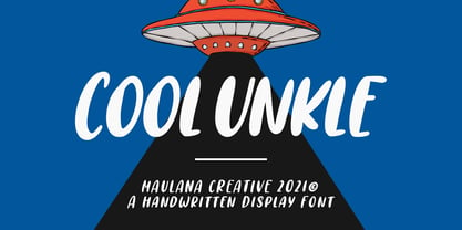 Cool Unkle is a handwritten display font. With bold stroke, slant and Unique Upper and lower characters with bit of ligatures. To give you an extra creative work. Cool Unkle font support multilingual more than 100+ language. This font is good for logo design, Social media, Movie Titles, Books Titles, a short text even a long text letter and good for your secondary text font with sans or serif. Make a stunning work with Cool Unkle font. Cheers, MaulanaCreative
 - WrenchedLetters by Ingrimayne Type,
$14.95 WrenchedLetters is a novelty font in which characters are composed of wrenches and bolts. It is caps only, but the characters on the lower-case keys differ from those on the upper-case keys. It has a large set of accented characters. It is not often that one needs a typeface made of wrenches and bolts, but if one does, there is a font for that. For related, tool-based typefaces, see Screwged, NailsNStaples, and Hammered.
 - Olgoods by Maulana Creative,
$15.00 Olgoods is a Simply casual script font. With regular stroke, italic and Unique Upper and lower characters with bit of ligatures. To give you an extra creative work. Olgoods font support multilingual more than 100+ language. This font is good for logo design, Social media, Movie Titles, Books Titles, a short text even a long text letter and good for your secondary text font with sans or serif. Make a stunning work with Olgoods font. Cheers, MaulanaCreative
 - Screwged by Ingrimayne Type,
$14.95 Screwged is a letterbat font in which letters are made of screwdrivers and screws. It is caps only, but the characters on the lower-case keys differ from those on the upper-case keys. It contains a large set of accented characters. It is not often that one needs a typeface made of screws and screwdrivers, but if one does, there is a font for that. For related, tool-based typefaces, see WrenchedLetters, NailsNStaples, and Hammered.
 - Bock by Latinotype,
$35.00 Is a recreational typography. Created from experimentation of the Slab Serif style with asymmetric lines. Bock is compact and stable, although having the quality of breaking the typographic rhythm, to benefit its use in short words as logotypes and lowering of text in editorials and publicity. The Fat variable was devised as an extension of the Bock concept, deleting the inner and outer space that surrounds a letter, creating a font with much weight and attitude.
 - Westey by sizimon,
$12.00 Westey is a script signature, beautiful for wedding card designs, logotype, website header, fashion design and any more. Westey come with 73 Glyph alternates and 63 Swash Characters. It contains a full set of lower & uppercase letters, a large range of punctuation, numerals, and multilingual support. - PUA encode - Bonus Swash - Multilingual support : (Danish,Finnish,English,,Spanish,Dutch,German,Icelandic,Italian,Norwegian,Portuguese,Indonesian, Swedish) If you have any question please do not hesitate to contact me.Thank You!
 - Malibu by ITC,
$29.99Malibu was designed for ITC by Alan Meeks in 1992 and is a font with distinctive calligraphic roots. Pronounced stroke contrast and a marked leaning to the right give the font its energetic, lively image. The letters look almost as though cut from paper, their outer contours angular and pointed against a background. Flowing and demure, Malibu works well for both short texts and headlines. For best results, the lower case letters should be set close together. - Hello Melodi by IRF Lab Studio,
$10.00 Hi, Introducing the latest styles Hello melodi Script with the kind of modern hand scratches, I hope you are interested in this font, if you want to use for your work this font can be used easily and simply because there are a lot of features in it to contain a complete set of letters lower and uppercase letters, assorted punctuation, numbers, and multilingual support. font also contains several ligatures and alternate style Stylistic. Thank You.
 - Axelentia by Realtype,
$11.00 Axelentia is a natural brushed font with a dirty texture. This font will give you a design that looks fresh and edgy and will look beautiful with offers, fashion magazines, stationery design logos, quotes, brands, greeting cards, packaging designs, posters, and more. Axelentia has two weights: Axelentia Regular and Axelentia Slant. They are complete with upper and lower case letters, as well as multi-language support, numbers, punctuation. Ligature and some additional letter characters are also provided.
 - Nuttelos by Maulana Creative,
$13.00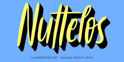 Nuttelos is a fancy handwritten script font. With regular stroke, slanted and Unique Upper and lower characters with a bit of ligatures. To give you an extra creative work. Nuttelos font support multilingual more than 100+ language. This font is good for logo design, Social media, Movie Titles, Books Titles, a short text even a long text letter and good for your secondary text font with sans or serif. Make a stunning work with Nuttelos font. Cheers, MaulanaCreative
 - Kaleko 105 Round Remix by Talbot Type,
$19.50 A remixed variation, available in three weights, of the popular Talbot Type geometric sans Kaleko 105 Round . The addition of occasional flourishes at the intersections of strokes, in both upper and lower case, adds character charm, making the font a perfect titling font to accompany Kaleko 105 and/or Kaleko 105 Round , or a display font in its own right. Kaleko 105 Round Remix features a comprehensive glyph set including accented characters for central European languages.
 - Qonitta by Zamjump,
$17.00 Called QONITTA is a serif display with a character that is beautiful, and elegant. With the addition of beautiful ligatures and alternatives to make your typography truly unique. No special software is required to type standard Typeface characters. To access Opentype Ligatures and Alternates, you need software that supports the Opentype feature in fonts. multi language support File Included : - Upper case and Lower case - Ligature - Alternate - Uniq dot (a underscore underscore, b underscore underscore, c underscore underscore)
 - Jason Uncial by URW Type Foundry,
$49.99 Jason Uncial, a unicase font, was created by Dutch designer Coen Hofmann. Uncial hand writing began to spread in Europe at the time of the late Roman Empire (200 A.D.). It influenced both the Carolingian Minuscule as well as our present lower case letter forms. Uncial fonts are still very much in use. It is used for headlines, display, titles, certificates, and not surprisingly, very much in Ireland or for anything with a Gaelic/Irish or Celtic touch.
 - Rigid Square by Dharma Type,
$19.99 Rigid Square There is a rule, Octagonal shape and 45 degree cuts. Very geometric shape but designed especially for body text, long sentence such like a mechanical instructions. Capital I and lower l have distinguishable shape. Neo-humanist shape on lowercase b.d.g.p.q is for further smooth readability. However, Also useful for display, titling, captions by their sophisticated glyph shapes and their eye-catching geometry. Consists of seven weights and their matching italics. Supporting almost all latin languages.
 - Chatter Pro by Jonahfonts,
$35.00 Chatter Pro is a handwritten unconnected script face in four styles: Light, Regular, Semibold and Bold with Small-Caps. Chatter Pro is a Pro-version of my previous font 'Chatter'. A free style specifically designed for Packaging but still works well for Greeting cards, Magazines, Posters and Advertising Ads. Invoking the OpenType CONTEXTUAL ALTERNATIVE variant. A space after any lower-case glyph will produce the word terminal. (Opentype variants may only be accessible via Opentype-Aware applications.)
 - Parangon by ParaType,
$25.00 PT Parangon™ was designed in 1986-2002 by Anatoly Kudryavtsev and licensed by ParaType. This type family belonges to Neogrotesque subclass of closed Sans Serif. Letterforms of lower case is based on the tradition of 1710 Civil type and some modern Italic types. The family has a lot of weights and styles including Extra Condensed, Condensed, Regular, Extra Light, Light, Bold, Extra Bold. For advertising and display matter. Also it can be used for texts in advertising magazines.
 - SS Banbury by Sharkshock,
$100.00 Banbury is a Neo Classical display font available in two versions. Broad line weights paired with hairline serifs create a striking contrast for an elegant look. Italic lowercase characters contain more rounded letterforms and feature shaved off lower serifs. This vintage inspired family would work nicely in a luxury logo, movie poster, or pub menu. Banbury is equipped with Basic Latin, extended Latin, diacritics, punctuation, ligatures, kerning, and small caps. Please check the glyph map for all supported characters.
 - Rookys by Maulana Creative,
$11.00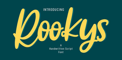 Rookys is a cartoon-is vibes handwritten display font. With bold stroke, slant and Unique Upper and lower characters with bit of ligatures. To give you an extra creative work. Rookys font support multilingual more than 100+ language. This font is good for logo design, Social media, Movie Titles, Books Titles, a short text even a long text letter and good for your secondary text font with sans or serif. Make a stunning work with Rookys font. Cheers, MaulanaCreative
 - Fortyfresh by Maulana Creative,
$11.00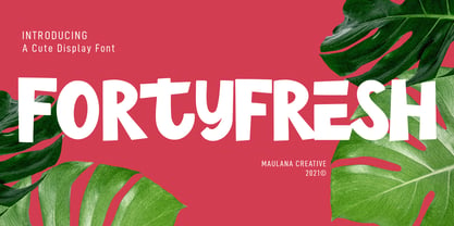 Fortyfresh is a quirky handwritten display font. With bold stroke, upright and fun character with a bit of ligatures and lower alternate. To give you an extra creative work. Fortyfresh font support multilingual more than 100+ language. This font is good for logo design, Social media, Movie Titles, Books Titles, a short text even a long text letter and good for your secondary text font with sans or serif. Make a stunning work with Fortyfresh font. Cheers, MaulanaCreative