10,000 search results
(0.014 seconds)
- Kally Dreams by Hishand Studio,
$14.00 Kally dreams is a beautiful monoline font with signature style that really good for water mark, logotype, advertisement, social media posts, product packaging, clothing design and more. complete with uppercase lowercase ligatures swashes alternates multilingual support
 - Confirmation JNL by Jeff Levine,
$29.00An old set of brass stencils spotted for sale on eBay were the inspiration for this font from Jeff Levine. Redrawn completely from scratch, Jeff retained the narrow "M" and angled corners found in the original. - Marborn by OCSstudio,
$14.00 Marborn Bold Script Typeface modern suitable for your design needs. This font is suitable for designs such as logo designs, t-shirts, branding, social media posts, thumbnails, mugs, tupperware, tote bags, and various other design purposes.
 - Ralexin by Mifiq,
$14.00 Ralexin is an excellent and elegant signature font for writing. Ralexin is suitable for social media posts, advertisements, logos & branding, invitations, product design, photography, watermarks, labels, wedding designs, product packaging, any event that requires a handwriting.
 - Attractype Reborn by Garisman Studio,
$24.00 Attractype Reborn combines attractive curves with a fresh urban edge; delivering a stylish script which is guaranteed to add an eye-catching appeal to your logo designs, brand imagery, quotes, product packaging, merchandise & social media posts
 - Ahmisya by Twinletter,
$15.00 The Ahmisya font will give your designs a genuine Middle Eastern feel. Use this font in your super projects to get everyone’s attention. Don’t put off adding an elegant Arabic touch to your design any longer.
 - John Davidson by Mindtype Co.,
$35.00 Introducing the John Davidson, a beautiful modern calligraphy font with handwritten, sophisticated flows. John Davidson offers beautiful typographic harmony for a diversity of design projects, including logos & branding, wedding designs, social media posts, advertisements & product designs.
 - Fatefulness by Brithos Type,
$15.00 Fatefulness is a sweet, soft hand-lettered handwritten font. Fall in love with its authentic feel and use it to create gorgeous wedding invitations, beautiful stationary art, eye-catching social media posts, and cute greeting cards.
 - Frisky Bug by Bogstav,
$16.00 Say hello to my multi-layered handmade sans font - not as frisky as the name, but frisky enough for most designs that needs that extra twist! Mix the 3 layers as you wish for great results!
 - Sveva by astype,
$58.00 Sveva Versal is a light swinging art nouveau caps only headliner, with swash like alternates and lots of special combinations. It's well suited to set a short and fancy block or line of text. PDF Specimen
 - 2009 Handymade by GLC,
$38.00 This font is not a historical one. Although to make it was quite time-consuming (each glyph was hand-drawn separately, except for the ligatures), this cartoon or comics style font is just made for fun.
 - Hairy Beast by Shelsey Birch,
$500.00 This display typeface is a little bit of scary and a whole lot of fun. Each character represents a little hairy monster of its own. It's sure to be a welcomed member to your font collection.
 - Industrial Stencil JNL by Jeff Levine,
$29.00 Samples of vintage machine-punched stencils used for marking crates and cartons were spotted in an online auction. These served as the basis for Industrial Stencil JNL, which is available in both regular and oblique versions.
 - Pumkinpie by Balpirick,
$15.00 Pumkinpie is a cute and lovely handwritten font. Fall in love with its simple and neat style and use it to create gorgeous wedding invitations, beautiful stationary art, eye-catching social media posts, and much more!
 - Leytta by AEN Creative Studio,
$10.00 Leytta is a sweet, soft hand-lettered handwritten font. Fall in love with its authentic feel and use it to create gorgeous wedding invitations, beautiful stationary art, eye-catching social media posts, and cute greeting cards.
 - Quotes and Texts by Pixel Colours,
$24.00 Quotes and Texts is a sweet handwritten uppercase font designed to look clear and chic in small formats like texts, quotes, and social media posts. Includes: Uppercase and lowercase caps characters, numbers and punctuation Supports Language
 - Spaceboy by Drewfonts,
$15.00Originally conceived from the basic sign writers brush stroke pattern and heavily influenced by the songs of David Bowie this style has developed into an organic Futurist face, kind of post modern retro, catch my drift? - Street Legal by LetterBalm,
$17.99 Hard core street scrawl, for tough graffiti urban hood, laid back and tough, lots of attitude and tons of muscle, for automotive, motorcycles, urban settings and back alleys. Gives your designs some serious five o'clock shadow.
 - Pacifica by Solotype,
$19.95This is really Congo from Barnhart Bros. & Spindler, but we felt it would be improved if we smoothed out some of the curves slightly. Conjures up visions of Pacific Islands and other exotic ports of call. - Shestopal by Arendxstudio,
$17.00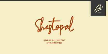 Shestopal is a monoline signature script and is made as elegantly as possible. It is suitable for a variety of design projects, including logos, branding, wedding designs, social media posts, advertisements, product designs, magazines and more.
 - Kostel Infinity Sans by Kostelansky,
$40.00 High-quality type design. Originally designed for headline / logo use. A lot of high-quality glyphs designs in this one so be sure to view the specimen PDF as well as the glyph page. Enjoy. - Kostelansky
 - Salovad Logo Type by LfarStudio,
$15.00 Hi... Thank for your visit :) Salovad logotype is a sans serif with brush, featuring a simple style and unique feel. This font suitable for social media posts, advertisements, decoration, logos, movie title and more! Happy design..
 - Plowright by Scriptorium,
$18.00Plowright is a new font based on hand lettering from the 1880s. It's a great example of the style we often associate with signmaking in the old west, with a lot of quirks and original character. - Wet Dog by Leimone Design,
$8.00 Wet Dog is the ultimate fur font reflecting the global movement of street pop art, Playful, yet with attitude. A versatile display font for making strong, loud statements, just about as shy as a wet dog!
 - Madelief by Balpirick,
$15.00 Madelief is a sweet, soft hand-lettered handwritten font. Fall in love with its authentic feel and use it to create gorgeous wedding invitations, beautiful stationary art, eye-catching social media posts, and cute greeting cards.
 - Worstveld Hand by Typotheticals,
$5.00 A rough hand-drawn plain sans serif that would be good for non-formal use. Do not expect a polished set of fonts from a professional, this family is hand drawn, hand spaced and hand kerned.
 - Fashion Wacks by Nirmana Visual,
$22.00 Fashion Wacks , contemporary of serif font, Inspired by all the retro aesthetics making a comeback, Fashion Wacks offers beautiful typographic harmony for a diversity of design projects, including logos & branding, social media posts, advertisements & product designs.
 - Cellestion by Fikryal,
$15.00 Cellestion is a new, modern and stylish handwritten font. It's perfect for logos, branding, invitations, tittles, wedding designs, social media posts, advertisements, product packaging, product designs, labels, photography, watermark, special events, magazines, web design, and more.
 - Brough by OtterType,
$19.00 Brough is a carefully crafted bold sans serif font. You can use it for a variety of design projects like posters, business cards, invitations, games, covers, social media posts, quote photos, branding, editorials, and much more.
 - Eu Alonira by Hishand Studio,
$15.00 Eu Alonira is elegant serif font that look aesthetic Perfect for Logo brand, advertisement, product packaging, social media post, clothing brand, magazine headers and many more complete with ligatures alternates regular italic icon kerning multilingual support
 - Neue Frutiger Paneuropean by Linotype,
$79.00During planning for the new Roissy Charles de Gaulle airport in Paris at the beginning of the 1970s, it was determined that the airport's signage system had to include the clearest and most legible lettering possible. The development of all signage was put into the hands of Adrian Frutiger and his studio. The team carried out their task so effectively that a huge demand for their typeface soon arose from customers who wanted to employ it in other signage systems, and in printed materials as well. The Frutiger® typeface not only established new standards for signage, but also for a range of other areas in which a clear and legible design would be required, especially for small point sizes and bread-and-butter type. The typeface family that which emerged as a result of this demand was added into the Linotype library as "Frutiger" in 1977. Frutiger Next, created in 1999, is a further development of Frutiger, not necessarily a rethinking of the design itself. It was based on a new concept, the most obvious visual characteristics of which is the larger x-height, as well as a more pronounced ascender height and descender depth for lower case letters in relation to capitals. This new design created a balanced image and included considerably narrower letterspacing. Frutiger Next meets the demand for a space-saving, modern humanist sans. 2009's Neue Frutiger is a rethink of the 1977 Frutiger family, now revised and improved by Akira Kobayashi in close collaboration with Adrian Frutiger. Despite the various changes, this "New Frutiger" still fits perfectly with the original Frutiger family, and serves to harmoniously enhance the weights and styles already in existence. The perfect mix, guaranteed Neue Frutiger has the same character height as Frutiger. As a result of this, already existing Frutiger styles can be mixed with Neue Frutiger where necessary. Likewise, Neue Frutiger is perfect for use alongside Frutiger Serif. Newly added are the "Neue Frutiger 1450" weights. Especially for the requirements of the newly released German DIN 1450 norm we have built together with Adrian Frutiger specific weights of the Neue Frutiger. The lowercase l" is curved at the baseline to better differentiate between the cap "I", additionally the number "0" has a dot inside to better differentiate between the cap "O", and the number "1" is now a serifed 1. The font contains additionally the origin letterforms from the regular Neue Frutiger font which can be accessed through an Opentype feature." - Neue Frutiger Cyrillic by Linotype,
$89.00During planning for the new Roissy Charles de Gaulle airport in Paris at the beginning of the 1970s, it was determined that the airport's signage system had to include the clearest and most legible lettering possible. The development of all signage was put into the hands of Adrian Frutiger and his studio. The team carried out their task so effectively that a huge demand for their typeface soon arose from customers who wanted to employ it in other signage systems, and in printed materials as well. The Frutiger® typeface not only established new standards for signage, but also for a range of other areas in which a clear and legible design would be required, especially for small point sizes and bread-and-butter type. The typeface family that which emerged as a result of this demand was added into the Linotype library as "Frutiger" in 1977. Frutiger Next, created in 1999, is a further development of Frutiger, not necessarily a rethinking of the design itself. It was based on a new concept, the most obvious visual characteristics of which is the larger x-height, as well as a more pronounced ascender height and descender depth for lower case letters in relation to capitals. This new design created a balanced image and included considerably narrower letterspacing. Frutiger Next meets the demand for a space-saving, modern humanist sans. 2009's Neue Frutiger is a rethink of the 1977 Frutiger family, now revised and improved by Akira Kobayashi in close collaboration with Adrian Frutiger. Despite the various changes, this "New Frutiger" still fits perfectly with the original Frutiger family, and serves to harmoniously enhance the weights and styles already in existence. The perfect mix, guaranteed Neue Frutiger has the same character height as Frutiger. As a result of this, already existing Frutiger styles can be mixed with Neue Frutiger where necessary. Likewise, Neue Frutiger is perfect for use alongside Frutiger Serif. Newly added are the "Neue Frutiger 1450" weights. Especially for the requirements of the newly released German DIN 1450 norm we have built together with Adrian Frutiger specific weights of the Neue Frutiger. The lowercase l" is curved at the baseline to better differentiate between the cap "I", additionally the number "0" has a dot inside to better differentiate between the cap "O", and the number "1" is now a serifed 1. The font contains additionally the origin letterforms from the regular Neue Frutiger font which can be accessed through an Opentype feature." - Neue Frutiger 1450 by Linotype,
$71.99 During planning for the new Roissy Charles de Gaulle airport in Paris at the beginning of the 1970s, it was determined that the airport's signage system had to include the clearest and most legible lettering possible. The development of all signage was put into the hands of Adrian Frutiger and his studio. The team carried out their task so effectively that a huge demand for their typeface soon arose from customers who wanted to employ it in other signage systems, and in printed materials as well. The Frutiger® typeface not only established new standards for signage, but also for a range of other areas in which a clear and legible design would be required, especially for small point sizes and bread-and-butter type. The typeface family that which emerged as a result of this demand was added into the Linotype library as "Frutiger" in 1977. Frutiger Next, created in 1999, is a further development of Frutiger, not necessarily a rethinking of the design itself. It was based on a new concept, the most obvious visual characteristics of which is the larger x-height, as well as a more pronounced ascender height and descender depth for lower case letters in relation to capitals. This new design created a balanced image and included considerably narrower letterspacing. Frutiger Next meets the demand for a space-saving, modern humanist sans. 2009's Neue Frutiger is a rethink of the 1977 Frutiger family, now revised and improved by Akira Kobayashi in close collaboration with Adrian Frutiger. Despite the various changes, this "New Frutiger" still fits perfectly with the original Frutiger family, and serves to harmoniously enhance the weights and styles already in existence. The perfect mix, guaranteed Neue Frutiger has the same character height as Frutiger. As a result of this, already existing Frutiger styles can be mixed with Neue Frutiger where necessary. Likewise, Neue Frutiger is perfect for use alongside Frutiger Serif. Newly added are the "Neue Frutiger 1450" weights. Especially for the requirements of the newly released German DIN 1450 norm we have built together with Adrian Frutiger specific weights of the Neue Frutiger. The lowercase l" is curved at the baseline to better differentiate between the cap "I", additionally the number "0" has a dot inside to better differentiate between the cap "O", and the number "1" is now a serifed 1. The font contains additionally the origin letterforms from the regular Neue Frutiger font which can be accessed through an Opentype feature."
 - ENYO Serif Light - Personal use only

- Notice2Std - 100% free

- Aracne Regular - Personal use only

- Aaah Speed - Unknown license

- StageDive - Unknown license

- Jesper by Linotype,
$29.993 robbers is not a typeface family, only a collective name for three typefaces with the looks of handtexted characters: Kasper, Jesper and Jonatan. There are some common traits between them, but they are three individuals. As the three terrible" robbers in the Swedish writer Lennart Hellsing's Kamomillastad - the ones who borrowed their names to the typefaces - are three individuals. They always appear in the same order: first Kasper, then Jesper and last Jonatan. Swedish children love to sing about them and are not at all scared of them. All three robbers were released in 1995. - Avonick by Valentino Vergan,
$16.00 Avonick is a beautiful condensed font family with an elegant touch. Avonick has a sophisticated and professional look, its clean and elegant letters make it perfect for sleek and professional projects. Avonick comes in four weights, Light, Regular, Semibold and Bold. Each font weight has an oblique version. Avonick has a stylish design which makes it very versatile, the font can cover a wide range of projects such as: branding, mastheads, magazines, logos, banners, wedding invitations, websites, blog posts, pull quotes, editorials, packaging, social media posts, advertisements and much more. We hope you enjoy using the Avonick font family.


