8,753 search results
(0.018 seconds)
- Encercle Draft by Typodermic,
$11.95 With Encercle Draft, you can create circles and other shapes containing numbers up to 999999. Here's how it works: hold shift and type the number of digits, followed by a number. If you want the number 25, hold shift, type 2 followed by 25. If you want the number 250, hold shift, type 3 followed by 250. You can also type letters, periods, slashes, hyphens, question marks and exclamation points. Create an inverse white-on-black effect using your application's Bold feature. Easily change shapes by selecting a different font style from your application's font menu. Encercle Draft is available in the following shapes. Circle Square Box (wide rectangle) Box with rounded ends (tab) Diamond Circle inside a diamond Hexagon Hexagon rotated Octagon Triangle up Triangle down Triangle right Triangle left Quote bubble with left tail Quote bubble with right tail Quote bubble with no no tail Cloud (thought bubble) Encercle Draft uses OpenType technology. Most current graphic design applications support basic OpenType features but there are a few exceptions including AutoCAD, SketchUp, Solidworks and Canva. Encercle Draft will work in Affinity, Inkscape, GIMP, Adobe apps (not Photoshop Elements), Microsoft apps (not Powerpoint), Sibelius and more. Encercle Draft includes a PDF manual with examples. There's also an advanced feature which allows you to create solid-colored backgrounds. For a thicker, sans-serif style, check out Encercle Sans. For more complex layered effects with a different selection of typefaces and shapes, check out Numbers with Rings. Encercle PDF user manual.
 - Encercle Sans by Typodermic,
$11.95 With Encercle Sans, you can create circles and other shapes containing numbers up to 999999. Here's how it works: hold shift and type the number of digits, followed by a number. If you want the number 25, hold shift, type 2 followed by 25. If you want the number 250, hold shift, type 3 followed by 250. You can also type letters, periods, slashes, hyphens, question marks and exclamation points. Create an inverse white-on-black effect using your application's Bold feature. Easily change shapes by selecting a different font style from your application's font menu. Encercle Sans is available in the following shapes. Circle Square Box (wide rectangle) Box with rounded ends (tab) Diamond Circle inside a diamond Hexagon Hexagon rotated Octagon Triangle up Triangle down Triangle right Triangle left Quote bubble with left tail Quote bubble with right tail Quote bubble with no no tail Cloud (thought bubble) Encercle Sans uses OpenType technology. Most current graphic design applications support basic OpenType features but there are a few exceptions including AutoCAD, SketchUp, Solidworks and Canva. Encercle Sans will work in Affinity, Inkscape, GIMP, Adobe apps (not Photoshop Elements), Microsoft apps (not PowerPoint), Sibelius and more. Encercle Sans includes a PDF manual with examples. There's also an advanced feature which allows you to create solid-colored backgrounds. For a thinner, classic architecture/drafting style, check out Encercle Draft. For more complex layered effects with a different selection of typefaces and shapes, check out Numbers with Rings. Encercle PDF user manual.
 - Frequent by PizzaDude.dk,
$19.00 This font was originally meant to be my last creation of 2022, but as it turned out, it was the first font of 2023 instead! Why? Well, because it took me a lot of time to complete the 150 different swahes letter combinations, the 182 different letters (not counting numbers, accented characters etc) the small caps, the subscript and the multilingual support! Anyway, it was worth the work - the Frequent font works great as a display font, or whatever you have in mind. Play around with the different versions (Regular, Solid and Inside) for great results.
 - Seven Seas by Hanoded,
$15.00 Some time ago, my son asked me to name all Seven Seas. I had to think for a bit, because I can think of more than 7 seas (the North Sea, the Caspian Sea, the South China Sea, the Sea Of Okhotsk, etc.), but apparently these are not part of the BIG Seven. It turns out that even oceans count as ‘seas’. Long story short, I created a font, had to think of my son’s question and named the font Seven Seas. Seven Seas is a hand made serif that comes with swashed alternatives for a lot of glyphs.
 - Club Type by Club Type,
$37.00 Perhaps the greatest tragedy in all English history began in 1642 when, for five years, families and friends were divided by violent struggle. Respect for the monarchy was as great then as it is today; but it was squandered by Charles I and Civil War ensued. Out of Cromwell's eventual victory came a period of absolute rule just as arbitrary. In communicating the affairs of Court, Mercurius Aulicus can claim to be England's first regular newspaper, printed at Oxford and reprinted in London almost throughout the entire war. This typeface family echoes the calligraphic scripts of newspaper cartoons of the time.
 - Martie by Canada Type,
$25.00From the heart of the Blue Ridge Mountains, by way of Toronto, comes Martie's handwriting. Martie Byrd is a school teacher in Roanoke, Virginia, and a friend of Canada Type's Rebecca Alaccari. After years of admiring the cheer and clarity of Martie's handwriting, we asked her to write out full alphabets for some cool font treatment. The intent was to do three different versions of her writing in two different pens, then use the auto-magic of OpenType to determine letter sequences and rotate character sets on the fly when the fonts are in use. A successful endeavor it was. Take a look at the images in the MyFonts gallery to see the character rotation in action, along with a visual explanation of why Martie is not just another handwriting font. Unlike other available felt tip and ballpoint handwriting fonts, the regular and bold variations are style-based, not weight-based. They are the handwritten expressions of two different Sharpie pens: The fine point one (Martie Bold), and the ultrafine one (Martie Regular). The style-based variation considerably helps the realism needed in design pieces that take advantage of the contrast of two different handwriting fonts. Weight thickening in handwriting is an obvious mechanical effect that only happens with computers. Weight changing by replacing pens is what happens in the real world. Martie Pro and Martie Pro Bold each contain three different character sets in a single font. Language support includes Western, Central and Eastern European languages for all three sets. This translates into each Pro font containing over 750 characters. Add OpenType code and stir, and you have true handwriting fonts with versatility unavailable out there in anything else of the genre. A software program that supports OpenType features is needed to use the randomization coded in Martie Pro and Martie Pro Bold. Current versions of QuarkXpress and Adobe applications (Photoshop, Illlustrator, InDesign) do contain support for the randomization feature. But if you don't have one of these apps, you can still use the interchangeable Type 1 or True Type fonts and change the characters manually to achieve the appearance of true handwriting. The Martie fonts come in a variety of price packages, from the affordable single fonts to value-laden complete sets. All the proceeds from these fonts received by Canada Type will be donated 50/50 to two primary schools: One in Roanoke (where Martie teaches), and one in Toronto (where the 10-year old, real Canada Type boss goes). So next time a design project needs a handwriting font, do the write thing and use Martie to keep it real. - Option Sans by Cadson Demak,
$29.00 Option Sans is a rework of Anuthin Wongsunkakon's Coupe. The popular font originally sold by T26 has now been humanized. Improved legibility from the original Coup to serve better as fine text font.
 - Handbills And Posters JNL by Jeff Levine,
$29.00 At first glance, Handbills and Posters JNL bears a strong resemblance to Classroom JNL. True, they both share the visual qualities that are based on Franklin Bold Condensed, but this is where the similarity ends. Handbills and Posters JNL is a refined re-draw of the classic design, based largely on vintage typographic examples. There are also some character variances. Classroom JNL is a rougher alphabet with varying curves and lines, and resembles such letters traced and cut out of construction paper for a bulletin board display at school.
 - QuickType by Wiescher Design,
$39.50 QuickType is a typeface I designed for demonstration purposes. I used it to illustrate my first book about type design. It has crooked slab serifs and looks very much like a typewriter font. But in order to make things clear I had to overdo some curves and so QuickType turned out a very distinct typewriter typeface. Since those days I worked on the shapes from time to time, so it got better and I extended it to include several neccessary cuts. Now it is a full fledged very usable font. Yours very quick Gert Wiescher.
 - Roughgates by Mozatype,
$15.00 Roughgates Display Font is a bold and chunky lettered display typeface. It’s a versatile serif typeface that gives a vintage aesthetic. Roughgates has multi-language support with western characters included. Roughgates include 2 font , clean version and rough version Add this font to your creative ideas and notice how it will make them stand out! What’s Included : – Works on PC & Mac – Easy to use ( Installations ) – Easy Convert to webfont – Compabilty Windows, Apple, Linux, Cricut, Silhouette and Other cutting machines Thanks for downloading, and I hope you enjoy it!
 - Page No. 508 by HiH,
$10.00 Page No. 508 was designed by William Hamilton Page in 1887 as one of a series of designs for die-cut wood types for the firm of Page & Setchell of Norwich, Connecticut. Page & Setchell was the successor to The William H. Page Wood Type Company and was sold to the Hamilton Manufacturing Company of Two Rivers, Wisconsin in 1891. 508 is a heavy all-caps font designed for headline work. It has a strong presence that reverses out well (light-colored type on a dark background). Great for retro style posters.
 - Delighted Atmosphere by Java Pep,
$15.00 Proudly present a pretty bouncy font called Delighted. As the name suggests, this font will make your project more enjoyable because it will make your project more beautiful and stand out. Delighted font comes with several alternates, so you can switch on for the alternate, stylistic alternate, and terminal form. This font is perfect for logo font, branding, greeting cards, cut files for quotes, silhouette font design, monogram font, etc. The packages and features Delighted font PUA encoded Multilingual support in more than 30 languages Thanks, and have a nice day
 - Frank Ruhl MF by Masterfont,
$59.00 The most popular Hebrew typeface, designed in 1908 by Raphael Frank and Otto Rühl. OpenType Pro Excellent support for Niqqud (Vowels). All marks are programmed to fit each glyph's shape and width. OpenType Pro includes new advanced features like Dagesh Hazak, ShevaNa, Qamatz Katan, Holam Haser and wide letters. Best used with Adobe InDesign CC that support complex Hebrew text. Please check these advanced features in this link: https://tinyurl.com/ybgdsxme
 - Dear Dolores by Samuelstype,
$24.00 Dear Dolores has had its name from the latin word dolorem, meaning sorrow or grief. When I started working on this display font I found myself trying it out using the latin requiem texts. The capitals somehow sat well with the monumental and solemn words of mourning. The broken hairlines suggested stone cuttings where the fine details had been worn down and obliterated over time and it felt at home in a churchyard or in a monument park. Adding lowercase gave the font a more personal and friendly appearance and opened up new possibilities for use. The name itself is a fictional message to someone long missed or perhaps lost too soon. Dear Dolores comes in a cut and an uncut version where the fine details are left intact. Both are excellent for headlines or memorable quotes.
 - Dramaminex by Emboss,
$12.40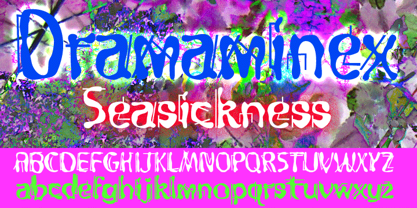 Designed after a bout with seasickness.
 - Colin by Tickbite Type,
$18.99 Colin is a fresh, somewhat futuristic geometric sans serif type with a large x-height that, to me, communicates both seriousness and cheerfulness. It supports 70 languages incl. monotonic Greek and comes in 7 weights with a small number of alternate glyphs (ss01) for more flexibility. It features fractions, old style and tabular figures. Colin works great in titles, displays and short paragraphs. And where does it come from? To be honest, the reason for this font is a selfish one. I wanted a typeface where my initials (n and c) look identical, just rotated by 90 degrees. That didn’t completely work but, hey, it’s pretty close.
 - Caturrita by Armasen,
$12.00 Caturrita is a versatile family for use in both long texts, and can be used in titles. The characters have fluidity, contemplating the principle of continuity. It has structural strength of the glyphs to be drawn by considering aspects calligraphy. The name comes from the similarity between the characteristics of the bird well known in southern Brazil: drawing the loose, fluid that resembles a flying bird. Moreover, a clear reminder that some of the glyphs are the serifs beak of the animal. Prize Winner Bornancini - Porto Alegre RS - Academic Category Selected Project Muestra de Estudiantes for the Ibero-American Biennial of Design - Madrid - Spain
 - Tulip by ArtyType,
$29.00 I've had an interest in typography ever since my college days, even submitting my NDD thesis on the subject. The basic concept for this typeface stems from that early creative period, hence the obvious 60’s retro feel. It’s only recently that I've have had the chance to carry through fully some of my dormant typographic ideas, but ‘better late than never’ as they say! The font’s characteristic style is based on repeating or rotating templates of a half and a quarter circle, the geometric, modular building blocks used here. The name was simply influenced by the letter ‘u’, which visually describes a stylized ‘tulip’ flower.
 - Slanted ITALIC Shift by TypoGraphicDesign,
$19.00 CONCEPT/CHARACTERISTICS The constructed, clear and modern character of the typeface based on the basic form of the triangle. The motto is geometrically and italic. APPLICATION AREA The modern, futuristic and constructed font „slanted ITALIC shift“ would look good at display size for poster, flyer, comics and graphic novel lettering and logos. Headlines in magazines or websites, packaging, music covers or webbanner etc. TECHNICAL SPECIFICATIONS Headline Font | Display Font | Geometric Font „slanted ITALIC shift“ OpenType Font with & 308 glyphs & 6 styles (thin, light, regular, medium, bold, black). Alternative letters, symbols and ligatures (with accents & €) FONT IN USE www.typographicdesign.de/font-in-use-slanted-italic-shift/
 - Biscuit Boodle Ornaments by insigne,
$5.00 Biscuit Boodle Ornaments are the ornament complement to Biscuit Boodle, a fun and uplifting brush-drawn script. Biscuit Boodle Ornaments offers a total of 72 vignettes, crests, fleurons, frames and many other useful ornaments. These ornaments were brush-drawn by Portland Studios‚ Illustrator Justin Gerard and have just a slight amount of natural texture. These energetic and lively ornaments can be resized and rotated easily without any loss of quality and can easily be converted to outlines and modified. Combine them to form unique compositions or insert them into text to add some excitement to your designs. Please see the sample .pdf to see all 72 ornaments in action.
 - Whitenow by Proportional Lime,
$15.99 In the year 1528 Pierre Attaignant led a revolution in music printing. His method of once-press moveable type, greatly simplifying the original 3 impression process developed by Petrucci, remained in use till near the end of the 17th century. The method could only realize one line of music per staff, and the introduction of barlines as a common means of aligning multiple staves brought this method to a close after nearly two centuries of use. This font is meant to allow the printing of music using that method with the notation of that era. It is largely based on an exemplar printed by Snodham of London.
 - Ciseaux Matisse by Harald Geisler,
$65.74 Ciseaux Matisse was inspired by the exhibition Drawing With Scissors, which I visited at the Kunsthalle Schirn in my hometown of Frankfurt am Main in 2003 and the book Jazz published in 1947 by Henri Matisse. Admittedly, before that time I wasn’t a fan of Matisse’s work, neither his late nor the early work. That definitely changed after the exhibition. While his motifs have been overused on postcards and mouspads, in front of the originals you forget those tiny pictures. Some of the works were massive—larger than 24ft. By cutting directly into the color Matisse created shapes with strong dynamics. Years later, in 2007, I used that inspiration to cut an exclusive font for a newspaper that I designed at that time (see Gallery Pictures). Later I developed that font into the four styles featured here. The cut-out style is a paper cutout; boxed is the paper background. Both linear and boxed linear have no curved outlines, so they are more aggressive. As drawing with scissors implies, all characters are cut by hand. With only uppercase letters, this font is designed for editorial use: headlines, slogans in ads, or musical usage in posters and flyers that need the little touch of the jazz scissors. In special cases the lowercase letters contain alternate shapes to the uppercase forms.
 - Fishmonger by Suitcase Type Foundry,
$39.00Fishmonger originated from a commission of two fonts for the corporate identity of a fishmonger shop. When sketching the elementary principles for the lettering, the idea for a modern, extensive font family with a large number of styles was born. The first step consisted of defining the range of widths and weights. Then the master design Medium Regular was completed. The next step was adjusting the Extra Condensed Thin, the Extra Condensed Bold, The Extra Extended Thin and the Extra Extended Bold weights, as they are the vertices of an imaginary square map of the face. This meant that, in order to achieve a harmonious result, the x and y axis needed to be defined. From top to bottom, from the widest to the most condensed cut, the proportions are linear. However, from light to black, the line curves gently, allowing lesser difference between the light cuts, and a dramatic one between the heavier cuts. To ensure the original parameters were respected each position on the vertex was checked against the Medium Regular. After sorting out the ideal set-up, the remaining characters of each of the weights were drawn, and the remaining cuts were interpolated according to the principles above. Fishmonger is a functional, clean design, free of any buoyant, ornamental shapes, almost minimalist. Maybe this is what lends the type family its unique appearance. - Bramante LP by LetterPerfect,
$39.00 Bramante™ is an original display font by LetterPerfect Fonts, designed by Garrett Boge in 2020. It is modeled after a fifteenth-century inscription in the church of Santa Cecilia in Trastevere, Rome. The name is a tribute to the pre-eminent Renaissance architect Donato Bramante, whose Tempietto (1502, San Pietro in Montorio) marked the beginning of the High Renaissance in Rome. In 1503 he was named lead architect for the new St. Peter's Basilica, which was completed by Michelangelo, Maderno and Bernini a century later. Based on the pervasive use of Adobe Trajan as a classical-inspired titling face, LetterPerfect offers this Renaissance revival of imperial Roman capitals as an alternative with additional refinement and personality. (The full size capitals are complemented with small capitals in the lowercase positions.)
 - As of my last update in early 2023, the font TypeMyMusic Notation might not be commonly recognized in mainstream font repositories or discussions among graphic designers and musicians. Nonetheless, t...
- Rezak by TypeTogether,
$36.00 Nothing is hidden in the simplistic forms and overt aesthetic of Anya Danilova’s Rezak font family. Rezak is not a type family directly from the digital world, but was inspired by the stout presence of cutting letters out of tangible material: paper, stone, and wood. With only a few cuts, the shapes remain dark and simple. With more cuts, the shapes become lighter and more defined, resulting in a dynamic type family not stuck within one specific category. The Black and medium weights began as one approach before separating into display and text categories. The four text weights were created through pendulum swings in design direction that experimented with contrast, angles, tangent redirections, and the amount of anomalies allowed. The text weights are vocal when set larger than ten points and subtle at smaller sizes. The tech-heavy Incised display style came last, employing a surprising range of trigonometric functions to make it behave exactly as desired. Its look can result in something distinctive and emotional or completely over-the-top. Most normal typefaces change only in thickness; Rezak changes in intention, highlighting the relationship between dark and light, presence and absence, what’s removed and what remains. Rezak’s Black and Incised display styles are like a shaft of light in reverse and are perfect in situations of impact: websites, headlines and large text, gaming, call-outs, posters, and packaging. The tone works for something from youthful or craft-oriented to organic and natural products. Try these two in logotypes, complex print layering, branding, and words-as-pattern for greater experimentation. The text styles are bold, energetic, well informed, and round out the family with four weights (Regular, Semibold, Bold, Extrabold) and matching italics for a family grand total of ten. These jaunty styles work well in children’s books, call-outs, movie titles, and subheads for myriad subjects such as architecture, coffee, nature, cooking, and other rough-and-tumble purposes. Rezak’s crunchy letters are meant to expose rough, daring, or dramatic text. A further benefit is that this family is not sequestered within one specific genre or script, so it can be easily interpreted for other scripts, such as its current Latin and extended Cyrillic which supports such neglected languages as Abkhaz, Itelmen, and Koryak. Rezak’s push toward creativity and innovation, with an eye on typography’s rich history, reinforces our foundry’s mission to publish invigorating forms at the highest function and widest applicability.
 - Stencil Package JNL by Jeff Levine,
$29.00 Stencil Package JNL has its design roots in the brand name hand-lettered on the paper sleeves for the short-lived Stencil-It line of lettering guides produced in 1955 as a direct competitor to Stenso Lettering Guides. Formed by Bernie Aronson [a relative of the Libauers who owned the Stenso Lettering Company and who once worked for them] along with a financial partner (noted artist) Sidney Levyne, the company was soon put out of existence by a court action. It re-emerged in 1956 as the E-Z Letter Stencil Company and existed until the 1990s. Stencil Package JNL is available in both regular and oblique versions.
 - Klin JY by JY&A,
$49.00Jure Stojan first created JY Klin for a student magazine in Ljubljana, Slovenia. ‘It was borne out of my frustration with layout [programs] and their taste for messing with decent fonts (making the headline occupy the entire column width at any cost, for instance). Therefore, I designed a “heavy duty” display font—it can be extended up to 120 per cent without any loss in quality (it is fairly condensed, so no one could think of squeezing it any further). I even used the font, stretched by the very 120 per cent, for 10 point text and the result was surprisingly legible (given some peculiar details prominent at display size).’ - RMU Czeschka by RMU,
$35.00 Thanks to the Quay Brothers, London, who provided me with original materials, I was able to revive Carl Otto Czeschka’s beautiful Czeschka Antiqua which was first released by Genzsch & Heyse in 1917. Since nowadays the word Antiqua rather refers to fonts with serifs, I dropped it, also because this fanciful font is a humanist sans. To get access to all ligatures, it is recommended to also activate the OT feature Discretionary Ligatures.
 - HWT Bon Air by Hamilton Wood Type Collection,
$24.95 Bon Air was one of a series of script typefaces cut into wood by the Hamilton Manufacturing Company for the Morgan Sign Machine Co. (makers of the Line-o-Scribe showcard press) in the mid 20th Century. These were some of the last new designs cut into wood by Hamilton until the museum revival in the early 2000s. Bon Air was created in 1958 and trademarked in 1961. The wood type made for Morgan was used largely in department stores to make their own signage. The script styles are reminiscent of sign painters alphabets and evoke a Mad Men era advertising aesthetic. The font was only cut in four sizes: 12, 18, 36 and 72 line. It was distributed by Morgan for use in their presses, but as type high wood type, it could be used on any press. The font was issued with several alternate letters and ligatures to simulate the effect of hand lettering. Its lively strokes and odd details give it an exotic flavor suitable for advertising display work. The digital version includes all of the original alternates plus new characters to fill out a full European character set.
 - Hunkster by Heypentype,
$20.00 HUNKSTER is heypentype journey to simplified a stencil fonts. Simplified means it must easy and fast to cut when creating stencil art. Hence, this typeface inspired a lot from stencil arts and fonts right from the beginning of its creations. When a lot of stencil fonts out there used to create political message and self-expression, Hunkster take it beyond that. This typefaces can be applied to anything, from motorsports, branding, logo or logotype, industrial design, products packaging, software, games, website headlines,etc. Whatever it will be used, the spirit of the stencil and street art remains. Include in this typeface family is plenty of ligatures because the nature of stencil and our design aims, easy-to-cut but still beautiful. Most importantly its thrown away an image of stencil fonts bound on military themes. This ligatures will be developed in the future release along with updates on Hunkster variable fonts.
 - Stay Bold by Set Sail Studios,
$12.00 #boldisbeautiful, and there's a whole lotta bold in this hand painted brush font, Stay Bold! With extra chunk in the trunk and a rough paintbrushed edge, Stay Bold cuts straight to the point; ideal for designing big impact merchandise, eye catching social media & marketing posts, and attention-grabbing product packaging & branding projects. Stay Bold supports uppercase, lowercase, numerals and a large range of punctuation. Includes multilingual support for the following languages; English, French, Italian, Spanish, Portuguese, German, Swedish, Norweigen, Danish, Dutch, Turkish, Polish, Finnish, Indonesian, Filipino, Malay Thanks for checking it out, and don't forget; Fortune favours the bold.
 - Brenson Charlotte by Grezline Studio,
$15.00 Brenson Charlotte is a unique retro script and sans font duo. It has a bold and dynamic looks and is perfect for making any design stand out. Brenson Charlotte is perfect use for a logotype, typography design, product packaging, quotes, t-shirt design, label poster, headings, letterhead, cutting sticker, hot stamping, signage, and anything that need retro taste. Get your nostalgic vibe with this unique font! Feature : - A lot of Alternates ( With a Total of 800+ Glyphs ) - Multilingual Language - Works on PC & Mac - Simple installations - Accessible in the Adobe Illustrator, Adobe Photoshop, Adobe InDesign, even works on Microsoft Word.
 - Remixa by Narrow Type,
$35.00 Introducing Remixa, a cutting-edge modern sans-serif typeface that seamlessly incorporates elements from serif typefaces, resulting in a truly unique and captivating design. Remixa boasts a carefully crafted set of six weights, ranging from light to bold, allowing for versatile usage across a wide range of design projects. Each weight has been meticulously balanced to ensure optimal legibility and visual impact, empowering designers to create captivating and expressive compositions. Its clean lines and subtle serif-inspired details create a harmonious blend that stands out in both digital and print media. Experience the essence of modernity and timeless elegance with Remixa.
 - EmBauhaus by Emboss,
$25.00 EmBauhaus is a display typeface, geometric in style, inspired by the face named after the world changing Bauhaus School. To aid readability I rethought the original typeface and closed all of the voids cut out of the strokes. We also modified the upper case to make it a more traditional design. An example of this is the upper case L, where a 90 degree angle was added. This typeface was designed to be used judiciously in a layout, to draw focus to words and headlines, using stark angles, radii and geometry to create visual rhythm and gestalt.
 - P22 Huffer by IHOF,
$24.95 Huffer is a chunky and irregular sans-serif font (with a few serifs) that simulates the look of letters crudely cut out of paper. The basic letters were originally inspired by an early 1970s instructional filmstrip dealing with the dangers of glue sniffing. Further inspiration came from other sources of 1960s display lettering. The lower case is almost as tall as the upper case allowing for a mix and match between cases to achieve a more lively display effect. Huffer Pro includes ligatures as well as Cyrillic and Central European character sets with a total of over 500 glyphs.
 - Grimmig by Schriftlabor,
$40.00 Grimmig draws inspiration from solid and angular blackletter shapes and the idea of cutting letters out of paper. The interaction between curves, sharp edges, and partially unconventional serif placement makes it an excellent typeface for impactful headlines. The vivid details fade into the background in smaller sizes and provide an enjoyable reading experience for continuous text. Open counters and a large x-height contribute to Grimmig’s legibility in text sizes. It was developed as part of the MA Typeface Design in the University of Reading but had started before as a graduation project for Tamara Pilz.
 - Linotype Cutter by Linotype,
$29.99Linotype Cutter was designed by Georg John in 1997. As the name suggests, the font looks like it was cut out of black cardboard pieces. Each letter has a irregular rectangle black background and they combine to form heavy rows of letter elements. The strong contrasts of the font make it good for short headlines or initials in larger point sizes and combines well with almost any text font. Georg John made a second version of this theme called Linotype Schere (scissors) it is a companion typeface where the conturs of the letters are even rougher in its form. - M Hei PRC by Monotype HK,
$523.99 Although traditional Heiti typefaces may not be as lively as Songti, the modesty of M Hei makes is enduring and stand out from other similar typefaces. M Hei’s design is based on the hallmarks of traditional Heiti typefaces: it has little to no thick-thin contrast in strokes and has square cut terminals. Its dots (點), ticks (剔) and downstrokes (撇、捺) are subtly curved and longer than usual; all stems (豎) and crossbars (橫) remain simple and clear; and hooks (勾) appear rounded. Together they make a harmonious form which is clean but pure, classy but contemporary.
 - Bobbi Bee by Baseline Fonts,
$39.00 Bobbi Bee won't stop popping her bubblegum, even though that's not very ladylike. Bobbi Bee is very proud of all of her 361 numbers, letters and alternates - all of which are chock full of summer sunshine and life. The font comes in a single weight (because she's perfect just the way she is.) She's cut out for a very special book title, logotype, or love letter. Keep Bobbi's hand firmly in yours in shopping malls, as she tends to get distracted and wander, and though it's hard, always remember to tell her how smart she is, as well as how beautiful.