10,000 search results
(0.008 seconds)
- Poster Linear by Jehansyah,
$9.00
- Poster Brush by Fenotype,
$18.00 - Poster Monster by BW90,
$19.00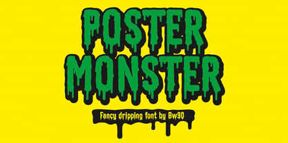
- Velino Poster by DSType,
$55.00
- Film Poster by Fontsphere,
$12.00
- Bodoni Poster by Linotype,
$29.99
- Post Human - Personal use only

- Post Industrial by TypeArt Foundry,
$45.00
- Helmswald Post by Sharkshock,
$125.00
- Post Box by Great Scott,
$16.00
- Pigeon Post by Hanoded,
$15.00
- Helmswald Post - Personal use only

- Wanted Poster Caps - Unknown license

- SF Movie Poster - Unknown license

- Movie Poster Condensed - Unknown license

- SF Movie Poster - Unknown license

- Retro Rock Poster - Unknown license

- Very bad posture - Unknown license

- SF Movie Poster - Unknown license

- SF Movie Poster - Unknown license

- Movie Poster Condensed - Unknown license

- Movie Poster Condensed - Unknown license

- Movie Poster Condensed - Unknown license

- Posterizer KG Rough by Posterizer KG,
$30.00
- Show Poster JNL by Jeff Levine,
$29.00
- Poster Casual JNL by Jeff Levine,
$29.00
- Posterizer KG Rounded by Posterizer KG,
$40.00
- Poster Slabserif JNL by Jeff Levine,
$29.00
- Poster Plain JNL by Jeff Levine,
$29.00
- Poster Contoured JNL by Jeff Levine,
$29.00
- Quick Poster JNL by Jeff Levine,
$29.00
- Posterizer KG Inline by Posterizer KG,
$40.00
- Poster Inline JNL by Jeff Levine,
$29.00
- Lobby Poster JNL by Jeff Levine,
$29.00
- Nouveau Poster JNL by Jeff Levine,
$29.00
- NS Yorkest Poster by Novi Souldado,
$25.00
- Metropolitan Poster Black by Intellecta Design,
$13.90
- Political Poster JNL by Jeff Levine,
$29.00
- Industrial Poster JNL by Jeff Levine,
$29.00
- California Poster SG by Spiece Graphics,
$39.00


