10,000 search results
(0.037 seconds)
- Crafter Pieces by Putracetol,
$28.00 Crafter Pieces - Multi-Style Font is a truly unique font that offers multiple styles within a single typeface. With a total of 8 different styles accessible through alternate characters, this font provides versatility and creative options for various design applications. From super bold and stencil to thin, slab, serif, sans-serif, sport, and postage stamp styles, Crafter Pieces is a font that can be applied to any design and suit any theme or style. Each style can stand on its own or be combined with others, making it a perfect choice for branding, logos, posters, quotes, books, magazines, headlines, and more. The versatility of Crafter Pieces is truly exceptional, as it allows you to experiment with different styles within a single font. The availability of 8 distinct styles in one typeface opens up a world of possibilities for your creative projects. Whether you need a super bold look for a striking poster, a stencil style for an edgy branding design, or a thin font for an elegant quote, Crafter Pieces has it all. With Crafter Pieces - Multi-Style Font, your design possibilities are endless. Whether you're working on a modern or vintage theme, an edgy or elegant concept, this font will be your go-to choice, offering a wide range of styles to suit every project and creative vision.
 - Farao by Storm Type Foundry,
$21.00Originally designed in 1998 as a 3-font family, updated in 2016 by new italics, small caps and many OpenType functions, resulting in a set of highly visible poster typefaces. If a text is set in a good Egyptienne, we can observe a kind of sparkle in the lines. Slab-serifs are cheerful typefaces, possibly due to the fact that they developed simultaneously with Grotesque typefaces. The design principle originating from the first half of the 19th century does not have such firm and long-established roots as for example, the Venetian Roman typefaces, hence it’s much more prone to a “decline”. We know of Egyptiennes with uneven color, with letters falling backwards (this often happens in the case of “S”), and especially with slightly bizarre modeling of details. In the course of time, however, it was realized that such things could be quite pleasant and tempting. After a century and a half, we find that such Egyptiennes could refresh uniform computer typography. The forms of many twisted letters resemble the gestures of a juggler: others, rectangularly static ones, reflect the profile of a rail or a steel girder – things which, in their times, were new and were observed by the first creators of Egyptiennes. These typefaces are ideal for circus posters and programs for theatre performances, just as for printing on cement sacks. - Ardalista by Mercurial,
$17.00 Ardalista is lovely script calligraphy made with a touch of sweet, lovely and charming attraction that adds to the impression of a beautiful and elegant. a charming typeface and So beautiful on invitation like greeting cards, sublimation, wedding invitation, branding materials, business cards, quotes, posters, headings, signature, logos, t-shirt, letterhead, signage, lable, news, posters, badges and more What is interesting? Imagine you get a beautiful and very charming font in the design you make. that would be the answer you wanted right now. Ardalista has a script typeface and extra letters that allows you to be more free in designing. What's new? Hey..look at this. besides you get a font with over 150 alternates, ligatures and swashes. let's imagine what you can do with all that. yeah that's awesome. For those with Opentype capable software ( Photoshop CC or any version of Illustrator/ Indesign), Ardalista also comes with Opentype features such as access to all the alternate letters and double letter ligatures. And this Font has given PUA unicode (specially coded fonts). so that all the alternate characters can easily be accessed in full by a craftsman or designer. Don't forget to check out other cool fonts on our store and wait for new fonts. Follow our shop for upcoming updates including additional glyphs and language support. feel free to send me a message, comment, like and share.
 - Rusty Forest by Mans Greback,
$69.00 Rusty Forest is a typeface that takes you back to the days of golden design, when travel and adventure were celebrated in striking posters. This font's rustic appearance, created by its brush-style strokes, evokes images of a cabin in the woods, surrounded by the beauty of nature. It's as if you can smell the campfire smoke and hear the rustling of leaves in the wind. This font is perfect for designers looking to add a touch of vintage charm to their projects, whether it be a poster for a national park or a logo for a wilderness-themed brand. Its 1950s-inspired style will transport viewers back in time to a simpler era, where the call of the wild was all one needed to feel free. The Rusty Forest family includes Bold, Italic, Bold Italic, and Regular, offer a range of options to suit different design needs. The font is built with advanced OpenType functionality and has a guaranteed top-notch quality, containing stylistic and contextual alternates, ligatures and more features; all to give you full control and customizability. It has extensive lingual support, covering all Latin-based languages, from Northern Europe to South Africa, from America to South-East Asia. It contains all characters and symbols you'll ever need, including all punctuation and numbers.
 - Qoronfull Arabic by Boharat Cairo,
$20.00 Qoronfull is an exuberant industrial display typeface, full of curves that create neat alignments. and it's our second collaboration with Hey Porter! Qoronfull means clove, (a dried flower buds spice tree native to Indonesia), Qoronfull's esthetics, curves, and lines are representing the flowers, leaves, and stems of clove, applied on a strong base of Arabic Kufi calligraphy style, with a big group of type compositions and ligatures.
 - Hand Retro Sketch Times by TypoGraphicDesign,
$19.00 CONCEPT/ CHARACTERISTICS A serif typeface with modern and fancy handmade haptics. Take the 3 layers for unique designs and create many different variations. From light and warm outline (take the regular style), about heavy and pithy filling (take the bold style) till fancy and modern 3d shadows (take the 3d style). The combination of all 3 font styles = bulky design freedom. Game with it! Handemade sketched for display size. APPLICATION AREA The vintage but modern, the raw but friendly serif font »Hand Retro Sketch Times« with many language support (for a display font) would look good at headlines. Editorial Design (Magazine or Fanzine) or Webdesign (Headline Webfont for your website), party flyer, movie poster, music poster, music covers or webbanner. And and and… TECHNICAL SPECIFICATIONS Headline Font | Display Font | Serif Layer Font »Hand Retro Sketch Times« OpenType Font with 341 glyphs, alternative letters and ligatures (with accents & €) & 3 styles & 3 layers (regular, bold, 3d)
 - Bluebottle by Greater Albion Typefounders,
$14.50 Bluebottle is a lively fun family of typefaces, a boisterous fun design, BLuebottle brings a distinctive cheerful character where ever it's used. Use Bluebottle to bring life and fun wherever you will.
 - The KR Chinese Zodiac font by Kat Rakos is a captivating and expressive display font that captures the essence of the Chinese Zodiac's symbolism through its intricate designs. Each character within t...
- Antique by Storm Type Foundry,
$26.00The concept of the Baroque Roman type face is something which is remote from us. Ungrateful theorists gave Baroque type faces the ill-sounding attribute "Transitional", as if the Baroque Roman type face wilfully diverted from the tradition and at the same time did not manage to mature. This "transition" was originally meant as an intermediate stage between the Aldine/Garamond Roman face of the Renaissance, and its modern counterpart, as represented by Bodoni or Didot. Otherwise there was also a "transition" from a slanted axis of the shadow to a perpendicular one. What a petty detail led to the pejorative designation of Baroque type faces! If a bookseller were to tell his customers that they are about to choose a book which is set in some sort of transitional type face, he would probably go bust. After all, a reader, for his money, would not put up with some typographical experimentation. He wants to read a book without losing his eyesight while doing so. Nevertheless, it was Baroque typography which gave the world the most legible type faces. In those days the craft of punch-cutting was gradually separating itself from that of book-printing, but also from publishing and bookselling. Previously all these activities could be performed by a single person. The punch-cutter, who at that time was already fully occupied with the production of letters, achieved better results than he would have achieved if his creative talents were to be diffused in a printing office or a bookseller's shop. Thus it was possible that for example the printer John Baskerville did not cut a single letter in his entire lifetime, for he used the services of the accomplished punch-cutter John Handy. It became the custom that one type founder supplied type to multiple printing offices, so that the same type faces appeared in various parts of the world. The type face was losing its national character. In the Renaissance period it is still quite easy to distinguish for example a French Roman type face from a Venetian one; in the Baroque period this could be achieved only with great difficulties. Imagination and variety of shapes, which so far have been reserved only to the fine arts, now come into play. Thanks to technological progress, book printers are now able to reproduce hairstrokes and imitate calligraphic type faces. Scripts and elaborate ornaments are no longer the privilege of copper-engravers. Also the appearance of the basic, body design is slowly undergoing a change. The Renaissance canonical stiffness is now replaced with colour and contrast. The page of the book is suddenly darker, its lay-out more varied and its lines more compact. For Baroque type designers made a simple, yet ingenious discovery - they enlarged the x-height and reduced the ascenders to the cap-height. The type face thus became seemingly larger, and hence more legible, but at the same time more economical in composition; the type area was increasing to the detriment of the margins. Paper was expensive, and the aim of all the publishers was, therefore, to sell as many ideas in as small a book block as possible. A narrowed, bold majuscule, designed for use on the title page, appeared for the first time in the Late Baroque period. Also the title page was laid out with the highest possible economy. It comprised as a rule the brief contents of the book and the address of the bookseller, i.e. roughly that which is now placed on the flaps and in the imprint lines. Bold upper-case letters in the first line dramatically give way to the more subtle italics, the third line is highlighted with vermilion; a few words set in lower-case letters are scattered in-between, and then vermilion appears again. Somewhere in the middle there is an ornament, a monogram or an engraving as a kind of climax of the drama, while at the foot of the title-page all this din is quietened by a line with the name of the printer and the year expressed in Roman numerals, set in 8-point body size. Every Baroque title-page could well pass muster as a striking poster. The pride of every book printer was the publication of a type specimen book - a typographical manual. Among these manuals the one published by Fournier stands out - also as regards the selection of the texts for the specimen type matter. It reveals the scope of knowledge and education of the master typographers of that period. The same Fournier established a system of typographical measurement which, revised by Didot, is still used today. Baskerville introduced the smoothing of paper by a hot steel roller, in order that he could print astonishingly sharp letters, etc. ... In other words - Baroque typography deserves anything else but the attribute "transitional". In the first half of the 18th century, besides persons whose names are prominent and well-known up to the present, as was Caslon, there were many type founders who did not manage to publish their manuals or forgot to become famous in some other way. They often imitated the type faces of their more experienced contemporaries, but many of them arrived at a quite strange, even weird originality, which ran completely outside the mainstream of typographical art. The prints from which we have drawn inspiration for these six digital designs come from Paris, Vienna and Prague, from the period around 1750. The transcription of letters in their intact form is our firm principle. Does it mean, therefore, that the task of the digital restorer is to copy meticulously the outline of the letter with all inadequacies of the particular imprint? No. The type face should not to evoke the rustic atmosphere of letterpress after printing, but to analyze the appearance of the punches before they are imprinted. It is also necessary to take account of the size of the type face and to avoid excessive enlargement or reduction. Let us keep in mind that every size requires its own design. The longer we work on the computer where a change in size is child's play, the more we are convinced that the appearance of a letter is tied to its proportions, and therefore, to a fixed size. We are also aware of the fact that the computer is a straightjacket of the type face and that the dictate of mathematical vectors effectively kills any hint of naturalness. That is why we strive to preserve in these six alphabets the numerous anomalies to which later no type designer ever returned due to their obvious eccentricity. Please accept this PostScript study as an attempt (possibly futile, possibly inspirational) to brush up the warm magic of Baroque prints. Hopefully it will give pleasure in today's modern type designer's nihilism. - TT Rationalist by TypeType,
$39.00 Please note! If you need OTF versions of the fonts, just email us at commercial@typetype.org TT Rationalist useful links: Specimen | Graphic presentation | Customization options We thought, "What if we provide the user with a collection of matching fonts, each of which would still be unique?"—and so we started developing TT Rationalist. For those familiar with the bestsellers TT Norms® Pro and TT Commons Pro, the new font will be intuitive to use. It has similar proportions, characteristics and functionality, but yet it is an independent and original font family. Unlike the geometric sans serifs TT Norms® Pro and TT Commons Pro, TT Rationalist is a slab serif typeface. It is functional and original. Slabs are characterized by massive rectangular serifs, but in TT Rationalist they are trapezoidal and refined, which makes them look modern. Speaking of modernity, when creating the typeface, we wanted to avoid the excessive historicism that can be seen in many slab serif fonts. We have been particularly careful working on the Black style, which in the first sketches had something in common with the Wild West posters. When we balanced out the excessive contrast caused by visual compensation, the font stopped evoking retro associations. Now TT Rationalist Black is perfect for headlines, especially on posters and posters, and works great with Light styles in TT Norms® Pro and TT Commons Pro. The new typeface works well for both headings and text arrays. It looks especially aesthetically pleasing in printed production (books, magazines, brochures). The TT Rationalist typeface consists of 22 two styles: 10 upright, 10 real Italics and two variable fonts, each with over 950 glyphs. It supports over 200 languages and contains 27 OpenType features. In addition to the standard ones, there are Small Capitals for Latin and Cyrillic languages, alternative versions of the ampersand and the letter g. The italics have two stylistic sets allowing to switch the design of style-forming characters (k, v, w, y, z) between italic and classical forms. TT Rationalist font field guide including best practices, font pairings and alternatives. FOLLOW US: Instagram | Facebook | Website
 - Rabenau by Linotype,
$29.99 Rabenau (formerly Lucinde), the distinctly warm and legible type family For 30 years the graphic designer Axel Bertram worked at creating his typefaces: He developed complete new alphabets for magazines and typewriters as well as for the constant demand for typefaces for use by commercial artists. He has developed wall charts the size of advertising posters as teaching aids for training commercial and graphic artists to write in a clean, classic cursive script. In the eighties he used the American Chyron computer to design a screen font for television. In the mid-nineties he discovered for himself the fabulous possibilities offered by the Fontographer font software program and explored them playfully. From the results of these experiments, Axel Bertram selected a design for further development. From 2003 onwards the calligrapher and type designer Andreas Frohloff collaborated with him on the further development and production of the 16 fonts of the Rabenau™ typeface family.The Rabenau font was inspired by many factors: From the fonts used as book covers to typewriter fonts and even printed material from England dating from the beginning of the nineteenth century (e.g. those used by the skilled printer William Bulmer), Rabenau's relatively high contrast is offset by some organic tapers, subtley rounded bracketed serifs, and a fairly generous x-height. This makes for a typeface that looks especially good in print. Its broad repertoire of weights and styles - Condensed, Poster, and Shadow - give it added versatility, and make it ideal for setting both display and text in the same typeface. Throughout the heavier weights, the contrast is maintained. The Poster Italic sparkles, and will make a fine display type for dynamic headlines, or logotypes. This family of sixteen fonts works beautifully together. All Rabenau font styles have a large set of ligatures and thus cover typical letter combinations in many European languages. Besides the standard ligatures for ff, fi and fl, letter connections are also available for tt, th and fj or ffi, ffl and ffk. The range is completed with lovely arched transitions for the characters st, ck or ct. The latter gives the font that certain something, both in continuous text and above all in headlines.
 - P22 Glaser Babyfat by P22 Type Foundry,
$24.95 Milton Glaser on designing Babyfat: “This is the first alphabet I ever designed. For some inexplicable reason I called it Babyfat. Because I’m not a type designer, most of my alphabets are actually novelties or graphic ideas expressed typographically. Here the idea was to take a gothic letter and view it simultaneously from two sides. It started out as a rather esoteric letterform; it ended up being used in supermarkets for ‘Sale’ signs.” This forced perspective 3-D font has appeared on many LP covers and posters from the mid 1960s onward. This revival includes the original lowercase for the first time in digital form. Besides the three original styles (Outline, Shaded, and Black) made for photo typesetting, the new P22 Glaser Babyfat introduces six additional variations to allow the user to easily colorize the type as Glaser envisioned. The Keyline, Fill, Glyph, Left, Right, and Down font styles give the user nearly infinite options to create dynamic chromatic effects. P22 Glaser Babyfat was based on original drawings and phototype proofs from the Milton Glaser Studios archives. Typographic punctuation and sorts were imagined by James Grieshaber to work with Glaser’s design, as well as diacritics to accommodate most European languages. Over the years there have been many typefaces that borrowed heavily from the Glaser designs, but these are the only official fonts approved by Milton Glaser Studio and the Estate of Milton Glaser.
 - Kuma by L'île Foundry,
$35.00 In Ancient Greek, Kuma means wave. This wavy, dynamic and poetic all-caps display typeface is useful for headlines or short texts. Kuma is the result of a graphic and perceptual game that, using experimentation as a working method, explores the possibilities of writing as an image. This grid-based typeface creates different shapes and directions, never predictable. There are different types of waves created by the wind. That's why there are three different versions of Kuma: Kuma, Kuma Rounded and Kuma Square. Each version is available in seven weights which can be combined together. In their black and white rhythm, they guarantee global readability and balance. Kuma was designed by Jérémy Ruiz. Supported languages: Afrikaans, Albanian, Basque, Bosnian, Breton, Catalan, Croatian, Czech, Danish, Dutch, English, Esperanto, Estonian, Faroese, Fijian, Finnish, Flemish, French, Frisian, German, Greenlandic, Hawaiian, Hungarian, Icelandic, Indonesian, Irish, Italian, Latin, Latvian, Lithuanian, Malay, Maltese, Maori, Moldavian, Norwegian, Polish, Portuguese, Provençal, Romanian, Romany, Sámi (Inari), Sámi (Luli), Sámi (Northern), Sámi (Southern), Samoan, Scottish Gaelic, Slovak, Slovenian, Sorbian, Spanish, Swahili, Swedish, Tagalog, Turkish, Welsh.
 - Kuma Square by L'île Foundry,
$35.00 In Ancient Greek, Kuma means wave. This wavy, dynamic and poetic all-caps display typeface is useful for headlines or short texts. Kuma is the result of a graphic and perceptual game that, using experimentation as a working method, explores the possibilities of writing as an image. This grid-based typeface creates different shapes and directions, never predictable. There are different types of waves created by the wind. That's why there are three different versions of Kuma: Kuma, Kuma Rounded and Kuma Square. Each version is available in seven weights which can be combined together. In their black and white rhythm, they guarantee global readability and balance. Kuma Square was designed by Jérémy Ruiz. Supported languages: Afrikaans, Albanian, Basque, Bosnian, Breton, Catalan, Croatian, Czech, Danish, Dutch, English, Esperanto, Estonian, Faroese, Fijian, Finnish, Flemish, French, Frisian, German, Greenlandic, Hawaiian, Hungarian, Icelandic, Indonesian, Irish, Italian, Latin, Latvian, Lithuanian, Malay, Maltese, Maori, Moldavian, Norwegian, Polish, Portuguese, Provençal, Romanian, Romany, Sámi (Inari), Sámi (Luli), Sámi (Northern), Sámi (Southern), Samoan, Scottish Gaelic, Slovak, Slovenian, Sorbian, Spanish, Swahili, Swedish, Tagalog, Turkish, Welsh.
 - Kuma Rounded by L'île Foundry,
$35.00 In Ancient Greek, Kuma means wave. This wavy, dynamic and poetic all-caps display typeface is useful for headlines or short texts. Kuma is the result of a graphic and perceptual game that, using experimentation as a working method, explores the possibilities of writing as an image. This grid-based typeface creates different shapes and directions, never predictable. There are different types of waves created by the wind. That's why there are three different versions of Kuma: Kuma, Kuma Rounded and Kuma Square. Each version is available in seven weights which can be combined together. In their black and white rhythm, they guarantee global readability and balance. Kuma Rounded was designed by Jérémy Ruiz. Supported languages: Afrikaans, Albanian, Basque, Bosnian, Breton, Catalan, Croatian, Czech, Danish, Dutch, English, Esperanto, Estonian, Faroese, Fijian, Finnish, Flemish, French, Frisian, German, Greenlandic, Hawaiian, Hungarian, Icelandic, Indonesian, Irish, Italian, Latin, Latvian, Lithuanian, Malay, Maltese, Maori, Moldavian, Norwegian, Polish, Portuguese, Provençal, Romanian, Romany, Sámi (Inari), Sámi (Luli), Sámi (Northern), Sámi (Southern), Samoan, Scottish Gaelic, Slovak, Slovenian, Sorbian, Spanish, Swahili, Swedish, Tagalog, Turkish, Welsh.
 - Maliska Script by Gatype,
$12.00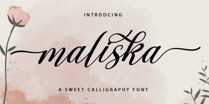 Maliska Script is a handwritten style calligraphy font featuring a varied baseline, smooth lines, a classic and elegant touch. Can be used for various purposes such as headings, signatures, logos, wedding invitations, t-shirts, letterheads, signage, labels, osters, badges etc. This typeface comes in uppercase, lowercase, punctuation, symbols & numbers, alternative style sets, ligatures, etc. also supports multilingual and is PUA encoded.
 - Kelvingrove by Typodermic,
$11.95 Welcome to the world of typography where every letter counts! Today we’d like to introduce you to our charming small-cap typeface—Kelvingrove. Inspired by the elegant Copperplate style, Kelvingrove is designed to add a touch of sophistication to any project. What makes this typeface truly special is its legibility, thanks to its eye-catching slab serif design. One of the unique features of Kelvingrove is the alternate K, Q, R, and small ampersand that can be accessed via OpenType stylistic alternates in applications that support them. This allows for endless creative possibilities and adds an element of personalization to your designs. Not only is this font aesthetically pleasing, but it’s also incredibly practical. The numerals are properly balanced for use with both caps and small caps, making it an excellent choice for headings, captions, and body text. When you need a typeface that exudes elegance and solemnity, but with a more distinct, captivating flavor, Kelvingrove is the way to go. With its unique blend of style and legibility, your designs are sure to stand out. In summary, Kelvingrove is the perfect choice for designers who want to add a touch of sophistication to their work without sacrificing legibility. Try it out for yourself and see the difference it makes! Most Latin-based European writing systems are supported, including the following languages. Afaan Oromo, Afar, Afrikaans, Albanian, Alsatian, Aromanian, Aymara, Bashkir (Latin), Basque, Belarusian (Latin), Bemba, Bikol, Bosnian, Breton, Cape Verdean, Creole, Catalan, Cebuano, Chamorro, Chavacano, Chichewa, Crimean Tatar (Latin), Croatian, Czech, Danish, Dawan, Dholuo, Dutch, English, Estonian, Faroese, Fijian, Filipino, Finnish, French, Frisian, Friulian, Gagauz (Latin), Galician, Ganda, Genoese, German, Greenlandic, Guadeloupean Creole, Haitian Creole, Hawaiian, Hiligaynon, Hungarian, Icelandic, Ilocano, Indonesian, Irish, Italian, Jamaican, Kaqchikel, Karakalpak (Latin), Kashubian, Kikongo, Kinyarwanda, Kirundi, Kurdish (Latin), Latvian, Lithuanian, Lombard, Low Saxon, Luxembourgish, Maasai, Makhuwa, Malay, Maltese, Māori, Moldovan, Montenegrin, Ndebele, Neapolitan, Norwegian, Novial, Occitan, Ossetian (Latin), Papiamento, Piedmontese, Polish, Portuguese, Quechua, Rarotongan, Romanian, Romansh, Sami, Sango, Saramaccan, Sardinian, Scottish Gaelic, Serbian (Latin), Shona, Sicilian, Silesian, Slovak, Slovenian, Somali, Sorbian, Sotho, Spanish, Swahili, Swazi, Swedish, Tagalog, Tahitian, Tetum, Tongan, Tshiluba, Tsonga, Tswana, Tumbuka, Turkish, Turkmen (Latin), Tuvaluan, Uzbek (Latin), Venetian, Vepsian, Võro, Walloon, Waray-Waray, Wayuu, Welsh, Wolof, Xhosa, Yapese, Zapotec Zulu and Zuni.
 - Chlorophyll by Alit Design,
$18.00 Introducing "Chlorophyll" - A Sans Serif Font with a Refreshing Natural Elegance Unveil the beauty of nature in your design projects with "Chlorophyll," a stunning sans serif font that combines modern simplicity with the organic charm of leaf illustrations. This elegant typeface is designed to infuse your creations with a sense of natural harmony, making it perfect for a wide range of applications, from branding to packaging and beyond. Key Features: Sans Serif Sophistication: "Chlorophyll" boasts a clean and versatile sans serif style, making it ideal for both display and body text. Its balanced letterforms exude a sense of modern sophistication, ensuring legibility and impact in all your design endeavors. Leafy Delight: With meticulously crafted leaf illustrations integrated into the font's characters, "Chlorophyll" embodies the spirit of the great outdoors. Each letter and symbol subtly incorporates the elegance of leaves, creating a seamless connection to the natural world. Elegance in Simplicity: "Chlorophyll" captures the essence of natural beauty through its simplicity. This font is a testament to the idea that less is more, allowing your content to shine while adding a touch of eco-friendly charm. Versatile Usage: Whether you're designing a logo for an eco-conscious brand, creating invitations for a garden wedding, or crafting a menu for a farm-to-table restaurant, "Chlorophyll" adapts effortlessly to diverse design projects. It's a versatile tool that can evoke a sense of elegance and sustainability in any context. Extensive Character Set: "Chlorophyll" includes an extensive character set, encompassing uppercase and lowercase letters, numerals, punctuation, and a wide range of special characters. This ensures compatibility with multiple languages and enables you to express your message with clarity and grace. Digital and Print Ready: "Chlorophyll" is delivered in multiple formats, making it ready for both digital and print applications. Its high-quality vectors ensure crisp and sharp rendering in any size or medium. Embrace the allure of nature and elevate your design projects with "Chlorophyll." This sans serif font, inspired by the beauty of leaves and the elegance of simplicity, brings a touch of the natural world to your creative endeavors. Elevate your designs, evoke a sense of harmony, and make a lasting impression with "Chlorophyll" today.
 - Astrochemistry by Typodermic,
$11.95 Looking for a typeface that packs a punch and leaves a lasting impression on your audience? Look no further than Astrochemistry! This hefty, square typeface is the perfect choice for delivering magnificent headlines that demand attention and leave a lasting impact. With its seamless contrast with sans-serif body copy, Astrochemistry is the ultimate choice for those seeking to cut through difficult situations and rigid systems with ease. It’s the perfect choice for those seeking to expand their reach and influence, helping clients envision product brands that connect with their target audience and establish preference. In a world where every moment counts, Astrochemistry is the ultimate weapon for winning the battle at the moment of truth. With its bold and striking design, this font is sure to leave a lasting impression on your audience, ensuring that your brand stands out from the competition and remains top of mind for years to come. So if you’re ready to take your brand to the next level and make a lasting impression on your audience, choose Astrochemistry today and experience the power of cutting-edge design! Most Latin-based European, Greek, and some Cyrillic-based writing systems are supported, including the following languages. Afaan Oromo, Afar, Afrikaans, Albanian, Alsatian, Aromanian, Aymara, Bashkir (Latin), Basque, Belarusian (Latin), Bemba, Bikol, Bosnian, Breton, Bulgarian, Cape Verdean, Creole, Catalan, Cebuano, Chamorro, Chavacano, Chichewa, Crimean Tatar (Latin), Croatian, Czech, Danish, Dawan, Dholuo, Dutch, English, Estonian, Faroese, Fijian, Filipino, Finnish, French, Frisian, Friulian, Gagauz (Latin), Galician, Ganda, Genoese, German, Greek, Greenlandic, Guadeloupean Creole, Haitian Creole, Hawaiian, Hiligaynon, Hungarian, Icelandic, Ilocano, Indonesian, Irish, Italian, Jamaican, Kaqchikel, Karakalpak (Latin), Kashubian, Kikongo, Kinyarwanda, Kirundi, Komi-Permyak, Kurdish (Latin), Latvian, Lithuanian, Lombard, Low Saxon, Luxembourgish, Maasai, Macedonian, Makhuwa, Malay, Maltese, Māori, Moldovan, Montenegrin, Ndebele, Neapolitan, Norwegian, Novial, Occitan, Ossetian, Ossetian (Latin), Papiamento, Piedmontese, Polish, Portuguese, Quechua, Rarotongan, Romanian, Romansh, Russian, Sami, Sango, Saramaccan, Sardinian, Scottish Gaelic, Serbian, Serbian (Latin), Shona, Sicilian, Silesian, Slovak, Slovenian, Somali, Sorbian, Sotho, Spanish, Swahili, Swazi, Swedish, Tagalog, Tahitian, Tetum, Tongan, Tshiluba, Tsonga, Tswana, Tumbuka, Turkish, Turkmen (Latin), Tuvaluan, Uzbek (Latin), Ukrainian, Venetian, Vepsian, Võro, Walloon, Waray-Waray, Wayuu, Welsh, Wolof, Xhosa, Yapese, Zapotec Zulu and Zuni.
 - Antihistory by Typodermic,
$11.95 Step back in time with Antihistory, the ultimate vintage typeface. Unlike other aged fonts that mimic designs from the early 1900s, Antihistory is inspired by typography from the late twentieth century and beyond. With its distressed look and feel, this typeface is perfect for adding an authentic, retro touch to your designs. Whether you’re working on a vintage-inspired logo, poster, or website, Antihistory will transport your audience to a future bygone era. Available in Regular and Italic styles, Antihistory is incredibly versatile. Use the Regular style for bold headlines and eye-catching titles, while the Italic style adds a touch of elegance and sophistication to your designs. Plus, with its unique look and feel, Antihistory is sure to make your work stand out from the crowd. So, why settle for boring, modern fonts when you can add a touch of alternate universe history to your designs with Antihistory? Get your hands on this one-of-a-kind typeface today and start creating stunning gonzo-vintage designs that will leave a lasting impression. Most Latin-based European, Greek, and some Cyrillic-based writing systems are supported, including the following languages. Afaan Oromo, Afar, Afrikaans, Albanian, Alsatian, Aromanian, Aymara, Bashkir (Latin), Basque, Belarusian (Latin), Bemba, Bikol, Bosnian, Breton, Bulgarian, Cape Verdean, Creole, Catalan, Cebuano, Chamorro, Chavacano, Chichewa, Crimean Tatar (Latin), Croatian, Czech, Danish, Dawan, Dholuo, Dutch, English, Estonian, Faroese, Fijian, Filipino, Finnish, French, Frisian, Friulian, Gagauz (Latin), Galician, Ganda, Genoese, German, Greek, Greenlandic, Guadeloupean Creole, Haitian Creole, Hawaiian, Hiligaynon, Hungarian, Icelandic, Ilocano, Indonesian, Irish, Italian, Jamaican, Kaqchikel, Karakalpak (Latin), Kashubian, Kikongo, Kinyarwanda, Kirundi, Komi-Permyak, Kurdish (Latin), Latvian, Lithuanian, Lombard, Low Saxon, Luxembourgish, Maasai, Macedonian, Makhuwa, Malay, Maltese, Māori, Moldovan, Montenegrin, Ndebele, Neapolitan, Norwegian, Novial, Occitan, Ossetian, Ossetian (Latin), Papiamento, Piedmontese, Polish, Portuguese, Quechua, Rarotongan, Romanian, Romansh, Russian, Sami, Sango, Saramaccan, Sardinian, Scottish Gaelic, Serbian, Serbian (Latin), Shona, Sicilian, Silesian, Slovak, Slovenian, Somali, Sorbian, Sotho, Spanish, Swahili, Swazi, Swedish, Tagalog, Tahitian, Tetum, Tongan, Tshiluba, Tsonga, Tswana, Tumbuka, Turkish, Turkmen (Latin), Tuvaluan, Uzbek (Latin), Ukrainian, Venetian, Vepsian, Võro, Walloon, Waray-Waray, Wayuu, Welsh, Wolof, Xhosa, Yapese, Zapotec Zulu and Zuni.
 - Inklea by Typodermic,
$11.95 Welcome to the world of Inklea, where curves and creativity reign supreme! Our typeface is the perfect choice for anyone who wants to make a statement with their design. Inklea’s smooth curves and unique design will make your words pop off the page and demand attention. With each letter crafted using only one line and one junction, our font is as elegant as it is efficient. But that’s not all—with our Shine style, you can take your design to the next level! Simply layer it on top of the Solid style and watch your words come to life with a glossy, wet look. But don’t stop there—experiment with different color layers to create a truly unique design. And if you really want to make your words pop, add some emboss and drop shadow effects for a touch of depth and dimension. So whether you’re designing a website, creating a poster, or crafting a social media post, Inklea is the perfect choice. With its curvaceous design and endless possibilities, the only limit is your own imagination. Try it out today and see where it takes you! Most Latin-based European writing systems are supported, including the following languages. Afaan Oromo, Afar, Afrikaans, Albanian, Alsatian, Aromanian, Aymara, Bashkir (Latin), Basque, Belarusian (Latin), Bemba, Bikol, Bosnian, Breton, Cape Verdean, Creole, Catalan, Cebuano, Chamorro, Chavacano, Chichewa, Crimean Tatar (Latin), Croatian, Czech, Danish, Dawan, Dholuo, Dutch, English, Estonian, Faroese, Fijian, Filipino, Finnish, French, Frisian, Friulian, Gagauz (Latin), Galician, Ganda, Genoese, German, Greenlandic, Guadeloupean Creole, Haitian Creole, Hawaiian, Hiligaynon, Hungarian, Icelandic, Ilocano, Indonesian, Irish, Italian, Jamaican, Kaqchikel, Karakalpak (Latin), Kashubian, Kikongo, Kinyarwanda, Kirundi, Kurdish (Latin), Latvian, Lithuanian, Lombard, Low Saxon, Luxembourgish, Maasai, Makhuwa, Malay, Maltese, Māori, Moldovan, Montenegrin, Ndebele, Neapolitan, Norwegian, Novial, Occitan, Ossetian (Latin), Papiamento, Piedmontese, Polish, Portuguese, Quechua, Rarotongan, Romanian, Romansh, Sami, Sango, Saramaccan, Sardinian, Scottish Gaelic, Serbian (Latin), Shona, Sicilian, Silesian, Slovak, Slovenian, Somali, Sorbian, Sotho, Spanish, Swahili, Swazi, Swedish, Tagalog, Tahitian, Tetum, Tongan, Tshiluba, Tsonga, Tswana, Tumbuka, Turkish, Turkmen (Latin), Tuvaluan, Uzbek (Latin), Venetian, Vepsian, Võro, Walloon, Waray-Waray, Wayuu, Welsh, Wolof, Xhosa, Yapese, Zapotec Zulu and Zuni.
 - Sheaff by Typodermic,
$11.95 Introducing Sheaff—the perfect display typeface to add a touch of retro sophistication to your graphic designs. This unique typeface merges the iconic, interlocking styles of the early 1970s with the soft, plastic forms of the Y2K era, resulting in a font that is both nostalgic and contemporary. Sheaff’s interlocking characters are truly something to behold. When certain letters combine, they create an exquisite and intricate interlock that is guaranteed to catch the eye of any viewer. You can fully experience this effect in all its glory by turning on your application’s “standard ligatures” function. With its delicate curves and playful shapes, Sheaff is the perfect choice for any display project that requires a touch of elegance and flair. Whether you’re designing a logo, creating a poster, or even working on a book cover, Sheaff’s unicase style will add a unique and sophisticated touch to your work. So why wait? Try out Sheaff today and experience the beauty of interlocking characters in all their glory. Whether you’re a seasoned designer or just starting out, this font is sure to impress and elevate your design projects to the next level. Most Latin-based European writing systems are supported, including the following languages. Afaan Oromo, Afar, Afrikaans, Albanian, Alsatian, Aromanian, Aymara, Bashkir (Latin), Basque, Belarusian (Latin), Bemba, Bikol, Bosnian, Breton, Cape Verdean, Creole, Catalan, Cebuano, Chamorro, Chavacano, Chichewa, Crimean Tatar (Latin), Croatian, Czech, Danish, Dawan, Dholuo, Dutch, English, Estonian, Faroese, Fijian, Filipino, Finnish, French, Frisian, Friulian, Gagauz (Latin), Galician, Ganda, Genoese, German, Greenlandic, Guadeloupean Creole, Haitian Creole, Hawaiian, Hiligaynon, Hungarian, Icelandic, Ilocano, Indonesian, Irish, Italian, Jamaican, Kaqchikel, Karakalpak (Latin), Kashubian, Kikongo, Kinyarwanda, Kirundi, Kurdish (Latin), Latvian, Lithuanian, Lombard, Low Saxon, Luxembourgish, Maasai, Makhuwa, Malay, Maltese, Māori, Moldovan, Montenegrin, Ndebele, Neapolitan, Norwegian, Novial, Occitan, Ossetian (Latin), Papiamento, Piedmontese, Polish, Portuguese, Quechua, Rarotongan, Romanian, Romansh, Sami, Sango, Saramaccan, Sardinian, Scottish Gaelic, Serbian (Latin), Shona, Sicilian, Silesian, Slovak, Slovenian, Somali, Sorbian, Sotho, Spanish, Swahili, Swazi, Swedish, Tagalog, Tahitian, Tetum, Tongan, Tshiluba, Tsonga, Tswana, Tumbuka, Turkish, Turkmen (Latin), Tuvaluan, Uzbek (Latin), Venetian, Vepsian, Võro, Walloon, Waray-Waray, Wayuu, Welsh, Wolof, Xhosa, Yapese, Zapotec Zulu and Zuni.
 - Chickweed by Typodermic,
$11.95 Chickweed: The Perfect Typeface for Effortlessly Captivating Headlines If you’re looking to make a bold statement with your typography, Chickweed is the font for you. This dynamic typeface effortlessly commands attention with its engaging, informal style that is perfect for headlines and subheadings that need to pack a punch. What’s more, Chickweed’s compact design allows it to take up less space while still making a big impact. Chickweed’s OpenType-savvy features automatically jumble up the variations, giving your design a more natural and exuberant look. This means that you can let your creativity flow, without being bogged down by technicalities. At the core of Chickweed’s design is a style that is stylish, playful, and contemporary. Its unique curves and swoops exude a sense of energy and excitement that is sure to captivate your audience. Whether you’re designing a poster, a logo, or a website, Chickweed is the perfect choice for creating designs that stand out. Why settle for ordinary typography when you can choose Chickweed? Let this dynamic typeface elevate your designs to the next level and bring your message to life in a way that is both engaging and memorable. Try it out today and see the difference for yourself. Most Latin-based European writing systems are supported, including the following languages. Afaan Oromo, Afar, Afrikaans, Albanian, Alsatian, Aromanian, Aymara, Bashkir (Latin), Basque, Belarusian (Latin), Bemba, Bikol, Bosnian, Breton, Cape Verdean, Creole, Catalan, Cebuano, Chamorro, Chavacano, Chichewa, Crimean Tatar (Latin), Croatian, Czech, Danish, Dawan, Dholuo, Dutch, English, Estonian, Faroese, Fijian, Filipino, Finnish, French, Frisian, Friulian, Gagauz (Latin), Galician, Ganda, Genoese, German, Greenlandic, Guadeloupean Creole, Haitian Creole, Hawaiian, Hiligaynon, Hungarian, Icelandic, Ilocano, Indonesian, Irish, Italian, Jamaican, Kaqchikel, Karakalpak (Latin), Kashubian, Kikongo, Kinyarwanda, Kirundi, Kurdish (Latin), Latvian, Lithuanian, Lombard, Low Saxon, Luxembourgish, Maasai, Makhuwa, Malay, Maltese, Māori, Moldovan, Montenegrin, Ndebele, Neapolitan, Norwegian, Novial, Occitan, Ossetian (Latin), Papiamento, Piedmontese, Polish, Portuguese, Quechua, Rarotongan, Romanian, Romansh, Sami, Sango, Saramaccan, Sardinian, Scottish Gaelic, Serbian (Latin), Shona, Sicilian, Silesian, Slovak, Slovenian, Somali, Sorbian, Sotho, Spanish, Swahili, Swazi, Swedish, Tagalog, Tahitian, Tetum, Tongan, Tshiluba, Tsonga, Tswana, Tumbuka, Turkish, Turkmen (Latin), Tuvaluan, Uzbek (Latin), Venetian, Vepsian, Võro, Walloon, Waray-Waray, Wayuu, Welsh, Wolof, Xhosa, Yapese, Zapotec Zulu and Zuni.
 - Emynam Crew by Alit Design,
$23.00 Introducing the Emynam Crew: A Funky Retro Display Typeface Dear Design Enthusiasts, Are you ready to groove to the rhythm of creativity and nostalgia? Say hello to the Emynam Crew, the font that's bringing back the funky retro vibes of yesteryears with a modern twist. With its unique blend of style, flair, and a whopping 705 glyphs, this typeface is a must-have for anyone looking to make a statement. Key Features: Retro Vibes: Emynam Crew captures the essence of the 70s and 80s with its bold, funky letterforms. It's like a blast from the past, perfect for adding a touch of nostalgia to your designs. Ligatures and Alternatives: Dive into the world of creativity with multiple ligatures and alternative characters. Mix and match to create stunning, one-of-a-kind typographic compositions. PUA Multilingual Support: Emynam Crew is not just about style; it's about substance too. With PUA multilingual support, you can use this font to communicate in various languages, making it a versatile choice for global projects. Endless Possibilities: With 705 glyphs at your disposal, the possibilities are endless. Whether you're designing posters, album covers, branding materials, or anything else, Emynam Crew gives you the freedom to express your unique vision. Stylish Display: Make a bold statement with Emynam Crew as your headline or display font. Its eye-catching style ensures that your message won't go unnoticed. Perfect for Retro Revival: Whether you're working on a retro-themed project or just want to infuse a touch of nostalgia into your designs, Emynam Crew is your go-to choice. Easy to Use: Emynam Crew is designed with user-friendliness in mind. It's compatible with popular design software and is easy to install and use. Unleash your inner artist and let Emynam Crew transport your designs to a bygone era. Embrace the funk, the retro, and the style with this one-of-a-kind typeface. Don't miss out on this opportunity to own the Emynam Crew – a font that's all about style, character, and endless possibilities. Get ready to turn back the clock and add a touch of funky nostalgia to your next project. Order your Emynam Crew Typeface today and start designing with retro flair!
 - Galderglynn 1884 by Typodermic,
$11.95 Introducing Galderglynn 1884, a font family that transports you back to the nineteenth century. With its refined expansion from the intentionally rustic Galderglynn Esquire, this typeface oozes old-world charm and sophistication. The condensed fonts are expertly squared off, paying homage to the typical condensed newspaper headline type of the era. Their weight and spacing are deliberately unrefined, just like the pre-twentieth century grotesques that inspired Galderglynn Esquire. Meanwhile, the extra-condensed “squeeze” fonts are completely flat-sided, reminiscent of the old wooden poster types and tight metal newspaper headline fonts. If you’re looking for a practical workhorse font family, Galderglynn 1884 is the perfect choice. It combines the pastoral design of Galderglynn Esquire with a polished finish that makes it easy to read and use. And if you’re after something extra special, you’ll love the three special effect fonts: all-capitals shadow, and engraved regular and condensed styles. Access tabular and lowercase (old-style) numerals with ease, thanks to the OpenType features available in this font family. Galderglynn 1884 is the perfect way to add a touch of old-fashioned charm to your designs. Try it today and transport your audience to a bygone era! Most Latin-based European, and some Cyrillic-based writing systems are supported, including the following languages. A Afaan Oromo, Afar, Afrikaans, Albanian, Alsatian, Aromanian, Aymara, Bashkir (Latin), Basque, Belarusian (Latin), Bemba, Bikol, Bosnian, Breton, Bulgarian, Cape Verdean, Creole, Catalan, Cebuano, Chamorro, Chavacano, Chichewa, Crimean Tatar (Latin), Croatian, Czech, Danish, Dawan, Dholuo, Dutch, English, Estonian, Faroese, Fijian, Filipino, Finnish, French, Frisian, Friulian, Gagauz (Latin), Galician, Ganda, Genoese, German, Greenlandic, Guadeloupean Creole, Haitian Creole, Hawaiian, Hiligaynon, Hungarian, Icelandic, Ilocano, Indonesian, Irish, Italian, Jamaican, Kaqchikel, Karakalpak (Latin), Kashubian, Kikongo, Kinyarwanda, Kirundi, Komi-Permyak, Kurdish (Latin), Latvian, Lithuanian, Lombard, Low Saxon, Luxembourgish, Maasai, Macedonian, Makhuwa, Malay, Maltese, Māori, Moldovan, Montenegrin, Ndebele, Neapolitan, Norwegian, Novial, Occitan, Ossetian, Ossetian (Latin), Papiamento, Piedmontese, Polish, Portuguese, Quechua, Rarotongan, Romanian, Romansh, Russian, Sami, Sango, Saramaccan, Sardinian, Scottish Gaelic, Serbian, Serbian (Latin), Shona, Sicilian, Silesian, Slovak, Slovenian, Somali, Sorbian, Sotho, Spanish, Swahili, Swazi, Swedish, Tagalog, Tahitian, Tetum, Tongan, Tshiluba, Tsonga, Tswana, Tumbuka, Turkish, Turkmen (Latin), Tuvaluan, Ukrainian, Uzbek (Latin), Venetian, Vepsian, Võro, Walloon, Waray-Waray, Wayuu, Welsh, Wolof, Xhosa, Yapese, Zapotec Zulu and Zuni.
 - Biondi by Typodermic,
$11.95 Introducing Biondi—a timeless typeface that exudes sophistication and refinement. Inspired by the beloved Copperplate Gothic, Biondi boasts a set of small caps slab-serif characters that stay true to the classic wide and squarish shape of its predecessor. But what sets Biondi apart is the beefed-up wedge serifs that replace delicate hairline serifs, making it perfect for today’s display environment. Every character in Biondi is thoughtfully crafted, with strategically placed serifs that create a cleaner-flowing line of text without sacrificing understated gravitas. Whether you’re designing a logo, a book cover, or a poster, Biondi’s elegant lines and bold presence will instantly elevate your project to the next level. Available in five weights and italics, Biondi offers unparalleled versatility and flexibility. Whether you need a bold statement or a subtle accent, this timeless typeface will deliver every time. Why settle for ordinary when you can elevate your work with Biondi? Try it today and experience the classic beauty of Copperplate Gothic reimagined for the modern world. Most Latin-based European, Vietnamese, Greek, and most Cyrillic-based writing systems are supported, including the following languages. Afaan Oromo, Afar, Afrikaans, Albanian, Alsatian, Aromanian, Aymara, Azerbaijani, Bashkir, Bashkir (Latin), Basque, Belarusian, Belarusian (Latin), Bemba, Bikol, Bosnian, Breton, Bulgarian, Buryat, Cape Verdean, Creole, Catalan, Cebuano, Chamorro, Chavacano, Chichewa, Crimean Tatar (Latin), Croatian, Czech, Danish, Dawan, Dholuo, Dungan, Dutch, English, Estonian, Faroese, Fijian, Filipino, Finnish, French, Frisian, Friulian, Gagauz (Latin), Galician, Ganda, Genoese, German, Gikuyu, Greenlandic, Guadeloupean Creole, Haitian Creole, Hawaiian, Hiligaynon, Hungarian, Icelandic, Igbo, Ilocano, Indonesian, Irish, Italian, Jamaican, Kaingang, Khalkha, Kalmyk, Kanuri, Kaqchikel, Karakalpak (Latin), Kashubian, Kazakh, Kikongo, Kinyarwanda, Kirundi, Komi-Permyak, Kurdish, Kurdish (Latin), Kyrgyz, Latvian, Lithuanian, Lombard, Low Saxon, Luxembourgish, Maasai, Macedonian, Makhuwa, Malay, Maltese, Māori, Moldovan, Montenegrin, Nahuatl, Ndebele, Neapolitan, Norwegian, Novial, Occitan, Ossetian, Ossetian (Latin), Papiamento, Piedmontese, Polish, Portuguese, Quechua, Rarotongan, Romanian, Romansh, Russian, Rusyn, Sami, Sango, Saramaccan, Sardinian, Scottish Gaelic, Serbian, Serbian (Latin), Shona, Sicilian, Silesian, Slovak, Slovenian, Somali, Sorbian, Sotho, Spanish, Swahili, Swazi, Swedish, Tagalog, Tahitian, Tajik, Tatar, Tetum, Tongan, Tshiluba, Tsonga, Tswana, Tumbuka, Turkish, Turkmen (Latin), Tuvaluan, Ukrainian, Uzbek, Uzbek (Latin), Venda, Venetian, Vepsian, Vietnamese, Võro, Walloon, Waray-Waray, Wayuu, Welsh, Wolof, Xavante, Xhosa, Yapese, Zapotec, Zarma, Zazaki, Zulu and Zuni.
 - Neuzon by Typodermic,
$11.95 Neuzon pays homage to the bygone era of antique metal typesetting with a retro design that brings an air of nostalgia and character to any project. This textured, inky typeface is a modern interpretation of the iconic Tempo Bold Extended typeface. One of the standout features of Neuzon is its unique custom letter pairings. These pairings help to break up the uniformity of repeating letters, adding a touch of artistry and originality to your designs. The result is a typeface that exudes rustic charm and a warm, authentic feel that is sure to leave a lasting impression on your audience. Designed with versatility in mind, Neuzon’s wide letterforms make it a great choice for a variety of design projects. It works particularly well as a headliner, instantly capturing attention and drawing the eye with its bold and engaging style. Whether you’re creating a vintage-themed poster or revamping your website, Neuzon’s distinctive personality is sure to leave a lasting impression. So why settle for bland, generic typefaces when you can bring your designs to life with the unique character and charm of Neuzon? Get your hands on this retro-inspired typeface today and take your designs to the next level. Most Latin-based European writing systems are supported, including the following languages. Afaan Oromo, Afar, Afrikaans, Albanian, Alsatian, Aromanian, Aymara, Bashkir (Latin), Basque, Belarusian (Latin), Bemba, Bikol, Bosnian, Breton, Cape Verdean, Creole, Catalan, Cebuano, Chamorro, Chavacano, Chichewa, Crimean Tatar (Latin), Croatian, Czech, Danish, Dawan, Dholuo, Dutch, English, Estonian, Faroese, Fijian, Filipino, Finnish, French, Frisian, Friulian, Gagauz (Latin), Galician, Ganda, Genoese, German, Greenlandic, Guadeloupean Creole, Haitian Creole, Hawaiian, Hiligaynon, Hungarian, Icelandic, Ilocano, Indonesian, Irish, Italian, Jamaican, Kaqchikel, Karakalpak (Latin), Kashubian, Kikongo, Kinyarwanda, Kirundi, Kurdish (Latin), Latvian, Lithuanian, Lombard, Low Saxon, Luxembourgish, Maasai, Makhuwa, Malay, Maltese, Māori, Moldovan, Montenegrin, Ndebele, Neapolitan, Norwegian, Novial, Occitan, Ossetian (Latin), Papiamento, Piedmontese, Polish, Portuguese, Quechua, Rarotongan, Romanian, Romansh, Sami, Sango, Saramaccan, Sardinian, Scottish Gaelic, Serbian (Latin), Shona, Sicilian, Silesian, Slovak, Slovenian, Somali, Sorbian, Sotho, Spanish, Swahili, Swazi, Swedish, Tagalog, Tahitian, Tetum, Tongan, Tshiluba, Tsonga, Tswana, Tumbuka, Turkish, Turkmen (Latin), Tuvaluan, Uzbek (Latin), Venetian, Vepsian, Võro, Walloon, Waray-Waray, Wayuu, Welsh, Wolof, Xhosa, Yapese, Zapotec Zulu and Zuni.
 - Electric by Typodermic,
$11.95 Introducing Electric—a typeface that’s as distinctive as the legendary Gibson custom electric guitars of the 1960s. This unique typeface was sparked by the custom nameplates that were used to cover the bolt holes left behind when dealers swapped out standard stoptails for the Bigsby vibrato tailpiece. Crafted using an oddball zig-zag pattern font and engraved with a pantograph router, the original nameplates featured a pair of starburst symbols that were as striking as the guitars they adorned. Now, you can recreate these iconic symbols using the lozenge symbol ◊ and add a touch of vintage cool to your designs. Whether you’re creating an album cover, a concert poster, or a logo for your band, Electric is the perfect way to convey your message in a bold and distinctive manner. So why settle for a bland, generic font when you can have one that’s inspired by the most iconic guitars in music history? Plug into the Electric typeface today and take your designs to the next level. Most Latin-based European, Vietnamese, Greek, and most Cyrillic-based writing systems are supported, including the following languages. Afaan Oromo, Afar, Afrikaans, Albanian, Alsatian, Aromanian, Aymara, Azerbaijani, Bashkir, Bashkir (Latin), Basque, Belarusian, Belarusian (Latin), Bemba, Bikol, Bosnian, Breton, Bulgarian, Buryat, Cape Verdean, Creole, Catalan, Cebuano, Chamorro, Chavacano, Chichewa, Crimean Tatar (Latin), Croatian, Czech, Danish, Dawan, Dholuo, Dungan, Dutch, English, Estonian, Faroese, Fijian, Filipino, Finnish, French, Frisian, Friulian, Gagauz (Latin), Galician, Ganda, Genoese, German, Gikuyu, Greenlandic, Guadeloupean Creole, Haitian Creole, Hawaiian, Hiligaynon, Hungarian, Icelandic, Igbo, Ilocano, Indonesian, Irish, Italian, Jamaican, Kaingang, Khalkha, Kalmyk, Kanuri, Kaqchikel, Karakalpak (Latin), Kashubian, Kazakh, Kikongo, Kinyarwanda, Kirundi, Komi-Permyak, Kurdish, Kurdish (Latin), Kyrgyz, Latvian, Lithuanian, Lombard, Low Saxon, Luxembourgish, Maasai, Macedonian, Makhuwa, Malay, Maltese, Māori, Moldovan, Montenegrin, Nahuatl, Ndebele, Neapolitan, Norwegian, Novial, Occitan, Ossetian, Ossetian (Latin), Papiamento, Piedmontese, Polish, Portuguese, Quechua, Rarotongan, Romanian, Romansh, Russian, Rusyn, Sami, Sango, Saramaccan, Sardinian, Scottish Gaelic, Serbian, Serbian (Latin), Shona, Sicilian, Silesian, Slovak, Slovenian, Somali, Sorbian, Sotho, Spanish, Swahili, Swazi, Swedish, Tagalog, Tahitian, Tajik, Tatar, Tetum, Tongan, Tshiluba, Tsonga, Tswana, Tumbuka, Turkish, Turkmen (Latin), Tuvaluan, Ukrainian, Uzbek, Uzbek (Latin), Venda, Venetian, Vepsian, Vietnamese, Võro, Walloon, Waray-Waray, Wayuu, Welsh, Wolof, Xavante, Xhosa, Yapese, Zapotec, Zarma, Zazaki, Zulu and Zuni.
 - Boopee by Typodermic,
$11.95 Today, we’re here to talk about Boopee, a font that’s unique in every way. You may have noticed its flaws, but let us tell you, those imperfections are what make Boopee so charming. Boopee is a personable typeface that’s messy yet easy to read. Its quirky shapes and uneven lines give it a human touch that’s hard to find in other fonts. Despite its playful appearance, Boopee remains legible and functional, making it a versatile choice for various design applications. One of Boopee’s best features is its custom ligatures. With unique letter combinations that add a touch of personalization to your designs, you can truly make Boopee your own. Whether you’re creating logos, posters, or social media graphics, Boopee has got you covered. Plus, Boopee comes in both standard and bold versions, giving you even more flexibility in your designs. Use the standard version for a subtle, playful touch or go bold for a more impactful statement. In summary, Boopee may not be perfect, but its imperfections are what make it stand out. Its personable, messy yet legible style and unique custom ligatures make it a font worth exploring. Give Boopee a try and see how it can bring a touch of charm to your designs. Most Latin-based European writing systems are supported, including the following languages. Afaan Oromo, Afar, Afrikaans, Albanian, Alsatian, Aromanian, Aymara, Bashkir (Latin), Basque, Belarusian (Latin), Bemba, Bikol, Bosnian, Breton, Cape Verdean, Creole, Catalan, Cebuano, Chamorro, Chavacano, Chichewa, Crimean Tatar (Latin), Croatian, Czech, Danish, Dawan, Dholuo, Dutch, English, Estonian, Faroese, Fijian, Filipino, Finnish, French, Frisian, Friulian, Gagauz (Latin), Galician, Ganda, Genoese, German, Greenlandic, Guadeloupean Creole, Haitian Creole, Hawaiian, Hiligaynon, Hungarian, Icelandic, Ilocano, Indonesian, Irish, Italian, Jamaican, Kaqchikel, Karakalpak (Latin), Kashubian, Kikongo, Kinyarwanda, Kirundi, Kurdish (Latin), Latvian, Lithuanian, Lombard, Low Saxon, Luxembourgish, Maasai, Makhuwa, Malay, Maltese, Māori, Moldovan, Montenegrin, Ndebele, Neapolitan, Norwegian, Novial, Occitan, Ossetian (Latin), Papiamento, Piedmontese, Polish, Portuguese, Quechua, Rarotongan, Romanian, Romansh, Sami, Sango, Saramaccan, Sardinian, Scottish Gaelic, Serbian (Latin), Shona, Sicilian, Silesian, Slovak, Slovenian, Somali, Sorbian, Sotho, Spanish, Swahili, Swazi, Swedish, Tagalog, Tahitian, Tetum, Tongan, Tshiluba, Tsonga, Tswana, Tumbuka, Turkish, Turkmen (Latin), Tuvaluan, Uzbek (Latin), Venetian, Vepsian, Võro, Walloon, Waray-Waray, Wayuu, Welsh, Wolof, Xhosa, Yapese, Zapotec Zulu and Zuni.
 - Kenyan Coffee by Typodermic,
$11.95 Get ready to give your designs a blast from the past with the Kenyan Coffee typeface! Inspired by the bold, blocky fonts that graced headlines in the 1960s, Kenyan Coffee is a sleek, compact typeface that exudes industrial chic. The sharp lines and innovative design of Kenyan Coffee give your message a distinctive appeal that’s sure to make it stand out from the crowd. Whether you’re designing a sleek modern logo or a retro-inspired poster, Kenyan Coffee’s seven weights and italics give you the flexibility to create the perfect look for your project. And for an even bolder statement, be sure to check out Kenyan Coffee Stencil. With its rugged, industrial look, this typeface is perfect for creating eye-catching designs that demand attention. So why settle for boring, everyday fonts when you can make a statement with Kenyan Coffee? Try it today and see the difference it makes! Most Latin-based European, Vietnamese, Greek, and most Cyrillic-based writing systems are supported, including the following languages. Afaan Oromo, Afar, Afrikaans, Albanian, Alsatian, Aromanian, Aymara, Azerbaijani, Bashkir, Bashkir (Latin), Basque, Belarusian, Belarusian (Latin), Bemba, Bikol, Bosnian, Breton, Bulgarian, Buryat, Cape Verdean, Creole, Catalan, Cebuano, Chamorro, Chavacano, Chichewa, Crimean Tatar (Latin), Croatian, Czech, Danish, Dawan, Dholuo, Dungan, Dutch, English, Estonian, Faroese, Fijian, Filipino, Finnish, French, Frisian, Friulian, Gagauz (Latin), Galician, Ganda, Genoese, German, Gikuyu, Greenlandic, Guadeloupean Creole, Haitian Creole, Hawaiian, Hiligaynon, Hungarian, Icelandic, Igbo, Ilocano, Indonesian, Irish, Italian, Jamaican, Kaingang, Khalkha, Kalmyk, Kanuri, Kaqchikel, Karakalpak (Latin), Kashubian, Kazakh, Kikongo, Kinyarwanda, Kirundi, Komi-Permyak, Kurdish, Kurdish (Latin), Kyrgyz, Latvian, Lithuanian, Lombard, Low Saxon, Luxembourgish, Maasai, Macedonian, Makhuwa, Malay, Maltese, Māori, Moldovan, Montenegrin, Nahuatl, Ndebele, Neapolitan, Norwegian, Novial, Occitan, Ossetian, Ossetian (Latin), Papiamento, Piedmontese, Polish, Portuguese, Quechua, Rarotongan, Romanian, Romansh, Russian, Rusyn, Sami, Sango, Saramaccan, Sardinian, Scottish Gaelic, Serbian, Serbian (Latin), Shona, Sicilian, Silesian, Slovak, Slovenian, Somali, Sorbian, Sotho, Spanish, Swahili, Swazi, Swedish, Tagalog, Tahitian, Tajik, Tatar, Tetum, Tongan, Tshiluba, Tsonga, Tswana, Tumbuka, Turkish, Turkmen (Latin), Tuvaluan, Ukrainian, Uzbek, Uzbek (Latin), Venda, Venetian, Vepsian, Vietnamese, Võro, Walloon, Waray-Waray, Wayuu, Welsh, Wolof, Xavante, Xhosa, Yapese, Zapotec, Zarma, Zazaki, Zulu and Zuni.
 - Graveblade by Typodermic,
$11.95 Introducing Graveblade, the heavy metal typeface that’s sharp as a knife and just as deadly. With its blackletter shapes and brutal angles, Graveblade is the perfect typeface to give your message a sense of forceful aggression that will leave a lasting impression. Featuring blade-like forms and a menacing edge, Graveblade exudes the power and intensity of heavy metal music. This typeface is not for the faint of heart—it’s for those who are bold, daring, and unafraid to make a statement. Whether you’re promoting a metal band, creating a dark and edgy poster, or designing a logo for a horror movie, Graveblade is the typeface that will take your designs to the next level. Its sharp and knifelike design will cut through the noise and make your message stand out from the crowd. So get ready to unleash the power of Graveblade and take your designs to new heights of brutal beauty. You’ve got another thing coming if you think you can ignore the force of Graveblade. Are you ready to embrace the darkness? Then grab Graveblade today and let the heavy metal typeface speak for itself. Most Latin-based European writing systems are supported, including the following languages. Afaan Oromo, Afar, Afrikaans, Albanian, Alsatian, Aromanian, Aymara, Bashkir (Latin), Basque, Belarusian (Latin), Bemba, Bikol, Bosnian, Breton, Cape Verdean, Creole, Catalan, Cebuano, Chamorro, Chavacano, Chichewa, Crimean Tatar (Latin), Croatian, Czech, Danish, Dawan, Dholuo, Dutch, English, Estonian, Faroese, Fijian, Filipino, Finnish, French, Frisian, Friulian, Gagauz (Latin), Galician, Ganda, Genoese, German, Greenlandic, Guadeloupean Creole, Haitian Creole, Hawaiian, Hiligaynon, Hungarian, Icelandic, Ilocano, Indonesian, Irish, Italian, Jamaican, Kaqchikel, Karakalpak (Latin), Kashubian, Kikongo, Kinyarwanda, Kirundi, Kurdish (Latin), Latvian, Lithuanian, Lombard, Low Saxon, Luxembourgish, Maasai, Makhuwa, Malay, Maltese, Māori, Moldovan, Montenegrin, Ndebele, Neapolitan, Norwegian, Novial, Occitan, Ossetian (Latin), Papiamento, Piedmontese, Polish, Portuguese, Quechua, Rarotongan, Romanian, Romansh, Sami, Sango, Saramaccan, Sardinian, Scottish Gaelic, Serbian (Latin), Shona, Sicilian, Silesian, Slovak, Slovenian, Somali, Sorbian, Sotho, Spanish, Swahili, Swazi, Swedish, Tagalog, Tahitian, Tetum, Tongan, Tshiluba, Tsonga, Tswana, Tumbuka, Turkish, Turkmen (Latin), Tuvaluan, Uzbek (Latin), Venetian, Vepsian, Võro, Walloon, Waray-Waray, Wayuu, Welsh, Wolof, Xhosa, Yapese, Zapotec Zulu and Zuni.
 - Rainforest by Typodermic,
$11.95 Picture this: you’re in the heart of a lush, vibrant rainforest. The leaves rustle in the breeze, and the vibrant colors of the flora and fauna surround you. That’s exactly the feeling you’ll get when you use Rainforest, our small caps display typeface inspired by the Jurassic Park logo. Rainforest is a nod to the classic typefaces of the early 20th century, like Rudolph Koch’s Neuland and Monotype’s Othello. These fonts captured the spirit of the Art & Crafts movement with their woodcut prints, and they were particularly popular in themes depicting jungles and tropical islands. But Rainforest takes that classic style to the next level with its sleek and modern design. The typeface can be used in a variety of ways: plain, outlined, or as a separate thin-line layer. It’s versatile, stylish, and sophisticated—perfect for any project that needs a touch of class. Whether you’re designing a poster for a tropical vacation or creating an eye-catching logo, Rainforest will make your work stand out from the crowd. Its candid, natural style will transport you straight to the heart of the rainforest—all while maintaining an air of elegance and sophistication. Give Rainforest a try today and see the difference for yourself! Most Latin-based European writing systems are supported, including the following languages. Afaan Oromo, Afar, Afrikaans, Albanian, Alsatian, Aromanian, Aymara, Bashkir (Latin), Basque, Belarusian (Latin), Bemba, Bikol, Bosnian, Breton, Cape Verdean, Creole, Catalan, Cebuano, Chamorro, Chavacano, Chichewa, Crimean Tatar (Latin), Croatian, Czech, Danish, Dawan, Dholuo, Dutch, English, Estonian, Faroese, Fijian, Filipino, Finnish, French, Frisian, Friulian, Gagauz (Latin), Galician, Ganda, Genoese, German, Greenlandic, Guadeloupean Creole, Haitian Creole, Hawaiian, Hiligaynon, Hungarian, Icelandic, Ilocano, Indonesian, Irish, Italian, Jamaican, Kaqchikel, Karakalpak (Latin), Kashubian, Kikongo, Kinyarwanda, Kirundi, Kurdish (Latin), Latvian, Lithuanian, Lombard, Low Saxon, Luxembourgish, Maasai, Makhuwa, Malay, Maltese, Māori, Moldovan, Montenegrin, Ndebele, Neapolitan, Norwegian, Novial, Occitan, Ossetian (Latin), Papiamento, Piedmontese, Polish, Portuguese, Quechua, Rarotongan, Romanian, Romansh, Sami, Sango, Saramaccan, Sardinian, Scottish Gaelic, Serbian (Latin), Shona, Sicilian, Silesian, Slovak, Slovenian, Somali, Sorbian, Sotho, Spanish, Swahili, Swazi, Swedish, Tagalog, Tahitian, Tetum, Tongan, Tshiluba, Tsonga, Tswana, Tumbuka, Turkish, Turkmen (Latin), Tuvaluan, Uzbek (Latin), Venetian, Vepsian, Vietnamese, Võro, Walloon, Waray-Waray, Wayuu, Welsh, Wolof, Xhosa, Yapese, Zapotec Zulu and Zuni.
 - Good Reporting JNL by Jeff Levine,
$29.00 A September 29, 1920 edition of The San Diego Union ran the headline “Cicotte Confesses Baseball Fraud; Eight White Sox Players Indicted”. The White Sox baseball scandal was the first to reveal illegal gambling on the game. However, the headline itself was set in a bold slab serif type style [likely ATF Foster] which served as the model for Good Reporting JNL; which is available in both regular and oblique versions.
 - Firelli by Typejockeys,
$60.00 Firelli is an original family of 14 styles including 7 weights and Italics. Delighting from thin to black, Italic swash caps, ligatures, and neat alternate characters. Big headlines will love Firelli’s incorruptible details. Longer texts will benefit from a wide-ranging family with its solid posture. Go, use everything Firelli has to offer, to design your contentful magazines, powerful annual reports, or even bedtime stories and fairy tales.
 - Bomberg Display Serif by iframe,
$32.00 Bomberg Display Serif Font Immerse yourself in the world of art and typography with Bomberg Serif Font by iframe type foundry. Inspired by the legendary David Bomberg's iconic painting, "The Mud Bath." Just as Bomberg's brush strokes conveyed raw emotion and creativity, our font captures that very essence in each meticulously crafted letterform. With Bomberg Serif Font, your designs transcend the ordinary, taking on a unique and expressive character. Like the vivid colors of "The Mud Bath," our font injects vibrancy and depth into your projects. Whether you're a designer seeking to infuse artistic flair or an artist searching for the perfect typographic medium, this font lets you channel the spirit of Bomberg's masterpiece into your work. Unleash your creativity, tell your story, and make your designs a work of art with Bomberg Serif Font. Explore the intersection of artistry and typography today! Design by iframefonts.com
 - Brioso by Adobe,
$35.00Brioso Pro is a new typeface family designed in the calligraphic tradition of the Latin alphabet. Brioso displays the look of a finely-penned roman and italic script, retaining the immediacy of hand lettering while having the scope and functionality of a contemporary composition family. Brioso blends the humanity of written forms with the clarity of digital design, allowing designers to set pages of refined elegance. Designed by Robert Slimbach, this energetic type family is modeled on his formal roman and italic script. In the modern calligrapher?s repertoire of lettering styles, roman script is the hand that most closely mirrors the oldstyle types that we commonly use today; it is also among the most challenging styles to master. Named after the Italian word for ?lively,? Brioso moves rhythmically across the page with an energy that is tempered by an ordered structure and lucidity of form. - FranklinGothicHandLight by Wiescher Design,
$39.50 FranklinGothicHandLight is part of a series of hand-drawn fonts from way back in time – before computers changed the way we worked. When I was in advertising – before computers – a very time consuming part of my daily work was sketching headlines. I used to be able to sketch headlines in Franklin Gothic, Times, Futura, Helvetica and several scripts. We had a kind of huge inverted camera – which we called Lucy. We projected the alphabet onto a sheet of transparent paper, outlined the letters with a fineliner and then filled them in. It was very tedious work, but the resulting headline had its own charm and we had a permanent race going on who was best and fastest. I won most of the time! They used to call me the fastest "Magic Marker" this side of the Atlantic. Great days, just like today! Your sentimental type designer from the past Gert Wiescher
 - FranklinGothicHandDemi by Wiescher Design,
$39.50 FranklinGothicHandDemi is part of a series of hand-drawn fonts from way back in time – before computers changed the way we worked. When I was in advertising – before computers – a very time consuming part of my daily work was sketching headlines. I used to be able to sketch headlines in Franklin Gothic, Times, Futura, Helvetica and several scripts. We had a kind of huge inverted camera – which we called Lucy. We projected the alphabet onto a sheet of transparent paper, outlined the letters with a fineliner and then filled them in. It was very tedious work, but the resulting headline had its own charm and we had a permanent race going on who was best and fastest. I won most of the time! They used to call me the fastest "Magic Marker" this side of the Atlantic. Great days, just like today! Your sentimental type designer from the past Gert Wiescher
 - Black Drum by Coniglio Type,
$19.95 Black Drum is a rare revival typewriter face, made digital from analog samples gathered with great care by Coniglio Type. A time and place; type and life. Black Drum is contemporary designer type, made from the struck steel hammers of an Art Deco Period san serif face transferred from a mechanical 1926 custom editor Royal Portable typewriter. Anna Conroy of Type Heritage, LLC, Philadelphia comments on Black Drum and its new place in time today: “Wow! nice lookin’ face Joseph! —Perfect, somewhere between Cable; [Rudolph Koch, 1927] (which was about the first transatlantic telegraph cable) with its raised x-height; and Futura [Paul Renner, 1928]. Yup, it has that great “Monopoly Game” question mark -- and all on a period-piece typewriter! You should have no trouble grafting that sorely needed Euro symbol.” –And he very well did! Author: Joseph Coniglio Producer: Coniglio Type MyFonts debut: October 2021
 - Chateau by Wilton Foundry,
$29.00 On the one hand Chateau is almost palatial but at the same time it has a quite earthy personality as represented by the stenciled strokes. However, this stencil effect serves to refine the strokes by creating the illusion of a completed thin stroke. Chateau is more of a hybrid roundhand script with its contrasting ornate capitals. Originally a fortified residence in France was called a Chateau. Today there are many estates with true Chateaux on them in Bordeaux, but it is customary for any wine-producing estate, no matter how humble, to prefix its name with "Chateau". This is true whether the building itself is a magnificent palace or a shack. The distinctive chateau architecture was in inspiration for the name of this script. Chateau is ideal for packaging design, invitations, announcements, headlines, brochures, menus, weddings, scrapbooking, etc. Chateau is available in Opentype, Postscript and Truetype for Macs and PCs.