10,000 search results
(0.037 seconds)
- Alumni by TypeSETit,
$29.00 At first glance, there is something familiar about this font, but one may not be sure... “Where have I seen this font before?” Known for his diverse portfolio of script style display fonts, typographic designer and lettering artist Rob Leuschke has taken a step back in time with Alumni™. A true departure from present trends, this font resurrects the clean and simple forms made popular in the 1950s. Originally inspired by the black face Impact™, it soon evolved to include numerous weights from the Black flavor of its progenitor to a super thin Pinstripe. The extreme weights (Pinstripe, Hairline and Black) are designed for display situations while the remaining weights may be used for more traditional textual design applications. The Inline and Collegiate flavors offer added display options. Alumni™ is available in Roman and Italic versions of each weight. Extensive kerning and OpenType programming have been applied to give it optimal functionality.
 - Giambattista by Wiescher Design,
$39.50 Giambattista is a long-time project of mine finally come to an end. After redesigning all of Giambattista Bodoni's work and then some additional cuts I started a long time ago with this Non-Bodoni Bodoni. The idea came to me while redesigning the original Chancellerosa (chancery). I thought Bodoni just didn't have the right approach to a chancery, this was just not his cup of tea! Maybe that is why he never used the Chancellerosa very much for his own printshop in Parma. So I thought someone has to design a script, that looks like Bodoni could have designed it but is more lively than his. Over the years I have been working on and off on the face and it turned out to become three typefaces which can be freely mixed. Here is my modern version of a script in the style of Giambattista, meant as an hommage, I called it Giambattista. Your modern scribe Gert Wiescher
 - DragonFyre by Scholtz Fonts,
$21.00 Beware: Here be Dragons! It Be Dangeroues to Venture Yonder! This warning, inscribed on a rock at the entrance of a cave in an inaccessible mountain in the far north of Scotland, provided the inspiration for the font DragonFyre. While I have not seen the actual rock myself, I have based the font on an accurate drawing of the original inscription. DragonFyre speaks of lands beyond our ken, of wistful faerie kingdoms, of dark happenings and white magic. Use it at your peril, for its very use will conjure up worlds long forgotten, places of faeries, elves and hobgoblins, of ogres and giants. Those who read texts written in this font may well have their lives strangely changed. I have included a complete character set of 242 characters; upper and lower case; as well as all accented and special characters. All characters have been carefully letterspaced and kerned. For maximum dramatic impact I suggest you use combinations of both upper- and lower-case characters.
 - LTC Goudy Initials by Lanston Type Co.,
$24.95LTC Goudy Initials has been a best-seller since it was reformatted to font format by P22 in 2005. We decided that while it works very well at medium sizes, when it was used extra large, the outlines were not as true to Frederic Goudy’s 1917 drawings as they could be. We decided to redraw from the ground up—and here we have the NEW LTC Goudy Initials! Meticulously redrawn by Miranda Roth, these ornaments referenced original proofs of large sizes of Cloister Initials. In our quest for artwork for this project, we even arranged a quickly sold out recasting of the 120 point size and have produced a limited edition letterpress print from this casting This new digital version features two additional layers to allow for quick colorizing of the central letter and/or the floriated background. Registered users of the previous version of LTC Goudy Initials may upgrade to the set at a discount. - Breaker Rockin by Nathatype,
$29.00 Two is better than one, right? With Breaker Rockin, you will not have problems in terms of lack font options. It is a versatile font duo that brings your design result vintage looks. The display font comes all in uppercase characters makes this font easy to read, while the script font shows bold and curvy strokes. You can mix and match this harmonious font duo to make gorgeous result in your design. Even more, this font duo has fascinating features that allows you maximize your design. Features: Stylistic Sets Ligatures Multilingual Supports Numerals and Punctuations PUA Encoded It can be used for many design projects, such as poster, logo, book cover, branding, heading, printed product, merchandise, quotes, social media campaign, etc. Learn more about how to use it by seeing the font preview. Thank you for purchasing our fonts. Please don’t hesitate to contact us, if you have any further question or issues. We’re happy to help. Happy Designing.
 - Nazare Exuberant by Ndiscover,
$39.00 Nazare Exuberant is the Poster version of Nazare. This version makes the vintage design more elegant and luxurious. It has super high contrast and the semi-serifs were turned into opulent serifs. Some shapes were redesigned by adding a slight calligraphic feel, making it even more vibrant. This way this design got more organic, more human, more serious, more trustworthy and more luxurious. This is the design for your posters, headlines and actually anything where the letters have a big point size. If you need a more text suitable version you can always use the original Nazare. Another feature is the insertion of some Opentype features: Ligatures were added as well as old style numbers. With its six weights you will have plenty of room for many variations. From the Regular that focus more on elegance to the Heavy that focus more on the lavishness. Regardless of which style you choose Nazare Exuberant is so unique that your designs will not remain unnoticed.
 - Gangnam by Ditatype,
$29.00 Gangnam is a captivating display font that dances to its own rhythm, embodying the spirit of the vibrant Gangnam district. Gangnam strikes the perfect balance between subtlety and impact, with a weight that is not bold, allowing the Korean-inspired letterforms to take center stage. The characters in Gangnam showcase a unique Korean touch, capturing the essence of the dynamic and stylish district. The large letters, while not bold, maintain a visible presence, creating an overall design that is both graceful and attention-grabbing. Gangnam is not just a font; it's a visual journey through the eclectic streets of Gangnam. In addition, enjoy the features here. Features: Alternates Ligature Multilingual Supports PUA Encoded Numerals and Punctuations The Korean-inspired design ensures that Gangnam infuses a sense of style and cultural authenticity into any project. Gangnam fits in headlines, logos, posters, flyers, branding materials, greeting cards, print media, editorial layouts, and many more designs. Find out more ways to use this font by taking a look at the font preview. Thanks for purchasing our fonts. Hopefully, you have a great time using our font. Feel free to contact us anytime for further information or when you have trouble with the font. Thanks a lot and happy designing.
 - Bridone by Tipo Pèpel,
$22.00 Introducing the innovative and original Josep Patau’s new recipe, salsa and wild-type master. 1. In a font, combine a bit of slightly outdated British slab types from the late Victorian period. If you find Vincent Figgins’s variety, do not discard. You'll find plenty to choose from in his specimens, some of then with unexpected vitality an enviably condition, despite it’s age. As aging wine, they had improve their quality with time. Cut Didones into thin slices and add. 2. In a blender, whisk the strength of these Slab serif with highly contrasted strokes from Bodoni or Didot’s neoclassical types. Adjust the mix to get a sweeter or spicier taste, but do not forget to emphasize the contrast to avoid the dressing off. 3. On the page, set the wide variety of weights as your menu demands. If you want to feed fill the stomach of the hungriest holders, use Bridone Titling as main course. If you are serving a traditional menu, starter, main and dessert, then simmer a combination of weights and sizes according to your space. It will not disappoint, much less your guests . 4. Spread thoroughly the page, serve and enjoy . If you like natural, switch to Bridona, your pages will thank you.
 - Averia Serif - 100% free

- Old Standard TT - 100% free

- Pecita - 100% free

- News Cycle - 100% free

- Pfennig - 100% free

- nineveh - 100% free

- Justus - Unknown license

- Averia Sans - Unknown license

- Averia - 100% free

- Aurulent Sans - Unknown license

- Nibby - 100% free

- Rambat Campotype - Personal use only

- Aurulent Sans Mono - Unknown license

- LT Stopwatch - 100% free

- LT Sonoma - 100% free

- LT Wave - 100% free

- LT Superior - 100% free

- LT Superior Serif - 100% free

- LT Makeup - 100% free

- LT Beverage - 100% free

- LT Renovate - 100% free

- FF Info Pict by FontFont,
$62.99 Erik Spiekermann, working in collaboration with Ole Schäfer, originally designed FF Info® Display for use in the context of wayfinding systems. The variants FF Info™ Text and FF Info™ Correspondence were developed later for text setting and office communication. FF Info Display The sober and clear forms of the sans serif FF Info Display have been deliberately molded to make them perfect for use on wayfinding systems. The font by Ole Schäfer and Erik Spiekermann not only takes the problem of lack of space into account - it is some 15% narrower than comparable typefaces - the characters have also been designed to ensure they remain legible even in adverse conditions for reading. As text on signs often contains words with which readers are unfamiliar and which are thus deciphered letter for letter rather than perceived as whole words, it is essential to provide for a clear differentiation between glyphs. Additional serifs on the lowercase "i" and uppercase "I" and a small arch on the terminal of the lowercase "l" ensure that it is possible to readily discriminate between these particularly problematic letters. Moreover, sharp corners on glyphs can also make it difficult to read signs with backlighting or when driving past. The rounded corners of FF Info Display counteract this effect and make sure that the character forms remain well defined.FF Info Display is available in five carefully coordinated weights, from Regular to Bold. In the corresponding italic variants, the letters appear overall more rounded while the lowercase "a" has a closed form and the "f" has a descender. Also included among the glyphs of FF Info Display are several ligatures and arrow symbols. Pictograms with different themes that complement the typeface are also available in four weights. FF Info Text Thanks to his know-how gained through designing other typefaces, Erik Spiekermann became aware that fonts created for use in problematic environments can be used in many different situations. In smaller point sizes, FF Info Display cuts a fine figure when used to set longer texts. So Spiekermann carefully reworked FF Info Display to produce FF Info Text, a font perfected for use in this context. Not only can the characters be more generously proportioned, certain features, such as additional serifs to aid with the differentiation of problematic letters, are also no longer necessary in textual surroundings. The upright styles have a double-story "g" while Spiekermann has added oldstyle figures and small caps. FF Info Correspondence FF Info Correspondence has also been designed for setting block text although it recalls the style of old typewriter characters and is specifically intended for use in office communication. The characters of this third member of the family are thus more formal, without rounded terminals but with rectangular punctuation marks. The narrower letters are provided with large serifs to give them more space although, at the same time, this reduces the differences in terms of letter width among the alphabet. In contrast with its two siblings, FF Info Correspondence has only three weights, each with corresponding italic.The three styles of the FF Info super family cover an extensive range of potential applications. If the different kerning is adjusted manually, the three styles harmonize happily with each other and can be readily used in combination to set, for example, headlines and texts and also creative display options.
 - Fontenay Fancy - Personal use only

- VTC-Bad Tattoo Hand One - Personal use only

- Turban Hey NF by Nick's Fonts,
$10.00The “Moorish arch” treatment of certain letters on a 2001 book on Dutch design, executed by René Knip, provided the inspiration for this exotic unicase typeface. The font also includes arabesque designs in the brace, florin and section mark positions. Both versions of the font include 1252 Latin and 1250 CE (with localization for Romanian and Moldovan) character sets. - The Morille by Wildan Type,
$15.00 The Morille is display bold serif typeface. The shape is classic and unique style. You can also get more elegant serif in alternate and ligature. With vintage fill It's great for logotypes, wedding invitations, romantic cards, labels, packaging, spelling of names and others. Add to your most creative ideas and watch how they bring them to life!
 - Pannartz by Suomi,
$29.00 I happened to come across a facsimile of a sample of text with typeface made by Sweynheim & Pannartz in 1476. I scanned the sample, and redraw all the available glyphs from the sample in RobFog. After that I added the missing characters by copying and pasting the forms of the original characters, and filling in the missing parts.
 - Crumpled Parchment by Celebrity Fontz,
$19.99This original typeface appears to be lifted straight from an old crumpled piece of parchment or from a pirate map. An absolute must-have for Halloween, children's publications, pirate-themed texts, and any writing that needs to convey a haunting feel. These tattered letters conjure up spirits and spooks of buccaneers, swashbucklers, and conquistadores from centuries past. - Arch Creek JNL by Jeff Levine,
$29.00Arch Creek JNL is Jeff Levine's all-caps re-interpretation of a classic typeface of the past; Beton. Clean lines and slab serifs make this design a wonderful display face for attention-getting headlines. The beautiful watercolor print used in the font flag is by a good friend of Jeff's - Miami artist Michael George, and is used by permission. - Ronsley Font Duo by Attract Studio,
$14.00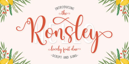 Ronsley Font Duo is a hand-drawn font with a modern look. This Ronsley Font Duo is perfect for any modern project including branding designs, logos, invitations, wedding decorations, website designs, instagram, business cards and more! You can access this easily in most programs. Please check to make sure you know how to access the alternatives. Thank you!
 - Exotique by Akrtype Studio,
$15.00 The Exotique is unique, this display font and is equipped with multilingual to be able to handle most typographic applications ranging from branding to body copying with various weights and inherent readability. will be perfect and look luxurious for many projects such as fashion, magazines, logos, branding, photography, invitations, quotes, blog headings, posters, advertisements, postcards, etc.
 - SavoryPaste by insigne,
$14.95SavoryPaste is a grungy sans serif from insigne. SavoryPaste includes 64 discretionary ligatures of the most common letter pairs for a more natural look without distracting repeating characters. The typeface family also includes OpenType small caps, old style figures and alternates without filled counters. The SavoryPaste family also includes a completely interchangeable and more restrained alternate.


