10,000 search results
(0.06 seconds)
- Stribe by Fateh.Lab,
$10.00 Stribe, this is an amazing work. Why? ... because this is not just talking about fonts, but more than that, with the spirit of Street Art, stribe invites you to explore with your wild ideas, I'm sure this will really make you feel happy in creating the work that you will wake up to the front. Supported by 3 font choices that are very sweet and also strong, stribe answers all your difficulties in choosing font support that suits your taste. And the most exciting thing is, you get a free bonus vector illustration that is very detailed and also has a very strong Street Art spirit, and is made very original, so what are you waiting for, have Stribe as soon as possible. Thank You
 - Asheboro by Parker Creative,
$18.00 Introducing Asheboro, a groovy retro font with modern style! Asheboro pairs the elements of groovy psychedelic lettering of the 1960's and 70's with the clean lines found in a modern geometric sans-serif. This combination creates a completely new aesthetic without losing the familiarity of the iconic typography of the past. With its iconic retro look, Asheboro is a great typeface selection for special branding projects, themed events, websites, even comic books and graphic novels. The Asheboro font family includes nine font weight variations for the ultimate font styling versatility. Each font weight is meticulously balanced and well-kerned for the optimal look. In addition, Asheboro includes a beautifully crafted number set, an expanded symbols set, and a large library of multilingual characters.
 - Stormy Youth by LomoHiber,
$16.00 I'm happy to present my Stormy Youth font. It has been drawn with a marker pen and a swift hand. Stormy Youth has intentionally overlapping letters to remind street style and give an underground look. Initially, I planned to make it as only uppercase, so feel free to use it this way. Stormy Youth is great for aggressive/rebel design style for teenagers. Stormy Youth Features: Can be used as uppercase font Set of alternates and ligatures for most common double letters Carefully tuned kerning (preview above doesn't always show it correctly for some reason) Swashes Wide Latin language support If you have some issues or questions, please let me know: lhfonts@gmail.com Hope you'll enjoy using Stormy Youth! You may also like my new font fracaso
 - Urban Blocker by Din Studio,
$25.00 Have you been looking for a graffiti font? Do you dream of creating headings that stand out and inspire creativity, imagination, modernity, and endless fun? Then we’ve got just the font for you! Introducing Urban Blocker-A Graffiti Font This bubble graffiti font can be used for a host of different content needs and projects. An excellent choice to add the right amount of street vibe and playfulness. Create gorgeous printed quotes, standout packaging, or beautiful t-shirts! You can even use it to create amazing headings, logos, menus, and social media graphics. Chalkboard includes multilingual options to make your branding reach a global audience. Features: Standart Ligatures Multilingual Support PUA Encoded Numerals and Punctuation Thank you for downloading premium fonts from Din Studio
 - Rangen by Letterfreshstudio,
$12.00 Rangen was inspired by Retro style in combination with hand lettering. Rangen has many alternative swashes and ligatures characters and has OpenType features such as alternative styles, ties and swashes so you can mix and match as you wish. Rangen is perfect for logos, posters, badges, book covers, t-shirt designs, handwritten quotes, product packaging, headers, posters, merchandise, social media & greeting cards. Rangen is coded with Unicode PUA, which allows full access to all additional characters without having special design software. Mac users can use the Font Book, and Windows users can use the Character Map to view and copy any of the additional characters to paste into your favorite text editor / application. Let me know if you have any questions.
 - Bill Hiffith Handwritten by Colllab Studio,
$19.00 "Hi there, thank you for passing by. Colllab Studio is here. We crafted best collection of typefaces in a variety of styles to keep you covered for any project that comes your way! Bill Hiffith is an Organic Script, a gorgeous font that can be used for making multiple things. it includes smooth brush stroke, simple and soft. Its elegant taste is one of the most gorgeous fonts. This typography is reflected in this exquisite font family. The type is clean and simple yet fun and stylish. It is beautiful, better for headlines style design or logo design. Or you can have it on your website’s body style. Grab it now, Bill Hiffith could elevate your elegance brand design. A Million Thanks Colllab Studio www.colllabstudio.com
 - Wathelmina by IRF Lab Studio,
$15.00 Wathelmina Script is a very readable Script typeface, get a touch of bold, classic and fun Vintage Script fonts, Features glyph and opentype with alternative styles. Can be used for various purposes. such as posters, t-shirts, signboards, logos, news, badges etc. To activate the OpenType Stylistic alternative, you need a program that supports OpenType features such as Adobe Illustrator CS, Adobe Indesign & CorelDraw X6-X7, Microsoft Word 2010 or a later version. Wathelmina Script is coded with PUA Unicode, which allows full access to all additional characters without having to design special software. Mac users can use Font Book, and Windows users can use Character Map to view and copy any additional characters for pasting into your favorite text editor / application.
 - La Taqueria by Sudtipos,
$39.00 Mexico’s storied culture is one of the most recognizable today. Its amazing vibrant art and delicious foods have made the leap to influence many parts of the world in recent years. This proud, intense and diverse identity was the inspiration behind La Taqueria, a set of four fonts that express different characteristics of Mexican pop culture. The heavy and spicy, the light and gentle, the constant dynamism, all come together with one rhythm to produce an explosion of personality. Just like its predecessors Distillery and Scrapbooker, the La Taqueria set contains down-to-earth alphabets perfect for chalkboard art and handmade design. All the fonts include alternates and ligatures, providing plenty of variation for that spontaneous appearance everyone is looking for these days.
 - Gobbler by Chank,
$49.00Gobble gobble gobble! The Gobbler font was drawn with a leaky pen on a napkin at the Modern Cafe in Northeast Minneapolis while the designer, Mister Chank Diesel, was waiting for some pot roast. “Apple cobbler drippings on the napkin add more character to the strokes of each letter,” says Chank. This font was originally named Modern Napkin, a free font released in 1997. Chank completed the character set, fixed some curves, and cleaned up some of the apple cobbler to make a more elegant font in 1999. Gobbler works great for either text or display purposes. - Caslon #540 by ITC,
$29.00The Englishman William Caslon punchcut many roman, italic, and non-Latin typefaces from 1720 until his death in 1766. At that time most types were being imported to England from Dutch sources, so Caslon was influenced by the characteristics of Dutch types. He did, however, achieve a level of craft that enabled his recognition as the first great English punchcutter. Caslon's roman became so popular that it was known as the script of kings, although on the other side of the political spectrum (and the ocean), the Americans used it for their Declaration of Independence in 1776. The original Caslon specimen sheets and punches have long provided a fertile source for the range of types bearing his name. Identifying characteristics of most Caslons include a cap A with a scooped-out apex; a cap C with two full serifs; and in the italic, a swashed lowercase v and w. Caslon's types have achieved legendary status among printers and typographers, and are considered safe, solid, and dependable. A few of the many interpretations from the early twentieth century were true to the source, as well as strong enough to last into the digital era. These include two from the American Type Founders Company, Caslon 540 and the slightly heavier Caslon #3. Both fonts are relatively wide, and come complete with small caps, Old style Figures, and italics. Caslon Open Face first appeared in 1915 from the Barnhart Bros & Spindler Foundry, and is not anything like the true Caslon types despite the name. It is intended exclusively for titles, headlines and initials, and looks elegant whether used with the more authentic Caslon types or by itself. - Merrymakers JNL by Jeff Levine,
$29.00 A throwback design reminiscent of 1950s signage and print ads, Merrymakers JNL takes a previous release (Bluesman JNL) and places the letters and numbers inside parallelograms with ‘TV screen’ openings. Merrymakers JNL is available in both regular and oblique versions. The upper case A-Z characters have the taller side of the shape to the left, while the lower case a-z has the taller side to the right. To make a ‘fan fold’ or zig-zag message, simply alternate upper and lower cases as in this example: C-a-R D-e-A-l-E-r-S You can type spaces between words, but if you prefer blank connectors, use the following: Upper case solid black connector – left bracket key Lower case solid black connector – right bracket key Upper case ‘TV screen’ connector – left brace key Lower case ‘TV screen’ connector – right brace key There is a very limited set of punctuation available. The upper case ampersand, question mark, exclamation point, period, comma, single quote and double quote are all on their respective key positions, but to accommodate the lower case [smaller side] versions, those glyphs have been reassigned to other standard keyboard positions: Type @ to get & Type # to get ? Type $ to get ! Type ^ to get . Type * to get , Type - to get ’ Type = to get ” Additionally, to access the lower case [smaller side] versions of the numerals, type the following keys: Type % to get 0 Type ( to get 1 Type ) to get 2 Type + to get 3 Type / to get 4 Type : to get 5 Type ; to get 6 Type < to get 7 Type > to get 8 Type \ to get 9
 - Dederon Sans by Suitcase Type Foundry,
$75.00Dederon Serif has been specifically designed for book setting. Preliminary sketches were drawn in 2004. Its inspiration — particularly its weight and width proportions — can be traced to the Liberta typeface from the TypoArt type foundry in former Eastern Germany. After a careful study of the model, the design of Dederon branched off into its own direction, finding its distinctive voice and becoming a wholly original type family. Dederon Serif kept most of the elements typical for the Old Style Roman lettering, such as the angle of the stress, the medium x-height, and lower contrast. In large sizes, the typical shapes of the letters stand out — the calligraphic feel characteristic for the Czech typefaces by Oldrich Menhart, the unusual serifs hinting at the angle of the pen, the shapes of the stems, or the terminals of dots and ears. Upon finishing the serif version, a sans-serif variant called Dederon Sans was added. The construction principles are also derived from the Old Style Roman model, which lends the lettering its open, humanist feel. Yet the design also conforms to the rules of the modern sans serif. Most characteristics of Dederon Sans match the serif version — the weight of individual cuts, the width proportions, x-height, ascenders' and descenders' length, and the slope of the italics. Each version of Dederon Open Type Std contains the standard Western Latin character set and the Central European characters; a number of basic and accented ligatures, small caps; old style, small caps and caps, table, fraction and superscript numerals; expert glyphs and alternative characters. This brings the total to a comfortable 820 glyphs per weight - Ablati by Hackberry Font Foundry,
$24.95 Ablati is the commercial release of the font designed during the production of our new font design book, “Practical Font Design”. It is a new serif font in my continuing objective of designing book fonts that I can really use. In many ways, Ablati is a very different direction for me. Designed to produce gaphics to use in the font design book, I was forced to really reconsider many of my working methods to make them work for outside readership. Like all designers, my internal design processes can get really sloppy. The book helped me clean up my act. Taking my inspiration from one of my favorite fonts of all time {though I've never really been able to use it much}, Romic, by Colin at Letraset, I decided to design a unilateral serif font. In most ways, this is a normal serif for me in that it has caps, lowercase, small caps with the appropriate figures for each case. This font has all the OpenType features in the new set developed for the book. There are several ligatures for your fun and enjoyment: bb gg ff fi fl ffi ffl ffy fj ft tt ty Wh Th and more. Several alternative forms, a dozen ornaments, and more. Like all of my fonts, there are: caps, lowercase, small caps, proportional lining figures, proportional oldstyle figures, & small cap figures, plus numerators, denominators, superiors, inferiors, and a complete set of ordinals 1st through infinity. Enjoy! The Oldstyle and Small Cap fonts are an attempt to have most of the OpenType characters available to people still using Type 1 and TrueType fonts.
 - Chordette for Mandolin by Ukefarm,
$10.00 Chordette Mandolin Chord Fonts are tuned GDAE and support Mandolin, Irish Tenor Banjo and Irish Bouzouki. Create a Mandolin Chord Chart quickly and easily. Mandolin Chord Fonts Chordette contains high quality Mandolin chord fonts. Each mandolin chord is mapped to a specific key on the keyboard, so you can type out chords. It’s a lot easier than dealing with images to create a Mandolin chord chart and song sheets. It’s a favorite tool for teachers, music therapists, and musicians. What instruments are supported? Chordette for Mandolin is tuned GDAE and supports Mandolin, Irish Tenor Banjo, and Irish Bouzouki. Chordette is available in multiple tunings for most stringed instruments. Most versions of Chordette support multiple instruments. App / Instruments Supported / Tuning Chordette for Guitalele / Guitalele, Baritone Guitar / ADGCEA Chordette for Ukulele / Concert Ukulele, Banjolele / GCEA Chordette for Soprano Uke Soprano Ukulele ADF#B Chordette for Baritone Uke / Baritone Ukulele / DGBE Chordette for Mandolin / Mandolin, Irish Tenor Banjo, Irish Bouzouki / GDAE Chordette for Banjo / Banjo /gDGBD Chordette for Tenor Banjo / Tenor Banjo, Tenor Guitar, Mandola / CGDA Chordette for Guitar / Guitar / EADGBE Each version of the Chordette font uses the same chord sets and keyboard mappings. If you play multiple instruments, you can create a chord sheet for one, then use another Chordette font to transpose the song to another. For example, you can create a song for Mandolin, then instantly transpose it for Guitar and Ukulele. Simply by changing fonts! Chordette for Mandolin is priced at $10, which includes the Mandolin chord font sets for both Mac and Windows. For help and support, please visit https://ukefarm.com/chordette/help.html
 - Kandidat by Fontroll,
$30.00 Imagine being printer in the early nineteenth century, your stock isn’t the finest, your lead characters are worn out: Voilá Kandidat Rough. But wait, Kandidat isn’t the usual scan-an-old-book,-put-the-glyphs-in-a-font-and-you’re-done-font. Kandidat Rough has a variety of whopping 14 alternates for most characters. Our algorithm changes the letters automatically. All you have to do is turn on Contextual Alternates in your layout app. The algorithm is the best we’ve seen so far, and it’s so good that even same words appear in different forms. And should by coincidence words have the same glyphs, just assign a different Style Set to the first letter, and all other letters in the word will change as well (well, it depends a bit on your software). The mechanism isn’t perfect and maybe we stretched OpenType capabilities a bit over the top, but we yet haven’t seen any better routine for switching letters on the fly. Is it worth to mention that Kandidat Rough not only speaks English, but also German, French, Spanish, Dutch, Danish, Norwegian, Swedish, Croatian, Turkish and most likely some other languages? Maybe. To be sure whether your language is supported, this is the typeset of all letters: ABCDEFGHIJKLMNOPQRSTUVWXYZÀÁÂÃÄÅÆÇÈÉÊËÌÍÎÏÑÒÓÔÕÖØÙÚÛÜÝĆČĐĞ݌ފŸŽ abcdefghijklmnopqrstuvwxyzàáâãäåæçèéêëìíîïñòóôõöøùúûüýÿćčđğıœşšž Apart from that we also included the following punctuation and currency symbols: !"#$%&'()*+,-./:;?@[\]_{|}¡©«®°±¶·»¿×–—‘’‚“”„†•…‹›⁄≠☞ €¢$£¥ This sums up to nearly 3000 glyphs per font, and we have three of them: Regular, Italic and Bold. All neatly kerned. All in all a great repertoire for even the most demanding book or advert jobs with a look of old times. And now imagine you are sick of the rugged print experience Kandidat Rough delivers: go for Kandidat. This is our Scotch-ish ancestor the Rough version was made from. A sturdy, friendly, round, warm friend from the beginning of the nineteenth century. A bit dark, maybe. You will like it. Kandidat has the aforementioned type set plus complete Baltics, Eastern Europe and Cyrillic. Plus a couple of gimmicks like fleurons, stars, circled numbers, arrows, and, and, and… Kandidat Regular additionally has small caps for Latin based scripts (not Cyrillic). The spick and span Kandidat font set also consists of Regular, Italic and Bold cuts. The bold cut is on the very bold side and can nicely be used for headings, whereas Italic is a great companion for Regular. It took us some time and trouble to finish this project, but after all we are very proud of our little feat and hope you will enjoy Kandidat as much as we do. Enjoy!
 - Times New Roman PS Cyrillic by Monotype,
$67.99In 1931, The Times of London commissioned a new text type design from Stanley Morison and the Monotype Corporation, after Morison had written an article criticizing The Times for being badly printed and typographically behind the times. The new design was supervised by Stanley Morison and drawn by Victor Lardent, an artist from the advertising department of The Times. Morison used an older typeface, Plantin, as the basis for his design, but made revisions for legibility and economy of space (always important concerns for newspapers). As the old type used by the newspaper had been called Times Old Roman," Morison's revision became "Times New Roman." The Times of London debuted the new typeface in October 1932, and after one year the design was released for commercial sale. The Linotype version, called simply "Times," was optimized for line-casting technology, though the differences in the basic design are subtle. The typeface was very successful for the Times of London, which used a higher grade of newsprint than most newspapers. The better, whiter paper enhanced the new typeface's high degree of contrast and sharp serifs, and created a sparkling, modern look. In 1972, Walter Tracy designed Times Europa for The Times of London. This was a sturdier version, and it was needed to hold up to the newest demands of newspaper printing: faster presses and cheaper paper. In the United States, the Times font family has enjoyed popularity as a magazine and book type since the 1940s. Times continues to be very popular around the world because of its versatility and readability. And because it is a standard font on most computers and digital printers, it has become universally familiar as the office workhorse. Times?, Times? Europa, and Times New Roman? are sure bets for proposals, annual reports, office correspondence, magazines, and newspapers. Linotype offers many versions of this font: Times? is the universal version of Times, used formerly as the matrices for the Linotype hot metal line-casting machines. The basic four weights of roman, italic, bold and bold italic are standard fonts on most printers. There are also small caps, Old style Figures, phonetic characters, and Central European characters. Times? Ten is the version specially designed for smaller text (12 point and below); its characters are wider and the hairlines are a little stronger. Times Ten has many weights for Latin typography, as well as several weights for Central European, Cyrillic, and Greek typesetting. Times? Eighteen is the headline version, ideal for point sizes of 18 and larger. The characters are subtly condensed and the hairlines are finer." - Times New Roman Seven by Monotype,
$67.99In 1931, The Times of London commissioned a new text type design from Stanley Morison and the Monotype Corporation, after Morison had written an article criticizing The Times for being badly printed and typographically behind the times. The new design was supervised by Stanley Morison and drawn by Victor Lardent, an artist from the advertising department of The Times. Morison used an older typeface, Plantin, as the basis for his design, but made revisions for legibility and economy of space (always important concerns for newspapers). As the old type used by the newspaper had been called Times Old Roman," Morison's revision became "Times New Roman." The Times of London debuted the new typeface in October 1932, and after one year the design was released for commercial sale. The Linotype version, called simply "Times," was optimized for line-casting technology, though the differences in the basic design are subtle. The typeface was very successful for the Times of London, which used a higher grade of newsprint than most newspapers. The better, whiter paper enhanced the new typeface's high degree of contrast and sharp serifs, and created a sparkling, modern look. In 1972, Walter Tracy designed Times Europa for The Times of London. This was a sturdier version, and it was needed to hold up to the newest demands of newspaper printing: faster presses and cheaper paper. In the United States, the Times font family has enjoyed popularity as a magazine and book type since the 1940s. Times continues to be very popular around the world because of its versatility and readability. And because it is a standard font on most computers and digital printers, it has become universally familiar as the office workhorse. Times?, Times? Europa, and Times New Roman? are sure bets for proposals, annual reports, office correspondence, magazines, and newspapers. Linotype offers many versions of this font: Times? is the universal version of Times, used formerly as the matrices for the Linotype hot metal line-casting machines. The basic four weights of roman, italic, bold and bold italic are standard fonts on most printers. There are also small caps, Old style Figures, phonetic characters, and Central European characters. Times? Ten is the version specially designed for smaller text (12 point and below); its characters are wider and the hairlines are a little stronger. Times Ten has many weights for Latin typography, as well as several weights for Central European, Cyrillic, and Greek typesetting. Times? Eighteen is the headline version, ideal for point sizes of 18 and larger. The characters are subtly condensed and the hairlines are finer." - Zapfino Extra X by Linotype,
$29.99Today's digital font technology allowed the world-renowned typeface designer/calligrapher Hermann Zapf to finally realize a vision he first had more than fifty years ago: creating a typeface that could capture the freedom and liveliness of beautiful handwriting. The basic Zapfino™ font family, released in 1998, consists of four alphabets with many additional stylistic alternates that can be freely mixed together to emulate the variations in handwritten text. In 2003, Herman Zapf completely reworked the Zapfino design, creating Zapfino™ Extra. This large expansion of the Zapfino family was designed in close collaboration with Akira Kobayashi. Zapfino™ Extra includes a cornucopia of new characters. It features exuberant hyper-flourishes, elegant small caps, dozens of ornaments, more alternates and ligatures, index characters, and a very useful bold version, named Zapfino™ Forte. A version of the 1998 Zapfino typeface ships as one of the pre-installed fonts included with Mac OSX. The Mac OSX version's letters are four times larger than the Linotype standard. In order to minimize compatibility problems for Macintosh users, Linotype has created OSX versions of its Zapfino Extra Pro typefaces, which have been enlarged to correlate visually with the Mac OS Zapfino system font. These special Linotype fonts can be distinguished by the letter X" in their name. Zapfino Extra is an OpenType format font, which is available in two versions. Which version you purchase should depend on which software applications you use the most and what features they support! The Contextual version of Zapfino Extra Pro contains a treasure-trove of extra contextual features. When created in 2004, this was the most advanced OpenType font released to date. By purchasing this version, users of OpenType-supporting applications, such as Adobe InDesign, may access all of the features available in the entire Zapfino family through just two fonts, Zapfino Extra LT Pro (Contextual) and Zapfino Forte LT Pro! Unfortunately, most non-Adobe applications currently do not support the contextual features made possible by recent OpenType developments. Users of Quark XPress and Microsoft Office should instead purchase all of the non-contextual fonts of Zapfino Extra Pro family, in order to access all of the Zapfino Extra family's 1676 glyphs. The Zapfino Extra family's character set supports 48 western and central European languages. Use Zapfino Extra to produce unusual and graceful advertisements, packaging, and invitations. Zapfino Extra is so joyously abundant that it's tempting to over-indulge, so be sure to check out the tips for working well with the possibilities." - Apresia Script by Asritype,
$42.00 Inspired by various shapes such as leaves, flowers, hearts etc., Apresia Script is harmonically crafted. My first intention is only for standard design, but, later added simpler characters for normal(standard) typings. Apresia Script is rich with capital letter variants and ornaments. There are also lowercase variants in lesser numbers. I assume that many or perhaps most people want to have their name or the other of their important designs to be written with some letters that are in various shapes harmoniously. Apresia Script with more then 4000 glyphs support this aim, also support many latin based languages. However, because of many variations, except the standard characters, the full marked capitals are only set in two variants; in ss01 and ss02, which is also some marked lowercases included here. Swash variants (swsh) consist only one variant of every uppercase and lowercase characters, but no marked characters. All the others capital and lowercase variants are put in stlystic alternatives (salt). There are tens of unmarked caps and fewer for unmarked lowercase in salt (see Apresia Script opentype features(1) poster for some). The ornaments can be accessed via opentype ornaments(ornm), using less() characters for easier access. There are also beginning small letter(lowercase) ornaments, end word(lowercase) ornaments and insertion ornaments to make your typing/design more flourish, using ornm via “[“ (bracketleft), “]” (bracketright) and “\” (backslash), respectively. For marks; marks via combining marks and mkmk was set for many characters variants, however, it seem most applications not yet support this features. Alternatively, you can add non standard unicode combining marks via ornaments for the language supported: asterisk “*” list for uppercase marks above letters; ASCIIcircum “^” list for lowercase marks above letters; underscore “_” for uppercase and lowercase marks below the letters; numbersign “#” for slashing characters, horn, caron alternate and reversed comma for g, (see Apresia Script opentype features(2) poster and save it if you download the font). Thus, it is recommended to have the application which are support these opentype features such as: Adobe in Design, Adobe Illustrator, CorelDRAW or others for easier accessing the glyphs. Still, for non supported applications, you can insert these glyphs via Character maps, insert symbols or other similar tools. Apresia Script will go for most typing/design such as invitation, wedding card, greeting card, banners, logos and many others. Use it for whatever you intended to, Apresia script will give an amazing end design, though you are not a designer. As intended to be able to be used by many, this font is set in an affordable price. Thank you very much for downloading this font.
 - Times New Roman WGL by Monotype,
$67.99 In 1931, The Times of London commissioned a new text type design from Stanley Morison and the Monotype Corporation, after Morison had written an article criticizing The Times for being badly printed and typographically behind the times. The new design was supervised by Stanley Morison and drawn by Victor Lardent, an artist from the advertising department of The Times. Morison used an older typeface, Plantin, as the basis for his design, but made revisions for legibility and economy of space (always important concerns for newspapers). As the old type used by the newspaper had been called Times Old Roman," Morison's revision became "Times New Roman." The Times of London debuted the new typeface in October 1932, and after one year the design was released for commercial sale. The Linotype version, called simply "Times," was optimized for line-casting technology, though the differences in the basic design are subtle. The typeface was very successful for the Times of London, which used a higher grade of newsprint than most newspapers. The better, whiter paper enhanced the new typeface's high degree of contrast and sharp serifs, and created a sparkling, modern look. In 1972, Walter Tracy designed Times Europa for The Times of London. This was a sturdier version, and it was needed to hold up to the newest demands of newspaper printing: faster presses and cheaper paper. In the United States, the Times font family has enjoyed popularity as a magazine and book type since the 1940s. Times continues to be very popular around the world because of its versatility and readability. And because it is a standard font on most computers and digital printers, it has become universally familiar as the office workhorse. Times?, Times? Europa, and Times New Roman? are sure bets for proposals, annual reports, office correspondence, magazines, and newspapers. Linotype offers many versions of this font: Times? is the universal version of Times, used formerly as the matrices for the Linotype hot metal line-casting machines. The basic four weights of roman, italic, bold and bold italic are standard fonts on most printers. There are also small caps, Old style Figures, phonetic characters, and Central European characters. Times? Ten is the version specially designed for smaller text (12 point and below); its characters are wider and the hairlines are a little stronger. Times Ten has many weights for Latin typography, as well as several weights for Central European, Cyrillic, and Greek typesetting. Times? Eighteen is the headline version, ideal for point sizes of 18 and larger. The characters are subtly condensed and the hairlines are finer."
 - Times New Roman by Monotype,
$67.99 In 1931, The Times of London commissioned a new text type design from Stanley Morison and the Monotype Corporation, after Morison had written an article criticizing The Times for being badly printed and typographically behind the times. The new design was supervised by Stanley Morison and drawn by Victor Lardent, an artist from the advertising department of The Times. Morison used an older typeface, Plantin, as the basis for his design, but made revisions for legibility and economy of space (always important concerns for newspapers). As the old type used by the newspaper had been called Times Old Roman," Morison's revision became "Times New Roman." The Times of London debuted the new typeface in October 1932, and after one year the design was released for commercial sale. The Linotype version, called simply "Times," was optimized for line-casting technology, though the differences in the basic design are subtle. The typeface was very successful for the Times of London, which used a higher grade of newsprint than most newspapers. The better, whiter paper enhanced the new typeface's high degree of contrast and sharp serifs, and created a sparkling, modern look. In 1972, Walter Tracy designed Times Europa for The Times of London. This was a sturdier version, and it was needed to hold up to the newest demands of newspaper printing: faster presses and cheaper paper. In the United States, the Times font family has enjoyed popularity as a magazine and book type since the 1940s. Times continues to be very popular around the world because of its versatility and readability. And because it is a standard font on most computers and digital printers, it has become universally familiar as the office workhorse. Times?, Times? Europa, and Times New Roman? are sure bets for proposals, annual reports, office correspondence, magazines, and newspapers. Linotype offers many versions of this font: Times? is the universal version of Times, used formerly as the matrices for the Linotype hot metal line-casting machines. The basic four weights of roman, italic, bold and bold italic are standard fonts on most printers. There are also small caps, Old style Figures, phonetic characters, and Central European characters. Times? Ten is the version specially designed for smaller text (12 point and below); its characters are wider and the hairlines are a little stronger. Times Ten has many weights for Latin typography, as well as several weights for Central European, Cyrillic, and Greek typesetting. Times? Eighteen is the headline version, ideal for point sizes of 18 and larger. The characters are subtly condensed and the hairlines are finer."
 - Times New Roman Small Text by Monotype,
$67.99In 1931, The Times of London commissioned a new text type design from Stanley Morison and the Monotype Corporation, after Morison had written an article criticizing The Times for being badly printed and typographically behind the times. The new design was supervised by Stanley Morison and drawn by Victor Lardent, an artist from the advertising department of The Times. Morison used an older typeface, Plantin, as the basis for his design, but made revisions for legibility and economy of space (always important concerns for newspapers). As the old type used by the newspaper had been called Times Old Roman," Morison's revision became "Times New Roman." The Times of London debuted the new typeface in October 1932, and after one year the design was released for commercial sale. The Linotype version, called simply "Times," was optimized for line-casting technology, though the differences in the basic design are subtle. The typeface was very successful for the Times of London, which used a higher grade of newsprint than most newspapers. The better, whiter paper enhanced the new typeface's high degree of contrast and sharp serifs, and created a sparkling, modern look. In 1972, Walter Tracy designed Times Europa for The Times of London. This was a sturdier version, and it was needed to hold up to the newest demands of newspaper printing: faster presses and cheaper paper. In the United States, the Times font family has enjoyed popularity as a magazine and book type since the 1940s. Times continues to be very popular around the world because of its versatility and readability. And because it is a standard font on most computers and digital printers, it has become universally familiar as the office workhorse. Times?, Times? Europa, and Times New Roman? are sure bets for proposals, annual reports, office correspondence, magazines, and newspapers. Linotype offers many versions of this font: Times? is the universal version of Times, used formerly as the matrices for the Linotype hot metal line-casting machines. The basic four weights of roman, italic, bold and bold italic are standard fonts on most printers. There are also small caps, Old style Figures, phonetic characters, and Central European characters. Times? Ten is the version specially designed for smaller text (12 point and below); its characters are wider and the hairlines are a little stronger. Times Ten has many weights for Latin typography, as well as several weights for Central European, Cyrillic, and Greek typesetting. Times? Eighteen is the headline version, ideal for point sizes of 18 and larger. The characters are subtly condensed and the hairlines are finer." - Times New Roman PS Greek by Monotype,
$67.99In 1931, The Times of London commissioned a new text type design from Stanley Morison and the Monotype Corporation, after Morison had written an article criticizing The Times for being badly printed and typographically behind the times. The new design was supervised by Stanley Morison and drawn by Victor Lardent, an artist from the advertising department of The Times. Morison used an older typeface, Plantin, as the basis for his design, but made revisions for legibility and economy of space (always important concerns for newspapers). As the old type used by the newspaper had been called Times Old Roman," Morison's revision became "Times New Roman." The Times of London debuted the new typeface in October 1932, and after one year the design was released for commercial sale. The Linotype version, called simply "Times," was optimized for line-casting technology, though the differences in the basic design are subtle. The typeface was very successful for the Times of London, which used a higher grade of newsprint than most newspapers. The better, whiter paper enhanced the new typeface's high degree of contrast and sharp serifs, and created a sparkling, modern look. In 1972, Walter Tracy designed Times Europa for The Times of London. This was a sturdier version, and it was needed to hold up to the newest demands of newspaper printing: faster presses and cheaper paper. In the United States, the Times font family has enjoyed popularity as a magazine and book type since the 1940s. Times continues to be very popular around the world because of its versatility and readability. And because it is a standard font on most computers and digital printers, it has become universally familiar as the office workhorse. Times?, Times? Europa, and Times New Roman? are sure bets for proposals, annual reports, office correspondence, magazines, and newspapers. Linotype offers many versions of this font: Times? is the universal version of Times, used formerly as the matrices for the Linotype hot metal line-casting machines. The basic four weights of roman, italic, bold and bold italic are standard fonts on most printers. There are also small caps, Old style Figures, phonetic characters, and Central European characters. Times? Ten is the version specially designed for smaller text (12 point and below); its characters are wider and the hairlines are a little stronger. Times Ten has many weights for Latin typography, as well as several weights for Central European, Cyrillic, and Greek typesetting. Times? Eighteen is the headline version, ideal for point sizes of 18 and larger. The characters are subtly condensed and the hairlines are finer." - Times New Roman PS by Monotype,
$67.99In 1931, The Times of London commissioned a new text type design from Stanley Morison and the Monotype Corporation, after Morison had written an article criticizing The Times for being badly printed and typographically behind the times. The new design was supervised by Stanley Morison and drawn by Victor Lardent, an artist from the advertising department of The Times. Morison used an older typeface, Plantin, as the basis for his design, but made revisions for legibility and economy of space (always important concerns for newspapers). As the old type used by the newspaper had been called Times Old Roman," Morison's revision became "Times New Roman." The Times of London debuted the new typeface in October 1932, and after one year the design was released for commercial sale. The Linotype version, called simply "Times," was optimized for line-casting technology, though the differences in the basic design are subtle. The typeface was very successful for the Times of London, which used a higher grade of newsprint than most newspapers. The better, whiter paper enhanced the new typeface's high degree of contrast and sharp serifs, and created a sparkling, modern look. In 1972, Walter Tracy designed Times Europa for The Times of London. This was a sturdier version, and it was needed to hold up to the newest demands of newspaper printing: faster presses and cheaper paper. In the United States, the Times font family has enjoyed popularity as a magazine and book type since the 1940s. Times continues to be very popular around the world because of its versatility and readability. And because it is a standard font on most computers and digital printers, it has become universally familiar as the office workhorse. Times?, Times? Europa, and Times New Roman? are sure bets for proposals, annual reports, office correspondence, magazines, and newspapers. Linotype offers many versions of this font: Times? is the universal version of Times, used formerly as the matrices for the Linotype hot metal line-casting machines. The basic four weights of roman, italic, bold and bold italic are standard fonts on most printers. There are also small caps, Old style Figures, phonetic characters, and Central European characters. Times? Ten is the version specially designed for smaller text (12 point and below); its characters are wider and the hairlines are a little stronger. Times Ten has many weights for Latin typography, as well as several weights for Central European, Cyrillic, and Greek typesetting. Times? Eighteen is the headline version, ideal for point sizes of 18 and larger. The characters are subtly condensed and the hairlines are finer." - Kyboshed - 100% free

- Mottek - Personal use only

- Last Ninja - Unknown license

- Iron Lung - Personal use only

- Special K - 100% free

- Heavenlight by Fargun Studio,
$15.00 Heavenlight is an elegant and casual monoline-signature font. This font is suitable for branding, logos, wedding invitations, magazines, brochures, and more This font has unique set and swashes alternates that will enhance your design.
 - Area 88 by Umbra95,
$22.00 AREA 88 is an experimental grunge style font with a unique look. The font is easily recognized with a messy, dirty texture . AREA 88 has all the features usually included in a fully professional font.
 - Happy Maggie by SIAS,
$29.90 The design of this font was created by a 13-year-old girl. The digitisation is faithful to the original drawings and keeps all of the wonderful special details which make this font absolutely unique.
 - Rogue Serif by Device,
$29.00 Recently the Rogue family was designed as an accompaniment to Paralucent for Loaded, London's notorious lads-mag that had found its design being cloned by the competition and sought something unique to set it apart.
 - Alinton by Khurasan,
$10.00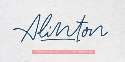 Introducing Alinton Signature Typeface - a font that is very fresh and unique style handmade. Alinton Signature Typeface is perfectly suited to logo, stationery, poster, apparel, branding, wedding invitation, card, tagline, layout design, and much more !!
 - Cabernet Sauvignon by BA Graphics,
$45.00An elegant fine serif gives this font that unique beautiful charming feeling. This a great font for that real sophisticated high end look. Like a fine wine this font is sure to please your taste. - Cream Pie by ErlosDesign,
$14.00 CreamPie - Handwritten Display Font by erlosDESIGN CreamPie is a sweet and friendly handwritten font. Its natural and unique style makes it incredibly fitting to a large pool of designs. The only limit is your imagination!
 - Christmas Melisya by Yoga Letter,
$18.00 "Christmas Melisya" is a unique and elegant blackletter font. This font is equipped with uppercase, lowercase, numerals, punctuation, and multilingual support. Very suitable for Christmas, weddings, winter, Valentine's, invitations, photography, spring, summer, fall, and others.
 - Christmas Everyday by Yoga Letter,
$16.00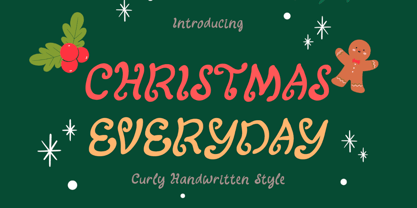 "Christmas Everyday" is a unique and cute handwritten font. This font is equipped with uppercase, lowercase, numerals, punctuation, and multilingual support. Very suitable for Christmas, wedding, engagement, invitations, Valentine, Halloween, Christmas, winter, fall, and others.
 - Khat Jannah by Motagadeda Type,
$40.00 Introducing Khat Jannah, a captivating and unique font that breaks away from traditional design conventions. This exceptional typeface pushes the boundaries of Arabic typography, offering a distinct and visually striking display font unlike any other.
 - Leader Kids by Awan Senja,
$14.00 Leader Kids is a fun and unique display font. It will elevate a wide range of design projects to the highest level, be it branding, headings, wedding designs, invitations, signatures, logos, labels, and much more!


