1,170 search results
(0.13 seconds)
- Landry Gothic by E-phemera,
$12.00Landry Gothic is inspired by a wood type alphabet by an unknown designer. It was digitized in order to make prop signage for movies and television. Its imperfect lines and rounded corners are meant to capture the feeling of real wood or metal type that's worn from use. - Mango Grotesque by Studio DC,
$20.00 - Copperlove by Resistenza,
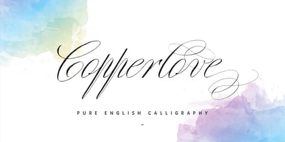
$49.00Copperlove was born during a very long and hard wintertime in Berlin. This font is based on Giuseppe Salerno’s Copperplate calligraphy. Oblique nib and sepia ink were the tools used to create this sublime english typeface. There are also many opentype features like alternates and beautiful swashes. Turquoise Nautica - AZ Dude by Artist of Design,
$20.00 - Disposable by PizzaDude.dk,
$20.00 - Times Sans Serif - Unknown license
- PGY - Personal use only
- Toppo Giggio - Personal use only
- Romanesque Serif - 100% free
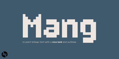
- Mang by MADType,
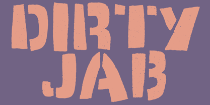
$21.00 - Dirty Jab by PizzaDude.dk,
$15.00Using Dirty Jabfor your graphical adventures is like having brunch when being hungry! The surface of the font is actually kind of grunge. Use the font at large sizes with reveal the authentic worn look. Comes with extensive language support and 6 contextual alternates that automatically cycles as you type! - Linotype Atlantis by Linotype,
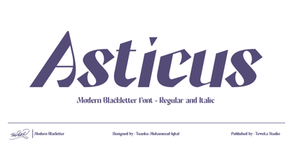
$29.99Lutz Baar was born in Berlin, now living in Gothenburg, Sweden. He is an art director at his own advertising and Web design studio Miraculus. Among his typeface designs you find the award winning Linotype Pisa, the hand tooled looking Linotype Atlantis, and the strictly Linotype Ordinar, designed for Web usage. - Asticus by Teweka,
$10.00New Fresh! Asticus was born by adapting the Blackletter style. This font is very distinctive, with lines that still maintain the blackletter style. This font has 372 glyphs and is multilingual. and some ligatures in it. This font is very suitable for various product designs, t-shirts, branding and others. - Montage by ITC,
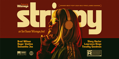
$29.00Montage was designed by Alan Dempsey. Like the name suggests, the design was inspired by the arrangement of elements such as torn paper, cut-outs, scratch board and stencilled letters. Montage is a creative, eye-catching alphabet of casually drawn letterforms set on a background of daub-like brush strokes. - Strippy by Just Font You,
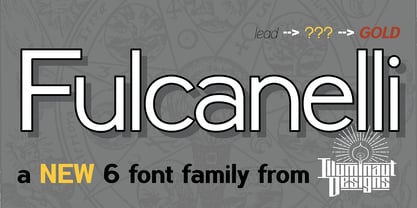
$18.00 - Fulcanelli by Illuminaut Designs,
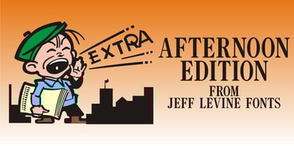
$10.00 - Afternoon Edition JNL by Jeff Levine,
$29.00Afternoon Edition JNL is another classic typeface (with Caslon influence) re-drawn from screen captures of vintage newspaper headlines. The font joins Final Edition JNL, Evening Paper JNL and Morning Paper JNL as a mini-collection of type styles used to grab a reader's attention in the 1930s, 1940s and 1950s. - Pamplemousse by The Ampersand Forest,
$19.00Meet Pamplemousse, a display font that's part fun, casual script and part elegant typeface! Pamplemousse is most decidedly a fellow who enjoys lazy Sunday mornings spent sipping mimosas or bloody marys over a plate of eggs benedict and the New York Times crossword puzzle. He enjoys dressing up for use in branding and headlines (he looks particularly dashing in all caps) and also sitting back and composing a casual note to a dear friend. Pamplemousse is mostly sweet and just a little sophisticated, and he likes being just as he is. Pamplemousse started out as a typeface based on the lettering of Gustav Klimt in his poster for the first exhibition of the Vienna Secession movement (Art Nouveau). This drifted into an homage to Rea Irvin's iconic masthead typeface for the New Yorker magazine. Finally, with the addition of a lowercase (absent from Irvin's typeface), a significant revision away from both Klimt and Irvin into a more casual space, Pamplemousse was born! Oh — why "pamplemousse?" "Pamplemousse" is French for grapefruit. What goes better in your Sunday gin and tonic than an aromatic slice of pamplemousse? Say it a few times. Preferably after a couple of those g & t's. You'll see how fun he can be... - Chave - Personal use only
- Datura - Unknown license
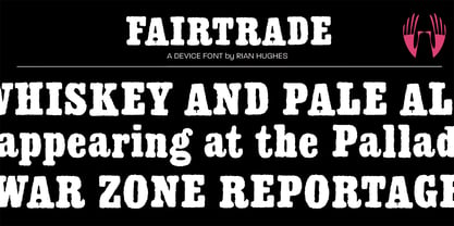
- Fairtrade by Device,
$39.00Rough and ready artisanal lettering for your fair trade coffee shop, whiskey microbrewery or Victorian bill-poster — or, alternatively, distressed type for the cover of a hard-hitting novel set in a war zone. Fairtrade uses opentype technology to cycle through three versions of each character, giving an authentically uneven time-worn appearance. - Keymer Thug by Talbot Type,
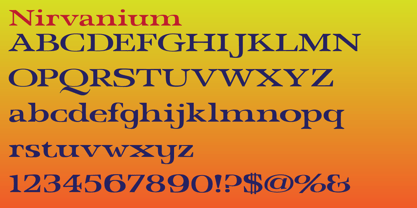
$19.50Talbot Type Keymer Thug is a display face available in three weights, it is a distressed variation of Keymer Radius . Its textured look brings a characterful, time-worn quality. Keymer Thug features an extended character set to include old style numerals, accented characters for Central European languages and bespoke characters in the italic. - Nirvanium NB by No Bodoni,
$39.00If John Baskerville had been born in Seattle in the 1960s his type would have looked like Nirvanium: a wide, extended body with chunky Dr. Martin serifs, an assertive inelegance and a sense of rebelliousness. It�s a display face, too big, too chunky and too rambunctious for text, but always friendly. - Rosalita by Forberas Club,
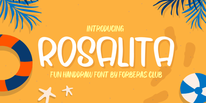
$16.00The Rosalita font is a cute and playful font. This font was born for crafter, you can use it as T-Shirt Design, merchandise, greeting card, invitation card, cricut design, decorative, or making some artwork. Lighter weights are well-suited for body text while heavier ones are ideal for high impact headlines. - Patient by Garisman Studio,
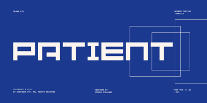
$22.00Patient was born in the modern era which was inspired by the letters found in various print and digital media. Comes with a modern and futuristic style that will rock your great design! It is suitable for you to use in logotype designs, posters, typography, t-shirts, tickets, and other modern designs. - AZ Hello Brushed by Artist of Design,
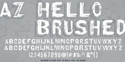
$25.00 - Motopica by Anomali Creative,
$19.99Motopica was born when I watched a show, namely "the pickers". At that time I realized that there were still many communities or people who really loved Western culture (Cowboy), Vintage Style in the 40s - 60s era and Classic Motorbike style (Caferacer). So I intend to combine these three concepts into a single font, and Motopica was born, which brings the spirit of the three styles, namely Western Cowboy, Vintage, Beer and motorbike. Motopica can be used as a Vintage Poster, Vintage Signage, Vintage badge What's Included Motopica Reguler Motopica Italic Motopica College Motopica Bold How to install your new font This font can be used with all software that can read standard fonts. Check out my instagram for update: https://www.instagram.com/anomalikreatif/ Thanks so much for checking out my shop! All the best, Krisna - Klutz AOE Pro by Astigmatic,
$19.00The Klutz AOE Pro Family was inspired by the plethora of naive hand drawn lettering becoming commonplace in modern advertising. What I hadn't seen was a family of hand drawn typefaces, in a range of widths and weights, with both alternate capitals as well as small caps character sets...and so Klutz Pro was born. The letterforms started with a few letters my daughter had drawn which I expanded on from there. Pulling from inspirations in retro cartoon titling and modern hand lettering playfulness, the full font was born, with weights and width to follow. Quirky, eclectic, and just a bit ridiculous, it lends itself to a range of design typesetting - although I must confess, even though it all began with the Regular width, the Extra Condensed styles are my personal favorites. What's your favorite? - Typewriter DirtY by Matthias Luh,
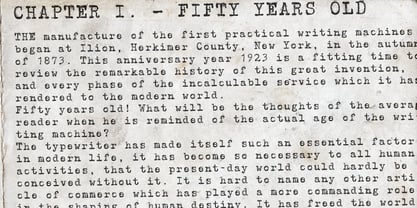
$32.00Typewriter DirtY is related to the Typewriter BasiX and Typewriter Revo fonts. While Revo has a very clean and simple outline, BasiX is a bit washed out and looks worn. DirtY goes a step further and has a very dirty, worn, fuzzy, grungy vintage look – even more so than BasiX. Typewriter DirtY is especially suitable for headlines, logos, covers, slogans and much more. BasiX and Revo are recommended for longer texts. Although Typewriter DirtY looks good even in small font size, it is a bit more complex to render because of its detailed outlines. Typewriter Revo, BasiX and Dirty are monospaced typewriter fonts, which are matched to each other. They have the same dimensions and generally somewhat similar contours. Therefore, they can be perfectly mixed and matched with each other. - ENYO Serif Light - Personal use only
- Aracne Regular - Personal use only
- Tropical Tourist JNL by Jeff Levine,
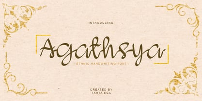
$29.00A 1934 advertisement for the Roney Plaza Hotel at 23rd Street and Collins Avenue on Miami Beach yielded the inspiration for Tropical Tourist JNL. While this wonderful example of Art Deco lettering survived, sadly the original Roney was torn down around 1969 and replaced with a modern apartment house/condos bearing the same name. - Agathsya by Egha's Studio,
$1.00 - MBF Taurian by Moonbandit,
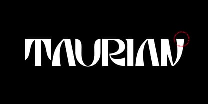
$15.00Introducing Taurian, a bold and elegant display typeface. Inspired by the majestic horn of the bull, taurian can gives a proud, strong and bold elegance to your projects. Passionately built with the utmost details on each glyph. Ideal use as a headline, title, display, logo, and many other. opentype features include: ligature alternate kerning - Kittle Round by Talbot Type,
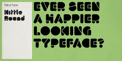
$19.50Kittle Round is a robust display font, with a strong, pared down look based on bold geometric forms. Loaded with personality, Kittle Round features a full upper and lower case character set and an extended set of accented characters for Central European languages. It is also available as Kittle Rough, with a time-worn look. - Chub by Chank,
$39.95Chub was inspired by and dedicated to: Jimmy Dean Pork Sausage, J Otto, Ben & Jerry, Spunk, Chuck Jones, Run DMC, those teenage kids with their big baggy pants, French Market coffee, George Clinton, Bill Clinton, Chistina Ricci, Sesame Street and the letter C. God bless all those big, fat, fun things that make life grand. - Evening Edition JNL by Jeff Levine,
$29.00Evening Edition JNL pays tribute to the ever-decreasing line of daily newspapers in this country by emulating the "wood type" look of the headlines. Way before the Internet took over as a popular information source, it was the morning, afternoon or evening edition of a paper that presented the big story of the day. - Gato - Personal use only
- Dash To School by Comicraft,
$15.00One of the more popular pupils in the Comicraft Academy of Lettering Arts, Dash Decent, has been working on his penmanship, thanks to a grant from those lovely learning specialists at Brainzy and Education.com. Developing learning games for Pre K, K and 1st grade, Brainzy requested a font that was fun and clean to help children learn to print. Dash to School is an all new revision and expansion of the Dash Decent family and features fun bold/heavy/outline and drop shadow weights for display, guidelines and dashed lines to assist learning and understanding and a healthy dose of decency! Dash Decent has graduated 1st Grade and with Dash to School’s help, so can you! See the families related to Dash To School: Dash Decent Features: Nine fonts (Regular, Bold, Heavy, Outline, Shadow, Guides, GuidesDashed & GuidesSolid) with upper and lowercase alphabets. - Swordtail by Type Innovations,
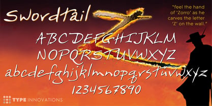
$39.00A friend bought me a Chinese calligraphic brush set in a beautifully decorated box. I started to letter the alphabet on parchment, in my own hand, using quick strokes and found the resulting script had an interesting energy to it. After further refinement in my font application software 'Swordtail' was born. A great free-hand script.
