10,000 search results
(0.036 seconds)
- Qasiru by Phoenix Group,
$13.00 Qasiru is a messy handwriting font with a theme of fun and love, it has bold and irregular lines, but fits perfectly in the whole lettering. Thank you
 - Steelfish Hammer by Typodermic,
$11.95 Welcome, esteemed customers, to our magnificent array of fonts! It is with great pleasure that we present to you the rusticized Steelfish Hammer, a variation of the popular Steelfish typeface. Its rugged appearance embodies the sincere and trustworthy nature of your message, evoking sentiments of the utmost assurance. With three textured letter variations that are shuffled automatically in OpenType-savvy applications, the Steelfish Hammer typeface creates an unparalleled realistic impression. To disable this effect, simply toggle the “standard ligatures” feature in your application. And oh, the compact letterforms of the Steelfish Hammer! They are nothing short of exquisite. Each of the five weights and italics of this typeface is a testament to the power and resilience of your message, with every character carefully crafted to achieve the desired effect. There are other kinds of Steelfish too: Steelfish Regular, Steelfish Rounded, Steelfish Steeled and Steelfish Unleaded. Come, delve into the world of typography with us and experience the unmatched beauty of the Steelfish Hammer. Let your message speak with confidence and authenticity, as it is our utmost priority to provide you with the best tools to achieve your goals. Most Latin-based European, Vietnamese, Greek, and most Cyrillic-based writing systems are supported, including the following languages. Afaan Oromo, Afar, Afrikaans, Albanian, Alsatian, Aromanian, Aymara, Azerbaijani, Bashkir, Bashkir (Latin), Basque, Belarusian, Belarusian (Latin), Bemba, Bikol, Bosnian, Breton, Bulgarian, Buryat, Cape Verdean, Creole, Catalan, Cebuano, Chamorro, Chavacano, Chichewa, Crimean Tatar (Latin), Croatian, Czech, Danish, Dawan, Dholuo, Dungan, Dutch, English, Estonian, Faroese, Fijian, Filipino, Finnish, French, Frisian, Friulian, Gagauz (Latin), Galician, Ganda, Genoese, German, Gikuyu, Greenlandic, Guadeloupean Creole, Haitian Creole, Hawaiian, Hiligaynon, Hungarian, Icelandic, Igbo, Ilocano, Indonesian, Irish, Italian, Jamaican, Kaingang, Khalkha, Kalmyk, Kanuri, Kaqchikel, Karakalpak (Latin), Kashubian, Kazakh, Kikongo, Kinyarwanda, Kirundi, Komi-Permyak, Kurdish, Kurdish (Latin), Kyrgyz, Latvian, Lithuanian, Lombard, Low Saxon, Luxembourgish, Maasai, Macedonian, Makhuwa, Malay, Maltese, Māori, Moldovan, Montenegrin, Nahuatl, Ndebele, Neapolitan, Norwegian, Novial, Occitan, Ossetian, Ossetian (Latin), Papiamento, Piedmontese, Polish, Portuguese, Quechua, Rarotongan, Romanian, Romansh, Russian, Rusyn, Sami, Sango, Saramaccan, Sardinian, Scottish Gaelic, Serbian, Serbian (Latin), Shona, Sicilian, Silesian, Slovak, Slovenian, Somali, Sorbian, Sotho, Spanish, Swahili, Swazi, Swedish, Tagalog, Tahitian, Tajik, Tatar, Tetum, Tongan, Tshiluba, Tsonga, Tswana, Tumbuka, Turkish, Turkmen (Latin), Tuvaluan, Ukrainian, Uzbek, Uzbek (Latin), Venda, Venetian, Vepsian, Vietnamese, Võro, Walloon, Waray-Waray, Wayuu, Welsh, Wolof, Xavante, Xhosa, Yapese, Zapotec, Zarma, Zazaki, Zulu and Zuni.
 - Morris Sans by Linotype,
$40.99 Morris Sans is a newly revised and extended version of a small geometric family of typefaces originally produced by Morris Fuller Benton in 1930 for ATF. His initial design consisted of an alphabet of squared capital letters with a unique twist that characterized its appearance: corners with rounded exteriors and right-angle interiors. The types were intended for use in the fine print found on business cards, banking or financial forms, and contracts. But over the ensuing decades, this design became a popular element in all sorts of design environments, and several foundries revived the typeface in digital form. Since digital fonts are bicameral, with slots for both upper and lowercase letters, new cuts of the type opted filled the lowercase slots with small caps. In 2006, Linotype commissioned its own version of the typeface-an extension for 21st century use. Under the advisement of Linotype's type director Akira Kobayashi, Dan Reynolds redrew the uppercase and added an original lowercase for the first time. Additionally, a number of extras were brought into the fonts, including six figure styles (tabular and proportional lining figures, tabular and proportional oldstyle figures, and special tabular and proportional small cap" figures). Small caps, which have become an iconic element over time, are accessible in each font as an OpenType feature. To differentiate this version from the original, Linotype's new family is named Morris Sans, in honor of Morris Fuller Benton. All fonts in the Morris Sans family are OpenType Com fonts; they include a character set capable of setting 48 European languages that employ the Roman alphabet, including all Central and Eastern Europe languages, those from the Baltics, and Turkish. This glyph coverage extends to the small caps as well. Morris Sans is a wide typeface, especially in its regular widths; the condensed faces set a more conventional line of text. The new lowercase letters are less geometric than the uppercase, except for those that share the same basic forms (e.g., c, o, and s). Instead of following this geometric trend, the new lowercase tends to strengthen the humanist elements that were present in several characters from the original type, including the uppercase D and the figures 5, 6, and 9. Morris Sans also sports a number of glyphic flares, like the stroke found on the original uppercase Q. Morris Sans is a clean, modern design best suited for headlines, advertising, posters, expressive signage (especially on storefronts), and corporate identity work."
 - Square Cat by Lalelum,
$12.99 This is a blocky typeface with thick lines and no serifs. It's a modern design with a hint of vintage lettering with a thicker vertical line on one side of each letter. Most letters are square shaped. The two styles are regualar and hollow, with the hollow style having the thicker areas hollowed out.
 - Mrs Eaves XL Serif by Emigre,
$59.00 Originally designed in 1996, Mrs Eaves was Zuzana Licko’s first attempt at the design of a traditional typeface. It was styled after Baskerville, the famous transitional serif typeface designed in 1757 by John Baskerville in Birmingham, England. Mrs Eaves was named after Baskerville’s live in housekeeper, Sarah Eaves, whom he later married. One of Baskerville’s intents was to develop typefaces that pushed the contrast between thick and thin strokes, partially to show off the new printing and paper making techniques of his time. As a result his types were often criticized for being too perfect, stark, and difficult to read. Licko noticed that subsequent interpretations and revivals of Baskerville had continued along the same path of perfection, using as a model the qualities of the lead type itself, not the printed specimens. Upon studying books printed by Baskerville at the Bancroft Library in Berkeley, Licko decided to base her design on the printed samples which were heavier and had more character due to the imprint of lead type into paper and the resulting ink spread. She reduced the contrast while retaining the overall openness and lightness of Baskerville by giving the lower case characters a wider proportion. She then reduced the x-height relative to the cap height to avoid increasing the set width. There is something unique about Mrs Eaves and it’s difficult to define. Its individual characters are at times awkward looking—the W being narrow, the L uncommonly wide, the flare of the strokes leading into the serifs unusually pronounced. Taken individually, at first sight some of the characters don’t seem to fit together. The spacing is generally too loose for large bodies of text, it sort of rambles along. Yet when used in the right circumstance it imparts a very particular feel that sets it clearly apart from many likeminded types. It has an undefined quality that resonates with people. This paradox (imperfect yet pleasing) is perhaps best illustrated by design critic and historian Robin Kinross who has pointed out the limitation of the “loose” spacing that Licko employed, among other things, yet simultaneously designated the Mrs Eaves type specimen with an honorable mention in the 1999 American Center for Design competition. Proof, perhaps, that type is best judged in the context of its usage. Even with all its shortcomings, Mrs Eaves has outsold all Emigre fonts by twofold. On MyFonts, one of the largest on-line type sellers, Mrs Eaves has been among the 20 best selling types for years, listed among such classics as Helvetica, Univers, Bodoni and Franklin Gothic. Due to its commercial and popular success it has come to define the Emigre type foundry. While Licko initially set out to design a traditional text face, we never specified how Mrs Eaves could be best used. Typefaces will find their own way. But if there’s one particular common usage that stands out, it must be literary—Mrs Eaves loves to adorn book covers and relishes short blurbs on the flaps and backs of dust covers. Trips to bookstores are always a treat for us as we find our Mrs Eaves staring out at us from dozens of book covers in the most elegant compositions, each time surprising us with her many talents. And Mrs Eaves feels just as comfortable in a wide variety of other locales such as CD covers (Radiohead’s Hail to the Thief being our favorite), restaurant menus, logos, and poetry books, where it gives elegant presence to short texts. One area where Mrs Eaves seems less comfortable is in the setting of long texts, particularly in environments such as the interiors of books, magazines, and newspapers. It seems to handle long texts well only if there is ample space. A good example is the book /CD/DVD release The Band: A Musical History published by Capitol Records. Here, Mrs Eaves was given appropriate set width and generous line spacing. In such cases its wide proportions provide a luxurious feel which invites reading. Economy of space was not one of the goals behind the original Mrs Eaves design. With the introduction of Mrs Eaves XL, Licko addresses this issue. Since Mrs Eaves is one of our most popular typefaces, it’s not surprising that over the years we've received many suggestions for additions to the family. The predominant top three wishes are: greater space economy; the addition of a bold italic style; and the desire to pair it with a sans design. The XL series answers these requests with a comprehensive set of new fonts including a narrow, and a companion series of Mrs Eaves Sans styles to be released soon. The main distinguishing features of Mrs Eaves XL are its larger x-height with shorter ascenders and descenders and overall tighter spacing. These additional fonts expand the Mrs Eaves family for a larger variety of uses, specifically those requiring space economy. The larger x-height also allows a smaller point size to be used while maintaining readability. Mrs Eaves XL also has a narrow counterpart to the regular, with a set width of about 92 percent which fulfills even more compact uses. At first, this may not seem particularly narrow, but the goal was to provide an alternative to the regular that would work well as a compact text face while maintaining the full characteristics of the regular, rather than an extreme narrow which would be more suitable for headline use. Four years in the making, we're excited to finally let Mrs Eaves XL find its way into the world and see where and how it will pop up next.
 - Grafilone by Linotype,
$29.99Linotype Grafilone is part of the Take Type Library, which features winners of Linotype’s International Digital Type Design Contest. In creating his font, Bo Berndal combined elements of the constructed and Art Deco styles. Slender and angular, Grafilone is mechanically exact and coolly resesrved. A distinguishing characteristic is the combination of angular and sloping strokes, which give the font a dynamic feel. Grafilone is particular good as a headline font and for initials when combined with constructed sans serif fonts. - Rabiosa - Personal use only

- Released - Personal use only

- Domestic Manners - Unknown license

- SPACE PEZ - Personal use only

- Sans Serif Shaded - Unknown license

- Claudius - Unknown license

- Kristolit by Sasha Denisova Type Foundry,
$35.00 Kristolit is a Scotch Roman-inspired typeface with a technological twist. Version 1.0 features regular and italic styles with basic Latin and Cyrillic sets. It’s both elegant and robust: its ample curves contrast with the brutality of its lines, the verticality of its axis and stroke contrast. It is optimized type family for editorial use, branding projects and identities striking a balance between aesthetic experimentation, functionality, and legibility. The italic version adds a calligraphic touch while maintaining its tech-savvy and robust character.
 - Saturday Script by Nicky Laatz,
$16.00 Say hello to Saturday Script! A a care-free, casual, handwritten script with authentic tell-tale dry brush imperfections. Saturday Script has the added bonus of having 'multiple personalities'! Saturday Script has 2 sets of lowercase stylistic sets, allowing you to make each word look completely unique to the next. Whether you need "flaunty & loud" or "soft & romantic" Saturday Script has the look for you. There are 2 variants of Saturday Script, to add even more flexibility to your designs: Regular, and Oblique
 - FF Holmen by FontFont,
$41.99 Danish type designer Per Jørgensen created this serif FontFont in 2007. The family has 5 weights, ranging from Regular to Bold (including italics) and is ideally suited for book text, festive occasions as well as editorial and publishing. FF Holmen provides advanced typographical support with features such as ligatures, small capitals, case-sensitive forms, fractions, and super- and subscript characters. It comes with a complete range of figure set options – oldstyle and lining figures, each in tabular and proportional widths.
 - Ace Sans by Factory738,
$15.00 Ace Sans is a modern and minimalist sans serif font family. The combination of minimal and geometric elements renders a modern design. Ace Sans family includes 8 fonts, clean and modern caps, thereby creating more variability. This is irreproachable sans serif to diversify your headlines, branding visual identity, poster, logo, magazines and etc. 8 Weights (Thin, Extralight, Light, Regular, Medium, Bold, Extrabold, Black) Oblique font is available Numbers & Punctuation Extensive Language Support Thanks for looking, and I hope you enjoy it.
 - HS Dream by Hiba Studio,
$50.00 HS Dream is based on some modern lines of Kufi calligraphy which supports Arabic, Persian. The typeface has been optimized for corporate identity work and modern projects when a contemporary and simple look is requested. It is an Opent type Arabic font and features four stylistic sets. This font consists of four weights (light, regular, medium and bold) which can constitute a striking addition to the library of Arabic fonts models that meet the purposes of various designs for all taste.
 - Racoti by Twinletter,
$12.00 Racoti is a sans serif font with four weights: Light, Regular, Medium, and Bold. It has a simple, calm, and elegant aesthetic. This font is ideal for a wide range of projects, including quotes, websites, logos, greeting cards, branding materials, and more! of course, your various design projects will be perfect and extraordinary if you use this font because this font is equipped with a font family, both for titles and subtitles and sentence text, start using our fonts for your extraordinary projects.
 - El Guapo by A New Machine,
$19.00 El Guapo is a hand drawn font available in sans serif and script faces. It is suitable for headlines and call outs of all kinds where a hand made look is desired. The letters were drawn by Prissy Pots owner Erin Solomon and include regular and bold versions. Each face also includes an entirely separate set of lowercase letters accessible in your glyphs palette. These extra letter will automatically show up with contextual alternates turned on for a more natural, random look.
 - The Brushentica by Almarkha Type,
$29.00 Introducing The Brushentica - Handbrush Script is a brush script that is written casually and quickly. Letters are made with brushes on paper. Then scanned and carefully drawn into vector format. That is why The Brushentica has charming, authentic and relaxed characteristic,has 2 styles of regular, slant, and swash with a more natural look to your text with a more natural look to your text. The Brushentica is perfect for homeware designs,branding projects, Logo, design, Quotes, Product packaging, Photography, Watermark.
 - ABC Idea by Alphabets by Chileans (A.B.C.),
$18.00 ABC Idea is a contemporary geometric sans full of opentype features in Regular, Bold and very "fast" Italic. The design is an experimental fusion or mix between Humanist, Geometric and Grotesque models. The fine drawing in all letters and signs has precise ink traps to highlight contrast jus like lettering and calligraphy does, then ABC Idea re-creates this exquisite graphic details into the digital world. Designed by Miguel H. Montoya Fonts in Use Images by letargo.cl Magazine. Art Direction by studioprado.cl
 - Summer Surfing by Edignwn Type,
$16.00 Introducing "Summer Surfing", a font duo - serif and sans serif designed to bring the energy of the waves to your designs! With three styles - regular, rough, and texture - you can create a range of effects, from clean and modern to weathered and rustic. Each style of the font features bold, rounded letters that evoke the movement and curves of the ocean. But that's not all! Summer Surfing also includes 13 beach-themed illustrations as dingbats, including surfboards, waves, and palm trees.
 - Marselind by Josstype,
$18.00 Marselid Serif. Marselid Serif.is a Serif Display Font with a modern, classy, fun, unique and versatile style. It looks amazing at display size and is easy to read in text size. This font also has lots of unique alternatives and binders that will make for stunning design projects. Marselid Serif. works well for branding projects, logos, wedding designs, social media posts, advertisements, product packaging, product designs, labels, photography, watermarks, invitations, or any project you are working on. File Includes: Regular Slant Outline Condensed
 - Smokers by Vozzy,
$5.00 A vintage look layered label font named "Smokers".Typeface includes six styles (including effect styles), for sample look at 4th preview. This font will good viewed on any retro design like poster, t-shirt, label, logo etc. For using effects layers: - Type your text in Regular. - Copy that and paste at the same position. - Change the style to Shadow or Texture. - Alternates in first letters - just type letter in caps. For alternates in last letters - just use alternates for small letters. Thank you!
 - Goddess by Device,
$39.00 Decadent, baroque and refined. Sinuous curves, ornate swashes and alternates that can be customized to suit your burlesque ball, bodice-ripping romance novel or high-fashion label. The “Swash” version includes swash capitals that can be toggled on or off using the ‘swash’ option in Adobe apps. The “Title” version includes drop-caps that connect with an underline that runs under the regular characters. These again can be toggled on and off using the ‘swash’ option. Also includes optional stylistic alternates and ligatures.
 - Royal Stencil JNL by Jeff Levine,
$29.00 An image spotted on the internet of a brass shipping stencil for the Royal Quality Brand (for the John H. Fitch Company of Youngstown, Ohio – a coffee and spice merchant). The lettering style for “Royal Quality” was a hand-cut, condensed, slightly flared sans serif with various character flourishes, giving the letters a stylish, somewhat regal look. Expanding on this idea, a full character set was developed and redrawn digitally as Royal Stencil JNL, which is available in both regular and oblique versions.
 - Espander by Great Studio,
$16.00 Espander is a rough brush script font with a clear style and dramatic movement this font is great for your next creative project such as logos, printed quotes, invitations, cards, product packaging, headers, Logotype, Letterhead, Poster, Apparel Design, Label, and etc. Espander has two Espander Regular and Espander Italic letters, complete with uppercase and lowercase letters, as well as multi-language support, numbers, punctuation. also provide some ligatures and extra swash. Mail Support: If you have any question, please contact : greatstudio92@gmail.com
 - Fonton by PeGGO Fonts,
$24.00 Fonton is a contemporary and modern bigger display font, inspired on bigger ton barrel shape, designed as posters font, with very soft curves drawing each stroke, The project regards 2 weight sizes, regular & small. Is useful in poster but also in covers and headings, letterhead, magazines, POP & Graphic culture, hip-hop topics, urban representations, and big sizes prints, Volumetric 3D shapes, etc. Now decorative ligatures, alternates and figures as the same graphic style as Fonton all powered by OTF technology.
 - Glenda by Hubert Jocham Type,
$39.00 Since I designed Mommie you can see a lot of script typefaces with big contrast for big sizes. With Narziss I created a roman interpretation with the very expressive Swirls version. Glenda is again an italic script like Mommie. In the Regular the characters join and it looks like a neatly written sprencerian handwriting. But like Narziss it has got a Swirls version too. Every glyph and swirl is carefully designed to work in every connection. Use Glenda at only very large sizes.
 - Picky Action by PizzaDude.dk,
$17.00 Sometimes you may be picky about your choices: What’s for dinner? Where are we going for vacation? Vanilla or chocolate? Which font suits this product the best? The answers are many, but on that last question, the answer could be Picky Action - because of the super clean and smooth letters, that goes well with anything that needs a fresh, legible and loose look (without being to loose!) I have added a Regular, Italic and rounded versions of these two. Enjoy!
 - Visoko by Mostardesign,
$19.00 Visoko is a playful, geometric typeface inspired by post-modern fonts designed by Mecanorma from the 80s. This typeface has been designed on a grid of 7×6 squares but the goal was to create variations from the grid to give the character a destructured aspect. VISOKO is available in two styles : regular and italic and only in uppercase. It has aspects of Laser shapes and proportions but has modern additions that make it ideal for industrial brands and modern titles.
 - Oddlini by sugargliderz,
$44.00 I have a lot of options to choose from, and it's hard to decide. For example, if I use "Thin" for the body text, I might make the title slightly larger and use "ExLight," and for the headings, I could use "Regular" or something similar. I could also stick to one font weight, like "Light," and differentiate the text using various sizes. This font is designed for enjoying the process of "indecisiveness," so please feel free to wander and deliberate extensively.
 - Maritime Champion Stencil by Kyle Wayne Benson,
$6.00 Make no mistake, Maritime Champion is not simply seaworthy. This peacoat grubbing, all hands on decking, accordion serenading font is not for the faint of heart. He’s all caps all the time. Even the lightest of his six weights is enough to anchor a Man-o-War in any Caribbean maelstrom. This stencil set includes four weights to accompany the existing four shoreline styles and six regular weights. It’s an all caps family that includes lots of language options and opentype fractions.
 - Marvaloha by Fontforecast,
$14.99 Marvaloha is based on the handwriting of an Advertising creative director. The casual but powerful strokes he uses for sketching are also visible in his writing. The Marvaloha font family consists of the original Marvaloha Regular and a Bold version. Both have matching Italics. All four styles have double letter ligatures and a set of symbols and catchwords to give your design some extra power. You will need an Open Type Savvy Application to get the most out of Marvaloha.
 - Brickston by Maulana Creative,
$14.00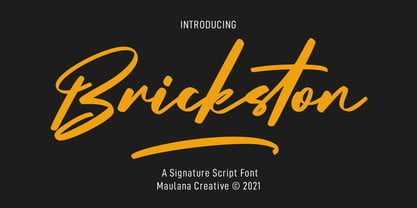 Brickston is a Fancy casual signature script font. With regular contrast stroke, slanted and fun character with a ligatures and extra swash plus a bit lowercase alternates. To give you an extra creative work. Brickston font support multilingual more than 100+ language. This font is good for logo design, Social media, Movie Titles, Books Titles, a short text even a long text letter and good for your secondary text font with sans or serif. Make a stunning work with Brickston font. Cheers, MaulanaCreative
 - Spacerace by Joe Hewitt Design,
$11.99 Spacerace is here to infuse a touch of the future into your projects. It is a modern, clean, multi-weight typeface heavily inspired by Science Fiction. It brings a sleek aesthetic to various design projects and conveys a sense of competition and progress. The geometric elements give the impression of space and exploration. Most glyphs have 'sliced through' alternatives for you to mix and match with the standard style. Available in Light, Regular, Medium, Semibold and Bold weights, all with matching oblique versions.
 - Yassitf by Ingrimayne Type,
$6.00 Yet another san serif typeface, Yassitf is a generic sans, a font meant to blend in rather than stand out. It has little contrast and is almost monoline. It includes three widths: condensed, narrow, and regular. The widths have four to six weights: ultra thin, thin, light, plain, bold, and extra bold. Further, each width and weight combination has both upright and italics styles. The thirty fonts in the family contain several open-type features, including both proportional and tabular (monospaced) numbers.
 - Solaris by Ultramarin,
$40.00 Solaris is a sans serif or a grotesque as we still call it where I come from. (it is an old term which means strange compared with Roman which was the normal font) The face is an open sans, which means that the round signs take the air into the form, minuscule d is drawn kind of backwards like in Gill Sans, which sets off on minuskel a. Here is the Regular version, with a slightly difference between stems and hairlines.
 - Buche by Factory738,
$15.00 Buche - a brief introduction Buche is a contemporary serif font designed for logo and brand design. It exudes an air of affluence and sophistication, despite its curvy appearance. The ligature fonts will come in handy for whatever your imagination can think up! 6 Weights & 2 Styles (Regular & Italic) Basic Latin A-Z and a-z Numerals & Punctuation Stylistic Ligatures Multilingual Support for ä ö ü Ä Ö Ü ... Free updates and feature additions Thanks for looking, and I hope you enjoy it.
 - Sonetto by TupiType,
$33.00 Sonetto is a typeface designed for the making of poetry books comprised of two styles: Regular, for setting prose, and Italic for verses. It is the result of a typographical exploration carried out at the UBA Type Design Master’s which sought to relate italics and cursive italics. Initial drawings were based on Griffo’s italics and early 16th century italian manuscripts that showcased connections between letters. Sonetto is in fact a historical revival, not of a particular style, but rather of a broader concept.


