10,000 search results
(0.089 seconds)
- ITC Weber Hand by ITC,
$40.99LisaBeth Weber's eponymous typeface ITC Weber Hand is deceptively simple-looking. It's a handwriting face in a light, monolineal style with a slightly formal, almost angular appearance. Weber, who is an accomplished singer/songwriter as well as an artist and lettering artist, says she has always had an inherent sensibility with lettering." Her favorite subject in the first grade was penmanship, and when, as an adult, she got her first checkbook, "I thought it was very unfair that the signature always had to be consistently the same." She describes Weber Hand as "a natural progression of my handwriting style, a friendly and versatile font." Its letterfit is naturally loose, and it shows its character best when set with ample leading. In 1999, when LisaBeth Weber's ITC Weber Hand™ typeface was released, it soon became one of ITC's most popular handwriting fonts. A decade later she decided that is was time to update her single-weight design. A light weight would benefit from a bold companion, in addition to condensed variations for much greater versatility. This warm, friendly, and charming design is just as at home in Restaurant menus as it is in brochures, for advertising, and on packaging. With the new weights ITC Weber Hand will surely continue to be a popular handwriting type with broad appeal." - Cardiff - Unknown license

- Tall Tales by Comicraft,
$39.00 In a World where no stories are small stories... In a Land where words need to be Bold, Meaningful and maybe even Italic... Comes a font worthy of telling Marvelous Tales some thought Too Tall, Too Astonishing to be told... And when those Untold Stories, those Astounding Tall Tales, are finally told... THAT WORLD WILL NEVER BE THE SAME AGAIN! From Visionary Font Director John Roshell and the Studio that brought you BlahBlahBlah, you must not miss TALL TALES! In theaters and Streaming now.
 - Streetwise buddy - Unknown license

- Bologna by David Turner,
$35.00 Inspired by pointed pen calligraphy and modulated sans serif typefaces used for advertising in the 1920´s, Bologna is a high contrasted sans serif with a modern and fashionable look. Bologna comes in three weights: Regular, Bold and Black. The Regular and Bold weights are, despite of their high contrast, also build for body texts. Whereas Bologna Black, with a more expressive look and sharp angles, is specially designed for large and striking headlines, packaging or identities. Overview: 3 weights - Regular, Bold, Black Regular/Bold: 657 Glyphs Black: 871 Glyphs Lining, tabular and old style figures Ligatures: fl, fi, ff, ffi ffl, Unicase Letters: a, e, m, n, r Alternative Guillemets Case Sensitive Arrows Bologna Black: hairline accents and interpunctations Fractions Extended Language Support Stylistic Sets: ss01 = Alternative Guillemets / Alternative y ss02 = Unicase glyphs ss03 = Numerals in circle ss04 = Numerals in black circle ss05 = Hairline Accents and Interpunctations (Bologna Black)
 - Evil Doings by Comicraft,
$19.00 In isolated Eastern European states, atop cold castle towers, nefarious nonbelievers are discussing their diabolical devises with their minions, acolytes and sweet little Yorkshire terriers! Evil Doings is a font that gives form to the softly spoken schemes and terrifying tweets of these psychopaths, sociopaths and just plain naughty boys and girls. Will Good Triumph and Defeat the EvilDoings of EvilDoers?! Only if we listen to the cries of the oppressed proletariat and quash the devilish dreams and evil schemes of Fascist Dictators EVERYWHERE! Features: Four fonts (Regular, Italic, Bold & Bold Italic) with upper and lowercase characters. Includes Western European international characters.
 - Lexia - Unknown license

- Inverness by Red Rooster Collection,
$45.00 In the 1930s, it was popular to take day-trips by train to the seaside in the British Isles. Many posters were designed by the various regions to advertise these excursions; it is from one of these posters that Inverness was created.
 - Beverage Stencil JNL by Jeff Levine,
$29.00 The brand marking on a vintage wooden shipping case for bottles of Mission Naturally Good Orange Soda inspired Beverage Stencil JNL, which is available in both regular and oblique versions. Mission was a popular soda in California from about 1929 through 1970.
 - Aesthico by Heinzel Std,
$16.00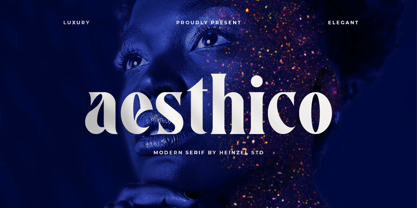 Aesthico is modern, elegant, fashion serif font inspired by a popular magazine logo. Aesthico is great for headlines, logos, covers, posters and other creative designs. This font is PUA encoded which means you can access all of the amazing glyphs with ease!
 - Stone Print by Stone Type Foundry,
$54.00 Stone Print is a "green" typeface. It uses less space than the most popular text typefaces without sacrificing legibility. Made for the reader, the environment, and whoever pays the bills. Together with Cycles, SFPL, and Arepo it makes up a superfamily of typefaces.
 - Good Vibrations by TypeSETit,
$24.95 A beautifully flowing script with casual uppercase forms combined with more formal lowercase letters. Good Vibrations Pro is an extension of this popular font. Over 400 glyphs, with character sets for European languages. OpenType features include smooth connecting ligatures and alternate characters.
 - Folio by Bitstream,
$29.99Designed by Konrad Bauer and Walter Baum in 1956, Folio was the first popular Swiss Sanserif; the positive black shapes of the letters appear to be locked inevitably into the correct position by the firm and positive white shapes that surround them. - Kids Yock by PizzaDude.dk,
$20.00 Kids Yock is an updated and cleaner version of my popular comic font Kids Rock. Even though this font is more steady and clean, I did my best to keep the characteristics of the original font, which includes influences from grafitti and comics.
 - Kolesom by Frantic Disorder,
$12.00 Kolesom is bold display font that inspired from classic rusty stuff like old signage and poster. This typeface has various styles of font that includes Clean, Alt, Texture, and Western. I found it perfect for poster design, t-shirt design, and other display design needs. Works best in 100pt and above.
 - RM Signwriter by Ray Meadows,
$19.00 Inspired by the signwriting on traditional old canal boats in the UK, this bold, block serif design has many potential uses. Due to the modular nature of this design there may be a slight lack of smoothness to the curves at very large point sizes (around 100 pt and above).
 - AZ Script by Artist of Design,
$25.00 AZ Script font was inspired from a need to have a "worn look" on bold headline script of letters This font utilizes an "old look" to the line work which is designed to have a "worn feel" to it. Ideal for use as headline or sub-head text in you design.
 - Aviel - 100% free

- TOY_SOLDIERS - Personal use only

- FLUID - Personal use only

- Octava by ParaType,
$30.00 PT Octava™ was designed at ParaType in 2001 by Vladimir Yefimov. The first (Cyrillic only) version named Scriptura Russica (1996) consisting of three styles (book, italic, bold) was commissioned by the Russian Bible Society. Lately the Latin letters and bold italic were added. Inspired by Lectura, 1969, by Dick Dooijes and Stone Print, 1991, by Sumner Stone. In spite of large x-height the typeface is both space saving and quite legible at small sizes. Expert fonts including small caps (book) and old style figures are available.
 - Alathena by Studio Sun,
$20.00 Alathena was inspired by the French art decade between art nouveau to art deco, comes with 2 style, Alternative swash and Modern deco, with some modified ligatures. Available with 6 Weights, Thin, Extra Light, Light, Regular, Bold, Extra Bold with support 75+ language (Latin Pro), and contains OpenType features. - Matching small caps for all weights. - Old Style Figure. - Full "f" Ligature set. - 20+ Optional (discretionary) ligatures. - Over 400+ Swash Characters. - Automatic Fractions. - Automatic Ordinals. - Extended language support for most Latin-based Western and Central European languages, including all the swash and alternate characters.
 - Claremont by Red Rooster Collection,
$45.00Claremont is a serif font family designed by Les Usherwood (Typsettra). Usherwood originally created four weights – a light, extra bold, light italic, and extra bold italic. Paul Hickson (P&P Hickson) and Steve Jackaman (ITF) digitized the family and created eight new weights, and it was released exclusively for the Red Rooster Collection in 1993. Claremont shares similarities to Bookman Old Style, but also shares properties with slab serif Egyptian-style typefaces. Like all Usherwood typefaces, the family was engineered with great care for maximum legibility and aesthetics. ©1993. International TypeFounders, Inc. - Nelson by Laura Worthington,
$25.00 Evocative of paint on weathered wood, Nelson’s engraved capital letters are as rustic and confident as the Old West. Combine the engraved face with bold and rough versions to create handsome wordmarks, or use Nelson to captivate customers of food packaging, restaurant menus, and roadside attractions. See what’s included! Engraved • Ornaments • Rugged • Bold *NOTE* Basic versions DO NOT include swashes, alternates or ornaments These fonts have been specially coded for access of all the swashes, alternates and ornaments without the need for professional design software! Info and instructions here: http://lauraworthingtontype.com/faqs/
 - Roman Caps - Unknown license

- onakite - Unknown license

- Straker by Device,
$29.00 Straker is named after the beige Nehru-collared commander in Gerry Anderson's masterpiece, UFO.
 - Bembo MT by Monotype,
$45.99 The origins of Bembo go back to one of the most famous printers of the Italian Renaissance, Aldus Manutius. In 1496, he used a new roman typeface to print the book de Aetna, a travelogue by the popular writer Pietro Bembo. This type was designed by Francesco Griffo, a prolific punchcutter who was one of the first to depart from the heavier pen-drawn look of humanist calligraphy to develop the more stylized look we associate with roman types today. In 1929, Stanley Morison and the design staff at the Monotype Corporation used Griffo's roman as the model for a revival type design named Bembo. They made a number of changes to the fifteenth-century letters to make the font more adaptable to machine composition. The italic is based on letters cut by the Renaissance scribe Giovanni Tagliente. Because of their quiet presence and graceful stability, the lighter weights of Bembo are popular for book typography. The heavier weights impart a look of conservative dependability to advertising and packaging projects. With 31 weights, including small caps, Old style figures, expert characters, and an alternate cap R, Bembo makes an excellent all-purpose font family.
 - Bembo Infant by Monotype,
$45.99The origins of Bembo go back to one of the most famous printers of the Italian Renaissance, Aldus Manutius. In 1496, he used a new roman typeface to print the book de Aetna, a travelogue by the popular writer Pietro Bembo. This type was designed by Francesco Griffo, a prolific punchcutter who was one of the first to depart from the heavier pen-drawn look of humanist calligraphy to develop the more stylized look we associate with roman types today. In 1929, Stanley Morison and the design staff at the Monotype Corporation used Griffo's roman as the model for a revival type design named Bembo. They made a number of changes to the fifteenth-century letters to make the font more adaptable to machine composition. The italic is based on letters cut by the Renaissance scribe Giovanni Tagliente. Because of their quiet presence and graceful stability, the lighter weights of Bembo are popular for book typography. The heavier weights impart a look of conservative dependability to advertising and packaging projects. With 31 weights, including small caps, Old style figures, expert characters, and an alternate cap R, Bembo makes an excellent all-purpose font family. - Little Brownie by The Ocean Studio,
$10.00 Little Brownie is playful font family which puts a smile on your projects and will inspire you to create something fun and memorable. It is perfect for headings, flyer, greeting cards, product packaging, book cover, printed quotes, logotype, apparel design, album covers, etc. Features: – Multilingual Support – PUA Encoded – Numerals and Punctuation Thank you for downloading from Ocean Stud.
 - Keynote Speaker NF by Nick's Fonts,
$10.00This curious little gem is patterned after a typeface named "Bloomsbury", released by P. M. Shanks & Sons, Ltd. of London in the 1920s. Its gentle curves and somewhat quirky construction combine to create a warm and friendly, if slightly offbeat, antique charm. Both versions of the font include 1252 Latin, 1250 CE (with localization for Romanian and Moldovan). - BPmono - Unknown license

- Amico by Hackberry Font Foundry,
$24.95 This is a new barely modulated, slightly narrow, sans serif font family. It has eight styles: thin, thin italic, regular, italic, bold, bold italic, black, & black italic grouped into two 4-font families: Amico Thin with the Bold; and Amico with the Black. Amico has the standard feature set developed at the end of 2007. It has many OpenType features and 654 character/glyphs: Caps, lower case, small caps, ligatures, discretionary ligatures, swashes, small cap figures, old style figures, numerators, denominators, accent characters, ordinal numbers (1st-infinity): lining and oldstyle), and so on. It is designed for text use in body copy. However, Amico really shines as the choice for heads & subheads when using Amitale or Brinar for the text family.
 - Cervo Neue Condensed by Typoforge Studio,
$29.00 Cervo Neue Condensed is the new perfected and Condensed version of Cervo Neue, containing 18 variants. It differs from the previous version of Cervo with the higher accents over glyphs, enlarged punctuation, old-style numerals and the newly added varieties Semi Bold, Bold, Extra Bold and Black. Additionally, there is the variety of grotesque. Font Cervo is inspired by a “You And Me Monthly” published by National Magazines Publisher RSW „Prasa” that appeared from Mai 1960 till December 1973 in Poland. Recently, Cervo Neue Condensed has started being used as a display text in „Przekrój Magazine” which was published in years 1945–2013 in Krakow (2002–2009 in Warsaw) as a weekly and again from 2016 as a quarterly journal in Warsaw.
 - Bodebeck by Linotype,
$29.99 The Swedish designer/typographer Anders Bodebeck designed the Bodebeck type family in 2002. The family, which includes five different styles, is primarily intended for use as a titling, or display face, and belongs to the neo-transitional style of typefaces. Transitional style type first appeared in England during the late 1750s, when John Baskerville released his first sets of type. Bodeck bears similarities to another, later transitional style typeface as well - Eric Gill's Perpetua (originally released by the British Monotype Corporation in 1928). Like these two previous English stonecutters turned masters of typography, Anders Bodebeck has given us a modern re-interpretation of classic letterforms. Bodebeck, which is fitted with old style figures, is available in the following styles: Regular, Italic, Bold, Bold Italic, and Extra Bold."
 - WC_AquaBlues_Bta - Unknown license

- Covington - Unknown license

- Plasmatica - Unknown license

- As an encouraging and helpful artist, let me introduce you to the intriguing world of the font known as STR, a creation that stands out for its unique characteristics and the purpose it serves within...
- Shelf Tags JNL by Jeff Levine,
$29.00 Before the mid-to-late 1970s, when retailers started to embrace UPC (universal price code) technology on a grand scale, pricing merchandise took on many forms. One method especially popular with variety stores (such as Woolworth's, McCrory's, Kress, etc.) were pre-printed price tags that came in small pads and were inserted into metal holders. Shelf Tags JNL recreates a vintage price tag based on examples seen online, and allows the user different ways to create their own vintage-style price tags. You can either utilize the round pen nib style numbers and price marks to place on any size or type tag, or type out prices using the reversed characters (white on black) along with the two end caps provided to form a complete tag unit. For the more adventurous, a complete blank tag is also provided in case the desire is to print a solid color tag background and [using the regular numbers] crate prices in custom colors. Two sets of smaller number (for "floating" cents prices) are also provided in regular numbers and reverse panels. As an extra bonus, there is a set of 1 through zero, dollar sign, cents sign and decimal point individual black-on-white outlined panels for making individual pricing numbers. The keyboard layout for the various characters is as follows: asterisk key - regular cents sign (no panel) dollar sign key - regular dollar sign (no panel) period key - regular decimal point (no panel) left and right parenthesis keys - panel end caps (to form price tags) colon key - reverse decimal point on black panel 1 thru 0 keys - regular numbers (no panels) A through J keys - small regular numbers (no panels) K and L keys - truncated [shorter width] end caps M through Y keys - individual price numbers (black on white with black border a through j keys - reverse numbers on black panels k key - reverse dollar sign on black panel l key - reverse cents sign on black panel m through v keys - reverse small numbers on black panels w through z keys - blank rectangular panels of varying widths equal sign key - full black panel price tag hyphen key - blank rectangular black panel based on the width of most number panels


