10,000 search results
(0.036 seconds)
- Bloery by Runsell Type,
$20.00 Bloery is a neo grotesque font modified with extended proportion. Comes with a modern look, this font suitable for display and body text. Bloery is a good choice for editorial design, branding, app design and web design. Comes with 7 weights from Thin to Bold with each matching Italic. Contain several OpenType features: Stylistic Alternates and Figures Variation (fraction, tabular lining, numerator, denominator). Each style includes 540+ glyphs supporting all western, eastern and central european languages (over 200 languages supported).
 - Begonia by Grontype,
$14.00 Description: Begonia is an unique bold with curve and pointy edge style font, inspired from begonia flower that traditionally symbolic of uniqueness, harmony, gratitude, or caution, which is make this font has its own characteristic. Begonia is all-caps font equipped with extra ligatures and alternates. Begonia is perfect for branding, text header, t-shirt design, logotype and other stunning graphic design. Begonia Features: Uppercase glyphs Lowercase glyphs Numeral and Punctuations Currencies Standard Ligatures Stylistic Alternates Thankyou for choosing this font Regard, Grontype
 - Kasa Green by Maulana Creative,
$11.00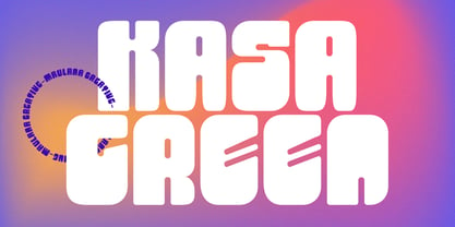 Kasa Green is a fancy handwritten script font. With bold contrast stroke, fun character with a bit of ligatures and alternates. To give you an extra creative work. Kasa Green font support multilingual more than 100+ language. This font is good for logo design, Social media, Movie Titles, Books Titles, a short text even a long text letter and good for your secondary text font with sans or serif. Make a stunning work with Kasa Green font. Cheers, Maulana Creative
 - Squiborn by Letterhend,
$14.00 Squiborn is a hand drawn display font with bold and strong feel. This font perfectly made to be applied especially in logo, and the other various formal forms such as invitations, labels, magazines, books, greeting / wedding cards, packaging, fashion, make up, stationery, novels, labels or any type of advertising purpose. We highly recommend using a program that supports OpenType features and Glyphs panels like many of Adobe apps and Corel Draw, so you can see and access all Glyph variations.
 - Hollow Mummy by Attype Studio,
$10.00 Hollow Mummy is a bold and authentic display font. Add this font to your creative and spooky ideas and notice how it will make them stand out! Hollow Mummy is perfect for branding, logo, invitation, stationery, social media post, product packaging, merchandise, blog design, game titles, cute style design, Book/Cover Title and more. What's Included : - hollow mummy (.otf) - hollow mummy display (.otf) - Multilingual Support (Afrikaans, Albanian, Catalan, Danish, Dutch, English, Estonian, Finnish, French, German, Icelandic, Italian, Norwegian, Portugese, Spanisch, Swedish, Zulu)
 - Retro Feeling by Prestige Artsy Studio,
$12.00 Retro Feeling is a bold and beautiful retro font that will take you back in time. It features a unique italic font that adds a touch of elegance to any design project. Perfect for vintage-themed designs. Retro Feeling will give your project a distinct and timeless look. Its versatility and elegance make it perfect for various design uses, from logos, posters, and display headlines to packaging and branding materials. Bring the retro vibe to your design project with Retro Feeling!
 - Hookypilots by Maulana Creative,
$12.00 Hookypilots Unique Handwritten Font Hookypilots is an expressive slanted handwritten display font. With bold stroke, fun character with a bit of ligatures and alternates. To give you an extra creative work. Hookypilots font support multilingual more than 100+ language. This font is good for logo design, Social media, Movie Titles, Books Titles, a short text even a long text letter and good for your secondary text font with sans or serif. Make a stunning work with Hookypilots font. Cheers, MaulanaCreative
 - Glendale by Sarid Ezra,
$15.00 Introducing, Glendale - an extreme expanded sans family! Glendale is a basic sans font with unique lowercase form. With expanded lowercase, this font will standout and make a great choice for your next project! The important things is, you can access the special features with any software. You can use this font for any designs. Cool for logos and powerful for posters! With light, regular, and bold version, you can make your headline text more standout! This font also support Multi Language.
 - Railstone by Maulana Creative,
$14.00 Railstone is a quirky handwritten font. With sharp bold stroke, slanted, tight spacing and fun character with a bit of ligatures and Capital "R" & "L" alternates. To give you an extra creative work. Railstone font support multilingual more than 100+ language. This font is good for logo design, Social media, Movie Titles, Books Titles, a short text even a long text letter and good for your secondary text font with sans or serif. Make a stunning work with Railstone font. Cheers, MaulanaCreative
 - Linotype Bariton Paneuropean by Linotype,
$92.99Linotype Bariton is part of the Take Type Library, chosen from contestants of Linotype's International Digital Type Design Contests of 1994 and 1997. Designer Alexei Chekulayev designed his font in one weight to mirror the Zeitgeist of the early 1930s. The characters of this extremely bold font are based on the form of a rectangle though its rounded edges soften its look a bit. Linotype Bariton should be used only in larger point sizes in headlines which should really catch the eye. - Antagonist by Haksen,
$20.00 Antagonist is a Bold elegant modern vintage serif style with upper and lowercase feel nice balanced. Its wide range of uppercase and lowercase alternates allow versatile design options and works perfectly for headlines, logos, posters, packaging, T-shirts, postcards and much more. Recommended to use in Adobe Illustrator or Adobe Photoshop with opentype feature. How to access Alternate Characters? Open glyphs panel : In Adobe Photoshop choose tool Window glyphs In Adobe Illustrator choose tool Type glyphs Have a great day, Haksen
 - Matricule 57 by designdefontes,
$24.00 Matricule 57 is a typeface whose design is inspired by license plates and by the deformations due to the stamping in the metal plates. These deformations give a very specific style, especially concerning the hairlines. It is the Condensed version of Matricule, a Typeface designed by Loïc Choquet. It consists of 4 fonts : Light, regular, bold and black. For Mac or PC. Well-suited for edition, logotypes, posters, etc. Each font contains 359 glyphs and supports up to 89 different languages.
 - Afons Infant by Andy Peat,
$9.00 About this font family Afons Infant has been designed for children’s storybooks; using round, single-decker letter forms to create simple, clear and readable stories that children are familiar. Features 5 weights (from thin to bold) Multi language Lowercase Numerals to blend with text Ligatures To be able to access alternative fonts, make sure the software you use can support opentype features such as Microsoft Word, Paint, Adobe, Corel draw and other applications. Designed and published by Andy Peat. Released April 2022
 - Snow Blue by Girinesia,
$17.00 Hello guys... We proudly presenting our new font. It's name SNOW BLUE. SNOW BLUE is modern display font. SNOW BLUE is a bold decorative font perfect for your celebration party like Halloween, Chrismast or New Year. SNOW BLUE would perfect for Titles for kid`s book, scrapbook, logo, icon, phrases or quotes for winter greeting cards ( Halloween, Christmas or New Year holidays), photo overlay, short phrases, children’s book, gift shops tag, presentation in social media Pinterest, Instagram, Facebook or others.
 - Morgalina Vintage by Agny Hasya Studio,
$12.00 Morgalina Vintage Is a Serif Display Font With a Retro Vintage Style Bold Typeface, Modern Classic Yet Decorative. It Comes in 2 (Two) Styles (Regular and Italic) Including Slants, and Is Created With Stylistic Alternatives and Ligatures. Featured With Uppercase and Lowercase, Numeral and Punctuation, Multilingual Support, and Opentype Features. Perfect for Your Design Projects Like Logos, Branding, Advertising, Product Designs, Stationery, Magazine Designs, Book/Cover Title Designs, Photography, Art Quotes, Wedding Designs, Fashion Designs, Special Events, Labels, Product Packaging, and More.
 - Aden by Sultan Fonts,
$19.99 Aden is An Arabic typeface for desktop applications. Aden is Modern typeface style. The font comes in two styles: normal and bold. The design is open, calligraphic, and very dynamic. This makes it suitable for large display sizes, especially in the area of advertising, while still functioning well as a text face. The font includes a matching Latin design and support for Arabic. It also includes proportional and tabular numerals for the supported languages. Aden typeface comes with many opentype features.
 - Mysterio by PandAE86,
$10.00 Hello, Mysterio fun font is sans serif font. It brings joyful and happiness to all of us. Inspired by handlettering with marker pen with bold and strong style. This font is ideal for display, text, print, branding, birthday, birthday invitation, with a set of optimal characters for your design in any layout. Happy Design What will you get ? OTF and TTF file formats Uppercase Lowercase Numeral Punctuation Ligatures Multilingual characters support Thank you and have a nice day ! Dedi T A
 - Boniksun by Alit Design,
$14.00 "BONIKSUN Typeface" is a modern sans serif font that comes in a variety of weights, ranging from Thin to Heavy. It has a high body, making it easy to read even in small sizes. The font includes 572 glyphs, which allow for a wide range of typographic possibilities. In addition to the regular weight, "BONIKSUN Typeface" also includes a condensed version, which is ideal for situations where space is limited. The font supports Private Use Area (PUA) encoding, allowing you to access special characters and symbols that are not available in standard character sets. Overall, "BONIKSUN Typeface" is a versatile font family that can be used in a variety of design contexts, from branding and advertising to editorial and web design. Its clean and modern aesthetic make it a popular choice for designers looking for a fresh and contemporary look. Language Support : Latin, Basic, Western European, Central European, South European,Vietnamese. In order to use the beautiful swashes, you need a program that supports OpenType features such as Adobe Illustrator CS, Adobe Photoshop CC, Adobe Indesign and Corel Draw. but if your software doesn't have Glyphs panel, you can install additional swashes font files.
 - Lionheart by Canada Type,
$24.95Lionheart is the digitization and expansion of Saladin, a neo-gothic typeface designed by Friedrich Poppl, long after he established himself as one of the greatest German designers of all time with some of the most “ausgezeichnet” scripts and text faces to ever come out of Europe. This typeface, though lesser-known among Poppl’s other masterpieces, was one of the first in its genre to abandon blackletter influence and attempt letter variations based strictly on Roman alphabet shapes. Poppl’s idea spawned a whole generation of neo-gothics that can now be found on many a movie poster or book cover where the design must hint at secrets and dark sides. Lionheart succeeds with the idea of gradual curves leading to sharp concave or plano-concave terminals, to effectively build serious letter forms that speak of historical mystique and mystery. This font was was named after Richard I, King of England for a decade in the late 11th century. He reportedly exchanged many gifts of respect with Saladin, even though the two kings were on different sides of the Crusades. Lionheart comes in all popular font formats, with some alternates placed in accessible cells of the character set. - Novare by Alit Design,
$15.00 "NOVARE Typeface" is a modern sans serif font that comes in a variety of weights, ranging from Thin to Heavy. It has a high body, making it easy to read even in small sizes. The font includes 600 glyphs, which allow for a wide range of typographic possibilities. In addition to the regular weight, "NOVARE Typeface" also includes a condensed version, which is ideal for situations where space is limited. The font supports Private Use Area (PUA) encoding, allowing you to access special characters and symbols that are not available in standard character sets. Overall, "NOVARE Typeface" is a versatile font family that can be used in a variety of design contexts, from branding and advertising to editorial and web design. Its clean and modern aesthetic make it a popular choice for designers looking for a fresh and contemporary look. Language Support : Latin, Basic, Western European, Central European, South European,Vietnamese. In order to use the beautiful swashes, you need a program that supports OpenType features such as Adobe Illustrator CS, Adobe Photoshop CC, Adobe Indesign and Corel Draw. but if your software doesn't have Glyphs panel, you can install additional swashes font files.
 - Decora Arabic by Naghi Naghachian,
$65.00 Decora Arabic is a new creation of Naghi Naghashian. Decora Arabic's design fulfills the following needs: A. Explicitly crafted for use in electronic media fulfills the demands of electronic communication. A modern interpretation of Naskh which was invented as calligraphic style by Ebn Moghleh, a Persian savant in ninth century. This script is the most widely used and its popularity has increased through the centuries. Most recently, it has served as a basis for the typefaces that are in use today. B. Suitability for multiple applications. Gives the widest potential acceptability. C. Extreme legibility not only in small sizes, but also when the type is filtered or skewed, e.g., in Photoshop or Illustrator. Decora Arabic's simplified forms may be artificial obliqued in InDesign or Illustrator, without any loss in quality for the effected text. D. An attractive typographic image. Decora Arabic was developed for multiple languages and writing conventions. Decora Arabic supports Arabic, Persian and Urdu. It also includes proportional and tabular numerals for the supported languages. E. The highest degree of calligraphic grace and the clarity of geometric typography. This typeface offers a fine balance between calligraphic tradition and the Roman aesthetic common in Latin typography.
 - Salome by Canada Type,
$24.95 Salome is a revival, normalization and elaborate expansion of a 1972 film face called Cantini. The original film type, released by a tiny independent outfit called Letter Graphics, looked like it was hand drawn with little consideration for consistency in essential lettering flow measurements, like angles, stroke widths, and vertical metrics. All these issues have been resolved in this digital version, and the original character set, including the whole lot of alternates, was entirely redrawn and expanded to include even more alternates and many useful ligatures, as well as extended support for Latin-based languages. Combining elements of early 20th century art nouveau with common 1960s and 1970s signage and poster lettering flair, Salome uses curls and curves to wave its fantastic shapes in a most hypnotic dance. Salome simply cannot be unseen. Just like its namesake, the female seduction icon, it does not hesitate to put all of its natural beauty and energy on display in order to get what it wants. Salome comes in all popular font formats. The OpenType version, Salome Pro, combines the main font with the alternates one, and contains convenient features for push-button alternation and ligature substitution in supporting software programs.
 - PF Mellon by Parachute,
$35.00 PF Mellon is a modernist variable grotesque with mixed roots. Its unconventional aesthetic is the product of an exploration into the art of emphasizing titles, headlines and text in captivating and unpredictable ways. Contrary to conventional practices of highlighting text with heavier weights, PF Mellon proposes an intriguing new scheme based on striking and attention-grabbing compositions of narrow and extended letterforms- even when set in lowercase. Part geometric and part grotesque, PF Mellon’s expressionist alphabet and extravagant style challenge conventions of visual culture in an Art Deco-like manner. PF Mellon’s rebellious idiosyncrasy takes its cues from the eccentric personality of our popular PF Venue, an earlier geometric sans serif characterized by its daring combinations of non-uniform structures. PF Mellon’s basic design skeleton was influenced by nineteenth and early twentieth century condensed sans serif typefaces such as Stephenson Blake's Grotesque No.77 and ATF’s Alternate Gothic, adding an extra contrast to the thickness of strokes. PF Mellon is also available as a variable font format which you may request it free of charge from Parachute® once you purchase the whole type family.
 - Brostel by Alit Design,
$16.00 "BROSTEL Typeface" is a modern sans serif font that comes in a variety of weights, ranging from Thin to Heavy. It has a high body, making it easy to read even in small sizes. The font includes 502 glyphs, which allow for a wide range of typographic possibilities. In addition to the regular weight, "BROSTEL Typeface" also includes a condensed version, which is ideal for situations where space is limited. The font supports Private Use Area (PUA) encoding, allowing you to access special characters and symbols that are not available in standard character sets. Overall, "BROSTEL Typeface" is a versatile font family that can be used in a variety of design contexts, from branding and advertising to editorial and web design. Its clean and modern aesthetic make it a popular choice for designers looking for a fresh and contemporary look. Language Support : Latin, Basic, Western European, Central European, South European,Vietnamese. In order to use the beautiful swashes, you need a program that supports OpenType features such as Adobe Illustrator CS, Adobe Photoshop CC, Adobe Indesign and Corel Draw. but if your software doesn't have Glyphs panel, you can install additional swashes font files.
 - Sweet Gothic by Sweet,
$39.00 Sweet Gothic is a 2009 addition to the Sweet Collection of engraved lettering styles from the 20th Century. Sweet Gothic Light is closely based on lettering from an engravers pattern from the early 1900s that was used for tracing letterforms with the engraving machine (pantograph) to make steel engraving plates. The design is related to many similar engravers gothics developed in the early 1900s, but as each engraving house created by hand their own patterns for popular styles of the time, there is variation among the models. Sweet Gothic offers contrast in stroke weight and its unique personality. The bolder weights are new designs, based on the characteristics of the Light. A serif variant (Sweet Gothic Serif) has also been developed to expand the usefulness of the family, offering an alternative to Copperplate Gothic. As such, most of the fonts are new designs, yet may seem familiar and ubiquitous given their model. The fonts offer two sizes of figures and monetary symbols: one set is intended for use with upper- and lowercase settings; the second set is the same height as the small caps.
 - Hortensia by Canada Type,
$24.95 Hortensia, designed around 1900 by Emil Gursch for his own Berlin foundry, is a typeface most expressive of the post-Victorian aesthetic that was all the rage in both Europe and America during the second half of the 19th century and up until the Great War. It is a reduced aesthetic of sharp points and natural curves that almost want to apologize for their own elegance, but clearly embody the simple excitement about the blossoming of industry and crafts during the period. This deco script trend would get a re-run for about a decade on either side of the second World War — especially in the entertainment and financial industries — before giving way to art nouveau and big brush faces. Hortensia was Gursch's most popular typeface, used extensively and prominently in many beautiful type catalogs, and a commonly seen design element in Germany for quite a while after its release. This digital version brings plenty of fixes and additions to the original metal Hortensia design, including many alternates sprinkled throughout the character set, and support for a wide range of Latin-based languages (including Central European, Baltic, Turkish and Welsh).
 - Parvin by Naghi Naghachian,
$95.00 Parvin is a new creation of Naghi Naghashian. Parvin design fulfills the following needs: A. Explicitly crafted for use in electronic media fulfills the demands of electronic communication. A modern interpretation of Naskh which was invented as calligraphic style by Ebn Moghleh, a Persian savant in ninth century. This script is the most widely used, and its popularity has increased through the centuries. Most recently, it has served as a basis for the typefaces that are in use today. B. Suitability for multiple applications. Gives the widest potential acceptability. C. Extreme legibility not only in small sizes, but also when the type is filtered or skewed, e.g., in Photoshop or Illustrator. Parvin's simplified forms may be artificial obliqued in InDesign or Illustrator, without any loss in quality for the effected text. D. An attractive typographic image. Parvin was developed for multiple languages and writing conventions. Parvin supports Arabic, Persian and Urdu. It also includes proportional and tabular numerals for the supported languages. E. The highest degree of calligraphic grace and the clarity of geometric typography. This typeface offers a fine balance between calligraphic tradition and the Roman aesthetic common in Latin typography.
 - VLNL Bint by VetteLetters,
$35.00 Kornelis de Vries, a headmaster from the Dutch province of Friesland, cultivated new potato breeds that he named after pupils in his school. In the early 1900s he came up with the tasty Bintje (a Frisian girl’s name) and it became a big success – in Belgium and France it has remained the most popular potato for french fries to this day, more than a century since its introduction. Donald Roos took 10 kilos of fresh Bintje potatoes and cut the Bint typeface by hand with a short, sharp knife. He then inked each character once and printed it twice; the second, lighter printing is accommodated in the lower case alphabet. The Bint family offers a script to make the letters bounce up and down the baseline; with OpenType functionality the font randomly chooses each character from the upper- or lowercase alphabet. ‘Tabular lining figures’ will activate a series of negative numerals in boxes; ‘Discretionary ligatures’ activates specially designed letter combinations like ‘www’ as well as arrows and stars. Bint has a distinct, slightly rough handmade appearance, making it useful for a wide range of designs.
 - Katz Pajamas JNL by Jeff Levine,
$29.00 According to Wiktionary, "the cat's pajamas" was a slang phrase coined by Thomas A. Dorgan, the well-known journalist, cartoonist and sportswriter of that era. The phrase became popular in the U.S. in the 1920s, as the word "cat" was used as a term to describe the unconventional flappers from the jazz era. This was combined with the word pyjamas (a relatively new women's fashion during that time) to form a phrase used to describe something that is the best at what it does, thus making it highly sought and desirable. Wikipedia adds that Dorgan was the first to use the terms "twenty-three, skidoo", and "yes, we have no bananas", "apple sauce" and "solid ivory", which also became part of the slang of the "Roaring Twenties". Katz Pajamas JNL is a condensed slab serif typeface based on the title lettering for the 1944 sheet music "Pretty Kitty Blue Eyes", hence the pun-laden font name paying homage to this bit of verbal Americana as well as making the pajamas a pair owned by Mr. Katz instead of the fashionable feline. Available in both regular and oblique versions.
 - Strawberry Junkies by Yumna Type,
$15.00 Choosing the right display font can make your designs look more attractive and stunning, so that your designs gain more popularity. This is the Strawberry Junkies for you. It is a rather circled display font of which prone circled letters express soft, fun nuances in order that the company becomes more easily recognized by customers and audience. This font’s main characters are the consistent geometry, proportion, and line thickness on every letter to make it legible for big text sizes. In addition, Strawberry Junkies provides an extra clipart as a special bonus. Furthermore, you can enjoy the available features here. Features: Multilingual Supports PUA Encoded Numerals and Punctuations Strawberry Junkies fits best for various design projects, such as brandings, posters, banners, headings, magazine covers, quotes, printed products, merchandise, social media, etc. Find out more ways to use this font by taking a look at the font preview. Thanks for purchasing our fonts. Hopefully, you have a great time using our font. Feel free to contact us anytime for further information or when you have trouble with the font. Thanks a lot and happy designing.
 - Chikita by Canada Type,
$24.95 Chikita greets you with big, happy eyes, and all the energy in the world. She wants to skip the talking and get to the dance floor, where she owns the beat and sways like a tongue of fire. She doesn't settle for anything less than everyone in the room fixating on her, and every pair of eyes is indeed happy to oblige. Being both the noumenon and phenomenon of the party, she remains in your mind long after closing time. And you just know the next time you see her your heart will skip a beat and a welcome wave of contentedness will wash over you. The Chikita design is rooted in the work of 1930s Dutch lettering artist Martin Meÿer, whose little-known work concerned itself with the beauty of letters mostly as individual forms, rather than part of a flowing alphabet. Chikita was reconceptualized to strike a great balance between singular and flowing beauties, resulting in a cheerful and very memorable expression. Chikita is available in all popular font formats, and the character sets cover a wide range of codepages, including Central and Eastern European languages, Esperanto, Turkish, Baltic, Celtic/Welsh and Vietnamese.
 - TessieOddsNends by Ingrimayne Type,
$9.00 A tessellation is a shape that can be used to completely fill the plane—simple examples are isosceles triangles, squares, and hexagons. Tessellation patterns are eye-catching and visually appealing, which is the reason that they have long been popular in a variety of decorative situations. These Tessie fonts have two family members, a solid style that must have different colors when used and an outline style. They can be used separately or they can be used in layers with the outline style on top of the solid style. For rows to align properly, leading must be the same as point size. To see how patterns can be constructed, see the “Samples” file here. TessieOddsNEnds contains shapes that did not fit into the other Tessie fonts: TessieStandingBirds, TessieFlyingBirds, TessieMoreBirds, TessieXtraBirds, TessieSpinners, TessiePuzzlePieces, TessieAnimals, TessieBugs, TessieMiscellaneous, and TessieMoreStuff. (Earlier tessellation fonts from IngrimayneType, the TessieDingies fonts, lack a black or filled version so cannot do colored patterns. The addition of a solid style that must be colored makes these new fonts a bit more difficult to use but offers far greater possibilities in getting visually interesting results.)
 - Hellschreiber by Jörg Schmitt,
$35.00 The birth of the monospaced types dates back to the past. There was a need for the creation of typesets for typewriters. The difficulty was to align the different glyphs in the same width. This led to particular problems with letters like “M” and “l”; the former seemed to be squeezed into the same width of all letters and the second one appeared way too streched. Despite – or perhaps because of – the impression of the typewriter is still popular with Graphic Designers. Nowadays there are even monospaced versions of primarily proportional types; for example the the Sans Mono designed by Lucas de Groot or the DIN Mono. Then again, why not the other way round?! In the first half of the Nineties, Erik Spiekermann developed a proportional type named ITC Officina based on the Letter Gothic. According to a survey on the 100 best fonts of all time conducted by FontShop, ITC Officina is in an eighth place, far ahead of its forerunner. This was the reason for me to create a wider design with a Serif and a Sans Serif based on the queen of all monospaced types – the Courier.
 - Blanchard by Canada Type,
$39.95 Blanchard is a revival and elaborate extension of Muriel, a 1950 metal face made by Joan Trochut-Blanchard for the Fonderie Typographique Française, that was published simultaneously by the Spanish Gans foundry under the name Juventud. Blanchard is a script that embodies the post-war narrow decorative aesthetic that would become the instantly recognizable feature of that era’s design. Its high ascenders corners make it the tuxedo of fonts, with slight and casual angles gradually revealing a trustworthy confidante, and sharp corners signaling a most expressive ally. Font. James Font. This digital version updates the original metal shapes to work within today’s design tools and designer needs. Some of the questionable metal shapes were optimized, plenty of alternates were added, and as many as five ending forms were built for most lowercase letters. Overall, this is one of the most useful packages for book cover, magazine and packaging design. Blanchard is available in all popular formats. Blanchard Pro combines all five fonts into a single one that makes use of OpenType’s cross-platform compatibility and programs that support OT’s fine typography features, like recent versions of Adobe InDesign and QuarkXpress.
 - Linotype Devanagari by Monotype,
$103.99 The new Linotype® Devanagari typeface is a traditional text face now available in five weights (from Light to Black) and suitable for a wide variety of print and digital uses. A compact design, Linotype Devanagari also provides economy of space where textual real estate is at a premium. In addition, its large character set enables the setting of Hindi, Marathi, Nepali and is suitable for Sanskrit passages. The design’s open counters ensure high levels of legibility at small sizes and at modest resolution. The history of Linotype Devanagari is quite extensive. Inspired by the late 19th and early 20th century Nirnaya Sagar designs, it was originally designed in 1977 by Mathew Carter for phototypesetting systems. It was then revised and expanded for digital typesetting by the Linotype letter-drawing studio headed by Georgie Surman under the art direction of Fiona Ross. This new, enhanced revival was designed by Lisa Timpi and Gunnar Vilhjálmsson with Fiona Ross as a consultant. This new Linotype Devanagari is part of a project to refresh the pivotal Linotype Bengali and Linotype Gujarati typefaces and make them available for the first time in the popular OpenType font format.
 - Haboro Serif by insigne,
$- The polls are in. Now here by customer request--Haboro Serif, the newest edition of the Haboro Hyperfamily. The Haboro fonts are an outstanding upstart success from the first part of 2016. Following the release of the popular Haboro, Haboro Sans and Haboro Slab have both been welcomed additions to the family, too. Now, Haboro Serif continues to build on the base of these related designs. Serif maintains the unique, script-like terminals of the original. These terminals, along with the optimized stroke weight of this face, make it useful for text settings. Prefer standard serifs? These are also available as OpenType alternates within the font, giving you a wider variety of options without compromising its effectiveness in the same text settings.. Haboro Serif works with many other members of the Haboro family as well. Try the original Haboro for your headlines, and pair your Serif text with Haboro Sans for a balanced design that appeals to the reader. Add Serif to your box today, and try this all-around “Renaissance man” of a typeface for a touch of practical elegance on your next job.
 - Mullen Hand by Canada Type,
$24.95 Mullen Hand is the fresh digitization and expansion of a Jerry Mullen metal typeface called Repro, originally published by ATF in 1953. The connectivity of certain letters in the original type was limited by metal technology, but this new digital version is updated to resolve those issues with. Two- and three-letter ligatures take care of the r, s, x and z connections. These ligatures are programmed in the 'liga' feature of the OpenType version, so they automatically activate in programs that support advanced typography. Casual, tall, and elegantly friendly, Mullen Hand's even strokes and confident connections embody the spirit of contentedness and reassurance sought by today's appeal designer. It accommodates a variety of applications, from posters and signs, to book and music covers and product packaging. Mullen Hand comes in all popular formats. The TrueType and PostScript versions come with 2 fonts, one of them containing the ligatures and some alternates. The OpenType version combines both fonts into one, and includes programmed features for localization, alternation and intelligent substitution. Language support includes Western, Central and Eastern European character sets, as well as Baltic, Esperanto, Maltese, Turkish, and Celtic/Welsh languages.
 - Lattolatoo by Zamjump,
$17.00 Lattolatoo is a unique modern display font with a fun and trendy kind of street style twist. From poster designs to t-shirts and packaging, Lattolatoo will give your designs an alternative to the minimal look and supercharge your creative work. Lattolatoo is hand-drawn, having an almost handwritten appearance; the characters skip the baseline giving it a charming yet modern look and feel. Alternative All characters A to Z one alternative. To make your text look less repetitive, you can substitute the letters for something else—this makes your design look more like handwriting. Ligature Lattolatoo has standard ligatures, 7 of them in total. You can activate it through the glyph panel in Adobe applications. The binder makes a huge difference in the look of Beautiful Freak. It switches the order of two popular letters making your design look more individual. opentype Please note: Alternatives and Binders use OpenType features. Therefore, you'll need a design application to access these options—an application such as Adobe Photoshop, Illustrator, or InDesign. Included : - Uppercase glyphs only (This font is unicase) - Punctuation, Symbols, and Numbers - Alternate A-Z characters (1 character) - 7 Ligatures - Support for Central, Western, and Southeast European characters
 - Moubaru by Alit Design,
$15.00 "MOUBARU Typeface" is a modern sans serif font that comes in a variety of weights, ranging from Thin to Heavy. It has a high body, making it easy to read even in small sizes. The font includes 680 glyphs, which allow for a wide range of typographic possibilities. In addition to the regular weight, "MOUBARU Typeface" also includes a condensed version, which is ideal for situations where space is limited. The font supports Private Use Area (PUA) encoding, allowing you to access special characters and symbols that are not available in standard character sets. Overall, "MOUBARU Typeface" is a versatile font family that can be used in a variety of design contexts, from branding and advertising to editorial and web design. Its clean and modern aesthetic make it a popular choice for designers looking for a fresh and contemporary look. Language Support : Latin, Basic, Western European, Central European, South European,Vietnamese. In order to use the beautiful swashes, you need a program that supports OpenType features such as Adobe Illustrator CS, Adobe Photoshop CC, Adobe Indesign and Corel Draw. but if your software doesn't have Glyphs panel, you can install additional swashes font files.
 - Dx Slight by Dirtyline Studio,
$39.00 Dx Slight a new fresh & modern Sans with a Ultra Condensed style. The font it’s look good in posters, it is ideally suited for setting titles. However, the font has gained wide popularity among designers, and now you can find Dx Slight on the covers of magazines, on restaurant signs and on the main pages of websites. Dx Slight Display Typeface is the part of a strong and modern display family. This typeface both impressive at display sizes and easily readable in text size, while the sharp shapes of the triangular sans and the distinctive letter shapes show their strength in logo design and impressive editorial use. Dx Slight comes with elegant style, strength, and contrasts, with features an extended Latin character set of 366 glyphs covering over 88 languages. It has been designed as a variable font to give lots of options and access to unique type looks, however, it also includes nine weights, three axis H-height and Slant to give just as much access to creativity to those without access to variable supporting software. Its distinctive character and many variables make it a versatile, stylish workhorse, great for interfaces and design.