9,518 search results
(0.017 seconds)
- Brush With Death by Cyberian Khatru,
$20.00 This font was made possible by creating a custom brush in Illustrator. I started with a flat brush dipped in India ink to create the stroke. From a scan of that stroke I made a vector tracing which I then I altered as necessary to get the desired dimensions. The lower case letters have a thinner stroke than the capitals.
 - Matita Connected by Trine Rask,
$12.00 Warning: works with contextual alternate-feature, which is not showing here. Matita Connected is part of a larger type family developed from 2005-2019 with handwriting in mind. A solid script face in two weights and a dotted instructional version. With alternative glyphs based on different writing habits. For teaching, teaching material or just typography. An unchildish handwritten type family for many purposes.
 - Kaldi by Hemphill Type,
$18.99 Kaldi is a tall condensed typeface that has gone through a natural process of handcraft and refinement to produce a speciality blend. On consumption expect light and dense notes with an earthy undertone. This font family was inspired by the legend of Kaldi – the goat herder who discovered the coffee plant after his goats started dancing after eating the coffee cherries.
 - Callina by Jos Gandos,
$15.00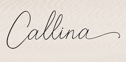 Callina is a new modern & fresh script in handwriting style. This font will make your design look elegant, natural and stylish. Callina handwritten font is perfect for any awesome projects such as photography, watermark, signature, quote design, social media posts, advertisements, logos, branding, invitation, product designs, label, stationery, wedding designs, product packaging, special events or any project that needs a handwriting taste.
 - Gesego by Twinletter,
$18.00 Introducing our newest font called Gasego, this font will bring a unique touch to your design, Gasego Groovy font is one of the right choices. With precise curves and soft lines, this fun font is sure to add something special to your designs. It’s never too late to start incorporating this cool font into your work, so don’t wait and use it now!
 - Tshikona by Scholtz Fonts,
$19.00Tshikona is casual and vigorous font with a taste of African spice. Although creating an impression of handwritten informality, Tshikona is a carefully crafted font, making it easy to use in any display setting, either for headings or as an informal body font. The line of the letters is reminiscent of the angular, dry branches of trees in the African veldt. - Nebulous Promise by Kitchen Table Type Foundry,
$16.00 This font was called differently when I started out building it, but after a long and insightful conversation with a good friend, I decided to call it Nebulous Promise. Nebulous Promise was made using a broken satay skewer (I like using those!) and Chinese ink. It comes with a full set of alternates for the lower case letters and extensive language support.
 - Brookside JNL by Jeff Levine,
$29.00 The 1920s were part of an era in songwriting where snappy wordplay and clever (if not long) titles prevailed. The lettering on one such piece of sheet music with the song title "In A Shady Nook by A Babbling Brook" offered up a bold, condensed sans serif design which is now available digitally as Brookside JNL. Available in both regular and oblique versions.
 - Vankours by Arterfak Project,
$15.00 Vankours is a freestyle brush font, created with expressive brush strokes, keeping the details and give an eye-catchy combination between the uppercase and small caps, also complete with alternates. Vankours is perfect for many themes such as urban, thriller, sporty, vibrant, and youth taste! Good choice to use this font for Logo, Merchandise, Brand imagery, Apparel, Packaging, Simple quotes, and many more!
 - Feeling Grateful by Olivetype,
$18.00 Bring joy to your designs with Feeling Grateful! This cheerful font offers a combination of adorable style and fun. Its bouncy and bold letters are the perfect addition to your logos, headlines, and other projects. Feeling Grateful is sure to make any design stand out with its positive vibes, so grab this font today and start adding some fun to your designs!
 - Sapeca by Just in Type,
$35.00 This project started from an idea to create a fun & informal typeface that would be cool for designers and for the general public. So, Just in Type designed a font with several OpenType features to create different letterings for different occasions, always in a cute way, sometimes even fancy. Have a look at the Sapeca Manual in the Gallery Menu.
 - Trisquare by Davide Romito,
$41.00 Trisquare is an Experimental Display Typeface, which is inspired by the strokes of the Fraktur alphabet but developed through the composition of triangular and square shapes. It has a particular ancient soul with a digital taste but is not monospaced. Trisquare is good to use for Branding, Signage, Packaging, Advertising, Headlines, Magazines, Book titles, or everything you want to use it for.
 - Magnitudo by ZetDesign,
$16.00 Magnitudo is a very amazing handwritten font. This font is equipped with many choices of styles (alternative A-z forms), making it easier for design workers to determine the form of writing according to their desired tastes. This font also features an international accent to be used in several countries at once.I hope you are interested in my work. Thank you...
 - Sackem PB by Pink Broccoli,
$14.00 There’s just nothing quite like a heavyweight geometric typestyle with tiny counters, you just love it like the Bee Gees. Sackem started as a digitization of a singular film typeface called Benman Jumbo by Lettergraphics. From there, this mechanical typeface was expanded into a giant family of playful widths and obliques: from the condensed “Slim” style to the original “Jumbo” style.
 - Rogan by Brink,
$30.00 Rogan: A Robust Modular Sans Rogans clean lines started out as an exercise in modularity and geometric forms. This initial construction approach was then adapted to improve the functionality of the family; Breaking away from the strictly modular system in exchange for more refinement and clarity. The resulting forms display a refined contemporary feeling alongside a hi- tech industrial element.
 - Sweetgrace by Good Java Studio,
$20.00 Sweetgrace is a romantic script font with many swashes in start and ending characters. This font includes full set of swash heart lowercase letters, numerals, and punctuation. Also it includes: short lowercase beginning and ending swashes, lowercase ending heart swashes, which serve to connect two words or letters. Sweetgrace is absolutely perfect for invitations, monograms, wedding invitations, fashion, branding, labels, and logotypes.
 - Lined by Oscar Pastarus,
$18.00The Lined font started out with some scribbles - playing with lines and making shapes fold, underlap and overlap, eventually evolving into letters. This is a display/ornamental font and it was made in 2009, it's meant for decorative use and not in large bodies of text. For example it does well used as a headline font. It is proportionally spaced and uppercase only. - Informe by Arterfak Project,
$19.00 Informe is a modern monospaced typeface. Built with strong letter shapes, and industrial taste. This typeface was designed to read well in small and large sizes. Informe is suitable for digital interface, simple coding, label, editorial, tickets, and more. Available in 4 styles that you can use for the headline, subheadline, tagline, and body text. Equipped with some alternates and multilingual support.
 - Freedam Theory by Stringlabs Creative Studio,
$25.00 Fredam Theory is a Retro bold script with Groovy style, unique design taste and combine with classic retro style of the 80s, trendy, vintage, and sporty. The Fredam Theory is perfect for retro lovers, besides this font is also perfect if used for brands such as: barbershop, motorcycle club, clothing, logo brand, coffee shop, shoe brands, hipster and many more.
 - Prince Frog by Hanoded,
$15.00 Prince Frog started out as an attempt to 'pimp' Rabbit On The Moon font. It quickly evolved into an entirely different typeface with just a hint of 'Rabbit' in it. Prince Frog is a very happy, very legible font and would be ideal for children's book covers, posters and packaging. It comes with enough diacritics to keep even the most spoiled princess happy.
 - Shania Quinton by Grezline Studio,
$10.00 Shania Quinton is a unique signature script font crafted very carefully. Shania Quinton is perfect use for a logo for branding, typography design, product packaging, invitation, quotes, t-shirt design, label poster, special events and anything that need handwriting taste. Feature : - Multilingual Language - Works on PC & Mac - Simple installations - Accessible in the Adobe Illustrator, Adobe Photoshop, Adobe InDesign, even works on Microsoft Word.
 - Montela by Romie Creative,
$15.00 Montela - is a modern calligraphic typeface with several alternate ligatures as well as swashes. This font is made in a modern style with a very beautiful, elegant, very casual start and finish and fits your various design needs Perfect for logos, branding, titles, social media posts, advertisements, product packaging, product design, labels, photography, watermarks , special events, magazines, web design, etc.
 - Monem by Wiescher Design,
$39.50 Monem is the word for the smallest significance-carrying part of a language. I thought that was a good name for a clean, straightforward Sans typeface. Monem is very sturdy and usable for lots of occasions. I am using this font myself for those of my clients that want to convey a clean unobtrusive image. Your very restrained Gert Wiescher
 - Rahere Roman Display by ULGA Type,
$30.00 Rahere Roman Display is an elegant design with flared stems and subtle old style features, influenced by Berthold Wolpe’s wonderful Albertus font and (to a lesser extent) fonts based on Roman square capitals. It’s a classic design for the modern age, appealing to serious typographers, graphic designers and anyone looking for a beautiful, multipurpose font that also offers value for money. Originally conceived as a display companion for the Rahere Sans typeface family, Rahere Roman harmonizes perfectly with its sans counterpart: use it for headings, sub-headings or pull-out quotes. Want an eye-catching introduction? The small caps have been sized to optically align with the x-height of Rahere Sans or start a paragraph with a swash drop cap. There are also ornaments and devices on hand to spice things up. Of course, Rahere Roman Display works beautifully as a standalone font too. Although predominantly a display font, with a quick flick of its lowercase switch, Rahere Roman transforms effortlessly into a readable text font. Like a Swiss Army Knife, this is a hugely versatile font, capable of conveying different messages from classic and romantic to historical and modern. It’s suitable for a wide range of applications including: branding, posters, advertising, packaging, labels, signage, wedding stationery, museums, art galleries and book covers. Weighing in at well over 2,000 glyphs, Rahere Roman contains a myriad of alternative characters (mostly capitals) including two sets of small caps that allow certain letter combinations - such as RO, LA, LI, TY, etc. - to mimic ligatures. The advantage of this is that if letter spacing is increased or decreased, the letter combinations aren’t fixed and can move too, which helps the space between letters to remain even. However, for lovers of ligatures there is still a bucketload of goodies to play with, including the obligatory ‘OO’ ligature. If that’s not enough, the font also contains start & end swashes, alternative numerals, seven ampersands, ornaments and devices. .ss01 - Initial swash capitals .ss06 - Superior small capitals (aligned to the cap height) .ss07 - Small capitals (sitting on the baseline)
 - FS Clerkenwell by Fontsmith,
$80.00 A creative context 2003. Fontsmith was sharing a small, cold, whitewashed studio space in Northburgh Street, Clerkenwell. But things were on the up following prestigious custom type commissions for The Post Office and E4. “Slab serifs were on the brink of another revival, we could feel it,” says Jason Smith. “All we wanted to do was have a play with these slabs, go as far as we could within what was acceptable and readable.” “It wasn’t initially clear what was happening,” recalls Phil Garnham. “We were becoming very influenced by our surroundings, outside the studio space. We absorbed the essence and the designer grime of where we were.” Process Jason began by drawing stems on-screen. “The key aspect of the font is the upward bend of the leading shoulder serif, the way it kind of ramps up and then plummets back down the stem. “The regular and light characters are quite narrow – great for text but the bold is quite wide and chunky – better for headlines. I think ‘y’ is quite different for a slab design. We call it the Fontsmith ‘y’.” Promotion Fontsmith were determined to get FS Clerkenwell noticed. To launch the font, Ian Whalley, a designer friend of Fontsmith, captured words heard on the streets of Clerkenwell, set them in the new font and crafted a small book of typographic conversations. It was a first for Fontsmith. “I think that’s part of why this font has been so successful,” says Phil. “It really does embody the spirit of the area, as a special place for design, arts and crafts. And designers love that.” Contemporary twist FS Clerkenwell, based on influences in and around this part of London with a rich tradition of printing and design, mixes tradition with creation. Old-fashioned values meet new-school trends. Its quirky, contemporary character lends an edge to headlines, logotypes and any large-size text.
 - FranklinGothicHandLight by Wiescher Design,
$39.50 FranklinGothicHandLight is part of a series of hand-drawn fonts from way back in time – before computers changed the way we worked. When I was in advertising – before computers – a very time consuming part of my daily work was sketching headlines. I used to be able to sketch headlines in Franklin Gothic, Times, Futura, Helvetica and several scripts. We had a kind of huge inverted camera – which we called Lucy. We projected the alphabet onto a sheet of transparent paper, outlined the letters with a fineliner and then filled them in. It was very tedious work, but the resulting headline had its own charm and we had a permanent race going on who was best and fastest. I won most of the time! They used to call me the fastest "Magic Marker" this side of the Atlantic. Great days, just like today! Your sentimental type designer from the past Gert Wiescher
 - FranklinGothicHandDemi by Wiescher Design,
$39.50 FranklinGothicHandDemi is part of a series of hand-drawn fonts from way back in time – before computers changed the way we worked. When I was in advertising – before computers – a very time consuming part of my daily work was sketching headlines. I used to be able to sketch headlines in Franklin Gothic, Times, Futura, Helvetica and several scripts. We had a kind of huge inverted camera – which we called Lucy. We projected the alphabet onto a sheet of transparent paper, outlined the letters with a fineliner and then filled them in. It was very tedious work, but the resulting headline had its own charm and we had a permanent race going on who was best and fastest. I won most of the time! They used to call me the fastest "Magic Marker" this side of the Atlantic. Great days, just like today! Your sentimental type designer from the past Gert Wiescher
 - Mastura by Aqeela Studio,
$15.00 WELCOME ! New Mastura Script Font. This is modern sleek typography with a delicious flow. Mastura Script features alternative characters, including a start, end, and terminal binding, and International support for most Western languages is included. This one will instantly make your designs professional and jaw-dropping! Become the perfect professional in a minute and start creating modern designs like ads, sales, logos, brands, posters, social media text overlays today! To activate the Stylistic OpenType alternative, you need a program that supports OpenType features such as Adobe Illustrator CS, Adobe Indesign & CorelDraw X6-X7, Microsoft Word 2010 or later. and there are additional ways to alternate / swash, using Character Map (Windows), Nexus Fonts (Windows), Font Book (Mac) or a software program such as PopChar (for Windows and Mac). How to access all alternative characters using Adobe Illustrator: https://www.youtube.com/watch?v=XzwjMkbB-wQ Thank you for your purchase!
 - Museum Ornaments by T4 Foundry,
$7.00Museum Borders and Ornaments is part of a typographical treasure, the Norstedts type collection in Sweden. Type designer Torbjörn Olsson has painstakingly translated the original 34 Ornament matrices in the collection to Open Type. Among them are several of Granjon's arabesques, as well as symbols from both Swedish and Danish typefoundries. The signs were cut in the 16th, 17th and 18th centuries. The old Swedish name for these "type trademarks" were "rössjor". Museum Borders and Ornaments is an OpenType creation, for both PC and Mac. Swedish type foundry T4 premiere new fonts every month. Museum Borders and Ornaments is our tenth introduction. Museum Borders and Ornaments is part of the growing Museum type family. Museum also includes Museum Tertia Cursive, an exquisite 1700's typeface with modern additions, and Museum Fournier, a set of Rococo capitals designed by Pierre Simon Fournier le Jeune circa 1760. - HS Alhuda by Hiba Studio,
$50.00 HS Alhuda is a display typeface. It can be used for titles and graphic projects, which support Arabic, Persian Urdu and Kurdish. It has been created based on modern kufi style. It enjoys flexibility between sharp and curved lines in the structure of characters. This supports with a beautiful appearance and wonderful geometric structure. The sharp endings in the bottom of character also give an aesthetic addition to the character. (8) Weights has been created for this typeface between the heariline weight and heavy weight. Besides, those six additional weights which can be used in headline, has baseline parts are more thicker than the vertical parts. One has a regular form and the others has a stencil form in the middle using various styles. This typeface with its diversity of (14) weights is intended to be an attempt for a good addition to Arabic typography.
 - Basil by Karandash,
$- A mix between tradition and innovation, Basil is a unique humanist slab serif well suitable for broad range of design projects - editorial, logotype, poster, etc. With its tall x-height and generous internal spaces, the type family was especially designed with legibility in mind and is well suitable for body text at small sizes. In the same time Basil is equally able as titling and headline font due to numerous distinctive visual features that shape its attractive appearance. A true workhorse, packed with lots of OpenType features and full multilingual support, the type family consisting of six weights, with Regular available for free! Basil type family received Special Mention in Cyrillic text Typeface category at 7th International Type Design Competition for non-Latin typefaces - Granshan 2014. It also was exhibited at New Bulgarian Typography exhibition part of Sofia Design week 2013 and then took part in several travelling exhibitions.
 - Servus Slab by Dada Studio,
$29.00 This family is very special to me. I started working on it right after my first son was born. I decided to name the typeface "Servus" which means "Hello" in my country. The whole idea of the family symbolizes a child’s growth. It starts with Thin and Narrow weights - just like a newborn baby - then it slowly grows to Black and Wide. As You can guess, my son is quite chubby now! And I can assure You that I put all my love into details. Servus consists of 9 weights which gives us 18 fonts with matching italics. Lights and Bolds, due to their strong personality, are perfect for display uses. At the same time, Regulars create a harmonious structure that provides good legibility in long texts. Servus covers all latin languages. It contains a wide set of numerals, small capitals, fractions, ligatures and other OpenType goodies.
 - Museum Fournier by T4 Foundry,
$16.00Museum Fournier is inspired by a set of Rococo capitals designed by Pierre Simon Fournier le Jeune circa 1760. The matrices are part of a set imported to Sweden by J.P. Lindh in 1818 from Breitkopf & Härtel in Leipzig, Germany. They are now in the Nordiska Museum in Stockholm. Type designer Torbjörn Olsson has expanded the original 31 lead matrices in the collection to 55 characters. Please note that the font contains capitals only, no lower case letters and no figures either. Museum Fournier is an OpenType creation, for both PC and Mac. Swedish type foundry T4 premiere new fonts every month. Museum Fournier is our ninth introduction. Museum Fournier is part of the growing Museum type family. Museum also includes three different border fonts, an ornament font with some of Granjon's arabesques and Museum Tertia Cursive, an exquisite 1700's typeface with modern additions. - Bodoni Classic by Wiescher Design,
$55.00 I became interested in designing Bodoni Classic because of a lazy graphic designer at Jacques Damase publishing house. He had to change a single letter on a bookcover about J. B. BODONI. The French call him Jean Baptiste instead of Giambattista! And that unknown graphic designer just took any old “J” from some newly cut Bodoni. All the new Bodoni cuts have square serifs, whereas the originals had rounded serifs and slightly concave feet. The single letter “J” with the squared off serif was for me like a road sign to start redesigning the entire Bodoni family. That’s exactly what I started in 1993 and a dozen years later I am finished. Okay, I am still adding new Bodoni Classics, but those are my personal additions. Recently I designed a family of seven »Bodonian Script« fonts, that can be mixed with most of my Bodonis. Yours very retro, Gert Wiescher
 - Wermut by Brownfox,
$45.00 An intoxicating blend of rare flavours is what makes the new transitional typeface Wermut (German for vermouth) resemble its alcoholic namesake. Bitter and thorny at first glance, it proceeds to surprise the palate with a complicated taste that leaves a pleasant aftertaste. Wermut may not be taken in hastily, but needs to be thoughtfully enjoyed at a measured pace. Its dark colour, compressed, spring-like, shapes, well-built proportions, and agreeable letterforms all look safe enough until one is jolted to encounter the clipped serifs that lend the page an unexpectedly edgy appearance. The font comes in two weights with an extended character set in Latin and Cyrillic scripts supporting 66 languages. A product of slow, careful distillation, this infusion of multiple ingredients comes together to form a unique mature taste which will be appreciated by true connoisseurs of typographic cocktails. Desined by Gayaneh Bagdasaryan and Vyacheslav Kirilenko.
 - Amor Serif by Storm Type Foundry,
$55.00Antique monumental incriptional majuscule, originally carved in stone, and sometimes called “Roman Capital”, is the origin of the upper-case part of our latin alphabet. Its narrowed form, derived from handwritten originals used between the first to third century A. D., served as the inspiration for the Mramor typeface, which I drew with ink on paper in 1988 under Jan Solpera’s leadership. After composing negative letters on a strip of film it was possible to use Mramor with the early phototypesetting devices. In 1994 with the help of Macintosh IIvi I added the lowercase letters and bolds, and issued this typeface as 14-font family. After some years of using Mramor for various purposes, I realized a need of modernization and humanizing its very fragile appearance, as well as removing numerous decorative and useless parts. Besides that, type design made a huge technical progress in past few years, so I was able to finish the remaining approximately 9600 glyphs contained in the present font system named Amor. It is already usual to combine sans and serif fonts within one family in order to distinguish (e. g. in a book) historical part from contemporary, a plain chapter from a special one, or, in quotations, to divide speaking persons. Sans-serif typefaces don't arise by simple removal of serifs; they have to be drawn completely separately, when occasionally many declined forms may be made, considered to the serifed original. Nevertheless, both parts of this type system appear consistent as for proportional, aesthetic and emotional atmosphere. Usage of type is often closely linked to its original inspiration, in this particular case with architecture and figurative sculpture. An inner “order” was also text setting in smaller sizes. A smooth scale of weights enriches the possibilities in designing of magazines, brochures, exposition catalogues and corporate identity. Economizing, but opened shape of characters is well legible and antique hint comes into play after longer reading. - Ganymede3D, ah, the font that decided it was too cool for the 2D world and literally popped out of the page to prove its point. This is not just a font; it's an adventure in typography that decided t...
- Dot.com Reverse Pro, designed by Iconian Fonts, presents a unique and engaging twist on typographic design that captivates with its distinct approach to character presentation. This font is character...
- Anaglyph by Luxfont,
$18.00 Introducing incredible COLOR ANAGLYPH font. Unique font family with anaglyph stereo effect - a novelty in the field of color fonts. Inspired by global trends in contemporary design with a touch of retro 90s, electric music and minimalistic purity of glyphs. Truly a reflection of modern POP culture. Font is ideal in entertainment design. Night club poster design, fashionable business card, website title, magazine illustration - there are countless options for using it. Font family has two thicknesses - bold & regular, 3 types of stereo effect, 2 font colors with stereo effect (black and white). Font consists of letters of the same height without division into uppercase and lowercase glyphs. This font family is based on the Regular & Bold fonts Boldini - which means that if necessary you can combine these two families and they will be absolutely stylistically identical and complement each other. Check the quality before purchasing and try the FREE DEMO version of the font to make sure your software supports color fonts. Features: Free Demo font to check it works. 36 OTF SVG fonts in the family 2 thicknesses: Bold, Regular 3 types of stereo anaglyph effect 6 font colors with stereo effect Kerning IMPORTANT: - OTF SVG fonts contain vector letters with gradients and transparency. - Multicolor OTF version of this font will show up only in apps that are compatible with color fonts, like Adobe Photoshop CC 2017.0.1 and above, Illustrator CC 2018. Learn more about color fonts & their support in third-party apps on www.colorfonts.wtf - Don't worry about what you see all fonts in black and not in multicolor in the tab “Individual Styles” - all fonts are working and have passed technical inspection, but not displayed in multicolor they, just because the website MyFonts is not yet able to show a preview of colored fonts. Then if you have software with support colored fonts - you can be sure that after installing fonts into the system you will be able to use them like every other classic font. Question/answer: How to install a font? The procedure for installing the font in the system has not changed. Install the font as you would install the classic OTF | TTF fonts. How can I change the font color to my color? · Adobe Illustrator: Convert text to outline and easily change color to your taste as if you were repainting a simple vector shape. · Adobe Photoshop: You can easily repaint text layer with Layer effects and color overlay. ld.luxfont@gmail.com
 - Savigny by insigne,
$22.00 Savigny began as an offshoot of Le Havre. Le Havre met my design objective of a geometric sans serif with a strong art deco touch. Le Havre’s primary inspiration came from the art deco titling of the 1930’s, and the lower case was just icing. The art of the 1930’s is of particular interest to me, and I love the art deco era and its art, and the simplicity of geometric shapes. I am mostly interested in designing display typefaces. In many ways Le Havre was the exact opposite of another popular insigne offering, Aviano Sans. Le Havre has very high ascenders, a lower case and is very condensed. Aviano Sans has no lowercase and extremely extended capitals. With the rise of webfonts I began to see Le Havre being used frequently online. It’s short x-height and very tall ascenders made it difficult to read in on screen text settings as it was intended as display type. With this observation, I felt that there is more room for a geometric sans in the insigne catalog. So I set about to design a new geometric sans using the successful skeleton of the Le Havre family. Although I planned to extend the Le Havre line, the new family is so drastically different I decided on a new name: Savigny. The face evolved and began to take on a few humanist touches. Designed from the very beginning as a webfont, the design is open and pleasing to the eye, with a tall x-height. To optimize it for onscreen settings, the spacing is generous. In addition, it includes extended and condensed members, making it insigne’s first superfamily. The family includes over 100 OpenType alternate characters. These include several style sets. Some are stemless, others are purely geometric, and in a nod to Savigny’s origins, Art Deco titling alternates. Please see the informative .pdf brochure to see these features in action. OpenType capable applications such as Quark or the Adobe suite can take full advantage of the automatically replacing ligatures and alternates. This family also includes the glyphs to support a wide range of languages. Savigny is a great choice for a professional designer who wants a well rounded typeface family that is ready for the web.