10,000 search results
(0.869 seconds)
- Brighten by Eurotypo,
$22.00 Brighten is the new family font composed of Brighten Regular and Regular Italic, Brighten Round and Round Italic. With the total number of 606 glyphs, Brighten is the perfect blend of elegant and casual. Brighten is equipped with plenty of OpenType features. Uppercase letters can alternate between at least two or three different forms and lowercase letters have leastways four choices more to avoid repetition. These effects include start and end forms of lowercase letters, which are automatically substituted in at beginnings or ends of words. To activate the optional glyphs, you may click on Swash, Contextual, Standard Ligatures, Stylistic or Discretionary Ligatures buttons in any OpenType savvy program or manually choose the characters from Glyph Palette. Also, there’s some ornaments designed to support the font (access the ornaments through the Glyph Palette). The Brighten family font might be the choice to use on creating headlines, logos & posters for branding and packaging purposes.
 - HS Albadr by Hiba Studio,
$59.00 HS Albadr is an Arabic display typeface. It is useful for book titles and graphic projects where a contemporary, geometrical and streamlined look is desired. The font is based on the simple lines of modern and simplified Kufi calligraphy that support Arabic, Persian and Urdu. It has one weight only which is similar to the bold weight. This typeface is created for being used in technical and engineering companies under strict geometric conditions . The company desires to follow the geometrical shape with uniform and equal dimensions in both vertical and horizontal storks; where some parts of the letters are to be cut at a slanting angle of 45 degree to give the impression of a coherent geometrical nature for this font. The typeface HS Albadr is considered as a chain of geometric fonts series designed for engineering companies. After HS Almohandis and HS Alhandasi were designed we are looking forward to giving some additions to the geometric typefaces field.
 - Scala Sans Pro by Martin Majoor,
$49.00 The award-winning Scala family (1990-1993) is a worldwide bestseller and has established itself as a ‘classic’ among digital fonts. It was one of the first serious digital text fonts to support small caps, ligatures and different set of numbers. In fact Scala and Scala Sans (1990-1993) are two workhorse-like typefaces sharing a common form principle: the skeletons of both Scala and Scala Sans are identical, therefore they can be combined perfectly. Where many of the modern sans serifs (like Helvetica and Univers) have rather ‘closed’ letter shapes, the same elements in Scala Sans are much more ‘open’. This greatly improves legibility, especially in the smaller point sizes. The italic of Scala Sans is not a slanted version of the roman, but rather a ‘real’ italic. Another part of Scala is very popular among its users: Scala Hands, containing more than one hundred decorative hands and pointers, is included in the Scala fonts and is a free bonus.
 - Aminah by Shakira Studio,
$19.00 Start good day for new font! present to you, Aminah! Aminah is a retro serif font that brings a classic and charming vintage touch to your designs. This font combines elegant serif elements with a stylish retro feel, creating a unique and eye-catching combination. Aminah is suitable for use in a variety of retro design projects, such as posters, greeting cards, logo designs, and brand displays that want to convey a vintage, classic yet modern feel. With Aminah, you'll have an elegant, stylish, and full of character retro serif font with a large selection of ligatures to bring that special touch to each of your designs. This font will be the perfect choice for designers who want to explore design inspiration from the classic retro era but still trendy. What did you get? Unique letterforms Works on PC & Mac Simple Installations Accessible in the Adobe Illustrator, Adobe Photoshop, Microsoft Word even work on Canva! PUA Encoded Characters Fully accessible without additional design software. I really hope you'll get pleasure using Aminah font and it will be perfect addition to your font collection! If you have some questions, please write me a letter! Shakira Studio
 - Arsenale Blue - 100% free

- Ceres by Wilton Foundry,
$29.00 Ceres is has its roots in Cyan, our other font family. Like Cyan, Ceres has a complementary lowercase that provides more versatility than a classic Roman. It is arguably more elegant than Cyan with its accentuated serifs. The lowercase "e" and "g" give Ceres a distinct calligraphic personality. Ceres, the font, derived its name from Ceres the Roman goddess. In Roman mythology, Ceres is the goddess of growing plants (particularly cereals) and of motherly love. Ceres was usually equated with the Greek goddess Demeter. Ceres was the daughter of Saturn and Ops, wife-sister of Jupiter, mother of Proserpina by Jupiter and sister of Juno, Vesta, Neptune and Pluto. Ceres made up a trinity with Liber and Libera, who were two other agricultural gods. She also had twelve minor gods who assisted her, and they were in charge of specific aspects of farming.
 - Running Board JNL by Jeff Levine,
$29.00 During the early years of the 20th Century, America's fascination with automobiles was just beginning. The cover for a 1916 piece of sheet music for the comedy song "On the Old Back Seat of the Henry Ford" had the title hand lettered by a round nib pen in an Art Nouveau style. This is now available digitally as Running Board JNL.
 - Film Event JNL by Jeff Levine,
$29.00 The August 11, 1929 issue of “The Film Daily” carried an ad for Tiffany-Stahl Productions’ presentation of a special film release featuring a wrestling match between “Strangler” Lewis and Gus Sonnenburg. The hand lettering for the ad was rendered in an Art Deco sans serif style, and is now available digitally as Film Event JNL in both regular and oblique versions.
 - Jorgey by Gatype,
$12.00 Jorgey's casual brush script has a nice texture and flow. Jorgey has many alternatives to make it look like real handwriting; four sets of lowercase and two sets of uppercase. suitable for design projects; logos, branding, posters, quotes, beautiful wedding invitations, beautiful stationery art, eye-catching social media posts, and cute greeting cards and other designs. It is unique, very natural and attractive
 - Oceanfront Property JNL by Jeff Levine,
$29.00 Oceanfront Property JNL was modeled from the hand lettered title on the cover of the 1932 sheet music for "There's Oceans of Love by the Beautiful Sea". A simple sans, it still reflects the beginnings of the Art Deco Era with its approach to letter forms and varying widths. This type design is available in both regular and oblique versions.
 - Angle & Fairy by Typia Nesia,
$20.00 Angle & Fairy is a vintage / classic fantasy serif. It is perfect for your up coming projects. Such as luxury logo and branding, classic editorial / magazine, cosmetic and fashion promotional, historical of architectural design, logo / branding and stationery design, advertising design, wedding card invitation, art and home decor, fantasy movie or game, novel / book cover title, special events and any more.
 - Neonbox by Putracetol,
$22.00 Introducing a new Futuristic Display Typeface Called “Neonbox”. Inspired from Modern Style, Digital, Neon Light, Futuristic Neon Art. Neonbox best uses for Logo, cover, poster, branding, UI, Titles, and many more. Neonbox is also support multi language. To access the alternate glyphs, you need a program that supports OpenType features such as Adobe Illustrator CS, Adobe Photoshop CC, Adobe Indesign and Corel Draw.
 - Huggy by Typogama,
$19.00 Huggy is a display typeface designed by Michael Parson and inspired by the work of Heinrich Heinz. Full of Art Nouveau flair, this two weight typeface is bold forceful but full of subtle features that give the design a unique personality. With a narrow width and tall aspect, it is perfect for setting text in tight spaces like posters or other titling situations.
 - Chewy Geewy by Agny Hasya Studio,
$12.00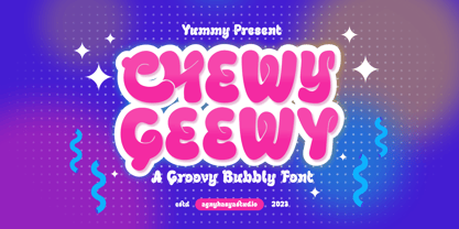 Chewy Geewy is a Playful, Groovy Bubbly, and Fun typeface. Come in 2 (two) styles (regular & slant) and is created with some alternate and ligature. Featured with Uppercase & Lowercase, Numeral & Punctuation, Multilingual Support, Opentype Features Perfect for your design projects like logos, branding, advertising, product designs, magazine designs, book/cover title designs, art quotes, special events, labels, product packaging, and more.
 - Courtroom JNL by Jeff Levine,
$29.00 Erle Stanley Gardner’s beloved lawyer “Perry Mason” first appeared on screen in a series of six films with Warren Williams starring in four of them. The hand lettered opening title for 1935’s “The Case of the Lucky Legs” is a classic Art Deco sans serif design, and is now available as Courtroom JNL in both regular and oblique versions.
 - Romancio by IKIIKOWRK,
$19.00 Proudly present Romancio - Romantic Type, created by ikiiko. Romancio is a decorative serif typeface that inspired by the spirit of Roman design. A perfect choice for projects that call for a touch of elegance and originality. Elegant flourishes and delicate curves abound, which evokes the refinement of old Roman art. Each character is painstakingly designed to capture the elegance of classic Roman letterforms.
 - Student Council JNL by Jeff Levine,
$29.00 While Student Council JNL was not influenced by any school activities, the design is based on a lithographed cardboard sign (circa 1930s) for Spizz Sparkling Water, a bottled seltzer from the Dr. Pepper Bottling Company of Lexington, Kentucky. A squared letterform with angled semi-serifs, this Art Deco typeface grabs attention. Student Council JNL is available in both regular and oblique versions.
 - Kievally by Zamjump,
$21.00 Kievally is a refined aesthetic. This majestic typeface adds a touch of stunning elegance to any design. Although the inspiration for this typeface dates back to the Art Deco era, Kievally feels modern and contemporary. Use Kievally for your branding, magazine designs, logo designs, headlines, posters, packaging, cards or wedding invitations. Included : - Uppercas and Lowercase - Ligatures - Numerals & Punctuation - Accented characters
 - Cabriolet by JVB Fonts,
$35.50 Cabriolet is a connected geometric script re-interpretation inspired by old chromo emblems of Chevy truck Apache of 1960. With three weight variables, it can be used in logos, games and graphic related to cars, automotive, American, Detroit, Art Deco, 1940, 1950, 1960, vintage, retro, classic and old machines. Can be expandable using underscore for connect words or expanding between letters space.
 - Retro Bold by ITC,
$40.99Retro was designed by Colin Brignall and Andrew Smith and comes in two weights, bold and bold condensed. They are all cap, slab serif typefaces which were inspired by a number of historical artistic movements: Constructivist, Bauhaus, Art Deco and Streamline. Retro has a strong graphic appearance, a number of alternate characters, and is suitable for a wide variety of promotional applications. - Staple Remover JNL by Jeff Levine,
$29.00 Hand lettering on the packaging for an Arrow "Commander" Staple Remover seen in an online auction is the inspiration for the unusual and angular typeface comprising Staple Remover JNL. The Art Deco era of the 1930s and 1940s offers many wonderful examples of stylized and experimental lettering, and this, by far is one of the more eclectic styles of the time.
 - Brasileiro by CastleType,
$19.00 Brasileiro, a CastleType Original, is a new art deco design inspired by the seven letters used for the masthead of the Brazilian magazine 'Para Todos' from the 1920s. Described as "great fun" and "nova e exuberante", Brasileiro captures the playful and joyful spirit of Brazil. Contains some alternates in the lowercase position, extensive language support for Latin and Cyrillic languages, and much more.
 - Madison Squared NF by Nick's Fonts,
$10.00Theater posters of the 1930s were often exuberant exercises in Art Deco lettering sensibilities, and the handiwork which inspired this typeface is no different. Big, bold and oddly elegant, this face is an excellent choice for enticing and commanding headlines. Both versions contain the complete Latin 1252, Central European 1250, Turkish 1254 and Baltic 1257 character sets, with several language-specific localizations. - Brownwood NF by Nick's Fonts,
$10.00The inspiration for this typeface was discovered on a 1906 travel poster, promoting the Hotel Braunwald, located in the Swiss Alps. Its odd blend of Art-Nouveau-meets-the-Old-West makes for fetching heads and subheads. Both versions include the complete Unicode Latin 1252, Central European 1250 and Turkish 1254 character sets, as well as localization for Lithuanian, Moldovan and Romanian. - Allorette by Greater Albion Typefounders,
$20.00 Allorette is a display face inspired by the precepts of the ‘Arts and Crafts’ movement - it is both functional and beautiful, a good clear all capitals face with distinctive design touches, but immediately clear and legible. Especially suitable for poster and signage work. An extensive range of discretionary ligatures are included, readily giving the aspect of carefully thought out hand-drawn lettering.
 - Society Column JNL by Jeff Levine,
$29.00 The title card for the 1938 screwball comedy "Four's a Crowd" (starring Errol Flynn, Olivia de Havilland and Rosalind Russell) offered a classic, thin Art Deco type design with stylized letter forms. This is the basis for Society Column JNL; which derives its name from the newspaper columns popularized in that era detailing the whereabouts of the "upper crust" of society.
 - Foreign Film JNL by Jeff Levine,
$29.00 The Art Deco hand lettered opening credits for the 1936 French drama “La Belle Équipe” [English title: “They Were Five”] provided the inspiration for Foreign Film JNL, which is available in both regular and oblique versions. According to Wikipedia, the film “…tells the story of five unemployed workers who win the jackpot in the national lottery but their solidarity then proves fragile.”
 - Penny Wise JNL by Jeff Levine,
$29.00 The unusually-shaped hand lettering of Penny Wise JNL was modeled from the cover of the 1936 sheet music for "You Dropped Me Like a Red Hot Penny", and is available in both regular and oblique versions. Although it was drawn during the Art Deco period, this type of lettering design style was revived during the Hippie movement of the 1960s and 1970s.
 - Flower Children JNL by Jeff Levine,
$29.00 At the apex of the 1960s-70s Hippie movement, San Franscisco's Haight-Ashbury district was the epicenter of the Love Generation, and the Fillmore (East and West) were the city's musical venues. Inspired by a 1970 concert poster, the Art Nouveau influence was strongly felt in the hand lettering from that poster, which is the basis for Flower Children JNL.
 - Retail Establishment JNL by Jeff Levine,
$29.00 The 1935 catalog for Vitrolite (a brand of pigmented structural glass) featured artist renderings of how the glass could be applied to business exteriors. One of the lettering styles used in these examples was an Art Deco lower case. This design has been turned into a digital typeface called Retail Establishment JNL and is available in both regular and oblique versions.
 - DeVinne by Linotype,
$29.99 DeVinne Ornamental is a display typeface from the famous Parisian typefoundry Deberny & Peignot, developed around 1900. Its style has become synonymous with the Art Noveau period, which was raging internationally when DeVinne Ornamental's letters were first drawn. The typeface is named after the renowned American printer Theodore Low DeVinne (1828-1914). Optimal uses for DeVinne Ornamental include headlines in magazines and newsletters.
 - Vintage Panels NF by Nick's Fonts,
$10.00 Here’s a collection of fifty-eight handy-dandy vintage Victorian and Art Deco panels to dress up your next design project. Letters A-Z, a-z and numbers 0, 7, 8 and 9 have single-element designs, and the number series 1-2-3 and 4-5-6 contain Victorian tapestry elements. Enjoy a wealth of design elements at a very attractive price.
 - Carlos by CastleType,
$59.00 Carlos was inspired by a Spanish typeface designed by Carlos Winkow called 'Elektra' (c. 1940), available elsewhere as Casablanca. Carlos is an exceptionally graceful, condensed art deco sans serif design that supports all European languages that use the Latin alphabet as well as those that use the Cyrillic alphabet, and includes OpenType features, arbitrary fractions, and a collection of geometrics, dingbats & fleurons.
 - Aquatronik by The Flying Type,
$18.00 Aquatronik is a decorative display face with a somewhat retro-futuristic flair. It brings alternate glyphs for some letters and numerals and has extended language coverage, speaking more than 200 languages. The family includes three widths, for added versatility. Aquatronik is an excellent pick for eye-catching designs, including posters, book covers, album art, editorial, apparel, and many more. Have fun!
 - Show Card Deco JNL by Jeff Levine,
$29.00 Show Card Deco JNL is a hybrid of examples from hand lettered titles found on various song folios from the Carl Fischer Music Library circa the 1930s and is available in both regular and oblique versions. This particular typeface lends itself perfectly to show cards, posters, headlines and display titling which captures the modern, streamlined design of the Art Deco era.
 - Oh Hex JNL by Jeff Levine,
$29.00 An Art Deco “thick and thin” novelty type design based on the hexagon shape was found within the pages of “La Lettre Dans le Decor & La Publicite Modernes” - a 1930s-era French alphabet collection. The title somewhat translates to “The Letter in Modern Decor and Advertising”). Named Oh Hex JNL, it is now available in both regular and oblique versions.
 - Virus by Phat Phonts,
$20.00It began as a series of photographs of the rusty metal brand names on old tractors in a museum. When I scanned the photos and began to trace the letters, I found the rust and deterioration created a level of detail which gave my letters a psychotic anger which, as an art director in an advertising agency, I closely identified with. - Movie Palace JNL by Jeff Levine,
$29.10 Decorative, Display, Headline, Sans Serif, 1930s, Hand Lettered, Monoline, Retro, Vintage, Nostalgic, Stylized, Elegant Some beautiful and stylized Art Deco hand lettering found in the Jan. 6, 1934 issue of the British movie fan publication Picturegoer Weekly inspired Movie Palace JNL, which is now available in both regular and oblique versions. This monoline design adds a touch of elegance to any retro projects.
 - Bucanera Soft by Corradine Fonts,
$24.95 Bucanera Soft is a clean modern blackletter designed especially considering its readability. Due to its soft edges, Bucanera Soft leaves the traditional look of aggressive and hard blackletters and allows to find a more friendly appearance in a wide range of applications. Bucanera Soft was selected as a winner in the 3rd Communication Arts Magazine Typography Contest in Typeface Design category, 2013 issue.
 - Fecktor by limitype,
$17.00 FECKTOR - MODULAR TYPEFACE Fecktor is a decorative typeface made for display needs, headlines, logos etc. Made with minimalism inspired by the shape of butterfly wings combined with modular to produce a modern Art deco impression and style. Fecktor has 8 variations ( light, regular, bold, solid, extended light, extended regular, extended bold and extended solid ) equipped with uppercase, lowercase, numbers and some symbols
