10,000 search results
(0.138 seconds)
- Dujour by Ascender,
$29.99 Dujour is an art deco revival of the 1930s typeface Independent from the Collette and Dufour typefoundry. Steve Matteson created Dujour to enhance posters, signs or other documents with a touch of historical boldness.
 - Boeuf Au Joost NF by Nick's Fonts,
$10.00Another in a series of typefaces (Joost a Gigolo and Modern Art) based on the works of comic-book artist Joost Swarte, which continues in a long-standing Dutch tradition of unconventional lettering design. - Family Deco JNL by Jeff Levine,
$29.00 Family Deco JNL was inspired by the bold Art Deco hand lettering of the movie credits for the 1936 Laurel and Hardy comedy “Our Relations”, and is available in both regular and oblique versions.
 - Waghu by Twinletter,
$12.00 Waghu is an abstract font that you can use for casual design purposes. It is also right for you to use it for formal design purposes, this font can adapt beautifully if you use it in your project. there are three alternatives thin, regular, and bold. makes it easier for you to combine them according to your needs. This handwritten font is perfect for children’s magazines, drink banners, games, posters, beverage, outdoor events, thumbnails, food banners, cheerful writing, film titles, quotes, titles, logos, and various kinds of projects you need, of course, your various design projects will be perfect and extraordinary if you use this font because this font is equipped with a complimentary font family, both for titles and subtitles and sentence text. start using our fonts for your amazing projects.
 - Kabusi by Twinletter,
$15.00 Kabusi San Serif is a premium font family with 18 different styles to choose from. Designed to aid you in the creation of visually stunning projects of all types. It is the most widely used typeface on the internet, in printed materials, and in other design projects. This Kabusi San Serif font embodies both modernity and classicism while remaining simple and clean in appearance. Apart from their great looks, this premium font family will assist you in giving your company a more unique look that will pay off! of course, your various design projects will be perfect and extraordinary if you use this font because this font is equipped with a font family, both for titles and subtitles and sentence text, start using our fonts for your extraordinary projects.
 - America Line by Kustomtype,
$30.00 Since its foundation in 1901, the iconic building in the Rotterdam neighborhood Kop van Zuid, is shining. Where previously the Holland America Line was housed, you will now find Hotel New York. A building with a tremendous history. We’re glad to take you back in time with captivating memories. In 1991, catering entrepreneurs Daan van der Have, Hans Loos and Dorine de Vos refurbished the at the time vacant property into a hotel/restaurant. To honor its 25 years existence, we celebrate this happening with a brand-new font, ‘America Line’. A tribute to Wim ten Broek, the multi-talented Dutch Graphic Designer. As early as the 1930’s before the Second World War, Wim ten Broek made the famous posters for the Holland-America Line. The influence of A.M. Cassandre here in, is clearly recognizable. Wim ten Broek also worked for HAL with large surfaces and fixed lines in which primary colors dominate, accentuated with shadows acquired by spraying technique. He also made graphic works for, among others, the World Exhibition in New York, the Dutch railway company ‘Werkspoor’ and the royal Dutch steel factory ‘Hoogovens’. His drawings and lettering gave me a love for the trade and naturally gave me a completely different view on fonts. That’s how I slowly but surely made my way to the trade. Based on the letters I had at my disposal from the Holland – America Line poster, I started to complete the alphabet in the same style as the original text. I digitized everything in order to acquire a usable and modern font. The Holland America Line Font comes with uppercase and lowercase with all the needs of modern times to create a good digital font and to be able to use it for all graphic purposes. The font is ideal for headtext, posters, logos, etc... Don't hesitate and use this unique historical font! It will give your work that glamour that you will find in few fonts. Enjoy the Holland America Line. The Holland America Line Font comes with uppercase, lowercase, numerals, punctuations so you can use the Holland America Line font to customize all your designs. The Holland America Line font is designed by Coert De Decker in 2018 and published by Kustomtype Font Foundry. The Holland America Line Font can be used for all graphic purposes. It is ideal for headtext, posters, logos, logos, letterhead, apparel design, package design, label design etc... Don't hesitate any longer and enjoy this unique historical font! It will give your work the glamour that you will only find in a few fonts. Enjoy your journey with the Holland America Line!
 - DreamTeam by Resistenza,
$43.00 Lining up on the start line is Resistenza’s DreamTeam! This fit font’s long limbs, nimble movement and shifting weight make the multiline-display (inspired by bestseller Afrobeat ) perfect to grab attention on signage, print advertising and editorial applications like book covers. DreamTeam’s distinctive forms also make it ideal for branding applications and obviously with its directional movement and the suggested speed DreamTeam’s 4 styles would be DreamSolutions on athleisure apparel and clothing lines. Check out also “Voguing” & “Afrobeat”
 - Peach Lotus by Nathatype,
$29.00 It can be a tough challenge to present the best display for your projects, especially in limited options of fonts. For that reason, let us introduce you to our display serif font to amaze your audience with your projects. Peach Lotus is a display serif font we created by mixing the classical serif elements with big, bold-sized letters for you to impress and attract your audience. On top of that, it gives you more artistic, creative touches as a result of the display font combinations. A display font with thickly-lined and high contrast capital letters will produce a prominent display to strengthen the impressions delivered. In addition, you can apply this font for big-sized texts to be legible. Also, you can enjoy the available features here. Features: Multilingual support PUA encoded Numerals and punctuations Peach Lotus fits best for various design projects, such as brandings, posters, banners, headings, magazine covers, quotes, printed products, merchandise, social media, etc. Find out more ways to use this font by taking a look at the font preview. Thanks for purchasing our fonts. Hopefully, you have a great time using our font. Feel free to contact us anytime for further information or when you have trouble with the font. Thanks a lot and happy designing.
 - Splinter2 - Personal use only

- Grund by SIAS,
$29.90 GRUND is a new fontographic adaption of a remarkable 1920s epigraphical find in the city of Leipsic. This old well-known European trade fair hotspot struggled with a severe shortage of exhibition space around 1920. The solution was to dig deeper into the matter – literally – and 1924 the world’s first underground trade fair exhibition hall was opened right under the city’s central market square. After several changes of use during the past decades the sophisticated Art Deco entrance structure (architect: Otto Droge) was re-opened in December 2013 as a gateway to a new subway rail track. – The original brass lettering of the UNTERGRUNDMESSHALLE MARKT has been retrieved – and served as the inspiration for this new and unique font. If you’d like to see more exceptional Art Deco type, have a look at my Arthur series. __________________________________________________________________________________________
 - Bayer Sans by Victory Type,
$20.00Bayer Sans, is based on the typography of the Austrian-born artist Herbert Bayer. Bayer worked as a teacher and graphic designer at the Bauhaus, a revolutionary German art school, during the 20's. His specialty was commercial art and he had many "radical" views on typography and its interaction with society. Bayer felt that written language should be merely a graphic version of spoken language. Thus, he advocated a single alphabet without majuscules and miniscules. Bayer's designs are simple, geometric letterforms that lend themselves to lowercase form. This font, based on the typography of Bayer and his students at the Bauhaus Werkstatt (studio), was digitally modeled by Noah Rothschild. Bayer Sans features a complete character set including European characters, alternate letters with adjusted widths and designs and ligatures. Included are the "f" characters and a special linked double-o. - Rotis Semi Sans by Monotype,
$40.99 Rotis¿ is a comprehensive family group with Sans Serif, Semi Sans, Serif, and Semi Serif styles, for a total of 17 weights including italics. The four families have similar weights, heights and proportions; though the Sans is primarily monotone, the Semi Sans has swelling strokes, the Semi Serif has just a few serifs, and the Serif has serifs and strokes with mostly vertical axes. Designed by Otl Aicher for Agfa in 1989, Rotis has become something of a European zeitgeist. This highly rationalized yet intriguing type is seen everywhere, from book text to billboards. The blending of sans with serif was almost revolutionary when Aicher first started working on the idea. Traditionalists felt that discarding serifs from some forms and giving unusual curves and edges to others might be something new, but not something better. But Rotis was based on those principles, and has proven itself not only highly legible, but also remarkably successful on a wide scale. Rotis is easily identifiable in all its styles by the cap C and lowercase c and e: note the hooked tops, serifless bottoms, and underslung body curves. Aicher is a long-time teacher of design and has many years of practical experience as a graphic designer. He named Rotis after the small village in southern German where he lives. Rotis¿ is suitable for just about any use: book text, documentation, business reports, business correspondence, magazines, newspapers, posters, advertisements, multimedia, and corporate design.Today Rotis ia also available with pan european caracter set.
 - Rotis Semi Sans Paneuropean by Monotype,
$92.99Rotis¿ is a comprehensive family group with Sans Serif, Semi Sans, Serif, and Semi Serif styles, for a total of 17 weights including italics. The four families have similar weights, heights and proportions; though the Sans is primarily monotone, the Semi Sans has swelling strokes, the Semi Serif has just a few serifs, and the Serif has serifs and strokes with mostly vertical axes. Designed by Otl Aicher for Agfa in 1989, Rotis has become something of a European zeitgeist. This highly rationalized yet intriguing type is seen everywhere, from book text to billboards. The blending of sans with serif was almost revolutionary when Aicher first started working on the idea. Traditionalists felt that discarding serifs from some forms and giving unusual curves and edges to others might be something new, but not something better. But Rotis was based on those principles, and has proven itself not only highly legible, but also remarkably successful on a wide scale. Rotis is easily identifiable in all its styles by the cap C and lowercase c and e: note the hooked tops, serifless bottoms, and underslung body curves. Aicher is a long-time teacher of design and has many years of practical experience as a graphic designer. He named Rotis after the small village in southern German where he lives. Rotis¿ is suitable for just about any use: book text, documentation, business reports, business correspondence, magazines, newspapers, posters, advertisements, multimedia, and corporate design.Today Rotis ia also available with pan european caracter set. - Rotis Semi Serif Paneuropean by Monotype,
$92.99Rotis¿ is a comprehensive family group with Sans Serif, Semi Sans, Serif, and Semi Serif styles, for a total of 17 weights including italics. The four families have similar weights, heights and proportions; though the Sans is primarily monotone, the Semi Sans has swelling strokes, the Semi Serif has just a few serifs, and the Serif has serifs and strokes with mostly vertical axes. Designed by Otl Aicher for Agfa in 1989, Rotis has become something of a European zeitgeist. This highly rationalized yet intriguing type is seen everywhere, from book text to billboards. The blending of sans with serif was almost revolutionary when Aicher first started working on the idea. Traditionalists felt that discarding serifs from some forms and giving unusual curves and edges to others might be something new, but not something better. But Rotis was based on those principles, and has proven itself not only highly legible, but also remarkably successful on a wide scale. Rotis is easily identifiable in all its styles by the cap C and lowercase c and e: note the hooked tops, serifless bottoms, and underslung body curves. Aicher is a long-time teacher of design and has many years of practical experience as a graphic designer. He named Rotis after the small village in southern German where he lives. Rotis¿ is suitable for just about any use: book text, documentation, business reports, business correspondence, magazines, newspapers, posters, advertisements, multimedia, and corporate design. Today Rotis ia also available with paneuropean caracter set. - Rotis Semi Serif by Monotype,
$40.99 Rotis¿ is a comprehensive family group with Sans Serif, Semi Sans, Serif, and Semi Serif styles, for a total of 17 weights including italics. The four families have similar weights, heights and proportions; though the Sans is primarily monotone, the Semi Sans has swelling strokes, the Semi Serif has just a few serifs, and the Serif has serifs and strokes with mostly vertical axes. Designed by Otl Aicher for Agfa in 1989, Rotis has become something of a European zeitgeist. This highly rationalized yet intriguing type is seen everywhere, from book text to billboards. The blending of sans with serif was almost revolutionary when Aicher first started working on the idea. Traditionalists felt that discarding serifs from some forms and giving unusual curves and edges to others might be something new, but not something better. But Rotis was based on those principles, and has proven itself not only highly legible, but also remarkably successful on a wide scale. Rotis is easily identifiable in all its styles by the cap C and lowercase c and e: note the hooked tops, serifless bottoms, and underslung body curves. Aicher is a long-time teacher of design and has many years of practical experience as a graphic designer. He named Rotis after the small village in southern German where he lives. Rotis¿ is suitable for just about any use: book text, documentation, business reports, business correspondence, magazines, newspapers, posters, advertisements, multimedia, and corporate design. Today Rotis ia also available with paneuropean caracter set.
 - Mix Label by Mix Fonts,
$13.00 Get the handwritten, labeled look you love with MIX LABEL – the perfect font for creating clean, thick designs. Inspired by the look of school supplies labeled with a Sharpie marker, this font is ideal for replicating the handwritten style of labels and addresses on mailers. Whether you’re looking to add a personal touch to your branding or simply want a unique font, MIX LABEL has got you covered. Don’t settle for boring, generic fonts – label your designs with MIX LABEL and stand out from the crowd. Includes the following characters: ABCDEFGHIJKLMNOPQRSTUVWXYZ abcdefghijklmnopqrstuvwxyz 0123456789 !@$#%^&*()`~♥❤✿•· ÷×+−±≈=≠≥≤[]‹›:;'",.|/?{}“”‘’-–—_ …©®™«»°¹²³ªº¡¿x₱¢€£¥§№† ÁÀÂÄÃÅĂĀĄÆĆĈČÇÐĐÉÈÊËĖĒĘĜĤIÍÌÎÏĪĮĴŁŃÑŇ ÓÒÔÖÕØŌŐŒŔŘŚŜŠȘŤȚÚÙÛÜŮŰŪŲẂẀŴÝŶŸŹẐŽŻÞ áàâäãåăāąæćĉčçðđéèêëėēęĝĥıíìîïīįĵłńñň óòôöõøōőœŕřśŝšșťțúùûüůűūųẃẁŵýŷÿźẑžżþß Discretionary Ligatures: bb dd ee gg kk ll mm nn oo pp tt
 - 1610 Cancellaresca by GLC,
$38.00 This font was inspired by the “Cancellaresca moderna ” type, which was calligraphed by Francesco Periccioli (published in 1610 in Siena, Italy). It was entirely handwritten by the designer for each circumstance, using quill pen and medieval ink on a rough paper, with added characters as accented ones and a lot of ligatures with respect for the original design. This font includes “long s” and also a lot of ligatures as “ff”, “ffi” “fij” “pp”... It can be used for web-site titles, posters and flier designs, editing ancient texts or greeting cards, or as a very decorative and elegant font. This font retains its qualities and beauty over a wide range of sizes.
 - Imaginary Cash by PizzaDude.dk,
$15.00 Here's Imaginary Cash - it features a full set of crusty upper- and lowercase letters, as well as ligatures for the most common double-letters (bb, cc, dd, ee, ff, gg, hh, kk, ll, mm, nn, oo, pp, rr, ss, tt, ww, xx and zz) Included is also multilingual support
 - Saint Pauline by Keristyper Studio,
$14.00 Saint Pauline is a modern minimalist serif font. Elegant Vintage aesthetic design inspired by the Art deco era. This font is good for logo design, Social media, Movie Titles, Books Titles, short text even long text letters, and good for your secondary text font with sans or serif. Featured: Standard Uppercase & Lowercase Numeral & Punctuation Multilingual : ä ö ü Ä Ö Ü ß ¿ ¡ Alternate & Ligature PUA encoded We recommend programs that support the OpenType feature and the Glyphs panel such as Adobe applications or Corel Draw. so you can use all the variations of the glyphs. Hope you enjoy our fonts!
 - Jutta by Spirit & Bones,
$9.00 As the basis for this new font artist and designer Lena Schmidt used an old font design by her mother Jutta. At a young age, her mother drew and illustrated a lot with pen and ink. She made beautiful illustrations and many font designs. Schmidt chose one of these drafts - delicately drawn Donovan lyrics - as the basis for this digital handwritten stencil font. What emerged from it is a stencil text and display typeface that relates to Auriol's art nouveau typefaces and the era of impressionism. More weights will be published in soon. Published by Spirit & Bones www.spiritandbonesdesign.com Designed by Lena Schmidt www.lenaschmidt.com
 - Barethelly Signature by Nathatype,
$29.00 Looking for a beautiful font? We've got what you want. Barethellly signature is a font designed with actual handwriting. This font generates clean, elegant and trustworthy appearance. As our commitment to support your brand globally recognized, we always come with multilingual options. Features: Stylistic Sets Ligatures Swashes Uppercase and lowercase PUA Encoded Numerals and Punctuation It is can used for branding, logos, social media quotes, invitations, stickers, posters, vintage designs, wall art, merchandise, social media, and many more. Get more inspiration by seeing the preview. Thank you for purchasing premium fonts from Natha Studio! Happy Designing!
 - Narfest by Keristyper Studio,
$14.00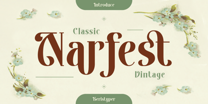 Narfest is a classic vintage serif font with an art nouveau style, in feminine and unique characteristics. This font is good for logo design, Social media, Movie Titles, Books Titles, short text even long text letters, and good for your secondary text font with script, sans, or serif. **Featured:** * Standard Uppercase & Lowercase * Numeral & Punctuation * Multilingual : ä ö ü Ä Ö Ü ß ¿ ¡ * Alternate & Ligature * PUA encoded We recommend programs that support the OpenType feature and the Glyphs panel such as Adobe applications or Corel Draw. so you can use all the variations of the glyphs. Hope you enjoy our fonts!
 - Rollgates Victoria by Cotbada Studio,
$16.00 It's too much fun! Of all the fonts I have designed, this is my favorite. Thin strokes and delicate embellishments really do it for me and I hope it's for you too! You won't find curves like this in regular fonts. This is modern meets the classic, minimally meets the decorative. Look at the numbers ... then, look again. They have curves of all kinds of unusual places. If you want to stand out then this is the font for you. Logo or title, fashion distribution to masthead, monogram or Instagram, create beautiful art with this font. Rollgates Victoria can do it!
 - Bitter Kiss by Gassstype,
$22.00 Here comes a New font,Introducing Bitter Kiss - Lovely Handwritten Font with a natural style and dramatic movement. Crafted manually with love and passion, This font is great for your next creative project such as logos, printed quotes, invitations, cards, product packaging, headers, Logotype, Letterhead, Poster, Label, and etc. Bitter Kiss a natural Hand Drawn feel. This handmade font will make your design has a beautiful natural touch for each details. It is perfect for any design project as Invitation,logo, book cover, craft or any design purposes,photos, photography overlays, signs, window art, scrapbooking, tags and so much more!
 - Hiper Hoper by Sipanji21,
$10.00 "Hyper Hoper" is a 3D layered graffiti font that includes regular, shadow, and inner styles within each character. Fonts with multiple layers like this are designed to provide a three-dimensional effect to the text, enhancing its depth and visual appeal. By utilizing the regular, shadow, and inner layers in "Hyper Hoper," you can create text that appears to have depth and dimension, with shadowed and inner details adding a dynamic quality to the font. This font is suitable for various design projects such as graffiti art, posters, or any creative work where a bold and three-dimensional typographic style is desired.
 - Fox Love by Fox7,
$16.00 Fox Love is a cute and fun color font. This font is your go-to for crafting cute greeting cards that express affection and warmth. Whether you’re a designer, a social media influencer, or someone with a penchant for creative expression. Fall in love with its authentic feel and use it to create gorgeous invitations, beautiful stationary art, eye-catching social media posts, and cute greeting cards. 🌺🌺 Learn more about color font support on third-party apps here: https://www.colorfonts.wtf/ 🌺🌺 🌺🌺 Please note that the Canva do not support color fonts! 🌺🌺
 - McKnight Kauffer by K-Type,
$20.00 McKnight Kauffer is a casual sans derived from poster and book cover lettering by the American designer, Edward McKnight Kauffer, who mainly worked in England through the 1920s and 1930s. The style owes much to Louis Oppenheim's Fanfare of 1927, but without the Germanic blackletter inflection. The two display fonts, regular and outline, have a playful art deco feel, and share spacing and kerning so can be overlapped for bicolor effects.
 - MB NOIR by Ben Burford Fonts,
$30.00 MB NOIR is a 4 weight with italics font family that visually has different layers of style, at first glance its a modern clean geometry based face with some nice retro touches, it also has hints of the vintage about it, with a nod to the art deco style, with alternates and ligatures it gives a lot of scope for its uses and works very well at large and small sizes.
 - Haute Couture JNL by Jeff Levine,
$29.00A style of die-cut cardboard letters and numbers used for signs, displays and show cards was the basis for Haute Couture JNL, an Art-Deco flavored typeface from Jeff Levine. A direct cousin to Signboard JNL, this font shares some similar characteristics in letterforms. Both styles of die-cut lettering were manufactured by a number of companies, and were most popular from the 1940s through the mid-1960s. - Seahawk JNL by Jeff Levine,
$29.00 The 1939 sheet music for “Sea Dreams” had its title hand lettered in an unusual Art Deco style that employed many unusual character shapes and widths within the font design. A teardrop-shaped ‘D’, a slightly off-kilter ‘S’ and a number of other interesting variations became the model for Seahawk JNL, which is available in both regular and oblique versions. The term “Seahawk” is another name for an Osprey.
 - Leaders by Mans Greback,
$59.00 Leaders is a decorative blackletter typeface. Created by Måns Grebäck during 2020, this medieval style lettering can be used for modern contexts that require a touch of flourishing, as well as any middle age art or festive occation. OpenType functions such as ligatures and alternates are present in the typeface. It contains numbers and all symbols and punctuation you'll ever need. The font also has support for European, Latin-based languages.
 - Fantastico by Sohel Studio,
$16.00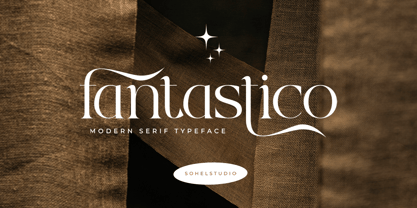 Fantastico is a Classy serif typeface Unique alternate , multilingual support with perfect kerning. This typeface is perfect for an elegant & luxury logo , classy editorial design, women's magazine, fashion brand , cosmetic brand, fashion promotion , modern advertising design, invitation card, art quote, home decoration , book/cover titles, special events, and much more. This elegant font needs to be in your collection and is perfect for your next luxury design project.
 - Night Halloween by Wyarecreatype,
$13.00 Night Halloween is a lovely halloween themed. Wide variety of halloween line art for Stylistic Alternates. Masterfully designed to become a true favourite, this font has the potential to bring each of your creative ideas to the highest level! Perfectly fit for the visual project such as logo, branding, poster, food and beverages, social media content, website, UI/UX design, youtube thumbnail, CV, mood board, wedding, you name it.
 - Calamity Jane NF by Nick's Fonts,
$10.00This typeface is an amalgam of Edwardian and Art Deco letterforms: the lowercase letters come from a turn-of-the-twentieth-century typeface named Amsterdam, and the uppercase letterforms come from a 1930s logotype for the Théâtre Moderne in Paris. Like its namesake, this typeface is not easily overlooked. This font contains the complete Latin language character set (Unicode 1252) plus support for Central European (Unicode 1250) languages as well. - Deco Of Tomorrow JNL by Jeff Levine,
$29.00 On occasion, when seeking retro source material for font designs, one can unearth interesting examples of typography that bridges decades with its ahead-of-its-time style. The songwriter credits on one particular piece of vintage sheet music had both the Art Deco influence but took on more of a techno look that was popularized in the 1980s. This hybrid of generations is the basis for Deco of Tomorrow JNL.
 - Mirthfind by Sohel Studio,
$16.00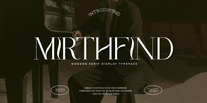 Mirthfind is a Classy serif typeface Unique alternate , multilingual support with perfect kerning. This typeface is perfect for an elegant & luxury logo , classy editorial design, women's magazine, fashion brand , cosmetic brand, fashion promotion , modern advertising design, invitation card, art quote, home decoration , book/cover titles, special events, and much more. This elegant font needs to be in your collection and is perfect for your next luxury design project.
 - Waxedtown GT by Gartype Studio,
$15.00 Street Arts give us inspiration to make a uniquely typeface with a touch of street artistic typeface with graffiti vibes. Waxedtown is a graffiti inspired typeface from us that also comes with multilingual features and extra graffiti swashes to make graffiti vibes. This font look so great when you using it for projects like text headlines, product packaging, poster, music purpose, game logo title, brands, and mascot logo designs.
 - Garstang Engraved by Greater Albion Typefounders,
$18.00 Garstang Engraved is the latest in Greater Albion's series of ‘wood type’ inspired fonts. Garstang Engraved is a hand-cut Roman, suggesting the late Victorian era, but the type of thing that continued in use well into the twentieth century. If you want a title face that has versatility and suggests a past history, as well as the art of finely cut wood type, then this is it!
 - Pure Psychedelia by Mysterylab,
$19.00 For a versatile timeless look that's sure to bring any groovy graphic idea to life, we have dubbed this offering: Pure Psychedelia. This condensed font is shot through with twin strands of modernized Art Nouveau and reimagined 1960s psych. This classic stylistic mélange is distilled down to a heady mix of hippy-trippy lava lamp blobs and assertively pointy end tapers, for a unique vibe and a dynamic linear flow.
 - Farm Girl by Open Window,
$19.95 From the lab of Open Window comes Farm Girl. Farm Girl was inspired by old Art Nouveau posters from Toulouse Lautrec and others. Farm Girl utilizes the same 'loosey-goosey' quality as those posters. Farm Girl consists of 3 different styles which are designed to be used in combination with each other. Many different variations are possible. It's fresh cut and contemporary. It's ideal use is as a display font.
