10,000 search results
(0.055 seconds)
- Kelly Signature by Ake,
$15.00 Kelly Signature is a unique handwritten font. A little bit quirky, this font looks incredibly adept on a wide variety of contexts! This font is PUA encoded which means you can access all of the glyphs and swashes with ease!
 - Degila by Letterena Studios,
$10.00 Degila is a cool and trendy serif font. It is PUA encoded which means you can access all of the glyphs and swashes with ease! Add it to your most creative ideas and notice how it makes them come alive.
 - Western Bevel JNL by Jeff Levine,
$29.00Western Bevel JNL smooths out the ornate design of Stablehand JNL to offer a cleaner slab serif font that retains its Western wood type feel. Aside from Western themes, it can be applied to sports team promotions and other nostalgic projects. - Kitra 77 by LightHouse,
$49.00Kitra 77 was one of the studies to Hamuel Nine Five. Though at first glance we can find several similarities, a closer look will reveal a completely different font in color and proportion. Kitra 77 is an OpenType/TTF Unicode font. - Milton Keynes by Dumadi,
$20.00 Milton Keynes is a modern thick font that comes from hand scratches so it is great for branding logos, t-shirt designs, posters, business cards, typography, newspapers, other design projects and many other media that can be manipulated with this font.
 - EightZeta by GRIN3 (Nowak),
$14.00EightZeta is a hand-drawn font designed by Bartek Nowak. It can be used for invitations, greeting cards, posters, advertising, weddings, books, menus etc. Language support includes Western, Central and Eastern European character sets, as well as Baltic and Turkish languages. - Lightning Christmas by Letterafandi Studio,
$16.00 Lightning Christmas is handwitten font featuring stars light. It will add an awesome to any design project that you wish to create! This font is PUA encoded which means you can access all of the glyphs and swashes with ease!
 - Groovy Night by Brown Cupple Typeface,
$15.00 Groovy Night is a retro groovy display font. The additional elements of blood dripping and bones-like letters make an ambiance of horror Invitations, postcards, posters, and headings for a Halloween event; this font can be used in every setting.
 - Turman Grotesk by Chank,
$99.00 Turman Grotesk is inspired by the hand-drawn painterly letterforms poster artist Adam Turman uses in his poster designs. Each character uppercase and lowercase has contextual alternates that can be used to give your type a more natural, handmade feel.
 - Liberty Script by Monotype,
$29.99The Liberty font was designed by William T. Sniffin and released in 1927. This script is very fine, with a light color. Liberty can be used on stationery and packaging and is also suitable for short pieces of copy in brochures. - Domek by Kulturrrno,
$7.00 Domek is a tall modern typeface. Includes 3 styles (Regular, Shadow, Halftone shadow), you can combine layers to make effects. Some stylistic alternates Extended latin glyph set This fonts are perfect for : logo design, headers, posters, packaging designs and more.
 - Ringtrack by Patria Ari,
$15.00 Ringtrack is a sharp and strong brush script font with variable swashes you can try on. This font perfect for branding projects, apparel, logo, social media posts, advertisements, product packaging, product designs, label, and any projects that you work on.
 - Sweet Holidays Brush by Stripes Studio,
$20.00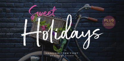 Sweet Holidays Brush is a super casual hand brushed script with detailed brush stroke texture, and a quirky, Can be used for various purposes. such as the title, signature, letterhead, signage, labels, newsletters, posters, logos, correspondence, wedding invitations, badges, etc.
 - Soul Taker by Gassstype,
$27.00 Hello Everyone, introduce our new product Font Soul Taker This is a Monsters Display Font.This is a Textured Natural Style and classy style with a clear style and dramatic movement. You can activate 3 Ligatures and 7 Alternate glyphs OpenType panel.
 - Marquee by Pelavin Fonts,
$15.00 Marquee is a family of two fonts, containing both faceted and solid characters which can be layered to effect 3D, dimensional and translucent marquee-style typography, allowing for the creation of headlines reminiscent of classic theater and motion picture marquee signage.
 - FM Rossija by FontMeister,
$24.95 'Rossija' is inspired by russian typographic designs. It's bold look makes a perfect font for the use of titles. You can use these fonts to create posters, greeting cards, scrapbooks, CD labels, T-shirts, coffee mugs, digital videos websites and banners.
 - Italian Typewriter by Flanker,
$20.00 Italian Typewriter was designed by Leonardo Di Lena studying some Italian typewriters of the thirties and forties. Italian Typewriter is a monospaced font that can be used for any work that requires an old-fashioned look or an old-tech look.
 - Happy vibe by Brown Cupple Typeface,
$15.00 Happy vibe is a cool retro groovy decorative font. The additional elements of blood dripping and bones-like letters make an ambiance of horror Invitations, postcards, posters, and headings for a Halloween event; this font can be used in every setting.
 - Dialog Anila by Prioritype,
$12.00 Simple and eye-catching display fonts for your design touch. You can apply it to packaging designs, posters, logos, quotes, merchandise etc. See some of the previews above for reference. Features: -Uppercase -Lowercase -Numeral -Punctuation -Multilingual -PUA Encoded -Opentype Features
 - Decorative Tuscanian by Intellecta Design,
$16.90a drop caps joining a barocque frame plus tuscanian caps - Heading Now by Zetafonts,
$39.00 Heading Now is the new incarnation of Heading Pro, developing the original typeface family designed by Francesco Canovaro for Zetafonts into a superfamily with 160 variant combinations. Built around 10 different widths, ranging from ultra-compressed to ultra-wide, and eight weights from thin to heavy, Heading Now provides a full spectrum of sans serif type solutions to your design problems. Born as a space-optimizing typeface for headers and titles, Heading Now can be used in its compressed widths to manage space on the printed page and on the screen. In these widths Heading Now excels in titles and subheadings, timetables, infographics and in situations of exuberant and excessive copywriting. On the other side of the width spectrum, you can find extended width variants, ready to be used for titling where style and energy matter more than pixel or paper economy. Heading family is not only made of extreme widths: you can use the medium width range to design body text. Matching italics provide versatility in text use, as well as a dynamic display alternate to the bolder weights. Heading Now keeps the original design of Heading, but extends the width and weight range while keeping its (post) modernist attention to readability and details. Each Heading Now font includes over 1100 characters with coverage for 200+ languages using Latin, Cyrillic and Greek alphabets. A full array of open-type features is included in each weight featuring also stylistic alternates, small caps, old-style and tabular numerals and positional figures. • Suggested uses: born as a space-optimizing typeface for headers and titles, Heading Now can be used in its compressed widths to manage space on the printed page and on the screen. Perfect for contemporary branding, web design, packaging and countless other projects; • 162 styles: 8 weights + 8 italics x 10 different widths + 2 variable fonts; • 1100 glyphs in each weight; • Useful OpenType features: Access All Alternates, Small Capitals From Capitals, Case-Sensitive Forms, Glyph Composition / Decomposition, Denominators, Fractions, Kerning, Standard Ligatures, Lining Figures, Localized Forms, Mark Positioning, Mark to Mark Positioning, Numerators, Oldstyle Figures, Ordinals, Proportional Figures, Stylistic Alternates, Scientific Inferiors, Small Capitals, Stylistic Set 1, Stylistic Set 2, Stylistic Set 3, Stylistic Set 4, Subscript, Superscript, Tabular Figures, Slashed Zero; • 220 languages supported (extended Latin, Cyrillic, Greek alphabets): English, Spanish, Portuguese, French, Russian, German, Javanese (Latin), Vietnamese, Turkish, Italian, Polish, Afaan Oromo, Azeri, Tagalog, Sundanese (Latin), Filipino, Moldovan, Romanian, Indonesian, Dutch, Cebuano, Igbo, Malay, Uzbek (Latin), Kurdish (Latin), Swahili, Greek, Hungarian, Czech, Haitian Creole, Hiligaynon, Afrikaans, Somali, Zulu, Serbian, Swedish, Bulgarian, Shona, Quechua, Albanian, Catalan, Chichewa, Ilocano, Kikongo, Kinyarwanda, Neapolitan, Xhosa, Tshiluba, Slovak, Danish, Gikuyu, Finnish, Norwegian, Sicilian, Sotho (Southern), Kirundi, Tswana, Sotho (Northern), Belarusian (Latin), Turkmen (Latin), Bemba, Lombard, Lithuanian, Tsonga, Wolof, Jamaican, Dholuo, Galician, Ganda, Low Saxon, Waray-Waray, Makhuwa, Bikol, Kapampangan (Latin), Aymara, Zarma, Ndebele, Slovenian, Tumbuka, Venetian, Genoese, Piedmontese, Swazi, Zazaki, Latvian, Nahuatl, Silesian, Bashkir (Latin), Sardinian, Estonian, Afar, Cape Verdean Creole, Maasai, Occitan, Tetum, Oshiwambo, Basque, Welsh, Chavacano, Dawan, Montenegrin, Walloon, Asturian, Kaqchikel, Ossetian (Latin), Zapotec, Frisian, Guadeloupean Creole, Q’eqchi’, Karakalpak (Latin), Crimean Tatar (Latin), Sango, Luxembourgish, Samoan, Irish, Maltese, Tzotzil, Fijian, Friulian, Icelandic, Sranan, Wayuu, Papiamento, Aromanian, Corsican, Breton, Amis, Gagauz (Latin), Māori, Tok Pisin, Tongan, Alsatian, Atayal, Kiribati, Seychellois Creole, Võro, Tahitian, Scottish Gaelic, Chamorro, Greenlandic (Kalaallisut), Kashubian, Faroese, Rarotongan, Sorbian (Upper Sorbian), Karelian (Latin), Romansh, Chickasaw, Arvanitic (Latin), Nagamese Creole, Saramaccan, Ladin, Kaingang, Palauan, Sami (Northern Sami), Sorbian (Lower Sorbian), Drehu, Wallisian, Aragonese, Mirandese, Tuvaluan, Xavante, Zuni, Montagnais, Hawaiian, Marquesan, Niuean, Yapese, Vepsian, Bislama, Hopi, Megleno-Romanian, Creek, Aranese, Rotokas, Tokelauan, Mohawk, Onĕipŏt, Warlpiri, Cimbrian, Sami (Lule Sami), Jèrriais, Arrernte, Murrinh-Patha, Kala Lagaw Ya, Cofán, Gwich’in, Seri, Sami (Southern Sami), Istro-Romanian, Wik-Mungkan, Anuta, Cornish, Sami (Inari Sami), Yindjibarndi, Noongar, Hotcąk (Latin), Meriam Mir, Manx, Shawnee, Gooniyandi, Ido, Wiradjuri, Hän, Ngiyambaa, Delaware, Potawatomi, Abenaki, Esperanto, Folkspraak, Interglossa, Interlingua, Latin, Latino sine Flexione, Lojban, Novial, Occidental, Old Icelandic, Old Norse, Slovio (Latin), Volapük;
 - Gready PERSONAL USE ONLY - Personal use only

- Ekorre PERSONAL USE ONLY Black - Personal use only

- Patched Medium - Personal use only

- Heartland by NREY,
$25.00 Heartland font family is a pack of the bold connected script and rounded sans. Font is great to use for logotype, menu and product labels, prints, posters, branding, social media. This pack include 3 fonts: - Heartland Script - Heartland Sans - Heartland Sans Condensed - Heartland Italic Sans - Heartland Bold Sans Download Heartland for your next project today! Thank you and have a great day!
 - Letric PERSONAL USE ONLY - Personal use only

- Rezak by TypeTogether,
$36.00 Nothing is hidden in the simplistic forms and overt aesthetic of Anya Danilova’s Rezak font family. Rezak is not a type family directly from the digital world, but was inspired by the stout presence of cutting letters out of tangible material: paper, stone, and wood. With only a few cuts, the shapes remain dark and simple. With more cuts, the shapes become lighter and more defined, resulting in a dynamic type family not stuck within one specific category. The Black and medium weights began as one approach before separating into display and text categories. The four text weights were created through pendulum swings in design direction that experimented with contrast, angles, tangent redirections, and the amount of anomalies allowed. The text weights are vocal when set larger than ten points and subtle at smaller sizes. The tech-heavy Incised display style came last, employing a surprising range of trigonometric functions to make it behave exactly as desired. Its look can result in something distinctive and emotional or completely over-the-top. Most normal typefaces change only in thickness; Rezak changes in intention, highlighting the relationship between dark and light, presence and absence, what’s removed and what remains. Rezak’s Black and Incised display styles are like a shaft of light in reverse and are perfect in situations of impact: websites, headlines and large text, gaming, call-outs, posters, and packaging. The tone works for something from youthful or craft-oriented to organic and natural products. Try these two in logotypes, complex print layering, branding, and words-as-pattern for greater experimentation. The text styles are bold, energetic, well informed, and round out the family with four weights (Regular, Semibold, Bold, Extrabold) and matching italics for a family grand total of ten. These jaunty styles work well in children’s books, call-outs, movie titles, and subheads for myriad subjects such as architecture, coffee, nature, cooking, and other rough-and-tumble purposes. Rezak’s crunchy letters are meant to expose rough, daring, or dramatic text. A further benefit is that this family is not sequestered within one specific genre or script, so it can be easily interpreted for other scripts, such as its current Latin and extended Cyrillic which supports such neglected languages as Abkhaz, Itelmen, and Koryak. Rezak’s push toward creativity and innovation, with an eye on typography’s rich history, reinforces our foundry’s mission to publish invigorating forms at the highest function and widest applicability.
 - Kernig Braille by Echopraxium,
$5.00 This font is the younger sister of HexBraille with which it may be combined to create new patterns. This also explains why their introductory text are similar. Introduction The purpose of this monospace font is to display braille in an original and "steganographic" way. The Kernig prefix means "Robust" in German, this is because of the crank shapes . The core of the glyph design is a flat hexagon which can be read as 3 rows of 2 dots (i.e. regular braille glyph grid). Even if within a glyph, braille dots ("square dots" indeed) are placed on the vertices of a flat hexagon, the difference with HexBraille is that edges connecting vertices are not straight lines but "crank shapes" instead. This can be summarized by saying that the whole glyph is a Hexcrank (a flat hexagon where vertice pairs are connected by a crank shape) NB: The initial design is illustrated by glyphs 'ç' (no dot) and 'û' (6 dots) as shown by poster 6. A. "Kernig Lattice" In KernigBraille, glyphs are connected to each other, thus for each Hexcrank glyph there are 6 connections: 2 on left/right and 4 on top/bottom. In the final design some cranks were removed for esthetical reason (i.e. leave empty space for allowing patterns diversity). In summary, a text using this font won't display a honeycomb but a lattice instead. NB: Please notice that in order to obtain the lattice without vertical gaps, you must set the interline to 0. The lattice is made from 3 kind of shapes: a.1. Hexcrank a.2. Square a.3. Irregular cross (mostly unclosed) The design favored squares over crosses. The whole slightly resembling a PCB. B. Text Frames It's possible to frame the text with 4 sets of frame glyphs (as illustrated by poster 2) b.1. Kernig { € ° £ µ § ¥ ~ ¢ } b.2. Rectangular-High { è é ê ï î à â ä } b.3. Rectangular-Low { Â ù Ä Ê Ë Ô õ ö } b.4. Mixed Kernig+High: a mix of Kernig and Rectangular-High frame glyphs When using frame glyphs, it is advised to show Pilcrow (¶) and Non Breaking Space, which are replaced by empty shapes in this font (e.g. in Microsoft Word, use CTRL+8 or use [¶] button in the ribbon).
 - Bouncy PERSONAL USE ONLY - Personal use only

- Brannboll Fet - Personal use only

- Bezar - Personal use only

- Shipped Goods 1 (Personal Use) - Personal use only

- Respective - Personal use only

- The World Is Yours - Personal use only

- Allrounder Monument by Identity Letters,
$22.00 An inscriptional titling font for truly epic headlines. Allrounder Monument is an inscriptional, dignified member of the Allrounder superfamily. This all-caps typeface with delicate serifs was inspired by ancient inscriptions on columns, monuments, and buildings in Rome: letters as old as two millennia that radiate their own classic charm. Allrounder Monument picks up this atmosphere in order to create a typographic tool that lives up to contemporary demands. It infuses today’s designs with a hint of history and an air of exclusivity. Allrounder Monument is a timeless titling typeface. You might use it for posters, magazines, book covers, greeting cards, advertising or packaging work, and even signage. If you want an even more spectacular and exciting headline or title, additional Discretionary Ligatures and a Stylistic Set provide the necessary OpenType power to achieve this goal with ease. As Allrounder Monument is a part of the Allrounder superfamily, you can combine the three weights Book, Regular and Medium with the corresponding weights of Allrounder Grotesk. The Allrounder superfamily is a series of typefaces sharing the same color and horizontal metrics (cap height, small cap height and x-height): a typesetting system whose components match each other perfectly. Any other part of this design kit, e. g., Allrounder Grotesk or Allrounder Antiqua, may be easily combined with Allrounder Monument. Whenever you need a truly epic headline, Allrounder Monument is the best horse in your barn. Ad astra!
 - Totemic by Canada Type,
$29.95 Jim Rimmer’s first typeface was originally published in 1970 as a basic film type alphabet through a small, independent type house in central California. Its sources of influence (now calligraphic type standards by Dair, Goudy and Zapf) are ones that remained with Jim for the rest of his career. If you squint at Totemic in just the right way, you can see some recognizable themes Jim would later flesh out and make his own in later works throughout his career as a type designer and printer. Totemic is now available for the first time as a digital font, of the refined and expanded kind now expected from Canada Type. It comes with quite a few standard advanced typography features: Small caps, caps-to-small-caps, automatic fractions and standard ligatures, stylistic alternate sets, six kinds of figures, case-sensitive forms, and extended Latin language support. It also comes with a very unique and unprecedented feature: Variably stackable totem poles. Simply enable the discretionary ligatures feature, type any unique three-digit combination using numbers between 1 and 4, and watch the magic happens. With a name like Totemic, we just couldn't help ourselves. Many thanks to Andrew Steeves of Gaspereau Press for finding Jim’s lost gem in a most unexpected place, and for helping us bring it back to life 45 years after its analog birth. 20% of Totemic’s revenues will be donated to the Canada Type Scholarship Fund, supporting higher typography education in Canada.
 - PT Serif Pro by ParaType,
$50.00PT Serif Pro is an universal type family designed for use together with PT Sans Pro family released earlier. PT Serif Pro coordinates with PT Sans Pro on metrics, proportions, weights and design. It consists of 38 styles: 6 weights (from light to black) with corresponding italics of normal proportions; 6 weights (from light to black) with corresponding italics of narrow proportions; 6 weights (from light to black) with corresponding italics of extended proportions; and 2 caption styles (regular and italic) are for texts of small point sizes. The letterforms are distinguished by large x-height, modest stroke contrast, robust wedge-like serifs, and triangular terminals. Due to these features the face can be qualified as matched to modern trends of type design and of enhanced legibility. Mentioned characteristics beside conventional use in business applications and printed stuff made the fonts quite useable for advertising and display typography. Each font next to standard Latin and Cyrillic character sets contain alphabet glyphs of title languages of the national republics of Russian Federation and support the most of the languages of neighboring countries. The fonts were developed and released by ParaType in 2011 with financial support from Federal Agency of Print and Mass Communications of Russian Federation. PT Serif family together with PT Sans won the bronze in Original Typeface category of ED-Awards 2011. Design – Alexandra Korolkova with assistance of Olga Umpeleva and supervision of Vladimir Yefimov - The "Action Is, Shaded JL" font, crafted by Jeffrey N. Levine, stands as a unique and expressive typeface designed to make a statement. This font is characterized by its distinct shading effect, whic...
- ForeignSheetMetal - Unknown license

- FIREBIRD by Cerri Antonio,
$35.00 FIREBIRD regular, outline and bold, is an 3 font system that can be layered in different ways to create a infinite title effects used commonly in poster and 3D logo design. Firebird’s layer combinations give you complete control in producing styles like, outline, 3D, beveled. It can be used alone and/or in layered and allows you adjust leading and kerning. Each font contains the similar metrics, so when your title is set, copy and paste-in-place to create layers of different weights/styles to build out your desired effect. Firebird works great in any graphics application that allows you to utilize layers or 3D effects.


