994 search results
(0.006 seconds)
- Bubblegum Pop by Device,
$39.00 A funky balloon type in three variants, Highlight, Shadow and plain old Vanilla. Guaranteed to bring a sense of playful fun to packaging, comic magazines, and merchandise.
 - Yancha Pop by Norio Kanisawa,
$50.00 It's a heavy and pop font that I imagined to be a naughty child. There are three kinds of "YanchaPop" which is easy to use with standards, "YanchaPopRounded" with a gentle impression which rounded the corner a little, "YanchaPopJitabata" of a cheerful image tilted randomly. It corresponds to Hiragana · Katakana · Alphabet · Numerals · Symbols · Kanji(chinese characters). You can also write vertically. You can use it easily, because it contains JIS first · second level, and IBM extended Kanji(about 6700chinese characters). This font is bold, recommended to use it for headlines and prominent places. It might be good for shop pop etc. I think it would be fun to make people around us happy like a naughty child. <「やんちゃポップ」紹介文> やんちゃな子供をイメージした、太めのポップ体です。 スタンダードで使いやすい「やんちゃポップ」、角を少し丸くした優しい印象の「やんちゃポップRounded」、ランダムに文字を傾けた元気なイメージの「やんちゃポップじたばた」の3種類がございます。 ひらがな・カタカナ・アルファベット・数字・記号類・漢字に対応。縦書きもできます。 漢字はJIS第一水準・第二水準・IBM拡張漢字(約6700文字)に対応しているので、使いやすいかと思います。 太めのフォントなので、見出しや目立つ場所に使うのがオススメです。お店のポップなどにもいいかもしれません。 やんちゃな子供みたいに、周囲の人たちを楽しくできるようなフォントになればいいなぁと思います。 <スタイルカテゴリー> ポップ体、角ゴシック
 - Pop Cubism by K-Type,
$20.00 The Pop Cubism fonts are inspired by Roy Lichtenstein who combined the strong outlines and benday dots of Pop Art with the fragmented viewpoints and facet line divisions of Cubism. The bold letterforms are derived from a variety of styles, both serif and sans, angular and rounded. Pop Cubism is available in two packages: Pop Cubism Shaded is a single font which contains the lines and dot tones for use in a single color. The Pop Cubism Color Kit contains three matching fonts (Pop Cubism Outline, Pop Cubism Halftone Underlay and Pop Cubism Color Underlay) for overlaying different colors of lines, dot tones, and background color.
 - Pickey Pop by Nathatype,
$29.00 Pickey Pop is a delightful display font that combines a thick weight, low contrast letters, and charming swinging endings. With its playful and bold design, this typeface brings a sense of joy and vibrancy to any creative project. The thick weight of this font adds a strong and confident presence to each letter. The boldness of the strokes creates visual impact and ensures legibility even at smaller sizes. This display font demands attention and stands out effortlessly in any design composition. In contrast to its bold weight, Pickey Pop features low contrast letters. This design choice gives the font a sense of solidity and consistency. The uniform strokes contribute to a clean and contemporary appearance, making it a versatile choice for a wide range of design applications. What makes this font truly special are the swinging endings found in select letters. These whimsical details add a touch of playful movement and uniqueness to the font. The swinging letter endings bring a sense of rhythm and energy, infusing your designs with a joyful and dynamic quality. For the best legibility you can use it in the bigger text. Enjoy the available features here. Features: Stylistic Sets Ligatures Multilingual Supports PUA Encoded Numerals and Punctuations Pickey Pop fits in headlines, logos, attention-grabbing titles, product packaging, branding materials, editorial layouts and website headers. Find out more ways to use this font by taking a look at the font preview. Thanks for purchasing our fonts. Hopefully, you have a great time using our font. Feel free to contact us anytime for further information or when you have trouble with the font. Thanks a lot and happy designing.
 - Blitz Pops by Maulana Creative,
$12.00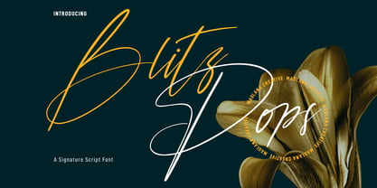 Blitz Pops is an expressive signature script font. With high contrast stroke, fun character with a bit of ligatures and alternates. To give you an extra creative work. Blitz Pops font support multilingual more than 100+ language. This font is good for logo design, Social media, Movie Titles, Books Titles, a short text even a long text letter and good for your secondary text font with sans or serif. Make a stunning work with Blitz Pops font. Cheers, MaulanaCreative
 - Loli Pop by Hatftype,
$15.00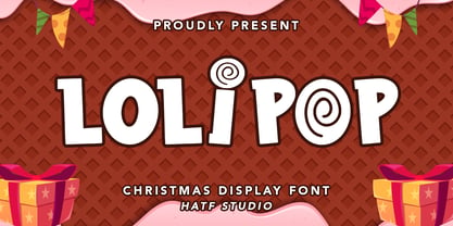 Loli Pop - Christmas Display Font is a font with distinctive handwritten characters perfect for branding projects, logos, wedding designs, media posts, advertisements, product packaging, product designs, labels, photography, watermarks, invitations, stationery, and any project who need handwritten dishes. Features : • Character Set A-Z • Numerals & Punctuations (OpenType Standard) • Accents (Multilingual characters) • Ligature Multilingual Support : Afrikaans, Albanian, Asu, Basque, Bemba, Bena, Catalan, Chiga, Cornish, Danish, English, Estonian, Faroese, Filipino, Finnish, French, Friulian, Galician, German, Gusii, Icelandic, Indonesian, Irish, Italian, Kabuverdianu, Kalenjin, Kinyarwanda, Low German, Luo, Luxembourgish, Luyia, Machame, Makhuwa-Meetto, Makonde, Malagasy, Malay, Manx, Morisyen, North Ndebele, Norwegian Bokmål, Norwegian Nynorsk, Nyankole, Oromo, Portuguese, Romansh, Rombo, Rundi, Rwa, Samburu, Sango, Sangu, Scottish Gaelic, Sena, Shambala, Shona, Soga, Somali, Spanish, Swahili, Swedish, Swiss German, Taita, Teso, Vunjo, Zulu There it is! I really hope you enjoy it
 - Chartu Poo by Enfeeltype,
$15.00 Chartu Poo is a stunning modern sans serif font that exudes a sense of luxury and sophistication. Its futuristic concept is truly unique, and makes it stand out from other fonts in its class. The sleek lines and bold curves of Chartu Poo give it a sense of elegance and refinement, while also conveying a sense of modernity and innovation. One of the things that sets Chartu Poo apart is its versatility. It can be used in a wide range of design projects, from logos and branding materials to website designs and advertising campaigns. Whether you're looking to create a bold and impactful headline, or a subtle and understated body copy, Chartu Poo is the perfect font for the job. Another great feature of Chartu Poo is its readability. Despite its bold and unique design, this font is incredibly easy to read, making it a great choice for both print and digital media. Whether you're designing a brochure or a website, Chartu Poo will ensure that your message is conveyed clearly and effectively. In short, if you're looking for a modern sans serif font that combines luxury, sophistication, and innovation, look no further than Chartu Poo. Its unique and futuristic concept, combined with its versatility and readability, make it the perfect choice for any design project.
 - Lunar Pop by Prioritype,
$19.00 Lunar Pop - Display Font. Bold and fun fonts are here to accompany your design projects. Consists of 2 styles, namely Regular & Outline which further adds to the creative value of this font. Perfect for poster design, branding, crafting, merchandise and more. Features: Uppercase, Lowercase, Numeral, Punctuation & Multilingual. Multilingual contained: Afrikaans, Albanian, Asu, Basque, Bemba, Bena, Breton, Catalan, Chiga, Cornish, Danish, Dutch, English, Estonian, Filipino, Finnish, French, Friulian, Galician, German, Gusii, Indonesian, Irish, Italian, Kabuverdianu, Kalenjin, Kinyarwanda, Luo, Luxembourgish, Luyia, Machame, Makhuwa-Meetto, Makonde, Malagasy, Manx, Morisyen, North Ndebele, Norwegian Bokmål, Norwegian Nynorsk, Nyankole, Oromo, Portuguese, Quechua, Romansh, Rombo, Rundi, Rwa, Samburu, Sango, Sangu, Scottish Gaelic, Sena, Shambala, Shona, Soga, Somali, Spanish, Swahili, Swedish, Swiss German, Taita, Teso, Uzbek (Latin), Volapük, Vunjo, Zulu. Thanks!
 - Pop Manta by Kickingbird,
$24.00 Pop Manta delivers the perfect punch when impact is needed. Useful on everything from boxes of bubble gum to pro wrestling posters. Pop Manta has been described as "Morris Fuller Benton meets Roy Lichtenstein". Benton's 1903 neo-grotesque letter shapes set to a Pop Art beat. With over 650 glyphs, characters, symbols and ornaments, Pop Manta is a complete design kit in one font. A full range of accents and extras allows Pop Manta to speak well over 70 languages. Including: Afrikaans, Basque, Breton, Catalan, Danish, Dutch, English, Finnish, French, Gaelic, German, Icelandic, Indonesian, Irish, Italian, Norwegian, Portuguese, Sami, Spanish, Swahili, Swedish, Croatian (Latin), Czech, Estonian, Hungarian, Latvian, Lithuanian, Polish, Romanian, Serbian (Latin), Slovak, Slovenian, Turkish, Afar, Azerbaijani, Belarusian (Latin), Chichewa, Croatian (Latin), Gikuyu, Greenlandic, Guarani, Igo/Igbo, Kuskokwim, Luba (Ciluba), Malay, isiNdebele, Oromo, Pilipino/Tagalog, Setswana, Sidamo, Somali, Sotho (Northern and Southern), Swazi, XiTsonga, Tuareg, Uzbek (Latin), Vietnamese, Welsh, isiXhosa, Yoruba, and isiZulu.
 - Go POP by Gleb Guralnyk,
$14.00 Hey! Introducing a vintage style font GoPOP. This font was inspired by 80s pop culture and has a smooth rounded shape with decorative thin lines. Base shape and additional lines can be combined from two font layers, for easy color manipulations.
 - Hypne Pop by Sitintahitam,
$9.00 Hypne Pop is inspiring by retro pop culture, groovy, and funky. Hypne Pop comes with 9 weight unique regular and unique slanted style. Hypne Pop have a different characters in every style. This font also suitable for making headlines, stickers, T-shirt design, logotypes, poster, magazine, etc.
 - Ziletti Pop by RM&WD,
$20.00 ZILETTI POP is a font used by Girolamo Ziletti in Venice in mid/late 1500. A typographic caracter characterized by a Venetian style cage with slight geometrical imperfections but with a great perceptual level. This is a multilayered variant with a wide range of possibility in variations in terms of end results. With the use of the color your artworks will have news optical effects. Ideal for Covers, Posters, Logos…
 - Pool Deck JNL by Jeff Levine,
$29.00 There's nothing too fancy about Pool Deck JNL, which is based on an older typeface design. It's your basic sans serif condensed type style with a few unconventional letter shapes.
 - Outer Loop NF by Nick's Fonts,
$10.00Here’s the follow-up to my Route 66 series, patterned after the typeface used on signage on the U.S. interstate highway system for fifty years. The numbers and uppercase letters are true to the original, while a number of the lowercase letters show the influence of the new Clearview type. Both versions of the font include 1252 Latin and 1250 CE (with localization for Romanian and Moldovan) character sets. - Two Lines Loop by Kaer,
$21.00 Alphabet set made of two white parallel lines. They are looked like infinite looped icons. Ideal for dynamic app, minimalism design, sports identity, technology adv. What's included? Uppercase (lowercase are the same) Numbers Symbols Punctuation Multilingual support Please feel free to request any help you need: kaer.pro@gmail.com Best, Roman.
 - Typist Slab Prop by VanderKeur,
$25.00 The Typist SlabSerif is part of a big family, the Typist Family. The family consists of a monospaced, a SlabSerif and a SansSerif version. The idea behind this family originated from the research into the design of typewriter typestyles, which is also the reason why the monospaced version was released first. Since it was decided from the start to make a SlabSerif and a SansSerif version of these monospaced fonts, it was also a logical consequence that the proportional variants also became available in these versions. The monospaced SansSerif fonts have been given the name 'Code' since they are designed to be used while writing code for a software program, for example. The proportional variants with each 6 weights of the Typist Slab Serif and Code (SansSerif) are now available. Although the name may seem a bit strange, it is a logical consequence from the monospaced variant. The SlabSerif variant therefore has Typist Slab Prop, written in full the Typist SlabSerif Proportional. After all, who wants to be bothered with long font names in their font menu. The entire Typist family is designed as a font for use in editorial and publishing publications. A lot of attention has been paid to the spacing and kerning of the fonts. Due to the many variants and weights, this font is versatile. Typist Font Family was designed by Nicolien van der Keur and published by vanderKeur design. Typist Slab Prop and Typist Code Prop contains each 6 styles (Thin, Light, Regular, Medium, SemiBold and Bold, each weight also designed as a true italic) and has family package options. The links to the monospaced version of The Typist are here: https://www.myfonts.com/collections/typist-slab-font-vanderkeur https://www.myfonts.com/collections/typist-code-font-vanderkeur
 - Municipal Pool JNL by Jeff Levine,
$29.00 A photo of the now closed [circa-1953] Lowell Municipal Pool (at 1601 N. 28th St.) in Boise, Idaho shows the words “Municipal Pool” formed into the cement of the entrance to the above-ground swimming facility. Both the lettering and building entrance designs harken back to the Art Deco era and the sign features stencil-like characters. This inspired a typeface aptly named Municipal Pool JNL, and is available in both regular and oblique versions.
 - Winnie The Hoop by LetterMaker,
$28.90 Winnie the Hoop is a bold, friendly and round display family inspired by a certain well known teddy bear. The family consists of three styles; Roman, Italic and Script, which are designed to be combined together. You can use any of the three styles as your main style and use the others to create multilayered typography that all share the same aesthetic. The typeface is well suited for branding and packaging design, advertisements, posters and even editorial design as a headline style. The Script is packed with ligatures and has Swash alternates that make it easy to customise your design. All styles include two sets of numerals.
 - Typist Code Prop by VanderKeur,
$25.00 The Typist Code SansSerif is part of a big family, the Typist Family. The family consists of a monospaced, a Slab Serif and a SansSerif version. The idea behind this family originated from the research into the design of typewriter typestyles, which is also the reason why the monospaced version was released first. Since it was decided from the start to make a SlabSerif and a SansSerif version of these monospaced fonts, it was also a logical consequence that the proportional variants also became available in these versions. The monospaced SansSerif fonts have been given the name 'Code' since they are designed to be used while writing code for a software program, for example. The proportional variants with each 6 weights of the Typist Slab Serif and Code (SansSerif) are now available. Although the name may seem a bit strange, it is a logical consequence from the monospaced variant. The SansSerif variant therefore has Typist Code Prop, written in full the Typist Code Proportional. After all, who wants to be bothered with long font names in their font menu. The entire Typist family is designed as a font for use in editorial and publishing publications. A lot of attention has been paid to the spacing and kerning of the fonts. Due to the many variants and weights, this font is versatile. Typist Font Family was designed by Nicolien van der Keur and published by vanderKeur design. Typist Slab Prop and Typist Code Prop contains each 6 styles (Thin, Light, Regular, Medium, Semi-Bold and Bold, each weight also designed as a true italic) and has family package options. The links to the monospaced version of The Typist are here: https://www.myfonts.com/collections/typistslabfont-vanderkeur https://www.myfonts.com/collections/typist-code-font-vanderkeur
 - The Brother Hoops by Figuree Studio,
$24.00 Introducing The Brother Hoops! The Brother Hoops is strong hand-drawn brush font that combines attractive curves with a fresh urban edge; delivering a stylish brush font that is guaranteed to add an eye-catching appeal to your logo designs, brand imagery, handwritten quotes, product packaging, merchandise, social media post, or website font. Features: Uppercase and Lowercase Number and Punctuation Ligature Extra Swash Versatile for branding, headline, or printing product Detailed dry brush markers I hope you enjoy this font. If you have questions, don't hesitate to give me a message
 - Shicken Zoop JNL by Jeff Levine,
$29.00Shicken Zoop JNL is based on an old lettering stencil from the early 1950s. The A-Z and a-z keystrokes contain the bulk of the Hebrew alphabet. Additional letters are found on the exclamation point, quote and apostrophe keystrokes. Vowels are positioned on the period, comma, hyphen, colon and semicolon. Please note that this is not a normal Hebrew font; it is in effect a latin font with Hebrew letters appearing in place of latin letters. It will not allow you to copy and paste with other samples of Hebrew text. - Janda Curlygirl Pop - Personal use only

- SF Synthonic Pop - Unknown license

- Pop Up Fontio - Unknown license

- SF Synthonic Pop - Unknown license

- SF Synthonic Pop - Unknown license

- SF Synthonic Pop - Unknown license

- Pop Tune JNL by Jeff Levine,
$29.00 Pop Tune JNL comes from the hand-lettered title on sheet music for "Does Your Heart Beat for Me?". This 1940s hit was co-written and made famous by Russ Morgan and His Orchestra. Many vintage pieces of sheet music employed hand-lettered titles and cartoon illustrations to emphasize the topic of the song itself.
 - Tokyo City Pop by IKIIKOWRK,
$19.00 Are you prepared to add a retro energy and the vivacious pop culture of the 1980s to your creative projects? Look no further than Tokyo City Pop, the ideal retro pop font that is ready to give your creative pursuits a fresh and vibrant edge! Tokyo City Pop yells instead than merely speaking. Its text is bold and funky, dancing across the page and vibrating with the energy of a busy city. Each word evokes a burst of vitality, embodying the youthful spirit and inventiveness that characterize urban landscape. This typeface is perfect for an vintage stuff, retro poster layout, magazine design, packaging, food & beverages and also good for quotes, or simply as a stylish text overlay to any background image. What's included? Uppercase & Lowercase Number & Punctuation Multilingual Support Works on PC & Mac
 - Corn Pop Plus by Intellecta Design,
$20.90
- P22 Pop Art by P22 Type Foundry,
$24.95 This font set was developed for the Albright-Knox Art Gallery and is inspired by their collection of Pop Art. Artists such as Warhol, Lichtenstein, and Rauchenberg sought to blur the lines between high and low art as well as the boundaries between art and everyday life. The alphabets and extras in this set reflect that spirit.
 - Hip Pop NF by Nick's Fonts,
$10.00Type designer Friedrich Poppl is perhaps best known for his classic text faces and elegant scripts, but it seems he had a playful side as well. This frisky face is based on Dynamische Antiqua, which Poppl did for the Stempel foundry in 1960, but which was never released. Bright, bold and bouncy, it’s the perfect choice for headlines with impish impact. Both versions of this font include the complete Unicode Latin 1252 and Central European 1250 character sets. - Hachi Maru Pop by Norio Kanisawa,
$40.00 It is a cute font that imaged a circle that was popular among young Japanese girls in the 1970s and 1980s, plus elements of the current round character as well. The momentum of the circle fads of the 70s and 80s back then seemed to have been great, and it seems that there were schools that prohibited the use of the round letters as students were all writing, too. In addition, a circular letter contest was held, and it seems that the work selected from many entries was released as a phototype. I tried to round up to the limit while incorporating the elements of that circle and the elements of the round letters that the current Japanese girls would write. It corresponds to Hiragana · Katakana · Alphabet · Numerals · Symbols · Kanji(chinese characters). You can also write vertically. You can use it easily, because it contains JIS first · second level, and IBM extended Kanji(about 6700chinese characters). I think that it is an eye-catching design although it lacks a little on readability, so it is also recommended to use it point-wise. The name "Hachimaru" is a thing that touched "80" in the 1980s. The 80s is one of my favorite times. I think that the power to young girls 'Kawaii' such as circle letters, fancy goods and idols was a very strong era. I hope I can express even a little "Kawaii" culture of that unique and unique 80's Japan. <「はちまるポップ」紹介文> 1970年〜80年代に、日本の若い女の子の間で流行した丸文字をイメージし、現在の丸文字の要素もプラスしたかわいいフォントです。 70〜80年代当時の丸文字の流行の勢いは凄かったらしく、学生さんもみな書いていたそうで、丸文字の使用を禁止する学校もあったそうです。 また、丸文字のコンテストが行われ、多数の応募から選ばれた作品が写植書体としてリリースされたこともあるそうです。 その丸文字の要素と、現在の日本の女の子が書くような丸文字の要素も取り込みながら、極限まで丸っこくしてみました。 ひらがな・カタカナ・アルファベット・数字・記号類・漢字に対応しており、縦書きもできます。 漢字はJIS第一水準・第二水準・IBM拡張漢字に対応(約6700文字)しているので、使い勝手も良いかと思います。 可読性には少々欠けますが目を引くデザインだと思うので、ポイント的に使うのもオススメです。 名称の「はちまる」は80年代の「80」をもじったものです。 80年代は私の好きな時代の1つです。丸文字をはじめ、ファンシーグッズやアイドルなど、若い女の子の「かわいい」へのパワーがとても強い時代だったんだなぁと思います。 その個性的で独特な80年代日本の「かわいい」カルチャーを少しでも表現できてればいいなぁと思います。 <スタイルカテゴリー> 手書き風、丸ゴシック
 - Nanki Poo NF by Nick's Fonts,
$10.00This little gem is based on a typeface discovered in a Boston Type Foundry catalog from the late 1800s, originally called "Mikado". This font gets its name from one of the more memorable characters in Gilbert and Sullivan’s operetta. Both versions of this font include the complete Unicode Latin 1252 and Central European 1250 character sets. - Rocket Pop Outline by astroluxtype,
$20.00 Rocket Pop Outline and Rocket Pop are influenced by product packaging and cereal box art from the 1960’s and 1970’s. The fonts will work as companions or separate. Best used over 36pt as a headline display face, these fonts will bring a bold playfulness to any project where a vintage or retro style is in the concept. The style reflects the era when things were indeed, mad, where men (and some women) did crazy art for vinyl records, food packaging and kiddie products. This outline font will bring a snap and crackle and a pop to any of your vintage design projects. Watch for the Cerealboxx Set coming soon that will include the astroluxtype fonts, Sugarbang! Koo Koo Puff and Rocket Pop together in one delicious box.
 - SF Synthonic Pop Shaded - Unknown license

- SF Synthonic Pop Shaded - Unknown license

- SF Synthonic Pop Condensed - Unknown license

- SF Synthonic Pop Condensed - Unknown license

- KR Oh Witchy Poo! - Unknown license


