10,000 search results
(0.035 seconds)
- Sun-kissed by Krafted,
$10.00 “Live in the sunshine. Swim in the sea. Drink the wild air.” ― Ralph Waldo Emerson Hey there sun-kissed beauties! Are you looking for a gorgeous handwritten font that’ll captivate your viewers and make your branding shine as bright as the sun? Introducing Sun-kissed - A Handwritten Font. With every hand-drawn stroke and curve, Sun-kissed will delight and add brightness, modernity, and fun to wherever it’s placed. Impress your party guests with gorgeous invitations, make a statement on your social media banners, and add a little bit of sunshine to your corporate identity. This stylish Handwritten font is also can be used for headings, logos, business cards, printed quotes, cards, packaging, and presentations. What you’ll get: Multilingual & Ligature Support Full sets of Punctuation and Numerals Compatible with: Adobe Suite Microsoft Office KeyNote Pages Software Requirements: The fonts that you’ll receive in the pack are widely supported by most software. In order to get the full functionality of the selection of standard ligatures (custom created letters) in the script font, any software that can read OpenType fonts will work. We hope you enjoy this font and that it makes your branding sparkle! Feel free to reach out to us if you’d like more information or if you have any concerns.
 - ITC Greengate by ITC,
$29.99ITC Greengate is the result of a time-traveling, intercontinental collaboration--one between 21st century South African designer Richard Every, and early 20th century Scottish artist Jessie Marion King. Jessie Marion King (1875-1949) began her professional career as a book designer and illustrator, but over time her creativity found its outlet in many forms, including posters, jewelry, ceramics, wallpaper, fabrics, murals, interior design and costumes. After eventually settling in Kirkcudbright, Scotland, she founded Green Gate Close, a center for women artists. Although her style is reminiscent of the Art Nouveau artist, Aubrey Beardsley, King's aesthetic was an offshoot of the “Glasgow Style,” a Scottish hybrid of the Arts and Crafts movement and Art Nouveau. Often, her illustrations included hand lettering. It was just this kind of lettering that gave Richard Every his inspiration for ITC Greengate. When he saw some children's book illustrations that King created in 1898, he knew on the spot he had to complete the hand lettering as a typographic font. He began working on the typeface in 1996, but it took six years to be released as an ITC typeface. Every simplified and harmonized King's letterforms slightly and, most importantly, added a suite of lowercase characters. The result is a somewhat earthy Art Nouveau design, with a character quite distinct from typical digital revivals. Every's career has been as diverse as King's. He was born in Durban, South Africa and studied graphic design at ML Sultan Technikon in Durban. He's been an art director, freelance designer, the owner and manager of a nightclub and co-manager of a South African band. “Through it all,” he says, “typography has always been one of my passions.” - Kylo Sans by The Northern Block,
$29.95 Kylo Sans is a carefully blended typeface, one-part humanist, one-part grotesque and a small dose of geometric. It takes the essence of three distinct forms to create a unique, readable typeface with an exact and understated personality. Additionally, the design process includes a hand-eye adjustment to three master weights, giving a greater range of usability across text layouts. Kylo Sans remastered to version 2.0 for improved OpenType features and usability. Details include six weights and italics, over 700 characters with alternative lowercase Q, a, g, l and y. Open type features include six variations of numerals, small caps, ligatures, and language support covering Western, South and Central Europe.
 - BB Anonym (Pro) by Bold Studio,
$49.00 BB Anonym™ (Std/Pro) is based on the research and realizations of the BB Noname™ Typeface and complements the font family with a rounded version. The idea and design are based on the principle of outsourcing and encryption: an intermediate step in the design process and production is inserted: "Designer, reseller, client". The process is not visible to the end user, but it affects the visual result. Compared to the sharp version, the font looks simpler and the craft and technical requirements are more complex. ● 3 Variants: designer, retailer, client ● 20 Stylistic-sets ● 17 Styles ● 39 OpenType features ● 93 Languages support ● 16,371 Glyphs (963/style)
 - Barlouth by Pixesia Studio,
$10.00 Introducing Barlouth - A Modern Handwritten Font Barlouth is a delicate, elegant and flowing handwritten typeface with lovely and well-balanced characteristics. Its soft curves and natural writing make it distinct and beautiful. Barlouth gives lovely typographic harmony for a wide range of design needs, including quotes, poster design, personal branding, promotional materials, logotype, product packaging, etc. Add it to your most creative ideas and see how they come to life! FEATURES - Stylistic Alternates - Ligatures - Uppercase and Lowercase letters - Numbering and Punctuations - Multilingual Support - Works on PC or Mac - Simple Installation - Support Adobe Illustrator, Adobe Photoshop, Adobe InDesign, also works on Microsoft Word Hope you Like it. Thanks.
 - Barlington by Mega Type,
$14.00 Barlington is a monoline script that is classic, vintage, and fun. This font can be used easily, even in mixing and matching with other fonts so that it can provide alternatives and new sensations for designers or craftsmen, in working on various projects. This font can be used for various purposes such as logos, wedding invitations, t-shirts, letterhead, signage, labels, news, posters, badges, and more. Barlington comes with uppercase letters, lowercase letters, numbers, punctuation, and so many variations on each character including OpenType alternatives, and multiple language support. If you have any question, don't hesitate to contact me by email : megatype04@gmail.com Thanks so much for looking and enjoy it!
 - Authentic Romantic by SilverStag,
$14.00 A brand new year is here and a brand new font is here as well. I have to say I had so much fun working on this funky slab serif typeface. I have created some quirky letters and over 100 ligatures + the font comes in four weights - light, regular, medium & italic. The font also includes full language support, punctuation, numerals and detailed instructions how to use ligatures in most of the apps on your computer, as well as in Canva. I invite you to check out the preview images, and I hope you will be immersed in my vision for this creative typeface that, I am sure, will work for all kinds of interesting projects you might be working on this year. If you end up publishing your designs on Instagram, tag me - @silverstagco and I will make sure to showcase your design and work to my audience as well! Authentic Romantic - Slab Serif Font Includes: 100+ Ligatures Numerals & Punctuation Language Support Detailed instructions on how to use alternates in most of the apps on your computer as well for Canva Happy creating everyone!
 - Monto Screen by Lucas Tillian,
$28.00 Introducing Monto Screen – the latest addition to the Monto superfamily, distinguished by its rational and meticulously constructed aesthetic. This new sub-family complements the success of Grotesk and Grotesk Display while offering a fresh take on Monto's design principles. Monto Screen is purposefully crafted for the digital era, ensuring unparalleled legibility and visual clarity on screens of all sizes. Its stroke endings align precisely at 90 and 0-degree angles, and its rounded shapes feature carefully designed verticals, creating a clean and harmonious structure. Through its rational construction, Monto Screen exudes a very trustworthy feel and established aesthetic, embodying a sense of reliability and timeless elegance. Its cap height aligned to the ascenders presents a unique choice that sets it apart, making it a compelling and distinct addition to the Monto superfamily. Embrace the future of typography with Monto Screen – a modern and rationally designed typeface that sets new standards for clarity and readability on digital platforms.
 - Afrocultures by IKIIKOWRK,
$17.00 Introducing Afrocultures - Exotic Typeface created by ikiiko. A handwriting with unique and exotic line curves typeface with ton of alternatives to choose. This typeface is perfect for an elegant logo, magazine layout, headline font, header page, beauty product, packaging product, quotes, or simply as a stylish text overlay to any background image. What's included? Uppercase & Lowercase Number & Punctuation Alternates & Swashses Multilingual Support Enjoy our font and if you have any questions, you can contact us by email : ikiikowrk@gmail.com
 - Ready For Anything BB by Blambot,
$15.00 Ready for Anything BB is a classic comic book lettering font designed with a Speedball C-6 pen nib, giving it supremely versatile letter-forms to complement any comic book art. As if that weren't enough, it also features contextual alternates that swap through six versions of every letter, three versions of every number, exclamation point, and questions marks. It also automatically corrects errant serif-I, and creates a bouncy baseline for any more than three consecutive letter!
 - Carta Marina by insigne,
$21.99 Carta Marina is based on the titling found on the famous map drawn by Olaus Magnus in 1539. The map of northern Europe took 12 years to complete, and the total size is a huge 1.7 meters tall by 1.25 meters wide. More information about the map, as well as the high resolution reference document used to create the typeface and illustration set can be found at the James Ford Bell Library, University of Minnesota. The titling is slightly aged, very sturdy and elegant. Carta Marina includes a full set of OpenType alternates for every character in the English alphabet, oldstyle figures, historical forms, small caps and 64 discretionary ligatures. These ligatures are used to alter the appearance of the type so that the printing appears realistic and without any duplicate letters to detract from the antique appearance. The Carta Marina family also includes some of the unique illustrations that gave the map its character. It includes depictions of fanciful sea creatures, land animals and some of the inhabitants of the lands pictured.
 - AT Move Billiard by André Toet Design,
$39.95 BILLIARD was born from the numerous sketches André Toet did for the design of a series of postage stamps in 2011. It’s a capital monospaced and ‘fun’ alphabet, based on the classic billiard play with two white and one red ball. Actually snooker and pool were derived from this rather old sport! In Europe it used to be a sport played by elderly people, practiced in traditional bars, including the smell of beer and the at that time prevalent smell of cigarettes and cigars. These days billiard, snooker and pool are quite popular once again with young people. Hopefully our new font will get the same attention the ‘old sport’ deserves and who knows it might even be used in a sportive way. Concept/Art Direction/Design: André Toet © 2017
 - Quintet by Lauren Ashpole,
$15.00 Quintet is a narrow, stylized sans serif font made up of thin, looping lines. This font tries to walk the line between retro and modern and to incorporate some hand drawn imperfections without being too obvious about it. I kicked off designing without any particular inspiration in mind but, as time went on, started associating it in my head with an old-timey, swingy jazz aesthetic. So hopefully it captures the spirit of the Jeeves and Wooster throwback theme song and opening credits, the music of Stéphane Grappelli and Django Reinhardt (who the name is a nod to), and countless album covers from that era.
 - Alysar by KA Designs,
$12.00 Alysar is a delicate + modern handwritten font. Some letters are rigid, some strokes are "scratchy" - and that is the beauty of this font. This font is intended to look authentic - as if it just left your nib. This font is perfect for your wedding invitations, announcements and decor, branding, logos, quotes, labels, signs and more! This font includes alternate letters with swashes embedded into the font file for all lowercase letters - beginning and ending. These letters are easily accessible through Photoshop and Illustrator Simply highlight any lowercase letter and choose one of the alternates available or access all alternates through the glyphs panel. Thank you so much for your interest!
 - Kambegi by Sealoung,
$25.00 Kambegi is a bold retro serif font with a casual feel and a clean, great modern retro aesthetic. Use this Kambegi serif font to add a special retro modern touch to any design idea you can think of. This font is PUA encoded which means you can access all glyphs and swashes easily via Character map or Character Viewer on mac! Feature : Uppercase & lowercase Numbers and punctuation Multilingual Alternates, swash & ligatures PUA encoded We highly recommend using a program that supports the OpenType feature and the Glyphs panel such as many Adobe and Corel Draw applications, so that you can view and access all variations of Glyphs.
 - Aranjuez Pro by Sudtipos,
$59.00 Aranjuez is the latest Koziupa and Paul adventure. This time, they max out on calligraphic art deco, then add a healthy dose of the thick-and-thin mantra that's been so trendy for quite a few years now. The result is neo-psychedelia in an upright cross-breed of pseudo-wood deco and ornamental calligraphy, complete with alternates, swashes, endings, playful contrast treatments, and even background possibilities. This font is quite expressive, and its elegance is meant to be shown prominently. So use it for packaging, book covers, or wherever the message needs to be delivered clearly and with a precisely controlled touch of class.
 - Bazilic by Tkachev,
$25.00 Bazilic is an informal decorative typeface. It would look nice in greeting cards, children’s books and magazines, on candy and food packages, holiday posters and flyers. Bazilic was based on informal lettering.
 - Movie Show JNL by Jeff Levine,
$29.00 A 1911 movie poster for a film called “How Bella Was Won” from the Edison studios had the name “Edison” hand lettered in a bold, spurred sans serif design. These few letters became the basis for Movie Show JNL, which is available in both regular and oblique versions.
 - Viralles Script by Letterniz,
$20.00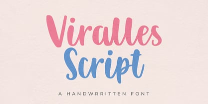 Viralles is a handwritten script font. Looks stunning on wedding invitations, thank you cards, quotes, greeting cards, logos, business cards and any other design that requires a handwritten touch.
 - Borough Park JNL by Jeff Levine,
$29.00 Borough Park JNL is named for a neighborhood in the southwestern part of the borough of Brooklyn, NY and was modeled from hand lettering found on vintage sheet music.
 - Javarosa by Letterniz,
$25.00 Javarosa is a handwritten script font. Looks stunning on wedding invitations, thank you cards, quotes, greeting cards, logos, business cards and any other design that requires a handwritten touch.
 - Anathalya by Letterniz,
$27.00 Anathalya is a handwritten script font. Looks stunning on wedding invitations, thank you cards, quotes, greeting cards, logos, business cards and any other design that requires a handwritten touch.
 - SK Irrationalist by Shriftovik,
$16.00 SK Irrationalist is a new experimental accidental font created by the SHRIFTOVIK font foundry and Tikhon Reztcov. This font is very unusual. It uses non-standard graphic techniques. Sloping non-parallel lines, sharp shapes and a combination of rectangles and circles all make the font special. The SK Irrationalist font was inspired by the works of constructivist artists of the early 20th century. The font contains both Latin, Latin Pro version for European countries and Cyrillic. This font delivered in 4 styles: Regular; Sharp; Outline; Rounded.
 - Funkley by Craft Supply Co,
$15.00 Introducing Funkley - Funky Font. It can be used to create almost all types of design projects like print materials. Just use your imagination and your project will become more alive and look great than ever with Funkley - Handmade Funky Font. You want to make a greeting card or a package design, or even a brand identity, craft design, any DIY project, book title, wedding font, pop vintage design, retro design or any purpose to make your art / design project look pretty and trendy? Feel free to play with this fonts!
 - Nawin Latin by Letterjuice,
$66.00 Nawin is an informal Arabic typeface inspired by handwriting. The idea behind this design is to create a type family attractive and ownable for children but at the same time a design that keeps excellent letter recognition for reading. Handwriting has been a great source of inspiration in this particular typeface. By emulating the movements of the pen, we have obtained letter shapes that express spontaneity. A bright group of letters create a lively and beautiful paragraph of text. To get closer to handwriting and the variety of letter shapes that we draw while writing, this typeface offers a large number of alternative characters, which differ slightly from the default ones. Because we have programed the «Contextual Alternate» feature in the fonts, these alternate characters appear automatically as you set a text on your computer. For instance, in the Arabic variability on vertical proportions between letters Alef and initial Lam, create movement in text and avoid the cold mechanical feel of repetition. In the case of the Latin a part from having an entire alternate basic alphabet, there are also different letterforms for characters with diacritics, this way variability becomes even greater. Nawin is quirky and elegant at the same time. Letter recognition is relevant when reading continuous text. For this reason, in the Arabic, we have added another contextual alternate feature with alternate characters that help to avoid confusion when letters with similar or the same shape repeat inside one word. This is the case of medial «beh and Yeh» repeated three times continuously in the same word. The alternate characters change in shape and length, facilitating distinction to the reader. Since this typeface is inspired by handwriting and the free movement of the hand while writing, we considered ligatures a good asset for this design. The Arabic has a wide range of ligatures that enhance movement and fluidity in text making look text alive, while the Latin achieves this same effect via contextual alternates.
 - Nawin Arabic Ltn by Letterjuice,
$107.00 Nawin is an informal Arabic typeface inspired by handwriting. The idea behind this design is to create a type family attractive and ownable for children but at the same time a design that keeps excellent letter recognition for reading. Handwriting has been a great source of inspiration in this particular typeface. By emulating the movements of the pen, we have obtained letter shapes that express spontaneity. A bright group of letters create a lively and beautiful paragraph of text. To get closer to handwriting and the variety of letter shapes that we draw while writing, this typeface offers a large number of alternative characters, which differ slightly from the default ones. Because we have programed the «Contextual Alternate» feature in the fonts, these alternate characters appear automatically as you set a text on your computer. For instance, in the Arabic variability on vertical proportions between letters Alef and initial Lam, create movement in text and avoid the cold mechanical feel of repetition. In the case of the Latin a part from having an entire alternate basic alphabet, there are also different letterforms for characters with diacritics, this way variability becomes even greater. Nawin is quirky and elegant at the same time. Letter recognition is relevant when reading continuous text. For this reason, in the Arabic, we have added another contextual alternate feature with alternate characters that help to avoid confusion when letters with similar or the same shape repeat inside one word. This is the case of medial «beh and Yeh» repeated three times continuously in the same word. The alternate characters change in shape and length, facilitating distinction to the reader. Since this typeface is inspired by handwriting and the free movement of the hand while writing, we considered ligatures a good asset for this design. The Arabic has a wide range of ligatures that enhance movement and fluidity in text making look text alive, while the Latin achieves this same effect via contextual alternates.
 - PF Libera Pro by Parachute,
$79.00 PF Libera was designed at a time of leisure with no particular intention for commercial use. In fact it was offered in the beginning as a freeware. In 2001, designer Charis Tsevis was convinced that it may have some commercial value, so Parachute obtained the rights to sell this typeface. At that time, we did not even imagine what would follow. Since then, PF Libera is one of our most successful typefaces. We have seen it being used in very diverse applications. From publishing to advertising to banking, to transportation, to retail applications. Food, beverages, fashion, automobiles, tourism, the list goes on and on. In any way, this typeface is very personal, modern and provocative. It stays with you and definitely it brings along the message. PF Libera comes in 3 styles. One of them, 'Liberissima', was added later and is more loose than the other two. The new 'Pro' version is powered with 7 OpenType features and is carefully designed to include all languages that are based on Latin, Greek and Cyrillic.
 - Bolda Display by The Infamous Foundry,
$29.00 Bolda Display is a a-z lowercase display font in two styles; regular and outline. Lowercase is regular and uppercase is outline. Inspired by the 1970’s tennis, dart and ping pong fashion. Perfect for headlines, logos and everything above the body.
 - Lina by Roy Cole,
$34.00 The Lina typeface family was designed by Roy Cole and completed in 2003. The roman font, Lina 30, was drawn originally by hand and later its character set extended and digitally redrawn with the aid of Fontographer. The five additional fonts, 60, 90, and the italics 33, 66, 99 followed and were all produced digitally from scratch. Lina is characterized by economy, lightness and evenness of weight. The capitals and figures are not as tall as the lower-case but retain the latter’s weight, and the figures are designed to provide enhanced recognition. The characters are relatively large on the body and text and benefit from additional leading. Lina is essentially a typeface for text composition. Roy Cole's other typeface families are Zeta, Colophon and Coleface.
 - FranklinGothicHandCond by Wiescher Design,
$39.50 FranklinGothicHandCond is another part of a series of hand-drawn fonts from way back in time – before computers changed the way we worked in advertising. When I was in advertising – before computers – a very time consuming part of my daily work was sketching headlines. I used to be able to sketch headlines in Franklin Gothic, Times, Futura, Helvetica and several scripts. We had a kind of huge inverted camera – which we called Lucy. We projected the alphabet onto a sheet of transparent paper, outlined the letters with a fineliner and then filled them in. It was very tedious work, but the resulting headline had its own charm and we had a permanent race going on who was best and fastest. I won most of the time! They used to call me the fastest "Magic Marker" this side of the Atlantic. Great days, just like today! Your sentimental type designer from the past, Gert Wiescher.
 - Sassoon Infant Pro by Sassoon-Williams,
$66.00 An upright typeface family developed to meet the demand for letters to produce pupil material for handwriting as well as for reading. Upright letters with extended ascenders and descenders are ideal on screen. They facilitate word recognition. The exit strokes link words together visually, and in handwriting they lead to spontaneous joins along the baseline leading logically to a joined-up hand. Teachers can print desk strips, charts of letter families and alphabet friezes, as well as consistent material across the curriculum. Together these typefaces provide a valuable resource for special needs teachers. Typefaces developed to meet demand for letters that can be used to produce pupil material for reading as well as handwriting. Regular and Bold typefaces covering pan-European languages: 9 Latin, 6 Cyrillic, Greek, Turkish, 13 Baltic, 8 Rusyn, 6 Nordic, Vietnamese. How to access Stylistic Sets of alternative letters in these fonts Cyrillic Stylistic Sets examples Greek Stylistic Sets examples Vietnamese Stylistic Sets examples
 - FranklinGothicHandBold by Wiescher Design,
$39.50 FranklinGothicHandBold is another part of a series of hand-drawn fonts from way back in time – before computers changed the way we worked in advertising. When I was in advertising – before computers – a very time consuming part of my daily work was sketching headlines. I used to be able to sketch headlines in Franklin Gothic, Times, Futura, Helvetica and several scripts. We had a kind of huge inverted camera – which we called Lucy. We projected the alphabet onto a sheet of transparent paper, outlined the letters with a fineliner and then filled them in. It was very tedious work, but the resulting headline had its own charm and we had a permanent race going on who was best and fastest. I won most of the time! They used to call me the fastest "Magic Marker" this side of the Atlantic. Great days, just like today! Your sentimental type designer from the past Gert Wiescher
 - Cadho Toys by Alit Design,
$20.00 Introducing CADHO TOYS, an exciting and playful bubble display font that will add a touch of whimsy to your designs. This font features a unique alternate ligature style that combines bubbles and letters, creating a fun and engaging visual experience. With its lively appearance, CADHO TOYS is perfect for various design projects, especially those aimed at children, toys, games, or anything that requires a cheerful and vibrant aesthetic. This font is carefully crafted with 707 characters, ensuring versatility and multilingual support. Whether you’re designing in English, French, Spanish, German, or any other language, CADHO TOYS has got you covered. The font includes special characters, punctuation marks, numerals, and a wide range of glyphs, allowing you to express your creativity without limitations. One of the standout features of CADHO TOYS is its support for PUA Unicode. This means that you can access the font’s extensive character set through private use area codes, giving you even more freedom to customize and personalize your designs. Let your imagination run wild as you combine different characters and ligatures to create captivating typographic compositions. CADHO TOYS will bring joy and excitement to any project it graces. Whether you’re designing posters, logos, packaging, websites, or any other creative endeavor, this bubble display font is bound to make a lasting impression. Its alternate ligature style adds a touch of uniqueness and flair, setting your designs apart from the crowd. So why wait? Get your hands on CADHO TOYS today and unlock a world of creativity, fun, and boundless possibilities. Let this font take your designs to new heights and bring smiles to the faces of your audience. Language Support : Latin, Basic, Western European, Central European, South European,Vietnamese. In order to use the beautiful swashes, you need a program that supports OpenType features such as Adobe Illustrator CS, Adobe Photoshop CC, Adobe Indesign and Corel Draw. but if your software doesn’t have Glyphs panel, you can install additional swashes font files.
 - Clear Sans by Positype,
$29.00 Clear Sans™ is a… wait for it… rational geometric sans serif. It is intended to fill a niche… to provide an alternative to the somewhat based-on-vernacular signage, somewhat geometric sans. I hear the word vernacular thrown around too much and too loosely. If a typeface is based in the vernacular, based on hand-painted or hand-crafted signage, then it should be based on the movements of the hand, retain that warmth and not on a pretty geometric model. For me, clean, geometric and precise doesn't have to be cold and expressionless. The original skeleton was hand-painted in 2008 to help determine and inform my decisions going forward. The typeface was completed shortly afterwards at the behest of an old friend for their identity. As usual, I expanded it, but considered retiring it since there were so many things similar out there. Years later, I had a chance to rediscover it and came to the conclusion that it could be improved, expanded in a logical and useful way, and introduced. I would be lying if I didn't admit that the rise of webfonts and embedded type in applications influenced many of the decisions I made about reworking Clear Sans™. Completely new Text and Screen fonts were developed that utitlize larger x-heights, space-saving widths, logical (and simplified) weight offerings… to name a few alterations. Even the pricing of each variant was considered to produce a more reasonable and simple solution for the developer, designer, professional and novice. Clear Sans™ is a departure from my previous sans serifs, but the influences of Aaux Next, Akagi Pro and Halogen are evident. Enjoy a light-hearted mini-site devoted to Clear Sans™
 - Clear Sans Text by Positype,
$25.00 Clear Sans™ is a… wait for it… rational geometric sans serif. It is intended to fill a niche… to provide an alternative to the somewhat based-on-vernacular signage, somewhat geometric sans. I hear the word vernacular thrown around too much and too loosely. If a typeface is based in the vernacular, based on hand-painted or hand-crafted signage, then it should be based on the movements of the hand, retain that warmth and not on a pretty geometric model. For me, clean, geometric and precise doesn't have to be cold and expressionless. The original skeleton was hand-painted in 2008 to help determine and inform my decisions going forward. The typeface was completed shortly afterwards at the behest of an old friend for their identity. As usual, I expanded it, but considered retiring it since there were so many things similar out there. Years later, I had a chance to rediscover it and came to the conclusion that it could be improved, expanded in a logical and useful way, and introduced. I would be lying if I didn't admit that the rise of webfonts and embedded type in applications influenced many of the decisions I made about reworking Clear Sans™. Completely new Text and Screen fonts were developed that utitlize larger x-heights, space-saving widths, logical (and simplified) weight offerings… to name a few alterations. Even the pricing of each variant was considered to produce a more reasonable and simple solution for the developer, designer, professional and novice. Clear Sans™ is a departure from my previous sans serifs, but the influences of Aaux Next, Akagi Pro and Halogen are evident. Enjoy a light-hearted mini-site devoted to Clear Sans™
 - Clear Sans Screen by Positype,
$21.00 Clear Sans™ is a… wait for it… rational geometric sans serif. It is intended to fill a niche… to provide an alternative to the somewhat based-on-vernacular signage, somewhat geometric sans. I hear the word vernacular thrown around too much and too loosely. If a typeface is based in the vernacular, based on hand-painted or hand-crafted signage, then it should be based on the movements of the hand, retain that warmth and not on a pretty geometric model. For me, clean, geometric and precise doesn't have to be cold and expressionless. The original skeleton was hand-painted in 2008 to help determine and inform my decisions going forward. The typeface was completed shortly afterwards at the behest of an old friend for their identity. As usual, I expanded it, but considered retiring it since there were so many things similar out there. Years later, I had a chance to rediscover it and came to the conclusion that it could be improved, expanded in a logical and useful way, and introduced. I would be lying if I didn't admit that the rise of webfonts and embedded type in applications influenced many of the decisions I made about reworking Clear Sans™. Completely new Text and Screen fonts were developed that utitlize larger x-heights, space-saving widths, logical (and simplified) weight offerings… to name a few alterations. Even the pricing of each variant was considered to produce a more reasonable and simple solution for the developer, designer, professional and novice. Clear Sans™ is a departure from my previous sans serifs, but the influences of Aaux Next, Akagi Pro and Halogen are evident. Enjoy a light-hearted mini-site devoted to Clear Sans™
 - Obsessed by Zang-O-Fonts,
$25.00Eroded, skeletal and gaunt, Obsessed was one of Zang-O-Fonts first typefaces, and is loosely based on a couple of Art Deco faces. - PR Arco by PR Fonts,
$10.00 Arcs for framing curved lines of text, in a style common on Victorian posters and almanac covers, and still seen on modern food packaging.
 - Waltograph UI - Unknown license

- Sunday Ride by Olivetype,
$18.00 Sunday Ride is a new hand-painted brush typeface with a carefree, youthful and playful vibe. It is perfect for logos and headlines where you want to create the feeling of warmth, fun and energy. With a hand-drawn, organic feel, this font is a must-have for all creatives out there. Come in and enjoy the ride! So what’s included : Basic Latin Uppercase and Lowercase Numbers, symbols, and punctuations Multilingual Support. Simple Installations Works on PC & Mac Thank You.
