10,000 search results
(0.046 seconds)
- Mindsight by Get Studio,
$23.00 Mindsight Funky Retro Display Font is a vibrant and energetic typeface that captures the essence of vintage aesthetics. With its playful curves and bold strokes, it adds a touch of nostalgia and creativity to any design project, making it perfect for eye-catching headlines, posters, and artistic displays.
 - Rofane by Reyrey Blue Std,
$14.00 Introducing, Rofane Typeface. A classy and modern typeface that exudes timeless charm and elegance, designed with tight kerning and spacing to achieve a more aesthetic appearance. Available in 2 styles, regular and italic, it will add a luxury spark to any design project that you wish to create!
 - Mommie by Hubert Jocham Type,
$59.90 In the early 1980s, at the start of my career, I had the opportunity to work in a print shop with classic lead setting. In those days I would study issues of U&lc magazine from ITC. What really caught my attention were scripts in the Spencerian style. I’ve been fascinated by this American penmanship tradition ever since. A few years ago I developed a font. Boris Bencic used it when he was redesigning L’Officiel magazine in Paris. I took these initial forms and developed them into the font Mommie when I started my own foundry. Although I usually design text typefaces, working on Mommie taught me how complex it can be to create a script headline font. The biggest challenge in this process has been to keep it alive and fresh. The Regular weight is only made for very big headlines. The thin lines with the bold drops are very elegant. For smaller sizes use the Medium and Small weight. It won the TDC 2008 award and was Judges Choice of Christian Schwartz.
 - Sethasso by Twinletter,
$15.00 Introducing our newest font called Sethasso, clean simple, and elegant themed signature font, which is written in natural hand strokes making this font more charismatic natural, This font in addition to having a charming and unique shape is also equipped with various alternative options that make it easier for you to create beautiful and extraordinary designs This font is perfect for business cards, photography studios, autographs, interior designs, model names, coffee late, travel, weddings, cosmetics, jewelry, social media posts, product packaging, watermarks, special events, or anything else. Start using this font to add an authentic and heartfelt vibe to any design project.
 - Botuna by Twinletter,
$15.00 Botuna San Serif is a typeface designed by Botuna San Serif. This is a high-end font family with 18 different styles. Designed to aid you in the creation of visually stunning projects of all types. This font is simple to use and integrates seamlessly with any standard software. Your project will stand out with this font! of course, your various design projects will be perfect and extraordinary if you use this font because this font is equipped with a font family, both for titles and subtitles and sentence text, start using our fonts for your extraordinary projects.
 - Razan by Kasheda Type,
$25.00 "Razan" is a digital font that transcends the boundaries between handwritten charm and advanced technological design. It embodies the artistry of handwriting, capturing the essence of creativity and uniqueness. The font is characterized by smooth lines and flexible design, with soft endings that add an artistic touch to each character. With a range of weights, "Razan" allows users full control over the thickness of the font, enhancing its versatility in various designs. Whether used for large headlines or small text, it shines with seamless and comfortable readability. Its unique allure gives the impression of carefully handcrafted characters, contributing a special and individualized touch to any artistic project or design.
 - Souljah by 38-lineart,
$17.00 Let us introduce you our new font Souljah, a natural script font. This font has a very contrast stroke, very wide down stroke and very tiny up stroke. Every glyphs shaped very flowy and smooth as if it is written by a dancing hand. All glyphs are connected nicely, this font also included ligature to add more natural touch. "Natural and Soulful Calligraphy" is a perfect tagline to describe Souljah Included Opentype font with ligature, swash alternate and multilingual support. Souljah swash Uppercase for beginning swash and lowercase for ending swash, this file was made to the user who is not common to opentype stylistic feature.
 - Soft Serve by Sentinel Type,
$24.90Looking like happy frosting on a cupcake at a twiddle bug party, this bouncy food entry from Canadian designer Haley Fiege turns the original Jellybrush type into organic happiness you can spread on pancakes, ice-cream, sorbets, sauces and condements, oh peanut butter! Yeah, all kinds of sandwich fillings. Anything really. What else? People who own rubber factories. Anybody in the food business, like green grocers or your local bakery. Thrift stores. Falling somewhere between cushions and cat food, this flexible and inviting letter mixes simplicity with organic character and humor for a wide range of uses. Soft Serve’s compact cursive forms and bouncy friendliness draw on artbrush scripts and the typo-italic model of Renaissance Vatican scribe Ludovico Arrighi. A versatile workhorse ideal for: * Dairy & beverage * Sweets & soft drink * Five minute food & sauces * Pet food & accessories * Bathroom & kitchen * Cushions, pillows, rubber & swimming pool, etc. - Bright by Ahmad Jamaludin,
$19.00 Start good day for new font! present to you, Bright! Bright is a stylish font It has both modern and retro look - clear, modern and fun. Helps to create layout design in 60s or 70s design projects. This font have more than 50 unique alternate and ligature that to give your logo,business card and another project to a unique vintage look. It has Italic version too so what a perfect vintage font! What's you get? Unique letterforms Works on PC & Mac Simple Installations Accessible in the Adobe Illustrator, Adobe Photoshop, Microsoft Word even work on Canva! PUA Encoded Characters Fully accessible without additional design software. I really hope you'll get pleasure using Bright font and it will be perfect addition to your font collection! If you have some questions, please write me a letter! Come and say hello over on Instagram! https://www.instagram.com/dharmas.studio/
 - Debs by Scholtz Fonts,
$9.95 Debs was inspired by a thank you note sent from one of my friends to another. The recipient liked the handwriting so much that he passed the note on to me after having asked permission from Debs, the writer. I enjoyed the vigor and looseness of the handwriting, as well as admiring its legibility and style. Debs has all the characteristics of modern handwriting: It appears loose, unstructured, and free, while maintaining good form and great legibility. Its baseline is varied, creating an impression of notes written by busy people, while its characters remain well formed and readable. Debs comes in five styles, regular, lite, black, wide and wide-black. Use Debs for advertising, for casual greeting cards, for a casual, handwritten look on music or fashion media. Debs has all the features usually included in a fully professional font. Language support includes all European character sets.
 - Bun Chalk by Storictype,
$12.00 Introducing BunChalk Typeface Here is new product, It's called Bun Chalk. BunChalk inspired by many lettering on menuboard chalk cafe and bistro, and it's specially designed for the resto who use chalk concept,menuboard Chalk up your brand with our one-of-a-kind chalk concept! Leave your mark and get noticed with custom branded chalk that makes a statement. Whether you're a hip cafe, a stylish boutique, or a savvy startup, our branding chalk is the perfect way to spread the word about your business. Write inspirational quotes, menu specials, sales announcements, or just your logo all over your windows and sidewalks. Made from handmade quality chalk texture that goes on clean and texture typeface, it's ideal for businesses who want to grab attention and stand out from the crowd. Let potential customers know you're there with playful, eye-catching branded chalk that gets your name seen.
 - ITC Scram Gravy by ITC,
$29.99The 1928 logotype for Sertal Toiletries consisted of a stylized woman's head, a very snaky S, and five fine, fat deco caps spelling out the rest of the brand name. From these five clues, designer Nick Curtis divined the rules" of the typeface and drew a complete alphabet, including a lower case. The result: ITC Scram Gravy. The finished product could be described as Bodoni on steroids. Tight curls in characters like the 'm,' 'r' and 'y' soften the lower case and give the design a light-hearted flavor. ITC Scram Gravy takes its name from one of many running gags in the screwball comic strip "Smokey Stover," which had folks alternately splitting their sides and scratching their heads from 1935 to 1973. Those familiar with Bill Holman's strip will recall Smokey's car, the Foomobile, and one of his famous nonsense declarations: "No foo-ling, that scram gravy ain't wavy."" - CS Silly by Cocomilk Studio,
$10.00 SILLY is Cocomilk Studio's first homegrown typeface. This typeface, made by Cocomilk designer, Yas Liamco, features curvy, drooping forms and rounded edges that add a sense of fun and silliness to any project!
 - Nurture Happiness by Seemly Fonts,
$12.00 Nurture Happiness is a tall, adaptable, and smart-looking display font. Add it to each of your party invitations, gathering, or pretty much any design that requires a touch of youth and joy.
 - Bitten Amore by FHFont,
$18.00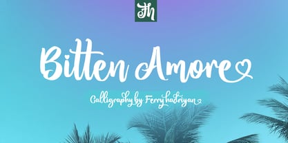 Bitten Amore is script font with hand-lettering brush style, and includes OpenType features. It is suitable for design, element design, weddings, events, t-shirts, logos, badges, sticker, and any other awesome work.
 - Sinzano by Typodermic,
$11.95 Hey there, cats and kittens. Have you heard the news about the grooviest typeface in town? That’s right, I’m talkin’ about Sinzano—the typeface that’s cool, collected, and interlocking! Now, you might be asking yourself, “What’s so special about Sinzano?” Well, let me tell you, this typeface is a real wild one. It’s got some serious style, with letterforms that interlock like a bunch of jazz cats jammin’ on stage. And don’t even get me started on the ligatures—they’re fascinating, man! Sinzano comes in three different styles, so you can choose the one that’s right for you. Sinzano Regular is a slender, slightly flared headliner, perfect for making a statement. Sinzano Sans is a similar concept, but with straight, flat ends, for a more modern vibe. And if you’re looking for something a little more modest, Sinzano Display is a companion typeface that’s broader and rounder, with just a touch of interlocking. So, if you’re ready to add some serious style to your designs, head on over to Sinzano, baby! This typeface is the real deal, and it’s gonna knock your socks off. Most Latin-based European writing systems are supported, including the following languages. Afaan Oromo, Afar, Afrikaans, Albanian, Alsatian, Aromanian, Aymara, Bashkir (Latin), Basque, Belarusian (Latin), Bemba, Bikol, Bosnian, Breton, Cape Verdean, Creole, Catalan, Cebuano, Chamorro, Chavacano, Chichewa, Crimean Tatar (Latin), Croatian, Czech, Danish, Dawan, Dholuo, Dutch, English, Estonian, Faroese, Fijian, Filipino, Finnish, French, Frisian, Friulian, Gagauz (Latin), Galician, Ganda, Genoese, German, Greenlandic, Guadeloupean Creole, Haitian Creole, Hawaiian, Hiligaynon, Hungarian, Icelandic, Ilocano, Indonesian, Irish, Italian, Jamaican, Kaqchikel, Karakalpak (Latin), Kashubian, Kikongo, Kinyarwanda, Kirundi, Kurdish (Latin), Latvian, Lithuanian, Lombard, Low Saxon, Luxembourgish, Maasai, Makhuwa, Malay, Maltese, Māori, Moldovan, Montenegrin, Ndebele, Neapolitan, Norwegian, Novial, Occitan, Ossetian (Latin), Papiamento, Piedmontese, Polish, Portuguese, Quechua, Rarotongan, Romanian, Romansh, Sami, Sango, Saramaccan, Sardinian, Scottish Gaelic, Serbian (Latin), Shona, Sicilian, Silesian, Slovak, Slovenian, Somali, Sorbian, Sotho, Spanish, Swahili, Swazi, Swedish, Tagalog, Tahitian, Tetum, Tongan, Tshiluba, Tsonga, Tswana, Tumbuka, Turkish, Turkmen (Latin), Tuvaluan, Uzbek (Latin), Venetian, Vepsian, Võro, Walloon, Waray-Waray, Wayuu, Welsh, Wolof, Xhosa, Yapese, Zapotec Zulu and Zuni.
 - Rationell by PeGGO Fonts,
$29.00 Download PDF Instructions from https://peggofonts.com/download/Rationell-Instructions_4.59.pdf Behance presentation https://www.behance.net/gallery/88695175/Rationell Rationell is a functional multipurpose corporate typeface, based on classic 1950's swiss rationalism, subtle tuned on a XIX century didonesque modernist structure, a contemporary interpretation with the eyes of the Latin idiosyncrasy. Designed in 12 upright weight with 12 matching Italic, from Hairline to ExtraBlack, average weights (Light to Bold) are easily read on text sizes, printed and digital media, while Hairline to ExtraLight and ExtraBold to ExtraBlack are especially suitable for big contexts like headlines, poster and higher sizes as big as storefronts, monumental billboards or building size printed mesh covers. 40 OpenType features: Standard and Discretionary Ligatures, Lining, Old Style and tabular numerals, scientific and fractional forms, slashed zero, stylistic and contextual alternates (rounded dots, "Il" readability, auto roman numbers, auto group enclosed numbers, slashed zero on alphanumeric contexts), sensitive case, localized forms, glyphs composition/decomposition, access to all alternates. Rationell has a serious but kind timeless look, an ideal voice for corporate publishing, branding, wayfinding and complex technical information systems. It Supports 222 Latin based languages, with +2200 glyphs Rationell is capable to solve the most advanced nowadays global design needs.
 - FF Signa Slab by FontFont,
$72.99 FF Signa is a typically Danish typeface, rooted in architectural lettering rather than book typography. Originally designed for signage—hence the name—FF Signa is now a typographic family with three widths. All weights include italics, small caps, and several styles of figures. Because of the quality of this “vernacular-lettering-into-typeface” conversion, FF Signa received a Danish Design Prize in 2002. FF Signa is radically different from most sans serif text typefaces that were published during the 1990s. It neither belongs in the “humanist sans” category, nor is it on the list of typefaces based on 19th-century grotesques. Its concise letterforms and a minimum of detail produce clear and harmonious word images. Yet its proportions are classical, and the underlying geometry has been subtly adjusted in order to create letterforms which are at once interesting, harmonious, and contemporary. These features make FF Signa pleasant for reading, even at very small sizes. The typeface has developed into a versatile family, with Condensed, Extended, and Correspondence versions. Later on Signa Serif, Stencil variants and a Signa Slab family added even more versatility. The resulting FF Signa type system may be used for corporate identities, brochures, magazines, communication, books, and on-screen publications.
 - Tablet Gothic by TypeTogether,
$35.00 Graphic designers of any nationality and background know very well that the art of composing titles correctly is not easy, Especially when it comes to periodical publications where there is need for both flexibility and graphic coherence. Tablet Gothic was originally engineered as a titling type family, meant to help designers working on publications that require output as hard copies and a variety of digital platforms at the same time. As such, it is a grotesque sans serif that looks to the future of publishing with a clear understanding of its history, and reminiscences that go back to nineteenth century Britain and Germany. Tablet Gothic delivers the sturdy, straightforward and clean appearance expected from a grotesque, but it allows itself a good measure of personality to make it stand out on the page. Its 84 styles –six series of condensation and seven weights in each series plus obliques– guarantee that, whatever the publication format is, there's a Tablet Gothic font that will do the job and perform well both technically and aesthetically. Furthermore, the rounder styles, Tablet Gothic Wide, Normal and Narrow achieved amazing results at very small sizes, producing a beautiful texture and highly readable text blocks. Tablet Gothic fonts can be purchased individually, by series or as a complete bundle (best value!)
 - Glance Slab by Identity Letters,
$29.00 Dynamic and sportive. A well-balanced experiment for sparkling headlines. Glance Slab is an experimental design that plays on the tension between connection and detachment. In this typeface, serifs may be detached and some strokes may not connect to their stems. This creates a dynamic impression of balance and movement. The elegance of an ice skater and the determination of a quarterback: Glance Sans has it all. Where a curve meets a stem and where serifs seem to “hover” near their respective letters, the nonjoining elements create an impression similar to a stencil typeface. But here, the function of the gaps differs from strictly stencil designs: while the gaps provide a “sparkling” effect in Glance Slab that’s clearly visible in large sizes, they take on the role of ink traps when set smaller, making for surprisingly legible body copy. With its strong visual character, this font family is quickly recognizable, making it perfectly suitable for branding and any large-scale application, such as posters, billboards, and event signage. Glance Slab consists of seven weights from Thin to Black. Each style has a character set of about 570 glyphs, which includes circled numbers and arrows (positive and negative versions), ligatures, extended language support, and many other features.
 - Shareholder JNL by Jeff Levine,
$29.00 Shareholder JNL could possibly be found on a stock certificate, but in truth, it's based on hand-lettering found on some old sheet music entitled "Sharing".
 - Steady Bonanza by Just Font You,
$10.00 Fashion is a trend, Style lives within a person *Oscar de la Rerta. I believe everybody's special. You have your own original character in every single appearance. And i feel so addicted to bring that something special in you to be shown to the universe. And that's what it cames from. Introducing, Steady Bonanza. A versatile hand lettering script typeface to dig up your authentic style. Made from the authenticity of brush and ink character, and delivers with so many style so you can always show up fresh in every use of it. Undoubtedly fit for your fashion branding, logo, posters, promotions kit, social media post, brochure, quote, lookbook, and a possibility to expand more such as wedding stuff, food and beverage, girly things, hand crafted stuff, you got the full control on it, dont stop yourself!
 - Areplos by Storm Type Foundry,
$53.00To design a text typeface "at the top with, at the bottom without" serifs was an idea which crossed my mind at the end of the sixties. I started from the fact that what one reads in the Latin alphabet is mainly the upper half of the letters, where good distinguishableness of the individual signs, and therefore, also good legibility, is aided by serifs. The first tests of the design, by which I checked up whether the basic principle could be used also for the then current technology of setting - for double-sign matrices -, were carried out in 1970. During the first half of the seventies I created first the basic design, then also the slanted Roman and the medium types. These drawings were not very successful. My greatest concern during this initial phase was the upper case A. I had to design it in such a way that the basic principle should be adhered to and the new alphabet, at the same time, should not look too complicated. The necessary prerequisite for a design of a new alphabet for double-sign matrices, i.e. to draw each letter of all the three fonts to the same width, did not agree with this typeface. What came to the greatest harm were the two styles used for emphasis: the italics even more than the medium type. That is why I fundamentally remodelled the basic design in 1980. In the course of this work I tried to forget about the previous technological limitations and to respect only the requirements then placed on typefaces intended for photosetting. As a matter of fact, this was not very difficult; this typeface was from the very beginning conceived in such a way as to have a large x-height of lower-case letters and upper serifs that could be joined without any problems in condensed setting. I gave much more thought to the proportional relations of the individual letters, the continuity of their outer and inner silhouettes, than to the requirements of their production. The greatest number of problems arose in the colour balancing of the individual signs, as it was necessary to achieve that the upper half of each letter should have a visual counterbalance in its lower, simpler half. Specifically, this meant to find the correct shape and degree of thickening of the lower parts of the letters. These had to counterbalance the upper parts of the letters emphasized by serifs, yet they should not look too romantic or decorative, for otherwise the typeface might lose its sober character. Also the shape, length and thickness of the upper serifs had to be resolved differently than in the previous design. In the seventies and at the beginning of the eighties a typeface conceived in this way, let alone one intended for setting of common texts in magazines and books, was to all intents and purposes an experiment with an uncertain end. At this time, before typographic postmodernism, it was not the custom to abandon in such typefaces the clear-cut formal categories, let alone to attempt to combine the serif and sans serif principles in a single design. I had already designed the basic, starting, alphabets of lower case and upper case letters with the intention to derive further styles from them, differing in colour and proportions. These fonts were not to serve merely for emphasis in the context of the basic design, but were to function, especially the bold versions, also as independent display alphabets. At this stage of my work it was, for a change, the upper case L that presented the greatest problem. Its lower left part had to counterbalance the symmetrical two-sided serif in the upper half of the letter. The ITC Company submitted this design to text tests, which, in their view, were successful. The director of this company Aaron Burns then invited me to add further styles, in order to create an entire, extensive typeface family. At that time, without the possibility to use a computer and given my other considerable workload, this was a task I could not manage. I tried to come back to this, by then already very large project, several times, but every time some other, at the moment very urgent, work diverted me from it. At the beginning of the nineties several alphabets appeared which were based on the same principle. It seemed to me that to continue working on my semi-finished designs was pointless. They were, therefore, abandoned until the spring of 2005, when František Štorm digitalized the basic design. František gave the typeface the working title Areplos and this name stuck. Then he made me add small capitals and the entire bold type, inducing me at the same time to consider what to do with the italics in order that they might be at least a little italic in character, and not merely slanted Roman alphabets, as was my original intention. In the course of the subsequent summer holidays, when the weather was bad, we met in his little cottage in South Bohemia, between two ponds, and resuscitated this more than twenty-five-years-old typeface. It was like this: We were drinking good tea, František worked on the computer, added accents and some remaining signs, inclined and interpolated, while I was looking over his shoulder. There is hardly any typeface that originated in a more harmonious setting. Solpera, summer 2005 I first encountered this typeface at the exhibition of Contemporary Czech Type Design in 1982. It was there, in the Portheim Summer Palace in Prague, that I, at the age of sixteen, decided to become a typographer. Having no knowledge about the technologies, the rules of construction of an alphabet or about cultural connections, I perceived Jan Solpera's typeface as the acme of excellence. Now, many years after, replete with experience of revitalization of typefaces of both living and deceased Czech type designers, I am able to compare their differing approaches. Jan Solpera put up a fight against the digital technology and exerted creative pressure to counteract my rather loose approach. Jan prepared dozens of fresh pencil drawings on thin sketching paper in which he elaborated in detail all the style-creating elements of the alphabet. I can say with full responsibility that I have never worked on anything as meticulous as the design of the Areplos typeface. I did not invent this name; it is the name of Jan Solpera's miniature publishing house, in which he issued for example an enchanting series of memoirs of a certain shopkeeper of Jindrichuv Hradec. The idea that the publishing house and the typeface might have the same name crossed my mind instinctively as a symbol of the original designation of Areplos - to serve for text setting. What you can see here originated in Trebon and in a cottage outside the village of Domanín - I even wanted to rename my firm to The Trebon Type Foundry. When mists enfold the pond and gloom pervades one's soul, the so-called typographic weather sets in - the time to sit, peer at the monitor and click the mouse, as also our students who were present would attest. Areplos is reminiscent of the essential inspirational period of a whole generation of Czech type designers - of the seventies and eighties, which were, however, at the same time the incubation period of my generation. I believe that this typeface will be received favourably, for it represents the better aspect of the eighties. Today, at the time when the infection by ITC typefaces has not been quite cured yet, it does absolutely no harm to remind ourselves of the high quality and timeless typefaces designed then in this country.In technical terms, this family consists of two times four OpenType designs, with five types of figures, ligatures and small capitals as well as an extensive assortment of both eastern and western diacritics. I can see as a basic text typeface of smaller periodicals and informative job-prints, a typeface usable for posters and programmes of various events, but also for corporate identity. Štorm, summer 2005 - Quiller by Canada Type,
$24.95Quiller is another catch from the hot metal days, another one that managed to slip through the fingers of both the photo-typers and digitizers of last 4 decades. JJ Sierke’s Privat design from 1966 is now resurrected and heavily extended to be used by computer users everywhere. The original design was revived, and two whole new fonts were added to it - one with very unique swash caps and alternates, and one with many many ligatures and letter-combination ornaments. Quiller is a cross between brush calligraphy and very casual fast handwriting. It even has a slight Arabic simulation to it. Given such traits, the addition of a swash font and a multitude of ligatures comes in very handy to keep the natural flow of the font and maintain the elegance of its spirit. Those who like the auto-magic of OpenType’s intelligent substitution should like the fact that the OTF version is a single font with all the bells and whistles ready to go in the swash and discretionary ligatures features. If you use the latest versions of Adobe programs, the OTF version of Quiller is highly recommended. - Vito by Dots&Stripes Type,
$70.00 Vito is a strong and elegant sans serif family in 60 styles. A wide range of weights and widths offering tremendous typographic flexibility. Perfect to mix in magazines or packaging, corporate designs or movie titles. Masculine and sporty for adrenaline junkies, reliable and elegant for serious typographers, but with a touch of bling for high snobiety. Vito was selected as one of Typographica’s favorite typefaces of 2015. The Vito Family sets its goal to stay very functional but with a strong and unique look. Neutrality is good, but sometimes you need a bit more edge. The extreme weights and widths work great in title sizes, while the normal weights make longer texts deliciously readable. The classic and elegant outlook in all sizes make the family suitable for everything high quality. While the family looks great on the outside, it is even greater on the inside. Loads of OpenType-Features, a big amount of language support, and the flexibility of alternative letters, make working with Vito easy and exciting. And the big range of widths invite you to mix all together, and find new ways to express your designs. We would love to see, what you come up with!
 - Dx Slight by Dirtyline Studio,
$39.00 Dx Slight a new fresh & modern Sans with a Ultra Condensed style. The font it’s look good in posters, it is ideally suited for setting titles. However, the font has gained wide popularity among designers, and now you can find Dx Slight on the covers of magazines, on restaurant signs and on the main pages of websites. Dx Slight Display Typeface is the part of a strong and modern display family. This typeface both impressive at display sizes and easily readable in text size, while the sharp shapes of the triangular sans and the distinctive letter shapes show their strength in logo design and impressive editorial use. Dx Slight comes with elegant style, strength, and contrasts, with features an extended Latin character set of 366 glyphs covering over 88 languages. It has been designed as a variable font to give lots of options and access to unique type looks, however, it also includes nine weights, three axis H-height and Slant to give just as much access to creativity to those without access to variable supporting software. Its distinctive character and many variables make it a versatile, stylish workhorse, great for interfaces and design.
 - Sandbrush by Typia Nesia,
$20.00 Sandbrush is a natural hand brushed font. Work great for any design needs : logo, branding, modern advertising design, logos, poster quote, book / cover Title, editorial design, website / blog, card, custom mug, pillow, t-shirts, and any hand-lettered needs.
 - Hermanz Titling by California Type Foundry,
$47.00 Hermanz™ Titling is inspired by the most majestic caps that Hermann Zapf ever drew. They are inscriptional caps, square caps, or “capitalis monumentalis”. These caps are some of the most beautiful letters made by one of the greatest talents of our time; so beautiful they deserve to be seen and appreciated by everyone. If you do any work for churches, wedding, funeral, anniversary, or other ceremonies, for the fine arts, exclusive clubs, or higher education—you will love how these letters make your brochures, pamphlets and announcements look. Hermanz Titling works for anything labeled "fine": fine dining, fine music, fine art (pamphlets, books, posters, cookbooks). It also fits well for religious topics: posters, events, websites, hymnals, for biblical; and ceremonies, religious or otherwise. Emotions It Can Communicate: • Importance • Timelessness • Special Event • Tradition • Reverence • Artistry • Beauty Released June 2021 on the Memorial of Hermann Zapf, as part of the California Type Foundry Memorial Series: Honoring the life and work of the great font designers. FONT STORY The Majestic Caps When I was on one of my visits to rare books rooms I found some large caps of Hermann Zapf, and I knew that I had to make a font inspired by these. I was surprised that no one had ever made them into a font. They were some of the most beautiful caps I had ever seen. These caps were surprisingly difficult to make. I thought it would take me a week or two; to get the detail and spirit right took significantly longer– but it was well worth the effort! When you print Hermanz Titling on a page, you will see what I mean. Even when printed digitally, it’s the closest thing to letterpress. You might even have some people thing it was printed by a traditional method with ink! (Note: Unless printed at very large sizes, this font is not recommended for actual letterpress, because the serifs are too thin.) If you do any work for churches, wedding, funeral, anniversary, or other ceremonies, for the fine arts, exclusive clubs, or higher education—you will love how these letters make your brochures, pamphlets and announcements look. Enjoy this breathtaking font, and may it help inspire people with your messages! –Dave Lawrence & the California Type Foundry
 - Ardina by Sensatype Studio,
$15.00 Ardina typeface is an old-style, retro, unique, and versatile vintage typeface with Special character, ready for branding and stand out. It is a display typeface with a unique curve that perfect for branding projects, logo, wedding designs, social media posts, advertisements, product packaging, product designs, label, photography, watermark, invitation, stationery, and any projects, it makes with a high level of legibility. What's Included: Character set A-Z Uppercase & Lowercase Numerals & Punctuation Accented Characters (West Europe) Ligature & Character alternate Works on PC & Mac Recommended using Adobe Illustrator or Adobe Photoshop and wish you enjoy our font. :)
 - Hometona Script by Lettersams,
$17.00 Hometona Script is an lovely script font that features alternative styles and ligatures that are very eye-catching and is perfect for branding, wedding invitations, and other romantic projects. To activate the OpenType Stylistic alternative, you support programs that support OpenType features such as Adobe Illustrator CS, Adobe Indesign & CorelDraw X6-X7, Microsoft Word 2010 or later. All the features and special characters of this font are included in one file. If you need help or have any questions please let me know or send an email "lettersams@gmail.com" I'm happy to help :) Thanks & Happy Designing!
 - Arigola by Hashtag Type,
$27.97 Arigola is a beautiful slab serif defined by its Art Nouveau spirit that gives it a particular charm; one that is eye pleasing and helps distinguish products against its competitors. Naturally highlighting words to give a striking title and create an extra visual weight, Arigola embraces natural forms inspired by the living world with great rhythm. Arigola offers an excellent range of alternative characters to add personality to projects and stand out from the crowd with its own voice. Full details include 4 weights with over 500 characters, manually edited kerning and a range of OpenType features.
 - Holingston by HansCo,
$12.00 Holingston is a Handwritten brush script that is written casual and naturaly. the letters are made with brushes on paper and then scanned carefully drawn into vector format. This typeface is ideal for use in any professional project, such as blog titles, posters, wedding elements, t-shirts, clothing, book covers, business cards, greeting cards, branding, merchandise etc. It has 4 styles, regular, regular slant, clean and clean slant variations, this package is also has many alternatives underlines that make your text and design more interesting. Tutorial how to Install & use Alternate / Special Character : https://hanscostudio.com/tutorial/ Enjoy !
 - Obvia Wide by Typefolio,
$29.00 'Obvia' appeared as a result of direct observation on typefaces classified as geometric and the plan to explore for the first time width axes Condensed, Narrow (soon), Normal and new Wide and Expanded. The idea behind 'Obvia's design was to create a distancing from geometrically pure shapes, in this case, square shapes. Then some details were added, such as subtle inktraps, concave endings of the stems and carefully drawn alternate characters, giving a 'geohumanist' tone to the font. This first family of 'Obvia' has 9 weights ranging from Thin to Black, delivering a strong typographic identity, from the paper to the pixel.
 - Breadcrumbs by Hanoded,
$15.00 Every morning, after the kids have gone to school, I vacuum the floor and remove about half a kilo of breadcrumbs… No, not really have a kilo, but any given bird could probably survive on the leftovers. When it was time to name this font, Breadcrumbs was all I could think of! Breadcrumbs and children seem to go together well, as they are featured in Hansel & Gretel and Hop-o'-My-Thumb. Breadcrumbs font is a happy, sloppy fairytale font, which you can use for your book covers, your party posters and maybe crumbly bread packaging. But that is entirely up to you.
 - Gears by Janworx,
$19.95 Gears, designed by Janet Valdez of Janworx, was inspired by the popularity of steampunk artwork, for which gears and levers are a defining element. Gears is a single bold typeface, incorporating gears and levers into each glyph in one form or another. It is intended to be used at a large size, and works well in graphics with gradient finishes, textures, and bevels. Lower case letters are uniformly understated, whereas upper case are more elaborate. This typeface is suitable for posters, screen printing, or any general graphics work that requires short words or slogans with high-impact, particularly in a steampunk theme.
 - ED Lithosphere by Emyself Design,
$16.00 ED Lithosphere is a sharp display serif font that looks elegant and modern. This font has a Stylish character set to add functionality and beauty to typography, besides that this font also has several features such as: Uppercase, Lowercase, Alternative character / Stylish set, Ligature, Diacritic (multilingual), punctuation, and symbols. This font is inspired by several typographic designs on social media, which are then created and designed to create a good character font that is easy to use for various graphic design needs. These fonts are perfect for cover designs, posters, UI, branding, fashion, logos, social media templates, packaging, etc.
 - Kajju by Twinletter,
$15.00 Introducing Kajju, a premium font family designed to help you create visually stunning projects of any kind. Kajju San Serif comes in 18 different styles and has everything you need for your design projects. This is an all-in-one font pack with a wide variety of font styles to choose from. So whatever your needs, Kajju can do the job! of course, your various design projects will be perfect and extraordinary if you use this font because this font is equipped with a font family, both for titles and subtitles and sentence text, start using our fonts for your extraordinary projects.
 - Brandan by Andfonts,
$69.00 If you're looking for the perfect font to make your logo stand out, then look no further than Brandan font. This modern and cool font is sure to give your logo, text, or any other design element a unique and eye-catching look. Whether you're looking for a font for a logo, lettering, website, or something else entirely, Brandan font has got you covered. Plus, it looks great on both light and dark backgrounds, so you know your design is going to look nice no matter where it's seen. Check out Brandan font today and give your design a professional edge!
 - Obvia Expanded by Typefolio,
$29.00 'Obvia' appeared as a result of direct observation on typefaces classified as geometric and the plan to explore for the first time width axes Condensed, Narrow (soon), Normal and new Wide and Expanded. The idea behind 'Obvia's design was to create a distancing from geometrically pure shapes, in this case, square shapes. Then some details were added, such as subtle inktraps, concave endings of the stems and carefully drawn alternate characters, giving a 'geohumanist' tone to the font. This first family of 'Obvia' has 9 weights ranging from Thin to Black, delivering a strong typographic identity, from the paper to the pixel.
 - Gatsby Modern by Nicky Laatz,
$15.00 Gatsby Modern Serif takes its cues from the "Roaring Twenties" , an era when breaking from the norm was the order of the day, when femininity took on a charming 'boyishness', and a time when anyone who’s anyone, needed to be bold and ever so slightly, or even not so slightly, eccentric. Perfect at any size - Gatsby Modern does well from large eye-catching headlines , to large paragraphs of small text. Great for modern branding, posters, logos, social media projects, headers, advertising and so much more. Gatsby Modern is available in two weights, regular and a heavier set bold to suit your project needs.