10,000 search results
(0.043 seconds)
- Khanza Script by Suamzu Art,
$12.00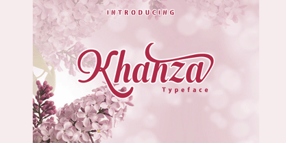 Khanza is a script font that is connected with clear style and dramatic movements. Khanza comes with uppercase, lowercase letters, numbers, punctuation, and so many variations on each character including alternative opentypes, common binders, and also additional cuts to allow you to customize your design. Perfect for use for Logotype, Letterhead, Posters, Clothing Designs, Labels and others. khanza font will help all the design projects that you are working on Khaza script features: Uppercase & lowercase Alternates & swashes Ligatures Standart international characters Punctuation & symbols
 - Luminum JNL by Jeff Levine,
$29.00In hardware stores across the country are display racks with letters and numbers silk-screened onto self-adhesive aluminum "parallelograms". These handy and durable items have graced countless mailboxes, office doors, hallway signs and automobiles for years. My fellow font designing buddy [Harold Lohner] suggested that I make a font based on this form of lettering as a counterpart to my Mailbox Letters JNL (also based on self-adhesive signage product)... and now his suggestion takes shape as a digital font... Luminum JNL. - Pax 2 by Linotype,
$29.99Pax is clearly a didone, using Vox classification. The contrast between the thin lines and the thicker ones is noticeable, as you would expect from a didone. The basic form is relatively narrow, therefore I designed another Pax, slightly wider and darker, and called it Pax #2. Otherwise they are more or less identical. Pax is Latin for peace, on everyone's want list in 1995 - as well as every single year before and after that. Pax was released in 1995. - Pixel Arcade by Comicraft,
$19.00 GAME OVER, MAN, GAME OVER! Time to grab your joystick, turn to channel 3 and level up, Player One, or you'll never beat the high score on your new game cartridge. Or bring a stack of quarters and a couple of friends to the mall, and we'll play some Rick Astley and Kajagoogoo over the PA while you scope out hotties near the food court. Either way, eight bit lettering has never looked more eighties than it does in our new PIXELARCADE font!
 - Stempel Schneidler LT by Linotype,
$29.99 F .H. Ernst Schneidler, type designer and teacher, originally designed Schneidler Old Style in 1936 for the Bauer foundry. Stempel Schneidler is based on the typefaces of Venetian printers from the Renaissance period and possesses their grace, beauty, and classical proportions. The Stempel Schneidler, a completely reworked and tuned font family made by D. Stempel AG in Frankfurt, is a fine, legible text font that also works well in display. One of Schneidler's more unique features is its question marks.
 - Feminous by Invasi Studio,
$17.00 Introducing Feminous, the latest font that'll give your designs a fresh and fun twist! This brush script font has got the perfect blend of sophistication and playfulness, making it the perfect choice for all your creative projects. The brush script style gives Feminous a unique, hand-drawn look that sets it apart from the crowd. Its elegant texture adds a touch of class, while the playful and youthful vibe will keep your designs fresh and fun. Whether you're designing logos, social media posts, invitations, or anything else, this font will bring the perfect amount of style to your work. So say goodbye to boring and generic fonts and hello to Feminous! This font is versatile, easy to use, and perfect for any project that needs a youthful and sophisticated touch. Get ready to add some spark to your designs with this fun and playful brush script font!
 - Helvetica Hebrew by Linotype,
$65.00Helvetica is one of the most famous and popular typefaces in the world. It lends an air of lucid efficiency to any typographic message with its clean, no-nonsense shapes. The original typeface was called Neue Haas Grotesk, and was designed in 1957 by Max Miedinger for the Haas'sche Schriftgiesserei (Haas Type Foundry) in Switzerland. In 1960 the name was changed to Helvetica (an adaptation of Helvetia", the Latin name for Switzerland). Over the years, the Helvetica family was expanded to include many different weights, but these were not as well coordinated with each other as they might have been. In 1983, D. Stempel AG and Linotype re-designed and digitized Neue Helvetica and updated it into a cohesive font family. At the beginning of the 21st Century, Linotype again released an updated design of Helvetica, the Helvetica World typeface family. This family is much smaller in terms of its number of fonts, but each font makes up for this in terms of language support. Helvetica World supports a number of languages and writing systems from all over the globe. Today, the original Helvetica family consists of 34 different font weights. 20 weights are available in Central European versions, supporting the languages of Central and Eastern Europe. 20 weights are also available in Cyrillic versions, and four are available in Greek versions. Many customers ask us what good non-Latin typefaces can be mixed with Helvetica. Fortunately, Helvetica already has Greek and Cyrillic versions, and Helvetica World includes a specially-designed Hebrew Helvetica in its OpenType character set. Helvetica has also been extende to Georgian and a special "eText" version has been designed with larger xheight and opened counters for the use in small point sizes and on E-reader devices. But Linotype also offers a number of CJK fonts that can be matched with Helvetica. Chinese fonts that pair well with Helvetica: DF Hei (Simplified Chinese) DF Hei (Traditional Chinese) DF Li Hei (Traditional Chinese) DFP Hei (Simplified Chinese) Japanese fonts that pair well with Helvetica: DF Gothic DF Gothic P DFHS Gothic Korean fonts that pair well with Helvetica: DFK Gothic" - Helvetica Thai by Linotype,
$149.00Helvetica is one of the most famous and popular typefaces in the world. It lends an air of lucid efficiency to any typographic message with its clean, no-nonsense shapes. The original typeface was called Neue Haas Grotesk, and was designed in 1957 by Max Miedinger for the Haas'sche Schriftgiesserei (Haas Type Foundry) in Switzerland. In 1960 the name was changed to Helvetica (an adaptation of Helvetia", the Latin name for Switzerland). Over the years, the Helvetica family was expanded to include many different weights, but these were not as well coordinated with each other as they might have been. In 1983, D. Stempel AG and Linotype re-designed and digitized Neue Helvetica and updated it into a cohesive font family. At the beginning of the 21st Century, Linotype again released an updated design of Helvetica, the Helvetica World typeface family. This family is much smaller in terms of its number of fonts, but each font makes up for this in terms of language support. Helvetica World supports a number of languages and writing systems from all over the globe. Today, the original Helvetica family consists of 34 different font weights. 20 weights are available in Central European versions, supporting the languages of Central and Eastern Europe. 20 weights are also available in Cyrillic versions, and four are available in Greek versions. Many customers ask us what good non-Latin typefaces can be mixed with Helvetica. Fortunately, Helvetica already has Greek and Cyrillic versions, and Helvetica World includes a specially-designed Hebrew Helvetica in its OpenType character set. Helvetica has also been extende to Georgian and a special "eText" version has been designed with larger xheight and opened counters for the use in small point sizes and on E-reader devices. But Linotype also offers a number of CJK fonts that can be matched with Helvetica. Chinese fonts that pair well with Helvetica: DF Hei (Simplified Chinese) DF Hei (Traditional Chinese) DF Li Hei (Traditional Chinese) DFP Hei (Simplified Chinese) Japanese fonts that pair well with Helvetica: DF Gothic DF Gothic P DFHS Gothic Korean fonts that pair well with Helvetica: DFK Gothic" - ATF Garamond by ATF Collection,
$59.00 The Garamond family tree has many branches. There are probably more different typefaces bearing the name Garamond than the name of any other type designer. Not only did the punchcutter Claude Garamond set a standard for elegance and excellence in type founding in 16th-century Paris, but a successor, Jean Jannon, some eighty years later, cut typefaces inspired by Garamond that later came to bear Garamond’s name. Revivals of both designs have been popular and various over the course of the last 100 years. When ATF Garamond was designed in 1917, it was one of the first revivals of a truly classic typeface. Based on Jannon’s types, which had been preserved in the French Imprimerie Nationale as the “caractères de l’Université,” ATF Garamond brought distinctive elegance and liveliness to text type for books and display type for advertising. It was both the inspiration and the model for many of the later “Garamond” revivals, notably Linotype’s very popular Garamond No. 3. ATF Garamond was released ca. 1918, first in Roman and Italic, drawn by Morris Fuller Benton, the head of the American Type Founders design department. In 1922, Thomas M. Cleland designed a set of swash italics and ornaments for the typeface. The Bold and Bold Italic were released in 1920 and 1923, respectively. The new digital ATF Garamond expands upon this legacy, while bringing back some of the robustness of metal type and letterpress printing that is sometimes lost in digital adaptations. The graceful, almost lacy form of some of the letters is complemented by a solid, sturdy outline that holds up in text even at small sizes. The 18 fonts comprise three optical sizes (Subhead, Text, Micro) and three weights, including a new Medium weight that did not exist in metal. ATF Garamond also includes unusual alternates and swash characters from the original metal typeface. The character of ATF Garamond is lively, reflecting the spirit of the French Renaissance as interpreted in the 1920s. Its Roman has more verve than later old-style faces like Caslon, and its Italic is outright sprightly, yet remarkably readable.
 - Helvetica Monospaced Paneuropean by Linotype,
$89.00Helvetica is one of the most famous and popular typefaces in the world. It lends an air of lucid efficiency to any typographic message with its clean, no-nonsense shapes. The original typeface was called Neue Haas Grotesk, and was designed in 1957 by Max Miedinger for the Haas'sche Schriftgiesserei (Haas Type Foundry) in Switzerland. In 1960 the name was changed to Helvetica (an adaptation of Helvetia", the Latin name for Switzerland). Over the years, the Helvetica family was expanded to include many different weights, but these were not as well coordinated with each other as they might have been. In 1983, D. Stempel AG and Linotype re-designed and digitized Neue Helvetica and updated it into a cohesive font family. At the beginning of the 21st Century, Linotype again released an updated design of Helvetica, the Helvetica World typeface family. This family is much smaller in terms of its number of fonts, but each font makes up for this in terms of language support. Helvetica World supports a number of languages and writing systems from all over the globe. Today, the original Helvetica family consists of 34 different font weights. 20 weights are available in Central European versions, supporting the languages of Central and Eastern Europe. 20 weights are also available in Cyrillic versions, and four are available in Greek versions. Many customers ask us what good non-Latin typefaces can be mixed with Helvetica. Fortunately, Helvetica already has Greek and Cyrillic versions, and Helvetica World includes a specially-designed Hebrew Helvetica in its OpenType character set. Helvetica has also been extende to Georgian and a special "eText" version has been designed with larger xheight and opened counters for the use in small point sizes and on E-reader devices. But Linotype also offers a number of CJK fonts that can be matched with Helvetica. Chinese fonts that pair well with Helvetica: DF Hei (Simplified Chinese) DF Hei (Traditional Chinese) DF Li Hei (Traditional Chinese) DFP Hei (Simplified Chinese) Japanese fonts that pair well with Helvetica: DF Gothic DF Gothic P DFHS Gothic Korean fonts that pair well with Helvetica: DFK Gothic" - Chocolatte by Hanoded,
$15.00 Chocolatte font is a yummy, creamy script font, made entirely with chocolate.. No, sorry, that’s not true. It was made with a pen, but I thought I’d create a nice urban myth. Chocolatte is a pretty useful font: you can stick it on your X-mas cards, write a little poem with it and surprise the love of your life with an enormous amount of chocolate, decorate your cake with it (preferably a chocolate cake) or use it for your… well, whatever. Just remember that this delicious font cannot be eaten, but it does come with copious amounts of diacritics for all you chocoholics out there!
 - Food Truck by Hanoded,
$14.00 Food Truck package is a wonderful set of fonts. During my recent trip to Japan, I stumbled upon a food truck / street food festival in Nara. Besides drinking the best cup of coffee ever (seriously, it was THAT good!), I got the idea of creating a font package based on the various handwritten signs I saw at the festival. Food Truck package consists of a fat headline font, a couple of outlined fonts, a great chalkboard font, a rather messy script font and a whole bunch of food-related doodles. I am sure you will come up with some great ideas to put these babies to use! Enjoy!
 - Reclaim - Personal use only

- Schoolroom JNL by Jeff Levine,
$29.00 Based on the type style used for the Superior Sign and Chart Printer No. 929, this simple and clean sans serif font was perfectly suited for use by teachers in the classroom and for businesses and organizations that needed to make signs, price cards, charts and notices. Digitally redrawn as Schoolroom JNL, it is available in both regular and oblique versions. The Superior Marking Equipment Company [formerly of Chicago] was not only a major supplier of materials for the rubber stamp industry, but for most of its existence manufactured date and numbering stamps, sign and chart printers (such as the one used for this font), and a line of children’s printing toys (amongst other items).
 - StudioSans by BrightHead Studio,
$20.00 StudioSans — is a modern representative of the class of sans-serif fonts inspired by the traditional Swiss design and typography of the mid 20th century. This is a minimal, clean and open font family with friendly forms. Focuses on functionality, has a high x-height and short ascender and descender elements. This is combined with soft circles and high legibility of characters contributing to comfortable reading. The family contains six weights from ExtraLight to ExtraBold. Each of them has in its arsenal more than 450 glyphs and knows more than 50 languages. Support for OpenType Features focused on the Oldstyle Figures (including signs of currencies and interest), Case-Sensitive Forms, Standarts and Discretionary Ligatures, Slashed Zero and Etc.
 - XXII Grober Pinsel by Doubletwo Studios,
$29.99 XXII Grober Pinsel - Rough brush capitals The Grober Pinsel is simply what it’s called - a rough brush ("Grober Pinsel“ in german). Handwritten Capitals from A - Z and 0 - 9 in three character sets, upper-, lowercase and an alternates set. In addition comes a set of 10 line strokes and a couple of ligatures and alternates. On the whole this font gives you the possibility to make your design look very unique and handmade. The Pinsel is awesome on shirts, posters and stickers, your stylish fashion blog or cookbook, and everything that needs a bold lettered message. It loves big headlines and gives its best in dynamic logos and also he speaks a well central european. Also see: Behance-Project.
 - Nero by Skinny Type,
$19.00 Nero is built on the Nero framework, our popular family of geometric types. Like the sans-serif Nero letterform, it has two contemporary look and feel styles. Echoing late 20th-century modernism, the Rounded's overall look is clean and sleek, more ephemeral and dynamic than pared-down bourgeois asceticism. Nero's place in font history is a complex one. Praised for their readability and also at the same time their fashionable qualities, they look very modern and nostalgic, easy to read and very stylish, authoritative and fun. Nero and Nero Rounded when combined, offer 2 styles to suit all text types and sizes. Both are excellent for short texts that require a sense of urgency or playfulness.
 - Vinho De Amora by Mans Greback,
$59.00 Vinho De Amora is a truly vintage serif font. Drawn by Mans Greback between 2019 and 2021, this font is created with inspiration from wine cellars, painted typography and genuine quality produce. It has a distinct sharp character, steady legs and a bold and wide appearance. The Vinho De Amora family consists of three styles: Black, White and Stencil; each one geometrically consistent and complimenting, perfect for stacking on top of each other to create more variations. The font is built with advanced OpenType functionality and has a guaranteed top-notch quality. It has extensive lingual support, covering all European Latin-based languages. It contains all characters and symbols you'll ever need, including all punctuation and numbers.
 - Amaro by Autographis,
$39.50 Amaro is the Italian word for bitter (amaro) herbal drinks like Ramazotti, Averna and a trillion lesser known ones. These liquors were the literal base for this elaborate set of four fonts. Each has different uppercase letters and some of the lowercase letters vary as well. Amaro-A, B, and C can be mixed freely. The Amaro-D has underlining swashes in two different lengths, the uppercase has the shorter underlines and the lowercase the longer ones. I throw these in for free and the entire set is very reasonably priced. Enjoy and cheers to you!
 - Future History by Sarid Ezra,
$17.00 Introducing, Future History, a unique font with sans and serif in one font! Future History is a modern and stylish font that combined sans and serif in one font. With sans as uppercase dan serif as lowercase. You can use the lowercase and uppercase in the same word that will make your text more stand out! And the best of this font is the italic version as the alternates which mean you can combine it all without worrying about the kerning! You can use this font for the magazine, poster, and suitable for headline. This font also support multi language.
 - Clasifa by Keristyper Studio,
$14.00 Introducing Clasifa font a retro bold script style typeface. Inspired by retro typography and lettering in the '70s and '80s combined with bold typography style. This Font is perfect for vintage and retro design, badges, logos, posters, branding, packaging, signage, book cover and so much more! Multilingual support: Afrikaans, Albanian, Catalan, Danish, Dutch, English, Estonian, French, Finnish, German, Icelandic, Indonesian, Italian, Malay, Norwegian, Portuguese, Spanish, Swedish, Zulu, and many more. What’s Included : Standard & Multilingual glyphs Ligature Works on PC & Mac Simple installations Accessible in Adobe Illustrator, Adobe Photoshop, Adobe InDesign, and even work on Microsoft Word. Hope you enjoy our font!
 - Egyptienne F by Linotype,
$29.99Adrian Frutiger designed Egyptienne F for the Deberny & Peignot Foundry in 1956. This was the first of several Egyptians designed by Frutiger, see also Glypha and Serifa. “Egyptian” or “Egyptienne” is a typographic designation for roman typefaces with slab (or square or rectangular) shaped serifs; and those that have bracketing between main stroke and serifs (like this one) are known as “Clarendon-style Egyptians”. Egyptienne F has a medium x-height and excellent character spacing for setting text in small point sizes. Legible, flexible, and neutral in appearance, Egyptienne F is a good choice for books, magazines, and on-screen presentations. - Dimensions by Dharma Type,
$19.99 Dimensions is redesigned font family based on Blackout font released as free font in 2005. The original blackout has been used especially for company or brand logo of fashion and music label in the world. In 2011, Blackout had evolved into this Dimensions font family of seven weights with roman and italics. They are one of the most condensed, black and skinny font in the world. All weights and italics have upper and lower cases, accented characters and small capital glyphs that can be used with OpenType smcp feature. There is high contrast version called Speedometer.
 - Mostyle by Keristyper Studio,
$14.00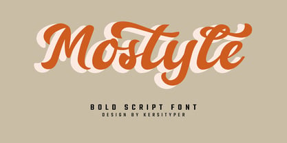 Introducing Mostyle font a Display Retro Script Font. Inspired by retro typography and lettering in the '70s and '80s combined with bold typography style. This Font is perfect for vintage and retro design, badges, logos, posters, branding, packaging, signage, and book cover. Multilingual support: Afrikaans, Albanian, Catalan, Danish, Dutch, English, Estonian, French, Finnish, German, Icelandic, Indonesian, Italian, Malay, Norwegian, Portuguese, Spanish, Swedish, Zulu, and many more. What’s Included : Standard & Multilingual glyphs Ligature Works on PC & Mac Simple installations Accessible in Adobe Illustrator, Adobe Photoshop, Adobe InDesign, and even work on Microsoft Word. Hope you enjoy our font!
 - Ainda by Resistenza,
$45.00 We always had a crush for multilinear fonts and a great love story with script types. So we decided to bring them together and create Ainda. A new multiline script font based on and English copperplate skeleton. A modern approach to classic flourished scripts, designed with a slanted angle that gives dynamism and creates a ribbon effect when the lines come together in the connections, adding depth and perspective. Ainda family includes 2 weights, Regular & Bold. This Display font will light your layout with a contemporary and elegant flair. Highly recommend to use it on big sizes.
 - Bionik by Fontador,
$24.99 Bionik is a squarish serif, especially designed for contemporary typography on print and screen. The super ellipse-based forms and high x-height allow large and open letterforms, perfectly adapted to the pixel grid on screen. With light rounded corners Bionik provides a soft and friendly atmosphere. The font contains 6 weights from ExtraLight to ExtraBold plus true italics. 944 glyphs include 218 ligatures, small caps, tabular, old style, fractions …, and a wide range of flexibility for latin language support for every typographical needs. Bionik is a contemporary serif typeface, special for logotypes, brands, magazines and editorial.
 - Calypso I by Typolar,
$65.00 Calypso I (Italian) draws its inspiration from type founders' plentiful show-off-letters, which were typical on title pages and lithographs in the early 19th century. It borrows luscious details from these but inherits a stiff modern backbone from its parent, Calypso E (Egyptian). Within the Calypso type family all fonts share the same dimensions and work together consistently. Calypso I supports many languages and includes, for example, four sets of basic numerals, circled numbers, alternative characters, case sensitive forms and dingbats. Give it a go on drop caps and headlines or even set short paragraphs with it. It loves colour and effects.
 - Bang by ITC,
$29.00Bang was designed by David Sagorski in 1993 as a playful font of spirals. It consists of two capital alphabets which can be combined like the usual capitals and small caps, although both have the same height. They differ from one another only in the decorative forms which adorn them and the highly decorated characters of one set are complemented by the slightly more reserved characters of the second. Serious this font is not, rather, with its circles and spirals, Bang is best in point sizes 12 and larger and is meant for short texts and headlines. - P22 Pooper Black Pro by IHOF,
$39.95 Pooper Black Pro is based on a brush ethic and has an extreme axis that lends a certain amount of speed to the font while the lack of connectors slows it down. The pro version expands on the original and popular Pooper Black with the addition of full Central and Eastern European character sets and plenty of alternate characters for those who have applications that support Opentype features. Almost all of the lower case characters now include an in stroke and out stroke version for greater design flexibility. A wonderful face for packaging, titling, and short bursts of text.
 - Grotica by Runsell Type,
$24.99 Grotica is a versatile geometric sans serif contains 7 weights from Thin to Bold. IIt's inspired by the beautiful logotype on old labels and by exploring the Retroica font we've created in 2020. This font is suitable for movies, TV, advertising, packaging, logos, posters, music, branding, posters and so on with a modern design style. With over 600 glyphs per style, Grotica supports around 150 languages in Latin and Cyrillic script. Grotica OpenType Features including alternate glyphs, fractions, contextual alternates, oldstyle and lining (proportional and tabular) numerals, numerators/denominators, superiors/inferiors, and a variety of symbols.
 - Eckmann by Linotype,
$29.99The font Eckmann is named after its designer, Otto Eckmann, and appeared with the Klingspor font foundry in 1900. The influence of the Jugendstil is clear to see in the flowing floral contours of the letters. This font was made for larger point sizes, like on posters, and while relatively legible, it is not meant for smaller print. The font was often used in book titles and advertisements of the 19th century and today Eckmann is often used to suggest a feeling of nostalgia and is often found on the Jugendstil facades in Germany, Austria and Switzerland. - Sofya by Gaslight,
$30.00 This funny script font based on the logo which we did. It will look great on the package, restaurant menus, logos and magazine headlines. A large number of ligatures help you vary your design.
 - Rum Sans by Trine Rask,
$30.00 Rum Sans is designed inside out based on modular counters. Rum Sans is a text & display family suitable for any purpose, any media, any size. A humanistic modular sans serif in five weights containing small caps, italic, swashes, alternative characters, old style, lining, tabular & proportional figures. Design date: 2001-2014 The complete family consists of Sans Serif & Serif in both sharp and soft version + the display fonts Rum Plakat & Rum Silhouette.
 - Rum Serif by Trine Rask,
$30.00 Rum Serif is designed inside out based on modular counters. Rum Serif is a text & display family suitable for any purpose, any media, any size. A humanistic modular Serif in five weights containing small caps, italic, swashes, alternative characters, old style, lining, tabular & proportional figures. Design date: 2011-2014 The complete family consists of Sans Serif & Serif in both sharp and soft version + the display fonts Rum Plakat & Rum Silhouette.
 - Aspen by Ludwig Type,
$39.00 Aspen is a refreshing and resilient typeface for text of any kind. Functional but not faceless, Aspen derives a very distinctive character from an unusual pedigree. It is loosely influenced by early American and European grotesques, but with more warmth and improved legibility. And where these historical models were rigid and bulky, Aspen’s curves have a gentle sway that makes for very comfortable reading. Relatively generous ascenders and descenders allow the typeface to feel spacious even when set with tight leading. These amiable qualities are matched with a lively italic based on cursive writing. The family consists of nine weights, and is intended for both text and display usage. Visit this minisite to see Aspen in action.
 - Linotype Syntax Lapidar Serif Text by Linotype,
$29.99Modeled on the writings chiseled in stone in the second century B.C., Syntax™ Lapidar is an energetic, spirited typeface designed by Hans Eduard Meier in 2000. Linotype Syntax Lapidar Text and Linotype Syntax Lapidar Serif Text have five weights each, with both cap and lowercase letterforms. Lapidar Display and Lapidar Serif Display also have five weights each, with mostly all cap letterforms and many alternates. It's a terrifically fun and inventive family, and if you look closely, you can see the resemblance to the more modern and restrained Syntax™ relatives. Great for menus, artist books, travelogues, or advertising - and if used very sparingly, it could add just the right element of lapidary significance to corporate documents. - Pixelate by IbraCreative,
$27.00 Pixelate is a playful and futuristic techno typeface that channels a sense of excitement and digital innovation. Inspired by the pixel art of retro video games and the sleek lines of modern technology, Pixelate combines the best of both worlds. Each letter is crafted with precision, resembling digital pixels and evoking a sense of nostalgia while embracing contemporary design elements. The squared edges and geometric forms create a visually captivating display, making it a perfect choice for technology-related projects, gaming graphics, and futuristic branding. Pixelate injects a dose of fun and energy into any composition, capturing the spirit of the digital age and inviting viewers to embark on a thrilling visual journey.
 - Goodwater by Fenotype,
$19.00 Goodwater is an original collection of a Brush, three weights of a monoline Script and four weights of condensed Sans typeface. Goodwater also has a “Print” version with rugged outline and worn-out texture of each font. Goodwater is a great pack for any display use from online to logo and from headline to packaging. All the styles are designed using the same proportions and soft corners so that they’ll place nice together. All Print versions have the same texture style and size too so that they’ll fit smooth together. Goodwater Script and Brush fonts are equipped with automatic Standard Ligatures and Contextual Alternates to keep the flow smooth and it’s best to keep those features on.
 - Linotype Syntax Lapidar Serif Display by Linotype,
$29.99Modeled on the writings chiseled in stone in the second century B.C., Syntax™ Lapidar is an energetic, spirited typeface designed by Hans Eduard Meier in 2000. Linotype Syntax Lapidar Text and Linotype Syntax Lapidar Serif Text have five weights each, with both cap and lowercase letterforms. Lapidar Display and Lapidar Serif Display also have five weights each, with mostly all cap letterforms and many alternates. It's a terrifically fun and inventive family, and if you look closely, you can see the resemblance to the more modern and restrained Syntax™ relatives. Great for menus, artist books, travelogues, or advertising - and if used very sparingly, it could add just the right element of lapidary significance to corporate documents. - Linotype Syntax Lapidar Display by Linotype,
$29.99Modeled on the writings chiseled in stone in the second century B.C., Syntax™ Lapidar is an energetic, spirited typeface designed by Hans Eduard Meier in 2000. Linotype Syntax Lapidar Text and Linotype Syntax Lapidar Serif Text have five weights each, with both cap and lowercase letterforms. Lapidar Display and Lapidar Serif Display also have five weights each, with mostly all cap letterforms and many alternates. It's a terrifically fun and inventive family, and if you look closely, you can see the resemblance to the more modern and restrained Syntax™ relatives. Great for menus, artist books, travelogues, or advertising - and if used very sparingly, it could add just the right element of lapidary significance to corporate documents.
