10,000 search results
(0.015 seconds)
- Noobia by Scholtz Fonts,
$19.95 Noobia is a casual, energetic handwritten font, with plenty of movement. Its moving baseline creates a funky, busy, dramatic impression. With its informal, immediate style, Noobia is like a swift swash of text handwritten with a slightly overfilled ink pen. This impression is exaggerated by blobs at the beginning and end of pen strokes. Noobia makes a simple, direct statement, bypassing complexity and superficiality. It's just an in-your-face, immediate font. It 's the font you'd use for a quick, hand drawn note or notice. Noobia comes in three great styles: Noobia Smooth - use it for ad media for anything from sports equipment to slinky lingerie, wine labels to washing powder packaging. Noobia Black - use it anywhere to emphasise Noobia Smooth, and on posters and children's book covers. Noobia Rough - use it for graffiti, music videos, funky clothing hang tags and event posters. Noobia has all the features usually included in a fully professional font. Language support includes all European character sets.
 - Shibuya Dancefloor by Megami Studios,
$10.00 Inspired by Rob’s years of living in Japan, Shibuya Dancefloor is an expanded version of an earlier font that we did, adding hiragana and katakana to the mix. It's perfect for anime artwork, sci-fi lettering or even just making flyers for that party you're planning down in Roppongi!
 - Major by Fox7,
$14.00 Major Font is designed to be versatile. Compatible with both modern and vintage design styles. You can use it for various projects, such as blog posts, logos, branding, ads, invitations, greeting cards, planners, photo albums, decorations, and much more. Hope you are happy and enjoy your creations. Thank you!
 - ALS Tongyin by Art. Lebedev Studio,
$63.00 ALS Tongyin is a bit rough and square-built with a pronounced oriental touch (Chinese word "tongyin" means "bronze molding"). Tongyin declares its ties to Russian constructivism and has 4 font styles. It matches well the rustic accident type frequently used for ads and announcements in Russian newspapers.
 - Buddy Kids by Fox7,
$10.00 Buddy Kids is a fun-lettered handwritten font that is easy to read. You can use it for various projects, such as blog posts, logos, branding, ads, invitations, greeting cards, planners, photo albums, decorations, and much more. Add it to any of your designs, and enjoy the results!
 - RMU Herkules by RMU,
$25.00 At the end of the 19th century, the fin de siècle, both Bauer and Berthold released ‚Herkules‘, a heavy Art Nouveau font for ads and posters. This font was carefully redesigned and makes it a great font in Jugendstil surroundings and a splendid partner of the Carlsbad font family.
 - Tough Stuff JNL by Jeff Levine,
$29.00Tough Stuff JNL is a solid version of Jeff Levine's Tough Guy JNL [an outline font with a cast shadow]. In this version, the bold lettering shows off its "hand-made" look, and is perfect for posters, fliers or ads that need to grab attention without looking too formal. - Cool Cat by Fox7,
$10.00 Cool Cat is a fun and comfortable handwritten font that is easy to read. You can use it for various projects, such as blog posts, logos, branding, ads, invitations, greeting cards, planners, photo albums, decorations, and much more. Add it to any of your designs, and enjoy the results!
 - Coffee & Tea Doodles by Outside the Line,
$19.00 Coffee and Tea Doodles are a font of coffee and tea things-- beans, cups, drinks, tea bag, iced tea, tea sets etc. Perfect set of clip art for coffee or tea shop menus, ads, invitations, etc. Includes scripted words that include coffee, tea, coffee break and tea for 2.
 - Yargo JNL by Jeff Levine,
$29.00A little funky, a little fun and thoroughly unusual - this is the best way to describe Yargo JNL. This novelty font is best used in short phrases and at large point sizes. No kerning has been added so the letters can retain their hand-made look and feel. - Magma II by Stone Type Foundry,
$49.00 Magma is a rare sans serif typeface family designed explicitly for use in both text and display applications. Starting with this design foundation, Sumner Stone refined the design and added a large suite of international characters to create Magma II, a type family with even more depth and versatility.
 - TWA Assembly Sans by Work Type,
$30.00 TWA Assembly Sans is not your standard workhorse sans. Although it sports the same geometric shapes, grotesk characteristics, and comes in many weights, its unique qualities and slight diagonal curves give Assembly Sans a friendlier appearance. As the weight increase, the contrast becomes more extreme, adding to its approachability.
 - Gendis by Surotype,
$20.00 Gendis is a complete fonts pack for build brands, comes in three different styles and extras. This complete package is perfectly for all your creative work such as branding projects, packaging design, ads and more. To enable the opentype stylistic alternates, you need a program that supports opentype features.
 - Kitty Sweet by Zamjump,
$11.00 Introducing my new monoline handwriting font = Kitty Sweet = It's perfect for creating quotes, logos, or just adding a handmade touch to any project. Equipped with ligatures and alternatives for uppercase letters, made especially for those of you who want to be simple and make every simple job easier.
 - Kish by That That Creative,
$15.00 KISH is a super quirky display type with reverse contrast. Imagine if the old west and the 70s had a lovechild with a sense of humor; now imagine that that child was a display font. That's KISH. It's the perfect typeface for adding sophisticated playfulness to any design project.
 - PL Benguiat Frisky by Monotype,
$29.99PL Benguiat Frisky is a script face designed by Ed Benguiat in 1960. It has an irregular x-height adding to its informal appeal. The PL Benguiat Frisky font is useful for books and posters and invitations for fun or informal events and also works well for packaging. - Royal Ambition by Lemonthe,
$13.00 Royal Ambition is a perfect mix modern script and sans serif font. Together or apart, these fonts are ideal for adding a chic and cheery touch to your crafts. It was created to help you designing makes gorgeous logos, posters, wedding invitations, blog posts, social media, and more!
 - Azuree ND by Neufville Digital,
$45.25 Azuree is a typeface designed by Bauersche Giessere in 1908, simulating copperplate engraving, frequently used in cards. Today it is still an excellent choice for publishing projects, both for typographic compositions and for headlines, adding a romantic and rough touch at once. Azuree is a Trademark of BauerTypes SL
 - Qiunels by Almarkha Type,
$35.00 Hello Introducing, Qiunels - Elegant Luxury Display Serif is an unique font that uses line to describe the impression of elegance and modern. Perfect for adding a unique twist to word-mark logos, monograms or pull quotes. Qiunels has 21 Alternate can be turned off if required standard writing needs.
 - Civic Sans by CozyFonts,
$25.00 A Clean Sans Serif font family with a few stylish glyphs to give extra character e.g., L-R-Q-Z-W-g-t. Usage: Any applications is appropriate especially signs, directions, posters, graphics and use especially in Ads and billboards. There's 13 font variations in Civic Sans Font Family.
 - IA Morning Star by Invisible Art Studio,
$14.99 IA Morning Star is a readable universal comic book dialogue font that adorns any book. The family includes Regular, Italic, Bold, and Bold Italic. Added a set of European characters, Cyrillic; auto ligatures to replace repeating characters, and contextual autoreplacing crossbar "I" in words like I, I'm, etc.
 - Neoscript Pro by John Moore Type Foundry,
$59.95 NeoScript Pro is a family of typefaces that leads Neoscript Pro Zero, a commercial script writing similar to those used in ads advertising the 40s and 50s, with fine lettering combinations of that time. NeoScript Pro is ideal for composing headlines and subheads and this is supplied four variations.
 - Patagon by Latinotype,
$19.00 Patagon is a contemporary Woodtype Sans typeface especially designed for fresh, high impact sentences with a mix of flavoured features. Its upper-case Opentype ornamental alternate glyphs provide great elegant textures adding versatility to the three weight family: condensed, regular & extended. Mix them up for a really cool design!
 - Road Bridge by Fox7,
$12.00 Designed to be versatile, the Road Bridge font is a great choice for any type of project. Compatible with both modern and vintage design styles. You can use it for various projects, such as blog posts, logos, branding, ads, invitations, greeting cards, planners, photo albums, decorations, and much more.
 - Vintage Mohai by Nirmana Visual,
$29.00 Vintage Mohai Inspired by art nouveau Design Era. This Serift font is perfect for adding a touch of elegance and sophistication to your designs. With its flowing lines and graceful curves, it is ideal for a diversity of design projects, including logos & branding, social media posts, advertisements & product designs.
 - Roulletes Handrawn by Siwox Studios,
$11.00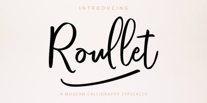 Roullet Fonts is a handwriting style. For designers, Instagrammers, bloggers, YouTubers, fashion lovers or somebody who Loves Fresh design. Roullet Fonts are suitable for any modern-design such as ad banner, modern card, invitation, announcement, seasonal design, social media promotion, web design, branding and logo stylist and many more.
 - Maxim by GroupType,
$19.00 Maxim was originally designed by Peter Schneidler in 1956 for the Bauer Type Foundry. This typeface is energetic and has the look and feel of a brush painted script. The FontHaus font studio released its revival version with added characters in 1994 and as an OpenType font in 2006.
 - Wendy LP by LetterPerfect,
$39.00 The Wendy family is a cursive script provided in three weights -- Light, Medium and Bold. The design is an upright, casual handwriting style, with natural joins and connecting strokes. Wendy, in her various modes, projects a friendly persona, adding an approachable quality to headlines and short runs of text.
 - Quacker by Ergibi Studio,
$16.00 Quacker is a display sans font and is equipped with 80 alternative characters that make this font look beautiful. Alternative letters are provided to make this font look sweet and classy. Quacker is very good for your work such as logos, brands, packaging, posters, invitations, social media, and ads.
 - Techno Cowboy by Hipfonts,
$22.00 Introducing Techno Cowboy, a modern techno display font with multilingual support. Techno Cowboy is great for creating eye-catching logos, headlines, ads, posters, web design, print, motion graphics, apparel and much more. If you're looking for a futuristic font that packs a punch, then Techno Cowboy is for you.
 - Poleno by DizajnDesign,
$39.00 Poleno is a custom typeface originally designed in 2006 for the Slovak folk dance ensemble Poleno, as a part of their corporate identity. Ever since, new weights have been added to complete six variables and two different options for accents. The typeface adds a fresh, bold and non-rational feeling to headlines and titles in books and posters in display sizes where emphasis and detail are equally important. Randomly-generated contextual alternates included in the family contribute to add a distinctive look to words with repeating characters, whenever they occur next to each other. The difference between the Poleno Set and the Poleno Alt Set is in the accented characters. In the first one, accents are merged with the characters and in Alt version, accents are separated from the characters.
 - TT Trailers by TypeType,
$39.00 Meet the new TT Trailers! The first version of TT Trailers was conceived as a font suitable for the film industry. The font harmoniously looks in posters, it is ideally suited for setting titles. However, the font has gained wide popularity among designers, and now you can find TT Trailers on the covers of magazines, on restaurant signs and on the main pages of websites. TT Trailers useful links: Specimen | Graphic presentation | Customization options Since 2019 when we released the first version, the TypeType studio team has released dozens of fonts, constantly improving our skills. In 2022, we decided to look at TT Trailers again, improving and expanding the font. In the new TT Trailers, we expanded the character set, corrected the contours, and improved the technical content. We have added extended Latin and Cyrillic characters, new symbols, and additional sets of numbers. The number of glyphs in one style has increased from 1081 to 1242. The inclined styles were long-awaited. The italics in TT Trailers are as eccentric as the upright fonts. The 15-degree tilt looks absolutely harmonious, complementing the character of the font family. We added italics to the variable font, so the new font changes along two axes at once, weight and slant. From the technical point of view, TT Trailers has become more modern and correct, and the number of OpenType features has increased from 29 to 42. We have added new alternative versions of glyphs and created a large number of localized features. The font retained all the qualities thanks to which designers fell in love with it, but became even more convenient. TT Trailers in the new version is suitable for titles and posters, for websites and printed materials. The font will embellish in restaurant and cafe signs and look beautiful in posters. There are 19 styles in TT Trailers: 9 upright, 9 italic and 1 variable font.
 - Areno by BoxTube Labs,
$24.00 Areno was our first ever font family, released in 2017. We’ve learned a lot since then and made the decision to redraw it from scratch with improved letterforms, better readability and added language support. Most adjustments are very subtle, but some glyphs have gotten a complete makeover. We've also added lowercase letters to the family. Areno is a strong and bold sports block font. These fonts are perfect for sports logos, branding, posters, apparel design, magazine headlines, labels and so much more. Areno now features a full Adobe Latin 1 Character Set with support for most Western European languages including Afrikaants, Basque, Breton, Catalan, Danish, Dutch, English, Finnish, French, Gaelic, German, Icelandic, Indonesian, Irish, Italian, Norwegian, Portuguese, Sami, Spanish, Swahili and Swedish.
 - Orittish by Hanzel Space,
$25.00 Orittish - Lettering Brand Font Introducing our font Orittish, we have finished the font project we made for your company's branding needs. The character of this font is that it has characters that are not connected to each other, we deliberately made it that way so that it is more flexible when it will be paired in a product branding for your business. Orittish comes with upper and lowercase characters, punctuation, numerals,supports international languages and OpenType features with Stylistic Alternates,watshot type is very best choice fonts for : ,quotes, Posters, Logos, Print Ads, Digital Ads, Promotion Product, video bumper, etc. Stylistic alternates for key lower case characters are also available, accessible in the Adobe Illustrator Glyphs panel, or under Stylistic Alternates in the Adobe Photoshop OpenType menu.
 - Edison Swirl SG by Spiece Graphics,
$39.00 Edison Swirl, with its terminals majestically looping and twirling in a circular fashion, quickly takes us back to the Victorian era of type. This unusual fancy face, which dates back to the early 1900s, distinguishes itself by employing splayed M & N caps. Some letterforms also contain double cross-strokes for added interest. Edison Swirl is full of ornament and detail which creates a truly striking pattern of intrigue and delight. Edison Swirl is also available in the OpenType Std format. Some new characters have been added to this OpenType version. Advanced features currently work in Adobe Creative Suite InDesign, Creative Suite Illustrator, and Quark XPress 7. Check for OpenType advanced feature support in other applications as it gradually becomes available with upgrades.
 - Myhota by Ingrimayne Type,
$7.00Myhota is a condensed sans-serif face that has a bit of rawness to it. It is condensed and has a very high x-height, so it more useful for display than text. Myhota-Bold and Myhota-Light were designed in 1990 and the other seven weights were added in 2021 as were the italic and backslanted styles. There is rarely a use for backslanted type, but when it is needed, Myhota provides an option. Myhota-Hatched was an attempt to see if a readable text font could be hatched out of Myhota by lowering the x-height and widening the letters. The result is a face with rather squarish letters. The regular and bold were original styles with the medium and italic styles added in 2021. - Myhota Hatched by Ingrimayne Type,
$7.00 Myhota is a condensed sans-serif face that has a bit of rawness to it. It is condensed and has a very high x-height, so it more useful for display than text. Myhota-Bold and Myhota-Light were designed in 1990 and the other seven weights were added in 2021 as were the italic and backslanted styles. There is rarely a use for backslanted type, but when it is needed, Myhota provides an option. Myhota-Hatched was an attempt to see if a readable text font could be hatched out of Myhota by lowering the x-height and widening the letters. The result is a face with rather squarish letters. The regular and bold were original styles with the medium and italic styles added in 2021.
 - FF Real Text by FontFont,
$50.99 FF Real is a convincing re-interpretation of the German grotesque style from between 1998 and 1908, but with much more warmth and improved legibility as well as a hint towards the warmer American grotesques. Later on, not just slanted styles, but a “proper” italic version was added inspired by the way Roman and Italic are distinguished in traditional serif faces. NEW: a specially created set of obliques were added in 2018 to give designers more design flexibility, for those looking for a less calligraphic look. In 2020 the family was extended with matching condensed weights. FF Real was originally conceived by Erik Spiekermann as one text weight and one headline weight to be used as the only faces in his biography ‘Hello I am Erik’, edited by Johannes Erler, published in 2014. While Spiekermann drew the alphabets, he passed on the font data to Ralph du Carrois and Anja Meiners who cleaned it up and completed it. In the meantime, FF Real has been extended to a family of two styles and 65 weights each. The design of FF Real is rooted in early static grotesques from the turn of the century. Several German type foundries – among them the Berlin-based foundries Theinhardt and H. Berthold AG – released such designs between 1898 and 1908. The semi-bold weight of a poster-size typeface that was lighter than most of the according semi-bolds in metal type at the time, gave the impetus to FF Real’s regular weight. In the words of Spiekermann, the historical example is “the real, non-fake version, as it were, the royal sans serif face“, thus giving his new typeface the name “Real” (which is also in keeping with his four-letter names, i.e. FF Meta, FF Unit). FF Real is a convincing re-interpretation of the German grotesque style, but with much more warmth and improved legibility. With a hint towards the warmer American grotesques, Spiekermann added those typical Anglo-American features such as a three-story ‘g’ and an ‘8’ with a more defined loop. To better distinguish characters in small text sizes, FF Real Text comes in old style figures, ‘f’ and ‘t’ are wider, the capital ‘I’ is equipped with serifs, as is the lowercase ‘l’. What’s more, i-dots and all punctuation are round.
 - FF Real Head by FontFont,
$50.99 FF Real is a convincing re-interpretation of the German grotesque style from between 1998 and 1908, but with much more warmth and improved legibility as well as a hint towards the warmer American grotesques. Later on, not just slanted styles, but a “proper” italic version was added inspired by the way Roman and Italic are distinguished in traditional serif faces. NEW: a specially created set of obliques were added in 2018 to give designers more design flexibility, for those looking for a less calligraphic look. In 2020 the family was extended with matching condensed weights. FF Real was originally conceived by Erik Spiekermann as one text weight and one headline weight to be used as the only faces in his biography ‘Hello I am Erik’, edited by Johannes Erler, published in 2014. While Spiekermann drew the alphabets, he passed on the font data to Ralph du Carrois and Anja Meiners who cleaned it up and completed it. In the meantime, FF Real has been extended to a family of two styles and 65 weights each. The design of FF Real is rooted in early static grotesques from the turn of the century. Several German type foundries – among them the Berlin-based foundries Theinhardt and H. Berthold AG – released such designs between 1898 and 1908. The semi-bold weight of a poster-size typeface that was lighter than most of the according semi-bolds in metal type at the time, gave the impetus to FF Real’s regular weight. In the words of Spiekermann, the historical example is “the real, non-fake version, as it were, the royal sans serif face“, thus giving his new typeface the name “Real” (which is also in keeping with his four-letter names, i.e. FF Meta, FF Unit). FF Real is a convincing re-interpretation of the German grotesque style, but with much more warmth and improved legibility. With a hint towards the warmer American grotesques, Spiekermann added those typical Anglo-American features such as a three-story ‘g’ and an ‘8’ with a more defined loop. To better distinguish characters in small text sizes, FF Real Text comes in old style figures, ‘f’ and ‘t’ are wider, the capital ‘I’ is equipped with serifs, as is the lowercase ‘l’. What’s more, i-dots and all punctuation are round.
 - Henman by ParaType,
$30.00 Based on the late 1970s artwork by outstanding Armenian type designer Henrik Mnatsakanyan (1923-2001). That was the only design created by Mnatsakanyan for Latin and Cyrillic. Digital version with adding the missing characters was designed for ParaType in 2003 by Manvel Shmavonyan. The font name Henman proposed by Mnatsakanyan is formed of the first three letters from the each designer's name: HENrik and MANvel. Some fractured elements make the face informal and a little bit funny. For use in text, advertising and display matter.