10,000 search results
(0.036 seconds)
- Comforting Sounds by PizzaDude.dk,
$17.00 Sometimes the way forward is simplicity. That goes for your personal life as well as designing. Sometimes what catches the eye is something simple. My Comforting Sounds font is a handmade sans serif font. It has a crunchy line, an organic look and legibility even at very small sizes. And in a charming way, it is quite simple!
 - DF Mercat by Dutchfonts,
$30.00 DF Mercat is a tribute to the famous marketplace situated at ‘La Rambla’ in Barcelona's historic centre. It is a picture font containing over 240 illustrations of fish, crustacean, clams, poultry, game, meat, sausages, herbs, vegetables, fruit, bread, butter, a variety of cheese, wines and spirits, small dishes, drinks (coffee, beer, soft drinks), ice cream, pastry, etc.
 - Mechanized JNL by Jeff Levine,
$29.00 Mechanized JNL is a solid interpretation of Jeff Levine's stencil font Trencher JNL. Both fonts were based on a photo of hand-cut stencils found on a 1940's trenching machine in the collection of the Marine Corps Mechanized Museum at Camp Pendleton, California. Thanks to restoration volunteer Brian Platzer for providing the images of those stencils.
 - Shearman Std by UFF,
$25.00 Shearman STD has a simple design, based on industrial fonts, in particular at the typewriters fonts. It's a geometric font with curves elimination, noting in particular the O and Q letters. It has smooth angles and clean forms which combine in a font with modern appearance. It include five weights with two italics and an extended European character set.
 - Burlingame by Monotype,
$50.99 The Burlingame™ typeface family from Carl Crossgrove is a sturdy typeface with open, clear shapes that offer high legibility, even in constrained digital settings, or in challenging print environments such as tiny pharmaceutical labels. The design performs with strength and grace at any size. It’s a multifaceted, multipurpose typeface family – a perfect addition to the Monotype® library.
 - Pancetta Pro by Mint Type,
$- Pancetta Pro is a squarish sans-serif typeface with semi-closed aperture and pillow-shaped terminals. The shape of a pillow is furthermore used to enliven the boring horizontal stems which are very frequent in Cyrillic script, and get rid of the right angles. Also take a look at Pancetta Pro's serif companion – Pancetta Serif Pro
 - Berlin Caligram by Genesislab,
$15.00 Berlin Caligram is a fancy yet elegant display font. characters that are suitable for today's style will be very interesting for you to create any design work with a classy model that maintains a calm and classy style to look at. you must already have the inspiration to be combined with the creativity you have! Multilingual Support.
 - Buckle by Wilton Foundry,
$29.00Keep up that great western tradition with Buckle Bold! Buckle was created to be a contemporary twist to old "cowboy" fonts. It is bold while retaining a narrow width. When reduced down, it has a slightly worn look caused by the reduced double diamonds inside the capitals - which does not look out of place at all. - Ex Libris by Fenotype,
$25.00 Ex Libris is a high contrasted Flared Serif font family in two weights. Ex Libris is a display type and it’s at its best in headlines, branding, packaging or as a logotype. Try adding some extra flair with Swash, Stylistic or Titling Alternates or wield any of Ex Libris’s 33 Discretionary Ligatures when typing in caps.
 - Onyx by Monotype,
$29.99 Gerry Powell, typographer, industrial designer, and director of typographic design for American Type Founders, designed Onyx font for ATF in 1937. A very popular advertising type in the 1940s, Onyx resembles an extremely condensed, bold member of the Bodoni family. Onyx is a good display font, with proportions that make it readable even when space is at a premium.
 - RM Hangle by Ray Meadows,
$19.00 This strong angular cousin of RM Hunky offers a bold display face. The distinctive nature of this design will be a welcome addition to any designers collection of useful fonts. Due to the nature of this design there may be a very slight lack of smoothness to the curves at extremely large point sizes (around 200 pt and above).
 - Diazy by Salamahtype,
$17.00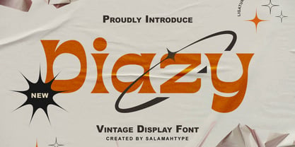 Diazy is a unique font with a modern or classic style, its beautiful shape makes the letters beautiful to look at. This font is perfect for branding projects, film/movie projects, logo designs, social media, advertising, product packaging, product designs, labels, photography, watermarks, invitations, stationery, or anything else where you want to add a touch of vintage class.
 - Brefid by Gian Studio,
$16.00 Brefid is a luxurious yet elegant display font. characters that suit today's styles will be very interesting for you to create any design work with a classy model while still maintaining a calm and impressive style to look at. You're sure to have inspiration to match your creativity! Free updates for more versions in the future. Thank You
 - Ten Oldstyle by Adobe,
$35.00Ten Oldstyle is a four-weight type family from Principal Designer Robert Slimbach at Adobe. He designed it as the Latin component of Ten Mincho, a Japanese typeface by Adobe?s Chief Designer Ryoko Nishizuka. As it began to take the form of a small type family, Robert decided to release Ten Oldstyle on its own as well. - Tarotee One by Monotype,
$29.99Traditional as Gutenberg, fresh as a sealed deck of playing cards - Tarotee One Arabesques is a remarkable set of ornaments that combine and recombine in endlessly beautiful combinations. Created by Tony Lansbury (and if you're still wondering what "tarotee" means, here's a hint - tear open that deck of cards mentioned above and look at the backs). - Adlery Pro by Zetafonts,
$39.00 Adlery is a brush typeface designed by Cosimo Lorenzo Pancini for display use. It has a handmade feel and it’s optimized for maximum readability at medium sizes. The typeface comes in three styles: Basic, Swash and Blockletter Uppercase and has a double set of lowercase alphabets that alternate in writing, so that no double letters are the same.
 - Lautren by Azzam Ridhamalik,
$16.00 Introducing Lautren, a new delightful bold script with reversed contrast typeface. The Ideas of this fonts came from funny summer vibes mood which is made more neater and smoother. Lautren created with a tons of opentype features like contextual alternates, stylistic sets, ligatures, and swashes at the ending of the letters. A fun typeface to play with!
 - FF Pastoral by FontFont,
$50.99 A sturdy workhorse with the grace of a gazelle, the FF Pastoral typeface family marries pure craftsmanship with rapturous excesses of form. With his fifteenth release under the FontFont brand, prolific French designer Xavier Dupré has filled a typographic toolbox with plentiful options ranging from a tender, feathery Thin to a robust, healthy Black. At a glance, FF Pastoral appears deceptively simple, particularly in the middle weights. That surface serenity is intentional and allows for easy reading and quick comprehension of short blocks of copy. Upon closer inspection, FF Pastoral is complex and nuanced, carrying a balanced tension in its forms. This plays particularly well in magazine spreads and corporate logos, where uniqueness is a virtue. In creating his latest design, Dupré drew inspiration from a tasteful mix of references, combining diverse elements with a deft hand. While its letter shapes were informed by humanist-geometric hybrid Gill Sans, FF Pastoral’s proportions have been optimized for contemporary typography. Slightly condensed but generously spaced, FF Pastoral features a tall x-height, open counters, and subtle, sprightly italics slanted at just 5°. Proportional oldstyle figures are the default in the family, with tabular and lining numbers and fractions accessible through OpenType features. Elegant details evocative of calligraphy judiciously pepper the FF Pastoral glyph set. The ‘e’ bears an oblique crossbar, while the right leg of the ‘K’ and the ‘R’ are insouciantly curved in both the upright and italic variants. Further flourishes appear throughout the italics, notably in the ‘T’ and the ‘Z’, the gloriously looped tail of the ‘G’, and an extraordinary ampersand. Sharp-eyed fans of Dupré’s work may feel like they’re in familiar territory, and they would be right. An early version of FF Pastoral sprang to life in 2017 as Malis, a family in four weights on the heavier side of the spectrum. Over time, Dupré refined his original design, expanding it with four lighter styles and including true italics for all. The lightest weights are ethereal, with exquisitely delicate strokes drawing the eye in and across a line of type. The most substantial styles are tremendous in their power, allowing text to make a deep impression in print or on screen. Fully fleshed out, FF Pastoral works sublimely in a vast array of text and display settings. Dupré sees his latest FontFont offering as a ‘cultural’ typeface, perfect for the pages of an oversized coffee-table book or business communications where warmth and informality will win the day. Born in Aubenas, France (1977), Xavier Dupré is a gifted user of type as well as an award-winning type designer and lettering artist. After training in graphic design in Paris, Dupré studied calligraphy and typography at the Scriptorium de Toulouse. Since releasing FF Parango in 2001, Dupré has published such FontFont classics as the FF Absara and FF Sanuk superfamilies, FF Megano, FF Tartine, and FF Yoga. A designer of Khmer fonts as well as Latin typefaces, Dupré splits his time between Europe and Asia.
 - Stu by StuArt,
$9.00 Stu is based on the penmanship of the late Raoul "Stu" Stuart. Raoul's penmanship was always admired by those who saw it; it was a first glimpse into the artistic and creative side of an otherwise easy-going, funny guy. The print variants exude a soft yet masculine feel, while the scripts evoke a sense of sentimentality and romance. Stu features dingbats which say something about Raoul: affectionate and romantic (heart), a big coffee drinker (coffee cup), a great cook (spoon and fork), a music lover (musical note), and a prankster (winking smiley). (The winking smiley is available in all the font styles, while each of the other four dingbats is unique to one font style.) Stu is a tribute to the coolest dad in the world.
 - Intellecta Monograms by Intellecta Design,
$20.90 IntellectaMonograms is an extensive collection of ancient intrincate monograms, of all kinds, mainly Victorian style. To better understand the recherché combinations in these fonts, please take a look at the pdf brochures in the Gallery section.
 - Dandy JY by JY&A,
$29.00 Danielle Smith describes her friendly, hand-drawn typeface family, available in roman and italic, as ‘non-élitist and accessible’. Originally created for a theatre project at Massey University, Dandy is reminiscent of Pablo Ferro’s hand-lettering.
 - Pen Gothic JNL by Jeff Levine,
$29.00 Pen Gothic JNL emulates lettering made with a round nib lettering pen, and is loosely based on some text found on the popular 1918 song "Ja-Da". The font is available in regular and oblique versions.
 - Webbies by Jelloween,
$3.50Webbies contains a set of 94 web-related dingbats. Use them in your e-shop, personal website, forum or wherever else you please! Webbies is best used at (any multiple of) size 15pt without anti-aliasing. - Crunk by Nerfect,
$15.00Crunk was inspired by the creator's (at the time) teenaged hoodlum of a brother. The font Crunk is great for headlines and text and has served its creator well over the years since it was made. - La Quinta by Jonahfonts,
$42.00La Quinta is a display font for some small text and logo applications as well as branding, invitations, stationery, packaging, fliers, gaming texts and book jackets. Plus many other applications at the discretion of the designer. - Anabolic Spheroid Pro by CheapProFonts,
$10.00 A funny looking font with circular shapes and cutouts - both hippie and futuristic at the same time. I have completely redrawn all the glyphs, and introduced a lot of alternate and new letterforms to make a little more variety between upper- and lowercase (the original layout with all the "old" letterforms can easily be accessed by using the OpenType menus "stylistic Alternates" or "Stylistic Set SS01"). All diacritics and accents are totally new, and made large - in the style of the original dotted i. ALL fonts from CheapProFonts have very extensive language support: They contain some unusual diacritic letters (some of which are contained in the Latin Extended-B Unicode block) supporting: Cornish, Filipino (Tagalog), Guarani, Luxembourgian, Malagasy, Romanian, Ulithian and Welsh. They also contain all glyphs in the Latin Extended-A Unicode block (which among others cover the Central European and Baltic areas) supporting: Afrikaans, Belarusian (Lacinka), Bosnian, Catalan, Chichewa, Croatian, Czech, Dutch, Esperanto, Greenlandic, Hungarian, Kashubian, Kurdish (Kurmanji), Latvian, Lithuanian, Maltese, Maori, Polish, Saami (Inari), Saami (North), Serbian (latin), Slovak(ian), Slovene, Sorbian (Lower), Sorbian (Upper), Turkish and Turkmen. And they of course contain all the usual "western" glyphs supporting: Albanian, Basque, Breton, Chamorro, Danish, Estonian, Faroese, Finnish, French, Frisian, Galican, German, Icelandic, Indonesian, Irish (Gaelic), Italian, Northern Sotho, Norwegian, Occitan, Portuguese, Rhaeto-Romance, Sami (Lule), Sami (South), Scots (Gaelic), Spanish, Swedish, Tswana, Walloon and Yapese.
 - Ongunkan Phoenician by Runic World Tamgacı,
$50.00 Phoenician/Canaanite The Phoenician alphabet developed from the Proto-Canaanite alphabet, during the 15th century BC. Before then the Phoenicians wrote with a cuneiform script. The earliest known inscriptions in the Phoenician alphabet come from Byblos and date back to 1000 BC. The Phoenician alphabet was perhaps the first alphabetic script to be widely-used - the Phoenicians traded around the Mediterraean and beyond, and set up cities and colonies in parts of southern Europe and North Africa - and the origins of most alphabetic writing systems can be traced back to the Phoenician alphabet, including Greek, Etruscan, Latin, Arabic and Hebrew, as well as the scripts of India and East Asia. Notable features Type of writing system: abjad / consonant alphabet with no vowel indication Writing direction: right to left in hortizontal lines. Sometimes boustrophedon. Script family: Proto-Sinaitic, Phoenician Number of letters: 22 - there was considerable variation in their forms in different regions and at different times. The names of the letters are acrophonic, and their names and shapes can be ultimately traced back to Egyptian Hieroglyphs. For example, the name of the first letter, 'aleph, means ox and developed from a picture of an ox's head. Some of the letter names were changed by the Phoenicians, including gimel, which meant camel in Phoenician, but was originally a picture of a throwing stick (giml).
 - Scroll by Canada Type,
$24.95Earlier this year, my eyes fell upon a discarded wedding invitation on the sidewalk. A closer look at it revealed that it had at one point been victimized by rain. Some of the fancy script letters were not quite broken, but sort of melted and run-down, while the rest were still somewhat intact. That's how Scroll was conceived, as an idea for a script where thicks and thins blend to produce a wet appearance. Unlike most available broken scripts, the Scroll script was originally drawn in its own juiced context, and not based on any existing script. This font is great for atmospheric antiquity, deep natural poetry, still life captioning, gothic music posters and collateral, or horror literature and poetry covers. - Redrail Superfast by astroluxtype,
$20.00 Bold mutant typography. Retro-futuristic. Sixties meets 1990’s comic book inspired, superfast for your superhero? The pencil tissue was dragged out from the very back of the file cabinet, stuck in the metal rail, it was lost then found- to bring a unique look to your project. A companion font to astroluxtype’s Spacepod, both fine ways to mark and identify your spacecraft. Note the lowercase letterforms that make connectors such as g, j, y, b, d and g. See the posters at myfonts.com for examples of how to you might use this feature. Redrail Superfast is a minimal glyph set which can be used at various sizes, we consider it a headline/display font and best applied larger than 36 points in size.
 - Galea Display by Letra Type,
$50.00 Galea is a slightly condensed serif typeface with long extenders. Its elongated proportions and graceful terminals seek to bring femininity and elegance to any layout. It is a display face that works well at large sizes in editorial contexts as a headline, titling or introduction to a text. Galea was designed by Isabel Urbina Peña while at Cooper Union’s Type@Cooper Extended Program, 2012 and released on May, 2014. Galea obtained an Honorable Mention from the Fine Press Book Association in the Text Family Category, 2013. Also, it is featured in the book "Playing with Type: 50 Experiments" by Lara McCormick, Rockport Press, on Parenthesis Magazine, Autumn 2013 on Behance's Typography Served and will appear on "Typography Magazine", Japan (Nov 2014).
 - Heather Flourish by Krntype Studio,
$18.00 Introducing Heather Flourish font Heather Flourish is a signature font created to impress an elegant and luxurious look Heather Flourish is perfect font for branding & logo projects, such a photography studio, clothing/fashion studio, also suitable for Product Packaging, Title on your article or book cover, Stationary, and many more. this font has a ligature and swash which you can access by typing the letters a-g You can try it first by typing the name you want below, I hope you can create amazing custom personal signature or logo with this font you can buy this font at https://www.myfonts.com/foundry/krntype-studio/ Enjoy the font, feel free to comment or feedback, send me PM or email at krntype@gmail.com. Thank you!
 - ITC Portago by ITC,
$29.99 ITC Portago was designed by Luis Siquot, who admits to a tendency toward unusual typefaces that can be read in text yet also work well in display settings. ITC Portago is a robust alphabet of caps and slightly smaller caps. It is a stencil face, based on the lettering on crates and luggage. Siquot says that his intention drawing Portago was to obtain a neutral, classical, very condensed grotesque stencil shape that is readable in text sizes, showing at the same time the 'movement' produced by the nicked edges. And of course the more obvious rough effect in headline sizes." At small sizes, Portago is best set with slightly looser letterspacing, as capital combinations usually do. Portago includes numerals in both full and small caps proportions.
 - Slalom - Unknown license

- Ars Nova by PintassilgoPrints,
$24.00 Ars Nova is an up-to-date incarnation of the Art Nouveau flair. Suited for striking typographic effects. Suited for some nostalgic pleasure. Specially suited for creative minds. Cheers!
 - Print Assistants JNL by Jeff Levine,
$29.00 For those who can't get enough of the wonderful illustrations, embellishments and dingbats of days gone by, Print Assistants JNL collects more of them in one handy font file.
 - Bayer Sans by Victory Type,
$20.00Bayer Sans, is based on the typography of the Austrian-born artist Herbert Bayer. Bayer worked as a teacher and graphic designer at the Bauhaus, a revolutionary German art school, during the 20's. His specialty was commercial art and he had many "radical" views on typography and its interaction with society. Bayer felt that written language should be merely a graphic version of spoken language. Thus, he advocated a single alphabet without majuscules and miniscules. Bayer's designs are simple, geometric letterforms that lend themselves to lowercase form. This font, based on the typography of Bayer and his students at the Bauhaus Werkstatt (studio), was digitally modeled by Noah Rothschild. Bayer Sans features a complete character set including European characters, alternate letters with adjusted widths and designs and ligatures. Included are the "f" characters and a special linked double-o. - Sashay Script by Ivan Angelic,
$19.99 Sashay Script is an elegant yet friendly script font. It is a rich smooth voice that gives an immediate human connection to any design. Do you need to display: speech; thought; emotions; desires…Sashay Script says it all in a clear legible script. It struts down the runway with panache, accompanied by: 13 Icons, 42 Ligatures and 21 Alternates. Although it is clearly a font that represents handwriting, it is very versatile and usable in that it is: easy to read; has good flow and looks great in both paragraph form or as a standalone word or line. As a bonus, since each and every letter was crafted from the ground up, Sashay Script can be used at larger sizes without losing any of its elegance as its edging is well groomed, without the raw edges that can be the terror of handwritten fonts at larger sizes. Sashay Arrows & Underlines was designed to match with Sashay Script. Often a font such as Sashay is used descriptively and the flow and line-weight of the 68 arrows and underlines match Sashay Script in look and feel. Please take a look at the gallery posters that show both Sashay Script and Sashay Arrows & Underlines, in use. We just know you'll have a perfect project for this little model of a font 'Sashaying' down the font runway.
 - Strange Times by PintassilgoPrints,
$20.00 Available in 3 fresh cuts plus a sweet picture font, Strange Times is a serifed hand-drawn family. Or is it handwritten? Either way, it’s quite a handy family with a generous touch of quirkiness and packed with lowercase alternates for a nice organic feel. Powered by Contextual Alternates programming, these alternates will cleverly cycle at the simple click of a button. Strange Times are here. Let’s have a good time. Cheers!
 - Mooseheart by E-phemera,
$20.00 Mooseheart is derived from some hand lettering on a 1920s membership card for a fraternal organization. It is a slightly rough and casual sans serif at a gentle oblique angle, with a comic book feel. It has numerous alternate glyphs intended for use with OpenType features to help create the feel of hand lettering, and a robust international character set. The numerals are in a contrasting style, inspired by the original source material.
 - Mignon by Supfonts,
$10.00 My new font is beautiful and smooth modern calligraphic script with a straight baseline. And I also added a separate font with cute swashes at the beginning and at the end. You do not need special software, everything works simply and clearly :) Mignon will look beautiful on Christmas and holiday invitations, wedding invites and stationery, logos, and more. I love using it for emphasis words and pairing it with serifs. Test it out below to see how it could look for your next project! Includes: Uppercase and lowercase Numbers and punctuation Foreign language support Check out my blog: https://www.instagram.com/zloillev pinterest.com/dmitriychirkov7
