10,000 search results
(0.023 seconds)
- SF Fourche - Personal use only

- Whipsnapper by Pink Broccoli,
$14.00 A wild at heart offbeat sansserif family inspired not by any single pulp or vintage source but a varied collection of influences. Just an all-around fun typeface with the widths and weights to offer a wide variety of uses.
 - Fairway by Alan Meeks,
$45.00 The thinking behind Fairway was to create a relatively conventional soft sans with a certain amount of movement at the top of the x-height line. The face is casual and quirky but can still be used as a text face.
 - Blaak by Mans Greback,
$19.00 Blaak is an interpretation of a Modern Classic typeface with a beautiful and strong impression for editorial design. The sharp serif combined with curves gives Blaak a fabulous, glamorous and bold look; at the same time doesn't sacrifice its functionality.
 - Black Rovers by Pandanwangi,
$16.00 Black Rovers is a striking sans serif font with a bold and modern charm. It will add a touch of minimalism to any design project. If there is anything you need to ask, you can contact me at suratnokang@gmail.com
 - Typewriter Olympia SM8 by Simeon out West,
$25.00 This font, based on old Olympia SM and SF typewriters from the 50’s and 60’s provides a nice clean, yet quirky look for your documents. Being a reproduction inspired by a typewriter, it works better at smaller sizes.
 - Okra Cubo by Cool Fonts,
$24.00 OkraCubo in a distressed font with a cubist bent. This font work nicely for both grunge and modern styles. Used at large point sizes the cubist look really comes out. This font is as strange as Okra is a vegetable????
 - Digital Clock by Beast Designer,
$15.99 Digital Clock Font is a typeface designed specifically for use in digital alarm clocks and other timekeeping devices. It is characterized by clear, legible numerals and symbols, and a modern, minimalistic design that is easy to read at a quick glance.
 - Franklin Fracture by WAP Type,
$15.00 Franklin fracture - Blackletter Something New, the fracture blackletter, has been designed with logo designers and typographers in mind. This display font is the perfect addition to your t-shirt, jacket, hat, design studio, ready for your next logo, barber shop, coffee shop label. Modern blend of fracture and blackletter with a touch or vintage
 - Meanwhile by Comicraft,
$49.00 'Suddenly --' just isn't 'Soon...' enough for some people, and 'Later...' isn't quite 'The Next Day...' 'Meanwhile...' lies inbetween 'Seconds pass...' and 'That Night...' and was designed by Comicraft's John 'With Just a few minutes to Go...' Roshell in order to tell the tales of Marvel's AVENGERS and FANTASTIC FOUR. 'And now, back to the action...'
 - Luckyfield by Allouse Studio,
$16.00 Proudly Presenting, Luckyfield a Fat Handwritten Font. Luckyfield is perfect for any titles, logo, product packaging, branding project, megazine, social media, wedding, or just used to express words above the background. Luckyfield also come with Multi-Lingual Support. Enjoy the font, feel free to comment or feedback, send me PM or email. Thank You!
 - Odaiba Soul by Megami Studios,
$12.50 The second in our Cool Japan series, Odaiba Soul echoes back to some of the futuristic amusement centers and entertainments found on Odaiba Island in Tokyo Bay. Tailored for sci-fi lettering, anime awesomeness or even just making flyers for a day trip across the Rainbow Bridge, this is one to keep in mind!
 - Moomeecoco by Allouse Studio,
$16.00 Proudly Presenting, Moomeecoco A Script Dotted Line Font Moomeecoco is perfect for any titles, logo, product packaging, branding project, megazine, social media, wedding, or just used to express words above the background. Moomeecoco also come with Multi-Lingual Support. Enjoy the font, feel free to comment or feedback, send me PM or email. Thank You!
 - Olbrich Display NF by Nick's Fonts,
$10.00Based on lettering on a poster for an 1907 art exhibition by Joseph Maria Olbrich. Use uppercase characters for headlines, and lowercase letters for text use. For “dotted” spaces, use the underscore, and brackets or braces for framing characters. Both versions of the font include 1252 Latin, 1250 CE (with localization for Romanian and Moldovan). - Vegacute by PizzaDude.dk,
$20.00Vegacute is probably the most romantic font from pizzadude.dk to date! With it's elegant swings and jumpy x-height it stays true to the handwritten sketches that served as a model for this font. Use it for headlines or logos; use it for massive text or letters; either way, Vegacute wins with its retro-cuteness! - Quichflour by Allouse Studio,
$16.00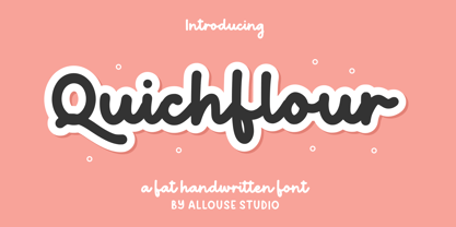 Proudly Presenting, Quichflour a Fat Handwritten Font. Quichflour is perfect for any titles, logo product packaging, branding project, megazine, social media, wedding, or just used to express words above the background. Quichflour also come with Multi-Lingual Support. Enjoy the font, feel free to comment or feedback, send me PM or email. Thank You!
 - Meoowly by Stefani Letter,
$12.00 Meoowly is an amazing display font. It is the perfect choice for cat related and anything project! This display font is the perfect choice for making original and outstanding designs. This font is PUA encoded which means you can access all of the cute glyphs with ease! It also features a wealth of including ligatures.
 - Hyggebukser by Bogstav,
$17.00 Hyggebukser are very comfortable trousers in danish. Trousers you'd wear after a long days work, when you just need to relax. The same goes for this font - it has something very comfortable to it! Also, don't forget to enjoy the 5 (!) different versions of each letter, along with the drawings, swashes and small caps!
 - Stonecut JNL by Jeff Levine,
$29.00 Stonecut JNL is an adaptation of a novelty display face found in one of the Dan X. Solo lettering books. Resembling letters made from cut stone, both the inline and solid black versions are perfect for themes encompassing outdoors, the Stone Age, "macho" events or anything where an unpolished or rustic look can be adapted.
 - Doright Black NF by Nick's Fonts,
$10.00 This typeface takes its design cues from Dudley Upright, a Dan X. Solo find from the sixties. This version is considerably wider than the original, which increases its legibility while retaining its flower-power vibe. Both flavors of this font feature the 1252 Latin, 1250 Central European, 1254 Turkish and 1257 Baltic character sets.
 - Malabar eText by Linotype,
$103.99 A clear and enjoyable reading experience hinges on the legibility of text copy, especially when reading on screen. This is why Monotype has developed the eText collection of fonts specifically tailored for the text-heavy display environments of e-readers, tablets, mobile devices, and the Web. The original Malabar was designed by Dan Reynolds.
 - Stencil Maker JNL by Jeff Levine,
$29.00 The type design which inspired Stencil Maker JNL comes from a 1920s-era machine used in movie theaters of the day. It rendered tiny punched out letters (some characters solid and some in stencil form), enabling the user to make projection slides of important messages or general notices for the theater audience to read.
 - PF Bague Round Pro by Parachute,
$79.00 Bague Round is a soft contemporary geometric typeface which blends distinct minimalist characteristics with mainstream details. It originates from Bague Universal, a superfamily with a warm well-balanced texture and a distinct personality. Usually, round sans letterforms tend to look rather organic and playful at heavier weights. This problem was avoided in Bague Round by applying all necessary optical corrections at the rounded corners in order to retain its robust qualities. Mechanical replacement of the stem endings with standard arcs was not implemented and each round form of the horizontal, vertical and diagonal strokes was treated differently from the other. Whilst the rounded endings at heavier weights become gradually more flat at acute corners, the round stems in letters such as A, b, m, p, s are perfectly matched with sharp diagonals in letters such as M, N, w, v, in a very distinct manner. A remarkable feature of Bague Round is its vast array of uppercase alternates and ligatures which truly shine when set at display sizes. Make your selection from 6 distinct groups of alternates as well as a rich set of discretionary ligatures and watch it transform into a flexible, charming and stylish typeface with strong modern aesthetics. This typeface offers enormous possibilities and variations for editorial design, branding and corporate identity. The Bague Round type family includes 14 weights from Thin to Ultra Black and matching true-italics with a consistent and well-refined structure. Each style consists of 1017 glyphs with more that 280 alternates and ligatures and an extended set of characters which supports Latin, Cyrillic and Greek. PDF Specimen Bague Round on Behance
 - Rough Therapy by Hanoded,
$15.00 No, I don’t need therapy - at least, not that I’m aware of. I needed a bold and rough name for this bold and rough font. Rough Therapy is a strong display font. Comes in a clean and a dirty version, so take your pick!
 - Bookseller Bk by Cyanotype,
$20.00 Bookseller Bk is a typeface designed for books and legible text at a small sizes, with an old book feeling. This typeface is the reinterpretation of a sample found in a French book, published between 1882 and 1893 and its author —Ernest Michel— lived between 1837 and 1896. This sample has influence from Didot, Scotch Roman and Clarendon (typefaces which were in use at that time). This reinterpretation expands the basic set for the contemporary era. Bookseller Bk includes small caps, old style figures, lining figures, fractions and basic Cyrillic alphabet. Everything in 3 different optical widths. You can save some lines with Reduced weight or fill some lines with Ample weight. All of them with italics, bold and bold italics. Bookseller Bk is also available in Caption size. 12 fonts for legibility at smaller sizes. Subhead & Title sizes are now in development. Finally this typeface was the result of the course Digital Reinterpretation of Classic Typography by Oscar Guerrero Cañizares at Domestika. Do you require additional glyphs? Please contact me to consider your request in order to expand Bookseller in further updates.
 - Bookseller Cp by Cyanotype,
$20.00 Bookseller Cp is a typeface designed for books and legible text at a smaller sizes, with an old book feeling. This typeface is the reinterpretation of a sample found in a French book, published between 1882 and 1893 and its author —Ernest Michel— lived between 1837 and 1896. This sample has influence from Didot, Scotch Roman and Clarendon (typefaces which were in use at that time). This reinterpretation expands the basic set for the contemporary era. Bookseller Cp includes small caps, old style figures, lining figures, fractions and basic Cyrillic alphabet. Everything in 3 different optical widths. You can save some lines with Reduced weight or fill some lines with Ample weight. All of them with italics, bold and bold italics. Bookseller Cp is also available in Book size. 12 fonts for legibility at small sizes. Subhead & Title sizes are now in development. Finally this typeface was the result of the course Digital Reinterpretation of Classic Typography by Oscar Guerrero Cañizares at Domestika. Do you require additional glyphs? Please contact me to consider your request in order to expand Bookseller in further updates.
 - Marzano by FontMesa,
$35.00 Marzano is a geometric sans serif font that's ideal for headlines, logos, text and advertising, the name comes from the ever so sweet and wonderful San Marzano plum tomato grown in Italy. Marzano includes stylistic alternates, small caps, swash caps, case sensitive forms, old style figures, tabular figures, small caps figures, small caps old style figures, small caps question mark and exclamation point. Since a lot of people today like to type in code using the copyright and trademark symbols in place of a C or R we've decided, the first time to offer two registered trademark symbols, one that's the same size as the copyright symbol and an alternate version that's reduced in size and sits at the caps height. Marzano Slant is set at 6 degrees and is perfect for when you want the look of an italic but don't have the horizontal space in your page design for a full 12 degree italic. At FontMesa all of our italic fonts are cleaned up placing all nodes at extremas.
 - Historic Warehouse by Just My Type,
$25.00 Gotta tell ya: think out of the box and this font is addictingly fun to use! Introducing Historic Warehouse, a substantial, yet elegant family, invoking advertising fonts of the early 20th century. Why the name? When asked to design a banner for Tucson’s Historic Warehouse District, I couldn’t find the look I wanted from any known fonts. After drawing what I wanted in Illustrator, there were three (and in the process, four) fonts just waiting to be realized. Happy to oblige. Here’s Historic Warehouse Regular, setting the stage. It’s sturdy, bold, and plays curves against rounded angular shapes. To its left is Historic Warehouse Condensed, trim, elegant and at its best at very large sizes; to the right is Historic Warehouse Wide, with charming style and presence. Finally, there’s Historic Warehouse Extended, extravagant in its proportions, with a beautifully-crafted form like a fine carriage. As the song says, “Everything Old Is New Again,” and this family looks as fresh and clean at the beginning of this century as it might have at the beginning of the last.
 - FF Real Text by FontFont,
$50.99 FF Real is a convincing re-interpretation of the German grotesque style from between 1998 and 1908, but with much more warmth and improved legibility as well as a hint towards the warmer American grotesques. Later on, not just slanted styles, but a “proper” italic version was added inspired by the way Roman and Italic are distinguished in traditional serif faces. NEW: a specially created set of obliques were added in 2018 to give designers more design flexibility, for those looking for a less calligraphic look. In 2020 the family was extended with matching condensed weights. FF Real was originally conceived by Erik Spiekermann as one text weight and one headline weight to be used as the only faces in his biography ‘Hello I am Erik’, edited by Johannes Erler, published in 2014. While Spiekermann drew the alphabets, he passed on the font data to Ralph du Carrois and Anja Meiners who cleaned it up and completed it. In the meantime, FF Real has been extended to a family of two styles and 65 weights each. The design of FF Real is rooted in early static grotesques from the turn of the century. Several German type foundries – among them the Berlin-based foundries Theinhardt and H. Berthold AG – released such designs between 1898 and 1908. The semi-bold weight of a poster-size typeface that was lighter than most of the according semi-bolds in metal type at the time, gave the impetus to FF Real’s regular weight. In the words of Spiekermann, the historical example is “the real, non-fake version, as it were, the royal sans serif face“, thus giving his new typeface the name “Real” (which is also in keeping with his four-letter names, i.e. FF Meta, FF Unit). FF Real is a convincing re-interpretation of the German grotesque style, but with much more warmth and improved legibility. With a hint towards the warmer American grotesques, Spiekermann added those typical Anglo-American features such as a three-story ‘g’ and an ‘8’ with a more defined loop. To better distinguish characters in small text sizes, FF Real Text comes in old style figures, ‘f’ and ‘t’ are wider, the capital ‘I’ is equipped with serifs, as is the lowercase ‘l’. What’s more, i-dots and all punctuation are round.
 - FF Real Head by FontFont,
$50.99 FF Real is a convincing re-interpretation of the German grotesque style from between 1998 and 1908, but with much more warmth and improved legibility as well as a hint towards the warmer American grotesques. Later on, not just slanted styles, but a “proper” italic version was added inspired by the way Roman and Italic are distinguished in traditional serif faces. NEW: a specially created set of obliques were added in 2018 to give designers more design flexibility, for those looking for a less calligraphic look. In 2020 the family was extended with matching condensed weights. FF Real was originally conceived by Erik Spiekermann as one text weight and one headline weight to be used as the only faces in his biography ‘Hello I am Erik’, edited by Johannes Erler, published in 2014. While Spiekermann drew the alphabets, he passed on the font data to Ralph du Carrois and Anja Meiners who cleaned it up and completed it. In the meantime, FF Real has been extended to a family of two styles and 65 weights each. The design of FF Real is rooted in early static grotesques from the turn of the century. Several German type foundries – among them the Berlin-based foundries Theinhardt and H. Berthold AG – released such designs between 1898 and 1908. The semi-bold weight of a poster-size typeface that was lighter than most of the according semi-bolds in metal type at the time, gave the impetus to FF Real’s regular weight. In the words of Spiekermann, the historical example is “the real, non-fake version, as it were, the royal sans serif face“, thus giving his new typeface the name “Real” (which is also in keeping with his four-letter names, i.e. FF Meta, FF Unit). FF Real is a convincing re-interpretation of the German grotesque style, but with much more warmth and improved legibility. With a hint towards the warmer American grotesques, Spiekermann added those typical Anglo-American features such as a three-story ‘g’ and an ‘8’ with a more defined loop. To better distinguish characters in small text sizes, FF Real Text comes in old style figures, ‘f’ and ‘t’ are wider, the capital ‘I’ is equipped with serifs, as is the lowercase ‘l’. What’s more, i-dots and all punctuation are round.
 - Contacta by Linotype,
$29.00Linotype Contacta is part of the Take Type Library, which features winners of Linotype’s International Digital Type Design Contest. Ralf Weissmantel designed this font to display no stroke contrast at all. Instead of using conventional letter forms, Contacta is a more designed-oriented font, with some characters recognizable only in context, not necessarily at first glance. The technical, unconventional forms look almost like a maze, especially when set together. This font is not suitable for text but makes a unique impression in logos and headlines. - NoExit by muccaTypo,
$39.00 NoExit is an industrial vernacular type system with multiple widths. Originally designed for the Chicago Athletic Association Hotel, its inspiration was an old sign that said “STAIRWAY” found the hotel’s old building. A pointed uppercase letter A stood up against the mechanic aspect of the rest of the letters, and that discrepancy was love at first sight. From that, we developed a type system in multiple widths and weights that looks best at large sizes. It’s an ideal typeface for signage systems, magazine headlines, posters and packaging.
 - Typex by Device,
$39.00 Based on the lettering used on Alan Turing’s famous code-breaking machine at Bletchley Park, the “Bombe”, and the subsequent British answer to the German Enigma machine, the Typex. Research done at Bletchley Park on their restored and antique machines provided the inspiration. The unusual shapes for the capitals have all been retained - the square O, the monospaced characters and other eccentricities that make it unique. This reference material was then extended to the numerals (which did not exist in the original) and a full international character complement. The initial design of the bombe was produced in 1939 at the UK Government Code and Cypher School (GC&CS) at Bletchley Park by Alan Turing, with an important refinement devised in 1940 by Gordon Welchman. It was based on a device that had been designed in 1938 in Poland at the Biuro Szyfrów (Cipher Bureau) by cryptologist Marian Rejewski, and known as the "cryptologic bomb" (Polish: bomba kryptologiczna). The Bombe was used to break the German Enigma code on a daily basis, and was a vital part of the Allied war effort. The British “Typex" (alternatively, Type X or TypeX) machines were an adaptation of the commercial German Enigma with a number of enhancements that greatly increased its security. It was used from 1937 until the mid-1950s, when other more modern military encryption systems came into use.
 - ITC Tyke by ITC,
$29.99Tomi Haaparanta got the idea for the Tyke typeface family after using Cooper Black for a design project. He liked Cooper's chubby design, but longed for a wider range of weights. “I wanted a typeface that was cuddly and friendly,” recalls Haaparanta, “but also one that was readable at text sizes.” He started tinkering with the idea, and Tyke began to emerge. Even though Haaparanta knew his boldest weight would equal the heft of Cooper Black, he began drawing the Tyke family with the medium. His goal was to refine the characteristics of the design at this moderate weight, and then build on it to create the light and bold extremes. Haaparanta got the spark to design type in 1990, when he attended a workshop held by Phil Baines at the National College of Art and Design in Dublin. “I've been working and playing with type ever since,” Haaparanta recalls. He released his first commercial font in 1996, while working as an Art Director in Helsinki. After about two dozen more releases, he founded his own type studio, Suomi Type Foundry, early in 2004. At five weights plus corresponding italics, Tyke easily fulfills Haaparanta's goal of creating a wide range of distinctive, completely usable designs. The light through bold weights perform well at both large and small sizes, while the Black is an outstanding alternative to Cooper for display copy. - Anne's Hand by National Eating Disorders Assn,
$10.00 Anne's Hand is a custom handwriting font of Anne Hubbard, who tragically lost her battle with anorexia nervosa this past January. Anne loved to write, so her brother Richard designed a custom font of her handwriting as a tribute to her memory. All proceeds from its sale will go to the National Eating Disorders Association to support programs and services like the NEDA Navigators and Loss Support Network, programs that many families count on for support.
 - Rum Soft Serif by Trine Rask,
$30.00 Rum Soft Serif is a soft version of Rum Serif with softly rounded outer corners. Rum Soft Serif is a text & display family suitable for any purpose, any media, any size. A humanistic modular Serif in five weights containing small caps, italic, swashes, alternative characters, old style, lining, tabular & proportional figures. Design date: 2011-2023 The complete family consists of Sans Serif & Serif in both sharp and soft version + the display fonts Rum Plakat & Rum Silhouette.
 - Rum Soft Sans by Trine Rask,
$30.00 Rum Soft Sans is a soft version of Rum Sans with softly rounded outer corners. Rum Soft Sans is a text & display family suitable for any purpose, any media, any size. A humanistic modular sans serif in five weights containing small caps, italic, swashes, alternative characters, old style, lining, tabular & proportional figures. Design date: 2001-2021 The complete family consists of Sans Serif & Serif in both sharp and soft version + the display fonts Rum Plakat & Rum Silhouette.
 - Bock by Latinotype,
$35.00 Is a recreational typography. Created from experimentation of the Slab Serif style with asymmetric lines. Bock is compact and stable, although having the quality of breaking the typographic rhythm, to benefit its use in short words as logotypes and lowering of text in editorials and publicity. The Fat variable was devised as an extension of the Bock concept, deleting the inner and outer space that surrounds a letter, creating a font with much weight and attitude.
 - Eckhardt Titling JNL by Jeff Levine,
$29.00Eckhardt Titling JNL is another treatment of a popular typeface that lends itself well to the hand-lettered sign and display work of days past. A clean sans serif with a slight touch of Art Deco, this font renders well from small point sizes to large posters. As with other fonts in this series, it is named in honor of Jeff Levine’s good friend Albert Eckhardt, Jr. who owned Allied Signs in Miami, Florida from 1959 until his passing. - Qonitta by Zamjump,
$17.00 Called QONITTA is a serif display with a character that is beautiful, and elegant. With the addition of beautiful ligatures and alternatives to make your typography truly unique. No special software is required to type standard Typeface characters. To access Opentype Ligatures and Alternates, you need software that supports the Opentype feature in fonts. multi language support File Included : - Upper case and Lower case - Ligature - Alternate - Uniq dot (a underscore underscore, b underscore underscore, c underscore underscore)
