10,000 search results
(0.042 seconds)
- Flow Handscript by Taner Ardali,
$26.00 Main idea of this font depends on creating a “well designed handwriting typeface”. With general brush script characteristics, this font is also designed in detail letter by letter to create the best geometric values. It is particularly designed to achieve better connections between letters as well as the best rhythm for words. It is not just a hand brush typeface, Flow handscript is a high quality designed typeface that can be used for graphic design like packaging, branding, poster design and invitations.
 - Wild Muerayam by Luhop Creative,
$10.00 Wild Muerayam is an elegant, modern and functional unique featuring a calm text and an expressive display. This font looks harmonious in books and other periodicals, on posters or on magazine covers. The scope is not limited to the printing industry, because Wild Muerayam looks aesthetically pleasing wherever text is used. Wild Muerayam a serif display font with a modern yet luxurious style. Aesthetic and unique letterforms, as well as soft curves and wild shape of the letters make this font so iconic. Wild Muerayam Features: Uppercase and lowercase Multilingual Numerals Punctuation PUA Encoded Alternates Ligatures To be able to access alternative fonts, make sure the software you use can support opentype features such as Microsoft Word, Paint, Adobe, Corel draw, Cricut and other applications. I hope you enjoy!
 - Cherishline Font by sizimon,
$20.00 Cherishline Script is a thin lettered and graceful script font. Fall for its ravishing style and use it to create gorgeous wedding invitations, beautiful stationary art, eye-catching social media posts, and much more! Cherishline Script is PUA encoded which means you can access all glyphs and swashes with ease! What's Include : PUA encode & Opentype ( It is full of Tails and glyphs ) Multilingual support Use the fonts for: logos, branding materials, wedding sign, wedding website card, farmhouse signs, sign bridal, shirts, pantry labels, sign bridal shower, business cards, greeting cards, wall decor, social media, planner prints and websites. • This font works with any application Microsoft Word, Adobe Photoshop, Microsoft Paint, Corel, Adobe Illustrator, Cricut Design Space, and many others! If you have any question please do not hesitate to contact me. Thank You!
 - Leakpaint by Andrew Tomson,
$10.00 Hello friends! Drawing is a great way to pass the time. Sometimes, clumsy people can spill paint on paper or on an already completed drawing. What do we end up with? A ruined drawing or a new work of art? I think the latter. After all, every drawing is unique and a unique thing. Even if you are drawing a stick man! This font presents the opportunity to see what happens if invisible ink is spilled on it. This font is great for your new and unique projects for social media, lettering and just for home use! A little sloppy, a little bouncy, so it's so lively and magical! I wish you good luck and love!
 - Ed's Market by Laura Worthington,
$29.00 It’s like hiring your own professional sign painter with a solid repertoire of styles; each one is distinctive, yet clearly by the same hand. No variants were created on the computer – each weight and version was individually hand-lettered. Ed’s Market lets you evoke the warm, inviting vibe of classic 20th-century grocery posters and showcard lettering right from your type menu. Smart programming ensures that digital perfection doesn't trump human charm: each display face features three variations of each letter, to ensure a natural hand-painted look when characters repeat. Ed’s Market includes three script styles, each with more than 100 alternate characters and swash forms. Seven display faces feature three variations of each letter, to ensure a natural hand-painted look when characters repeat. Design Elements offer expandable arrows, rules and ribbons; along with badges, swashes, scribbles, clouds and snipes. See what’s included! http://bit.ly/1Mzurs3 *NOTE* Basic versions DO NOT include swashes, alternates or ornaments These fonts have been specially coded for access of all the swashes, alternates and ornaments without the need for professional design software! Info and instructions here: http://lauraworthingtontype.com/faqs/
 - Grand Atlantic by Fenotype,
$35.00 Grand Atlantic is a powerful display package by Fenotype. It’s a genuine Brush script packed with features and Swoosh extras and it’s a striking condensed flared serif in two weights, designed with the same sharp edges on the flares as the Brush. Together they make stunning logotypes, posters or headlines. On top of that there’s a “Printed” version of each. Printed versions are the same but with rugged outlines and a print texture. Grand Atlantic is great for creating powerful identities for artisanal coffee brands, craft beer, organic juice or a sports teams. Grand Atlantic Brush is equipped with Standard Ligatures and Contextual alternates that help keeping the connections between letters smooth. They’re automatically on as you should normally keep them. On top of that Grand Atlantic Brush has Stylistic, Titling and Swash Alternates for standard characters if you need more ornamental letters and if you want to break up the rectangular word shapes. There’s even more alternates in the glyph palette, making it total more than 600 glyphs. Grand Atlantic Swoosh contains 52 shapes designed to go with the Brush. There’s many “terminal swashes” that you can put in the end of a word and it will connect to the last letter, and swirl under the word from there.
 - Hispania Script by HiH,
$10.00 Hispania Script is a distinctive and distinctly nineteenth century script. It was released by Schelter & Giesecke of Leipzig, Germany around 1890. Particularly noteworthy are the sharply-pointed legs of the upper case ‘K’ & ‘R’ that seem to be characteristic of the period. Similar strokes, often with a slight curve, may be seen in typefaces like Alt-Romanish and Tinteretto by Schelter & Giesecke, Artistic and Lateinsch by Bauer and Berthold and the poster lettering of Edward Penfield. The angle of this script (approximately 24 degrees) and the sharp delicate points must have made the manufacture of this face in metal type a challenge. The resulting type was probably quite fragile and subject to accidental damage. Additionally, the sharp points would be subject to wear. With digital type, these concerns are eliminated. As far as I know, no one has ever dropped a digital letter on the floor. Nonetheless, creating a digital outline for a typeface like Hispania Script, with many crossing strokes, can be quite time-consuming. Even with an accurate scan of a good quality original, it is usually necessary to construct each crossing stroke separately and then remove the overlap in order to obtain a sharp and convincing intersection. Steep internal angles are often defined with two points, rather than one, to minimize ink or toner fill that can muddy the rendering in smaller sizes. Like all formal scripts, Hispania Script is always useful for announcements and invitations. However, the distinctiveness of of this design strongly suggests that there are other applications that may benefit from its use. Step outside the box and try it in some unexpected places. It is the unexpected that often draws a person’s eye.
 - Blastday by Beary,
$10.00 Blastday is a cool and stylish serif font, featuring its own unique style and modern look. Masterfully designed to become a true favorite, this font has the potential to bring each of your creative ideas to the highest level! This typeface is perfect for an elegant & luxury logo, book or movie title, fashion brand, magazine, clothes, lettering, quotes and more.
 - Enfluence by Thera Type,
$9.00 Enfluence is a modern typeface perfect for titles and short texts. It could worked in print and digital mediums. It depicts a fresh and modern image but with some winks to older typefaces. About the shape of the letter, it was built with a wide “x” height, short ascendants and descendants, a high contrast, angular serif, and some round terminals. Some letters such as “m, n, h” show a light inclination in the right stem. These characteristics give this typeface great readability with a strong attraction to the eye for its cool forms. Not enough? Also includes a set of ornamental capital letters perfect for the creation of awesome designs.
 - F2F Mekkaso Tomanik by Linotype,
$29.99The techno sound of the 1990s, a personal computer, font creation software, and some inspiration all came together to inspire the F2F (Face2Face) font series. Alessio Leonardi and his friends had the demand to create new unusual typefaces, which would be used in the leading German techno magazine of the day, Frontpage. Even typeset as small as 6-points, in nearly undecipherable layouts, it was a pleasure for the kids to read and try to decrypt the messages. F2F Mekkaso Tomanik is a font whose letters have had diamond holes punched into them. In fact, so many holes have been punched into the letters that one could ask whether this font is more letterforms, or more holes! - Turbo Modul by PizzaDude.dk,
$15.00 The future is square! Well, at least according to Turbo Modul! Maybe the future is square, but it is also funky - just like Turbo Modul ... and its pretty unpredictable! Turbo Modul is loaded with alternative letters with arrows pointing in all directions, all made to pimp your designs! I've also added ligatures to substitute double letters, and there's a slight difference from caps and lowercase. Wow! That's a lot of different combinations! I tell you what ... I take a look at the posters I've made, and hopefully it will make you want to try out the font. I had a lot of fun doing the font, and maybe you will have a lot of fun using it! ;)
 - Bumbon by Luxfont,
$18.00 Introducing unusual Sans Serif font family. Font is concise and minimalistic. But behind the apparent simplicity of the font is hidden the original feature in the form of modernized uppercase glyphs, which can be used as an accent in the header or logo. Pure letterings with excellent readability have 2 thicknesses. Font will emphasize the high status of the business and complement modern branding design, and the general versatility of the font provides for its widespread use in various directions and is combined with different styles in design. Balanced glyphs will fit into the typographic design and will not distract attention from the main point. Features: Bold, Bold Italic, Regular, Regular Italic Upgraded uppercase letters Kerning ld.luxfont@gmail.com
 - Piercing by Linotype,
$29.99Piercing is part of a series of typographic experiments from the young Swiss designer Michael Parson. In the Piercing family, which contains three separate weights, Parson has successfully transformed the movements of points and lines into a fabulous display of alphabets. But you can use Piercing as your key to the techno scene: these letters, made up of fine lines terminated by dots, virtually groove with the beat as you set them in text. Like a musical score, they provide a fantastic look just right for your next flyer. Piercing is one of ten experiments in constructed letter design that Parson has included in the Take Type 5 collection from Linotype GmbH." - News Crew JNL by Jeff Levine,
$29.00 It seems that after the 1960s, very few display typefaces were being produced that had the desirability to transcend generations, as did many type designs of the past. In 1970, a local television station embraced a lettering style for its logo that was a cross between round point pen nib lettering and the modular, techno look complete with squared characters in a futuristic "space age" style. News Crew JNL was inspired by the few examples found of this particular font [in use by the station at the time] and was pretty much created from scratch in order to capture the 1970s era of experimental typography. It is available in both regular and oblique versions.
 - Sideroad by Melvastype,
$22.00 Sideroad is an intensive hand-drawn brush script font. It comes in two versions, Textured and Smooth. Textured version has this rough effect that comes when letters are drawn with pointed-brush on rugged surface. The Smooth version is, like the name says, smooth as silk with polished edges and properly drawn forms. Sideroad includes two sets of lower case letters to give variation and more imperfect hand-drawn effect. You can cycle these two sets by enabling Contextual Alternates OpenType feature. It also has set of lower cases without connector strokes. And a set of lower cases with end swashes. On top of these there are also a few underlines to give that final punch to your design.
 - Caprizant by Laura Worthington,
$29.00 Caprizant is a lively, upright script based on letters inked with a pointed pen. For display settings, titles, and identity work, Caprizant shines with even more energy and elegance. Customize it using one of the 337 swashes, three sets of capitals, and 20 ornaments. Alternates of every letter create a fully connected or unconnected look, plus dozens of ligatures, and contextual alternates provide a convincingly human variation. See what’s included! http://bit.ly/1RGYIl1 *NOTE* Basic versions DO NOT include swashes, alternates or ornaments These fonts have been specially coded for access of all the swashes, alternates and ornaments without the need for professional design software! Info and instructions here: http://lauraworthingtontype.com/faqs/
 - ITC Orbon by ITC,
$29.99ITC Orbon font is the work of New York designer James Montalbano, inspired in part by a demo of black letter calligraphy in which letters were created out of only four or five basic strokes. I combined that idea with the notion of taking historical forms like German gothic blackletter and progressively paring them down to achieve a futuristic version, as if this old form naturally evolved over several hundred years to arrive at its post-modern incarnation." Text should be set in point sizes of 20 and higher for optimal legibility. ITC Orbon is a highly condensed font with unique, oblong shapes which are ideal for a number of display applications." - Fractus by Eurotypo,
$36.00 The requirements of Middle Ages scribes who copied and produced books in monasteries were fundamentally to preserve space, due to the high cost of the writing surface. During this long period of the development of Gothic forms, many other variations of the style of black letters appear: Textur or “Gothic-antique”, another group called Rotunda preferred by Italian and Spanish scribes. In 1490, the style "Bâtarde" (according to the the French classification) began to be widely used in Germany with more rounded shapes and named Scwabacher (probably derived from the city of Schwabach, but not certified) Fractur is a more condensed and narrower form than Schwabacher. This style is attributed to Johann Neudörfer of Nuremberg, cut in 1513; it was quickly imitated, therefore a few years later became to be a German national identity that extended over the next four centuries. The shape of its characters can be considered as a fusion of Texture and Schwabacher: the lowercase actually has medium strictly vertical and half curved strokes. The first expressions of the baroque influence this writing whose appearance of movement is due to the ornaments applied to the uppercase letters and the ascending and descending features of the lowercase. Despite having spent so many years and being a typeface not suitable for extensive reading texts, the Gothic Fractur has endured over time for possessing a strong and solid characteristic, as well as being closely linked to the spirit of gothic cathedrals of countries in northen Europe. In fact, it is probably that this expressive feature leads them to be chosen in the most varied graphic communication needs, which run from from banks and financial companies, insurers, law offices, publishers, newspapers and TV networks, till alcoholic drinks, funeral tombstones, packaging and even tattoos.
 - Junius by Eurotypo,
$34.00 Are you looking for a new casual and organic script font? Please take a look at Junius! The Junius font is the perfect combination of sleek and casual that is best used in OpenType compatible software. This font contain 797 glyphs, equipped with plenty of OpenType features. Upper case letters can alternate between at least two different forms. Lowercase letters have at least six more options to avoid repetition. These effects include initial and final forms of lowercase letters. In addition, there is a set of 65 ornaments designed to support the font (accessing the ornaments through the Glyph palette). Some of these ornaments were specially designed to be combined with the letters for a "more calligraphic" effect. Junius font can be the option used to create titles, logos and posters for brand and packaging purposes. I hope you enjoy it.
 - Velino Text by DSType,
$55.00 Velino is the most recent of our premium typefaces. The serif version comes in two packages with three widths: Velino, Velino Condensed, and Velino Compressed. The display package contains high-contrast typefaces, with a modern flair—very feminine but with plenty of character, especially designed for fine print in big text sizes. The text package was designed for any running text. Its proportions and colors make it the ideal for text, even in very difficult conditions such as newspaper printing. We also designed the perfect companion to this enormous type system: Velino Poster, a slab serif typeface with only one weight and its respective italic, but with plenty of muscle, for every time some extra strength is needed, such as setting very big text, magazine covers or newspapers’ special sections. Finally, we designed Velino Sans and Velino Sans Condensed to perfectly match the weight and proportions of Velino, all with matching italics.
 - Razumec by Igor Petrovic,
$29.00 Razumec is a carefully crafted display serif typeface with a highly unique personality. Its epic yet warm sentiment is established by a skillful blend of slab and wedge serifs, tapered stems, curves with raised center, and creative weight distribution. Proper pronunciation of these style elements influenced wide proportions and medium-to-high contrast. Besides its main typology, it incorporates subtle allusions to a spectrum of typographic and visual traditions, from calligraphy, ordinary handwriting, blackletter, and medieval uncial script to the neoclassical Didone and industrial typefaces. All of these flavors are combined tastefully and consistently throughout the whole set. With its rich visual identity, Razumec is primarily intended for display usage, as shown in the promo images. It's perfect for branding and packaging. Fantastic for projects focusing on storytelling like fairy tales, epic fantasy books, board and video games with historic or adventurous themes. Superb for theme magazines, quotes, headlines, museum and concert brochures. On the other side, its authentic historical voice works great as a strong counterpart point in ultra-modern contemporary designs for print and screen. Web design, motion graphics, conceptual art, posters, and social media material are just the first few ideas. The laborious production process focused on achieving a high level of classical typographic virtues rather than having an extensive character set. Beautiful stylistically consistent characters with balanced weight and width, high-quality curves, meticulous spacing and kerning, well-articulated diacritics, and punctuation were priorities. Special attention is given to solving problematic letter pairs through contextual alternates, which enable better spacing and smooth joints (hence the recommendation to always keep the Contextual alternates feature on for this font. Learn more about it HERE). Razumec is a small but well-executed and thoroughly tested font. Font family comprises nine weights plus variable font.* * Variable font lets you access all the weights through the single font file. In apps that support it, you will find a slider where you can pick any number from 100 to 900 corresponding to 800 possible font weights. Learn more about variable fonts and their support on the following two links: VF ABOUT and VF SUPPORT.
 - Theater Lobby JNL by Jeff Levine,
$29.00 A vintage photo (circa 1950s) taken outside one of the movie houses owned at the time by Miami-based Wometco Theaters showed a small hand lettered sign with the word “Wometco” painted in a stylized Art Deco alphabet. This inspired Theater Lobby JNL, which is available in both regular and oblique versions.
 - HT Trattoria by Dharma Type,
$19.99 HT Trattoria is a lovely brush script with authentic and organic feel.It works best for packaging, magazines, marketing, labels, film and clothing. Holiday Type Project offers retro hand drawing scripts. Inspired by retro script on shopfront lettering, wall paint advertisements in Italy around 1950s. Check out the script fonts from Holiday Type!
 - Curwen Initials by ARTypes,
$30.00Transcribed from letters designed by Jan van Krimpen for The Curwen Press at Plaistow, London, in 1925; printed on pages 49, 51 & 53 of A Specimen Book of Types and Ornaments in Use at The Curwen Press (1928). A setting at 120 pt is recommended to match the size of the original. - Fourties by Aestherica Studio,
$12.00 Fourties is an elegant bold hand-brushed display font with capital letters. With a cool style, it will add a bold and powerful touch to your projects, inspiring you to create something bold too. Fourties is ideal for headings, flyers, greeting cards, product packaging, book covers, printed quotes, logotypes, and album covers.
 - Treatmill by Wacaksara co,
$14.00 Treatmill is a playful hand-lettered font family. There are 9 font families included from thin to black styles. It is perfect for title, headings, flyer, greeting cards, product packaging, book cover, printed quotes, logotype, apparel design, album covers, children book, comic etc. Treatmill comes with uppercase, lowercase, numbers, punctuation, multilingual support. Cheers!!
 - Patient by Garisman Studio,
$22.00 Patient was born in the modern era which was inspired by the letters found in various print and digital media. Comes with a modern and futuristic style that will rock your great design! It is suitable for you to use in logotype designs, posters, typography, t-shirts, tickets, and other modern designs.
 - Oblique Rain by NREY,
$19.00 Introducing a cool monoline script font family - Oblique Rain. Typeface is based on handwriting text, like school work or retro letters. Works great applied to logos, prints, quotes, magazine headers, clothing, and many others! Features: Uppercase Lowercase Numeral & Punctuation Standart Ligatures Stylistic Alternates PUA Encoded Multilingual Support I hope you enjoy it! Thanks!
 - Ceriburn by Typeskets,
$18.00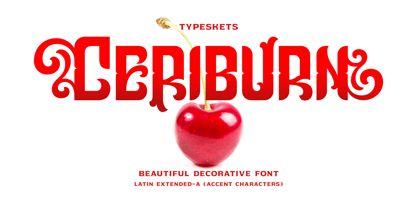 Ceriburn is inspired by the sweetness and richness of cherries. It easily evokes impressions of nature, elegance, and romanticism. You can use this stunning decorative font for logos, packaging, business cards, crafts, books, labels, headlines, invitations, print templates, and a multitude of other design ideas! Letter, Number & Punctuation, Accent Characters, Alternates Features.
 - Hillusy by BaronWNM,
$12.00 Hillusy is a scrip font traced from handwriting using a pen monoline. displays a variety of letters so that it looks more casual and less stiff. This font is suitable for use in almost any casual style design and is not rigid, such as branding, advertising, printing, portfolio, business cards,signature, etc.
 - HT Farmacia by Dharma Type,
$19.99 This is a monoline script without descenders. Its tail gives us cute and lovely impression, but it is also methodical and punctual. Holiday Type Project offers retro hand drawing scripts. Inspired by retro script on shopfront lettering, wall paint advertisements in Italy around 1950s. Check out the script fonts from Holiday Type!
 - Nearland by Uncurve,
$20.00 Nearland is an aesthetic vintage Script font. Inspired from the past, elegant signage, gold leaf art, sign painting, lettering, logo and old label product. Nearland Script comes with tons of alternates characters and special alternate (i) lowercase is a ending swash thats to make more eye cacthy. Finally BOOM..!! you get a great design for your project. Nearland It's suitable for authentic logos, headings, sign painting, posters, letterhead, branding, magazines, album covers, book covers, movies, apparel design, flyers, greeting cards, product packaging, badge and more.
 - Cajoun by Linotype,
$29.99Cajoun is a bold serif face from German designer Hans-Jürgen Ellenberger. The letters sit visually low on their baseline, in part due to their small x-height. Also, the curved portions of the letterforms have an old-style distribution of weight, which pulls the eye downward. This font has a contemporary feel, however, with crisp edges, and some pointy terminals. The typeface also contains old style figures. Cajoun is recommended for use in larger applications, where the eye can get a change to dance along its wide curves. Cajoun was designed in 2002, and is part of the Take Type 5 collection from Linotype GmbH." - Brown Amsonia by Nathatype,
$29.00 Brown Amsonia is a lovely script font of which letters are in handwriting to express unique, personal nuances in your designs. Such a handwriting font is available in high contrasts having noticeable differences between the bright and the dark letter parts to produce clear, firm displays making the designs look professional and modern. Besides, Brown Amsonia can express personal, artistic displays to create more interesting, noticeable designs. The letters are interconnected and their details show sharp, curvy scratches on the edges. Due to the complex font style details, this font is better to apply for big text sizes. In addition, you may enjoy the available features here. Features: Ligatures Stylistic Sets Multilingual Supports PUA Encoded Numerals and Punctuations Brown Amsonia fits best for various design projects, such as brandings, invitations, greeting cards, name cards, quotes, printed products, merchandise, social media, etc. Find out more ways to use this font by taking a look at the font preview. Thanks for purchasing our fonts. Hopefully, you have a great time using our font. Feel free to contact us anytime for further information or when you have trouble with the font. Thanks a lot and happy designing.
 - Wolby by LetterMaker,
$16.00 Wolby is a rough and organic hand drawn typefamily which draws inspiration from a variety of sources such as sign painting, hand lettering, comic books, cartoons, health food, sticks and stones to name a few. The letter shapes were all originally created by writing with a pointed brush. The use of one writing tool results in an aesthetical harmony between the very different styles making them all fit together. The family consists of eight styles; upright and slanted caps in regular and bold, a layered block style in fill, outline and shadow styles and a lively script. Wolby is capapble of creating very different moods depending on which style you choose to highlight. Because of it’s aesthetics, range of styles and extensive language support, Wolby is especially suitable for use in advertising, packaging design and gritty branding & fashion design. When using the layered block styles you’ll get the best result by placing the shadow layer on the bottom, the fill in the middle and the outline layer on top. These can also be combined freely so you can use just shadow + fill, shadow + outline or fill + outline. The script style is armed with a set of ligatures and swash capitals which allow you to supercharge your designs.
 - PUJI by pororoca,
$25.00 PUJI is an experimental sans serif perfectly suited for graphic design and any display use. It could work for web, print, motion graphics etc. PUJI has the other version "PUJI narrow" which has different letter's width in "A","V","W".
 - Paduka Script by Siwox Studios,
$15.00 Introducing Paduka Script, Modern Smooth Calligraphy. 471+ glyphs included, with swashes alternative characters, suitable for any design needs, modern design, branding, stationery design, blog design, modern advertising design, invitation, wedding, special events, any lettering needs and more, for commercial use or personal use. Paduka Script is available for any printing needs, desktop, print on demand, video design, blog header image, or designing a commercial product for reselling. For Adobe Photoshop / Illustrator CC user, Swashes / Stylistic Alternates can be used directly. If you are a non-glyph panel software user, You can use the alternative letters by Install OTF font files. To activate the alternates click on Swash, and Stylistic Alternates in any OpenType savvy program or manually select the characters from Glyph Palette. Then Change the font to Paduka Script.
 - Albrecht Durer Gothic by Scriptorium,
$18.00While browsing through a sourcebook on historic calligraphy and antique type I came on an interesting sample of a gothic style attributed to the legendary artist Albrecht Durer. I had previously seen fonts based on the peculiar style of lettering Durer used on prints for his signature and some captions, but this style was radically different and much more characteristic of the lettering and early printed types of the 'Northern Renaissance' which Durer was a big part of. Whether it's authentically Durer's work or not is up in the air, but it's a very nice example of early gothic type. We've called the resulting font Albrecht Durer Gothic and it's a very striking face well suited to titles and other contemporary uses where you need something heavy and eye catching. - Colmar JNL by Jeff Levine,
$29.00 French Art Deco lettering found within the pages of the 1934 publication L'Art du Tracé Rationnel de la Lettre (roughly translated to “The Rational Path Art of the Letter”) have provided a number of designs well-suited for digital revival. A hand lettered sans with varying character widths was the basis for Colmar JNL, which is available in both regular and oblique versions. As the source of the lettering design was a French publication, the typeface is named for the city of Colmar, which (according to Wikipedia) is the third-largest commune of the Alsace region in north-eastern France.
 - Illyrian by Solotype,
$19.95Our font of the original was only ten point, so we had to use our imagination to a great extent. As specialists in Victorian typography, we have found that many people do not like the "center alignment" idea, used on several old time faces, but we have been faithful to the original. So there!