10,000 search results
(0.049 seconds)
- Kappa by W Type Foundry,
$25.00 Kappa is a modern sans serif with humanistic and geometric features. Its structure is slightly narrow to fit in a greater range of platforms (moreover if you print it, you may save a lot of paper), and its height is higher allowing a great legibility in small sizes. This family is composed with the display version and the text version providing a broad spectrum of solutions, making this family easier and friendlier to use. Designed with powerful OpenType features in mind. Each weight includes alternate characters, ligatures, fractions, special numbers, arrows, extended language support, small caps and many more… Perfectly suited for graphic design and any display / text use. The 36 fonts are part of the larger Kappa super family. Learn about upcoming releases, work in progress and get to know us better! On Instagram W Foundry On facebook W Foundry wtypefoundry.com
 - Long Wink by Seemly Fonts,
$14.00 Long Wink is a handwritten typeface that is ideal for use on stationery, logos, t-shirts, paper, print designs, website headers, picture frames, flyers, album covers, posters, image sliders, and other things.
 - Julie Brious by Cotbada Studio,
$5.00 Julie Brious is a handwritten signature typeface. Its classy energetic look makes it the perfect fit for feminine logos, printed quotes, invitation cards, social media headers, product packaging and a lot more!
 - Bricklayers by RMU,
$30.00 Bricklayers is a gorgeous poster and headline font which allows its users to build their individual brick walls for print and web design. Heed the instruction how to build your own wall.
 - Erpos by Baqoos,
$18.00 Erpos is a dynamic soften integral tech sans= apt for headline, editorial, branding, packaging, printed materials and typographic applications. 200+ glyphs with ligatures and fractions provided in opentype .otf and .woff format.
 - Heart Mother by Yoga Letter,
$14.00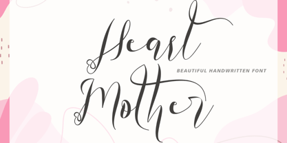 "Heart Mother" is a unique and beautiful handwritten font. This font is equipped with lowercase, uppercase, ligatures, numerals, punctuation, and multilingual support. Suitable for weddings, engagements, stickers, posters, prints, invitations, and others.
 - Blackburn by E-phemera,
$20.00Blackburn is a distressed text font designed to capture the look of old printing at small sizes. Based on a 19th century French type specimen, it contains a complete international character set. - Mstov by Baqoos,
$18.00 Mstov is an alacritous kooky tech display typeface apt for headline, editorial, branding, packaging, printed materials and typographic applications. 220+ glyphs with ligatures and fractions provided in opentype .otf and .woff format.
 - Autumnal by Seemly Fonts,
$12.00 A lovely handwritten typeface is called Autumnal. For stationery, logos, t-shirts, paper, print design, website headers, picture frames, flyers, album covers, posters, image sliders, and other things, this typeface is ideal.
 - Classy Wishes by Seemly Fonts,
$14.00 Classy Wishes is a display font. Classy Wishes is perfectly suited for stationery, logos, t-shirt, paper, print design, website headers, photo frames, flyers, music covers, posters, image sliders, and much more.
 - Godehyda by Anomieka,
$13.00 It's smooth, it's cute, it's fun, and it's mighty tasty: it's Godehyda! It is perfect for headings, flyer, greeting cards, product packaging, book cover, printed quotes, logotype, apparel design, album covers, etc.
 - Bloop by Robert Petrick,
$19.95 Bloop is a versatile bold new cartoon font that is great for the web, video, print headlines or product logos. It is a hot, contemporary, very readable design with language character function.
 - Manohara Pro by BBA Key,
$17.00 Introducing Manohara Pro Family, a new modern font. Manohara Pro is perfect for stationery, logos, t-shirts, paper, print designs, website headers, photo frames, leaflets, music covers, posters, image sliders and more.
 - Mykonos by Deniart Systems,
$20.00 A geometrical, modern, angular design inspired by the Greek Key. It's complex yet simple, creating smooth, continuously flowing print. This font is well suited for headlines, posters, greeting cards, and much more.
 - Pleasing Moment by Seemly Fonts,
$14.00 Pleasing Moment is a striking display font. It is perfectly suited for stationery, logos, t-shirt, paper, print designs, website headers, photo frames, flyers, music covers, posters, image sliders, and much more.
 - Outrage by AVP,
$19.00Outrage is highly disfigured to the verge of illegibility. The base font is Fiendstar Bold Condensed and the distress pattern is derived from a series of semi-abstract paintings. The result screams. - Shining Monday by Subectype,
$16.00 Shining Monday is a fun and whimsical paint brushed display font. This font is perfect for children themed designs, especially when combined with bright colors. What's Include: Hello Angel Thank You, Subectype
 - Mothman by Hanoded,
$15.00 In 1966 and 1967 a series of weird events spooked Point Pleasant, a small town in West Virginia. Townspeople described a creature that looked like a man, with red eyes and moth-like wings, which appeared at several locations around town. The Mothman myth was born. Mothman font is spooky as well. It is a very scratched and distorted typeface, completely hand drawn, using ink and various sharp utensils. Mothman font will surely leave a lasting impression!
 - Altrincham by URW Type Foundry,
$39.99 Back when shop window decoration was done with a brush, every window designer had his own style. In this vein the sans serif Altrincham was created. But even as a text font, it has stood the test of time, since it is very easy to read even in smaller point sizes, thanks to its relatively large x-height. With the Altrincham Condensed and Altrincham Wide Bold two other fonts have been created to perfectly complement the font family.
 - Tacit by Fontar,
$25.00 Tacit is the first typeface to be the creative outcome of a PhD thesis in graphic design. The work's main study had the aim of documenting design processes in an effort to externalise the tacit (experiential) knowledge of graphic designers. Initially the task was only to design several glyphs but the work resulted in a full typeface. Tacit is an elegant sans serif with a distinctive character and is legible at small and large point sizes.
 - Hot LBaltimore NF by Nick's Fonts,
$10.00Patterned after cheap neon signage, this face has class, all of it low. Uppercase only, the lowercase positions are filled with an assortment of cheesy neon graphics, intended to be used at twice the point size of the caps. Named after a 70s TV show about a hotel with a defective neon sign. Both versions of this font contain the Unicode 1252 Latin and Unicode 1250 Central European character sets, with localization for Romanian and Moldovan. - 2008 Script 2 by GLC,
$38.00 This font was created for the birth of a baby in June 2008. It's a melting font, including various types : blackletter script, bastarde, humanistic... a joyful interpretation for a joyful event. It is intended for use as web-site titles, posters and flyers design, but primarily for greeting cards, invitations, party, menus... as a very fancy and joyful font... This font remains clear and easy to read from 8 or 9 points to 72 and much more...
 - Manufactory JNL by Jeff Levine,
$29.00 Manufactory JNL and its oblique counterpart were re-drawn from examples of a now-antique typeface used within many advertisements found throughout the pages of The American Stationer magazine, circa 1879. The term ‘manufactory’ was popular during this era; the word being a more archaic form of ‘factory’. There is a bit of Western flavor to this type design, as the spurred serifs and the top and bottom strokes are heavier than the vertical and mid-point stroke weights.
 - Geometrico Slab by FSdesign-Salmina,
$39.00 GeometricoSlab. Round with strong serifs. Should it express power? Geometric and Slabserifs: a relatively rare combination. GeometricoSlab takes its cue from Herb Lubalin’s typeface family of the same name, and by using optical corrections with restraint, it looks a touch more uncompromising. The flexible, partly asymmetrical arrangement of the serifs avoids an overly heavy effect. The typeface family is suitable for both headlines and small point sizes and is related Geometrico Sans Curious? Try GeometricSlab free of charge.
 - Atnew by Outerend,
$18.00 "Atnew" is a modern typeface that includes six individual fonts (ExtraLight, Light, Regular, Medium, SemiBold, Bold) and a variable font ranging between Light (50pt) and Bold (200pt). Keeping geometric shapes but with soft curves gives fonts a playful feel. They can be used in interfaces, websites, posters, stationery, tv show credits, and many other purposes. It could be for your everyday activities like journaling. The variable font version provides more flexibility for your needs by fine-tuning weight points.
 - Mouzambik by Kereatype,
$17.00 Mouzambik is a simple, condensed sans-serif font with a bold and intricate personality. It comes in three styles: regular, Inktrap, and Smooth, each with italics. Crafted with intention, it maintains its allure in both large and small point sizes. This font is ideal for headlines, billboards, magazines, websites, titles, posters, branding, and logos. With an abundance of ligatures, alternates, and other features to choose from, you can ensure your project stands out from the rest.
 - PLatinum by Letterhead Studio-IG,
$35.00 The pLatinum family was created in 1998. Ink, scanner, Fontographer and as a result Regular and Italic styles of pLatinum typeface. Kyrillitsa'99 International type design competition Award winning typeface. The design style is “Irregular Serif”. The glyphs of pLatinum roman are reminiscent of the Russian types of early eighteenth century—especially in the smaller point sizes. An Italic, surprisingly close to the handwriting copybooks of mid-eighteenth century, is a later addition to the design.
 - Shababa by Okaycat,
$24.50 Shababa is a hand-drawn 3-D font. The linework is fairly relaxed, mostly smooth with some distressed edges. There is lots of texturing from the pen strokes which becomes more evident at larger point sizes. This looseness enhances the smooth technicality of the properly extruded forms. With extended codepages for Cyrillic, Romanian, Turkish, Baltic & Central Europe, Shababa is suitable for multilingual environments & publications. It also features West European diacritics, ligatures & a sprinkling of dingbats for extra fun!
 - Linotype Animalia by Linotype,
$29.00Linotype Animalia is part of the Take Type Library, chosen from the contestants of Linotype’s International Digital Type Design Contests of 1994 and 1997. The font was designed by German artist Johannes Plass and is full of surprises. It is like a walk through the zoo, where the j is a shark chasing a small fish and the K is a moose gazing at the sky. Linotype Animalia is intended exclusively for use in headlines with large point sizes. - Linotype Zurpreis by Linotype,
$29.99Linotype Zurpreis is a family of two typefaces created by the Swedish designer Bo Berndal in 1999. The letterforms in these faces are made up almost entirely of curves, giving them a slightly handmade, inky, or psychedelic appearance. The round characters dance and bounce along their baseline, lending a fun and uneven quality to text set with the fonts. Linotype Zurpreis is best used in sizes above 12 points, either for short passages of text, or headlines. - Freight Big Pro by Freight Collection,
$39.00 Big headlines, big mastheads, big cover art. Big, big, big–big is best when big. The exquisiteness of Freight Big Pro’s hairline strokes and elegantly pointed serifs provide a striking contrast to its surroundings. Very useful when you really wanna knock someone’s socks off but with the touch of a feather so they’ll know something happened but not how it happened. Freight Big Pro, sublimely subliminal. Go ahead, slip one on (or under) your covers–we won’t tell.
 - Ashbourne 1241 by New Renaissance Fonts,
$20.00 Rick Bradley - known for his Fine Hand, Bible Script, Bradley Hand and Calligraphic Ornaments - drew this font from a gravestone in Ashbourne, Derbyshire, dated 1241. The irregularity lends a special charm to this 'English dialect' version of the international Lombardic style, while the ornamental points reflect the mediaeval 'horror vacui', fear of empty spaces where the evil one might creep in with his influences. Perhaps most useful as a display font, but complete with lower case and extras.
 - Schnitz by Linotype,
$29.99Linotype Schnitz is part of the Take Type Library, selected from the contestants of Linotype’s International Digital Type Design Contests of 1994 and 1997. Designed by the Finnish artist Osmo Niemi, the characters seem to contain no round forms at all. Linotype Schnitz looks as though it were chiseled and has an angular, almost brittle feel. The restless and lively appearance makes Linotype Schnitz particular well-suited to headlines and shorter texts with point sizes of 12 and larger. - Linotype Gneisenauette by Linotype,
$29.99 Linotype Gneisenauette is part of the Take Type Library, selected from the contestants of Linotype’s International Digital Type Design Contests of 1994 and 1997. The handwriting font was designed by Latvian artist Gustavs A. Grinbergs and is available in eight weights. Linotype Gneisenauette is a dynamic font which also reflects a bit of the optimistic spirit of the 1950s. The font is best used for headlines or middle length texts with a point size 12 or larger.
 - Gunar by The Northern Block,
$39.00 A geometric sans serif with a square chiseled appearance. Precise curves are met with straight lines and tapered angles to produce a fresh, technical typeface. It’s large x-height and neutral width give it good legibility at small point sizes. These refined rectangular features make it ideally suited to a wide range of modern applications. Details include 550 characters with alternative lowercase a, e, g and y. 5 variations of numerals, manually edited kerning and Opentype features.
 - Gable Antique Condensed SG by Spiece Graphics,
$39.00 This Art Nouveau typeface was created around the turn of the 20th century by the Bauer Type Foundry in Germany. A unique foot and head serif treatment is the key design feature in this antique revival. Many vertical stems terminate in what has been called “the swooping, pointy-foot look.” A marvel to look at and a joy to set, Gable Antique Condensed will be a lasting asset to your growing typeface collection. Gable Antique Condensed is also available in the OpenType Std format. Some new characters have been added to this OpenType version. Advanced features currently work in Adobe Creative Suite InDesign, Creative Suite Illustrator, and Quark XPress 7. Check for OpenType advanced feature support in other applications as it gradually becomes available with upgrades.
 - Bank Sans EF by Elsner+Flake,
$35.00 With its extended complement, this comprehensive redesign of Bank Gothic by Elsner+Flake offers a wide spectrum for usage. After 80 years, the typeface Bank Gothic, designed by Morris Fuller Benton in 1930, is still as desirable for all areas of graphic design as it has ever been. Its usage spans the design of headlines to exterior design. Game manufacturers adopt this spry typeface, so reminiscent of the Bauhaus and its geometric forms, as often as do architects and web designers. The creative path of the Bank Gothic from hot metal type via phototypesetting to digital variations created by desktop designers has by now taken on great breadth. The number of cuts has increased. The original Roman weight has been augmented by Oblique and Italic variants. The original versions came with just a complement of Small Caps. Now, they are, however, enlarged by often quite individualized lower case letters. In order to do justice to the form changes and in order to differentiate between the various versions, the Bank Gothic, since 2007 a US trademark of the Grosse Pointe Group (Trademark FontHaus, USA), is nowadays available under a variety of different names. Some of these variations remain close to the original concept, others strive for greater individualism in their designs. The typeface family which was cut by the American typefoundry ATF (American Type Founders) in the early 1930’s consisted of a normal and a narrow type family, each one in the weights Light, Medium and Bold. In addition to its basic ornamental structure which has its origin in square or rectangular geometric forms, there is another unique feature of the Bank Gothic: the normally round upper case letters such as B, C, G, O, P, Q, R and U are also rectangular. The one exception is the upper case letter D, which remains round, most likely for legibility reasons (there is the danger of mistaking it for the letter O.) Because of the huge success of this type design, which follows the design principles of the more square and the more contemporary adaption of the already existing Copperplate, it was soon adopted by all of the major type and typesetting manufacturers. Thus, the Bank Gothic appeared at Linotype; as Commerce Gothic it was brought out by Ludlow; and as Deluxe Gothic on Intertype typesetters. Among others, it was also available from Monotype and sold under the name Stationer’s Gothic. In 1936, Linotype introduced 6pt and 12pt weights of the condensed version as Card Gothic. Lateron, Linotype came out with Bank Gothic Medium Condensed in larger sizes and a more narrow set width and named it Poster Gothic. With the advent of photoypesetters and CRT technologies, the Bank Gothic experienced an even wider acceptance. The first digital versions, designed according to present computing technologies, was created by Bitstream whose PostScript fonts in Regular and Medium weights have been available through FontShop since 1991. These were followed by digital redesigns by FontHaus, USA, and, in 1996, by Elsner+Flake who were also the first company to add cursive cuts. In 2009, they extended the family to 16 weights in both Roman and Oblique designs. In addition, they created the long-awaited Cyrillic complement. In 2010, Elsner+Flake completed the set with lowercase letters and small caps. Since its redesign the type family has been available from Elsner+Flake under the name Bank Sans®. The character set of the Bank Sans® Caps and the Bank Sans® covers almost all latin-based languages (Europe Plus) as well as the Cyrillic character set MAC OS Cyrillic and MS Windows 1251. Both families are available in Normal, Condensed and Compressed weights in 4 stroke widths each (Light, Regular, Medium and Bold). The basic stroke widths of the different weights have been kept even which allows the mixing of, for instance, normal upper case letters and the more narrow small caps. This gives the family an even wider and more interactive range of use. There are, furthermore, extensive sets of numerals which can be accessed via OpenType-Features. The Bank Sans® type family, as opposed to the Bank Sans® Caps family, contains, instead of the optically reduced upper case letters, newly designed lower case letters and the matching small caps. Bank Sans® fonts are available in the formats OpenType and TrueType.
 - Zentral by Wilton Foundry,
$29.00 My goal in designing Zentral was to create a distinctive sculptural font intentionally in Regular and Italic only. I believe Zentral Regular and Italic has the latitude and flexibility needed in most type scenarios without having to resort to multiple weights. Zentral Regular upper/lowercase provides a very pleasant contrast and can be varied by using Zentral Regular capitals. Zentral Italic is ideal for creating emphasis of words, quotes or phrases. This combination provides maximum impact and readability. Zentral is a contemporary font ideal for branding, packaging, advertising, editorial in print and e-print applications.
 - Andara by BonjourType,
$15.00 'Andara' is a handwritten font. We created this font for any modern branding brand. Unique and natural hand touch gives a different impression, this can make attention to take a closer look at your brand. Some agencies like this font for branding modern products, you can also make a large number of logos with one font as this font is suitable for use on web logos, signatures, portfolios, prints, headers, magazines, book covers, printed t-shirts, crafts, and cosmetic packaging. Hope this is a font worthy of your collection. Thank you,
 - Burdigala Semi Serif by Asgeir Pedersen,
$19.99Burdigala is a clean-cut, modern yet classic typeface inspired by Didones and Aicher’s Rotis family. The Semi Serif is ideal for larger amounts of (printed) texts in brochures, magazines and books. It is slighty narrow in order to conserve space, but spacious enough to faciliate reading and overall clarity. The expanded versions of the semi serif, being wider and more open, works equally well in media intended both for print and on-screen reading, e.g. in Pdf-documents etc. Burdigala is the ancient Roman name of the city of Bordeaux France.