10,000 search results
(0.13 seconds)
- Fake Boss by NJ Studio,
$19.00 Hi...Thank for your visit :) Fake Boss Modern Fonts are font designs that are made for various vector designs, printing such as digital wedding invitations, blogs, online shops, social media, while printing can be used in the field of product clothing, accessories, bags, pins, logos, business cards, watermarks and many others ... so it can make your product look elegant and attractive, and also Multilingual support!!! Happy design ...
 - Ramkoers by Hanoded,
$10.00 Ramkoers means ‘Collision Course’ in Dutch. I made this font with a bit of salvaged plastic and thick black paint. I carved a wedge out of the plastic and used it as a spatula to apply the paint to the paper. Ramkoers is a bit of a rough & ready grunge font with some jagged edges and wobbly stems. Comes with an abundance of diacritics.
 - Linsingen by Jean Wojciechowski,
$20.00 Linsingen is a font family inspired by Brazilian tea barrel labels printed with lithography in the beginning of the 20th century. The family consists of three styles - Linsingen Vintage, which preserves the shapes found in the original prints; Linsingen Moderna, a contemporary interpretation of the original shapes, with increased contrast and sharper lines; and Linsingen Stencil. All of the three styles are suited for titles and headlines.
 - Albertho by NJ Studio,
$19.00 Hi...Thank for your visit :) Albertho A Bold Fonts are font designs that are made for various vector designs, printing such as digital wedding invitations, blogs, online shops, social media, while printing can be used in the field of product clothing, accessories, bags, pins, logos, business cards, watermarks and many others ... so it can make your product look elegant and attractive, and also Multilingual support!!! Happy design ...
 - Olaus by Monotype,
$29.99The Olaus Magnus and Olaus Bandus alphabets are inspired by the letterforms cut in the pictures and wood-cuts of Olaus Magnus great book Historia de Gentibus Septentrionalibus. This great history of the Nordic Peoples was printed in Rome in 1555 in his own printing shop there. Olaus Magnus, Catholic priest and appointed archbishop by the Pope, never returned to the now Lutheran Sweden. - Toddler Toys by NJ Studio,
$19.00 Hi...Thank for your visit :) Toddler a handmade fonts are font designs that are made for various vector designs, printing such as digital wedding invitations, blogs, online shops, social media, while printing can be used in the field of product clothing, accessories, bags, pins, logos, business cards, watermarks and many others ... so it can make your product look elegant and attractive, and also Multilingual support!!! Happy design ...
 - P22 Aglio by IHOF,
$24.95 Aglio was developed from letterforms originally painted by muralist/artist Tanya Zabinski. Aglio maintains the character of bold brushstrokes with random gaps and marks, and there are flourishes of articulated endstrokes. This typeface merges the looseness and freedom of hand painting with a decorative artistic sensitivity. Aglio (the Italian word for garlic) has an organic construction that evokes the spirit of this most assertive culinary favorite.
 - TT Tsars by TypeType,
$39.00 TT Tsars useful links: Specimen | Graphic presentation | Customization options The TT Tsars font family is a collection of serif display titling fonts that are stylized to resemble the fonts of the beginning, the middle and the end of the XVIII century. The project is based on title fonts, that is, the fonts that were used to design book title pages. The idea for the project TT Tsars was born after a small study of the historical development of the Cyrillic type and is also based on Abram Shchitsgal’s book "Russian Civil Type". At the very beginning of the project, we had developed a basic universal skeleton for the forms of all characters in all subfamilies of the family, and later on, we added styles, visual features, artifacts and other nuances typical of the given period onto the skeleton. Yes, from the historical accuracy point of view it might be that such an approach is not always justified, but we have achieved our goal and as a result, we have created perfectly combinable serifs that can be used to style an inscription for a certain time period. The TT Tsars font family consists of 20 fonts: 5 separate subfamilies, each of which consists of 4 fonts. Each font contains 580 glyphs, except for the TT Tsars E subfamily, in which each font consists of 464 characters. Instead of lowercase characters in the typeface, small capitals are used, which also suggests that the typeface is rather a display than text one. In TT Tsars you can find a large number of ligatures (for Latin and Cyrillic alphabets), arrows and many useful OpenType features, such as: frac, ordn, sinf, sups, numr, dnom, case, onum, tnum, pnum, lnum, salt (ss01), dlig. Time-related characteristics of the subfamilies are distributed as follows: • TT Tsars A—the beginning of the 18th century (Latin and Cyrillic) • TT Tsars B—the beginning of the 18th century (Latin and Cyrillic) • TT Tsars C—the middle of the 18th century (Latin and Cyrillic) • TT Tsars D—the end of the 18th century (Latin and Cyrillic) • TT Tsars E—conditionally the beginning of the 18th century (only Latin) TT Tsars A and TT Tsars B families (both the beginning of the 18th century) have different starting points: for TT Tsars A it is Latin, for TT Tsars B it is Cyrillic. The development of the TT Tsars A family began in Latin, the font is based on the royal serif Romain du Roi. The Cyrillic alphabet is harmoniously matched to the Latin. The development of the TT Tsars B family began in Cyrillic, which is based on a Russian civil type. Characteristic elements are the curved one-sided serifs of triangular characters (A, X, Y), drops appear in the letter ?, the middle strokes ? and P are adjacent to the main stroke. Latin was drawn to pair with Cyrillic. It is still based on the royal serif, but somewhat changed: the letters B and P are closed and the upper bar of the letter A rose. This was done for the visual combination of Cyrillic and Latin and at the same time to make a distinction between TT Tsars A and TT Tsars B. TT Tsars C is now the middle of the 18th century. Cyrillic alphabet itself did not stand still and evolved, and by the middle of the 18th century, its forms have changed and become to look the way they are shown in this font family. Latin forms are following the Cyrillic. The figures are also slightly modified and adapted to the type design. In TT Tsars C, Cyrillic and Latin characters are created in parallel. A distinctive feature of the Cyrillic alphabet in TT Tsars C is the residual influence of the flat pen. This is noticeable in such signs as ?, ?, K. The shape of the letters ?, ?, ?, ? is very characteristic of the period. In the Latin alphabet, a characteristic leg appears at the letter R. For both languages, there is a typical C characterized by an upper serif and the appearance of large, even somewhat bolding serifs on horizontals (T, E, ?, L). TT Tsars D is already the end of the 18th century when with the development of printing, the forms of some Cyrillic characters had changed and turned into new skeletons of letters that we transposed into Latin. The figures were also stylized. In this font, both Cyrillic and Latin are stylistically executed with different serifs and are thus logically separated. The end of the century is characterized by the reduction of decorative elements. Straight, blueprint-like legs of the letters ?, R, K, ?. Serifs are very pronounced and triangular. E and ? are one-sided on the middle horizontal line. A very characteristic C with two serifs appears in the Latin alphabet. TT Tsars E is a steampunk fantasy typeface, its theme is a Latinized Russian ?ivil type (also referred to as Grazhdansky type which emerged after Peter the Great’s language reform), which includes only the Latin alphabet. There is no historical analog to this typeface, it is exclusively our reflections on the topic of what would have happened if the civil font had developed further and received a Latin counterpart. We imagined such a situation in which the civil type was exported to Europe and began to live its own life.
 - Molto by TypeTogether,
$49.00 Xavier Dupre’s Molto font family is a tonal master, creating tenderness in a slab serif and tempering toughness with flourishes. Slab serifs created their original niche by their ability to grab attention and overwhelm, which caused them to be seen as strong, dominant, and desired fonts, especially in advertising. Slab serifs are the result of placing defined edges on something meant to take up an inordinate amount of space, rather than meant to be graceful. Molto updates this concept to allow a greater, and gentler, range in the lighter weights. Molto’s nine weights are defined by their intended use. The two extreme weights (Hair and Fat) act as display partners for magazines, titles, and posters. The Hair weight is runway ready with its sturdy serifs, breathy internal space, and stable lettershapes that were designed both to perform and impress. Molto’s Fat weight packs maximum punch in a believable way. Its wide and deliberate curves contrast against thin connections and landing strip stems. Molto can be put to perfect use in a fashion magazine using swashy Hair headlines set against its darkest weight. Molto’s seven intermediate weights, with their classic and legible shapes, are meant for texts of all sizes. The notches on diagonals, distinct numerals, and acute terminals grant benefits from caption sizes up to headings. Molto’s refined light weights and punchy heavy weights set the stage for a swashy surprise — alternate capital letters act as refined garments laid atop its concrete skeleton. The Molto font family rejects saving space in favour of intensifying shapes, placing maximum weight on the edges for better legibility and impact. Latin-based digital and printed designs will benefit from Molto’s design voice and breadth. This means UI, video, and online text, and print materials like dictionaries, packaging, advertising, and branding can all put Molto’s robust forms to multipurpose use. Molto successfully creates balance in a slab serif design: an opinionated and striking type family, stalwart in captions and exuberant in display, thanks to swashes which add some originality to the slab category.
 - Woodmark JNL by Jeff Levine,
$29.00 Woodmark JNL is a rough and somewhat irregular in letter form wood type based on some examples of William H. Page's "New Process No. 507". The eccentricity of the letters is reminiscent of many of the 1800's wood type designs, and is perfect for a rustic look within any retro project.
 - The Devils Poetry by Michael W. Moss,
$10.00 The Devil's Poetry is a new blackletter typeface from Michael W. Moss. The lowercase letters feature a pleasing hexagonal visual cadence while the capital letters stand tall and modestly ornate. The Devil's Poetry is available in three styles and features a Unicode Latin Extended-A character set. "Sarcasm is The Devil's Poetry."
 - Screenplay JNL by Jeff Levine,
$29.00Screenplay JNL was modeled from the signage seen in an old photo of the RKO movie studios building circa the 1930s. This multi-line lettering is so classic of the Art Deco period. For best effect and readability, use wider spacing between letters. For single words or initials, regular spacing should do fine. - Stina by profonts,
$41.99 profonts Stina is an cursive font based on cross stitch pattern. It can be used in (very) tall letters but it also keeps legible in smaller sizes. Because of its joined letter pairs and ligatures it keeps the flow of a "handwritten" cursive font. So, you ever felt like stitching? - Start today.
 - Calagio by Eurotypo,
$38.00 Calagio is a casual and modern font, which can be categorized as expressive lettering style. This font contain 565 glyphs carefully designed, with OpenType features. A lot of alternative glyphs in upper and lower case letters, ligatures and ornaments, so you can combine and make your design more real at your convenience.
 - Empty Page by PizzaDude.dk,
$16.00 A font based upon my own handwriting (when I am concentrating and making each letter legible!) Very suitable for anything that needs a handwritten feeling. I've added 4 (slightly) different versions of each lowercase letter, and that really helps making your text look more like real handwriting rather than "just a font"
 - Good Night JNL by Jeff Levine,
$29.00 The beautiful hand lettering on the sheet music cover for Will R. Anderson's "Good Night Dear" (circa 1908) features quaint, semi-calligraphic lettering in the Art Nouveau Style. The song itself was popularized by Billie Burke [best remembered as the Good Witch in “The Wizard of Oz”] in the musical comedy "Love Watches".
 - Ariergard Rondo by ParaType,
$25.00 AriergardRondo is supplemental to Ariergard by the same author. It differs with sharp geometrical letterforms and with circular shapes of round letters. The face includes antique Cyrillic letter shapes: N has diagonal stroke, uppercase Y and Ч are equilateral. Both lc г and т have ascenders. For use in advertising and display typography.
 - Frelline Script by Soft Creative,
$14.00 Frelline looks beautiful on wedding invitations, thank you cards, quotes, greeting cards, logos, business cards and more. Perfect for use in ink or watercolors. Including beginning and end letters, alternative support and many languages. I made this font very carefully so that each letter looked very unique and had various beautiful alternatives.
 - Nouveau Nights JNL by Jeff Levine,
$29.00 The deep well of creativity that is the era of the hand lettered sheet music title page brings forth Nouveau Nights JNL. Re-drawn from a period example of the 1920s, this titling font perfectly captures the warm "human" look of pen and ink lettering, long before the advent of "perfect" digital type.
 - Photogenic by Ef Studio,
$15.00 photogenic is natural handwritten that suitable for any purpose like wedding invitation, template, headline, branding, logo and so on. It has beautiful inky texture on its letter form. You will get full set of lowercase and uppercase letters, numerals and punctuation, multilingual symbols, lowercase beginning and ending swashes, ligatures and extra swashes.
 - LeBeau by Ascender,
$29.99 LeBeau is a new display typeface designed by Steve Matteson. LeBeau is an all capital letters font, and is based on brush-lettering from the turn of the 20th Century. The Lebeau font has an amusing, art nouveau attitude and can be used for festive posters and fliers, greeting cards or invitations.
 - Morning by Monotype,
$15.99 Morning’s spirited, bouncy cursive letterforms feel like a painter’s signature; it’s a familiar style but with something of a twinkle in its eye. The style of Morning looks to imitate wet brush and ink lettering, and dances between seriousness and play. You’ll find a mix of letter connections here, and some ligatures, too.
 - Nouveau Dreams JNL by Jeff Levine,
$29.00 The 1910 sheet music for “In All My Dreams I Dream of You” had the title hand lettered in an eclectic sans serif that typified the free form Art Nouveau movement of the time. The lettering was recreated digitally as Nouveau Dreams JNL, and is available in both regular and oblique versions.
 - Betina Script by ParaType,
$30.00 The type family was designed at ParaType (ParaGraph) in 1992 by Alexander Tarbeev. Based on the handwriting of the German graphic artist Betina Kuntzsch. For use in advertising and display typography. Additional Latin letters (for the whole family) and Greek letters (for the normal style) were added by Gennady Fridman in 2006-2009.
 - Show Card Freehand JNL by Jeff Levine,
$29.00 The title and credits for the 1951 Dick Powell and Rhonda Fleming film “Cry Danger” were hand lettered in a freehand brush lettering often seen on store signs and show cards. Serving as the model for Show Card Freehand JNL, this pleasant and casual typeface is available in both regular and oblique versions.
 - Hatmi White by Beary,
$14.00 Hatmi White is an elegant handwritten font. Every single letter has been carefully crafted to make your text looks beautiful. This modern script will be perfect for many different project such as photography, watermark, quotes, blog header, poster, wedding, branding, logo, fashion, apparel, letter, invitation, stationery, etc. Hatmi White has Multi-lingual support.
 - LHF Welo Thin by Letterhead Fonts,
$42.00 A classic Art Deco period style inspired by Samuel Welo, circa 1930. Letters are widely spaced to allow the subtle beauty of the letters to shine. Includes over 30 bonus alternates and two sets of small caps which are designed to be used at the cap height rather than sit on the baseline.
 - Analog Script by Mans Greback,
$69.00 Drawn and created by Mans Greback in 2022, this lettering has a distinct style and a strong personality. Use underscore _ anywhere in a word to make a swash under the word. Example: Wonder_woman Use multiple underscores for different swashes. Example: Love______letter Write # or ¤ after any letter to make a swash version. (Download required.)
 - Kynges X NF by Nick's Fonts,
$10.00This luscious, loopy Lombardic face was inspired by an offering in the 1938 classic, Letters and Lettering by Paul Carlyle and Gus Oring. Suitable for formal or informal occasions. Both versions of this font contain the Unicode 1252 (Latin) and Unicode 1250 (Central European) character sets, with localization for Romanian and Moldovan. - Mister Rii PB by Pink Broccoli,
$19.00 A spunktastic offbeat latin typeface inspired by numerous Caribbean travel brochures & retro album covers from the mid 50’s. This font really dances off the page! Opentype features include Stylistic Alternates that change the scale of monetary symbols, and Contextual Alternates that modifies the second letter when typing double letters in lowercase.
 - Gill Facia by Monotype,
$29.99 Based on lettering from Eric Gill for the British bookseller WH Smith, Colins Banks made the Gill Facia family for Monotype in 1996. This lettering from Eric Gill was one of the first alphabets that was used for corporate branding. Gill Facia is an elegant signage face for advertisements and for displays.
 - Hanasobi by Phonnastudio,
$12.00 Hanasobi is a Japanese bold handwritten font. It is made with the best brushes to become a true favorite. it appears wonderful, readable, and, ultimately, incredibly versatile. it is very helpful for various projects. what you get: · Alternative letter · Number and Punctuation · Lettering script format font · Include Multilingual support in Latin simple.
 - Chillerz by Hanoded,
$15.00 I was doodling away on a piece of paper, when I noticed that the weird letters I was producing were in fact a nice font. So, I decided to build it! Chillerz is a lovely, messy handmade script font. It comes with double letter ligatures, a healthy attitude and a relaxed fit.
 - Zombie Nation by Supfonts,
$19.00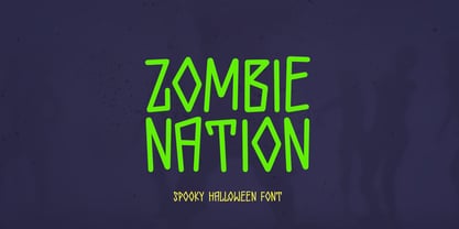 Zombie Nation spooky halloween font will be perfect for halloween lettering, beautiful frame for your home, book covers, greeting cards, logos, marketing, magazines or anything that requires cute handwritten lettering :) What's inside: - Zombie Nation Regular - Multilingual support - Cricut support If you have any questions, please contact me directly or in instagram @superdizigner
 - Odd Stencil JNL by Jeff Levine,
$29.00 The sheet music for "Dancing Butterfly" had the title of the 1929 composition hand lettered in what can be only described as an odd hybrid of letters with an Art Nouveau stencil influence. This quirky style became the basis for Odd Stencil JNL, which is available in both regular and oblique versions.
 - Belora Vintage by Mainelli,
$17.00 Introducing Belora Vintage, a bold serif font with soft, bold edges and curves giving it a groovy 70s feel. Belora Vintage has separate lowercase and uppercase letters, as well as numbers, punctuation, and multilingual letters. With alternates and ligatures it's perfect for fancy retro-style logos, or bold header text and much more.
 - Edda Morgana NF by Nick's Fonts,
$10.00In the 1921 work Letters and Lettering by Frank Chouteau Brown, these letterforms were offered as examples of typical medieval English fare. The font is all caps, but there are variant letterforms in all the lowercase positions. Both versions of the font include 1252 Latin, 1250 CE (with localization for Romanian and Moldovan). - Nora Halim by Beary,
$12.00 Introducing the elegant Nora Halim! Nora Halim is a Scrip font, every single letters has been carefully crafted to make your text looks beautiful. With modern script style this font will be perfect for many different project ex: photography, watermark, quotes, blog header, poster, wedding, branding, logo, fashion, apparel, letter, invitation, stationery, etc.
 - Eurasian Stencinitials JNL by Jeff Levine,
$29.00Eurasian Stencinitials JNL are modeled from a set of crudely die-cut Old English capital letter stencils that were made in Japan in the Early 1960s. The interesting treatment of the letters (with a slight hint of Japanese calligraphy) has some added bamboo plants for balance and decoration in this digital version. - Moon Time by Supfonts,
$17.00 This modern calligraphy monoline script has been attentively written with gentle curves to produce a font that's completely distinctive and original. It contains a full set of lower & uppercase letters, a large range of punctuation, numerals, and multilingual support. Perfect for adding an elegant and unique touch to your lettering projects and branding.