10,000 search results
(0.039 seconds)
- Zauberer by Scriptorium,
$24.00The Scriptorium got its start in the early days of personal computers with a few font designs for the Commodore 64, and the very first font which we did back then in the early 1980s was a gothic calligraphy font. That style of fonts - the medieval, gothic and black letter genre - has always been the backbone of our collection, but with recent releases we've stayed away from them to introduce a bit more variety. Well, with our new Zauberer font the antique, medieval and gothic look is back with a vengeance. Zauberer isn't a true medieval calligraphy style. It's based on early printed type from Germany which combines calligraphic elements with decorative embellishments from the woodcut printing era. The result is decorative and antique looking and rather appealing. The name comes from the German word for a magician or illusionist. - Daily Smiles by Nathatype,
$29.00 Are you looking for a font that speaks beauty? Do you dream of creating headings that stand out and inspire creativity, imagination, and endless fun? Wait no more, we will give you the best choice. Daily Smiles-A Signature Font Inspired by the recent print design trend, the look of the script typeface is elegant and beautiful. Everything’s well with cursive! Show your opulence and decadence with this fancy font and blow your audience’s mind away as you put these cursive letters in your projects. Every detail of this beautiful font making it easy to present your brand or project in the best light. Go ahead and use it on your website, your social media branding, Pinterest banners, printed invitations, and more! Features: Ligatures Stylistic Sets PUA Encoded Numerals and Punctuation Thank you for downloading premium fonts from Nathatype
 - Kessel 105 Text by Talbot Type,
$19.50 Kessel 105 Text is the text specific variation of stablemate, Kessel 105 . With a narrower x-height and longer ascenders and descenders, its more traditional proportions make it more economical with space and better suited to continuous text. It's a versatile, modern sans, highly legible as a text font and with a clean, elegant look as a display font at larger sizes. It has an art deco flavour with sharp points at the apex of many characters. The Kessel 105 Text family comprises of four weights and includes old style non-aligning (lower case) numbers, both proportional and tabular as well as accented characters for Central European languages.
 - Preto Serif OT Std by DizajnDesign,
$50.00 Preto is an extensive type family, which explores the function of serifs on readability and legibility. Preto consist of three subfamilies: Sans, Semi and Serif. Preto is designed for multilingual typesetting. All of the subfamilies have equal gray value but different texture which can be use to differentiate languages. Preto sub-families have two text weights and two bold styles (Regular -> Bold, Medium -> Black). Every weight has a companion Italic style as well. The serif version has been designed to work best at small point sizes (around 8, 9 points). You will not achieve calm, boring or invisible look of your text with Preto Serif. Its long, spiky and sharp serifs contribute to give the typeface a distinct and energetic character. It is very suitable for magazines, corporate identity, brochures or other print materials where a typeface for continuous reading is required. The ligatures in Preto Serif are very special. You can set them in different tracking values and spacing will increase/decrease consistently in the ligatures as well. Alternative characters in the font files allow you to change the feeling of the text from typical to more special (J, Q, g , &). Each font contains a full set of small caps and many alternative characters for complex typesetting.
 - Preto Serif by DizajnDesign,
$24.00 Preto is an extensive type family, which explores the function of serifs on readability and legibility. Preto consist of three subfamilies: Sans, Semi and Serif. Preto is designed for multilingual typesetting. All of the subfamilies have equal gray value but different texture which can be use to differentiate languages. Preto sub-families have two text weights and two bold styles (Regular -> Bold, Medium -> Black). Every weight has a companion Italic style as well. The serif version has been designed to work best at small point sizes (around 8, 9 points). You will not achieve calm, boring or invisible look of your text with Preto Serif. Its long, spiky and sharp serifs contribute to give the typeface a distinct and energetic character. It is very suitable for magazines, corporate identity, brochures or other print materials where a typeface for continuous reading is required. The ligatures in Preto Serif are very special. You can set them in different tracking values and spacing will increase/decrease consistently in the ligatures as well. Alternative characters in the font files allow you to change the feeling of the text from typical to more special (J, Q, g , &). Each font contains a full set of small caps and many alternative characters for complex typesetting.
 - Colonial Press by Simeon out West,
$25.00 Colonial Press is a font based on serif typefaces designed by William Caslon I (1692-1766) and various revivals thereof. Caslon is cited to be the first original typeface of English origin, but some type historians point out the close similarity of Caslon's design to the Dutch Fell types, presumed to be the work of Dutch punchcutter Dirck Voskens. Colonial Press harkens to the look and feel of newspapers in Colonial North America around the mid 1700s without the rough edges commonly associated with colonial printing and many reconstructions. The rough quality of the American typeface is believed to be the result of oxidation from the exposure to seawater during the long voyage from England to the Americas. Colonial Press is a heavy font that retains some of the handcut quality of these fonts while smoothing out the irregularities that make many of these fonts so visually distracting at larger point sizes. For the italic version of this font, I chose to emulate the more ornate letterforms that I have encountered, giving the italic characters a more ornamental feel. Colonial Press comes with full punctuation and a 362 glyph character set for most Western European-based Latin alphabet languages. It is a font that is designed both for normal typing and for larger, decorative display.
 - Newcastle by FaceType,
$9.00 Newcastle gives you great opportunities for spicy typography. If you find some similarities to one of our fonts, ‘Blitzplakat’, you are right. We took it to the next level and made it even better: We extended the range of letters, added optional catchwords, extra shapes, shadows, dust and arrows. Here is a lead to get the most out of Newcastle: Use ‘Discretionary Ligatures’ in the OpenType section of your layout program of choice to turn frequent short words like ‘and’, ‘of’ or ‘from’ into catchwords. Choose ‘Styleformat 01’ to make them vertical. Keep ‘Contextual Alternates’ activated to make consecutive letters look more realistic (the second letter will be replaced automatically by a slightly different looking version). Want to roughen the look of your design even more? Add the dust hidden in the ‘Extras’ style by typing underscore, emdash, endash or hyphen. This font is vintage fun - let’s party!
 - Geekabeat by PizzaDude.dk,
$20.00 Geekabeat is my wooden lookalike grunge typeface! All uppercase letters has got a funky swirl. Comes with different upper- and lowercase letters, alternate letters (both upper- and lowercase!) and ligatures for both double letters and double numbers, along with ligatures for most common letter-combinations - and of course it has got unique accented letters! You will need to use OpenType supporting applications to use the ligatures.
 - Barberry by FontaZY,
$35.00 Barberry is a hand-made brush script typeface equipped with some decorative OTF features, made by Zakhar Yaschin (FontaZY). Barberry font contains stylistic alternates, initial and final alternates (which is duplicated by contextual alternates in the case when ini & fina are not supported), ligatures, titling alternates, small caps and large collection of swashes (additional variants - in Stylistic Set). The Barberry font is essential for hand-made lettering and design. The Barberry family also includes Barberry Vigniette font with over 200 icons and vigniettes in it. Barberry Letters supports most of Western languages (including Central Europian, Baltic and Eastern European languages) and also Cyrillic. Each lowercase letter has three positional versions of the design – basic (if the letter is in the middle of a word), initial (if the word starts with it) and the final (in the end of the word) that makes the set look more alive and expressive. Working with Barberry Letters you can enable and disable if needed such typographic tools as swashes, ligatures, small caps, titling alternates, stylistic alternates, additional swashes and the already mentioned initial and final alternates. If your design software does not support the use of the initial and final alternatives, they can be duplicated by contextual substitutions. There are more than 20 Latin and Cyrillic ligatures in the Barberry Letters. It works by default as the standard ligatures, but you can switch it off for design reasons or to select the more appropriate typographic solution in any particular case. Ornamental font Barberry Vigniette has more than 200 pictograms and vignettes that can decorate your typographic layout. All icons are drawn with a brush in the same style as the Barberry Letters. You can use them inside the text lines, or make the ornamental decoration for text, or use separately, without any letters. OpenType extensions of the Barberry Letters significantly expand the choice of typographical tools to design a better, more expressive layout. Choosing the optimal variant of certain letters in each case, you can receive a unique composition. Whether it is lettering for packaging or magazine headline, logotype or the name in the invitation – just one Barberry font-family gives you the very wide typographic possibilities.
 - Geo Deco by Tipo Pèpel,
$28.00 Geodeco font family brings to you the recovery of the typographic forms from the beginning of the 20th century, with a strong ArtDecó flavour but from a new point of view: modernity and geometry. Modernity in the visual contrast between lowercase and capital letters, where rounded shapes are opposed to the breaks and graphic tensions of the strokes of the capital letters. which gives it an enormous originality. Generous doses of internal whites, assure a powerful legibility even with the spite of its short ascending and descending strokes. What we get is a coherent and martial look where fluidity and homogeneity is the main note. Soft and rounded minuscule, with large internal whites for super legibility, bombproof, especially on screens, where Geodeco lives with an astonishing naturalness. The capital letters, used alone as display, or as companions of the minuscule characters, give the family a touch of originality and exotic flavor. Like the spices in the food; a brief but intense note. Breaking the rectangular shapes so that the appearance of the letter comes out benefits from enlarging the internal whites and making them consistent with the white of the lower case. GeoDeco works very well in plain text with the obvious limitation that it is not a type for small bodies, but exceptionality weldon for plain text and signage. Maximum visibility, total beauty on screens. A family of this new century with the flavour of that epoch of experimentation that were the years 20. Extensive multilanguage support and almost all Opentype functionalities. Try it and it will convince you - for sure!
 - Marli by URW Type Foundry,
$36.99 Marli is an adaption of a face designed by F. Schweimanns and issued by the Stempel Foundry from 6 to 48 point, as “Korso”, in 1913. In 1936 the American Intertype issued their version for the line composing machines in 12 and 14 point as “Camera”. It is a very suitable type face for personal stationery, announcements, greeting cards and the like. The font is updated with a full Open Type character set, while also a Cyrillic has been added.
 - TE Nastaaliq by Tharwat Emara,
$59.00 TE Nastaaliq Font It is one of the Persian calligraphy or ta'liq line that appeared in Persia in the seventh century AH (thirteenth century AD), as it was extracted from the lines of naskh, patch and thuluth. It is a beautiful font whose letters are distinguished by precision and extension. It is also characterized by its ease, clarity and lack of complexity. It does not tolerate diacritics, despite its difference with the line of the patch, as it is one of the best fonts in the world and the best without a competitor and admires many Arab calligraphers, and no cultural or literary exhibition is devoid of a painting written in Persian script. It is one of the most beautiful lines that has a special character that distinguishes it from others, as it is characterized by gracefulness in its letters, so it appears as if it descends in one direction, and its beauty is increased by the soft and rounded lines in it, because it is more flexible in drawing and more flexible, especially if it is drawn with precision, elegance and good distribution, and the calligrapher may baptize In his use of decoration to reach strength in expression by taking advantage of arches and circles, in addition to the grace of painting, the artist may link the letters of one word and the two words to reach the composition of a frame or curved and wrapped lines in which he shows his genius in imagination and creativity.
 - Vala by Monotype,
$29.99 Vala™ dances across printed pages and shines on screen. This is a high-energy design that blends the grace of an English Roundhand script with the gravitas of an extra bold Bodoni. There is even a bit of romance in the design. Vala speaks with a resonant voice – and knows few bounds. The typeface enhances print headlines, subheads, cover art and packaging. The design also brings its distinctive melding of verve and poise to banners, headings, navigational links and branding in web sites, blog posts, games and apps. Oscar Guerrero found inspiration for Vala in shop window lettering near his home in Bogotá, Colombia. “The capital A, R and V caught my attention and I photographed the window for future reference,” he explains. “Later I started to draw more letters inspired by the ones in the window.” Guerrero admits that he has always admired the work of Giambattista Bodoni and allowed his classic Didone designs to infuse Vala. Striking contrast in stroke weights, lively ball-terminals and a large x-height give Vala the grace and force of a Waikiki wave. Not satisfied with just a basic character set, Guerrero also took advantage of OpenType’s capabilities and drew a complete set of swash capitals, a bevy of fancy ligatures, and a suite of lowercase alternative designs. The result is that Vala easily emulates custom lettering in posters, headlines and logotypes. The “romantic” part of Vala? Guerrero dedicated the design to his girlfriend, Valentina, and named it after her.
 - Warm Curves by Nathatype,
$29.00 Most traditional display fonts are old-fashioned and hard to read in small sizes and are not applicable for any contexts in which you need to deliver messages to the audience clearly. Therefore, think about a beautiful, clean, legible modern font which is multipurpose and applicable anywhere along with the pretty serif style. Warm Curves is a display serif font to meet your needs. This elegant, modern, legible display serif font is perfectly applicable to formal, serious contents. It looks more stylish and has its own protruding characters to strengthen the points delivered. Furthermore, this display serif font is legible due to the thick, regular serif to ease readers to recognize every letter accurately. For that reason, you can use this font for any text length and size due to its great legibility. Also enjoy interesting features available in this font. Features: Alternates Multilingual Supports PUA Encoded Numerals and Punctuations Warm Curves fits best for various design projects, such as brandings, posters, banners, logos, magazine covers, quotes, headings, printed products, invitations, name cards, merchandise, social media, etc. Find out more ways to use this font by taking a look at the font preview. Thanks for purchasing our fonts. Hopefully, you have a great time using our font. Feel free to contact us anytime for further information or when you have trouble with the font. Thanks a lot and happy designing.
 - Sedid by Fontuma,
$20.00 Sedid, “solidity; It is an Arabic term meaning “righteousness”. In particular, the correctness and soundness of a word is indicated by this word. The fact that I gave this name to the writing family is to point out its accuracy and robustness. This typeface, which is sans serif, consists of three families: ▪ Sedid: Font family containing Latin letters ▪ Sedid Pro: Font family including Latin, Arabic and Hebrew alphabets ▪ Sedid World: A family of typefaces including Latin, Cyrillic, Greek, Arabic and Hebrew alphabets Those who want to meet a new face of writing for their works and projects and make a difference in their work should meet the Sedid writing family. This typeface is as serious as it is affectionate, and solid as well as elegant. The Sedid font family can be used as a text and title font in all publishing and printing areas, magazines, newspapers, books, banner and poster designs, and websites. Sedid also has a pleasant-looking, flexible face with smooth lines and transitions. The inner and outer spaces of the font are proportioned so that the text can be read easily. Sedid font family consists of 14 fonts, seven plain and seven italic. The font family includes open type features, as well as a large number of ligatures, small caps, modifiers, and currency symbols of many countries.
 - Landa by Sudtipos,
$39.00 As good as Nylon is, there’s nothing better than a nice woolly blanket. The smell and coarse, uneven texture are relaxing and feel reassuring. More comfortable. In a world where technology can reach millimetric precision, sometimes it’s good to connect with the imperfect and controlled impurity that is nature. Font design in particular has matured through software that can generate the most perfect letters in the world. But most of them don’t have soul. Landa is a glimpse from the cutting edge into the past. Inspired by Venetian lettering from the 15th century, whilst giving them new meaning, its letters become expressionist and have a modern touch. A rendez-vous between Nicolas Jenson, Oldřich Menhart, and nature itself. In Landa you can feel the texture of trunks and branches, from full fertile splendour to dried-out frailty. It takes the reader for a stroll through the woods on a late autumn evening, or on an adventure through the Amazonian rainforest, depending on the weight chosen. In the lighter and italic options, Landa text is organic and rustic, and very comfortable to read. What’s more, while it’s discreet on smaller screens, when enlarged it reveals brittle and expressive calligraphic shapes. This also makes it ideal for packaging or display elements. Landa provides advanced typographical support in several languages and OpenType features including case-sensitive forms, small caps, contextual alternatives, stylistic alternates, fractions, proportional and tabular figures. In this case it is technology that serves lettering, not the latter being technology dependent. Let’s not forget, as Erik Spiekermann said “we are still analogical beings. Our brains and eyes are analogical.” Perhaps that’s why to disconnect we always need to go back to forests, rivers, nature. Perhaps that’s why we still prefer wood to steel or wool to nylon.
 - Hejira by Sudtipos,
$49.00 Hejira means “rupture” and this concept was the primary principle that guided the creation of this typeface: to escape conventions and take up the challenge of designing letters with an unusual and fresh approach. Unlike traditional typefaces, each member of this somewhat atypical family has its own distinct personality and formal features. A thin, spiky font that looks like its sharp serifs could pierce through. A more experimental sibling, based on the same skeleton but taken to the extreme, that is best suited to setting big titles. An odd-one-out, sans-serif style whose shapes mimic those generated by the movement of a calligraphic pen. And a quirky fat-face with a flair for combining round curves with pointy elements. Regardless of how different they may be, all four styles feel part of the same system and can be used alongside each other seamlessly. The Hejira set includes multiple ligatures and supports a wide variety of Latin alphabet-based languages.
 - Classification JNL by Jeff Levine,
$29.00 Sometimes it's easy to find a name to fit a font design, other times it's a struggle because of the sheer number of digital fonts available and the number of names already taken. Classification JNL stretches a point to arrive at its name. The attractive sans design was found as a hand-lettered title on a piece of vintage sheet music called "My Hawaiian Souvenirs". During the 1940s, the popular mode of travel to other countries was by steamship. Steamship passengers were assigned their accommodations by the type of passage they booked (such as First Class and Tourist), thus they were in various levels of classification. This aside, Classification JNL is a nice alternative to "standard" condensed fonts for design projects.
 - Fargo Tuscan by Greater Albion Typefounders,
$20.00 Fargo Tuscan is the first of seven typefaces exploring the decorative possibilities of the Tuscan letter form, all of which are releasing in 2017. It’s the most European of the seven- it’s a Mid-Victorian inspired display face which would have been (and is) at home on either side of the Atlantic, unlike some of the others in this batch of Tuscan faces which are distinctly ‘trans-Atlantic’ (we know, that depends on your point of view but we are Greater ALBION Typefounders after all) in flavour. Fargo Tuscan is replete with decorative features, including Swash Capitals, alternate numeric forms and stylistic alternates ideal for the beginning and ending of words. Have some mid-Victorian mid-Atlantic fun with your next design project!
 - Bisco Condensed by Galapagos,
$39.00Bisco Condensed is a small capital design inspired by hand lettered memorial wall art from the Harlem section of New York City. As a memorial, this design is dedicated to a type design colleague who lost his long battle with cancer. This font is a tribute to his strength and his liveliness. The original idea for Bisco Condensed was to capture the energy of those unique "streetforms" in a text/display design and encapsulate them into a lively & fluid type design with a high level of readability at all point sizes. Bisco Condensed is an excellent type for expressive display layouts. It works well as an independent design or a long with contemporary sans serifs that complement Bisco's irregular contours, weighting and bounce. - Scroll by Canada Type,
$24.95Earlier this year, my eyes fell upon a discarded wedding invitation on the sidewalk. A closer look at it revealed that it had at one point been victimized by rain. Some of the fancy script letters were not quite broken, but sort of melted and run-down, while the rest were still somewhat intact. That's how Scroll was conceived, as an idea for a script where thicks and thins blend to produce a wet appearance. Unlike most available broken scripts, the Scroll script was originally drawn in its own juiced context, and not based on any existing script. This font is great for atmospheric antiquity, deep natural poetry, still life captioning, gothic music posters and collateral, or horror literature and poetry covers. - Flowers by BluHead Studio,
$22.00 The Flowers Family is a collection of 3 typefaces in two weights, meticulously drawn by British designer Roy Preston. The Flowers fonts share a common clean and narrow design, with oval-shaped rounds and distinctive individual letter shapes that give each font a unique character all their own. Flowers Petal is the base typeface, essentially a sanserif with rounded terminal ends. Flowers Bud adds a unique inverted triangle shaped serif, and Flowers Thorn replaces that with an elegant pointed serif. All 3 typefaces are very legible and usable for text runs, and there are bold weights of each font for headlines and display applications. Flowers' extended character set supports many Western European languages and each font has some OpenType features, including Ligatures, that make them more useful.
 - Linotype Party Time by Linotype,
$29.99Linotype Party Time is part of the Take Type Library, chosen from the entries of the Linotype-sponsored International Digital Type Design Contests of 1994 and 1997. The typeface is the work of Bulgarian designer Christo Velikov and is composed exclusively of capital letters. Different components make up this cheeful, frolicking font: stripes, dots, triangles, arrows, a trumpet, a ribbon, and others. The characters of Linotype Party Time stand straight on the base line while those of Linotype Party Time Drunk take on the stance typical of this state. Linotype Party Time is perfect for anything which has to do with fun and should be used exclusively in larger point sizes to emphasize the details which make the figures so unique. - Floriste by Eurotypo,
$48.00 Floriste is an elegant, stylized and expressive script font inspired by those beautiful calligraphies of yesteryear, but with a modern point of view. Its informal and friendly appearance refers to traditional flowing writing. Floriste includes many stylistic variations, swashes, stylistics sets, ligatures, contextual and stylistic alternates to create more authentic and varied connections between letters and to assure almost infinite combination possibilities. In addition, the font includes a set of very useful ornaments to combine and give an ornamental aspect to the calligraphic text. It has Central European language support to suit your design. Floriste works perfectly on greeting cards, invitations, weddings, posters, magazines, fashion world, brands, logos, packaging, etc. Floriste is friendly, cool and fun to use in your works. Enjoy it!
 - ITC Dartangnon by ITC,
$29.99ITC Dartangnon is a work of English designer Nick Cooke and began with the thought, It's a long shot but it might just work as a font." It started as a doodle with a chunky pencil. "So many script fonts look too stylized so I thought I'd try to produce one that looks more like handwriting." He scanned the doodles and used Fontographer to draw a set of monoline letters. "Working quickly I soon drew the whole alphabet, and without being too pedantic about the characters joining exactly, I arrived at this script." ITC Dartangnon is an energetic font which remains legible even in small point sizes. And, Cooke adds, "It is supposed to be used as upper and lowercase only, NEVER just caps."" - Letraset Romic by ITC,
$40.99Typeface designer and Letraset type director Colin Brignall created the font Romic. The character of the strokes as well as the serif forms give the font its calligraphic look. The placement of the serifs, on the upper left and lower right of a character, also distinguishes this typeface and allows the figures to be set very close to one another. The dots on the i and j do not hang in the air, rather, they are connected to the rest of the letter with a light, serif-like stroke. The elegant and lively Romic font is legible even in smaller point sizes. It is best used in middle length texts and headlines and wherever an individual and sophisticated image is the goal. - ITC Vino Bianco by ITC,
$29.99ITC Vino Bianco was created by German designer Jochen Schuss. He drew his inspiration from the handwriting of the waiter in his favorite local pub, especially the form of the capital Q. Based on this one character Schuss developed the entire alphabet. The figures are sketchy and generous and look as though they were written on paper with a ball point pen. Vino Bianco is an alphabet of capital letters, each of which also has an alternative form, making it very flexible and true to the tendency of true handwriting. In spite of its fine strokes, the overall look is open and light due to the large amount of space each character occupies. The cheerful, carefree ITC Vino Bianco is best used for headlines and short texts. - Liveria by Subectype,
$17.00 Liveria is an urban font with natural hand-painted style. Suitable for any design needs, branding, urban design, modern advertising design, Book/Cover Title, special events, adventures, headlines, any brush lettering needs and more. Liveria comes with upper and lowercase Standard Characters, Punctuation, Numerals. And some glyphs variation of the OpenType features such as Standard Ligatures and Stylistic Set. Includes a range of multilingual support WHATS INCLUDED : Multilingual Support Ligatures and alternates font If you have any questions please don't hesitate to drop me a message :) Thank You, Subectype Studio
 - The Begundals by HansCo,
$12.00 The Begundals is a modern brush script font in hand lettering style. This font looks cool in any design and is very recommended for craft, posters, books, branding, quotes, print templates, packaging, invitations or anything else that needs a unique and fun touch. The Begundals comes in uppercase and lowercase, with punctuation, symbols, numerals, stylistic alternate sets, ligatures, and also has multi-lingual support. You can access all alternates from your OpenType panel in your design software. Tutorial how to Install & use Alternate / Special Character : https://hanscostudio.com/tutorial/ Enjoy!
 - Hello Kartina by madjack.font,
$14.00 Hello Kartina Script is a beautiful, organic, and fun hand-painted script with different basics and handkerchiefs that can be applied at the beginning and end of all lowercase letters. International support for most Western languages is included. For separate font swash, type lowercase a-z for initial swash and final swash. This font can be used for various purposes. Such as titles, signatures, , wedding invitations, t-shirts, letterhead, signage, labels, news, posters, badges etc. Thank you very much for searching and letting me know if you have questions.
 - Octava by ParaType,
$30.00 PT Octava™ was designed at ParaType in 2001 by Vladimir Yefimov. The first (Cyrillic only) version named Scriptura Russica (1996) consisting of three styles (book, italic, bold) was commissioned by the Russian Bible Society. Lately the Latin letters and bold italic were added. Inspired by Lectura, 1969, by Dick Dooijes and Stone Print, 1991, by Sumner Stone. In spite of large x-height the typeface is both space saving and quite legible at small sizes. Expert fonts including small caps (book) and old style figures are available.
 - Caysa by Flawlessandco,
$9.00 Introducing "Caysa" - An Elegant Display Font. Unveil the extraordinary with "Caysa," an exquisite display font that redefines elegance with its distinct and unique design. There's some connected letters and some alternates that suitable for any graphic designs such as branding materials, t-shirt, print, business cards, logo, poster, t-shirt, photography, quotes .etc This font support for some multilingual. Also contains uppercase A-Z and lowercase a-z, alternate character, numbers 0-9, and some punctuation. If you need help, just write me! Thanks so much for checking out my shop!
 - Fosho by Chank,
$49.00 For more than 70 years the 10-foot tall letters displaying the word FOSHAY have illuminated the Foshay Tower in the Minneapolis skyline. However, the typestyle has never been made into a font before. This new modern font family, dubbed Fosho Book, is optimized for book print usage as well as functioning as big bold display type on screen. The Fosho fonts are available in three styles: Outlines, Dotted Bulb Inlines and Composite with both. You can use the three styles in overlapping colors for dramatic chromatic effects.
 - Reaktif by Plasebo Studio,
$14.90 Reaktif type family has been created with a new and modern approach to the popular geometric sans serif type. It has a very legible, multifunctional, contemporary and dynamic design. Sharp-angle details in minuscule letters “a, b, d, f, g, m, n, p, q, r, t, u” boosts its' characteristics in the Reaktif font family. Reaktif type family contains 24 fonts and 550+ glyphs. Stylistic alternatives come with 30+ ligatures and many opentype features. It can meet your needs in many medium such as Reaktif branding, editorial, web and printing.
 - Ridtype Pro by Ridtype,
$30.00 Ridtype Pro is a custom font for our brand, and later this font will work in all roles in the type of brand we use. both in units of typography, printing, and type texting. This font is equipped with a modern semi-classic category type, so this font can work in all lines of business, both for supporters of implementation in modern and classic business. This font has been designed as best as possible, both in terms of letter design and the type of weight that is made to be compatible in all roles.
 - Daytona Variable by Monotype,
$209.99The Daytona™ typeface family grew out Jim Wasco’s desire to design a readable and legible typeface for video and on screen use. Because of its high levels of legibility, the Daytona family is additionally an ideal design for display usage in digital user interfaces and a wide range of print applications. Wasco drew each character with legibility as a primary goal, some of the letters having unique attributes to minimize the ambiguity. Daytona Variables are font files which are featuring two width axes and have a preset instance from Thin to Fat. - Cheltenham by Bitstream,
$29.99 Daniel Berkeley Updike seems to have stimulated the architect Bertram G. Goodhue to design the prototype in 1896 for Ingalls Kimball at the Cheltenham Press. Six years later Morris Fuller Benton at ATF developed it into the design and then the series that we know today. “Owing to certain eccentricities of form,” writes Updike, “it cannot be read comfortably for any length of time.” But he concludes: “It is, however, an exceedingly handsome letter for ephemeral printing.” Mergenthaler bought composing machine rights to the original design c. 1896, but bought the Benton design in 1904.
 - Manova by Flawlessandco,
$9.00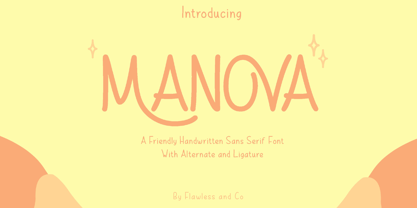 Introducing "Manova" - a friendly and approachable handwritten sans serif font that adds a touch of warmth and authenticity to your designs. There's some connected letters and some alternates that suitable for any graphic designs such as branding materials, t-shirt, print, business cards, logo, poster, t-shirt, photography, quotes .etc This font support for some multilingual. Also contains uppercase A-Z and lowercase a-z, alternate character, numbers 0-9, and some punctuation. If you need help, just write me! Thanks so much for checking out my shop!
 - Linotype Compendio by Linotype,
$40.99Linotype Compendio is a part of the Take Type Library, chosen from the contestants of the International Digital Type Design Contests from 1994 and 1997. Christian Bauer designed this font based on the basic forms of Transitional faces of the 17th century. The outer contours of the letters are purposely raw and irregular, much like alphabets printed on low-quality paper. The legibility of the font is thus reduced, making it necessary to use this font only for shorter texts or headlines, but it is exactly this characteristic which lends Linotype Compendio its distinctiveness. - Baisteach by Fontdation,
$15.00 Introducing Baisteach, our latest all-caps vintage serif. Inspired from early 1900's typography that often used in sign paintings, packaging labels, and advertisements. This typeface is made of sharp serifs, clean edges and strong form, give you a simple yet impactful feels. Suits best for headline, logo/logotype, and many more. If you're a fan of classic typography, make sure you add this font to your design toolbox. Last but not least, don't forget to activate its OpenType Feature to get the wider selection of letter combinations.