10,000 search results
(0.034 seconds)
- ITC Typados by ITC,
$29.99ITC Typados is the joint effort of Roselyne and Michel Besnard and is composed of characters in two different senses of the word. First, it is of course made of letters and symbols, clean and legible with generous widths and x-heights. There is a hint of Art Nouveau style in the tapering, brush-like strokes. But the figures of ITC Typados are also made of characters in the theatrical sense: little tear-drop heads on tapering bodies that bend themselves into the shapes of an alphabet while maintaining a life of their own. The typeface is based on a recurring character in Michel's sculpture and painting, Ado. Ado is the first character who sings and repeats itself in all my creations," says Michel. "This adventure brings new forms for my painting and my sculpture: coiffed heads, bodies in the form of a cone, arms in the form of spread wings, etc." "Type" plus a number of "Ados" equals ITC Typados." - MFC Monarchy Initials by Monogram Fonts Co.,
$19.95 The inspiration source for Monarchy Initials is the 1934 Book of American Types by American Type Founders. In that specimen book, they had created a sophisticated two color initial design they called "Stationers Initials" which was only available in metal type at 24, 36, and 48 points. This wonderfully detailed initial style is now digitally recreated and revived for modern use. Monarchy Initials is only capable of initial or single letter monograms due to its unique design. The two color aspect of the original design has been preserved and made accessible within all programs. The Capital character slots contain the background color glyphs, and the lowercase slots hold the outline art for the letters. You can choose a color, type a capital letter, then switch to black and type a lowercase letter for the two color effect, or just tpe a lowercase letter on its own. It's that easy! Download and view the Monarchy Initials Guidebook if you would like to learn a little more.
 - MFC Memoriam Initials by Monogram Fonts Co.,
$19.95 The inspiration source for Memoriam Initials is the 1934 Book of American Types by American Type Founders. In that specimen book, they had created a sophisticated two color initial design they called “University Initials” which was only available in metal type at 24, 36, and 48 points. This wonderfully detailed initial style is now digitally recreated and revived for modern use. Memoriam Initials is only capable of initial or single letter monograms due to its unique design. The two color aspect of the original design has been preserved and made accessible within all programs. The Capital character slots contain the background color glyphs, and the lowercase slots hold the outline art for the letters. You can choose a color, type a capital letter, then switch to black and type a lowercase letter for the two color effect, or just type a lowercase letter on its own. It’s that easy! Download and view the Memoriam Initials Guidebook if you would like to learn a little more.
 - Linotype Renee Display by Linotype,
$29.00Linotype Renee is part of the Take Type Library, selected from contestants of Linotype’s International Digital Type Design Contests of 1994 and 1997. It was a prize-winning entry of American designer Renee Ramsey-Passmore. The letters of this font are strictly constructed with a grid, which is still visible in the weight Types + Lines. The figures are designed with only the basic forms of circle, rectangle and triangle, giving the font an individual and technical feel. Some letters are only recognizable in the context of a word, making Linotype Renee exclusively for short headlines in large point sizes. - Dezen Pro by DizajnDesign,
$- Dezen is a contemporary, mechanical grotesque typeface. Its letters were first constructed from individual modules and then optically refined to enhance its rhythm. Its tight letter spacing and narrow proportions make the typeface particularly well suited for display sizes and headlines. When you add spacing, font can be used for shorter amount of text, bigger than 12 points. The Dezen type family consists of a wide variety of styles – solid and stencil. The Dezen Pro subfamily combines all 4 styles (Solid, Stencil 01, Stencil 02, Stencil 03) in a specific sequence, which originates a “pattern” for the alphabet (or dezen, in Slovak).
 - Dezen Solid by DizajnDesign,
$39.00 Dezen is a contemporary, mechanical grotesque typeface. Its letters were first constructed from individual modules and then optically refined to enhance its rhythm. Its tight letter spacing and narrow proportions make the typeface particularly well suited for display sizes and headlines. When you add spacing, font can be used for shorter amount of text, bigger than 12 points. Dezen type family consists of a wide variety of styles – solid and stencils. Dezen Pro subfamily combines all 4 styles (Solid, Stencil 01, Stencil 02, Stencil 03) in a specific sequence, which originates a “pattern” for the alphabet (or dezen, in Slovak).
 - Dezen Stencil 02 by DizajnDesign,
$39.00 Dezen is a contemporary, mechanical grotesque typeface. Its letters were first constructed from individual modules and then optically refined to enhance its rhythm. Its tight letter spacing and narrow proportions make the typeface particularly well suited for display sizes and headlines. When you add spacing, font can be used for shorter amount of text, bigger than 12 points. Dezen type family consists of a wide variety of styles – solid and stencils. Dezen Pro subfamily combines all 4 styles (Solid, Stencil 01, Stencil 02, Stencil 03) in a specific sequence, which originates a “pattern” for the alphabet (or dezen, in Slovak).
 - Linotype Irish Text by Linotype,
$29.99Linotype Irish Text is part of the Take Type Library, chosen from the contestants of Linotype’s International Digital Type Design Contests of 1994 and 1997. German artist Torsten Weisheit designed this font based on Irish scripts of the 5th century. Characteristic of this style is the mixture of upper case letters in the mostly lower case alphabet and vice versa. The letters look as though written with a broad tipped pen and have triangular serifs, displaying a decorative tendency akin to that of Irish calligraphy. Linotype Irish Text is intended exclusivley for headlines in large point sizes. - Dezen Stencil 03 by DizajnDesign,
$39.00 Dezen is a contemporary, mechanical grotesque typeface. Its letters were first constructed from individual modules and then optically refined to enhance its rhythm. Its tight letter spacing and narrow proportions make the typeface particularly well suited for display sizes and headlines. When you add spacing, font can be used for shorter amount of text, bigger than 12 points. Dezen type family consists of a wide variety of styles – solid and stencils. Dezen Pro subfamily combines all 4 styles (Solid, Stencil 01, Stencil 02, Stencil 03) in a specific sequence, which originates a “pattern” for the alphabet (or dezen, in Slovak).
 - LoveYaHoney by Typadelic,
$14.95 Aw, aren't they sweet? This lettering is based on a 1950s note a husband wrote to his wife shortly after they were married. His beautifully controlled and strong handwriting knows no lowercase characters; he gets his point across in uppercase only. In today's world of email and internet writings, we know that uppercase means shouting and is considered quite rude, but he didn't know that when he wrote this letter to his lovely wife! Love Ya Honey is very legible and looks beautiful when used for headlines, titling or even long expanses of body copy. Perfect for scrapbooking too!
 - Dezen Stencil 01 by DizajnDesign,
$39.00 Dezen is a contemporary, mechanical grotesque typeface. Its letters were first constructed from individual modules and then optically refined to enhance its rhythm. Its tight letter spacing and narrow proportions make the typeface particularly well suited for display sizes and headlines. When you add spacing, font can be used for shorter amount of text, bigger than 12 points. Dezen type family consists of a wide variety of styles – solid and stencils. Dezen Pro subfamily combines all 4 styles (Solid, Stencil 01, Stencil 02, Stencil 03) in a specific sequence, which originates a “pattern” for the alphabet (or dezen, in Slovak).
 - Monoicono by astroluxtype,
$40.00 Monoicono is a graphics font which contains various iconography related to environmental, health, weather, emergency, quality control, and synergy. There are a total of sixty-six items which includes a light version in the lowercase letters and a bold version in the uppercase letters as well as various numbers that have additional icons. See the poster examples provided for all the dingbats/icons in the font. Recommended size usage would be approximately 62 points or above in size, although some icons will read fine much smaller. Note parenright and left, braceright and left have additional icons.
 - Anthracite by Fabulous Rice,
$15.00 A title is something strong. Something that leaves its mark through time, in the memories and in the hearts. A title tells things about the content, its purpose, its meaning, its point. For your needs in strong titlecase letters comes Anthracite. Looking almost like they were carved out of raw wood in the 1820s, the letters of Anthracite will not only imprint well but they will also impress. Its carving gives a feeling of relief, or shades, of textures that will be unique every time you use it. The perfect font if you want to stand out and be read.
 - Golden Opportunity JNL by Jeff Levine,
$29.00 The cover of vintage sheet music for "With Plenty of Money and You (The Gold Diggers' Lullaby)" from the Warner Brothers musical "Gold Diggers of 1937" had the movie title hand-lettered in a classic Art Deco style. Bold, brash and totally fun, this became the model for Golden Opportunity JNL.
 - Rare Bird Specimen III by Rare Bird Font Foundry,
$100.00 RARE BIRD SPECIMEN III Rare Bird Specimen III is a graceful hand by Karla Lim of Written Word Calligraphy. This all lowercase font feels both modern and feminine. While uppercase letters are still lowercase in shape, they are larger and read as caps. OBSERVATIONS Specimen III has a dancer-like form; supple and lithe. Willowy letters are nimble and lissome, content alone or paired with a stronger, more masculine specimen. DEFINING CHARACTERISTICS Opentype programming, formal title and preposition word art, 7 alternate lowercase t cross-strokes, Roman numerals, old-style numerals, seamlessly semi-connecting calligraphic letters, realistic double-letter ligatures, in and out-stroked letters at the beginning and end of words where appropriate, basic Latin encoding. POTENTIAL SIGHTINGS Bridal + baby shower stationery, logo design, gourmet food packaging, clothing labels.
 - Renaissance Initial by Kaer,
$19.00 This is a new classic Renaissance Initial font. Renaissance Initial font is perfect for premium design labels, medieval print, antique posters, etc. The fonts are presented in usual and color versions. Only uppercase letters from A to Z and numbers set (36 characters)
 - Cuckoo by Very Good Fonts,
$19.00Cuckoo was first seen in 1988 when I painted it on a record shop's window. Since then this hand lettered font has been there and done that. Cuckoo is strong, classic and informal display font designed to work well on any job. - Rennie Mackintosh Moonlight by CRMFontCo,
$20.00Derived from the world famous Rennie Mackintosh Font, the Moonlight version gives a hollowed effect with a drop shadow to the Classic Rennie Mackintosh lettering. The "Moonlight" name comes from one of Mackintosh's less well known watercolour paintings - The Harvest Moon (1892). - Personal Message JNL by Jeff Levine,
$29.00 Inspired by the calligraphic poster art of Santa Fe's Randall Hasson, Personal Message JNL is part calligraphic, part cartoon lettering. A light, casual and friendly design, Personal Message JNL can be applied to many different print or web projects with equally attractive results.
 - Stenciling Cards JNL by Jeff Levine,
$29.00Stenciling Cards JNL is the digital equivalent of the individual letter and number stencils used to paint markings on walls, crates, boxes, etc. Use this type design when you want a reversed stencil look. Kern it super tight for a continous word stencil. - Revillia by Din Studio,
$29.00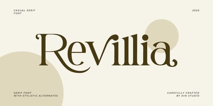 Revillia is modern serif font. Made for any professional project branding. It is the best for branding, printing, wedding and quotes. Every letter has a unique and beautiful touch. Features: Beautiful Ligatures Many Swashes Stylistic Sets PUA Encoded Multilingual Support Numerals and Punctuation
 - Olivier by Letters&Numbers,
$28.00 Olivier is based on painted black ink letters. Inspiration for this typeface is fluidity of wine. Shifting base-, mean- and cap lines, varying tails and ascenders give it an organic, playful feel. The font is suitable for logo types, short paragraphs and headings.
 - HT Orologiaio by Dharma Type,
$19.99 HT Orologiaio is made by sharp and thin lines with a retro mood. Holiday Type Project offers retro hand drawing scripts. Inspired by retro script on shopfront lettering, wall paint advertisements in Italy around 1950s. Check out the script fonts from Holiday Type!
 - Trade Printer JNL by Jeff Levine,
$29.00Trade Printer JNL is another font design inspired by an old rubber stamp sign printing set. In this case, the lettering has a classic "wood type" look, reminiscent of the letterheads, billheads and fliers made by local printers of the 1880s-1920s. - AW Conqueror Std Didot by Typofonderie,
$59.00 Homage to 70s phototype typography in 3 styles The AW Conqueror typeface family is a nod to the spirit of phototype typefaces and transfer lettering from the early 70’s. Founded by Ed Rondthaler, Photo-lettering catalogs swarmed with more daring typefaces than the others. Both transfer letter and phototitling have liberated the principle of letter-to-letter spacing, previously impossible with metal type. Phototype allowed operators to position millimeters, on the fly, letter after letter: words, sentences according to the specifications of the art director. AW Conqueror superfamily AW Conqueror Didot is part of a larger family, who include 4 others subfamilies with great potential: They’re but based on same structure, with some connection between them (width for example), to offer a great & easy titling toolbox to any designers, from skilful to beginner. Each of the members try their best to be different from the others because of their features. They should work harmoniously in contrast. Club des directeurs artistiques Prix 2010 European Design Awards 2011
 - Tattoo Sailor, crafted by the talented font designer Juan Casco, is a font that seamlessly embodies the spirit and aesthetic of traditional sailor tattoos, which have captivated people's imaginations...
- Fox Wizard by Fox7,
$12.00 Fox Wizard is a vintage and cool slab serif font. this font is perfect for publications, logos, business cards, or printed on t-shirts, this font will look outstanding on everything, no matter the topic. This font will be an incredible asset to your fonts’ library, as it has the potential to elevate any creation.
 - Dahlia Darling by Sulthan Studio,
$12.00 This beautiful handwritten font we made very attractive with a natural touch we worked back to clean smudges and into smooth lettering it's easy when you cut as well as print stickers and other cool work you're working on this font has 3 front swashes and 3 back swashes for lowercase and one alternative for uppercase, 98 ligature Fonts include uppercase and lowercase letters, punctuation numbers, and language support
 - Cannoli by Eurotypo,
$36.00 Cannoli is a brush lettering style font, designed specially for use in logotypes, advertising and packaging. It is interesting to note the use of free-flowing lettering to perform its own eye-catching. This vintage typeface is a reminiscent of the posters of the 50s, painted with a brush in enamel advertising signs. Cannoli was inspired by the delicacy of the Sicilian pastry, and the robust charm of its landscape.
 - Lost & Forlorn by Dawnland,
$19.00 Punk/horror typeface for harsh designs, or to add some uease to strict ones. It's all up to you! 444 Glyphs with alternate caps using the Small Caps feature and double letters for a varied handwritten look. (Open type requiered.) Combine with the slanted and bold versions for even bigger variation. Ink on paper and carefully touched up digitally so that all letters will look good printed in bigger sizes.
 - Jacques & Gilles by Emily Lime,
$34.00 There are two “personalities” in this font. Jacques’ persona comes to life when typing in all lowercase letters. And Gilles’: when using all uppercase. And the best part is Jacques and Gilles were made for each other. J&G features 300+ glyphs including terminal letters, alternates, ordinals, roman numerals (I,V,X) and 2 sets of ornaments - 1 outline & 1 solid so you can create a cool, modern painted effect.
 - Teja by Eurotypo,
$59.00 “Teja” font was inspired in the lettering styles printed on enamel advertising signs. The enameled iron signs were, from 1880s until the 1950s, amongst the most striking features of streets and railway stations in most towns and villages around the world. “Teja” was designed specially for use in logotypes, advertising and packaging. It is interesting to note the use of free-flowing lettering to perform its own eye-catching.
 - HT Espresso by Dharma Type,
$19.99 The biggest feature of HT Espresso is a mixture of straight line and curve.It is like a cup of espresso with a bite-sized piece of chocolate. You can connect all the letters with thin line and It would attract notice. Holiday Type Project offers retro hand drawing scripts. Inspired by retro script on shopfront lettering, wall paint advertisements in Italy around 1950s. Check out the script fonts from Holiday Type!
 - Honeyvoid by PizzaDude.dk,
$20.00 Honeyvoid is my handwritten font, and it is perfect for invitations, greetingcards, prints, logos and decorative sayings or headlines. The letters vary beautifully in both height and weight. Using contextual alternates, the font cycles with 5 different versions of each letter - and that’s a sweet trick to make your text look excactly like you did all the brushstrokes! Honeyvoid comes with a large amount of accents, for many languages!
 - Rylan by Jen Wagner Co.,
$17.00 Rylan is the classic serif I've been looking for in my design work – clean lines, modern serifs, and just a touch of vintage. It looks gorgeous in logo work as well as web headings and printed materials! Rylan Serif includes: • Upper & lowercase letters • Numbers & punctuation • Foreign language accents & characters for the international designer Rylan Grotesque includes: • Upper & lowercase letters • Numbers & punctuation • Foreign language accents & characters for the international designer
 - Linotype Sansara by Linotype,
$29.99Linotype Sansara, from Swiss designer Grégoire Poget, is part of the TakeType Library, chosen from the entries of the Linotype-sponsored International Digital Type Design Contest 1999 for inclusion on the TakeType 3 CD. This fun font is a type experiment behind whose oriental facade hide Arabic letters, recognizable only at second glance. This font displays generous, pointed ascenders and descenders as well as a bar-like emphasis on the upper third of the figures which connects lines and words and gives them a decorative look. Linotype Sansara reveals an astounding variety of details which bring to mind 1001 Arabian Nights, flowing gowns and snake charmers. This font is best for display in point sizes of 14 or larger. - Skagwae by Ingrimayne Type,
$7.95 The characters of Skagwae have no curves, just straight line segments. The letter shapes themselves are fairly standard, but the choppy line segments used to construct them give the fonts a crude, unfinished look that is highlighted at large point sizes. At small point sizes the fonts are surprisingly legible. The family has nine styles. The regular, bold, italic, bold italic, shadow, and shadow inside styles are proportionally spaced. Shadowinside is very similar to regular but is spaced to be used in a layer with the shadow style. SkagwaeMono-Regular and SkagwaeMono-Bold are monospaced versions of the family. A third monospaced style, SkagwaeMono-Rippled, is a distorted version with squiggly lines full of curves.
 - AI Wood by Alphabets,
$17.95These six faces are interpreted from examples shown in Rob Roy Kelly's "American Wood Types" They are not merely scanned copies, but have been redrawn from scratch with various optical adjustments. Kelly points out that the true glory of the American Wood Types are the negative spaces, which are, in their dynamic active forms, the antithesis of the anemic flimsy letters produced by type foundries in the 19th century. The Alphabets Wood Types are designed with digital manipulation in mind. Stretch, curve and distort at will! These designs were released prior to similar revivals from Adobe. Each font has two full alphabets (one full height, one smaller) and numerals. However, certain points and accents will not be found. - Playsign by Jinan Studio,
$25.00 Introducing Playsign a vibrant and dynamic sign painting display typeface that infuses creativity into every character stroke. With its meticulously crafted uppercase and lowercase letters, punctuations, numbers, symbols, and thoughtful ligatures, Playsign stands as a versatile typographic tool with boundless possibilities. Its seamless multi-language support ensures a global reach for your creative endeavors. Designed to ignite visual impact, Playsign is a perfect choice for diverse applications, elevating designs across logos, posters, product designs, print and digital advertising, branding, and beyond. Whether aiming for a bold statement or a subtle nuance, this font injects charisma into every project, embodying a harmonious blend of classic aesthetics and contemporary flair. Unleash your imagination with Playsign and watch your designs resonate with vibrancy and distinction." Features A set of uppercase and lowercase glyphs Number, symbol, and punctuation Multilingual Support Swashes and Ligature Type j_1 until j_10 to features swash, ligatures will automatically replace the standard letter pairs whenever available, when using any OpenType capable software.
 - SAV PT by Puckertype,
$29.00SAV Display PT is directly inspired from hand-painted commercial signage found around Savannah, Georgia. There is a strong tradition of hand-painted signs adorning small car wash stations, to beauty salons, to mechanics and restaurants. Currently a collection of about four to five painters account for the majority of the signs. This font was derived from 10 uppercase letters that seemed to represent the aesthetic thread found throughout the signs. There are no lowercase letters found in these signs, so the lowercase of the font had to be designed from scratch. I felt this added versatility to the font and its possibilities for usage. This font is strictly a display font. However, because of the apparent roots (intended or unintended) of the lettering to transitional/modern modulated fonts, it does read surprising well at smaller sizes.