10,000 search results
(0.032 seconds)
- Giovanna Handwriting by SoftMaker,
$7.99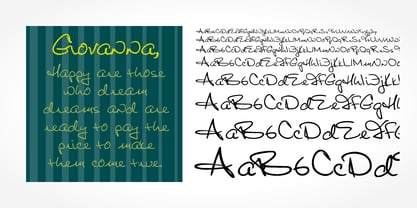 Digitized handwriting fonts are a perfect way to give documents the “very special touch”. Invitations look simply better when handwritten than when printed in bland Arial or Times New Roman. Short handwritten notes look authentic and appealing. There are numerous occasions where handwritten text makes a better impression. Giovanna Handwriting is a beautiful typeface that mimics true handwriting closely. Use Giovanna Handwriting to create stunningly beautiful designs easily.
 - Dario Handwriting by SoftMaker,
$7.99 Digitized handwriting fonts are a perfect way to give documents the “very special touch”. Invitations look simply better when handwritten than when printed in bland Arial or Times New Roman. Short handwritten notes look authentic and appealing. There are numerous occasions where handwritten text makes a better impression. Dario Handwriting is a beautiful typeface that mimics true handwriting closely. Use Dario Handwriting to create stunningly beautiful designs easily.
 - Josh Handwriting by SoftMaker,
$15.99 Digitized handwriting fonts are a perfect way to give documents the “very special touch”. Invitations look simply better when handwritten than when printed in bland Arial or Times New Roman. Short handwritten notes look authentic and appealing. There are numerous occasions where handwritten text makes a better impression. Josh Handwriting is a beautiful typeface that mimics true handwriting closely. Use Josh Handwriting to create stunningly beautiful designs easily.
 - Theo Handwriting by SoftMaker,
$15.99 Digitized handwriting fonts are a perfect way to give documents the “very special touch”. Invitations look simply better when handwritten than when printed in bland Arial or Times New Roman. Short handwritten notes look authentic and appealing. There are numerous occasions where handwritten text makes a better impression. “Theo Handwriting” is a beautiful typeface that mimics true handwriting closely. Use Theo Handwriting to create stunningly beautiful designs easily.
 - Volker Handwriting Pro by SoftMaker,
$15.99 Digitized handwriting fonts are a perfect way to give documents the “very special touch”. Invitations look simply better when handwritten than when printed in bland Arial or Times New Roman. Short handwritten notes look authentic and appealing. There are numerous occasions where handwritten text makes a better impression. “Volker Handwriting Pro” is a beautiful typeface that mimics true handwriting closely. Use Volker Handwriting Pro to create stunningly beautiful designs easily.
 - Brouet Handwriting by SoftMaker,
$15.99 Digitized handwriting fonts are a perfect way to give documents the “very special touch”. Invitations look simply better when handwritten than when printed in bland Arial or Times New Roman. Short handwritten notes look authentic and appealing. There are numerous occasions where handwritten text makes a better impression. Brouet Handwriting is a beautiful typeface that mimics true handwriting closely. Use Brouet Handwriting to create stunningly beautiful designs easily.
 - Salew Handwriting by SoftMaker,
$7.99 Digitized handwriting fonts are a perfect way to give documents the “very special touch”. Invitations look simply better when handwritten than when printed in bland Arial or Times New Roman. Short handwritten notes look authentic and appealing. There are numerous occasions where handwritten text makes a better impression. Salew Handwriting is a beautiful typeface that mimics true handwriting closely. Use Salew Handwriting to create stunningly beautiful designs easily.
 - Lennart Handwriting by SoftMaker,
$15.99 Digitized handwriting fonts are a perfect way to give documents the “very special touch”. Invitations look simply better when handwritten than when printed in bland Arial or Times New Roman. Short handwritten notes look authentic and appealing. There are numerous occasions where handwritten text makes a better impression. “Lennart Handwriting” is a beautiful typeface that mimics true handwriting closely. Use Lennart Handwriting to create stunningly beautiful designs easily.
 - Teje Handwriting by SoftMaker,
$15.99 Digitized handwriting fonts are a perfect way to give documents the “very special touch”. Invitations look simply better when handwritten than when printed in bland Arial or Times New Roman. Short handwritten notes look authentic and appealing. There are numerous occasions where handwritten text makes a better impression. “Teje Handwriting” is a beautiful typeface that mimics true handwriting closely. Use Teje Handwriting to create stunningly beautiful designs easily.
 - Kris Handwriting Pro by SoftMaker,
$15.99 Digitized handwriting fonts are a perfect way to give documents the “very special touch”. Invitations look simply better when handwritten than when printed in bland Arial or Times New Roman. Short handwritten notes look authentic and appealing. There are numerous occasions where handwritten text makes a better impression. “Kris Handwriting Pro” is a beautiful typeface that mimics true handwriting closely. Use Kris Handwriting Pro to create stunningly beautiful designs easily.
 - Fabio Handwriting by SoftMaker,
$15.99 Digitized handwriting fonts are a perfect way to give documents the “very special touch”. Invitations look simply better when handwritten than when printed in bland Arial or Times New Roman. Short handwritten notes look authentic and appealing. There are numerous occasions where handwritten text makes a better impression. Fabio Handwriting is a beautiful typeface that mimics true handwriting closely. Use Fabio Handwriting to create stunningly beautiful designs easily.
 - Juri Handwriting by SoftMaker,
$15.99 Digitized handwriting fonts are a perfect way to give documents the “very special touch”. Invitations look simply better when handwritten than when printed in bland Arial or Times New Roman. Short handwritten notes look authentic and appealing. There are numerous occasions where handwritten text makes a better impression. Juri Handwriting is a beautiful typeface that mimics true handwriting closely. Use Juri Handwriting to create stunningly beautiful designs easily.
 - Foster Handwriting by SoftMaker,
$7.99 Digitized handwriting fonts are a perfect way to give documents the “very special touch”. Invitations look simply better when handwritten than when printed in bland Arial or Times New Roman. Short handwritten notes look authentic and appealing. There are numerous occasions where handwritten text makes a better impression. Foster Handwriting is a beautiful typeface that mimics true handwriting closely. Use Foster Handwriting to create stunningly beautiful designs easily.
 - Federico Handwriting by SoftMaker,
$15.99 Digitized handwriting fonts are a perfect way to give documents the “very special touch”. Invitations look simply better when handwritten than when printed in bland Arial or Times New Roman. Short handwritten notes look authentic and appealing. There are numerous occasions where handwritten text makes a better impression. Federico Handwriting is a beautiful typeface that mimics true handwriting closely. Use Federico Handwriting to create stunningly beautiful designs easily.
 - Pablo Handwriting by SoftMaker,
$15.99 Digitized handwriting fonts are a perfect way to give documents the “very special touch”. Invitations look simply better when handwritten than when printed in bland Arial or Times New Roman. Short handwritten notes look authentic and appealing. There are numerous occasions where handwritten text makes a better impression. “Pablo Handwriting” is a beautiful typeface that mimics true handwriting closely. Use Pablo Handwriting to create stunningly beautiful designs easily.
 - Phil Handwriting by SoftMaker,
$15.99 Digitized handwriting fonts are a perfect way to give documents the “very special touch”. Invitations look simply better when handwritten than when printed in bland Arial or Times New Roman. Short handwritten notes look authentic and appealing. There are numerous occasions where handwritten text makes a better impression. Phil Handwriting is a beautiful typeface that mimics true handwriting closely. Use Phil Handwriting to create stunningly beautiful designs easily.
 - Huben by Minor Praxis,
$20.00 Inspired by a dark techno typography design style which tends to utilize space of a module. Designed for headlines, titling, large-format prints and posters. Huben is a wide extended width based, dense kern, a strong of a structures and heavy looks, make it more loud and on-point type of impression. Matched with basic sans serif typefaces as a body copy. Available regular and italic in standard and outlined version of styles with multi languages support. Ligatures, stylistic alternates, and some stuff like icons and symbols are added.
 - Goodies by Linotype,
$29.99German designer Anne Boskamp created the Goodies font family in 2002. These two fonts, Goodies A and Goodies B, are both very illustrative, and their letterforms look similar to the drawings and paintings of Joan Miro. Using Goodies in your work adds a personal, sensitive creative touch. The design of the Goodies fonts lend it to use in larger point sizes, where the expressive quality of the line may be seen inside these elegant creations. Both fonts are included in the Take Type 5 collection from Linotype GmbH." - Revx Neue Rounded by OneSevenPointFive,
$9.00 Revx Neue Rounded is a modern rounded sans serif typeface. It contains 14 styles - 7 uprights and corresponding italics. The typeface supports the OpenType Latin Pro character set of 455 characters. It is packed with powerful OpenType features, alternative glyphs, kerning pairs, guided typing experience, and more which makes the typeface well featured. The typeface is suitable for all platforms (web, display, print, etc.). Revx Neue Rounded blends beautifully in your designs. Revx Neue (Non-Rounded corners): https://www.myfonts.com/fonts/one-seven-point-five/revx-neue/ Feedback: https://forms.gle/iY8Zswmsg689m95M8
 - Robotik by ITC,
$29.99The extremely narrow Robotik was created by the British typeface designer David Quai and appeared with ITC in 1989. The figures are robust and strong and form tightly packed, bar-like lines. The characters' slim, narrow and angular forms suggest mechanical exactness and cool distance. The similarity of the forms are also reminiscent of machinery and the letters form chains of words. The form principle shows parallels with the constructivism of Moscow after the First World War. Robotik is best used for headlines in large point sizes. - Scarville by Factory738,
$15.00 This year's Halloween is approaching quickly!!! Scarville is an excellent choice for Halloween projects. Use its eerie atmosphere as a jumping-off point for your Horror project. There are numbers, punctuation, and multilingual letters included. These ligatures will come in handy for whatever your imagination brings to mind up.. 7 Styles Basic Latin A-Z and a-z Numerals & Punctuation Stylistic Ligatures Multilingual Support for ä ö ü Ä Ö Ü ... Free updates and feature additions Thanks for looking, and I hope you enjoy it.
 - Rosalia by preussTYPE,
$25.00 Rosalia is an impulsive typeface designed by Heinz Schumann in 1964 as Stentor for Typoart Dresden. The marked stroke contrast and the spontaneous look typical of handwriting gives the typeface a lively, energetic character. The generous capitals lean slightly to the right and contrast beautifully with the reserved, upright lower case letters and can also be used for initialing. Rosalia is a good choice for headines and texts in middle to large point sizes. OpenType features: Contains 390 Glyhps Central European faces Standard Ligatures Discretionary Ligatures
 - Smudger by ITC,
$39.00 Smudger, from designer Andrew Smith, is oriented toward a young generation who does not want to mind the rules. The font invites unconventional and playful use. The figures seem to be almost coincidentally shaped. Letters alternate between thin and thick strokes alternate and give the font the smudged look that inspired its name and gives the font its unmistakable character. Smudger is a font that just cannot settle down. It is best used for headlines and short texts in point sizes of 12 or larger.
 - My Hands by Wiescher Design,
$49.50 The hands in this font are the pointing, counting, threatening, signaling, demonstrating and playing hands I use in my own design projects. I have drawn them all with a felt-tip marker, scanned and digitized for use in a font. This picture font is more user-friendly than having single ps-files. I usually convert the letter to paths once I have decided which one to use, because I might want to fill the lines or background with different colors. Yours very handy, Gert Wiescher.
 - Rover Pro by Fontforecast,
$24.00 Rover Pro is a hand painted font family that comes in 5 styles: Regular, Bold, Bold Shadow, Bold Rough and Extra. It was designed with retail in mind, but is also perfectly suited for other uses. The flat brush that was used to hand paint all 424 glyphs creates a nonchalant stroke that adds a personal touch and plenty of pizzaz to your design. Combine Rover Pro Bold Shadow with the Bold and Rough styles for more variety and beautiful designs. For extra fun Rover Pro Extra adds another 85 glyphs to play around with. All in all Rover Pro is a smashing painted font family for virtually every project. Rover Pro is PUA encoded. This means that all Rover Pro's characters are fully accessible via Character Map or Font Book (that come with your PC or Mac).
 - Neacademia by Rosetta,
$70.00 Neacademia is a Latin and Cyrillic type family inspired by the types cut by 15th century punchcutter Francesco Griffo for Venetian printer Aldus Manutius. Beyond the letterforms themselves, however, the digital fonts themselves are based on the techniques and methods Griffo employed. The family comprises four distinct variants optimised for specific point sizes, as was traditional in metal type. While the display sizes maintain a visual link to calligraphic roots, text sizes exhibit more typographic qualities, following the hand of the carver. Likewise, Neacademia maintains its even colour on the page by carefully employing alternative letterforms, rather than leaning on a multitude of kerning pairs. A geeky little detail you’ll likely need to point out with a magnifying glass to your type friends, but creating a neat texture that works in readers favour nonetheless. Neacademia’s historically sensitive eye is put to work for modern typographers’ needs. It incorporates Griffo’s italic capitals and harmonizes them with the lowercase and the romans — where the original Aldine italics had no capitals of their own and simply re-used the uprights. It was designed with specific allowances for letterpress photopolymer printing. Printed digitally, it can tolerate – and even benefit from – low resolution, rough paper, and low-grade presswork. In many ways, it feels like using metal type again!
 - Rummage Sale by Ingrimayne Type,
$11.95 Several years ago I was asked to do a sign for a rummage sale. To print the words RUMMAGE SALE, I took letters from some of the ornate fonts I was working on at the time. I liked the results, so made them into a font. Fonts from which the letters come include HippityDippity, Tuskcandy, Letunical, OakPark, WyomingStrudel, NeuAltisch, WyomingMacroni, WyomingPastad, and Rundigsburg. The original typeface had two variants of each letter, one on the upper-case keys and the other on the lower-case keys. The name of the original font, RummageSaleOne, acknowledged that a greater selection of letters was desirable but it was only with the upgrade of 2020 that the greater selection was added. The additional variants were added in two ways: as a separate typeface (RummageSale-Two) and also as OpenType stylistic alternatives.
 - FF Fago Monospaced by FontFont,
$67.99 FF Fago Thanks to his many years of involvement in major corporate type projects, Ole Schäfer had the necessary resources from which to construct his FF Fago™. The result is an extended family that provides comprehensive typographic support and whose qualities come to the fore in all relevant contexts ? from print to office through internet and wayfinding systems. FF Fago The sizable x-height together with the generous and open design of the characters ensure that the sans serif Fago remains clearly legible even in small point sizes or in potentially difficult situations, such as on wayfinding systems. A subtle contrast in line weight and letter forms that are reminiscent of those of an antiqua typeface provide the font with a restrained yet friendly and lively tone. Available in five weights, each with three different kerning widths and matching genuine italic variants, FF Fago is equipped for practically every situation. There are also small caps, oldstyle and lining figures, a selection of ligatures and geometric symbols. The range of potential applications of this universal font is almost inexhaustible ? it can be used in packaging design, on signs, posters and even for setting longer text sections. Fago is the ideal partner for those working on major corporate projects! FF Fago Correspondence Sans und Correspondence SerifThe Correspondence versions of Fago have been optimized for use in the business environment and in office communication. The carefully modified characters have a particularly robust feel, so that the clear, easily differentiated glyphs allow for straightforward communication even on screen. With these aims in mind, Schäfer has not only adjusted the x-height, but has provided certain letters in the sans variant ? such as the lowercase "i", the "r" and the uppercase "I" ? with serifs. Correspondence Serif, on the other hand, has been conceived as a slab serif throughout and in appearance has the look of the letters produced by the old office typewriting machines. An individual note has been added by providing a few unusual serif forms, as for example in the case of the "m", the "v" and the "y". Both Correspondence Sans and Serif are available in two weights with complementary italic versions and thus are ideally suited for use with standard office programs. This is all rounded off with a selection of office symbols. FF Fago Monospaced The use of a few typographic tricks is necessary to ensure that the letters of the alphabet appear to have the same width. Narrow letters such as "r" and "i" have been made to seem more expansive by using prominent serifs while the broader letters ? a good example is the "m" ? have the forms seen in a condensed font. And it is thanks to this design strategy that Fago Monospaced has the character of old typewriter text. What was once unavoidable because of the technology of the time is now a welcome alternative that can be used for the purposes of emphasis. As an additional supplement to the Fago superfamily, Fago Monospaced can be used, for example, to set short notes or draw attention to special text passages. There are three weights, in their original form without italic variants or small caps, but offering an alternative, technical form of the "0" with a crossbar.
 - 1467 Pannartz Latin by GLC,
$38.00 This family was inspired by the edition De Civitate Dei (by Sanctus Augustinus) printed in 1467 in Sobiano (Italy, Roma) by Konrad Sweynheym and Arnold Pannartz who was the Punchcutter. It is one of the first few “Roman style” fonts, just before the birth of Jenson’s pattern (look at 1470 Jenson Latin). The present font contains all of the specific latin abbreviations and ligatures used in the original (about 54). Added are the accented characters and a few others not in use in this early period of printing. Decorated letters such as 1512 Initials, 1550 Arabesques, 1565 Venetian, or 1584 Rinceau can be used with this family without anachronism. If Italic style is required (not yet existing in early time of printing), we recommend using 1557 Italique.
 - WizarMagi Script by Ililion,
$12.00 WizarMagi Script is a font design with a variety of fantasy and magic styles. The font features a unique customization for each uppercase letter, and a magical glitter style for the lowercase letters. It has accentuation in both uppercase and lowercase. Can be used for a variety of designs, limited only by your creativity.
 - Janek by Pawel Fonts,
$35.00 Janek is a semi-serif typeface inspired by old Polish signage. Rather then mimic specific style, it synthesises various inspirations. It is named after an Author of a classic Polish manual, that kickstarted this project, „Techniques of Lettering“ by Jan Wojeński. Large character set and style selection allows for richness of expression. Pointy upright and slightly decorative italic bring unique blend of aesthetics. It works well in rich text and as a striking display. Janek consists of seven italic and seven upright styles ranging from Light, to Black. With extensive language support and wide selection of features, it is suited for range of latin use cases. Janek is a contemporary throwback to the past.
 - LiebeGerda by LiebeFonts,
$29.00 Go out into the wilderness. Cut down a tree. Stop and smell the roses. And then treat yourself with this unplugged, hand-lettered typeface. LiebeGerda is an effortless-but-refined, spontaneous-but-elegant brush font. She is ready for your next project, and she wants to add that little crafty something that makes the difference. Her natural breath of fresh air lets you escape those same old monotonous script fonts you’ve been using. After our successful first brush font, LiebeDoris, and our first interconnected script, LiebeLotte, we’re combining both genres and taking them to the next level: an interconnected brush script. OpenType magic varies LiebeGerda’s letterforms: Most characters have no less than three different variations that are automatically shuffled and inserted as you type. Plus, the “All-Caps” OpenType feature exchanges uppercase letters with less-swashy variants. Now you know why every one of the four styles contains more than 1,200 characters! Ulrike of LiebeFonts painted LiebeGerda’s four styles individually from scratch and carefully adjusted every detail by hand. Rather than being one typeface with different weights, LiebeGerda is a package of four individual fonts that go together really well. Ulrike’s high level of type-nerdy craftsmanship shows. When you use LiebeGerda, your designs will easily convince your audience that they’re looking at a hand-crafted piece of lettering. Feel free to add a few of the stacked ligatures like “the”, “for”, and “new” to round off the illusion. Last but not least, LiebeGerda has a lot more detail than most other brush fonts. That means there’s no ugly, lazy bézier artifacts in the brush traces. You can print words at billboard size, and people will still believe they smell the paint from your brush!
 - Anca by DizajnDesign,
$49.00 Anca typeface started as a comission work for Fest Anca, an international animation festival. They needed something to complement the corporate identity of the festival. Inspiration came from a sketch made by my friend long time ago, which had a tremendous potential. As letters were digitized and the basic alphabet was completed, a very practical and universal typeface resulted. The whole type family has a playful and simple look with rounded stroke endings as well as long ascenders. The construction skeleton uses the minimum number of strokes and as a consequence, some original letter shapes (Q, w, j, &, A, §) were produced. Despite the fact that most letter shapes are based on geometry, some strokes are intentionally irregular, which creates a very natural feeling. Anca is appropriate for setting short paragraphs, headings and big inscriptions.
 - Sond by Eurotypo,
$34.00 Sond is a casual, modern and hand brushed font. I've designed Sond carefully with the intention to preserve in its glyphs the original tell-tale dry brush imperfections and a bouncy baseline for a more personalized effect even more authentic. As an exclusively Open Type release, with 519 glyphs and ornaments, it has special alternatives for all letters with lots of possibility an infinity of combinations. There are plenty of options to allow you to create something unique and special: standard ligatures, swashes and stylistics alternates for each letter, beginning and ending letters. This lovely fonts have already an extended character set to support Central and Eastern as well as Western European languages. Sond is a good choice for greeting cards, posters, labels, t-shirt design, logos, and more.
 - Cherrypie by Andinistas,
$39.00 @andinistas presents Cherrypie, a font family inspired by 1957 Speedball lettering, Ross F. George. Cherrypie will bring unusual typographic fun to your designs with 3 fonts with a fresh and creative brush lettering look. Use Cherrypie Script, Caps & CapsB mixed or independently in logos or headlines for coffee, music, juice, beer or sports. With Cherrypie you will get flashy and spontaneous short messages on packaging and craft and sweet designs. Take a look at the examples in our gallery and you'll get inspiration to get the most out of the Cherrypie OpenType potential with alternate uppercase and lowercase letters and numbers, ligatures and flourishes ideal for beginning, middle and end of words. Cherrypie has a total of 1583 glyphs distributed in Cherrypie Script (707 glyphs), Cherrypie Caps (438 glyphs), Cherrypie CapsB (438 glyphs).
 - Bonna by Eurotypo,
$28.00 Bonna and Bonna Bold is a casual calligraphy family Font with an original textured appearance that will allow you to create an effect even more authentic. It’s an exclusively Open Type release with 815 glyphs, 93 ornaments to combine with letters and decorate your text. There are plenty of options to create something unique and special with lots of possibility an infinity of combinations: standard and discretionary ligatures, several swashes and stylistics alternates for each letter, catchwords, tails that can be added to the beginning or end of each letter, and much more. These ravishing fonts have already an extended character set to support Central and Eastern as well as Western European languages. Bonna was designed to help your projects look more creative, wonderful and fascinating! Have fun with it!
 - Conte Script Plus by Ingo,
$61.00 A personal handwriting done in pencil. Conté Script is a computer font but has the extraordinary look of handwriting. The typeface is exceedingly lively, diversified and distinct thanks to more than 300 different ligatures, i.e. letter combinations. In addition to the letter combinations in Conté Script, there are also double letters and figures included (aa, ff, AA, MM, 22, 66…) as ligatures with stylistic alternates. Type set in Conté Script appears remarkably similar to a text actually handwritten with a pencil. The typical style of the pencil — crumbliness where pressure lessens and the deep darkness where the pressure of the graphite in it's fullest denseness smudges — is another earmark of Conté Script. The font appears to be written quickly, fleetingly, casually, as if not really to be taken seriously, and as if it would be written one minute and erased the next. Conté Script looks most ”authentic“ around the point size of 18 to 22.
 - Ahra by Magpie Paper Works,
$58.00 Ahra from Magpie Paper Works is an upright, hand-lettered script full of fun calligraphy. This Opentype font was created with a pointed pen & ink, and features a host of special features. Within Ahra are three sets of capital letters, ranging from simple to quirky to traditional, as well as single-word characters for common titles (Mr., Miss, Dr., etc.) prepositions (to, the, for, etc.) and envelope addressing (blvd., st., etc.). You'll also find simple & automatic end-of-word swashes, old-style numerals and special double-letter ligatures for a true hand-drawn look. Ahra Hand features decorative word art, all lovingly drawn in a swirling traditional calligraphy style. There are 88 unique greetings, prompts, and phrases, plus an ornate set of numerals 0-9. Ahra Swash includes over fifty unique hand-inked flourishes, borders, corners, swashes and curls. Mix and match for a truly custom look! All were designed to coordniate with the Ahra alphabet, but can be used to enhance other faux-calligraphy fonts.
 - Spry Roman by Stephen Rapp,
$49.00 Handmade, expressive, lively, organic— …words typically used to describe a script font or a casual sans. Spry Roman opens up new possibilities. It’s origin is handwritten letters created using a pointed nib on slightly toothy paper. While based on a Roman form, the letters are designed to break out of the mold and dance along the baseline. Spry Roman Pro is a fully featured opentype font. Among the 964 glyphs are loads of alternate characters and swash letters; a full set of small caps; simple fractions; case sensitive punctuation; and a variety of ornaments, border elements, and flourishes. It also includes a full dose of language support for not only main characters, but also for alternates and small caps. Ligatures have been kept to a minimum to allow users the option of tracking text. **Please note that the Pro version has all the glyphs of the others combined. The smaller versions are for those who don't have opentype savvy apps like Adobe Illustrator.
 - Ice Creamery by FontMesa,
$29.00Ice Creamery is a new variation of our Saloon Girl font family complete with italics and fill fonts which may be used to layer different colors into the open parts of each glyph. We don’t recommend using the fill fonts for Ice Creamery as stand alone solid fonts, Ice Creamery Chocolate was designed as a the stand alone solid font for this font family. Fill fonts go back to the 1850's where they would design matched sets of printing blocks and the layering of colors took place on the printing press, they would print a page in black then on a second printing they would print a solid letter in red or blue over the letters with open spaces to fill them in. Most of the time the second printing didn't line up exactly to the open faced font and it created a misprinted look. With the fill fonts in Ice Creamery and other FontMesa fonts you have the option to perfectly align the fill fonts with the open faced fonts or shift it a little to create a misprinted look which looks pretty cool in some projects such as t-shirt designs. I have some ice cream making history in my family, my Grandfather Fred Hagemann was the manager of the ice cream plant for thirty years at Cock Robin Ice Cream and Burgers in Naperville IL. In the images above I've included an old 1960's photo of the Cock Robin Naperville location, the ice cream plant was behind the restaurant as seen by the chimney stack which was part of the plant. If you were to travel 2000 feet directly behind the Cock Robin sign in the photo, that's where I started the FontMesa type foundry at my home in Naperville. My favorite ice cream flavor was their green pistachio ice cream with black cherries, they called it Spumoni even though it wasn't a true Spumoni recipe. Their butter pecan ice cream was also incredibly good, the pecans were super fresh, their Tin Roof Sundae ice cream was chocolate fudge, caramel and peanuts swirled into vanilla ice cream. One unique thing about Cock Robin and Prince Castle was they used a square ice cream scoop for their sundaes.